
在看这个属性时,好像国内的文章都没给大家说太明白,今天就一起说说
首先来一个素材图片whiteButton.png
然后我们要做成这样的效果:
代码(呵呵!请不要急,继续向下看):
 代码
代码
<div style="-webkit-border-image: url(images/whiteButton.png) 0 12 0 12 stretch stretch;
-moz-border-image: url(images/whiteButton.png) 0 12 0 12 round stretch;
border-image: url(images/whiteButton.png) 0 12 0 12 stretch stretch;
display: block;
width:600px;
border-width:0 12px;
padding:10px;
text-align: center;
font-size: 16px;
text-decoration: inherit;
color:white;+color:black;">在safari3+和FF3.5,chrome5.0+,opera10.53浏览器里能看到边框背景图</div>
下面我们来讲一下基本知识:
一。定义: border-image : none | <image> [ <number> | <percentage>]{1,4} [ / <border-width>{1,4} ]? [ stretch | repeat | round ]{0,2}
<number>:
拉伸 | 重复 | 平铺 (其中stretch是默认值。)
请看下图平剖析一下css代码

也就是:
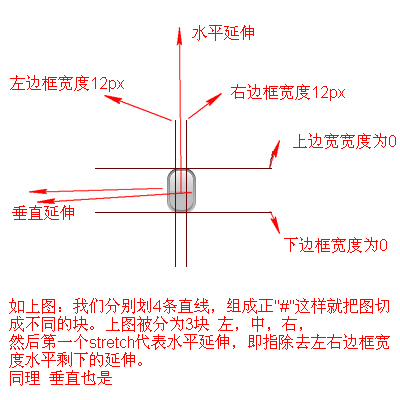
他们把图片,用#的方式截取,然后用 stretch | repeat | round 来控制水平或垂直的效果。看看下图你就明白了
当然关于边框的宽度你也可以用%;其原理也是一样:

到这 大家应该弄明白border-image是怎么一回事了吧。
给大家 一些例子 练习
圆角
borderImage
border-width: 10px;
border-image: url("media/roundedCorner.png") 20;ninja!
border-width: 20px;
border-image: url("media/border.png") 20;Drop shadow
wooooosh
border-width: 10px;
border-image: url("media/blackShadow.png") 5;Tab
katanas
border-width: 15px 20px 0;
border-image: url("media/tab.png") 20 20 0;learn
to be
lazy
to be
lazy
border-width: 10px 10px 0;
border-image: url("media/gradient.png") 10 10 0;多个按钮
But not impossible.


This one is tricky.
转载无需注明出处,多多交流 ,欢迎访问我的博客:http://www.cnblogs.com/niuniu

 浙公网安备 33010602011771号