

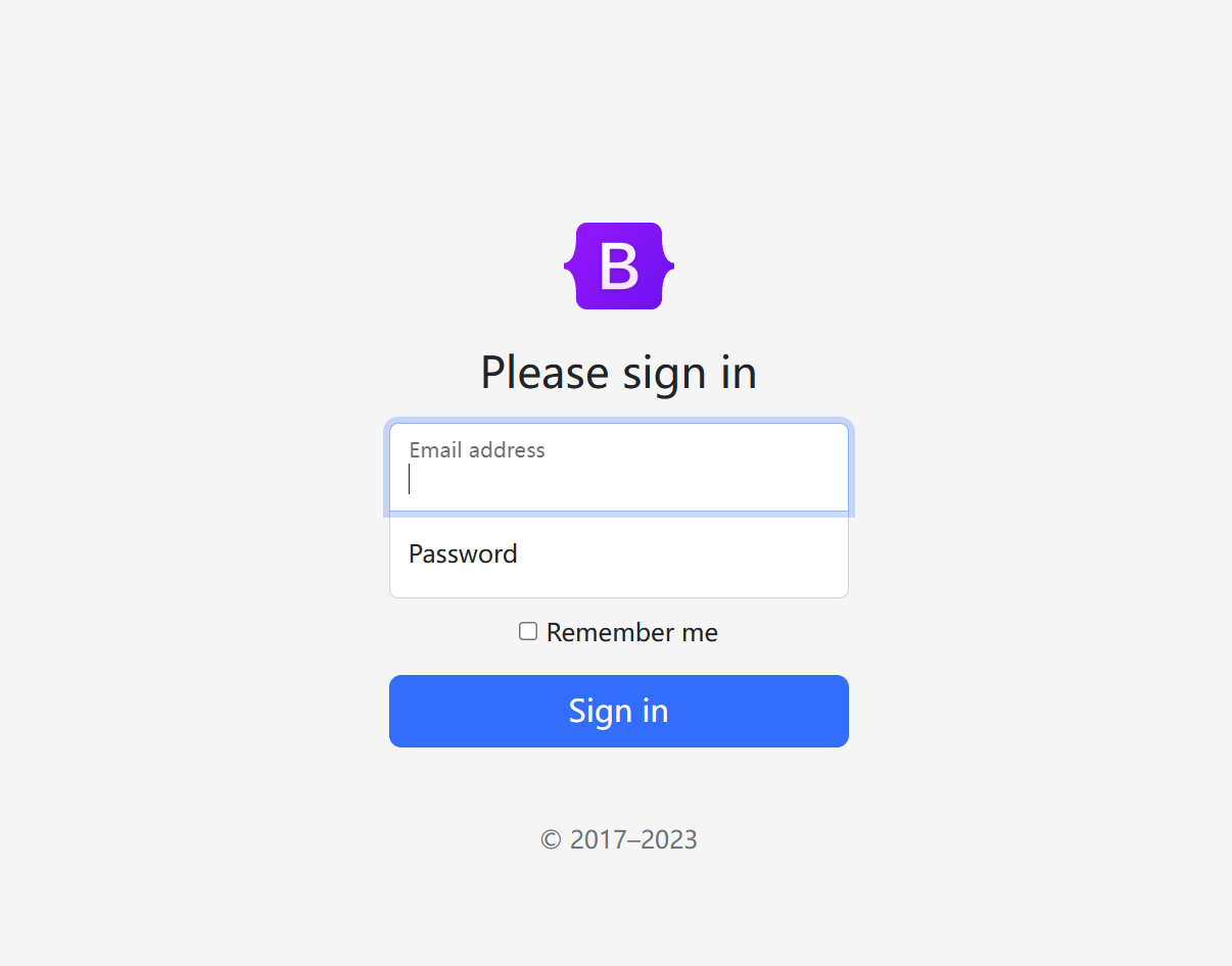
bootstrap 5登录页
bootstrap 5登录页
从bootcss网站上扒下来的,点那个用户名和密码的框框有个文字缩小的效果
<!doctype html>
<html lang="zh-CN">
  <head>
    <meta charset="utf-8">
    <meta name="viewport" content="width=device-width, initial-scale=1">
    <meta name="description" content="">
    <meta name="author" content="Mark Otto, Jacob Thornton, and Bootstrap contributors">
    <meta name="generator" content="Hugo 0.108.0">
    <title>Signin Template · Bootstrap v5 中文文档 v5.3</title>


 <link href="https://cdn.bootcdn.net/ajax/libs/bootstrap/5.2.3/css/bootstrap.min.css" rel="stylesheet">

<meta name="theme-color" content="#712cf9">


    <style>
      .bd-placeholder-img {
        font-size: 1.125rem;
        text-anchor: middle;
        -webkit-user-select: none;
        -moz-user-select: none;
        user-select: none;
      }

      @media (min-width: 768px) {
        .bd-placeholder-img-lg {
          font-size: 3.5rem;
        }
      }

      .b-example-divider {
        height: 3rem;
        background-color: rgba(0, 0, 0, .1);
        border: solid rgba(0, 0, 0, .15);
        border-width: 1px 0;
        box-shadow: inset 0 .5em 1.5em rgba(0, 0, 0, .1), inset 0 .125em .5em rgba(0, 0, 0, .15);
      }

      .b-example-vr {
        flex-shrink: 0;
        width: 1.5rem;
        height: 100vh;
      }

      .bi {
        vertical-align: -.125em;
        fill: currentColor;
      }

      .nav-scroller {
        position: relative;
        z-index: 2;
        height: 2.75rem;
        overflow-y: hidden;
      }

      .nav-scroller .nav {
        display: flex;
        flex-wrap: nowrap;
        padding-bottom: 1rem;
        margin-top: -1px;
        overflow-x: auto;
        text-align: center;
        white-space: nowrap;
        -webkit-overflow-scrolling: touch;
      }
    </style>


    <!-- Custom styles for this template -->
    <style>
      html,
body {
  height: 100%;
}

body {
  display: flex;
  align-items: center;
  padding-top: 40px;
  padding-bottom: 40px;
  background-color: #f5f5f5;
}

.form-signin {
  max-width: 330px;
  padding: 15px;
}

.form-signin .form-floating:focus-within {
  z-index: 2;
}

.form-signin input[type="email"] {
  margin-bottom: -1px;
  border-bottom-right-radius: 0;
  border-bottom-left-radius: 0;
}

.form-signin input[type="password"] {
  margin-bottom: 10px;
  border-top-left-radius: 0;
  border-top-right-radius: 0;
}
    </style>
  </head>
  <body class="text-center">

<main class="form-signin w-100 m-auto">
  <form>
    <img class="mb-4" src="https://v5.bootcss.com/docs/5.3/assets/brand/bootstrap-logo.svg" alt="" width="72" height="57">
    <h1 class="h3 mb-3 fw-normal">Please sign in</h1>

    <div class="form-floating">
      <input type="email" class="form-control" id="floatingInput" placeholder="name@example.com">
      <label for="floatingInput">Email address</label>
    </div>
    <div class="form-floating">
      <input type="password" class="form-control" id="floatingPassword" placeholder="Password">
      <label for="floatingPassword">Password</label>
    </div>

    <div class="checkbox mb-3">
      <label>
        <input type="checkbox" value="remember-me"> Remember me
      </label>
    </div>
    <button class="w-100 btn btn-lg btn-primary" type="submit">Sign in</button>
    <p class="mt-5 mb-3 text-muted">© 2017–2023</p>
  </form>
</main>


  </body>
</html>
在线浏览:http://www.niunan.net/bs5login.html
撸码:复制、粘贴,拿起键盘就是“干”!!!

 浙公网安备 33010602011771号