
20190404-transition、transform转换、animation、媒体查询
目录
1、transition过渡
1.1简写:transiton:transition-property | transition-duration | transition-timing-function | transition-delay
1.2transition-poperty(过渡属性):all | none | property;
1.3transition-duration(过渡持续时间):0 | time;
1.4transition-timing-function(过渡时间函数):ease | linear | ease-in | ease-out | ease-in-out | cubic-bezier(Bézier curve);
1.5transition-delay(过渡延迟):0 | time;
2、transform转换
2.1transform(转换):none | transform-functions;
2.2translate(平移):translate(x,y)| translate3d(x,y,z);
2.3scale(缩放):scale(x,y)| scale3d(x,y,z);
2.4rotate(旋转):rotate(angle)| rotate3d(x,y,z,angle);
2.5skew(倾斜):skew(x-angle | y-angle);
2.6perspective(n)(景深):代表眼睛与元素原点的距离,用于确定元素透视灭点位置。其属性值越大,元素的变形越小,灭点与元素的距离越大
3、animation动画
3.1简写:animation:animation-name | animation-duration | animation-timing-function | animation-delay | animation-iteration-count | animation-direction | animation-play-state | animation-fill-mode;
3.2animation-name(动画名称):keyframesname | none;
3.3animation-duration(动画持续时间):0 | time;
3.4animation-timing-funtion(动画时间函数):ease | linear | ease-in | ease-out | ease-in-out | cubic-bezier(Bézier curve)| steps(count | start | end);
3.5animation-delay(动画延迟时间):0 | time;
3.6animation-iteration-count(动画重复次数):n | infinite;
3.7animation-direction(轮流反向播放):normal | alternate;
3.8animation-paly-state(动画正在运行或暂停):paused | running;
3.9animation-fill-mode(动画最后一帧):none | forwards | backwards | both;
4、媒体查询
4.1概念:用于实现响应式设计,针对不同的媒体类型定义不同的样式
4.2引入方法
4.2.1link元素:<link rel="stylesheet" media="mediatype logical operator(media feature)" href="index.css"/>(增加页面http的请求次数)
4.2.2css样式表:@media mediatype logical operator(media feature) {CSS Code }
4.3媒体类型(mediatype)
4.4逻辑操作符(logical operator)
4.5媒体属性(media feature)
内容
1、transition过渡
1.1简写:transiton:transition-property | transition-duration | transition-timing-function | transition-delay
1.2transition-poperty(过渡属性):all | none | property;
1.3transition-duration(过渡持续时间):0 | time;
1.4transition-timing-function(过渡时间函数):ease | linear | ease-in | ease-out | ease-in-out | cubic-bezier(Bézier curve);
1.5transition-delay(过渡延迟):0 | time;
2、transform转换
2.1transform(转换):none | transform-functions;
2.2matrix(矩阵):matrix(n,n,n,n,n,n) | matrix3d(n,n,n,n,n,n,n,n,n,n,n,n,n,n,n,n);
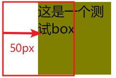
2.3translate(平移):translate(x,y)| translate3d(x,y,z);
CSS Code
div.box{
          width: 100px;
          height: 100px;
          background: olive;
          transform: translateX(50px);
}
HTML Code
<div class="box">这是一个测试box</div>
Result
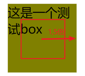
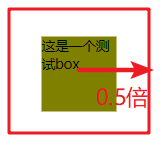
2.4scale(缩放):scale(x,y)| scale3d(x,y,z);
CSS Code
div.box{
          margin: 300px;
          width: 100px;
          height: 100px;
          background: olive;
          transform: scale(1.5);
          transform:scale(0.5);
     }
HTML Code不变
Result
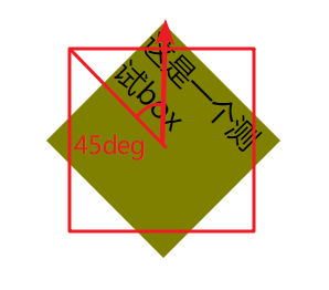
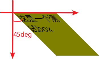
2.5rotate(旋转):rotate(angle)| rotate3d(x,y,z,angle);
CSS Code
transform: rotate(45deg);
HTML Code不变
Result
2.6skew(倾斜):skew(x-angle | y-angle);
CSS Code
transform: skewX(45deg);
HTML Code不变
Result
2.7perspective(n)(景深、透视):代表眼睛与元素原点的距离,用于确定元素透视灭点位置。其属性值越大,元素的变形越小,灭点与元素的距离越大
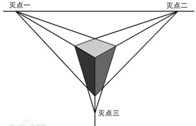
2.7.1透视:分单点透视、两点透视、三点透视
2.7.2灭点:指立体图形各条边的延伸线所产生的相交点,透视点的消失点
如:一个1680像素宽的显示器中有张美女图片,应用了3D transform,同时,该元素或该元素父辈元素设置的perspective大小为2000像素。则这张美女多呈现的3D效果就跟你本人在1.2个显示器宽度的地方(1680*1.2≈2000)看到的真实效果一致!!

2.7.3translateZ帮忙理解透视
对于没有rotateX以及rotateY的元素,translateZ的功能就是让元素在自己的眼前或近或远。
https://www.zhangxinxu.com/study/201209/transform-perspective-translateZ.html
2.7.4perspective的两种写法
一种用在舞台元素上(动画元素们的共同父辈元素);第二种就是用在当前动画元素上,与transform的其他属性写在一起。
.stage {
    perspective: 600px;
}
以及:
#stage .box {
    transform: perspective(600px) rotateY(45deg);
}
多个元素下两种书写的对比
2.7.5perspective-origin:默认就是所看舞台或元素的中心
perspective-origin:25% 75%;
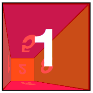
2.8transform-style(开启3d舞台):flat | preserve-3d;
2.9backface-visibility(隐藏透视后元素,如上图橘黄色):visible | hidden;
2.0各种demo:
参考文献:https://www.cnblogs.com/yangyang63963/p/5859913.html?utm_source=itdadao&utm_medium=referral
3、animation动画
3.1简写:animation:animation-name | animation-duration | animation-timing-function | animation-delay | animation-iteration-count | animation-direction | animation-play-state | animation-fill-mode;
可以使用多个动画,用逗号隔开,用于同个元素使用不同属性进行不同帧的动画
3.2animation-name(动画名称):keyframesname | none;
3.3animation-duration(动画持续时间):0 | time;
3.4animation-timing-funtion(动画时间函数):ease | linear | ease-in | ease-out | ease-in-out | cubic-bezier(Bézier curve)| steps(count | start | end);
3.4.1贝塞尔曲线可视化
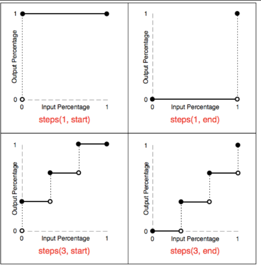
3.4.2帧动画steps
3.4.2.1除了steps之外的过渡函数会为其插入补间,但有些效果只需要关键帧之间的跳跃,类似于手翻书动画,则可使用steps()

3.4.2.2steps函数指定一个阶跃函数,第一个参数指定了时间函数中的间隔数量(必须是正整数),第二个参数可选,接受 start 和 end 两个值,指定在每个间隔的起点或是终点发生阶跃变化,默认为 end
3.4.2.3step-start等同于steps(1,start),动画分成1步,动画执行时为开始左侧端点的部分为开始;
3.4.2.4step-end等同于steps(1,end):动画分成一步,动画执行时以结尾端点为开始,默认值为end
3.4.2.5steps() 第一个参数 number 为指定的间隔数,即把动画分为 n 步阶段性展示,而不是keyframes写的变化次数,其工作机制如下图
如:steps(5,start)中的5,是0%-25%之间变化五次,而不是指的keyframes中的0% 25% 50% 75% 100% 分成5个间隔等分
3.4.2.6在使用定位平移背景图使其水平运动时,需正向即从左到右进行平移,而不能倒置从右到左,否则会产生类似跳频的效果。
参考文献:http://www.cnblogs.com/aaronjs/p/4642015.html#undefined
3.5animation-delay(动画延迟时间):0 | time;
3.6animation-iteration-count(动画重复次数):n | infinite;
3.7animation-direction(轮流反向播放):normal | alternate;
要求animation-iteration-count大于2
3.8animation-paly-state(动画正在运行或暂停):paused | running;
3.9animation-fill-mode(动画最后一帧):none | forwards | backwards | both;
案例demo
3-1丝带导航


<!DOCTYPE html>
<html lang="en">
<head>
    <meta charset="UTF-8">
    <title>Document</title>
    <style type="text/css">
     *{
          margin: 0px;
          padding: 0px;
     }
     body{
          background: olive;
     }
     nav{
          position: relative;
          display: flex;
          margin: 30px auto;
          width: 380px;
          height: 48px;
          /*background: olive;*/
     }
     nav:before,nav:after{
          content: "";
          display: inline-block;
          width: 0px;
          height: 0px;
          border-top: 24px solid #fff;
          border-bottom: 24px solid #fff;
     }
     nav:before{
          position: absolute;
          left: -48px;
          border-left: 24px solid olive;
          border-right: 24px solid #fff;
     }
     nav:after{
          position: absolute;
          right: -48px;
          border-right: 24px solid olive;
          border-left: 24px solid #fff;
     }
     nav a span{
          position: relative;
          display: inline-block;
          width: 95px;
          height: 48px;
          vertical-align: 48px;
          text-decoration: none;
          color: #000;
          background: #fff;
          text-align: center;
          line-height: 48px;
     }
     nav a span:before,nav a span:after{
          display: none;
          position: absolute;
          bottom: -8px;
          content: "";
          width: 0px;
          height: 0px;
          border-top: 4px solid #9B8651;
          border-bottom: 4px solid #fff;
     }
     nav a span:before{
          left: 0px;
          border-right: 4px solid #9B8651;
          border-left: 4px solid #fff;
     }
     nav a span:after{
          right: 0px;
          border-right: 4px solid #fff;
          border-left: 4px solid #9B8651;
     }
     nav a:hover > span{
          transform: translateY(-8px);
          background: #FFD204;
          transform: all 2s linear;
     }
     nav a:hover > span:before,nav a:hover > span:after{
          display: block;
     }
    </style>
</head>
<body>
    <nav>
          <a href="#" class="navlist"><span>HTML</span></a>
          <a href="#" class="navlist"><span>CSS</span></a>
          <a href="#" class="navlist"><span>JavaScript</span></a>
          <a href="#" class="navlist"><span>Ajax</span></a>
     </nav>
</body>
</html>
3-2闪过效果
<!DOCTYPE html>
<html>
<head>
    <meta charset="UTF-8">
    <title>Flicker</title>
    <style type="text/css">
     *{
          margin: 0px;
          padding: 0px;
     }
     body{
          margin: 100px;
          background: olive;
     }

     div.flicker,div.flicker-words{
          position: relative;
          overflow: hidden;
          width: 300px;
          height: 100px;
          background: repeating-linear-gradient(to bottom right,#3B50D0,#32436A 20%,#3B50D0 50%);
          border-radius: 10px;
          text-align: center;
          line-height: 100px;
     }
     div.flicker:before{
          position: absolute;
          left: -330px;
          content: "";
          display: inline-block;
          width: 300px;
          height: 100px;
          background: -webkit-linear-gradient(0deg,rgba(255,255,255,0),rgba(255,255,255,0.5),rgba(255,255,255,0));
          transform: skewX(25deg);
     }
     div.flicker-words span{
          text-align: center;
           /* 背景颜色线性渐变 */
               /* 老式写法 */
                   /* linear为线性渐变,也可以用下面的那种写法。left top,right top指的是渐变方向,左上到右上 */
                   /* color-stop函数,第一个表示渐变的位置,0为起点,0.5为中点,1为结束点;第二个表示该点的颜色。所以本次渐变为两边灰色,中间渐白色 */
           background: -webkit-gradient(linear, left top, right top, color-stop(0, #4d4d4d), color-stop(.4, #4d4d4d), color-stop(.5, white), color-stop(.6, #4d4d4d), color-stop(1, #4d4d4d));
               /* 新式写法 */
           /* background: -webkit-linear-gradient(left top, right top, color-stop(0, #4d4d4d), color-stop(.4, #4d4d4d), color-stop(.5, white), color-stop(.6, #4d4d4d), color-stop(1, #4d4d4d)); */

           /* 设置为text,意思是把文本内容之外的背景给裁剪掉 */
           -webkit-background-clip: text;
           /* 设置对象中的文字填充颜色 这里设置为透明 */
           -webkit-text-fill-color: transparent;
           /* 每隔2秒调用下面的CSS3动画 infinite属性为循环执行animate */
           -webkit-animation: animate 1.5s infinite;
     }
     @-webkit-keyframes animate {
           /* 背景从-100px的水平位置,移动到+100px的水平位置。如果要移动Y轴的,设置第二个数值 */
           from {background-position: -100px;}
           to {background-position: 100px;}
           }
           @keyframes animate {
                from {background-position: -100px;}
                to {background-position: 100px;}
           }
     div.flicker:hover:before{
          left: 600px;
          transition: 1s;
     }
     div.flicker-img{
          position: relative;
          width: 198px;
          overflow: hidden;
     }
     div.flicker-img:before{
          position: absolute;
          left: -198px;
          content: "";
          display: inline-block;
          width: 198px;
          height: 170px;
          background: -webkit-linear-gradient(0deg,rgba(255,255,255,0),rgba(255,255,255,0.5),rgba(255,255,255,0));
     }
     div.flicker-img:hover:before{
          left: 400px;
          transition: 1s;
     }
    </style>
</head>
<body>
    <!-- img -->
     <div class="flicker-img"> <img src="images/flicker.jpg" alt=""></div>

     <!-- div -->
     <div class="flicker"></div>
     <!-- words -->
     <div class="flicker-words"><span>我是一闪而过的Flicker</span></div>
</body>
</html>
3-3小米悬停及评论上浮
4、媒体查询
4.1概念:用于实现响应式设计,针对不同的媒体类型定义不同的样式
4.2引入方法
4.2.1link元素:<link rel="stylesheet" media="mediatype logical operator(media feature)" href="index.css"/>(增加页面http的请求次数)
4.2.2css样式表:@media mediatype logical operator(media feature) {CSS Code }
4.3媒体类型(mediatype)
4.3.1all:用于所有设备
4.3.2print:用于打印机和打印预览
4.3.3screen:用于电脑屏幕、平板电脑、智能手机等
4.3.4speech:用于屏幕阅读器等发声设备
4.4逻辑操作符(logical operator)
4.4.1and:多个媒体属性组合成一条媒体查询,只有当每个属性都为真时,则生效(常用)
4.4.2or或,:任一媒体查询返回真,则生效
4.4.3not:应用于整个媒体查询,在其为假时生效,在逗号媒体查询列表中not仅否定它应用到的媒体查询
4.4.4only:仅在媒体查询匹配成功时生效
4.5媒体属性(media feature)
4.5.1"min-"与"max-",用于表达"小于等于"和"大于等于",避免了使用html的"<"与">"冲突
4.5.2必须用括号()包起来,否则无效

 浙公网安备 33010602011771号