python-matplotlib(一)
**Markers**

=============    ===============================
character        description
=============    ===============================
``'.'``          point marker
``','``          pixel marker #像素点
``'o'``          circle marker
``'v'``          triangle_down marker #下三角
``'^'``          triangle_up marker   #上三角
``'<'``          triangle_left marker  #左三角
``'>'``          triangle_right marker  #右三角
``'1'``          tri_down marker
``'2'``          tri_up marker
``'3'``          tri_left marker
``'4'``          tri_right marker
``'s'``          square marker   #正方形
``'p'``          pentagon marker  #五边形
``'*'``          star marker  #星星
``'h'``          hexagon1 marker   #六角形1
``'H'``          hexagon2 marker   #六角形2
``'+'``          plus marker       #+
``'x'``          x marker          #x
``'D'``          diamond marker    #粗钻石
``'d'``          thin_diamond marker  #细钻石
``'|'``          vline marker      #竖线
``'_'``          hline marker      #横线
=============    ===============================
**Line Styles**

=============    ===============================
character        description
=============    ===============================
``'-'``          solid line style     #实线
``'--'``         dashed line style    #虚线----
``'-.'``         dash-dot line style  #点虚线-。-。
``':'``          dotted line style    #细点线。。。。。
=============    ===============================
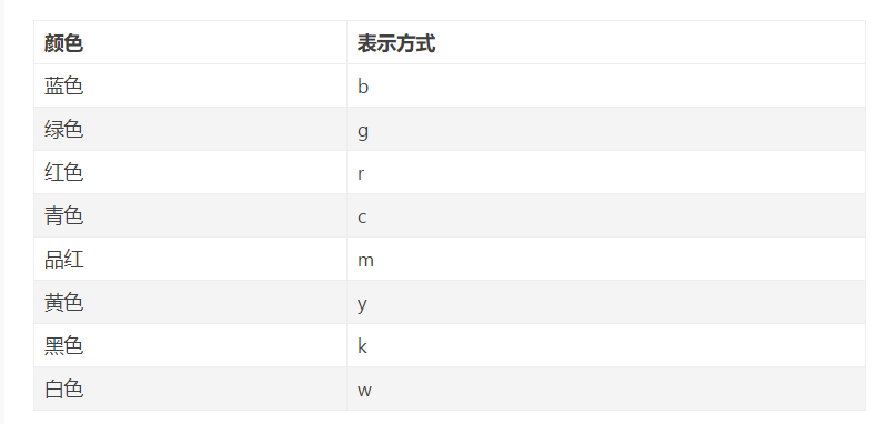
**Colors**

The supported color abbreviations are the single letter codes

=============    ===============================
character        color
=============    ===============================
``'b'``          blue
``'g'``          green
``'r'``          red
``'c'``          cyan      #青色
``'m'``          magenta   #品红色
``'y'``          yellow
``'k'``          black
``'w'``          white
=============    ===============================
一、基本操作
1.figure图像


x=np.linspace(-3,3,50)#50为生成的样本数
y1=2*x+1
y2=x**2
plt.figure(num=1,figsize=(8,5))#定义编号为1 大小为(8,5)
plt.plot(x,y1,color='red',linewidth=2,linestyle='--')#颜色为红色,线宽度为2,线风格为--
plt.plot(x,y2)
plt.show()#显示图
2.设置坐标轴
x=np.linspace(-3,3,50)
y1=2*x+1
y2=x**2
plt.figure(num=2,figsize=(8,5))
plt.plot(x,y1,color='red',linewidth=2,linestyle='-')
plt.plot(x,y2)#进行画图
plt.xlim(-1,2)
plt.ylim(-2,3)
plt.xlabel("I'm x")
plt.ylabel("I'm y")
plt.show()
3.自定义坐标轴
x=np.linspace(-3,3,50)
y1=2*x+1
y2=x**2
plt.figure(num=2,figsize=(8,5))
plt.plot(x,y1,color='red',linewidth=2,linestyle='-')
plt.plot(x,y2)#进行画图
plt.xlim(-1,2)
plt.ylim(-2,3)
plt.xlabel("I'm x")
plt.ylabel("I'm y")
new_ticks=np.linspace(-1,2,5)#小标从-1到2分为5个单位
print(new_ticks)
#[-1.   -0.25  0.5   1.25  2.  ]
plt.xticks(new_ticks)#进行替换新下标
plt.yticks([-2,-1,1,2,],
           [r'$really\ bad$','$bad$','$well$','$really\ well$'])
plt.show()
4.设置边框属性
x=np.linspace(-3,3,50)
y1=2*x+1
y2=x**2
plt.figure(num=2,figsize=(8,5))
plt.plot(x,y1,color='red',linewidth=2,linestyle='--')
plt.plot(x,y2)#进行画图
plt.xlim(-1,2)
plt.ylim(-2,3)
new_ticks=np.linspace(-1,2,5)#小标从-1到2分为5个单位
plt.xticks(new_ticks)#进行替换新下标
plt.yticks([-2,-1,1,2,],
           [r'$really\ bad$','$bad$','$well$','$really\ well$'])
ax=plt.gca()#gca=get current axis
ax.spines['right'].set_color('none')#边框属性设置为none 不显示
ax.spines['top'].set_color('none')
plt.show()
5.设置移动坐标轴
x=np.linspace(-3,3,50)
y1=2*x+1
y2=x**2
plt.figure(num=2,figsize=(8,5))
plt.plot(x,y1,color='red',linewidth=2,linestyle='--')
plt.plot(x,y2)#进行画图
plt.xlim(-1,2)
plt.ylim(-2,3)
new_ticks=np.linspace(-1,2,5)#小标从-1到2分为5个单位
plt.xticks(new_ticks)#进行替换新下标
plt.yticks([-2,-1,1,2,],
           [r'$really\ bad$','$bad$','$well$','$really\ well$'])
ax=plt.gca()#gca=get current axis
ax.spines['right'].set_color('none')#边框属性设置为none 不显示
ax.spines['top'].set_color('none')
ax.xaxis.set_ticks_position('bottom')#使用xaxis.set_ticks_position设置x坐标刻度数字或名称的位置 所有属性为top、bottom、both、default、none
ax.spines['bottom'].set_position(('data', 0))#使用.spines设置边框x轴;使用.set_position设置边框位置,y=0位置 位置所有属性有outward、axes、data
ax.yaxis.set_ticks_position('left')
ax.spines['left'].set_position(('data',0))#坐标中心点在(0,0)位置
plt.show()
6.添加图例
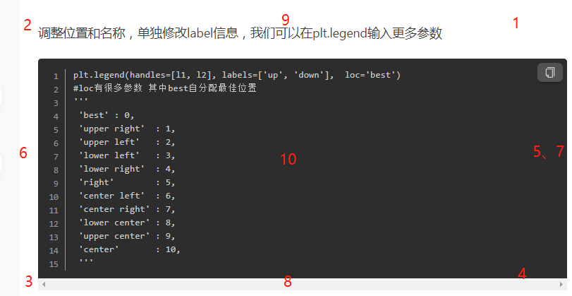
x=np.linspace(-3,3,50)
y1=2*x+1
y2=x**2
plt.figure(num=2,figsize=(8,5))
plt.xlim(-1,2)
plt.ylim(-2,3)
new_ticks=np.linspace(-1,2,5)#小标从-1到2分为5个单位
plt.xticks(new_ticks)#进行替换新下标
plt.yticks([-2,-1,1,2,],
           [r'$really\ bad$','$bad$','$well$','$really\ well$'])

l1,=plt.plot(x,y1,color='red',linewidth=2,linestyle='--',label='linear line')
l2,=plt.plot(x,y2,label='square line')#进行画图
plt.legend(loc='best')#显示在最好的位置
plt.show()#显示图
7.标注
x=np.linspace(-3,3,50)
y = 2*x + 1
plt.figure(num=1, figsize=(8, 5))
plt.plot(x, y,)

#移动坐标轴
ax = plt.gca()
ax.spines['right'].set_color('none')
ax.spines['top'].set_color('none')
ax.xaxis.set_ticks_position('bottom')
ax.spines['bottom'].set_position(('data', 0))
ax.yaxis.set_ticks_position('left')
ax.spines['left'].set_position(('data', 0))

#标注信息
x0=1
y0=2*x0+1
plt.scatter(x0,y0,s=50,color='b')
plt.plot([x0,x0],[y0,0],'k--',lw=2.5)#连接(x0,y0)(x0,0) k表示黑色 lw=2.5表示线粗细
#xycoords='data'是基于数据的值来选位置,xytext=(+30,-30)和textcoords='offset points'对于标注位置描述和xy偏差值,arrowprops对图中箭头类型设置
plt.annotate(r'$2x0+1=%s$' % y0, xy=(x0, y0), xycoords='data', xytext=(+30, -30),
             textcoords='offset points', fontsize=16,
             arrowprops=dict(arrowstyle='->', connectionstyle="arc3,rad=.2"))
#添加注视text(-3.7,3)表示选取text位置 空格需要用\进行转译 fontdict设置文本字体
plt.text(-3.7, 3, r'$This\ is\ the\ some\ text. \mu\ \sigma_i\ \alpha_t$',
         fontdict={'size': 16, 'color': 'r'})
plt.show()
plt.annotate和plt.text两种方法都可。
plt.text(0.5, -0.25, "sin(np.pi) = %s"%y0, fontdict={'size': 16, 'color': 'r'})
8.能见度调整
x=np.linspace(-3, 3, 50)
y=0.1*x
plt.figure()
plt.plot(x, y, linewidth=10, zorder=1)
plt.ylim(-2, 2)

#移动坐标轴
ax = plt.gca()
ax.spines['right'].set_color('none')
ax.spines['top'].set_color('none')
ax.spines['top'].set_color('none')
ax.xaxis.set_ticks_position('bottom')
ax.spines['bottom'].set_position(('data', 0))
ax.yaxis.set_ticks_position('left')
ax.spines['left'].set_position(('data', 0))

#label.set_fontsize(12)重新调整字体大小 bbox设置目的内容的透明度相关参数 facecolor调节box前景色 edgecolor设置边框 alpha设置透明度 zorder设置图层顺序
for label in ax.get_xticklabels() + ax.get_yticklabels():
    label.set_fontsize(12)
    label.set_bbox(dict(facecolor='red', edgecolor='None', alpha=0.7, zorder=2))
plt.show()
9.测试--做一个y=-x的图像
x=np.linspace(-3,3,10)
y=-x
plt.figure()
plt.plot(x,y,linewidth=2, zorder=1)
plt.xlim(-2,2)
plt.ylim(-2,2)
plt.xlabel('X')
plt.ylabel('Y')
l1,=plt.plot(x,y,color='red',linewidth=2,linestyle='-',label='y=-x')
plt.legend(loc=0) ##添加图例
ax = plt.gca() ##移动位置
ax.spines['right'].set_color('none')
ax.spines['top'].set_color('none')
ax.xaxis.set_ticks_position('bottom')
ax.spines['bottom'].set_position(('data',0))
ax.yaxis.set_ticks_position('left')
ax.spines['left'].set_position(('data',0))
plt.show()
10.添加标题
plt.title('kkkk')
11.中文乱码
x = ['-北京', '上海', '深圳', '广州']
y = [60000, 58000, 50000, 52000]
plt.plot(x, y)
plt.show()

plt.rcParams['font.sans-serif']=['SimHei'] #用来正常显示中文标签
plt.rcParams['axes.unicode_minus']=False #用来正常显示负号
plt.plot(x, y)
plt.show()


 浙公网安备 33010602011771号