超级实用CSS
2024-03-29 11:09 WEB前端小菜鸟 阅读(41) 评论(0) 收藏 举报1.美化滚动条
.common_scrollbar {
  &::-webkit-scrollbar {
    /*滚动条整体样式*/
    width: 5px; /*高宽分别对应横竖滚动条的尺寸*/
    height: 4px;
    position: absolute;
  }
  &::-webkit-scrollbar-thumb {
    /*滚动条里面小方块*/
    border-radius: 5px;
    height: 20px;
    // -webkit-box-shadow: inset 0 0 5px rgba(0,0,0,0.2);
    background: transparent;
  }
  &::-webkit-scrollbar-track {
    /*滚动条里面轨道*/
    // -webkit-box-shadow: inset 0 0 5px rgba(0,0,0,0);
    border-radius: 0;
    background: rgba(235, 232, 232, 0);
  }
  &:hover {
    &::-webkit-scrollbar-thumb {
      /*滚动条里面小方块*/
      border-radius: 5px;
      height: 20px;
      // -webkit-box-shadow: inset 0 0 5px rgba(0,0,0,0.2);
      background: rgba(155, 153, 153, 0.2);
    }
  }
}
2.单行文字溢出时显示省略号
.one-line-ellipsis {
  /* Key Style */
  overflow: hidden;
  white-space: nowrap;
  text-overflow: ellipsis;
  max-width: 375px;
}
3.多行文字溢出时显示省略号
.more-line-ellipsis {
  overflow: hidden;
  text-overflow: ellipsis;

  display: -webkit-box;
  /* set n lines, including 1 */
  -webkit-line-clamp: 2;
  -webkit-box-orient: vertical;
}
4.filter:grayscale(1)”使页面处于灰色模式[通常哪个去世了]
body{
  filter: grayscale(1);
  兼容自己百度
}
5.“outline:none”去掉输入状态行(就是点击输入框后)
当输入框被选中时,默认会有一个蓝色的状态行,可以使用 outline: none 去掉。
6.动态计算宽度或者高度
calc(100vh - 50px);
请注意,减号前后必须有空格!!! 必须有空格
calc的除法呢 --》 请注意,减号前后必须有空格!!! 必须有空格 /前后也有哈
background: url('@/static/images/lianxifangshi.png') no-repeat center / 100% auto;auto auto 可以省略不写,为避免背景图显示异常,建议始终明确设置background-size:,background-size:100%宽度铺满 auto 高度自适应才不会压缩图片,一般写法就够用了,
cover图片等比缩放至完全覆盖容器,可能裁剪部分边缘。(eg:小狗的耳朵被裁了)
contain图片等比缩放至完全显示在容器内,可能留有空白区域。(eg:小狗全部显示在div,但是div会有留白部分)
100% 100% 图片被拉伸 / 压缩以填满容器,可能导致比例失真;(所以100% auto 保持等比压缩)
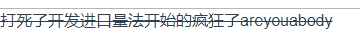
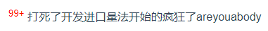
<div>
<sup class="in" >99+</sup>
打死了开发进口量法开始的疯狂了areyouabody
</div>
9.手写el-selectr如图,这个小三角
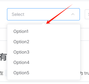
思路就是正常写下拉 v-if --循环选项--写样式--然后定位--最后写这个三角形,让后定位把横线盖着就行(z-index级别比 循环的div高就行)
10.flex布局
问题1:有个bug当flex布局是左边固定右边flxe:1;当我在最右边的div里面 动态添加表格的列的时候页面会被撑开。
 flex: 1;              /* 占满剩余空间 */
 min-width: 0;         /* 允许收缩到0宽度 */
 overflow-x: auto;     /* 超出内容显示滚动条 */
问题2:如何均分布局(div之间的间隔为20px)-关键词gap
.test{
    width: 100%;
    height: 300px;
    background-color: gainsboro;
    display: flex;
    gap: 20px;/* 替代 margin,更简洁的间距控制 */
.son{ flex: 1; height: 100%; background-color: aqua; } }

关键词-父元素:gap 子元素:flex;1
问题3:这种布局怎么解决,数量不固定(最后一行从左往右排列)
.test{
    width: 100%;
    // height: 800px;
    background-color: gainsboro;
    display: flex;
    flex-wrap: wrap;
    justify-content: space-between;
    gap:10px;
    box-sizing: border-box;
    padding: 10px;
    .son{
        width: calc((100% - 30px) / 4); /* 4列布局,预留间距 */
        height: 200px;
        background-color: aqua;
    }
}

解决办法:
1.写空的div去补位置,
2.放弃 justify-content: space-between,改用 margin-right: auto 让项目自动填充间距。
3.Grid布局替代更简单,二维布局,flex是一维布局
.test{
    width: 100%;
    // height: 800px;
    background-color: gainsboro;
    display: grid;
    grid-template-columns: repeat(4, 1fr); /* 一行4个,均分宽度 ===grid-template-columns: 1fr 1fr 1fr 1fr;*/
    gap: 20px;
    box-sizing: border-box;
    padding: 10px;
    .son{
        height: 200px;
        background-color: aqua;
    }
}
11.flex布局的时候被压缩了(如图中午被压缩了)

问题2:顶部视觉效果没对齐,改父元素:
 ,改后
,改后

12.background-color 取值为 none 和 background color transparent 的区别
background-color 取值为 none 不合法的写法,CSS 中并没有 none 这个针对背景颜色的合法取值;由于 none 不是合法取值,当使用时,该样式不会生效,元素会沿用默认的背景颜色(通常是透明,即等同于transparent)或继承父元素的背景颜色。若想设置背景为透明,应使用 background-color: transparent
NO最后一个.初始化css(清除默认的margin等) --参考https://blog.csdn.net/chaoPerson/article/details/130796513
html,
body {
  height: 100%;
  /* 文字风格 Sans-serif 各笔画粗细相同,Serif 笔画粗细不同,monospace 等宽体,cursive草书,fantasy梦幻 */
  font-family: 'Microsoft YaHei', sans-serif, 'Helvetica Neue', Helvetica, Arial,
    '黑体', '宋体', Arial;
  -webkit-tap-highlight-color: transparent;
  -webkit-font-smoothing: antialiased;
  -moz-osx-font-smoothing: grayscale;
}
body {
  font-size: 14px;
  color: #333;
}

/* 重置各标签的默认样式 */
a,
body,
center,
cite,
code,
dd,
del,
div,
dl,
dt,
em,
fieldset,
figcaption,
figure,
footer,
form,
h1,
h2,
h3,
h4,
h5,
h6,
header,
hr,
html,
img,
input,
label,
legend,
li,
mark,
ol,
p,
section,
span,
textarea,
time,
td,
th,
ul {
  margin: 0;
  border: 0;
  padding: 0;
  font-style: normal;
  box-sizing: border-box;
  /*  自动换行 */
  word-wrap: break-word;
  /*  强制英文单词断行 */
  word-break: break-all;
}

/*  设置标签为块级分类 */
article,
aside,
details,
fieldset,
figcaption,
figure,
footer,
header,
main,
nav,
section {
  display: block;
}

/* 去除input标签的默认样式 */
button,
input,
textarea {
  -webkit-appearance: none;
  font-family: 'Microsoft YaHei', sans-serif, 'Helvetica Neue', Helvetica, Arial,
    '黑体', '宋体', Arial;
  border: 0;
  margin: 0;
  padding: 0;
  font-size: 1em;
  line-height: 1em;
  outline: none;
  background-color: transparent;
}

/*  禁止多文本框手动拖动大小 */
textarea {
  resize: none;
  -webkit-appearance: none;
}

/* 去掉按下的阴影盒子 */
input,
textarea,
a {
  -webkit-tap-highlight-color: transparent;
}

/*  清除a标签下划线 */
a,
a:visited {
  text-decoration: none;
}
a:focus,
a:active,
a:hover {
  outline: none;
}

/*  清除列表前面的点 */
ol,
li,
ul {
  list-style: none;
}

/*  清除IE下图片的边框 */
img {
  border-style: none;
  font-size: 0;
}

/*  解决chrome浏览器默认黄色背景问题 */
input:-webkit-autofill,
textarea:-webkit-autofill,
select:-webkit-autofill {
  -webkit-box-shadow: 0 0 0 1000px #fff inset;
}

/*  设置默认滚动条样式 */
::-webkit-input-placeholder {
  color: #afbdcc;
}
:-moz-placeholder {
  color: #afbdcc;
}
::-moz-placeholder {
  color: #afbdcc;
}
:-ms-input-placeholder {
  color: #afbdcc;
}
::-webkit-scrollbar {
  width: 6px;
  height: 6px;
}
::-webkit-scrollbar-track {
  background-color: #f5f5f5;
}
::-webkit-scrollbar-track-piece {
  background-color: #f5f5f5;
  border-radius: 6px;
}
::-webkit-scrollbar-thumb {
  background-color: #cccccc;
  border-radius: 6px;
}
::-webkit-scrollbar-corner {
  background-color: #f5f5f5;
}
::-webkit-resizer {
  background-repeat: no-repeat;
  background-position: bottom right;
}
后台管理系统不踩坑布局
上header
下(左边菜单,右边内容区)
<!-- 必须加视口,保证在各种设备下正常显示 --> <meta name="viewport" content="width=device-width, initial-scale=1.0"/>
<meta name="viewport" content="width=device-width, initial-scale=1.0"/>
* { margin: 0; padding: 0; /* 统一盒模型,防止 padding/border 撑大盒子 */ box-sizing: border-box; }
html, body { width: 100%; height: 100%; /* 禁止全局滚动条,只让内容区单独滚动 */ overflow: hidden; }
 /* 最外层布局容器 */
    .layout {
      /* 宽度用 % 安全,不会包含滚动条导致横向滚动,不能用100vw,滚动条占宽度的,如果用了则会被挤出去so用% */
      width: 100%;
      /* 高度用 vh 直接撑满一屏 */
      height: 100vh;
      display: flex;
      /* 纵向排列:header 在上,container 在下 */
      flex-direction: column;
      /* 防止窗口缩太小时布局挤变形,后台通用最小宽度 */
      min-width: 1200px;
    }

    /* 顶部导航 */
    .header {
      /* 后台通用头部高度 */
      height: 60px;
      background: #2f4050;
      color: #fff;
      display: flex;
      /* 垂直居中 */
      align-items: center;
      /* 左右分开:系统名 & 用户信息 */
      justify-content: space-between;
      padding: 0 20px;
    }

    /* 中间主体:左侧菜单 + 右侧内容 */
    .container {
      /* 占满除 header 外的所有剩余高度,为啥这里不用加min-height:0 呢 因为100vh已经锁死高度 */
      flex: 1;
      display: flex;
      /* 隐藏溢出,防止内部内容撑大布局 */
      overflow: hidden;
    }

    /* 左侧菜单 */
    .sidebar {
      /* 固定菜单宽度,后台常用 200~240px */
      width: 220px;
      background: #333;
      color: #fff;
      /* 菜单过长时单独滚动 */
      overflow-y: auto;
      /* 禁止被 flex 压缩宽度,保证菜单永远这么宽 */
      flex-shrink: 0;
    }

    /* 右侧内容区域(核心) */
    .main {
      /* 占满除左侧菜单外的所有剩余宽度 */
      flex: 1;
      /* 🔥 关键:必须加,否则长内容会撑破布局、出现横向滚动条 */
      min-width: 0;
      /* 内容过长时,只在这里垂直滚动 */
      overflow-y: auto;
      background: #f3f3f4;
      padding: 20px;
    }

只要是横向 flex + 子元素 flex:1;不管加不加 overflow,一律加上 min-width:0因为:flex 子元素默认 min-width:auto,优先级比 overflow 高,浏览器优先保证:内容不能被压缩
浏览器默认有一个规则:盒子再窄,也不能比里面的内容窄!,如果有一个大图片,浏览器就会说我内容这么宽,你flex也不能把我压扁,所以会把盒子撑大,布局就炸了,so要加上min-width:0
所以盒子依然会被撑大

横向 flex:1 → min-width:0(必加)
纵向 flex:1 + 高度不固定 → min-height:0(必加)
纵向 flex:1 + 高度固定(100vh /fixed)→ 不用加
妈的:手机屏幕怎么自使用布局?还在简单说flex布局吗?NO
最终整合版:面试流利回答(背这段就够)
第二,模块宽度用百分比,按比例分配,保证不同设备比例一致;(如一行两个盒子,永远各占一半 写50%)第三,字体、间距、高度用 rem,配合动态根字体实现等比缩放;(开发时直接按照设计稿写 px,然后通过 postcss-pxtorem 或 amfe-flexible 这类插件,自动把 px 转换成 rem,-----用amfe-flexible动态设置根的font-size--》它是阿里手淘团队做的移动端适配工具,核心就一件事:自动根据当前屏幕宽度,计算并设置 html 的 font-size。(公式:1rem = 屏幕宽度 / 10 eg:375px 屏幕 →)),具体怎么用呢 自己搜 安装然后配置看你的设计稿是375px还是750px 然后写进去就行了html { font-size: 37.5px; }第四,全屏通栏模块用 vw,直接相对于屏幕宽度适配;(全屏100vw)最后,对特殊尺寸设备,通过媒体查询做细节微调,保证所有手机体验统一。(@media (max-width: 375px) { .title { font-size: 14px; } },)
用户缩放浏览器,布局错乱;
之前江西项目用的postcss-px-to-viewport 插件转成vw不管你咋缩放都搞定,有个问题是postcss-px-to-viewport 只能转 CSS 里的 px,
方案1:写一个工具函数 pxToVw(最简单、最常用
// 设计稿宽度 1920
export function pxToVw(px) { return (px / 1920) * 100 + 'vw' };如echarts的配置里面:fontSize: pxToVw(14) 搞定
方案2:放弃这个插件改用scale缩放(豆包说的这就是 PC 端最稳、最万能、抗缩放、不变形、兼容 ECharts 的终极方案。 )
// 页面等比缩放核心函数(PC端万能适配)
function scalePage() {
  // 1. 获取页面最外层根容器 #app(Vue/React/原生项目都用这个)
  const app = document.getElementById('app')

  // 2. 定义设计稿宽度(设计师给你的宽度,一般是1920)
  const designWidth = 1920

  // 3. 获取当前浏览器可视区域的宽度(用户屏幕的宽度)
  const clientWidth = document.documentElement.clientWidth

  // 4. 计算缩放比例 = 当前屏幕宽度 / 设计稿宽度
  // 屏幕比设计稿小 → 缩小页面
  // 屏幕比设计稿大 → 放大页面
  const scale = clientWidth / designWidth

  // 5. 核心:给容器设置 transform: scale(比例)
  // 让整个页面 等比例 放大/缩小
  app.style.transform = `scale(${scale})`

  // 6. 缩放的中心点:左上角(必须设置,否则页面会偏移、错位)
  app.style.transformOrigin = 'left top'

  // 7. 把容器宽度固定为设计稿宽度(让内容按设计稿排版,不自动挤压)
  // 这一步是保证页面不变形、不换行、不错乱的关键
  app.style.width = `${designWidth}px`
}

// 监听浏览器窗口大小变化
// 窗口拖动、放大、缩小时 → 自动重新计算缩放
window.addEventListener('resize', scalePage)

// 页面一加载就执行一次,让页面自动适配当前屏幕
scalePage()
这个代码的核心逻辑(一句话)
把整个页面当成一张图片,按屏幕大小自动等比缩放,永远不变形!

优点:不用改任何单位
- echarts 不用动
- CSS 不用动
- 行内样式不用动
- JS 数字不用动
- 怎么缩放都不变形
当然你也可以用插件,不用手写autofit.js 豆包和千问都推荐它,但是他会左右留白,不能用,SO
解决方案是禁止用户缩放,如果不能禁止缩放呢?那就用flex布局啊,写min-width:最小宽度,避免样式错乱
关键 JS:禁止用户 Ctrl + 滚轮缩放(防止错乱)
// 禁止 Ctrl + 滚轮缩放   放到 main.js 最下面:
document.addEventListener('wheel', (e) => {
  if (e.ctrlKey) e.preventDefault()
}, { passive: false })

// 禁止 Ctrl + - + 0 缩放
document.addEventListener('keydown', (e) => {
  if ((e.ctrlKey || e.metaKey) &&
     (e.key === '+' || e.key === '-' || e.key === '0')) {
    e.preventDefault()
  }
})

 浙公网安备 33010602011771号