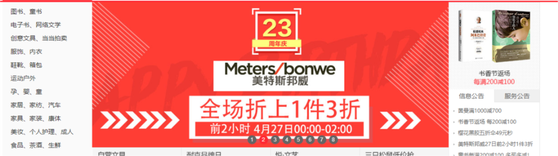
三栏布局,顾名思义就是两边固定,中间自适应。三栏布局在开发十分常见,那么什么是三栏布局?例如当当网首页边商品导航和右边导航固定宽度,中间的主要内容随浏览器宽度自适应。效果如下图所示:
![]()
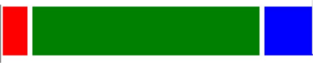
下面围绕的这样的目的,即左右模块固定宽度,中间模块随浏览器变化自适应,想要完成的最终结果如下图:
![]()
红色和蓝色宽度固定,绿色宽度自适应,下面七种方法实现的最终效果跟这个差不多,可能会稍有不同。
方法一:流体布局(左右模块各自向左右浮动,并设置中间模块的 margin 值使中间模块宽度自适应。缺点就是主要内容无法最先加载,当页面内容较多时会影响用户体验。)
<!DOCTYPE html>
<html lang="en">
<head>
<style>
.left {
float: left;
height: 200px;
width: 100px;
}
.right {
width: 200px;
height: 200px;
background-color: blue;
float: right;
}
.main {
margin-left: 120px;
margin-right: 220px;
height: 200px;
background-color: green;
}
</style>
</head>
<body>
<div class="container">
<div class="left">left</div>
<div class="right">right</div>
<div class="main">mian</div>
</div>
</body>
</html>
方法二:BFC三栏布局(缺点跟方法一类似,主要内容模块无法最先加载,当页面中内容较多时会影响用户体验。)
<!DOCTYPE html>
<html lang="en">
<head>
    <style>
	.left {
	    float: left;
	    height: 200px;
	    width: 100px;
	    margin-right: 20px;
	    background-color: red;
	}
	.right {
	    width: 200px;
	    height: 200px;
	    float: right;
	    margin-left: 20px;
	    background-color: blue;
	}
	.main {
	    height: 200px;
	    overflow: hidden;
	    background-color: green;
	}
    </style>
</head>
<body>
    <div class="container">
        <div class="left"></div>
        <div class="right"></div>
        <div class="main"></div>
    </div>
</body>
</html>
方法三:双飞翼布局(利用的是浮动元素 margin 负值的应用。主体内容可以优先加载,HTML 代码结构稍微复杂点。)
<!DOCTYPE html>
<html lang="en">
<head>
<style>
.content {
float: left;
width: 100%;
}
.main {
height: 200px;
margin-left: 110px;
margin-right: 220px;
}
.left {
float: left;
height: 200px;
width: 100px;
margin-left: -100%;
background-color: red;
}
.right {
width: 200px;
height: 200px;
float: right;
margin-left: -200px;
background-color: blue;
}
</style>
</head>
<body>
<div class="content">
<div class="main"></div>
</div>
<div class="left"></div>
<div class="right"></div>
</body>
</html>
方法四:圣杯布局(跟双飞翼布局很像,有一些细节上的区别,相对于双飞翼布局来说,HTML 结构相对简单,但是样式定义就稍微复杂,也是优先加载内容主体。)
<!DOCTYPE html>
<html lang="en">
<head>
<style>
.container {
margin-left: 120px;
margin-right: 220px;
}
.main {
float: left;
width: 100%;
height: 300px;
}
.left {
float: left;
width: 100px;
height: 300px;
margin-left: -100%;
position: relative;
left: -120px;
background-color: blue;
}
.right {
float: left;
width: 200px;
height: 300px;
margin-left: -200px;
position: relative;
right: -220px;
background-color: green;
}
</style>
</head>
<body>
<div class="container">
<div class="main"></div>
<div class="left"></div>
<div class="right"></div>
</div>
</body>
</html>
方法五:flex布局(简单实用,未来的趋势,需要考虑浏览器的兼容性。)
<!DOCTYPE html>
<html lang="en">
<head>
<style>
.container {
display: flex;
}
.main {
flex-grow: 1;
height: 300px;
}
.left {
order: -1;
flex: 0 1 200px;
margin-right: 20px;
height: 300px;
background-color: blue;
}
.right {
flex: 0 1 100px;
margin-left: 20px;
height: 300px;
background-color: green;
}
</style>
</head>
<body>
<div class="container">
<div class="main"></div>
<div class="left"></div>
<div class="right"></div>
</div>
</body>
</html>
方法六:table布局(缺点:无法设置栏间距)
<!DOCTYPE html>
<html lang="en">
<head>
<style>
.container {
display: table;
width: 100%;
}
.left, .main, .right {
display: table-cell;
}
.left {
width: 200px;
height: 300px;
}
.main {
background-color: blue;
}
.right {
width: 100px;
height: 300px;
background-color: green;
}
</style>
</head>
<body>
<div class="container">
<div class="left"></div>
<div class="main"></div>
<div class="right"></div>
</div>
</body>
</html>
方法七:绝对定位布局(简单实用,并且主要内容可以优先加载。)
<!DOCTYPE html>
<html lang="en">
<head>
<style>
.container {
position: relative;
}
.main {
height: 400px;
margin: 0 120px;
}
.left {
position: absolute;
width: 100px;
height: 300px;
left: 0;
top: 0;
background-color: red;
}
.right {
position: absolute;
width: 100px;
height: 300px;
background-color: blue;
right: 0;
top: 0;
}
</style>
</head>
<body>
<div class="container">
<div class="main"></div>
<div class="left"></div>
<div class="right"></div>
</div>
</body>
</html>


 浙公网安备 33010602011771号