CSS BFC 总结
CSS BFC 总结
01 BFC 简介
BFC(Block Formatting Context)块格式化上下文
BFC 是一个独立的区域,是块盒子的布局发生的的区域,也是浮动元素和其他元素交互的区域。
02 父元素触发 BFC 的情况:
- 根元素
- 浮动元素(float 不是 none)
- 绝对定位元素(position 为 absolute 或 fixed)
- display 为以下属性值的元素:
行内块 inline-block,
表格单元格 table-cell,
表格标题 table-caption,
匿名表格单元格 table, table-row, table-row-group, table-header-group, table-footer-group
flow-root
- overflow 值不为 visible 的元素
- 弹性元素 display: flex/inline-flex
- 网格元素 display: grid/inline-grid
块格式化上下文包含创建它的元素内部的所有内容。
03 BFC 特性
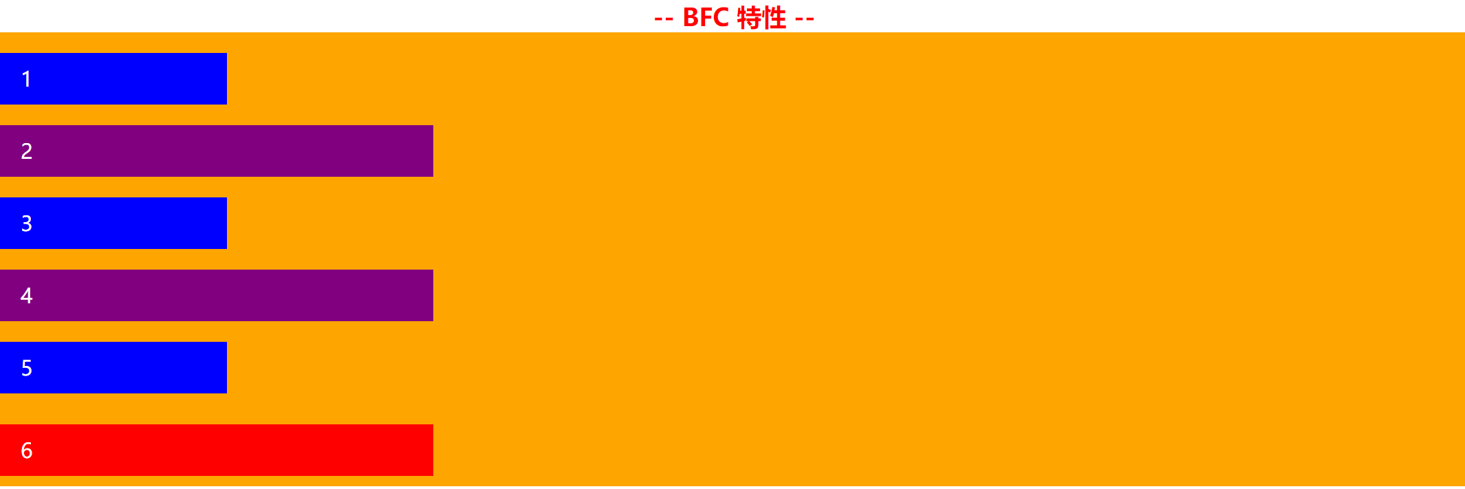
- 子盒子会沿垂直方向顺序排列;
- 子盒子左边缘会和父盒子 content-box 的左边缘重合;
- 子盒子垂直方向的距离由 margin 属性决定,同一个 BFC 内的子盒子的 margin 会发生塌陷;
- BFC 是一个独立的容器,容器的子元素不会响应外部的元素,同时也不会受到外部元素的影响;
- 计算 BFC 的高度的时候会将浮动子元素考虑在内;
- 浮动元素后的 BFC 兄弟元素宽度小于浮动元素所在行剩余的宽度时,该 BFC 兄弟元素的左边缘会和浮动元素所在行剩余空间的左边缘重合;
边缘是指元素 (margin + border + padding + content 的区域的边缘)
04 BFC 的应用
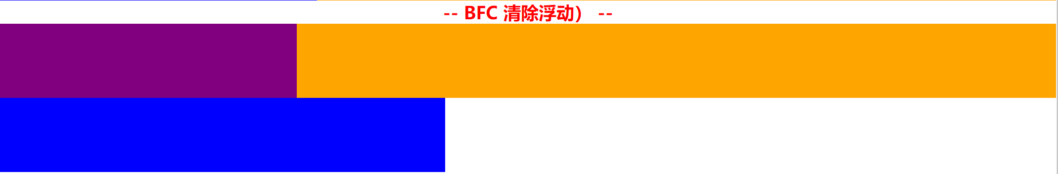
4.1 清除浮动
将父元素设置为 BFC 就可以清除子盒子的浮动。
最长间的方法就是设置父元素属性 overflow 为 hidden。
不设置父元素为 BFC 时,浮动元素会脱离文档标准流,父元素高度将为0,
将父元素设置为 BFC 后,计算父元素的高度时会考虑浮动子元素。
4.2 解决外边距塌陷
两个 BFC 是两个独立的区域不会相互影响。
4.3 盒子宽度自适应
根据 BFC 特性:浮动元素和 BFC 兄弟元素之间的关系,可以给定浮动元素的宽度,不设置 BFC 兄弟元素的宽度,
或者设置为 auto(两种方法等价都会自动填充剩余的宽度),可以实现 BFC 兄弟元素的宽度自适应。
4.4 防止字体环绕
设置浮动元素后的下一个子元素为 BFC 即可。
实例
01 BFC 特性
<!--------------------------------------------------------------
    BFC 特性实例
--------------------------------------------------------------->
<style>
    .container01 {
        width: 100%;
        overflow: hidden;                   /* 触发 BFC */
        background-color: orange;
    }

    .container01 div {
        padding-left: 20px;
        height: 50px;
        color: #fff;
        font-size: 20px;
        font-weight: 500;
        line-height: 50px;
    }

    .container01 .item:nth-of-type(2n) {
        margin: 10px 0;
        width: 400px;
        background-color: purple;
    }

    .container01 .item:nth-of-type(2n + 1) {
        margin: 20px 0;
        width: 200px;
        background-color: blue;
    }

    .container01 .item:last-of-type {
        float: left;                        /* 触发 BFC(两个 BFC 互不影响) */
        background-color: red;
    }
</style>

<h2 style="color: red; text-align: center;">-- BFC 特性 --</h2>
<div class="container01">
    <div class="item">1</div>
    <div class="item">2</div>
    <div class="item">3</div>
    <div class="item">4</div>
    <div class="item">5</div>
    <div class="item">6</div>
</div>
02 BFC 特性实例:浮动元素和 BFC 兄弟元素
<!--------------------------------------------------------------
    BFC 特性实例:浮动元素和 BFC 兄弟元素
--------------------------------------------------------------->
<style>
    .container02 {
        width: 100%;
        overflow: hidden;                   /* 触发 BFC */
        background-color: orange;
    }

    .container02 div:nth-of-type(1) {
        float: left;                        /* 触发 BFC */
        width: 50%;
        height: 100px;
        background-color: purple;
    }

    .container02 div:nth-of-type(2) {
        overflow: hidden;
        width: 40%;
        height: 100px;
        background-color: pink;
    }

    .container02 div:nth-of-type(3) {
        overflow: hidden;
        width: 60%;
        height: 100px;
        background-color: red;
    }

    .container02 div:nth-of-type(4) {
        display: flex;
        width: 30%;
        height: 100px;
        background-color: blue;
    }
</style>

<h2 style="color: red; text-align: center;">-- BFC 特性实例:浮动元素和 BFC 兄弟元素 --</h2>
<div class="container02">
    <div></div>
    <div></div>
    <div></div>
    <div></div>
</div>

03 BFC 清除浮动
<!--------------------------------------------------------------
    BFC 清除浮动
--------------------------------------------------------------->
<style>
    .container03 .float-container {
        width: 100%;
        overflow: hidden;                   /* 触发 BFC */
        background-color: orange;
    }

    .container03 .float-container .float-box {
        float: left;
        width: 400px;
        height: 100px;
        background-color: purple;
    }

    .container03 .no-float-box {
        width: 600px;
        height: 100px;
        background-color: blue;
    }
</style>

<h2 style="color: red; text-align: center;">-- BFC 清除浮动) --</h2>
<div class="container03">
    <div class="float-container">
        <div class="float-box"></div>
    </div>
    <div class="no-float-box"></div>
</div>
04 BFC 盒子宽度自适应:两列布局
<!--------------------------------------------------------------
    BFC 盒子宽度自适应:两列布局
--------------------------------------------------------------->
<style>
    .container04 {
        width: 100%;
        overflow: hidden;                   /* 触发 BFC */
        background-color: orange;
    }

    .container04 div:first-of-type {
        float: left;                        /* 触发 BFC */
        width: 400px;
        height: 100px;
        background-color: purple;
    }

    .container04 div:last-of-type {
        overflow: hidden;                   /* 触发 BFC */
        height: 100px;
        background-color: blue;
    }
</style>

<h2 style="color:red; text-align: center;">-- BFC 盒子宽度自适应:两列布局 --</h2>
<div class="container04">
    <div></div>
    <div></div>
</div>

05 BFC 盒子宽度自适应:三列布局
<!--------------------------------------------------------------
    BFC 盒子宽度自适应:三列布局
--------------------------------------------------------------->
<style>
    .container05 {
        width: 100%;
        overflow: hidden;                   /* 触发 BFC */
        background-color: orange;
    }

    .container05 div:nth-of-type(1),
    .container05 div:nth-of-type(2) {
        width: 200px;
        height: 100px;
        background-color: purple;
    }

    .container05 div:nth-of-type(1) {
        float: left;
    }

    .container05 div:nth-of-type(2) {
        float: right;
    }

    .container05 div:last-of-type {
        overflow: hidden;                   /* 触发 BFC */
        height: 100px;
        background-color: blue;
    }
</style>

<h2 style="color:red; text-align: center;">-- BFC 盒子宽度自适应:三列布局 --</h2>
<div class="container05">
    <div></div>
    <div></div>
    <div></div>
</div>

参考:
https://developer.mozilla.org/zh-CN/docs/Web/Guide/CSS/Block_formatting_context
https://www.cnblogs.com/chen-cong/p/7862832.html
需要源码的朋友可以在下方留下你的邮箱,一般一周之内就会回复。

 浙公网安备 33010602011771号