

What?SVG 还能做动画,这么强大还不学!
当我第一次看到这动画效果时,还以为是通过 GIF、CSS3 或者 Canvas 制作的。结果出乎意料,居然是用 SVG 实现的!
也许你对 SVG 动画还不太熟悉,那就让我们一起开启这场奇妙的旅程吧!
什么是 SVG 动画?
SVG(Scalable Vector Graphics)是一种用于描述二维矢量图形的 XML 格式。除了静态图形,SVG 还支持动画效果,这为前端开发提供了更加灵活和强大的工具。
简单的 SVG 示例
我们从一个简单的例子开始:
<style>
  svg {
    border: 1px solid red;
  }
  svg line {
    stroke: #000; /* 线条的颜色 */
  }
</style>
<svg width="200" height="200">
  <line x1="0" x2="100%" y1="50%" y2="50%"></line>
</svg>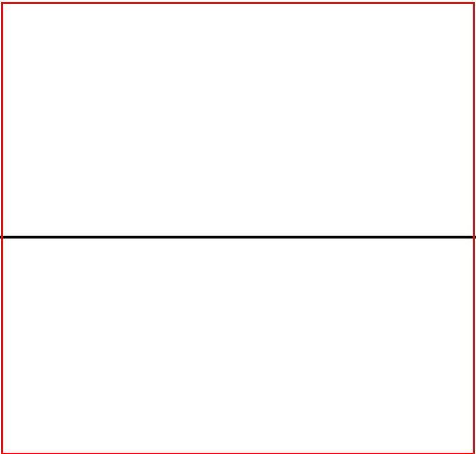
代码解析
<svg> 标签
- 作用:定义
SVG容器。 - 属性:
width和height:设置容器宽高(单位:像素),这里为200px。
<line> 标签
- 作用:绘制直线。
- 关键属性:
x1和x2:起点和终点的水平坐标。y1和y2:起点和终点的垂直坐标。
为直线添加动画
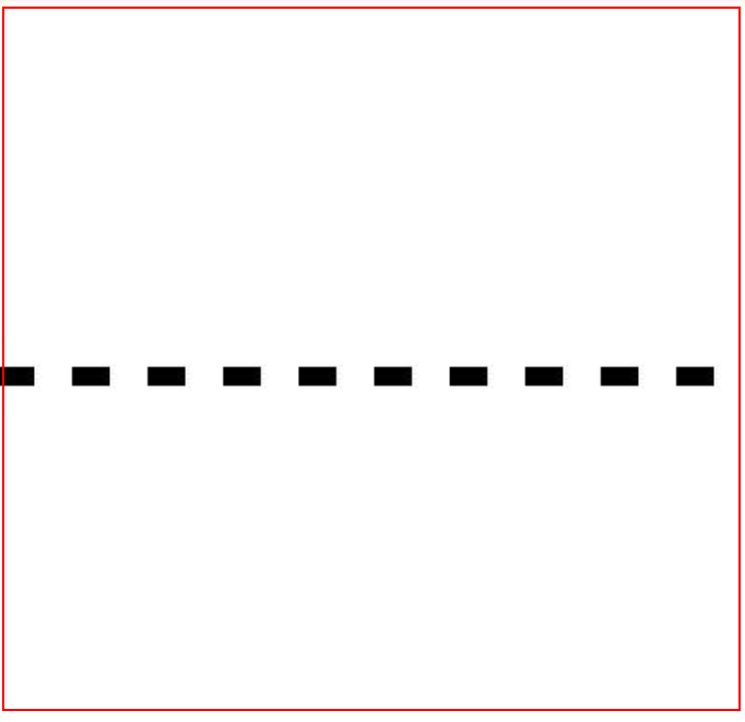
首先为直线增加一些样式:
svg line {
  stroke: #000;
+ stroke-width: 5;
+ stroke-dasharray: 10;
+ stroke-dashoffset: 0;
}
新增属性解析
stroke-width:设置线条的宽度(例如5px)。stroke-dasharray:定义虚线模式,例如10表示线段和空隙均为10px。stroke-dashoffset:控制虚线起始偏移量。
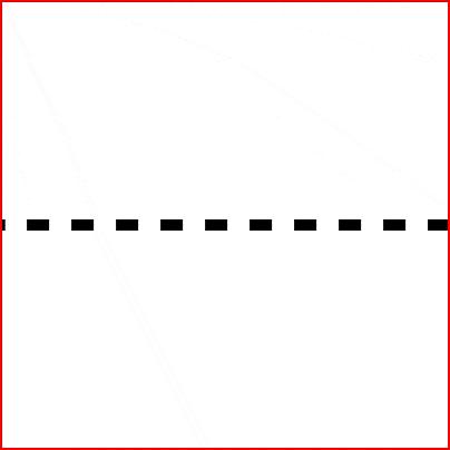
然后利用 stroke-dashoffset,为这条虚线添加动画效果:
svg line {
  stroke: black;
  stroke-width: 5;
  stroke-dasharray: 10;
  stroke-dashoffset: 0;
+ animation: dash 2s linear infinite;
}

+@keyframes dash {
  to {
    stroke-dashoffset: -100; /* 虚线反方向移动 */
  }
}
属性说明
- 动画通过改变
stroke-dashoffset,让虚线看起来在移动。 2s linear infinite表示动画每2 秒循环一次,且速度匀速。
绘制折线动画
使用 <path> 标签,我们可以绘制更复杂的路径:
<style>
  svg {
    border: 1px solid red;
  }
</style>
<svg width="200" height="200">
  <path d="M125.69 0.44 L182.46 16.41 L0.23 113" />
</svg>
看上去怎么有点怪,因为 path 填充了黑色的背景颜色,填充了黑色的背景颜色。这时只需加入 CSS 样式 fill: none:
svg path {
  fill: none;
  stroke: blue;
}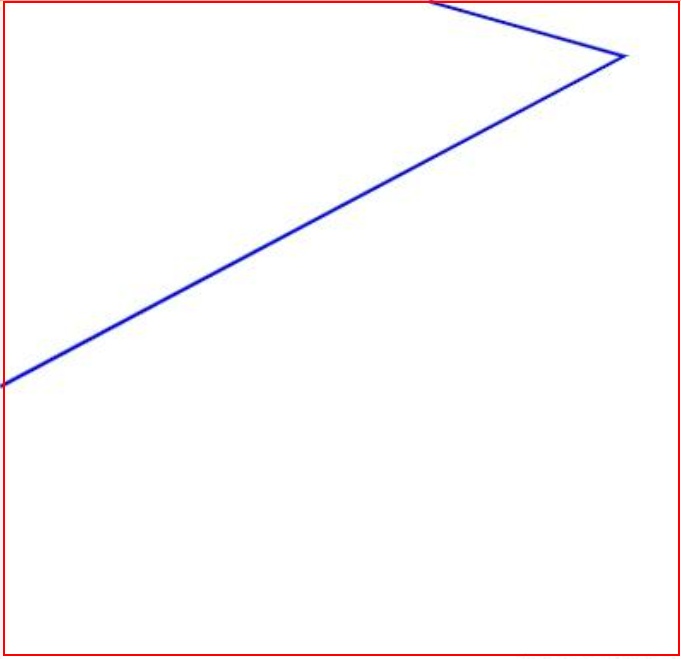
再加上之前例子的动画 CSS:
svg path {
  fill: none;
  stroke: blue;
  + stroke-width: 5;
  + stroke-dasharray: 10;
  + stroke-dashoffset: 0;
  + animation: dash 2s linear infinite;
}

+ @keyframes dash {
  to {
    stroke-dashoffset: -100;
  }
}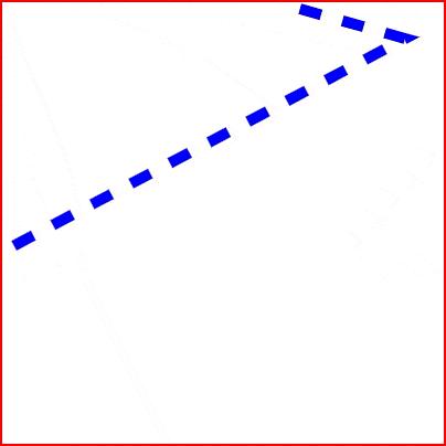
是不是已经实现了开头的线条动画效果?
创建箭头移动动画
不仅是线条,普通元素也能沿着路径移动!利用 offset-path 属性,我们可以实现箭头沿路径运动的效果:
<style>
  .box {
    width: 200px;
    height: 200px;
    border: 1px solid red;
    position: relative;
  }
  .arrow {
    background: url(./images/arrow.png) no-repeat 0 0 / contain;
    width: 45px;
    height: 30px;
    offset-path: path("M125.69 0.44 L182.46 16.41 L0.23 113");
    animation: arrow-go 4s linear infinite;
  }
  @keyframes arrow-go {
    0% {
      offset-distance: 0%;
    }
    100% {
      offset-distance: 100%;
    }
  }
</style>
<div class="box">
  <div class="arrow"></div>
</div>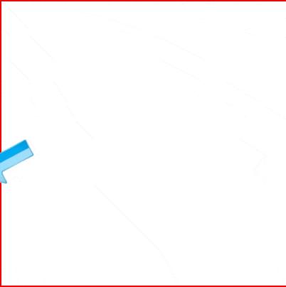
效果解析
offset-path:设置运动路径,其值可以是路径字符串(与<path>元素的d属性语法相似)offset-distance:控制元素在路径上的移动距离,配合动画可以实现平滑移动。- 由于 svg 的横坐标是向右的, 所以箭头方向也向右。如果箭头方向向上, 可以设置
transform: rotate(90deg);来旋转箭头向右。
通过调整 opacity 或加入 transform 属性,你还可以进一步增强动画效果,例如实现淡入淡出或者旋转。
绘制自定义路径
通过网站 https://yqnn.github.io/svg-path-editor/ 就能绘制想要的各种路径。
总结
通过以上示例,我们探索了 SVG 的基本用法和动画实现方式。无论是简单的直线动画、折线动画,还是路径运动,SVG 都能轻松胜任。
附件源码
https://github.com/zm8/wechat-oa/tree/main/svg-animation
您可以通过访问 https://yqnn.github.io/svg-path-editor/ 轻松绘制各种自定义路径。
蓦然、回首,那人就在灯火阑珊处

 浙公网安备 33010602011771号