CSS3制作图片样式
问题:
如果在img上直接使用CSS3的border-radius和box-shadow应用在图片,浏览器并不会完全显示。前面在《jQuery和CSS3给图片制作圆角》中说过其解决方法,就是把图片作为背景图片,这样我们就可以应用任何样式来修饰图片,而且此时浏览器也会完美的呈现出来。
解决方法:
要让浏览器能正常渲染图像的圆角和内阴影效果,你需要将图像转为背景图像来渲染。
<div style="background:url(image.jpg)" no-repeat center center;width:150px;height:150px></div>
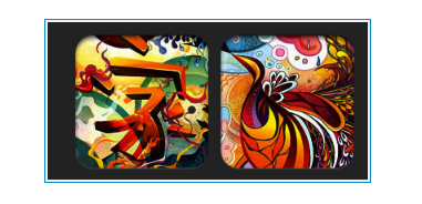
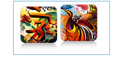
一、浮雕样式

.embossed .image-wrap {
			-webkit-box-shadow: inset 0 0 2px rgba(0,0,0,.8), inset 0 2px 0 rgba(255,255,255,.5), inset 0 -7px 0 rgba(0,0,0,.6), inset 0 -9px 0 rgba(255,255,255,.3);
			-moz-box-shadow: inset 0 0 2px rgba(0,0,0,.8), inset 0 2px 0 rgba(255,255,255,.5), inset 0 -7px 0 rgba(0,0,0,.6), inset 0 -9px 0 rgba(255,255,255,.3);
			box-shadow: inset 0 0 2px rgba(0,0,0,.8), inset 0 2px 0 rgba(255,255,255,.5), inset 0 -7px 0 rgba(0,0,0,.6), inset 0 -9px 0 rgba(255,255,255,.3);
			-webkit-border-radius: 20px;
			-moz-border-radius: 20px;
			border-radius: 20px;
		}
二、软浮雕效果
这也是一种浮雕效果,只是这个效果增加了一点模糊效果
.soft-embossed .image-wrap {
			-webkit-box-shadow: inset 0 0 4px rgba(0,0,0,1), inset 0 2px 1px rgba(255,255,255,.5), inset 0 -9px 2px rgba(0,0,0,.6), inset 0 -12px 2px rgba(255,255,255,.3);
			-moz-box-shadow: inset 0 0 4px rgba(0,0,0,1), inset 0 2px 1px rgba(255,255,255,.5), inset 0 -9px 2px rgba(0,0,0,.6), inset 0 -12px 2px rgba(255,255,255,.3);
			box-shadow: inset 0 0 4px rgba(0,0,0,1), inset 0 2px 1px rgba(255,255,255,.5), inset 0 -9px 2px rgba(0,0,0,.6), inset 0 -12px 2px rgba(255,255,255,.3);
			-webkit-border-radius: 20px;
			-moz-border-radius: 20px;
			border-radius: 20px;
		}
三、剪影效果
同样是box-shadow的inset的值变化,但此例看上去像一种剪影效果。
.cut-out .image-wrap {
-webkit-box-shadow: 0 1px 0 rgba(255,255,255,.2), inset 0 4px 5px rgba(0,0,0,.6), inset 0 1px 0 rgba(0,0,0,.6);
-moz-box-shadow: 0 1px 0 rgba(255,255,255,.2), inset 0 4px 5px rgba(0,0,0,.6), inset 0 1px 0 rgba(0,0,0,.6);
box-shadow: 0 1px 0 rgba(255,255,255,.2), inset 0 4px 5px rgba(0,0,0,.6), inset 0 1px 0 rgba(0,0,0,.6);
-webkit-border-radius: 20px;
-moz-border-radius: 20px;
border-radius: 20px;
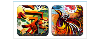
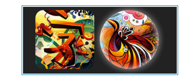
}四、变形和发光效果
在这个效果中,增加了CSS3的transition效果,当你的鼠标悬停在图片上时,图片会从一个圆角图片转圆形图片,并会发光。使用多重box-shadow来模仿发光效果。
.morphing-glowing .image-wrap {
			-webkit-transition: 1s;
			-moz-transition: 1s;
			transition: 1s;
			-webkit-border-radius: 20px;
			-moz-border-radius: 20px;
			border-radius: 20px;
		}

		.morphing-glowing .image-wrap:hover {
			-webkit-box-shadow: 0 0 20px rgba(255,255,255,.6), inset 0 0 20px rgba(255,255,255,1);
			-moz-box-shadow: 0 0 20px rgba(255,255,255,.6), inset 0 0 20px rgba(255,255,255,1);
			box-shadow: 0 0 20px rgba(255,255,255,.6), inset 0 0 20px rgba(255,255,255,1);
			-webkit-border-radius: 60em;
			-moz-border-radius: 60em;
			border-radius: 60em;
		}
五、图片渐变效果
这个效果,在元素的伪类上增加了一个渐变的效果。
.glossy .image-wrap {
-webkit-box-shadow: inset 0 -1px 0 rgba(0,0,0,.5);
-moz-box-shadow: inset 0 -1px 0 rgba(0,0,0,.5);
box-shadow: inset 0 -1px 0 rgba(0,0,0,.5);
-webkit-border-radius: 20px;
-moz-border-radius: 20px;
border-radius: 20px;
}
.glossy .image-wrap:after {
position: absolute;
content: ' ';
width: 100%;
height: 50%;
top: 0;
left: 0;
-webkit-border-radius: 20px;
-moz-border-radius: 20px;
border-radius: 20px;
background: -moz-linear-gradient(top, rgba(255,255,255,0.7) 0%, rgba(255,255,255,.1) 100%);
background: -webkit-gradient(linear, left top, left bottom, color-stop(0%,rgba(255,255,255,0.7)), color-stop(100%,rgba(255,255,255,.1)));
background: -webkit-linear-gradient(top, rgba(255,255,255,0.7) 0%,rgba(255,255,255,.1) 100%);
background: -o-linear-gradient(top, rgba(255,255,255,0.7) 0%,rgba(255,255,255,.1) 100%);
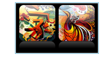
}六、倒影效果
使用伪类制作了一个倒影效果,并应用hover改变其位置。
.reflection .image-wrap {
			-webkit-box-shadow: inset 0 0 1px rgba(0,0,0,.5), inset 0 2px 0 rgba(255,255,255,.5), inset 0 -1px 0 rgba(0,0,0,.5);
			-moz-box-shadow: inset 0 0 1px rgba(0,0,0,.5), inset 0 2px 0 rgba(255,255,255,.5), inset 0 -1px 0 rgba(0,0,0,.5);
			box-shadow: inset 0 0 1px rgba(0,0,0,.5), inset 0 2px 0 rgba(255,255,255,.5), inset 0 -1px 0 rgba(0,0,0,.5);
			-webkit-transition: .5s;
			-moz-transition: .5s;
			transition: .5s;
			-webkit-border-radius: 20px;
			-moz-border-radius: 20px;
			border-radius: 20px;
			}
			.reflection .image-wrap:after {
			position: absolute;
			content: ' ';
			width: 100%;
			height: 30px;
			bottom: -31px;
			left: 0;
			-webkit-border-top-left-radius: 20px;
			-webkit-border-top-right-radius: 20px;
			-moz-border-radius-topleft: 20px;
			-moz-border-radius-topright: 20px;
			border-top-left-radius: 20px;
			border-top-right-radius: 20px;
			background: -moz-linear-gradient(top, rgba(0,0,0,.3) 0%, rgba(255,255,255,0) 100%);
			background: -webkit-gradient(linear, left top, left bottom, color-stop(0%,rgba(0,0,0,.3)), color-stop(100%,rgba(255,255,255,0)));
			background: linear-gradient(top, rgba(0,0,0,.3) 0%,rgba(255,255,255,0) 100%);
			}
			.reflection .image-wrap:hover {
			position: relative;
			top: -8px;
			}
七、发光和倒影效果
这个效果使用了伪类创建了一个渐变加倒影图像的效果。
.glossy-reflection {
background: #000;
padding: 20px 40px 50px;
color: #fff;
-webkit-border-radius: 20px;
-moz-border-radius: 20px;
border-radius: 20px;
}
.glossy-reflection .image-wrap {
-webkit-box-shadow: inset 0 -1px 0 rgba(0,0,0,.5), inset 0 1px 0 rgba(255,255,255,.6);
-moz-box-shadow: inset 0 -1px 0 rgba(0,0,0,.5), inset 0 1px 0 rgba(255,255,255,.6);
box-shadow: inset 0 -1px 0 rgba(0,0,0,.5), inset 0 1px 0 rgba(255,255,255,.6);
-webkit-transition: 1s;
-moz-transition: 1s;
transition: 1s;
-webkit-border-radius: 20px;
-moz-border-radius: 20px;
border-radius: 20px;
}
.glossy-reflection .image-wrap:before {
position: absolute;
content: ' ';
width: 100%;
height: 50%;
top: 0;
left: 0;
-webkit-border-radius: 20px;
-moz-border-radius: 20px;
border-radius: 20px;
background: -moz-linear-gradient(top, rgba(255,255,255,0.7) 0%, rgba(255,255,255,.1) 100%);
background: -webkit-gradient(linear, left top, left bottom, color-stop(0%,rgba(255,255,255,0.7)), color-stop(100%,rgba(255,255,255,.1)));
background: linear-gradient(top, rgba(255,255,255,0.7) 0%,rgba(255,255,255,.1) 100%);
}
.glossy-reflection .image-wrap:after {
position: absolute;
content: ' ';
width: 100%;
height: 30px;
bottom: -31px;
left: 0;
-webkit-border-top-left-radius: 20px;
-webkit-border-top-right-radius: 20px;
-moz-border-radius-topleft: 20px;
-moz-border-radius-topright: 20px;
border-top-left-radius: 20px;
border-top-right-radius: 20px;
background: -moz-linear-gradient(top, rgba(230,230,230,.3) 0%, rgba(230,230,230,0) 100%);
background: -webkit-gradient(linear, left top, left bottom, color-stop(0%,rgba(230,230,230,.3)), color-stop(100%,rgba(230,230,230,0)));
background: linear-gradient(top, rgba(230,230,230,.3) 0%,rgba(230,230,230,0) 100%);
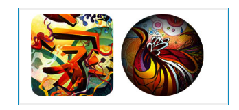
} 八、变形和着色效果
这个效果使用了径向渐变和transition,以及伪类制作一种变形和着色效果,当鼠标悬停在图片上时,图片会变成圆形,并着上另一种颜色。
.morphing-tinting .image-wrap {
			position: relative;
			-webkit-transition: 1s;
			-moz-transition: 1s;
			transition: 1s;
			-webkit-border-radius: 20px;
			-moz-border-radius: 20px;
			border-radius: 20px;
			}
			.morphing-tinting .image-wrap:hover {
			-webkit-border-radius: 30em;
			-moz-border-radius: 30em;
			border-radius: 30em;
			}
			.morphing-tinting .image-wrap:after {
			position: absolute;
			content: ' ';
			width: 100%;
			height: 100%;
			top: 0;
			left: 0;
			-webkit-transition: 1s;
			-moz-transition: 1s;
			transition: 1s;
			-webkit-border-radius: 30em;
			-moz-border-radius: 30em;
			border-radius: 30em;
			}
			.morphing-tinting .image-wrap:hover:after {
			background: -webkit-gradient(radial, 50% 50%, 40, 50% 50%, 80, from(rgba(0,0,0,0)), to(rgba(0,0,0,1)));
			background: -moz-radial-gradient(50% 50%, circle, rgba(0,0,0,0) 40px, rgba(0,0,0,1) 80px);
			}
九、羽化效果

.feather .image-wrap {
			position: relative;
			-webkit-border-radius: 30em;
			-moz-border-radius: 30em;
			border-radius: 30em;
			}
			.feather .image-wrap:after {
			position: absolute;
			content: ' ';
			width: 100%;
			height: 100%;
			top: 0;
			left: 0;
			background: -webkit-gradient(radial, 50% 50%, 50, 50% 50%, 70, from(rgba(255,255,255,0)), to(rgba(255,255,255,1)));
			background: -moz-radial-gradient(50% 50%, circle, rgba(255,255,255,0) 50px, rgba(255,255,255,1) 70px);
			}
小结:上面就是Web Designer Wall在《CSS3 Image Styles 》一文中给我们带来的十二种使用CSS3的border-radius、box-shadow、rgba、transition、gradient以及伪类“:before”和“:after”等属性制作的图片效果。
蓦然、回首,那人就在灯火阑珊处

 浙公网安备 33010602011771号