

18个工作中常用的CSS样式
01、页面动画出现闪烁
在Chrome and Safari浏览器中,在使用transforms或者animations这类过渡属性和动画的时候可能会出现页面的闪烁情况那此时我们就可以使用一下代码来尝试回避。
.cube {
  -webkit-backface-visibility: hidden;
  backface-visibility: hidden;
  -webkit-perspective: 1000;
  perspective: 1000;
}
/* 或者 */
.cube {
  -webkit-transform: translate3d(0, 0, 0);
  transform: translate3d(0, 0, 0);
/* Other transform properties here */
}
02、英文字母的大小写转换
/* 将所有字母变成大写字母 */
  .p1 {text-transform: uppercase}
/* 将所有字母变成小写字母 */
  .p2 {text-transform: lowercase}
/* 首字母大写 */
  .p3 {text-transform: capitalize}
/* 将字体变成小型的大写字母 */
  .p4 {font-variant: small-caps}
03、透明容器
.wrap {
  filter: alpha(opacity=50);
  -moz-opacity: 0.5;
  -khtml-opacity: 0.5;
  opacity: 0.5;
 }
04、识别文本中的\n换行符
在富文本组件中一般换行并不是使用</br>标签,而是\r\n这样的换行转义符。一般情况下在页面中无法识别则就需要通过该样式设置
body {
  white-space: pre-line;
}
05、a标签点击时出现的边框
a {
  outline: none;
/* 或者outline: 0 */
  text-decoration: none;
/* 去除默认下划线 */
}
06、CSS显示连接之后的url地址
<a href="www.feifanedu.com.cn">非凡学院</a>
<style>
a:after {content: " (" attr(href) ")";}
</style>
07、修改input输入框中光标的颜色但不改变字的颜色
input{
  color:  #333;
  caret-color: red;
}
08、div元素中图片和文字同时垂直居中
在不使用flex布局的情况下
.wrap {
  height: 100px;
  line-height: 100px;
}
img {
    vertical-align: middle;
}
09、宽高等比例自适应
.scale {
  width: 100%;
  padding-bottom: 50%;
  height: 0;
  position: relative;
}

.item {
  position: absolute;
  width: 100%;
  height: 100%;
  background-color: #499e56;
}
10、纯CSS实现loading动画
.loader {
  border: 16px solid #f3f3f3;
  border-radius: 50%;
  border-top: 16px solid #3498db;
  width: 80px;
  height: 80px;
  -webkit-animation: spin 2s linear infinite;
  animation: spin 2s linear infinite;
}

@-webkit-keyframes spin {
  0% { -webkit-transform: rotate(0deg); }
  100% { -webkit-transform: rotate(360deg); }
}

@keyframes spin {
  0% { transform: rotate(0deg); }
  100% { transform: rotate(360deg); }
}
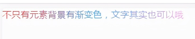
11、文字渐变色
.text {
  -webkit-background-clip: text;
  -webkit-text-fill-color: transparent;
  background-image: linear-gradient(to right, #ec2239, #40a4e2,#ea96f5);
  width: 320px;
}
12、边框阴影效果
.text_shadow {
  background-color: white;
  width: 500px;
  height: 100px;
  box-shadow: 0px 0px 13px 1px rgba(51, 51, 51, 0.1);
}
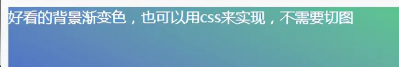
13、背景渐变效果
.text_gradient {
  width: 500px;
  height: 100px;
  background: linear-gradient(25deg, rgb(79, 107, 208), rgb(98, 141, 185), rgb(102, 175, 161), rgb(92, 210, 133)) rgb(182, 228, 253);
}
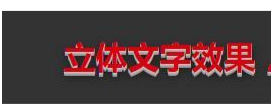
14、立体字效果
.text_solid{
  font-size: 32px;
  text-align: center;
  font-weight: bold;
  line-height:100px;
  text-transform:uppercase;
  position: relative;
  background-color: #333;
  color:#D6000F;
  text-shadow:
  0px 1px 0px #c0c0c0,
  0px 2px 0px #b0b0b0,
  0px 3px 0px #a0a0a0,
  0px 4px 0px #909090,
  0px 5px 10px rgba(0, 0, 0, 0.6);
}
15、文字模糊效果
.vague_text{
  color: transparent;
  text-shadow: #111 0 0 5px;
}
16、1px边框有时候变粗的问题
主要是因为2x(2倍)屏幕的1px实际宽高都有2个物理像素的原因造成的
.dom{
  height: 1px;
  background: #dbdbdb;
  transform:scaleY(0.5);
}
17、CSS样式中的不同尺寸的计算
多用于传统的自适应宽度写法,rem单位的计算。需要通道calc计算函数
.div{
  width: calc(100% - 50px);
}
18、CSS滤镜
用css让彩色图片变成灰色。
.icon{
  -webkit-filter: grayscale(100%);
  -moz-filter: grayscale(100%);
  -ms-filter: grayscale(100%);
  -o-filter: grayscale(100%);
  filter: grayscale(100%);
  filter: gray;
}
蓦然、回首,那人就在灯火阑珊处

 浙公网安备 33010602011771号