解决移动端垂直滚动 使用justify-content显示不全的问题
一、需求:
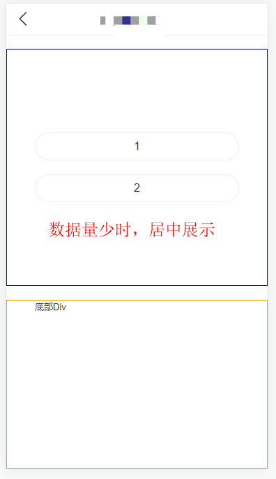
移动端页面 展示一列列表,当数据量少时,不需要滚动且数据居中展示,数量多则自动向两边撑开 且出现滚动条。
其中,盒子高度是不固定的,根据页面屏幕比例和flex布局自动撑开。
二、
一开始代码是如下写法,发现 页面只能展示部分数据,前面的第一、二个数据显示不全或被隐藏了。为了使效果更明显,这里将两个div分别用边框标识出来。
<div className={styles.pageWrapper}>
  <div className={styles.topBox}>
    {list && list.length && (
      list.map((item: ListItem) => (
        <Button
          key={item.wid}
          className={styles.button}
          block
          shape="rounded"
        >
          {item.name}
        </Button>
      ))
    )}
  </div>
  <div className={styles.bottomBox}>
    底部Div
  </div>
</div>

// CSS样式
.pageWrapper {
    display: flex;
    flex-direction: column;
    background-size: 100% 100%;
    height: calc(100vh - var(--nav-bar-height));
    position: relative;
}
// 盛放列表的div盒子
.topBox {
    flex: 1 1;
    display: flex;
    flex-direction: column;
    justify-content: center;
    overflow-y: auto;
    border: 1px solid blue;
    margin: 20px 0;
    padding: 0 40px;
    .button {
        margin-bottom: 20px;
        &:last-child {
            margin-bottom: 0px;
        }
    }
}
// 底部盒子 定高(这里只是为了演示效果,实际项目需求中  底部盒子高度不固定,随屏幕高度而变化)
.bottomBox{
    position: relative;
    height: 240px;
    border: 1px solid #ff9900;;
}
假设当前list中数据为 从1到7的七条数据,底部盒子高度设为 240px(ps:实际项目需求中 底部盒子高度不定,随屏幕高度而变化)。
具体效果如下:
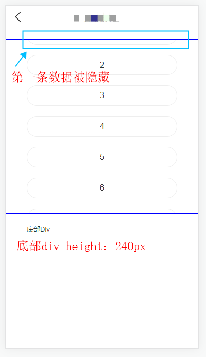
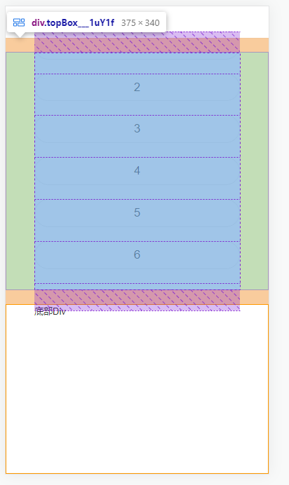
选中顶部盒子的dom元素时 我们可以发现,它的实际高度已超出我们当前页面的,所以出现了部分数据显示不全的现象。
如果把topBox里的justify-content: center;换成justify-content: space-between;或者justify-content: start; 是可以的,但是当只展示两三个选项时就会间距过大。而我们需要选项过少的时候是center效果,多了则显示全并能滚动。
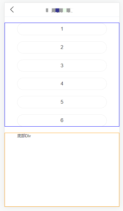
尝试了很多种方法,最终发现,在topBox元素里面 再包一层div,把列表放到这层div就可以了,注意的是: 这层div不能再加justify-content: center样式了。
具体代码如下:
<div className={styles.pageWrapper}>
  <div className={styles.topBox}>
    // 注意:在这里加了一层div(style: btnBox),去包裹数据list
    <div className={styles.btnBox}>
      {list && list.length && (
        list.map((item: ListItem) => (
          <Button
            key={item.wid}
            className={styles.button}
            block
            shape="rounded"
          >
            {item.name}
          </Button>
        ))
      )}
    </div>
  </div>
  <div className={styles.bottomBox}>
    底部Div
  </div>
</div>

// CSS样式
.pageWrapper {
    display: flex;
    flex-direction: column;
    background-size: 100% 100%;
    height: calc(100vh - var(--nav-bar-height));
    position: relative;
}
// 顶部div盒子
.topBox {
    flex: 1 1;
    display: flex;
    justify-content: center;    // 在这里使用justify-content: center样式
    overflow-y: hidden;
    flex-direction: column;
    margin: 20px 0;
    padding: 0 40px;
    border: 1px solid blue;
    //这里加一层div,样式为btnBox,盛放list数据
    .btnBox {    // 这里无需再加justify-content: center样式
        display: flex;
        flex-direction: column;
        overflow-y: auto;
        .button {
            margin-bottom: 20px;
            &:last-child {
                margin-bottom: 0px;
            }
        }
    }
}
// 底部盒子 定高(这里只是为了演示效果,实际项目需求中  底部盒子高度不固定,随屏幕高度而变化)
.bottomBox{
    position: relative;
    height: 240px;
    border: 1px solid #ff9900;;
}
效果如下:
引:

 浙公网安备 33010602011771号