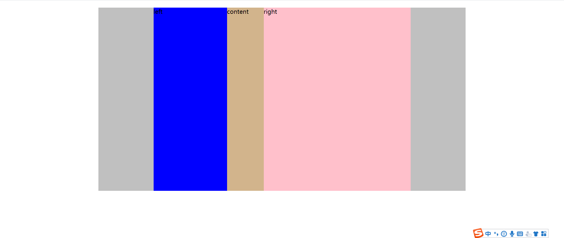
弹性盒子
1.jusify-content
<!DOCTYPE html>
<html lang="en">

<head>
    <meta charset="UTF-8">
    <meta name="viewport" content="width=device-width, initial-scale=1.0">
    <title>Document</title>
    <style>
        .father {
            width: 1000px;
            height:500px;
            margin:20px auto;
            display: flex;
            background-color: silver;
            justify-content:center ;
        }

        .left-side {
            width:20%;


            background-color: blue;
        }

        .right-side {
            width:40%;
            background-color: pink;
        }

        .content {
            width:10%;
            background-color: tan;
        }
    </style>
</head>

<body>
    <div class="father">
        <div class="left-side">left</div>
        <div class="content">content</div>
        <div class="right-side">right</div>
    </div>
</body>

</html>
弹性元素
flex-shrink
1.弹性元素设定了宽度
<!DOCTYPE html>
<html lang="en">

<head>
    <meta charset="UTF-8">
    <meta name="viewport" content="width=device-width, initial-scale=1.0">
    <title>Document</title>
    <style>
        .father {
            width: 800px;
            height: 500px;
            margin: 20px auto;
            display: flex;
            flex-wrap: nowrap;
            background-color: silver;
        }


        .left-side {
            flex-shrink: 0 ;
            width: 200px;
            height: 30%;
            background-color: blue;
        }

        .right-side {
            flex-shrink: 0;
            width: 500px;
            background-color: pink;
            height: 20%;
        }

        .content {
            flex-shrink: 0;
            margin-top: 60px;
            width: 300px;
            background-color: tan;
            height: 70%;
        }
    </style>
</head>

<body>
    <div class="father">
        <div class="left-side">left</div>
        <div class="content">content</div>
        <div class="right-side">right</div>
    </div>
</body>

</html>
flex-shrink: 0
![]()
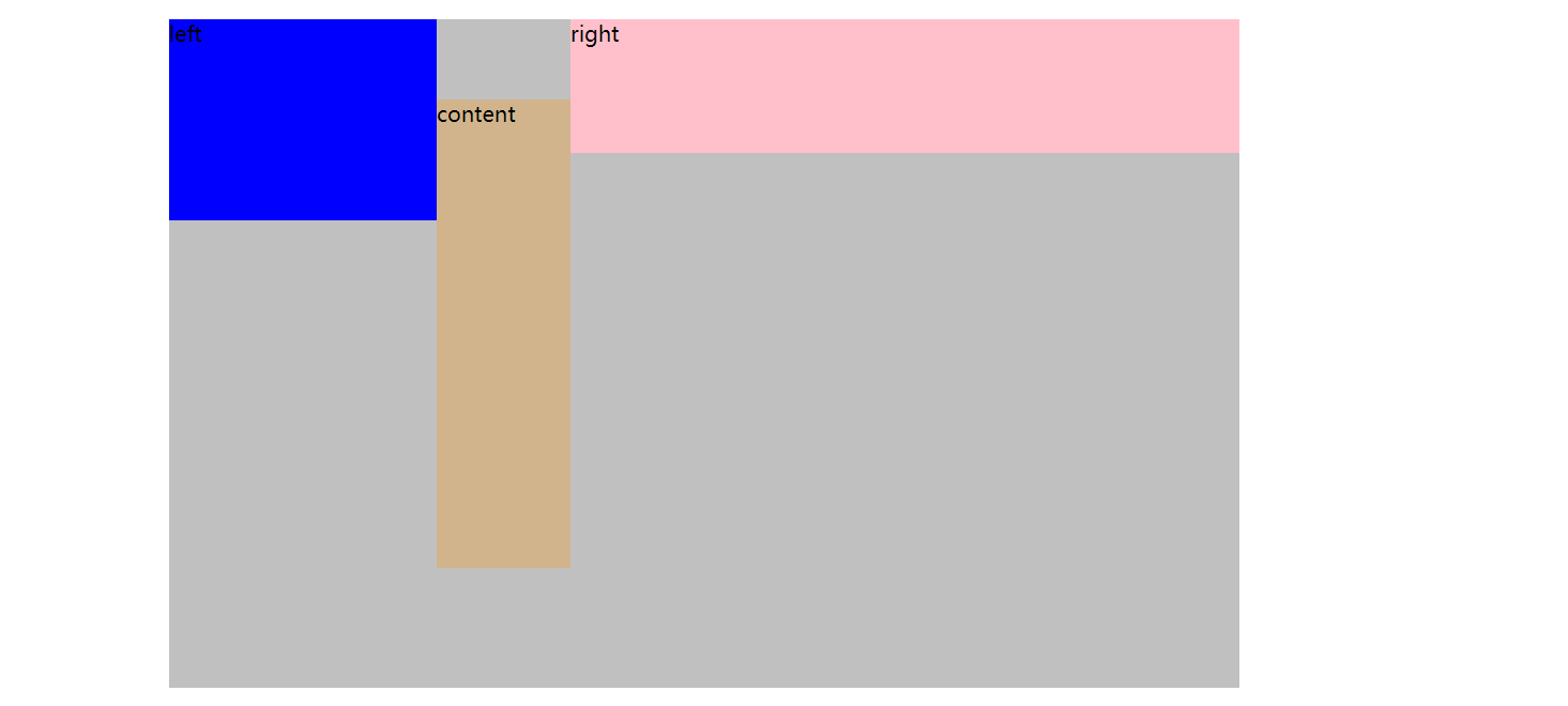
.content {
flex-shrink: 1;
margin-top: 60px;
width: 300px;
background-color: tan;
height: 70%;
}
2.如果弹性元素没有设置宽度,宽度由内容决定
<!DOCTYPE html>
<html lang="en">

<head>
    <meta charset="UTF-8">
    <meta name="viewport" content="width=device-width, initial-scale=1.0">
    <title>Document</title>
    <style>
        .father {
            width:200px;
            height: 500px;
            margin: 20px auto;
            display: flex;
            background-color: silver;
        }


        .left-side {
            height:50%;
            width:auto;
            flex-shrink: 0;
            background-color: blue;
        }

        .right-side {
            height:50%;
            width:auto;
            flex-shrink: 0;

            background-color: pink;

        }

        .content {
            width:auto;
            height:50%;
            flex-shrink: 0;
            background-color: tan;
        }
    </style>
</head>

<body>
    <div class="father">
        <div class="left-side">left:fewwords</div>
        <div class="content">content:set with a lot addtionnal text,shrink:0</div>
        <div class="right-side">right:medium words shrink:0</div>
    </div>
</body>

</html>
![]()
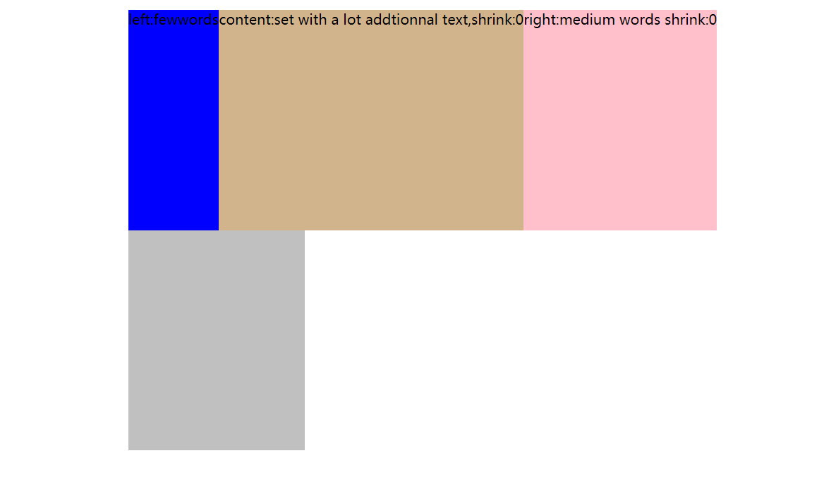
2.flex shrink 全是1

 浙公网安备 33010602011771号