用svg+css 或者js制作打钩的动画
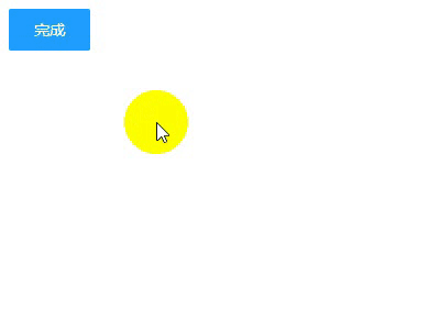
之前老板让做一个登陆后 可以显示一个打钩的效果 百度死活搜不到 今天在B站看到的一个视频居然有 根据需求改进了一下废话不多说先看效果!
html代码
 1 <!DOCTYPE html>
 2 <html lang="en">
 3 <head>
 4     <meta charset="UTF-8">
 5     <title>打钩动画</title>
 6 </head>
 7 <body>
 8 <div id="d1">
 9     <input type="checkbox" style="display: none" id="love1" />
10     <label for="love1" id="btn1" >完成</label>
11 <svg width="200px" height="200px">
12     <circle r="90" class="circle" fill="none" stroke="#2de540" stroke-width="10" cx="100" cy="100" stroke-linecap="round" transform="rotate(-90 100 100) " ></circle>
13     <polyline  fill="none" stroke="#2de540" stroke-width="10" points="44,107 86,137 152,69" stroke-linecap="round" stroke-linejoin="round" class="tick" ></polyline>
14 </svg>
15 <h2 style="text-align: center;width: 200px">成功</h2>
16
17 </div>
18 </body>
19 <!--这里引入你本地的jq-->
20 <script src="http://libs.baidu.com/jquery/2.0.0/jquery.min.js"></script>
21 </html>
css代码
h2 {
        font-family: Helvetica;
        font-size: 30px;
        margin-top: 20px;
        color: #333;
        opacity: 0;
    }
    input[type="checkbox"]:checked+ label ~ h2 {
        animation: .6s title ease-in-out;
        animation-delay: 1.2s;
        animation-fill-mode: forwards;
    }
    .circle {
        stroke-dasharray: 1194;
        stroke-dashoffset: 1194;
    }
    input[type="checkbox"]:checked + label + svg .circle {
        animation: circle 1s ease-in-out;
        animation-fill-mode: forwards;
    }
    .tick {
        stroke-dasharray: 350;
        stroke-dashoffset: 350;
    }
    input[type="checkbox"]:checked + label+ svg .tick {
        animation: tick .8s ease-out;
        animation-fill-mode: forwards;
        animation-delay: .95s;
    }
    @keyframes circle {
        from {
            stroke-dashoffset: 1194;
        }
        to {
            stroke-dashoffset: 2388;
        }
    }
    @keyframes tick {
        from {
            stroke-dashoffset: 350;
        }
        to {
            stroke-dashoffset: 0;
        }
    }
    @keyframes title {
        from {
            opacity: 0;
        }
        to {
            opacity: 1;
        }
    }
    label {
        display: inline-block;
        height: 38px;
        width: 38px;
        line-height: 38px;
        padding: 0 18px;
        background-color: #1E9FFF;
        color: #fff;
        white-space: nowrap;
        text-align: center;
        font-size: 14px;
        border: none;
        border-radius: 2px;
        cursor: pointer;
    }
    #d1 {
        display: flex;
        justify-content: center;
        min-height: 100px;
        flex-direction: column;
    }
写到这里本来应该就结束了 但是我们在真正实现功能的时候 不太可能用 checkbox切换动画效果的显示 一般还是需要按钮操作动画效果 下面是jq操作的代码 其实用jq的.animate()更好一些但是我是小白所以就偷了个懒 (ps:好吧其实是不会)直接用.css()
JavaScript代码
   $("#btn1").on("click",function () {
       if($(this).text()==="完成"){
           $(".circle").css({'animation':'circle 1s ease-in-out','animation-fill-mode':'forwards'});
           $(".tick").css({'animation':'tick .8s ease-out','animation-fill-mode':'forwards','animation-delay':'.95s'});
           $("h2").css({'animation':'.6s title ease-in-out','animation-fill-mode':'forwards','animation-delay':'1.2s'})
           $(this).text("取消")
       }else{
           $(".circle").css({'animation':'none','animation-fill-mode':'none'});
           $(".tick").css({'animation':'none','animation-fill-mode':'none'});
           $("h2").css({'animation':'none','animation-fill-mode':'none'})
           $(this).text("完成")
       }
   });
哦 对了还有一件事记得给人家UP主一键三连 (BV1ME411F7BG)

 浙公网安备 33010602011771号