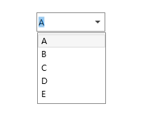
WPF ComboBox
WPF ComboBox,可编辑
<Window ...>
    <Window.Resources>
        <!--ToggleButton 样式-->
        <ControlTemplate x:Key="LoginComboBoxToggleButton" TargetType="ToggleButton">
            <Grid>
                <Grid.ColumnDefinitions>
                    <ColumnDefinition />
                    <ColumnDefinition Width="20" />
                </Grid.ColumnDefinitions>
                <Border x:Name="Border"  Grid.ColumnSpan="2" CornerRadius="2" Background="Transparent"  BorderBrush="Transparent"  BorderThickness="1" />
                <Border Grid.Column="0" Visibility="Hidden" CornerRadius="2,0,0,2" Margin="1" Background="#FFF" BorderBrush="#444" BorderThickness="0,0,1,0" />
                <Path x:Name="Arrow" Grid.Column="1" Fill="#444" HorizontalAlignment="Center" VerticalAlignment="Center" Data="M 0 0 L 4 4 L 8 0 Z"/>
            </Grid>
            <ControlTemplate.Triggers>
                <Trigger Property="IsEnabled" Value="False">
                    <Setter TargetName="Border" Property="Background" Value="#EEE" />
                    <Setter TargetName="Border" Property="BorderBrush" Value="#AAA" />
                    <Setter Property="Foreground" Value="#888"/>
                    <Setter TargetName="Arrow" Property="Fill" Value="#888" />
                </Trigger>
            </ControlTemplate.Triggers>
        </ControlTemplate>
        <ControlTemplate x:Key="ComboBoxTextBox" TargetType="TextBox">
            <Border x:Name="PART_ContentHost" Focusable="False" Background="{TemplateBinding Background}" />
        </ControlTemplate>
        <!--ComboBox样式-->
        <Style x:Key="ComboBoxUserNameStyle" TargetType="ComboBox">
            <Setter Property="IsEditable" Value="True"/>
            <Setter Property="FocusVisualStyle" Value="{x:Null}"/>
            <Setter Property="SnapsToDevicePixels" Value="true"/>
            <Setter Property="OverridesDefaultStyle" Value="true"/>
            <Setter Property="ScrollViewer.HorizontalScrollBarVisibility" Value="Auto"/>
            <Setter Property="ScrollViewer.VerticalScrollBarVisibility" Value="Auto"/>
            <Setter Property="ScrollViewer.CanContentScroll" Value="true"/>
            <Setter Property="Width" Value="100"/>
            <Setter Property="Height" Value="28"/>
            <Setter Property="Template">
                <Setter.Value>
                    <ControlTemplate TargetType="ComboBox">
                        <Border BorderBrush="#888" BorderThickness="1">
                            <Grid>
                                <ToggleButton Name="ToggleButton" Template="{StaticResource LoginComboBoxToggleButton}" Focusable="false"
                                IsChecked="{Binding Path=IsDropDownOpen,Mode=TwoWay,RelativeSource={RelativeSource TemplatedParent}}" ClickMode="Press">
                                </ToggleButton>
                                <ContentPresenter Name="ContentSite" IsHitTestVisible="False" Content="{TemplateBinding SelectionBoxItem}" ContentTemplate="{TemplateBinding SelectionBoxItemTemplate}"
                                ContentTemplateSelector="{TemplateBinding ItemTemplateSelector}" VerticalAlignment="Center" HorizontalAlignment="Left" />
                                <TextBox x:Name="PART_EditableTextBox" Style="{x:Null}" Template="{StaticResource ComboBoxTextBox}" HorizontalAlignment="Left" VerticalAlignment="Center"
                                     Focusable="True" Background="Transparent" Visibility="Hidden" IsReadOnly="{TemplateBinding IsReadOnly}"/>
                                <Popup Name="Popup" Placement="Bottom" IsOpen="{TemplateBinding IsDropDownOpen}" AllowsTransparency="True" Focusable="False" PopupAnimation="Slide">
                                    <Grid Name="DropDown" SnapsToDevicePixels="True" MinWidth="{TemplateBinding ActualWidth}" MaxHeight="{TemplateBinding MaxDropDownHeight}">
                                        <Border x:Name="DropDownBorder" BorderThickness="1" CornerRadius="0" BorderBrush="#888"/>
                                        <ScrollViewer Margin="1,5,1,5" SnapsToDevicePixels="True">
                                            <StackPanel IsItemsHost="True" KeyboardNavigation.DirectionalNavigation="Contained" />
                                        </ScrollViewer>
                                    </Grid>
                                </Popup>
                            </Grid>
                        </Border>
                        <ControlTemplate.Triggers>
                            <Trigger Property="HasItems" Value="false">
                                <Setter TargetName="DropDownBorder" Property="MinHeight" Value="95"/>
                            </Trigger>
                            <Trigger Property="IsEnabled" Value="false">
                                <Setter Property="Foreground" Value="#444"/>
                            </Trigger>
                            <Trigger Property="IsGrouping" Value="true">
                                <Setter Property="ScrollViewer.CanContentScroll" Value="false"/>
                            </Trigger>
                            <Trigger SourceName="Popup" Property="Popup.AllowsTransparency" Value="true">
                                <Setter TargetName="DropDownBorder" Property="CornerRadius" Value="0"/>
                                <Setter TargetName="DropDownBorder" Property="Margin" Value="0,2,0,0"/>
                            </Trigger>
                            <Trigger Property="IsEditable" Value="true">
                                <Setter Property="IsTabStop" Value="false"/>
                                <Setter TargetName="PART_EditableTextBox" Property="Visibility"    Value="Visible"/>
                                <Setter TargetName="ContentSite" Property="Visibility" Value="Hidden"/>
                            </Trigger>
                        </ControlTemplate.Triggers>
                    </ControlTemplate>
                </Setter.Value>
            </Setter>
            <Style.Triggers>
            </Style.Triggers>
        </Style>
    </Window.Resources>
    <Grid Width="500" Height="350">
        <ComboBox Name="cmbUsername" SelectedIndex="0" Style="{StaticResource ComboBoxUserNameStyle}" ItemsSource="{Binding}"/>
    </Grid>
</Window>
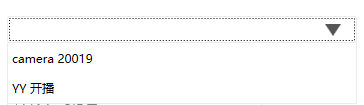
样式二
<!-- ComboBoxItem样式 -->
    <Style x:Key="ComboBoxItemStyle" TargetType="ComboBoxItem">
        <Setter Property="VerticalContentAlignment" Value="Center"/>
        <Setter Property="Height" Value="30"/>
        <Setter Property="Template">
            <Setter.Value>
                <ControlTemplate TargetType="ComboBoxItem">
                    <Border Name="Back" Background="Transparent" BorderThickness="0,0,0,0" BorderBrush="#FF6A6A6A" >
                        <ContentPresenter ContentSource="{Binding Source}" Margin="{TemplateBinding Padding}" HorizontalAlignment="Left" VerticalAlignment="Center"></ContentPresenter>
                    </Border>
                    <ControlTemplate.Triggers>
                        <Trigger Property="IsHighlighted" Value="True">
                            <Setter TargetName="Back" Property="Background" Value="#f5f5f5"></Setter>
                        </Trigger>
                        <Trigger Property="IsSelected" Value="True">
                            <Setter TargetName="Back" Property="Background" Value="#e9e7e6"></Setter>
                        </Trigger>
                    </ControlTemplate.Triggers>
                </ControlTemplate>
            </Setter.Value>
        </Setter>
    </Style>

    <!-- ToggleButton样式(折叠展开按钮) -->
    <Style x:Key="ComboBoxToggleButton" TargetType="{x:Type ToggleButton}">
        <Setter Property="OverridesDefaultStyle" Value="true"/>
        <Setter Property="IsTabStop" Value="false"/>
        <Setter Property="Focusable" Value="false"/>
        <Setter Property="ClickMode" Value="Press"/>
        <Setter Property="Template">
            <Setter.Value>
                <ControlTemplate TargetType="{x:Type ToggleButton}">
                    <Border x:Name="templateRoot" CornerRadius="4" SnapsToDevicePixels="true" Background="{TemplateBinding Background}" BorderThickness="{TemplateBinding BorderThickness}" BorderBrush="#FF565656">
                        <Border x:Name="splitBorder" CornerRadius="4" Width="40" SnapsToDevicePixels="true" Margin="0" HorizontalAlignment="Right"
                                        BorderThickness="{TemplateBinding BorderThickness}" BorderBrush="#FF565656">
                            <Border.Background>
                                <LinearGradientBrush EndPoint="0,1" StartPoint="0,0">
                                    <GradientStop Color="White" Offset="0"/>
                                    <GradientStop Color="White" Offset="0.75"/>
                                </LinearGradientBrush>
                            </Border.Background>
                            <Path x:Name="arrow" VerticalAlignment="Center" Margin="9,0,0,0" Stretch="Fill" Height="12" Width="16" HorizontalAlignment="Left" Fill="#FF565656" Data="M 50,50 L 0,0 100,0 z"/>
                        </Border>
                    </Border>
                    <ControlTemplate.Triggers>
                        <MultiDataTrigger>
                            <MultiDataTrigger.Conditions>
                                <Condition Binding="{Binding IsEditable, RelativeSource={RelativeSource AncestorType={x:Type ComboBox}}}" Value="true"/>
                                <Condition Binding="{Binding IsMouseOver, RelativeSource={RelativeSource Self}}" Value="false"/>
                                <Condition Binding="{Binding IsPressed, RelativeSource={RelativeSource Self}}" Value="false"/>
                                <Condition Binding="{Binding IsEnabled, RelativeSource={RelativeSource Self}}" Value="true"/>
                            </MultiDataTrigger.Conditions>
                            <Setter Property="BorderBrush" TargetName="templateRoot" Value="#FF565656"/>
                        </MultiDataTrigger>
                        <Trigger Property="IsEnabled" Value="false">
                            <Setter Property="Fill" TargetName="arrow" Value="#FFADADAD"/>
                            <Setter Property="BorderBrush" TargetName="templateRoot" Value="#FFADADAD"/>
                        </Trigger>
                    </ControlTemplate.Triggers>
                </ControlTemplate>
            </Setter.Value>
        </Setter>
    </Style>

    <!-- ComboBox Template样式 -->
    <ControlTemplate x:Key="ComboBoxTemplate" TargetType="{x:Type ComboBox}">
        <Grid x:Name="templateRoot" SnapsToDevicePixels="true">
            <Grid.ColumnDefinitions>
                <ColumnDefinition/>
                <ColumnDefinition Width="0"/>
            </Grid.ColumnDefinitions>
            <Popup x:Name="PART_Popup" AllowsTransparency="true" Grid.ColumnSpan="2" IsOpen="{Binding IsDropDownOpen, Mode=TwoWay, RelativeSource={RelativeSource TemplatedParent}}" Margin="1" PopupAnimation="{DynamicResource {x:Static SystemParameters.ComboBoxPopupAnimationKey}}" Placement="Bottom">
                <Border x:Name="dropDownBorder" BorderBrush="#EcEcEc" BorderThickness="1 0 1 1" Background="{DynamicResource {x:Static SystemColors.WindowBrushKey}}" MaxHeight="{TemplateBinding MaxDropDownHeight}" MinWidth="{Binding ActualWidth, ElementName=templateRoot}">
                    <ScrollViewer x:Name="DropDownScrollViewer">
                        <Grid x:Name="grid" RenderOptions.ClearTypeHint="Enabled">
                            <Canvas x:Name="canvas" HorizontalAlignment="Left" Height="0" VerticalAlignment="Top" Width="0">
                                <Rectangle x:Name="opaqueRect" Fill="{Binding Background, ElementName=dropDownBorder}" Height="{Binding ActualHeight, ElementName=dropDownBorder}" Width="{Binding ActualWidth, ElementName=dropDownBorder}"/>
                            </Canvas>
                            <StackPanel IsItemsHost="True" KeyboardNavigation.DirectionalNavigation="Continue" Background="#FFFFFFFF"/>
                            <!--<ItemsPresenter x:Name="ItemsPresenter" KeyboardNavigation.DirectionalNavigation="Contained" SnapsToDevicePixels="{TemplateBinding SnapsToDevicePixels}"/>-->
                        </Grid>
                    </ScrollViewer>
                </Border>
            </Popup>
            <Border Grid.ColumnSpan="2" BorderBrush="{TemplateBinding BorderBrush}" BorderThickness="{TemplateBinding BorderThickness}" CornerRadius="2">
                <Grid>
                    <ToggleButton x:Name="toggleButton" BorderBrush="{TemplateBinding BorderBrush}" BorderThickness="0" Background="{TemplateBinding Background}" Grid.ColumnSpan="2" IsChecked="{Binding IsDropDownOpen, Mode=TwoWay, RelativeSource={RelativeSource TemplatedParent}}" Style="{StaticResource ComboBoxToggleButton}"/>
                        <ContentPresenter x:Name="contentPresenter" ContentTemplate="{TemplateBinding SelectionBoxItemTemplate}" ContentTemplateSelector="{TemplateBinding ItemTemplateSelector}"
                                          Content="{TemplateBinding SelectionBoxItem}" ContentStringFormat="{TemplateBinding SelectionBoxItemStringFormat}" HorizontalAlignment="{TemplateBinding HorizontalContentAlignment}"
                                          IsHitTestVisible="false" Margin="{TemplateBinding Padding}" SnapsToDevicePixels="{TemplateBinding SnapsToDevicePixels}" VerticalAlignment="{TemplateBinding VerticalContentAlignment}"/>
                </Grid>
            </Border>
        </Grid>
        <ControlTemplate.Triggers>
            <Trigger Property="HasItems" Value="false">
                <Setter Property="Height" TargetName="dropDownBorder" Value="95"/>
            </Trigger>
            <MultiTrigger>
                <MultiTrigger.Conditions>
                    <Condition Property="IsGrouping" Value="true"/>
                    <Condition Property="VirtualizingPanel.IsVirtualizingWhenGrouping" Value="false"/>
                </MultiTrigger.Conditions>
                <Setter Property="ScrollViewer.CanContentScroll" Value="false"/>
            </MultiTrigger>
            <Trigger Property="ScrollViewer.CanContentScroll" SourceName="DropDownScrollViewer" Value="false">
                <Setter Property="Canvas.Top" TargetName="opaqueRect" Value="{Binding VerticalOffset, ElementName=DropDownScrollViewer}"/>
                <Setter Property="Canvas.Left" TargetName="opaqueRect" Value="{Binding HorizontalOffset, ElementName=DropDownScrollViewer}"/>
            </Trigger>
        </ControlTemplate.Triggers>
    </ControlTemplate>

    <Style x:Key="ComboBoxSetterStyle" TargetType="{x:Type ComboBox}">
        <Setter Property="Margin" Value="5"/>
        <Setter Property="Padding" Value="5"/>
        <Setter Property="Background">
            <Setter.Value>
                <LinearGradientBrush EndPoint="0,1" StartPoint="0,0">
                    <GradientStop Color="White" Offset="0"/>
                    <GradientStop Color="White" Offset="0.75"/>
                </LinearGradientBrush>
            </Setter.Value>
        </Setter>
        <Setter Property="BorderBrush" Value="#EcEcEc"/>
        <Setter Property="Foreground" Value="{DynamicResource {x:Static SystemColors.WindowTextBrushKey}}"/>
        <Setter Property="BorderThickness" Value="1"/>
        <Setter Property="ScrollViewer.HorizontalScrollBarVisibility" Value="Auto"/>
        <Setter Property="ScrollViewer.VerticalScrollBarVisibility" Value="Auto"/>
        <Setter Property="ScrollViewer.CanContentScroll" Value="true"/>
        <Setter Property="ScrollViewer.PanningMode" Value="Both"/>
        <Setter Property="Stylus.IsFlicksEnabled" Value="False"/>
        <Setter Property="VerticalContentAlignment" Value="Center"/>
        <Setter Property="ItemContainerStyle" Value="{DynamicResource ComboBoxItemStyle}"/>
        <Setter Property="Template" Value="{StaticResource ComboBoxTemplate}"/>
    </Style>
设置第一项为默认项
comboBox.SelectedIndex = 0;
避免SelectionChanged事件的第一次执行
private void ComboBox_SelectionChanged(object sender, SelectionChangedEventArgs e)
{
	if (e.RemovedItems.Count > 0)
	{
		//事件响应
	}
}

参考:https://www.cnblogs.com/xiaomingg/p/8748286.html

 浙公网安备 33010602011771号