
Preface
Messaging friends, booking airplane tickets, ordering a grocery delivery, checking bank accounts, buying metro tickets... this is just a short list of tasks we accomplish today with the help of mobile and web applications. Apps are omnipresent, and someone must develop them. If you are holding this book, there is a high chance that you are one of these developers.
In recent years, Flutter has become a stable and widely used framework for building apps. And not just mobile apps, as it also supports building for web, desktop, and beyond. However, to thrive in the modern world, apps need to be more than just functional – they must be beautiful, fast, and reliable. These qualities are achieved through the approaches used to build the apps. A scalable, flexible, maintainable, and testable architecture is essential to help businesses stand out and to provide users with the high-quality experience they expect. This is where design patterns and best practices come into play.
Design patterns are proven blueprints for solutions to common problems that arise in software design. They provide standard terminology and are specific to particular scenarios, making the development process more efficient and reliable. For instance, patterns such as Singleton, Observer, and Factory Method offer templates for solving issues related to object creation, communication between objects, and more.
Best practices, on the other hand, are guidelines or methodologies that have been shown through experience and research to lead to optimal results. These practices include coding standards, architectural principles, and development processes that ensure high-quality software. They help to maintain code readability, performance, security, and scalability.
This book dives into the details of Flutter’s inner workings, teaches various design patterns to build Flutter apps, and explores the best practices for developing robust applications. Understanding these fundamentals is crucial for making informed decisions about which practices and guidelines to follow and which to adapt or skip.
This knowledge is built on the experience of developing over 50 apps of various scales in industry-leading mobile development agencies and companies. However, it’s important to remember that there is always room for individual opinions and adjustments.
It is a great time to be a Flutter developer, and this book will help you become one who is highly skilled and competitive.
Who this book is for
Mobile developers of any level can gain practical insights into how to craft Flutter apps according to best practices. You are especially likely to benefit from this book if you belong to one of the following groups:
- Flutter developers: If you have already built some projects with Flutter and want to enhance your skills to build scalable, maintainable, and stable applications that follow the best practices, this book will show you how.
- Mobile developers from other tech stacks: If you have already built mobile apps in other frameworks, such as React Native or Xamarin, or for native platforms, and want to transition to Flutter, this book will teach you how to apply your existing knowledge to Flutter.
- Aspiring Flutter developers: If you have not yet built apps in any tech stacks but have some programming experience in other stacks, this book can be used to navigate the Flutter framework alongside more beginner-friendly resources.
What this book covers
Chapter 1, Best Practices for Building UIs with Flutter, discusses the difference between imperative and declarative approaches to UI building and why modern frameworks prefer the latter. We will explore the details of the Flutter widget tree system, and practical advice on how to build performant interfaces.
Chapter 2, Responsive UI for All Devices, provides an overview of the Flutter layout algorithm, dives into the best practices and available options for building responsive interfaces, and covers accessibility best practices.
Chapter 3, Vanilla State Management, opens the topic of state management in Flutter. It provides the definition of state and its different types. In this chapter, we start building the Candy Store app, which we will continue building throughout the book, and learn how to implement state management patterns in the vanilla Flutter way. You will also see an overview of the InheritedWidget class details, and practical tips on working with BuildContext in Flutter.
Chapter 4, State Management Patterns and Their Implementations, continues the topic of state management, introducing popular industry patterns such as MVVM and MVI, the rationale behind using them, and their implementation in Flutter with and without third-party libraries.
Chapter 5, Creating Consistent Navigation, provides an overview of navigation patterns in Flutter, going into details on how to implement imperative style navigation and declarative style navigation. We will see some examples of building complex navigation scenarios and when to choose which approach.
Chapter 6, The Responsible Repository Pattern, introduces the Repository pattern and its benefits for scalable app architecture. The chapter goes deep into implementation details and explores practices for building flexible data sources.
Chapter 7, Implementing the Inversion of Control Principle, explores various approaches to implementing the Inversion of Control principle, via practices such as dependency injection and the Service Locator pattern, and demonstrates their practical application with the help of different libraries.
Chapter 8, Ensuring Scalability and Maintainability with Layered Architecture, provides an overview of how to structure the code that we have built up to this point according to layered architecture principles. The chapter also highlights how we have been following the SOLID and other best software design principles all along.
Chapter 9, Mastering Concurrent Programming in Dart, introduces concepts related to concurrent programming in general and provides an overview of asynchronous APIs in Dart. The chapter goes into details of how to work efficiently with the Future APIs, as well as how to handle parallel operations with the Isolates API.
Chapter 10, A Bridge to the Native Side of Development, provides an overview of the Flutter app architecture from the perspective of the SDK and hosting platforms. The chapter goes into details of working with platform channels, a mechanism used to communicate with the host platform, as well as demonstrating the shortcomings of this API. We then explore a type-safe way to implement that communication via the pigeon code generation library.
Chapter 11, Unit Tests, Widget Tests, and Mocking Dependencies, provides an overview of the automated testing approaches in Flutter. You will learn how to write unit tests and go into the details of widget testing. The chapter showcases the mocking dependencies technique and how to implement it with the Mockito library.
Chapter 12, Static Code Analysis and Debugging Tools, discusses the topic of static analysis in Flutter and why it’s important to establish coding conventions and follow them consistently. We then see how this can be automated by setting up a robust static analysis system. The chapter also explores debugging practices and their applications, such as logging, assertions, breakpoints, and Flutter DevTools.
To get the most out of this book
You will need to download an IDE that supports development with Flutter and Dart, and the Flutter SDK itself.
|
Software covered in the book |
Operating system requirements |
|
Flutter SDK 3.22.0+ |
Windows, macOS, Linux, or ChromeOS |
|
Dart 3.4.0+ |
Windows, macOS, Linux, or ChromeOS |
You may use any IDE of your choice, but some popular ones that support Flutter are Android Studio, VS Code, and IntelliJ IDEA. Up-to-date details for installation can always be viewed at the official website: https://docs.flutter.dev/get-started/install.
If you are using the digital version of this book, we advise you to type the code yourself or access the code from the book’s GitHub repository (a link is available in the next section). Doing so will help you avoid any potential errors related to the copying and pasting of code.
The best way to read this book is consecutively, chapter by chapter, as we start with the basics and build on top of the previous chapter with every step. That said, you may still find individual chapters useful if you’re searching for specific topics – just remember they are part of the bigger project.
Download the example code files
You can download the example code files for this book from GitHub at https://github.com/PacktPublishing/Flutter-Design-Patterns-and-Best-Practices. If there’s an update to the code, it will be updated in the GitHub repository.
We also have other code bundles from our rich catalog of books and videos available at https://github.com/PacktPublishing/. Check them out!
Conventions used
There are a number of text conventions used throughout this book.
Code in text: Indicates code words in text, database table names, folder names, filenames, file extensions, pathnames, dummy URLs, user input, and Twitter handles. Here is an example: “Here’s how we could use the Align widget to achieve the same effect.”
A block of code is set as follows:
    Container(
      constraints: BoxConstraints.tight(
        const Size(200, 100),
      ),
      color: Colors.red,
      child: const Text('Hello World'),
    );
When we wish to draw your attention to a particular part of a code block, the relevant lines or items are set in bold:
    Container(
      alignment: Alignment.center,
      constraints: BoxConstraints.tight(
        const Size(200, 100),
      ),
      color: Colors.red,
      child: const Text('Hello World'),
);Bold: Indicates a new term, an important word, or words that you see onscreen. For instance, words in menus or dialog boxes appear in bold. Here is an example: “Select System info from the Administration panel.”
Get in touch
Feedback from our readers is always welcome.
General feedback: If you have questions about any aspect of this book, email us at customercare@packtpub.com and mention the book title in the subject of your message.
Errata: Although we have taken every care to ensure the accuracy of our content, mistakes do happen. If you have found a mistake in this book, we would be grateful if you would report this to us. Please visit www.packtpub.com/support/errata and fill in the form.
Piracy: If you come across any illegal copies of our works in any form on the internet, we would be grateful if you would provide us with the location address or website name. Please contact us at copyright@packt.com with a link to the material.
If you are interested in becoming an author: If there is a topic that you have expertise in and you are interested in either writing or contributing to a book, please visit authors.packtpub.com.
Share Your Thoughts
Once you’ve read Flutter Design Patterns and Best Practices, we’d love to hear your thoughts! Please click here to go straight to the Amazon review page for this book and share your feedback.
Your review is important to us and the tech community and will help us make sure we’re delivering excellent quality content.
Download a free PDF copy of this book
Thanks for purchasing this book!
Do you like to read on the go but are unable to carry your print books everywhere?
Is your eBook purchase not compatible with the device of your choice?
Don’t worry, now with every Packt book you get a DRM-free PDF version of that book at no cost.
Read anywhere, any place, on any device. Search, copy, and paste code from your favorite technical books directly into your application.
The perks don’t stop there, you can get exclusive access to discounts, newsletters, and great free content in your inbox daily
Follow these simple steps to get the benefits:
- Scan the QR code or visit the link below

- Submit your proof of purchase
- That’s it! We’ll send your free PDF and other benefits to your email directly
Part 1: Building Delightful User Interfaces
In this part, you will learn how to build beautiful user interfaces (UIs) with Flutter and how to do that in a productive and efficient manner. The topics that we will cover include the difference between imperative and declarative UI paradigms, the details of the inner workings of the most important concept in Flutter – widgets, best practices for working with widgets and their lifecycle, the Flutter layout algorithm, and various techniques for building responsive and accessible UIs.
This part includes the following chapters:
1
Best Practices for Building UIs with Flutter
Flutter is rapidly becoming a go-to framework for creating applications of various scales. Google Trends and Stack Overflow confirm that Flutter has become a more popular search term than React Native for the last several years (see https://trends.google.com/trends/explore?q=%2Fg%2F11f03_rzbg,%2Fg%2F11h03gfxy9&hl=en and https://insights.stackoverflow.com/trends?tags=flutter%2Creact-native). Flutter consistently appears in various development ratings: the top 3 GitHub repositories by number of contributors (https://octoverse.github.com/2022/state-of-open-source), the top 3 most downloaded plugins in JetBrains Marketplace (https://blog.jetbrains.com/platform/2024/01/jetbrains-marketplace-highlights-of-2023-major-updates-community-news/), and second in Google Play Store ratings right after Kotlin (https://appfigures.com/top-sdks/development/apps).
This isn’t a surprise, since Flutter offers a delightful toolkit that allows developers to build smooth and pixel-perfect UIs almost immediately after their first encounter with the framework. Flutter also does a great job of hiding away the details of the rendering process. However, because it is so easy to overlook those details, a lack of understanding of how the framework actually works can lead to performance issues.
This chapter explores the benefits of using Flutter’s declarative UI-building approach, as well as how that approach affects developers. We will discuss methods for optimizing performance and avoiding interference with the framework’s building and rendering processes. We will also examine how this approach works under the hood and provide best practices for creating beautiful and blazing-fast interfaces.
By the end of this chapter, you will understand the concept of the Flutter tree system and how to scope your widget tree for the best performance. This knowledge will provide the foundation necessary for learning architectural design patterns based on the framework’s build system.
In this chapter, we’re going to cover the following main topics:
- Understanding the difference between declarative and imperative UI design.
- Everything is a widget! Or is it?
- Reduce, reuse, recycle!
Understanding the difference between declarative and imperative UI design
The beauty of technology is that it evolves with time based on feedback about developer experience. Today, if you’re in mobile development, there is a high chance that you have heard about Jetpack Compose, SwiftUI, React Native, and of course Flutter. The thing these technologies have in common is both that they’re used for creating mobile applications and the fact that they do it via a declarative programming approach. You may have heard this term before, but what does it actually mean and why is it important?
To take full advantage of a framework, it’s important to understand its paradigm and work with it rather than against it. Understanding the “why” behind the architectural decisions makes it much easier to understand the “how,” and to apply design patterns that complement the overall system.
Native mobile platforms have a long history of development and major transitions. In 2014, Apple announced a new language, Swift, that would replace the current Objective-C. In 2017 the Android team made Kotlin the official language for Android development, which would gradually replace Java. Those introductions had a hugely positive impact on the developer experience, yet they still had to embrace the legacy of existing framework patterns and architecture. In 2019, Google announced Jetpack Compose and Apple announced SwiftUI – completely new toolkits for building UIs. Both SwiftUI and Jetpack Compose take advantage of their respective languages, Swift and Kotlin, leaving legacy approaches behind. Both toolkits also loudly boast their declarative programming paradigm. But language advantages aside, let’s explore why declarative is now the industrial de facto and what is wrong with imperative.
Understanding the imperative paradigm
By definition, the imperative programming paradigm focuses on how to achieve the desired result. You describe the process step by step and have complete control of the process. For example, it could result in code such as this:
fun setErrorState(errorText: String) {
    val textView = findViewById<TextView>(R.id.error_text_view)
    textView.text = errorText
    textView.setTextColor(Color.RED)
    textView.visibility = View.VISIBLE
    val button = findViewById<Button>(R.id.submit_button)
    button.isEnabled = true
    val progressView = findViewById<ProgressBar>(R.id.progress_view)
    progressView.visibility = View.GONE
}This is a real example of code that could’ve been written for a native Android application. Even though this approach may be powerful and gives the developer fine-grained control over the flow of the logic, it comes with the possibility of the following problems:
- The more elements that can change their presentation based on a state change, the more mutations you need to handle. You can easily imagine how this simple setErrorState becomes cumbersome as more fields need to be hidden or changed. The approach also assumes that there are similar methods for handling a progress and success state. Code such as this may easily become hard to manage, especially as the amount of views in your app grows and the state becomes more complex.
- Modifying the global state can produce side effects. On every such change, we mutate the same UI element and possibly call other methods that also mutate the same elements. The resulting myriad of nested conditionals can quickly lead to inconsistency and illegal states in the final view that the user sees. Such bugs tend to manifest only when certain conditions are met, which makes them even harder to reproduce and debug.
For many years, the imperative approach was the only way to go. Thankfully, native mobile frameworks have since started adopting declarative toolkits. Although these are great, developers who need to switch between paradigms inside of one project can encounter many challenges. Different tools require different skills and in order to be productive, the developer needs to be experienced with both. More attention needs to be paid to make sure that the application that is created with various approaches is consistent. While the new toolkits are in the process of wider adoption, some time and effort are required until they are able to fully implement what their predecessors already have. Thankfully, Flutter embraced declarative from the start.
Understanding the declarative paradigm
In an imperative approach, the focus is on the “how.” However, in the declarative approach, the focus is on the “what.” The developer describes the desired outcome, and the framework takes care of the implementation details. Since the details are abstracted by the framework, the developer has less control and has to conform to more rules. Yet the benefit of this is the elimination of the problems imposed by the imperative approach, such as excessive code and possible side effects. Let’s take a look at the following example:
Widget build(BuildContext context) {
     final isError = false;
     final isProgress = true;
     return Column(
      children: [
        MyContentView(
          showError: isError,
        ),
        Visibility(
          visible: isProgress,
          child: Center(
            child: CircularProgressIndicator(),
          ),
        ),
      ],
    );
}This approach can also be called reactive, since the widget tree updates itself as a reaction to a change of state.
Does Flutter use the declarative or imperative paradigm?
It is important to understand that Flutter is a complex framework. Conforming to just one programming paradigm wouldn’t be practical, since it would make a lot of things harder (see https://docs.flutter.dev/resources/faq#what-programming-paradigm-does-flutters-framework-use). For example, a purely declarative approach with its natural nesting of code would, make describing a Container or Chip widget unreadable. It would also make it more complicated to manage all of their states.
Here’s an excerpt from the build method of the Container describing how to build the child widget imperatively:
  @override
  Widget build(BuildContext context) {
    Widget? current = child;
    // ...
    if (color != null) {
      current = ColoredBox(color: color!, child: current);
    }
    if (margin != null) {
      current = Padding(padding: margin!, child: current);
    }
    // ...
}
Even though the main approach of describing the widget tree can be viewed as declarative, imperative programming can be used when it feels less awkward to do so. This is why understanding the concepts, patterns, and paradigms is crucial to creating the most efficient, maintainable, and scalable solutions.
If you are coming from an imperative background, getting used to the declarative approach of building the UI may be mind-bending at first. However, shifting your focus from “how” to “what” you’re trying to build will help. Flutter can help you too, as instead of mutating each part of the UI separately, Flutter rebuilds the entire widget tree as a reaction to state changes. Yet the framework still maintains snappy performance, and developers usually don’t need to think about it much.
In the next section, let’s take a closer look at the abstraction to understand how the what actually works. We will explore not only how to use the widgets as a developer but also how the framework efficiently handles them under the hood. We will cover what to do and what not to do to avoid interfering with the building and rendering processes.
Everything is a widget! Or is it?
You have probably heard this phrase many times. It has become the slogan of Flutter – in Flutter, everything is a widget! But what is a widget and how true is this saying? At first glance, the answer might seem simple: a widget is a basic building block of UI, and everything you see on the screen is a widget. While this is true, these statements don’t provide much insight into the internals of a widget.
The framework does a good job of abstracting those details away from the developer. However, as your app grows in size and complexity, if you don’t follow best performance practices, you may start encountering issues related to frame drop. Before this can happen, let’s learn about the Flutter build system and how to make the most of it.
What is a widget?
For most of our development, we will create widgets that extend StatelessWidget or StatefulWidget. The following is the code for these:
abstract class StatelessWidget extends Widget {...}
abstract class StatefulWidget extends Widget {...}
@immutable
abstract class Widget {...}
From the source code, we can see that both of these widgets are abstract classes and that they inherit from the same class: the Widget class.
Another important place where we see the Widget class is in our build method:
Widget build(BuildContext context) {...}When we look at the Widget class signature, we see that it is marked with an @immutable annotation. From a programming perspective, this means that all of the fields of this class have to be final. So after you create an instance of this class, you can’t mutate any of its fields (collections are different but let’s ignore this for now and return to it in Chapter 4). This is an interesting fact when you remember that the return type of our build method is Widget and that this method can be called up to 120 times per second. Does that mean that every time we call the build method, we will return a completely new tree of widgets? All million of them? Well, yes and no. Depending on how you build your widget tree and why and where it was updated, either the whole tree or only parts of it get rebuilt. But widgets are cheap to build. They barely have any logic and mostly serve as a data class for another Flutter tree that we will soon observe. Before we move on to this tree though, let’s take a look at one special type of widget.
Getting to know the RenderObjectWidget and its children
We have already discussed that when dealing with widgets, we mostly extend StatelessWidget and StatefulWidget. Inside the build method of our widgets, we only compose them like Lego bricks using the widgets already provided by the Flutter framework, such as Container and TextFormField, or our own widgets.
Most of the time, we only use the build method. Less often, we may use other methods such as didChangeDependencies or didUpdateWidget from the State object. Sometimes we may use our own methods, such as click handlers. This is the beauty of a declarative UI toolkit: we don’t even need to know how the UI we compose is actually rendered. We just use the API. However, in order to understand the intricacies of the Flutter build system, let’s think about it for a moment.
How many times have you used SizedBox to add some spacing between other widgets? An interesting thing about this widget is that it extends neither StatelessWidget nor StatefulWidget. It extends RenderObjectWidget. As a developer, you will rarely need to extend this widget or any other that contains RenderObjectWidget in its title. The important thing to know about this widget is that it is responsible for rendering, as the name suggests. Each child of RenderObjectWidget has an associated RenderObject field. The RenderObject class is one of the three pillars of the Flutter build system (the first being the widget and the last being the Element, which we will see in the next section). This is the class that deals with actual low-level rendering details, such as translating user intentions onto the canvas.
Let’s take a look at another example: the Text widget. Here is a piece of code for a very simple Flutter app that renders the Hello, Flutter text on the screen:
void main() {
  runApp(
    const MaterialApp(
      home: Text('Hello, Flutter'),
    ),
  );
}// Some code has been omitted for demo purposes
class Text extends StatelessWidget {
@override
Widget build(BuildContext context) {
return RichText(...);
}
}
class RichText extends MultiChildRenderObjectWidget {...}An important difference here is that RichText extends MultiChildRenderObjectWidget, which is just a subtype of a RenderObjectWidget. So even though we didn’t do it explicitly, the last widget in our widget tree extends RenderObjectWidget. We can visualize the widget tree, and it will look something like this:
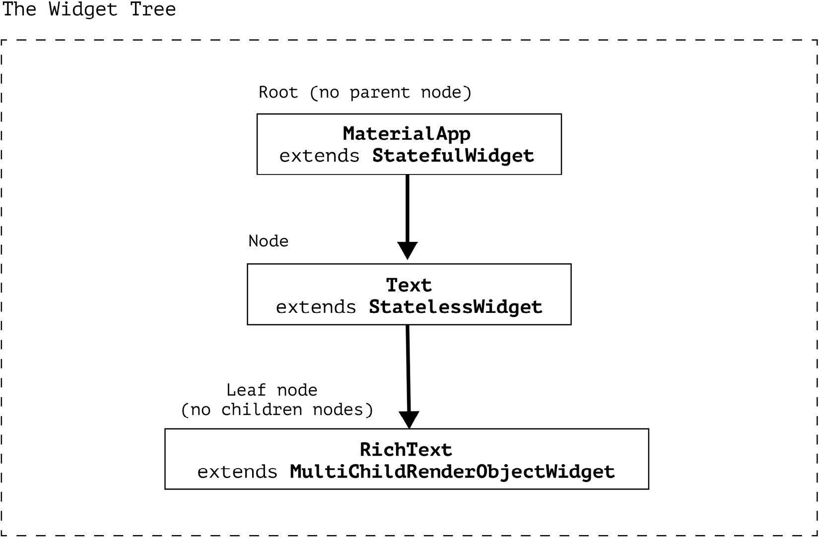
Figure 1.1 – Visual example of a widget tree
Even though you, as a developer, won’t be extending RenderObjectWidget often, you need to remember one takeaway!
This is important!
No matter how aggressively you compose your widget tree, the widgets that are actually responsible for the rendering will always extend the RenderObjectWidget class. Even if you, as a developer, don’t do it explicitly, you should know that this is what is happening deeper in the widget tree. You can always verify this by following the nesting of the build methods.
Let’s sum up what we’ve learned about the widget types:
|
StatelessWidget and StatefulWidget |
RenderObjectWidget |
|
|
Function |
Composing widgets |
Rendering render objects |
|
Methods |
build |
createRenderObject updateRenderObject |
|
Extended by developer |
Often |
Rarely |
|
Examples |
Container, Text |
SizedBox, Column |
Table 1.1 – Widget differences
But if widgets are immutable, then who updates the render objects?
Unveiling the Element class
From the createRenderObject and updateRenderObject we understand that render objects are mutable. Yet the widgets themselves that create those render objects are immutable. So how can they update anything, if they are recreated every time their build method is called?
The secret lies within the Widget API itself. Let’s take a closer look at some of its methods, starting with createElement:
@immutable
abstract class Widget {
  Element createElement();
}
The first method that should interest us is createElement, which returns an Element. The element is the last of the three pillars of the Flutter build system. It does all of the shadow work, giving the spotlight to the widget. createElement gets called the first time the widget is added to the widget tree. The method calls the constructor of the overriding Element, such as StatelessElement. Let’s take a look at what happens in the constructor of the Element class:
abstract class Element {
 Widget? _widget;
 Element(Widget widget)
      :_widget = widget {...}
}
We pass the widget field as the parameter to the constructor and assign it to the local _widget field. This way, the Element retains the pointer to the underlying widget, yet the widget doesn’t retain the pointer to the element. The _widget field of the element is not final, which means that it can be reassigned. But when? The framework calls the update method of the Element any time the parent wishes to change the underlying widget. Let’s take a look inside the update method source code:
abstract class Element {
 void update(covariant Widget newWidget) {
   _widget = newWidget;
 }
}Only if this method returns true, which means that the runtimeType and key of the old and new widgets are the same, can we update our element with a new widget. Otherwise, the whole subtree will be disregarded and a completely new element will be inserted in this place.
To better understand the flow of this process, let’s take a look at the following diagram:
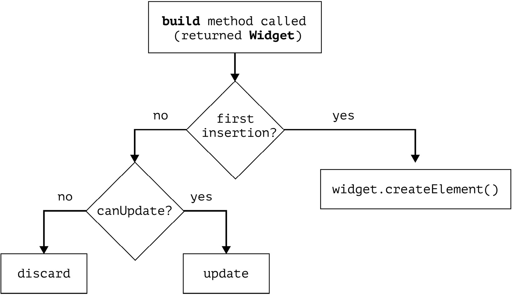
Figure 1.2 – Element relationship with the widget
The fact that the element can be updated instead of being recreated is even more important for the performance of RenderObjectWidget, since it deals with render objects that do the low-level painting. In the update method of RenderObjectElement, we also call updateRenderObject, which is a performance-optimized method: it only updates the render objects if there are any changes, and it only updates them partially. That’s why even though there may be many calls of the build method, it doesn’t mean that the whole tree gets completely repainted.
Finally, let’s summarize everything we’ve learned about the Flutter tree system:
|
Widget |
Element |
RenderObject |
|
|
Mutable? |
No |
Yes |
Yes |
|
Cheap to create? |
Yes |
No |
No |
|
Created on every build? |
Yes |
No |
No |
|
Used by devs |
Always |
Almost never |
Very rarely |
|
Relationships |
Every widget has an Element, but not every widget has a RenderObject |
Implements BuildContext and has access both to the widget, and the RenderObject (if it exists) |
Only created by implementers of RenderObjectWidget |
Table 1.2 – Summary of widget, Element, and RenderObject roles
As we have just seen, Flutter has some straightforward yet elegant algorithms that make sure your application runs smoothly and looks flawless. Unfortunately, it doesn’t mean that the developer doesn’t have to think about performance at all, since there are many ways the performance can be impacted negatively if the best practices are ignored. Let’s take a look at how we can support Flutter in maintaining a delightful experience for our users.
Reduce, reuse, recycle!
Now that we know that the build method can be called up to 120 times per second, the question is: do we really need to call the whole build method of our app if only a small part of the widget tree has changed? The answer is no, of course not. So let’s review how we can make this happen.
First things first, let’s get one obvious but still important thing out of the way. The build method is supposed to be blazing fast. After all, it can have as little as 8 ms to run without dropping frames. This is why it’s crucial to keep any long-running tasks such as network or database requests out of this method. There are better places to do that which we will explore in detail throughout this book.
Pushing rebuilds down the tree
There can be several situations when pushing the rebuilds down the tree can impact performance in a positive way.
Calling setState of StatefulWidget
One of the most used widgets is StatefulWidget. It’s a very convenient type of widget because it can manage state changes and react to user interactions. Let’s take a look at the sample app that is created every time you start a new Flutter project: the counter app. We are interested in the code of the _MyHomePageState class, which is the State of MyHomePage:
class _MyHomePageState extends State<MyHomePage> {
  int _counter = 0;
  void _incrementCounter() {
    setState(() { _counter++; });
  }
  @override
  Widget build(BuildContext context) {
    return Scaffold(
      appBar: AppBar(
        title: const Text('Flutter Demo Home Page'),
      ),
      body: Center(
        child: Column(
          mainAxisAlignment: MainAxisAlignment.center,
          children: <Widget>[
            const Text(
              'You have pushed the button this many times:',
            ),
            Text(
              '$_counter',
              style: Theme.of(context).textTheme.headlineMedium,
            ),
            // In the original Flutter code the increment button is a
            // FloatingActionButton property of the Scaffold,
            // but for demonstration purposes, we need a slightly
            // modified version
            TextButton(
              onPressed: _incrementCounter,
              child: const Text('Increase'),
            )
          ],
        ),
      ),
    );
  }
}
The UI is very simple. It consists of a Scaffold with an AppBar and a FloatingActionButton. Clicking the FloatingActionButton increments the internal _counter field. The body of the Scaffold is a Column with two Text widgets that describe how many times the FloatingActionButton has been clicked based on the _counter field. The preceding example differs from the original Flutter sample in one regard: instead of using the FloatingActionButton for handling clicks, we are using the TextButton. So every time we click the TextButton, the _incrementCounter method is called, which in turn calls the setState framework method and increments the _counter field. Under the hood, the setState method causes Flutter to call the build method of _MyHomePageState, which causes a rebuild. An important thing here is that setState causes a rebuild of the whole MyHomePage widget, even though we are only changing the text.
An easy way to optimize this is to push state changes down the tree by extracting them into a smaller widget. For example, we can extract everything that was inside the Center widget of Scaffold into a separate widget and call it CounterText:
class _MyHomePageState extends State<MyHomePage> {
  @override
  Widget build(BuildContext context) {
    return Scaffold(
      appBar: AppBar(
        title: const Text('Flutter Demo Home Page'),
      ),
      body: const Center(child: CounterText()),
    );
  }
}
class CounterText extends StatefulWidget {
  const CounterText({Key? key}) : super(key: key);
  @override
  State<CounterText> createState() => _CounterTextState();
}
class _CounterTextState extends State<CounterText> {
  int _counter = 0;
  void _incrementCounter() {
    setState(() { _counter++; });
  }
  @override
  Widget build(BuildContext context) {
    return Column(...// Same code that was in the original example );
  }
}
We haven’t changed any logic. We only took the code that was inside of the Center widget of _MyHomePageState and extracted it into a separate widget:CounterText. By encapsulating the widgets that need to be rebuilt when an internal field changes into a separate widget, we ensure that whenever we call setState inside of the _CounterTextState field, only the widgets returned from the build method of _CounterTextState get rebuilt. The parent _MyHomePageState doesn’t get rebuilt, because its build method wasn’t called. We pushed the state changes down the widget tree, causing only smaller parts of the tree to get rebuilt, instead of the whole screen. In real-life app code, this scales very fast, especially if your pages are UI-heavy.
Subscribing to InheritedWidget changes via .of(context)
By extracting the changing counter text into a separate CounterText widget in the last code snippet, we have actually made one more optimization. The interesting line for us is Theme.of(context).textTheme.headlineMedium. You have certainly used Theme and other widgets, such as MediaQuery or Navigator, via the .of(context) pattern. Usually, those widgets extend a special type of class: InheritedWidget. We will look deeper into its internals in the state management part (Chapters 3 and 4), but for now, we are interested in two of its properties:
- Instead of creating those widgets, we will access them via static getter and use some of their properties. This means that they were created somewhere higher up the tree. Hence, we will inherit them. If they weren’t and we still try to look them up, we will get an error.
- For some of those widgets, such as Theme and MediaQuery, the .of(context) not only returns the instance of the widget if it finds one but also adds the calling widget to a set of its subscribers. When anything in this widget changes – for example, if the Theme was light and became dark – it will notify all of its subscribers and cause them to rebuild. So in the same way as with setState, if you subscribe to an InheritedWidget, changes high up in the tree will cause the rebuild of the whole widget tree starting from the widget that you have subscribed in. Push the subscription down to only those widgets that actually need it.
Extra performance tip
You may have used MediaQuery.of(context) in order to fetch information about the screen, such as its size, paddings, and view insets. Whenever you call MediaQuery.of(context), you subscribe to the whole MediaQuery widget. If you want to get updates only about the paddings (or the size, or the view insets), you can subscribe to this specific property by calling MediaQuery.paddingOf(context), MediaQuery.sizeOf(context), and so on. This is because MediaQuery actually extends a specific type of InheritedWidget – the InheritedModel widget. It allows you to subscribe only to those properties that you care about as opposed to the whole widget, which can greatly contribute to widget rebuild optimization.
Avoiding redundant rebuilds
Now that we’ve learned how to scope our trees so that only smaller sections are rebuilt, let’s find out how to minimize the amount of those rebuilds altogether.
Being mindful of the widget life cycle
Stateless widgets are boring in terms of their life cycles. Stateful widgets, on the other hand, are not. Let’s take a look at the life cycle of the State:
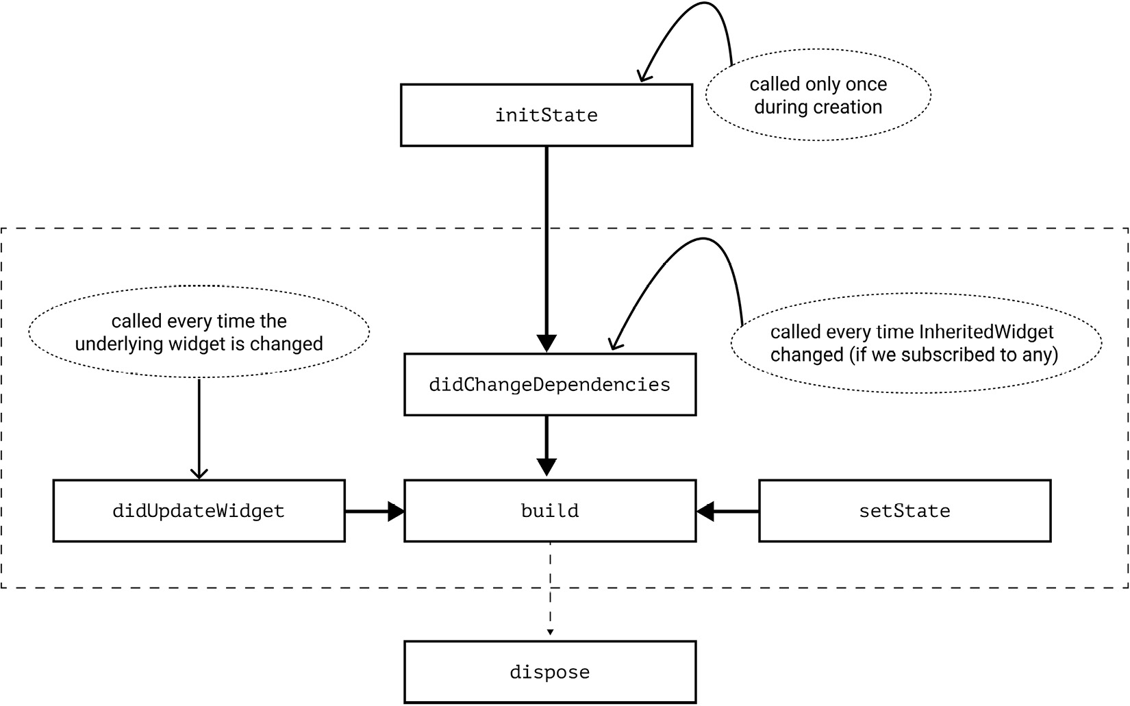
Figure 1.3 – Main methods of State life cycle
Here are a few things that we should care about:
- The initState method gets called only once per widget life cycle, much like the dispose method.
- The didChangeDependencies method gets called immediately after initState.
- didChangeDependencies is always called when an InheritedWiget that we subscribed to has changed. This is the implementation aspect of what we have just discussed in the previous section.
- The build method always gets called after didChangeDependencies, didUpdateWidget, and setState.
This is important!
Don’t call setState in didChangeDependencies or didUpdateWidget. Such calls are redundant, since the framework will always call build after those methods.
The best performance practices in the preceding list are also the reason why it’s better to decouple your widgets into other custom widgets rather than extract them into helper methods such as Widget buildMyWidget(). The widgets extracted into methods still access the same context or call setState, which causes the whole encapsulating widget to rebuild, so it’s generally recommended to prefer widget classes rather than methods.
One more important thing regarding the life cycle of the State is that once its dispose method has been called, it will never become alive again and we will never be able to use it again. This means that if we have acquired any resources that hold a reference to this State, such as text editing controllers, listeners, or stream subscriptions, these should be released. Otherwise, the references to these resources won’t let the garbage collector clean up this object, which will lead to memory leaks. Fortunately, it’s usually very easy to release resources by calling their own dispose or close methods inside the dispose of the State.
Caching widgets implicitly
Dart has a notion of constant constructors. We can create constant instances of classes by adding a const keyword before the class name. But when can we do this and how can we take advantage of them in Flutter?
First of all, in order to be able to declare a const constructor, all of the fields of the class must be marked as final and be known at compile time. Second, it means that if we create two objects via const constructors with the same params, such as const SizedBox(height: 16), only one instance will be created. Aside from saving some memory due to initializing fewer objects, this also provides benefits when used in a Flutter widget tree. Let’s return to our Element class once again.
We remember that the class has an update method that gets called by the framework when the underlying widget has changed its fields (but not type or key). This method changes the reference to the widget. Soon the framework calls rebuild. Since we’re working with a tree data structure, we will traverse its children. Unless your element is a leaf element, it will have children. There is a very important method in the Element API called updateChild. As the name says, it updates its children elements. But the interesting thing is how it does it:
#1 Element? updateChild(Element? child, Widget? newWidget,
   Object? newSlot) {
#2    // A lot of code removed for demo purposes
#3
#4    final Element newChild;
#5    if (child.widget == newWidget) {
#6        newChild = child;
#7     } else if (Widget.canUpdate(child.widget, newWidget)) {
#8        child.update(newWidget);
#9        newChild = child;
#10    }
#11
#12    return newChild;
#13 }
In the preceding code, in case our current widget is the same as the new widget as determined by the == operator, we only reassign the pointer, and that’s it. By default, in Dart, the == operator returns true only if both of the instances point to the same address in memory, which is true if they were created via a const constructor with the same params.
However, if the result is false, we should check the already-familiar Widget.canUpdate. However, aside from reassigning the pointer to the new element, we also call its update method, which soon causes a rebuild.
Hence, if we use const constructors, we can avoid rebuilds of whole widget subtrees. This is also sometimes referred to as caching widgets. So use const constructors whenever possible and see whether you can extract your own widgets that can make use of const constructors, even if nested widgets can’t.
Keep in mind that you have to actually use the const constructor, not just declare it as a possibility. For example, we have a ConstText widget that has a const constructor:
class ConstText extends StatelessWidget {
  const ConstText({super.key});
  @override
  Widget build(BuildContext context) {
    return const Text('Hello World');
  }
}// Don't!
class ParentWidget extends StatelessWidget {
const ParentWidget({Key? key}) : super(key: key);
@override
Widget build(BuildContext context) {
return ConstText(); // not const!
}
}We need to explicitly specify the const keyword when creating an instance of the class. The correct usage of the const constructor looks like this:
// Do
class ParentWidget extends StatelessWidget {
  const ParentWidget({Key? key}) : super(key: key);
  @override
  Widget build(BuildContext context) {
    return const ConstText(); // const, all good
  }
}Explicitly cache widgets
The same logic can be applied if the widget can’t be created with a const constructor, but can be assigned to a final field of the State. Since you’re literally saving the pointer to the same widget instance and returning it rather than creating a new one, it will follow the same execution path as the one we saw with const widgets. This is one of the ways in which you can work around the Container not being const. You might do so using the following, for example:
class _MyHomePageState extends State<MyHomePage> {
  final greenContainer = Container(
    color: Colors.green,
    height: 100,
    width: 100,
  );
  @override
  Widget build(BuildContext context) {
    return Column(
      children: [
        greenContainer,
        Container(
          color: Colors.pink,
          height: 100,
          width: 100,
        ),
      ],
    );
  }
}
In the preceding code, the update method of the green container won’t be called. We have retained the reference to an already-existing widget by caching it in a local greenContainer field. Hence, we return the exact same instance as in the previous build. This falls into the case described on line 5 in the updateChild method code snippet provided earlier in this section. If the instances are the same based on the equality operator, then the update method is not called. On the other hand, the pink Container will be rebuilt every time because we create a new instance of the class every time the build method is called. This is described in line 7 of the same code snippet.
Avoiding redundant repaints
Up to this point, we have looked at tips to help you avoid causing redundant rebuilds of the widget and element trees. The truth is that the building phase is quite cheap when compared to the rendering process, as this is where all of the heavy lifting is done. Flutter optimizes this phase as much as possible, but it cannot completely control how we create our interfaces. Therefore, we may encounter cases where these optimizations are not enough or are not working effectively.
Let’s take a look at what happens when one of the render objects wants to repaint itself. We may assume that this repainting is scoped to that specific object – after all, it was the only one marked for repaint. But this is not what happens.
The thing is, even though we have scoped our widget tree, our render object tree has a relationship of its own. If a render object has been marked as needing repainting, it will not only repaint itself but also ask its parent to mark itself for repaint too. That parent then asks its parent, and so on, until the very root. And when it finally comes to painting, the object will also repaint all of its descendants. This happens until the framework encounters what is known as a repaint boundary. A repaint boundary is a Flutter way of saying “stop right here, there is nothing further to repaint.” This is done by wrapping your widget into another widget – yes, the RepaintBoundary widget.
If we wanted to depict this flow visually, it would be something like this:
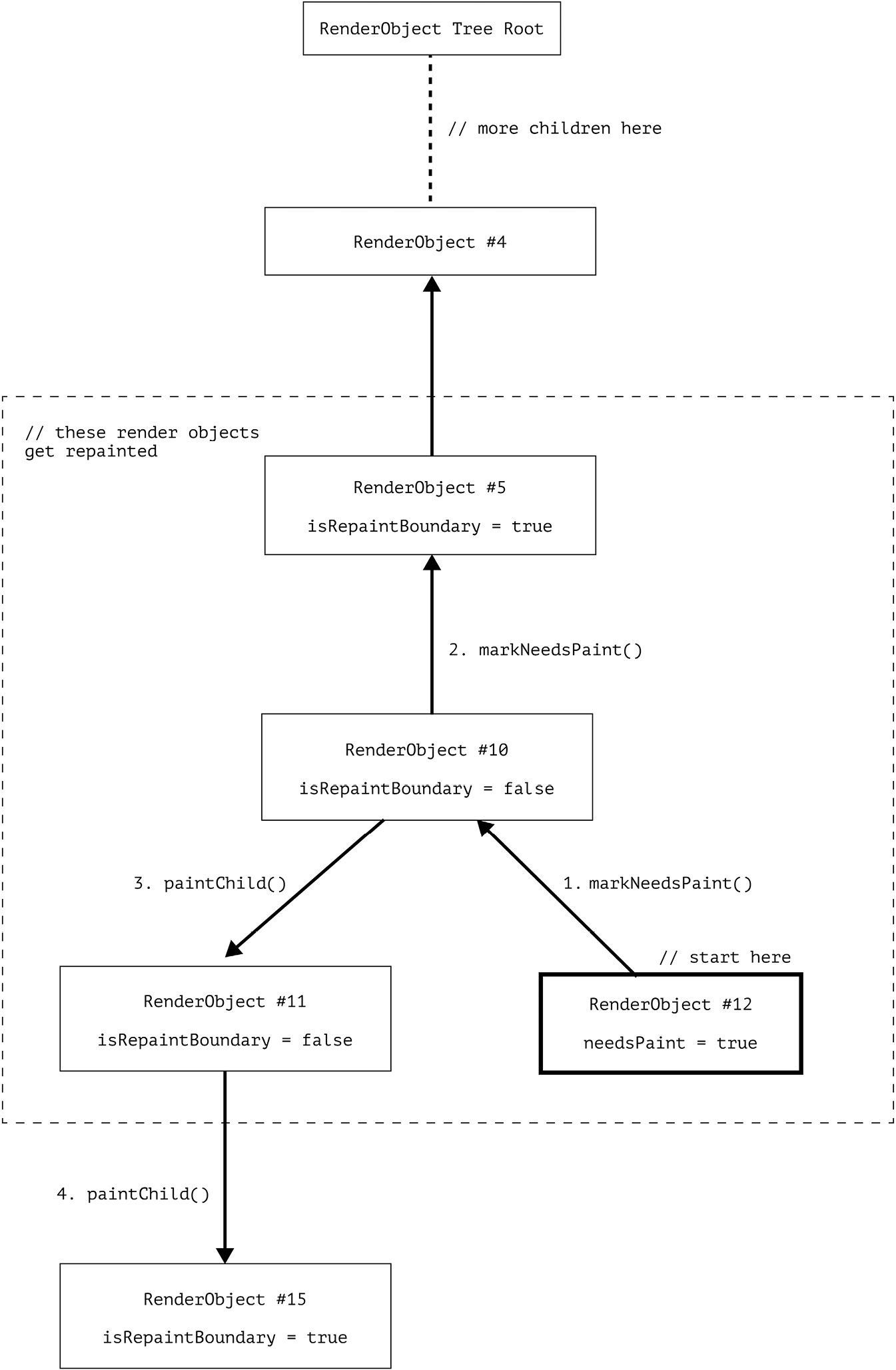
Figure 1.4 – Flow of the render object’s repainting process
Here is what’s happening in Figure 1.4:
- We start from RenderObject #12, which was the initial one to be marked for repainting.
- The object goes on to call parent.markNeedsPaint of RenderObject #10. Since the isRepaintBoundary field is false, the needsPaint gets set to true and goes on to ask the same for its parent.
- The isRepaintBoundary value of RenderObject #5 is true, so needsPaint stays false and the parent marking is stopped right there.
- Then the actual painting phase is started from the top widget marked as needsPaint. It traverses its children. Since isRepaintBoundary of RenderObject #11 is false, it traverses further.
- But isRepaintBoundary of RenderObject #15 is true, so the process is stopped right there.
So we end up repainting render objects #10, #11, and #12.
Let’s take a look at an example where a RepaintBoundary widget can be useful – in a ListView. This is the simplified version of the ListView source code:
class ListView {
  ListView({
      super.key,
      bool addRepaintBoundaries = true,
      ... // many more params
  });
  @override
  Widget? build(BuildContext context, int index) {
     if (addRepaintBoundaries) {
       child = RepaintBoundary(child: child);
     }
     return child;
  }
}
The ListView constructor accepts an addRepaintBoundaries parameter in its constructor, which by default is true. Later, when building its children, the ListView checks this flag, and if it’s true, the child widget is wrapped in a RepaintBoundary widget. This means that during scrolling, the list items don’t get repainted, which makes sense because only their offset changes, not their presentation. The RepaintBoundary widget can be extremely efficient in cases where you have a heavy yet static widget, or when only the location on the screen changes such as during scrolling, transitions, or other animations. However, like many things, it has trade-offs. In order to display the end result on the screen, the widget tree drawing instructions need to be translated into the actual pixel data. This process is called rasterization. RepaintBoundary can decide to cache the rasterized pixel values in memory, which is not limitless. Too many of them can ironically lead to performance issues.
There is also a good way to determine whether the RepaintBoundary is useful in your case. Check the diagnosis field of its renderObject via the Flutter inspector tools. If it says something along the lines of This is an outstandingly useful repaint boundary, then it’s probably a good idea to keep it.
Optimizing scroll view performance
There are two important tips for optimizing scroll view performance:
- First, if you want to build a list of homogeneous items, the most efficient way to do so is by using the ListView.builder constructor. The beauty of this approach is that at any given time, by using the itemBuilder callback that you’ve specified, the ListView will render only those items that can actually be seen on the screen (and a tiny bit more, as determined by the cacheExtent). This means that if you have 1,000 items in your data list, you don’t need to worry about all 1,000 of them being rendered on the screen at once – unless you have set the shrinkWrap property to true.
- This leads us to the second tip: the shrinkWrap property (available for various scroll views) forces the scroll view to calculate the layout of all its children, defeating the purpose of lazy loading. It’s often used as a quick fix for overflow errors, but there are usually better ways to address those errors without compromising performance. We’ll cover how to avoid overflow errors while maintaining performance in the next chapter.
Summary
In this chapter, we explored the relationships between the Widget, Element, and RenderObject trees. We learned how to avoid rebuilds of the Widget and Element trees by scoping the StatefulWidgets and subscriptions to inherited widgets, as well as by caching the widgets via const constructors and final initializations. We also learned how to limit repaints of the render object subtrees, as well as how to effectively work with scroll views.
In Chapter 2, we will explore how to make our already performant interfaces responsive on the ever-growing set of devices. We will cover how sizing and layout work in Flutter, how to fix overflow errors, and how to ensure that your application is usable for all users.
2
Responsive UIs for All Devices
Flutter originally started as a framework with a primary focus on creating high-quality native apps for iOS and Android smartphones. It quickly evolved to support platforms beyond smartphones, such as tablets, web browsers, and desktop applications. With such a variety of devices to support, it has become important for developers to learn how to create responsive user interfaces (UIs) that look great on every screen. The key to creating these responsive UIs is to use techniques and strategies that enable the UI to adapt to different screen sizes, orientations, and resolutions.
In this chapter, we will get to explore how Flutter lays out the different widgets on screen and how this integrates with the build process that we covered in the first chapter. Secondly, we will learn how to obtain information about the device’s screen size and orientation and use it to adjust the UI based on these parameters. We will also discuss which widgets can help us control the position and size of our widgets and allow us to create complex and flexible layouts. Finally, we will cover how to implement accessibility features seamlessly into our Flutter layouts, ensuring that our beautifully designed interfaces are usable and welcoming to individuals of all abilities.
By the end of this chapter, you will have a better understanding of how the layout phase works in Flutter and how to create responsive and adaptive UIs using Flutter’s layout system. As Flutter continues to evolve and support more platforms, the importance of creating responsive UIs will only continue to grow, making it essential for developers to master these strategies.
In this chapter, we’re going to cover the following main topics:
- Understanding the Flutter layout algorithm
- Designing responsive apps with Flutter
- Ensuring accessibility in Flutter apps
Technical requirements
If this is not your first Flutter app, then you probably already have everything you need installed.
Otherwise, you will need to install the following:
- An IDE of your choice that supports Flutter, such as Android Studio or VSCode
- The Flutter SDK
All of the code samples referred in this chapter can be found here: https://github.com/PacktPublishing/Flutter-Design-Patterns-and-Best-Practices/tree/master/CH02/candy_store.
Understanding the Flutter layout algorithm
In Flutter, the layout phase is an essential part of the widget-building process. It is during this phase that the engine calculates how the widgets are positioned and sized on the screen. The layout phase starts after the build process that we discussed in Chapter 1 is done and is followed by the painting and composition steps of the rendering pipeline.
This layout process is critical to the overall performance and user experience of the app. If the layout is incorrect, widgets may overlap or be positioned in unexpected locations on the screen, leading to a confusing and frustrating experience for the user.
In Flutter, the layout process is handled by the RenderObject class. Each RenderObjectWidget in the widget tree has a corresponding RenderObject that is responsible for handling the layout and rendering of that widget. The RenderObject calculates its size based on information provided by its parent RenderObject and the position of its child render objects. This information passed by the parent to its child is called constraints. Let’s learn why constraints are so important.
Understanding BoxConstraints
To understand the layout process, we first need to understand the concept of constraints. In Flutter, each widget has a set of constraints that define its minimum and maximum allowable size. While the abstract version of Constraints is not bound to anything and allows the implementer to be as creative as needed, it will be easier to understand constraints if we use a more concrete example. The BoxConstraints method is the implementation that describes the constraints based on the notion of a box that can have a minimum and maximum width and height. It is used for many, if not most, of the widgets that you will encounter. There are multiple possibilities for such constraints. For example, a widget could have a minimum 0 size and a maximum infinite size. To set such constraints, we would specify them in a BoxConstraints constructor like this:
BoxConstraints(
  minWidth: 0,
  minHeight: 0,
  maxWidth: double.infinity,
  maxHeight: double.infinity,
);
These constraints would mean that the sizing options are endless and that our widget is free to choose the size it wants. On the other hand, we could be more strict and force the widget to match only a specific size, with a width of 10 and a height of 20. The BoxConstraints need to be applied to a widget that accepts constraints as a parameter, such as ConstrainedBox. We can specify a colorful child, such as a ColoredBox. Our code would look like this:
lib/example_constraints.dart
void main() {
  runApp(
    MaterialApp(
      home: Scaffold(
        body: ConstrainedBox(
          constraints: BoxConstraints(
            minWidth: 10,
            minHeight: 20,
            maxWidth: 10,
            maxHeight: 20,
          ),
          child: ColoredBox(color: Colors.red),
        ),
      ),
    ),
  );
}
In this case, the widget will be forced to have a width of 10 and height of 20, with no other option, since the minimum allowed size is the same as the maximum. The size of the widget will always need to satisfy its constraint conditions.
Fun fact
In the preceding snippet, we have done what Container does under the hood by wrapping different kinds of box widgets based on parameters such as constraints, size, and color.
How do constraints determine the child widget’s size?
The Flutter layout algorithm can be summarized as follows:
This easy and catchy rule describes the three key steps that are needed to position and lay out any widget.
Let’s break it down in more detail:
- Constraints go down: A widget gets its own constraints from its parent. This widget also passes new constraints to its children one by one (these can be different for each child). This process walks down the entire render tree until it reaches the last child. Once every RenderObject has constraints, the next step is to define the actual size.
- Sizes go up: The child picks a size that satisfies the constraints received by the parent. The sizing algorithm is defined by each RenderObject depending on their own needs. In this step, together with step 3, the framework walks back up the render tree passing the defined geometry.
- Parent sets the position: Once all children have had their size defined, the parent will position its children (horizontally on the x axis and vertically on the y axis) one by one. Once all children have been positioned, the parent will move to step 2 again until we reach the RenderObject root.
This can be visualized with the following diagram:
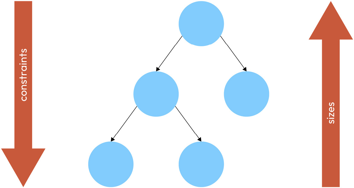
Figure 2.1 – Constraints going down from the parent to its children and sizes going up from the children to the parent
In the diagram, you can see that the constraints are passed all the way down from the root to the leaf nodes of the render object tree. Then the sizes are passed all the way up from the leaf nodes to the root. This also demonstrates the efficiency of Flutter’s layout algorithm: the layout process is a single-pass process. This means that the render tree is walked at most once in each direction: down to pass constraints and up to pass sizes. Now let’s look at some specific examples.
The parent widget limits the size of the child with the passed constraints but it is the child that decides its final size.
Let’s see this through a simple example of a container and a Text widget as its child:

Figure 2.2 – A red container with Hello World text aligned to the top-left corner
For brevity, we will only look at the code of the relevant widget. You can find the fully runnable example in the filename mentioned at the start of the code snippet. Until you see otherwise otherwise, keep in mind that the Container that we’re working with is a child of a Scaffold.
The code to generate this widget is as follows:
      Container(
          constraints: BoxConstraints(
            minWidth: 200,
            minHeight: 100,
            maxWidth: 200,
            maxHeight: 100,
          ),
          color: Colors.red,
          child: Text('Hello World'),
)Something interesting that you may have noticed in this code is that we set the same values for minWidth and maxWidth, as well as for minHeight and maxHeight. In terminology, this is known as tight constraints because there is quite literally no wiggle room. The size is tightly constrained. For this, BoxConstraints has a BoxConstraints.tight constructor. Instead of accepting four values, this requires just two. Code like this will produce the same result as the previous snippet:
        Container(
          constraints: BoxConstraints.tight(
            const Size(200, 100),
          ),
          color: Colors.red,
          child: Text('Hello World'),
) Container(
constraints: BoxConstraints.loose(
const Size(200, 100),
),
color: Colors.red,
child: Text('Hello World'),
) Container(
constraints: BoxConstraints(
minWidth: 0,
minHeight: 0,
maxWidth: 200,
maxHeight: 100,
),
color: Colors.red,
child: Text('Hello World'),
)With loose constraints, our text would only take up as much space as it requires. Hence, the container will do the same. Instead of being the 100x200 size, it will wrap the text tightly like this:

Figure 2.3 – A red container with Hello World text wrapped with loose constraints
Once the child knows its size, the parent will take care of positioning it. The parent defines how its children will be allocated on the screen. It is important to remark that a child does not know its own position. In the previous example, the container decided to position the Text widget child in the top left of the screen, while the child only knows its size.
Now we can modify the position of the child by adding or modifying its parents. Imagine that we want to center the text inside the container in the previous example, as shown in the following figure.

Figure 2.4 – A red container with Hello World text aligned to the center
As the container is the one that defines the position, we will have to either modify it or wrap the text with a more appropriate parent that has a different positioning algorithm. In this case, we will change the alignment field of this widget as follows:
lib/example_container_5.dart
   Container(
     alignment: Alignment.center,
     constraints: BoxConstraints.tight(Size(200, 100)),
     color: Colors.red,
     child: Text('Hello World'),
); Container(
constraints: BoxConstraints.tight(
const Size(200, 100),
),
color: Colors.red,
child: Align(
alignment: Alignment.center,
child: Text('Hello World'),
),
),Aside from the Align widget, there is also a very specific one called Center, which aligns the child widget in the center and provides the developer with a more concise API.
Note
There are endless scenarios that can occur when defining constraints and positioning children. To see more examples, you can check out https://docs.flutter.dev/development/ui/layout/constraints.
Understanding the limitations of the layout rule
While the layout algorithm has quite a lot of benefits, such as only needing one pass through the whole tree, it also comes with some limitations. It is important to be aware of the limitations so that we don’t try to fight against them. Let’s see what some of them are:
- A widget might not have its desired size: A child is forced to follow its parent’s constraints, yet the child’s desired size might not fit in those constraints, so the child’s final size might not match the desired one. One scenario where this can create conflicts is when the parent forces its child to fit a tight size. In our previous experiments with the Container widget, it has always been a child of the Scaffold. The Scaffold imposes its own constraints, which is why the results we have seen have corresponded with our expectations. However, there are use cases that might surprise you. In the following code, we set a container as the root widget, with a desired size of 10x10:
-
ib/example_container_7.dart
runApp(
  Container(
    height: 10,
    width: 10,
    color: Colors.red,
  ),
);
While we would expect the Container to have a 10x10 size, this won’t be the actual case and the Container will cover the full screen. It will look like this:
![Figure 2.5 – A red container filling the full screen]()
Figure 2.5 – A red container filling the full screen
The height and width params in the preceding code are in reality a shortcut to define the constraints of its child. They are defined withBoxConstraints.tightFor(width: width, height: height).
So, let’s see what is happening in the preceding code based on what we have learned so far. First, the Container receives constraints from its parent. As this Container is the top widget, it is a special case. The RenderObject root will have a tight constraint that enforces the minimum and maximum to be the size of the screen. Therefore, when the Container is sizing itself, the only option available is the size of the screen.
- A widget is not aware of its own position on the screen: Another interesting limitation is that we cannot learn the position of a widget from the widget itself. Its parent contains that information. While this looks like a huge disadvantage, it has a huge performance benefit for algorithms that do not have to recalculate child size each time they want to position their items (for example, GridView). In the upcoming sections of this chapter, we will learn how we can create widgets that can be positioned relative to others and therefore mitigate this inconvenience.
- Final size and position are relative to a parent: The final consideration is that a widget’s size and position depend on its parent. This parent widget also depends on its own parent. It is impossible to define the size and position of a specific widget without taking the whole tree into consideration.
Now that we know the general rule and its limitations, let’s learn about the layout solutions that implement these basic concepts. We will learn how we can use them to create our own layouts. When in doubt, always remember: constraints go down, sizes go up, parent sets the position.
Designing responsive apps with Flutter
When building your Flutter app, you will probably want to target multiple platforms and screen sizes. It is important to keep in mind that each platform has its own unique design guidelines and user experience expectations. However, this does not mean giving up on designing a flexible layout that can adapt to most scenarios. Flutter brings with it all the tools needed to create responsive apps that work across a wide range of devices, screen sizes, and orientations. Let’s discover what these are.
Getting to know the user’s device with MediaQuery
In Flutter, MediaQuery is a utility widget that provides information about the device and its constraints. It allows you to query various properties of the device, such as its orientation, screen size, pixel density, and more.
Good to know
When talking about screen size and pixels, there are a couple of concepts that we need to understand. Physical pixels, also known as device pixels, is a measure of the number of actual pixels on the display. This can vary a lot based not only on the actual screen size but also on pixel density. Pixel density is often measured in inches and referred to as pixel per inch (PPI). The higher the PPI, the higher the resolution and the better the display quality. On the other hand, there are logical pixels which are roughly 96 physical pixels per inch. This concept is also known as device-independent pixels. It allows for creating an app UI without dealing with pixel density. In Flutter, we work with logical pixels.
Here are some of the most useful properties we can use:
- size: The physical size of the device’s screen in logical pixels
- devicePixelRatio: The number of physical pixels per logical pixel
- orientation: The orientation of the device (portrait or landscape)
- padding: The amount of padding applied to the screen, such as the status bar and navigation bar
- textScaleFactor: The scaling factor applied to text based on the device’s accessibility settings
The MediaQuery widget is included in the widget tree when using MaterialApp, CupertinoApp, or WidgetsApp in your Flutter app. This allows you to access the properties of the device and its constraints throughout your app. For example, you might use MediaQuery.sizeOf(context) to retrieve the screen size of the device and adjust the layout of your app accordingly.
Here’s an example of how you can use MediaQuery to create a layout that adapts to different screen sizes:
lib/example_responsive_layout.dart
 void main() {
  runApp(
    MaterialApp(
      home: Scaffold(
        body: ResponsiveLayoutExample(),
      ),
    ),
  );
}
class ResponsiveLayoutExample extends StatelessWidget {
  const ResponsiveLayoutExample({super.key});
  @override
  Widget build(BuildContext context) {
    final screenSize = MediaQuery.of(context).size;
    return GridView.count(
      crossAxisCount: _getCrossAxisCount(screenSize.width),
      children: List.generate(
        12,
        (index) => Container(
          margin: const EdgeInsets.all(8),
          alignment: Alignment.center,
          color: Colors.green,
          child: Text('Item ${index + 1}'),
        ),
      ),
    );
  }
  int _getCrossAxisCount(double screenWidth) {
    if (screenWidth >= 1200) {
      return 4;
    } else if (screenWidth >= 800) {
      return 3;
    } else if (screenWidth >= 600) {
      return 2;
    } else {
      return 1;
    }
  }
}
In the preceding example, we used MediaQuery to retrieve the screen size and determine the number of columns in the grid based on the screen width. The _getCrossAxisCount method returns 4 columns for screens wider than 1200 pixels, 3 columns for screens between 800 and 1200 pixels, 2 columns for screens between 600 and 800 pixels, and 1 column for screens narrower than 600 pixels. We have also used a GridView widget here, which is an easy way to show a list of items in a grid format. Here is how it would look on different devices:
![Figure 2.6 – A responsive layout with various numbers of columns depending on the screen width]()
Figure 2.6 – A responsive layout with various numbers of columns depending on the screen width
By using MediaQuery to adapt the layout to different screen sizes, we can ensure that our app looks good and is easy to use on a wide range of devices.
Creating adaptive layouts
When we want to create dynamic layouts based on the available size or the device’s orientation, LayoutBuilder and OrientationBuilder are our safest bet.
LayoutBuilder is a widget that provides a callback that you can use to build your layout based on the available layout constraints. The widget allows you to create layouts that are responsive and adapt to different screen sizes. For example, you might use LayoutBuilder to adjust the number of columns in a grid layout based on the screen width or to adjust the font size of text based on the available height.
Here’s an example of how to use LayoutBuilder:
lib/example_layout_builder.dart
void main() {
  runApp(
    MaterialApp(
      home: Scaffold(
        body: LayoutBuilder(
          builder: (BuildContext context, BoxConstraints constraints){
            if (constraints.maxWidth > 600) {
              return DesktopLayout();
            } else {
              return MobileLayout();
            }
          },
        ),
      ),
    ),
  );
}
class DesktopLayout extends StatelessWidget {
  const DesktopLayout({super.key});
  @override
  Widget build(BuildContext context) {
    return Container(
      color: Colors.pink,
      child: Align(
        alignment: Alignment.center,
        child: Text('Desktop Layout'),
      ),
    );
  }
}
class MobileLayout extends StatelessWidget {
  const MobileLayout({super.key});
  @override
  Widget build(BuildContext context) {
    return Container(
      color: Colors.purple,
      child: Align(
        alignment: Alignment.center,
        child: Text('Mobile Layout'),
      ),
    );
  }
}
Here is how it would look on different devices:
![Figure 2.7 – A responsive layout with different layouts on mobile and desktop devices]()
Figure 2.7 – A responsive layout with different layouts on mobile and desktop devices
In the preceding example, we used LayoutBuilder to switch between a desktop layout and a mobile layout based on the maximum width of the available layout constraints.
OrientationBuilder, on the other hand, is a widget that provides a callback that you can use to build your widgets based on the device’s orientation. This allows you to create layouts that adjust to changes in orientation, such as rotating the device from portrait to landscape mode. For example, you might use OrientationBuilder to adjust the layout of your app when the device is rotated, such as by rearranging elements or adjusting the size and position of widgets.
Here’s an example of how to use OrientationBuilder:
lib/example_orientation_builder.dart
void main() {
  runApp(
    MaterialApp(
      home: Scaffold(
        body: OrientationBuilder(
          builder: (BuildContext context, Orientation orientation) {
            if (orientation == Orientation.portrait) {
              return PortraitLayout();
            } else {
              return LandscapeLayout();
            }
          },
        ),
      ),
    ),
  );
}
class LandscapeLayout extends StatelessWidget {
  const LandscapeLayout({super.key});
  @override
  Widget build(BuildContext context) {
    return Container(
      color: Colors.green,
      child: Align(
        alignment: Alignment.center,
        child: Text('Landscape Layout'),
      ),
    );
  }
}
class PortraitLayout extends StatelessWidget {
  const PortraitLayout({super.key});
  @override
  Widget build(BuildContext context) {
    return Container(
      color: Colors.yellow,
      child: Align(
        alignment: Alignment.center,
        child: Text('Portrait Layout'),
      ),
    );
  }
}
In the preceding example, we used OrientationBuilder to switch between a portrait layout and a landscape layout based on the device’s orientation.
Overall, LayoutBuilder and OrientationBuilder are two useful utility widgets in Flutter that can help you create responsive and adaptable layouts that adjust to changes in screen size and orientation.
Positioning widgets relative to each other
Stack and Align are two of the most commonly used widgets in Flutter for arranging and positioning child widgets. We are already familiar with the Align widget, which allows us to change the alignment of the child widget. Now let’s get to know the Stack widget.
The Stack widget allows you to stack widgets on top of each other, similar to a stack of cards. The child widgets are positioned relative to the top-left corner of the stack by default but you can also position them relative to other corners or to the center of the stack. The order in which the child widgets are added to the stack determines the order in which they are painted onto the screen, with the last child widget added appearing on top.
Here’s an example of how to use the Stack widget:
runApp(
    MaterialApp(
      home: Scaffold(
        body: Stack(
          children: [
            Container(
              width: 100,
              height: 100,
              color: Colors.red,
            ),
            Container(
              width: 50,
              height: 50,
              color: Colors.blue,
            ),
          ],
        ),
      ),
    ),
  );
As a result of the preceding code, the two containers will be laid out as follows.
![Figure 2.8 – A stack with two colored containers]()
Figure 2.8 – A stack with two colored containers
The preceding code will display a blue square on top of a red square since the blue square was added after the red square.
To position widgets within a stack, the Positioned widget can be used. The Positioned widget can only be added as a child of the Stack widget. It provides a way to position its child widget in a specific location within the stack. Using Positioned when it’s not a direct child of a Stack widget will throw an Incorrect use of ParentDataWidget error.
Here’s an example of how to use the Positioned widget to position a blue box in the bottom-right corner of the stack. We will omit the code required to run the app, as it stays the same as in the previous example, and just focus on the Stack:
lib/example_stack_2.dart
Stack(
    children: [
        Container(
            width: 100,
            height: 100,
            color: Colors.red,
        ),
        Positioned(
            bottom: 0,
            right: 0,
            child: Container(
                width: 50,
                height: 50,
                color: Colors.blue,
            ),
        ),
    ],
)
In this case, the two containers will be laid out with different alignments, as shown in the following figure.
![Figure 2.9 – A stack with two colored containers with different alignments]()
Figure 2.9 – A stack with two colored containers with different alignments
As you can see in the preceding code, we created a blue box using the Container widget, then we positioned it in the bottom-right corner of the stack using the Positioned widget.
The Align widget, on the other hand, allows you to position a child widget within another widget using a combination of horizontal and vertical alignment properties. The child widget is first positioned within the container according to the given horizontal and vertical alignment properties, then any additional offset properties are applied. By combining the Stack, Positioned, and Align widgets, you can create complex layouts with precise positioning and layering of child widgets. In case you want to align all the children of the Stack in the same way, you can use the alignment property of the Stack itself. By default, it’s set to be top left, as you have seen in the previous examples. However, you can change it to be centered, as follows:
lib/example_stack_3.dart
        Stack(
          alignment: Alignment.center,
          children: [
            Container(
              width: 300,
              height: 300,
              color: Colors.red,
            ),
            Container(
              width: 200,
              height: 200,
              color: Colors.green,
            ),
            Container(
              width: 100,
              height: 100,
              color: Colors.blue,
            ),
          ],
        ),
This code will ensure that all the children of the Stack are aligned centrally and will produce a UI that looks like this:
![Figure 2.10 – A stack with three colored containers aligned centrally]()
Figure 2.10 – A stack with three colored containers aligned centrally
Next, we’ll look at flexible layouts.
Building flexible layouts
While the Stack widget arranges widgets on top of each other, you might want to lay down multiple widgets in just one dimension. In the flexible layout model, the children of a Flex widget can be laid out in a single direction and can flex their sizes, either growing to fill unused space or shrinking to avoid overflowing the parent.
Row and Column
In Flutter, Row and Column are Flex widgets used for arranging child widgets horizontally and vertically, respectively.
The Row widget arranges its children widgets horizontally, in a single row. Each child widget in a row is laid out in the order in which it appears in the children list.
Similarly, the Column widget arranges its children widgets vertically, in a single column. Each child widget in a column is laid out in the order it appears in the children list.
Both Row and Column widgets can have an optional mainAxisAlignment property, which defines how the children widgets are positioned along the main axis (horizontal for Row, vertical for Column). The default value for this property is MainAxisAlignment.start, which aligns the children at the start of the main axis. Other possible values for this property include .center, .end, .spaceBetween, and .spaceAround.
Both widgets also have an optional crossAxisAlignment property, which defines how the child widgets are positioned along the cross axis (vertical for Row, horizontal for Column). The default value for this property is CrossAxisAlignment.center, which centers the children along the cross axis. Other possible values for this property include .start, .end, and .stretch. At first, all of this terminology may sound confusing, but it becomes intuitive quite fast. Here is an example of using the Row and Column widgets:
lib/example_column_row.dart
 runApp(
    MaterialApp(
      home: Scaffold(
        body: Column(
          mainAxisAlignment: MainAxisAlignment.center,
          crossAxisAlignment: CrossAxisAlignment.start,
          children: [
            Text('1'),
            Text('2'),
            Row(
              mainAxisAlignment: MainAxisAlignment.spaceAround,
              children: [
                Text('3'),
                Text('4'),
              ],
            ),
            Text('5'),
          ],
        ),
      ),
    ),
  )
In the preceding example, we have a Column widget with four child widgets. The first two child widgets are Text widgets that are arranged vertically in the Column. They are laid out vertically beginning from the center of the screen because we have set the mainAxisAlignment property of the Column to center. They are aligned to the left side of the screen (horizontally) because we have set the crossAxisAlignment property to start. The third child widget is a Row widget that arranges two Text widgets horizontally with even free spaces between them, as well as around them. This is thanks to the mainAxisAlignment property of the Row being set to spaceAround. The fourth child widget is another Text widget arranged vertically in the Column. To understand better, let’s see the UI that this code produces:
![Figure 2.11 – A column with text widgets and a row with various alignments]()
Figure 2.11 – A column with text widgets and a row with various alignments
By default, the Row and Column widgets will allocate the space needed for each of their children. However, this behavior can be modified using the Flexible widget.
Flexible and Expanded
The Flexible widget is a modifier widget that can be used with other widgets to make them flexible within a Row or Column. The Flexible widget can be used to specify how much space a widget should take up within a Row or Column relative to the other children.
The Flexible widget has a flex property that can be used to specify how much of the remaining space should be allocated to the widget. For example, if a row has three children and each child has a flex value of 1, then each child will take up one-third of the available space. If one child has a flex value of 2 and the other two have a flex value of 1, then the first child will take up twice as much space as the other two combined.
For example, consider the following code:
lib/example_flexible_expanded_1.dart
  runApp(
    MaterialApp(
      home: Scaffold(
        body: Row(
          children: [
            Flexible(
              child: Container(height: 50.0, color: Colors.green),
              flex: 1,
            ),
            Flexible(
              child: Container(height: 50.0, color: Colors.red),
              flex: 2,
            ),
          ],
        ),
      ),
    ),
  );
In the preceding code, the result of adding all the flex properties is 3. The first child is a Flexible widget with a flex property set to 1, which means it will take up one-third of the remaining space within the Row widget. The second child will then take up two-thirds of the space. This is how it will look:
![Figure 2.12 – A layout with Flexible and Expanded with various flex properties]()
Figure 2.12 – A layout with Flexible and Expanded with various flex properties
Notice that it is possible to combine non-flexible widgets with Flexible widgets. In such a case, the widgets that are not wrapped with a Flexible space will try to allocate their own desired extent and then Flexible will use the space that is left:
lib/example_flexible_expanded_2.dart
 runApp(
    MaterialApp(
      home: Scaffold(
        body: Row(
          children: [
            Flexible(
              child: Container(height: 50.0, color: Colors.red),
              flex: 1,
            ),
            Container(width: 50.0, height: 50.0, color: Colors.green),
            Flexible(
              child: Container(height: 50.0, color: Colors.blue),
              flex: 1,
            ),
          ],
        ),
      ),
    ),
  );
As a result of the preceding code, the widgets will be laid out as follows.
![Figure 2.13 – A Row with three elements with different widths]()
Figure 2.13 – A Row with three elements with different widths
In the preceding figure, the second child (green) is a fixed-width container with a width of 50.0 pixels. The first (red) and third (blue) child are Flexible widgets wrapped around a container with a height of 50.0 pixels. The flex property of each Flexible widget is set to 1, and as the total flex count is 2, each Flexible will take up half of the remaining space within the Row widget.
The Flexible widget has a fit parameter, which is set to FlexFit.loose by default. This means that the child of the Flexible can be as large as the available space, but it is also allowed to be smaller than that. However, if we set the fit variable to FlexFit.tight, the child will be forced to take up all the available space. To avoid explicitly setting the fit to tight, we can use a helpful widget called Expanded. The Expanded widget is a specific version of the Flexible widget that sets the fit property to fit FlexFit.tight. Let’s compare Flexible and Expanded in an example:
lib/example_flexible_expanded_3.dart
  runApp(
    MaterialApp(
      home: Scaffold(
        body: Row(
          children: [
            Expanded(
              flex: 1,
              child: Container(
                color: Colors.red,
                height: 100,
                width: 100,
              ),
            ),
            Flexible(
              flex: 1,
              child: Container(
                color: Colors.green,
                height: 100,
                width: 100,
              ),
            ),
          ],
        ),
      ),
    ),
  );
The preceding code will cause the children to be laid out as in the following figure.
![Figure 2.14 – A row with one flexible child and another expanded one]()
Figure 2.14 – A row with one flexible child and another expanded one
In the preceding figure, we have a row with two children. As Flexible and Expanded have flex set to 1, both will try to take up half of the available space. The main difference is that both of their children have the desired width set to 100. The Expanded widget (red) will force the Container to expand to fill the available space, while the Flexible widget (green) will let it take its desired size if it is smaller than the available space.
Solving the overflow problem
The most common issue Flutter developers have is the overflow problem. This mostly happens when using rows and columns when the content inside these widgets exceeds the available space. This can cause the content to be clipped, hidden, or displayed incorrectly, leading to a poor user experience.
Let’s consider an example. Suppose you have a row with three children: two Text widgets and a Container widget. If the combined width of these widgets exceeds the width of the device screen, the Text or Container will be clipped or hidden from view. For example, we could write code like this:
lib/example_flexible_expanded_4.dart
runApp(
    MaterialApp(
      home: Scaffold(
        body: Row(
          children: [
            Text('First text'),
            Container(
              color: Colors.red,
              width: 1000000,
              height: 100,
            ),
            Text('Second text')
          ],
        ),
      ),
    ),
  );
At first glance, the code looks all right. However, when we render this UI, we will get what is known as an overflow error: the children of the row didn’t fit in the available space because the width of the Container is too big. We can see this on the screen, as the second Text is never rendered. Additionally, there is an error in the IDE console.
![Figure 2.15 – A layout with an overflowing Container]()
Figure 2.15 – A layout with an overflowing Container
To solve this problem, we can use the following solutions:
- Wrap the content inside the Row or Column with an Expanded or Flexible widget. This will cause the content to take up all the available space inside the Row or Column. We will omit the wrapping code for running the app, as well as Scaffold, and will just focus on the widget we pass in the body. For example, see the following code block:
lib/example_flexible_expanded_5.dart
     Row(
          children: [
            Expanded(child: Text('First text')),
            Expanded(
              child: Container(
                color: Colors.red,
                width: 1000000,
                height: 100,
              ),
            ),
            Expanded(child: Text('Second text'))
          ],
        )
Since all of the children are wrapped in Expanded with the same default flex parameter, the available space is distributed evenly among them, thereby ignoring the desire of the Container to have a width of 1000000. It might not always be the result that you want to achieve, so you might consider other options.- Use a SingleChildScrollView widget to allow the content inside the row or column to scroll if it exceeds the available space, for example:
lib/example_single_child_scroll_view.dart
        SingleChildScrollView(
          scrollDirection: Axis.vertical,
          child: Column(
            children: [
              Text('1'),
              Text('2'),
              Text('3'),
              Text('4'),
              Container(
                width: 200,
                height: 1000,
                color: Colors.red,
              ),
              Text('5'),
              Text('6'),
              Text('7'),
              Text('8'),
            ],
          ),
        )
This code allows all the widgets to be laid out at the size they want, including the Container. Since they don’t fit on the screen, the whole screen is made scrollable. It looks like this:
![Figure 2.16 – Different states of the SingleChildScrollView]()
Figure 2.16 – Different states of the SingleChildScrollView
- Use a Wrap widget instead of a Row or Column. The Wrap widget automatically wraps its content to the next line when it exceeds the available space. For example, in the following code:
lib/example_wrap.dart
        Wrap(
          children: [
            Text('First text'),
            Container(
              color: Colors.red,
              width: 100,
              height: 100,
            ),
            Text('Second text'),
            Container(
              color: Colors.green,
              width: 100,
              height: 100,
            ),
            Text('Third text'),
            Container(
              color: Colors.blue,
              width: 100,
              height: 100,
            ),
          ],
        )
This code will produce a UI similar to Figure 2.17, depending on the screen size. As you can see, when the next widget in the layout didn’t have enough space, it was moved to the next line:
![Figure 2.17 – A layout of different widgets in a Wrap widget]()
Figure 2.17 – A layout of different widgets in a Wrap widget
By implementing one of these solutions, you can avoid the overflow problem with rows and columns in Flutter and provide a better user experience for your app users.
Scrollable items
One of the key features of Flutter is its support for complex scrolling experiences, which enables users to navigate through content that extends beyond the visible screen area. In this section, we will explore the concepts of ListView, GridView, CustomScrollView, and slivers in Flutter. We will explore how they can be used to create dynamic and scrollable UIs.
Building scrollable views the easy way
We have just seen the SingleChildScrollView widget, which is a scrollable container that can be used to wrap other widgets and enable scrolling when the content exceeds the available space. The SingleChildScrollView widget can only have one child widget, which can be any widget that can fit within the constraints of the available space. When the content exceeds the available space, the SingleChildScrollView widget will automatically enable scrolling, allowing the user to navigate through the content.
The SingleChildScrollView widget is an easy and convenient way to add scrolling capabilities to a single child widget. However, it may not be suitable for more complex layouts. For example, if you have multiple child widgets that need to be scrolled together, you may need to use a different type of scrolling widget.
One issue that you can run into by using SingleChildScrollView is that when you wrap any children inside the Column or Row in an Expanded widget, you will encounter an unbounded height or width exception. This will throw something along the lines of “RenderFlex children have non-zero flex but incoming height constraints are unbounded.” This happens because the SingleChildScrollView parent already assumes infinite height due to scrolling capabilities, yet the Expanded child wants to be as big as possible, which in our case is infinite height. This leads to a sizing conflict, which can’t be resolved by using these widgets. For example, this code would produce the mentioned error:
lib/example_unbound_height.dart
  runApp(
    MaterialApp(
      home: Scaffold(
        body: SingleChildScrollView(
          scrollDirection: Axis.vertical,
          child: Column(
            children: [
              Text('1'),
              Text('2'),
              Text('3'),
              Text('4'),
              Expanded(
                child: Container(
                  width: 200,
                  height: 1000,
                  color: Colors.red,
                ),
              ),
              Text('5'),
              Text('6'),
              Text('7'),
              Text('8'),
            ],
          ),
        ),
      ),
    ),
  );
If you have a list of homogenous items, there is an easy way to display them as a list or as a grid. We have seen how to do that with a ListView widget in Chapter 1 and with a GridView widget earlier in this chapter, when we talked about building responsive layouts according to information from MediaQuery. While these widgets cater to a lot of use cases, we still can sometimes run into even more complicated designs when there are many moving yet different parts. In Flutter, we have a whole system of widgets dedicated specifically to that. They are called slivers.
The secret of slivers
Slivers are a special type of widget that are used in conjunction with scrollable containers to enable more complex scrolling behaviors. Slivers essentially comprise a type of flexible space that can adapt itself as the user scrolls. You can add slivers into a CustomScrollView to create scrollable areas that contain various types of widgets, such as lists, grids, and cards. You can also define custom scrolling behaviors and animations.
Some of the most commonly used sliver widgets include the following:
- SliverAppBar: This is a sliver widget that provides an app bar that can expand and contract as the user scrolls. The sliver app bar can also float at the top of the screen and display a flexible space.
- SliverList: This is a sliver widget that displays a list of items. The SliverList is designed to work efficiently with large lists and can be used to build scrolling lists that are optimized for performance.
- SliverGrid: This is a sliver widget that displays a grid of items. The SliverGrid can be used to create scrolling grids that can be customized with various properties, such as the number of columns and the size of each grid item.
- SliverToBoxAdapter: This is a sliver widget that allows you to insert a non-scrollable widget into a CustomScrollView. It is important to note that all children of the CustomScrollView must be slivers. If you try to insert a regular widget instead of a sliver, such as a simple Container, you will get an error that says A RenderViewport expected a child of type RenderSliver but received a child of type RenderConstrainedBox. To avoid that, wrap any widget that is not a sliver and can’t be represented with a sliver analog in a SliverToBoxAdapter.
Here’s an example of how to create a CustomScrollView with a SliverAppBar and a SliverList:
lib/example_sliver_1.dart
 runApp(
    MaterialApp(
      home: Scaffold(
        body: CustomScrollView(
          slivers: [
            SliverAppBar(
              title: Text('My App'),
            ),
            SliverList(
              delegate: SliverChildBuilderDelegate(
                (BuildContext context, int index) {
                  return ListTile(
                    title: Text('Item $index'),
                  );
                },
                childCount: 100,
              ),
            ),
          ],
        ),
      ),
    ),
  );
In the preceding example, we created a CustomScrollView that contains a SliverAppBar and a SliverList. The SliverAppBar provides an app bar that can expand and contract as the user scrolls and the SliverList displays a list of items.
When rendered, it will look like this:
![Figure 2.18 – A basic layout with slivers]()
Figure 2.18 – A basic layout with slivers
In addition to the built-in sliver widgets, Flutter also provides a way to create custom sliver widgets. Custom slivers can be created by extending the SliverPersistentHeaderDelegate class and overriding its methods to customize the behavior of the sliver. This provides a high degree of flexibility when creating complex scrolling behaviors. Let’s see an example of how to use SliverPersistentHeaderDelegate in Flutter:
lib/example_sliver_2.dart
class MySliverHeaderDelegate extends SliverPersistentHeaderDelegate {
  final double maxHeight;
  final double minHeight;
  final Widget child;
  MySliverHeaderDelegate({
    required this.maxHeight,
    required this.minHeight,
    required this.child,
  });
  @override
  Widget build(BuildContext context, double shrinkOffset,
               bool overlapsContent) {
    return SizedBox.expand(child: child);
  }
  @override
  double get maxExtent => maxHeight;
  @override
  double get minExtent => minHeight;
  @override
  bool shouldRebuild(SliverPersistentHeaderDelegate oldDelegate) {
    return true;
  }
}
In the preceding example, we have defined a custom MySliverHeaderDelegate that extends SliverPersistentHeaderDelegate. This delegate takes in a maxHeight and minHeight of type double, and a child of type Widget.The build method returns a SizedBox that expands to fill the available space and contains the child widget. The maxExtent and minExtent methods return the corresponding heights and the shouldRebuild method always returns true, indicating that the header should be rebuilt if the delegate changes. For example, let’s say that we want a blue Container with the text My Header to expand from height 100 to 200 when scrolled down, and to collapse from 200 to 100 when scrolled up. To use this custom header delegate, we can create a CustomScrollView with a SliverPersistentHeader:
lib/example_sliver_2.dart
class MyScrollView extends StatelessWidget {
  @override
  Widget build(BuildContext context) {
    return Scaffold(
      body: CustomScrollView(
        slivers: [
          SliverPersistentHeader(
            delegate: MySliverHeaderDelegate(
              maxHeight: 200,
              minHeight: 100,
              child: Container(
                color: Colors.blue,
                child: Center(
                  child: Text('My Header'),
                ),
              ),
            ),
            pinned: true,
          ),
           SliverList(
            delegate: SliverChildBuilderDelegate(
              (BuildContext context, int index) {
                return ListTile(
                  title: Text('Item $index'),
                );
              },
              childCount: 100,
            ),
          ),
        ],
      ),
    );
  }
}
This code will produce the following UI:
![Figure 2.19 – A layout with a custom sliver]()
Figure 2.19 – A layout with a custom sliver
In the preceding example, we created a CustomScrollView that contains a SliverPersistentHeader with our custom delegate. The SliverPersistentHeader is set to be pinned, which means that it will remain visible at the top of the screen even as the user scrolls.
The CustomScrollView also contains a SliverList that displays a list of items. By combining these two slivers, we can create a scrolling interface that contains a custom header that remains visible as the user scrolls through the list.
Other layouts
While flexible and scrollable widgets can feel like enough to build our desired UI, there might be some scenarios in which we might need more complex layouts. For those cases, we can make use of the Wrap and Flow widgets or build our custom own solution. The Wrap widget is a layout widget that can be used to wrap a set of child widgets with specific alignment and spacing. The Wrap widget is similar to the Row and Column widgets, but it provides more flexibility by allowing child widgets to flow onto multiple lines as needed. We have already seen it in action earlier in this chapter when we discussed how to handle overflow errors.
The flow layout
The Flow widget is a layout widget that can be used to create custom layouts by manually positioning child widgets within the available space. The Flow widget allows you to specify the position of each child widget using a set of transformation matrices.
Let’s say that we want to create a custom layout wherein child widgets are positioned along the circumference of a circle. We could use the Flow widget to achieve this. Here is an example of how the Flow widget can be used to create a circular layout:
lib/example_flow.dart
  runApp(
    MaterialApp(
      home: Scaffold(
        body: Flow(
          delegate: CircleLayoutDelegate(),
          children: [
            Container(w: 50.0, h: 50.0, color: Colors.red),
            Container(w: 50.0, h: 50.0, color: Colors.green),
            Container(w: 50.0, h: 50.0, color: Colors.blue),
            Container(w: 50.0, h: 50.0, color: Colors.yellow),
            Container(w: 50.0, h: 50.0, color: Colors.purple),
            Container(w: 50.0, h: 50.0, color: Colors.pink),
            Container(w: 50.0, h: 50.0, color: Colors.orange),
          ],
        ),
      ),
    ),
  );
Instead of laying out children in a boring horizontal or vertical line, we now lay them out in a circle like this:
![Figure 2.20 – A Flow layout with children laid out in a circle]()
Figure 2.20 – A Flow layout with children laid out in a circle
In the preceding example, we have defined a custom layout strategy by creating a CircleLayoutDelegate class that extends the FlowDelegate class. The CircleLayoutDelegate class overrides the paintChildren() method to specify the position of each child widget using a set of transformation matrices. The Flow widget will use the CircleLayoutDelegate class to position the child widgets within the available space. We won’t be looking into the code of CircleLayoutDelegate in this chapter, as it mostly just deals with mathematical calculations. If you’re curious, you can find it in the sample code at lib/example_flow.dart.
Building your own layout
The CustomMultiChildLayout widget in Flutter is a powerful and flexible way to create custom layouts by manually positioning multiple child widgets within the available space. It is a layout widget that takes a delegate as a parameter, which is responsible for positioning the child widgets. This delegate must extend the MultiChildLayoutDelegate class, which defines methods for measuring and positioning child widgets. The delegate is responsible for laying out the child widgets and returning their positions as Size and Offset objects.
The MultiChildLayoutDelegate class has several methods that can be overridden to define the layout strategy. These include the following:
- getSize(BoxConstraints constraints): This method is responsible for calculating the size of the layout based on the constraints provided by the parent widget.
- performLayout(Size size): This method is responsible for laying out the child widgets within the available space.
- hasChild(int index): This method is responsible for determining whether a child widget exists at the specified index.
- getFirstChildKey() and getLastChildKey(): These methods are responsible for returning the keys of the first and last child widgets, respectively.
The CustomMultiChildLayout widget is useful in situations where the standard layout widgets, such as Row and Column, are not flexible enough to achieve the desired layout.
Let’s say that we want to create a custom layout wherein child widgets are arranged in a grid layout. We could use the CustomMultiChildLayout widget to achieve this.
For example, let’s say that we want to lay out our children in a 3x3 grid. If there are less than 3 items in a row, the last item should occupy all the available space.
![Figure 2.21 – A layout with a custom MultiChildLayoutDelegate]()
Figure 2.21 – A layout with a custom MultiChildLayoutDelegate
Here is an example of how the CustomMultiChildLayout widget can be used to create such a grid layout. First, we need to override the MultiChildLayoutDelegate:
lib/example_custom_multichild_layout.dart
 class CustomGridLayoutDelegate extends MultiChildLayoutDelegate {
  @override
  void performLayout(Size size) {
    int count = 4;
    final double itemWidth = size.width / 3;
    final double itemHeight = size.height / 3;
    for (int i = 0; i < count; i++) {
      layoutChild(i, BoxConstraints.loose(size));
      final double xPos = (i % 3) * itemWidth;
      final double yPos = (i ~/ 3) * itemHeight;
      positionChild(i, Offset(xPos, yPos));
    }
  }
  @override
  bool shouldRelayout(covariant MultiChildLayoutDelegate oldDelegate)
  => true;
}
In the preceding example, we have defined a custom layout strategy by creating a CustomGridLayoutDelegate class that extends the MultiChildLayoutDelegate class. The CustomGridLayoutDelegate class overrides the performLayout() method to position each child widget within the available space, having at most 3 children in a row.
Now, in order to display a grid of such items, we could do the following:
lib/example_custom_multichild_layout.dart
void main() {
  runApp(
    MaterialApp(
      home: Scaffold(
        body: CustomMultiChildLayout(
          delegate: CustomGridLayoutDelegate(),
          children: [
            GridItem(id: 0, color: Colors.red),
            GridItem(id: 1, color: Colors.green),
            GridItem(id: 2, color: Colors.blue),
            GridItem(id: 3, color: Colors.yellow),
          ],
        ),
      ),
    ),
  );
}
class GridItem extends StatelessWidget {
  final Color color;
  final int id;
  const GridItem({super.key, required this.color, required this.id});
  @override
  Widget build(BuildContext context) {
    return LayoutId(
      id: id,
      child: Container(
        color: color,
      ),
    );
  }
}
We have defined four child widgets called GridItem, each wrapped in a LayoutId parent. This is required to pass an id, which is then retrieved in the for loop via the i variable. We have currently hardcoded the number of items to be 4, but this can easily be refactored to have a variable number of children. Those children are passed to the CustomMultiChildLayout widget, which uses our CustomGridLayoutDelegate as the delegate.
When the CustomMultiChildLayout widget is built, it passes its size to the delegate’s performLayout() method. The CustomGridLayoutDelegate then calculates the size of each child widget and positions them in a 3x3 grid layout, with a spacing of 0 between each widget. If there are fewer than 3 children in a row, the last child occupies all of the space that is left.
Ensuring accessibility in Flutter apps
Accessibility is an important aspect of building apps that are inclusive for all users, regardless of their ability or disability. Flutter provides several widgets and tools to make it easy to build accessible apps.
What is accessibility?
Accessibility is the practice of designing and building apps that can be used by people with disabilities. It involves making sure that users with disabilities can interact with your app using assistive technologies such as screen readers, switch devices, and keyboard-only navigation.
Some common disabilities that affect how people interact with digital products include visual, auditory, cognitive, and motor impairments. For example, someone who is visually impaired may rely on a screen reader to navigate an app, while someone who is physically impaired may use a switch device to interact with the app.
Getting to know accessibility widgets in Flutter
Flutter provides several widgets that are designed to be accessible out of the box. These widgets include the following:
- Semantics: This widget is used to provide accessibility information about other widgets in your app. For example, you can use Semantics to specify the role of a widget (such as button or text field), describe its purpose, or provide a hint to assistive technologies about how to interact with it.
- ExcludeSemantics: This widget is used to exclude a widget from the accessibility tree. It can be useful in situations where a widget should not be announced by assistive technologies, such as a decorative image.
- FocusNode: This widget is used to manage focus within your app. Focus is important for users who rely on keyboard-only navigation, as it allows them to navigate through your app using the Tab key.
- FocusScope: This widget is used to create a scope for focus within your app. It can be useful for grouping related widgets together and ensuring that the focus stays within a particular area of the app.
- MergeSemantics: This widget is used to merge the accessibility information of multiple widgets into a single Semantics node. It can be useful for grouping related widgets together and providing a single, coherent accessibility experience.
Next up, let’s look at how to style our words on screen.
Font size and color contrast
Flutter app users can adapt their font sizes on both Android and iOS through the system settings. Flutter text widgets automatically adjust font sizes according to these settings.
As a developer, it’s important to ensure that your app’s layout accommodates larger font sizes by leaving enough space to render all content. To do this, you can test your app on a small-screen device with the largest font setting enabled to ensure that all parts of the app are still visible and usable.
Color contrast ratio is also an important aspect of accessibility in a Flutter app because it affects the legibility and usability of the app for users with visual impairments or color vision deficiencies.
In general, a contrast ratio of at least 4.5:1 is recommended between the foreground (text or graphics) and background colors of an interface. This helps ensure that users with low vision or color blindness can distinguish between different elements on the screen. Additionally, it helps prevent eye strain for all users.
Lastly, dark mode, which is often viewed as an appealing extra for enthusiasts, goes beyond aesthetics and serves as a significant accessibility feature that some might overlook. This mode is especially beneficial for individuals with certain visual impairments, as bright colors and extensive white spaces can be discomforting to them. Black text on a white background can also pose challenges to people with conditions such as dyslexia or Irlen Syndrome. Similar to other accessibility tools, dark mode offers each user the flexibility to interact with applications in the way that suits them best. In Flutter, this can easily be achieved with theming. For example, you might specify ThemeData for the theme and darkTheme parameters, as well as any other theme parameters of the MaterialApp widget.
Dev tooling for accessibility
The Flutter framework also provides the tools to verify whether your app meets the requirements to be considered accessible. While we will cover testing in Chapters 11 and 12, we can have a look at how we can use AccessibilityGuideline to test our app’s accessibility.
The framework provides four main guidelines:
- androidTapTargetGuideline: Verifies whether tappable nodes have a minimum size of 48 by 48 pixels
- iOSTapTargetGuideline: Verifies whether tappable nodes have a minimum size of 44 by 44 pixels
- textContrastGuideline: Provides guidance for text contrast requirements, as specified by WCAG
- labeledTapTargetGuideline: Enforces that all nodes with a tap or long press action also have a label
To check whether our app meets any of these guidelines, we can create a test that verifies this. In Flutter, you could write a widget test like this:
testWidgets('HomePage meets androidTapTargetGuideline',
    (WidgetTester tester) async {
  final SemanticsHandle handle = tester.ensureSemantics();
  await tester.pumpWidget(const MaterialApp(home: HomePage()));
  await expectLater(tester,
  meetsGuideline(androidTapTargetGuideline));
  handle.dispose();
});
In the preceding test widget, we verified that the HomePage meets the androidTapTargetGuideline.
What is a widget test?
Don’t worry if you don’t know yet how to implement testing in your application. We will cover that in Chapter 11. Make sure to review this section once you feel more comfortable with widget tests.
Manual review
As you prepare your app for release, there are several considerations to keep in mind. Some of these include the following:
- Active interactions: Ensure that all active interactions have a purpose. If a button is pushed, it should perform an action. If there is currently a no-op callback for an onPressed event, consider updating it to show a SnackBar that explains which control was just pushed.
- Screen reader testing: Test your app with TalkBack (Android) and VoiceOver (iOS) to ensure that the screen reader can accurately describe all controls on the page and that the descriptions are intelligible.
- Contrast ratios: We encourage you to have a contrast ratio of at least 4.5:1 between controls or text and the background. Images should also be reviewed for sufficient contrast, with the exception of disabled components.
- Context switching: Nothing should automatically change the user’s focus while they are entering information. Widgets should generally avoid changing the user’s context without some sort of confirmation action.
- Tappable targets: All tappable targets should measure at least 48x48 pixels to ensure ease of use.
- Errors: Important actions should be able to be undone. Fields that show errors should suggest a correction if possible.
- Color vision deficiency testing: Controls should be usable and legible in colorblind and grayscale modes.
- Scale factors: The UI should remain legible and usable at very large-scale factors for text size and display scaling.
Accessibility is an important aspect of building apps that are inclusive for all users. Flutter provides several widgets and tools to make it easy to build accessible apps and it is our job to give priority to accessibility in our app development process.
Summary
In this chapter, we learned about the layout system in Flutter. We learned how to create complex and flexible layouts that are accessible to all users. The layout algorithm in Flutter is based on the “Constraints go down. Sizes go up. Parent sets the position” rule. This means that the parent widget passes constraints to its children, which then determine their size. The parent then positions the children based on their size. However, widgets are not aware of their own position. The final size and position of a widget depends on its parent. Despite these limitations, Flutter’s layout algorithm is very efficient and can be used to create responsive UIs that look great on any screen size.
We learned how to obtain information about the device’s screen size and orientation to adjust the UI based on these parameters. We also covered the use of widgets such as Stack or Row to control the position and size of other widgets. We learned that accessibility is an important aspect of building apps that are inclusive for all users. As we have learned in this chapter, Flutter provides several widgets and tools to make it easy to build accessible apps. The importance of creating responsive UIs will only continue to grow as Flutter continues to evolve and support more platforms, making it essential for developers to master these strategies. These lessons are important for creating UIs that are adaptable to different devices and screen sizes, fast, responsive, and accessible to all users.
In Chapter 3, we will dig into how to manage the state of our app, as well as consider which challenges it presents. We will also start applying everything that we have learned so far with a new example project that we will start building in the following chapters.
Part 2: Connecting UI with Business Logic
In this part, you will learn how to take your apps beyond a beautiful UI by efficiently connecting them to business logic. We will explore which patterns are used in the Flutter framework and how they impact our choice of state management solutions. We will look at various approaches, from vanilla state management to third-party tools, and explore their benefits and limitations. This experience will help us make informed decisions. Moreover, we will learn how to implement efficient navigation in our applications.
This part includes the following chapters:
- Chapter 3, Vanilla State Management
- Chapter 4, State Management Patterns and Their Implementations
- Chapter 5, Creating Consistent Navigation
3
Vanilla State Management
Beautiful, responsive applications capture the user’s attention and leave a positive impression about your product. However, there is much more going on behind what the user sees as they navigate and interact with your app. Button taps, network requests, saving data, showing progress, conveying errors, and delivering notifications are just a tiny fraction of what’s happening in a typical app. Handling all of this flawlessly for the user greatly depends on the state management techniques that are used under the hood.
In this chapter, we will learn what state management is and what challenges it presents, what tools the Flutter framework offers developers to tackle these tasks, and how to use them efficiently without introducing unwanted bugs.
We will be working on a sample eCommerce application called Candy Store to gather knowledge.
By the end of this chapter, you will feel confident in your ability to tackle state management challenges by using only the tools available in the Flutter SDK out of the box, observe their peculiarities and limitations, and gain the fundamental knowledge required to understand more advanced techniques.
In this chapter, we’re going to cover the following main topics:
- What is state and why do you need to manage it?
- Getting to know our Candy Store app
- Managing state the vanilla Flutter way
- Passing around dependencies via InheritedWidget
- Interacting with BuildContext in the right place at the right time
Technical requirements
If this is not your first Flutter app, then you probably already have everything you need installed.
Otherwise, you will need to install the following:
- An IDE of your choice that supports Flutter, such as Android Studio or VS Code
- The Flutter SDK
You can find all of the code required for this chapter here: https://github.com/PacktPublishing/Flutter-Design-Patterns-and-Best-Practices/tree/master/CH03.
You can find full versions of the source code snippets that we will be examining here:
- https://github.com/flutter/flutter/blob/master/packages/flutter/lib/src/widgets/framework.dart
- https://github.com/flutter/flutter/blob/master/packages/flutter/lib/src/foundation/change_notifier.dart
- https://github.com/flutter/flutter/blob/master/packages/flutter/lib/src/widgets/media_query.dart
What is state and why do you need to manage it?
You can probably guess that state is something integral to app development. You can further understand the importance of state in Flutter by the fact that the two main types of widgets contain the word state in their title: StatelessWidget and StatefulWidget. To have a state or not to have, that is the question. But first, let’s figure out what state is.
What is state?
State is the representation of data at any given time. It can also refer to the status of user interface elements. The state can change due to many reasons, such as user interaction, updates from data sources, or reactions to animation ticks. State can be anything between something as small as the index of the selected tab or a string of text on the screen, and a full-blown user profile showing all its details. However, this broad definition of state can sometimes cause more confusion than clarity. The topic of state, and specifically its management, is notorious in the Flutter community. This isn’t much of a surprise since the state, in some sense, is the essence of the app. It conveys the current state of things to the user through a visual user interface and translates data into something that the user can consume and interact with.
Understanding the difference between ephemeral and app state
The official Flutter documentation (https://docs.flutter.dev/data-and-backend/state-mgmt/ephemeral-vs-app) has a dedicated section on state management. The official documentation is intentionally quite vague in describing what state is and how to manage it because, as with many things in programming, it depends on many factors: your app, your knowledge, and your preferences. That being said, there is a useful notion that can help us tackle state – being able to separate state into ephemeral state and app state.
The Cambridge Dictionary defines the word ephemeral as “lasting for only a short time, synonym to short-lived” (https://dictionary.cambridge.org/dictionary/english/ephemeral). So, the first difference between ephemeral and app state is the lifetime or persistence of the state. To understand how to handle the state according to its lifetime, we need to answer the following questions:
- How long is this state relevant?
- Where does this state need to be stored?
- Does this state have value only while the user is on the current page or does the user need to save this information even if the app is suddenly closed?
These questions also highlight the second difference – the scope of the state:
- In how many places should this state be accessible?
- Can it be self-contained inside of a single widget?
- Should this data be available from various pages of the application?
It is also important to understand that answers to these questions will vary from case to case as it highly depends on the functionality and business logic of the specific application. For some, it is OK if the text from TextField is cleared once the app is closed; for others, it is crucial to save it so that the user can continue where they left off. As we discussed earlier – it depends.
The difference between ephemeral state and app state is summarized in the following table:
Ephemeral State
App State
Contains important business logic
Usually no
Often yes
Can survive app restart
No
Sometimes yes
Accessible to more than one widget
No
Often yes
Is relevant across several pages
No
Can be
Is backed up by more persistent storage (database, server, and so on)
No
Can be
Lifetime
Short-lived, usually while the widget is visible on the screen
Anything from short-lived to persistent information in long-term storage
Scope
Self-contained within the host widget
Can vary from self-contained to the whole app level
Table 3.1 – Summary of the difference between ephemeral and app state
Although I agree with the idea, I’m not exactly a fan of the wording ephemeral versus app state: ephemeral is still a type of app state; it just has a shorter lifespan and a tighter scope. So, when it comes to state management in this book, we will assume the management of the lifetime and scope of the application’s state. In a way, this is also managing the application in general since everything is, in some sense, app state.
Since the definition of state is quite broad, it means that the problems related to it will be quite wide-ranging as well. To build our toolbox from the ground up and explore the pros, cons, and issues that are present in various approaches, we will learn from practice. We will build a sample app and refactor it step by step as we learn new things along the way.
Getting to know our Candy Store app
The app that we will be building throughout several of the following chapters will be a typical eCommerce app. You can check out the initial code for this chapter by going to the folder CH03/initial, and you can view the final result, as well as step-by-step refactoring, via the git commit history in CH03/final. Now, let’s take a look at the wireframes of the app that we will be working with, starting with MainPage and ProductsPage:
![Figure 3.1 – The Candy Store app wireframe for MainPage and ProductsPage]()
Figure 3.1 – The Candy Store app wireframe for MainPage and ProductsPage
The initial version of the app will consist of only two functional pages and its root will be MaterialApp. The app will be made up of the following components:
- MainPage: This is the wrapper page for the app. ProductsPage is its child, and the Cart button is also part of it.
- ProductsPage: This is a simple ListView that builds ProductListItemView. Each ProductListItemView is backed up by a data object called ProductListItem, which contains the title, description, image, and other product information. On clicking the + button of ProductListItemView, this item gets added to the cart.
- The Cart button: The total amount of items in the cart is shown via the Cart button. There can be several instances of one product, but this number shows all of them. Upon clicking the Cart button, CartPage will open.
With that, we have reviewed the various components of ProductsPage. Now, let’s take a look at CartPage. The wireframe of CartPage looks like this:
![Figure 3.2 – The Candy Store app wireframes for CartPage]()
Figure 3.2 – The Candy Store app wireframes for CartPage
The CartPage class consists of the following elements:
- CartPage: This is built in a similar way to ProductPage, except that instead of ProductListItemView, it shows CartListItemView. The total amount of items and their total price is shown at the bottom of CartPage. It is updated dynamically as the items get added and removed from the cart.
- CartListItemView: This is backed up by a CartListItem data object. It contains information about the product, as well as how many instances of this product are present in the cart. We can remove and add the same type of items to the existing cart. It also updates the list on MainPage so that the count on the Cart button is updated when we return to it.
Let’s also review the Candy Store app from the widget tree’s perspective:
![Figure 3.3 – The Candy Store app widget tree]()
Figure 3.3 – The Candy Store app widget tree
This is a simplified version of the widget tree that includes only the widgets that are relevant to demonstrate the data flow. Note that ProductsPage and CartPage are independent widget stacks; this knowledge will be important later on. Now that we know what we’re going to build, let’s get started.
Managing state the vanilla Flutter way
While the debate over the best state management solution is never-ending, it is important to note that all of the third-party libraries are built on top of the existing Flutter framework. In software development, the term vanilla is used to describe something that is used without modification. In our case, the vanilla Flutter framework refers to the raw framework without any dependencies. Understanding the fundamentals of how popular libraries are built can help inform how we work with libraries, solutions, and our existing frameworks. Sometimes, the good old setState is enough.
Lifting the state up
To implement our Candy Store app, the first thing we must consider is how to access the list of items in the cart. Remember that we can add items to the cart from the products page and manage the cart from the cart page itself. To do this, we need a way to share cart data between these two independent pages.
Although we could technically achieve this using a global or static variable, these approaches are generally considered bad practice in programming for several reasons:
- Global scope: These variables are available from anywhere in your code. As the code base grows, it becomes increasingly harder to track the places where those variables are modified, which can lead to nasty and hard-to-trace bugs.
- Tight coupling: Abstraction and encapsulation are two of the main pillars of object-oriented programming. Following those principles makes the code more maintainable since it’s less coupled, and potential changes can be done in one place instead of all over the place. This makes swapping implementations less painful.
- Testability: Having a shared state makes tests dependent on each other, which quickly leads to unstable tests that add more problems than they solve.
We will delve into these issues in much greater detail in Part 3 and Part 4 of this book. With these anti-patterns out of the way, let’s address the problem at hand.
Let’s consider the following aspects:
- Both pages need the cart items list.
- We are working with a tree data structure (of widgets).
In this case, it probably makes sense to have a common parent for those children and let the parent manage the cart items list. The parent can store the list in its own state and, when required, pass that list to its children.
This parent will be MainPage, the code for which is as follows:
lib/main_page.dart
class MainPage extends StatefulWidget {
  const MainPage({super.key});
  @override
  State<MainPage> createState() => _MainPageState();
}
class _MainPageState extends State<MainPage> {
  // The Map key is the id of the CartListItem.
  // We will use a Map data structure because
  // it is easier to manage the addition & removal of items.
  final Map<String, CartListItem> items = {};
  @override
  Widget build(BuildContext context) {...}
}
In the preceding code, we have added a cartItemsMap field, which will be responsible for storing the items in the cart. So far, so good. However, an empty cart is useless, so let’s create a way to add and remove items from it. To do that, we will create two methods, addToCart and removeFromCart, in MainPage:
lib/main_page.dart
class _MainPageState extends State<MainPage> {
  final Map<String, CartListItem> items = {};
  // ...
  void addToCart(ProductListItem item) {
    // Add `item` to items
  }
  void removeFromCart(CartListItem item) {
    // Remove `item` from the items
  }
}
The actual implementation details of these methods in the sample app are irrelevant at this point. We only need to understand that we manipulate the items directly inside of them and keep the reference to the map inside _MainPageState.
MainPage itself doesn’t call these methods. We can add and remove items from CartPage and ProductsPage. We can pass those methods as callbacks to their constructors using the following code:
lib/products_page.dart
class ProductsPage extends StatefulWidget {
  final Function(ProductListItem) onAddToCart;
  // ...
}
lib/cart_page.dart
class CartPage extends StatefulWidget {
  final List<CartListItem> items;
  final Function(CartListItem) onRemoveFromCart;
  final Function(CartListItem) onAddToCart;
  // ...
}
In the preceding code, we pass the onAddToCart callback to ProductsPage as an argument. We also pass the onAddToCart callback to CartPage, along with onRemoveFromCart and the list of CartListItem values to be displayed.
Because we need to share our list of cart items among several pages, it means that none of those pages can be responsible for storing and manipulating this list. So, what we must do is lift the state to the parent of those pages – to MainPage – and pass down the callbacks that manipulate the cart items list to the children pages – ProductsPage and CartPage. This is called lifting state up and it is a very common pattern for dealing with shared state.
If we test our app now, we will notice that the products page works perfectly fine as the number of cart items increases. However, if we do the same from the cart page, nothing changes. This is because we have opened CartPage via Navigator and created a new, independent widget tree on the navigation stack. Therefore, if we want to see updates on CartPage, we need to maintain its internal state and propagate the changes back to the parent.
The code to update the cart could look something like this:
lib/cart_page.dart
class _CartPageState extends State<CartPage> {
  List<CartListItem> _items = [];
  @override
  void initState() {
    super.initState();
    _items = widget.items;
  }
  // ...
  void _removeFromCart(CartListItem item) {
    setState(() {
      // Remove `item` from _items, same logic as in MainPage
    });
    widget.onRemoveFromCart(item);
  }
  void _addToCart(CartListItem item) {
    setState(() {
      // Add `item` to the _items, same logic as in MainPage
    });
    widget.onAddToCart(item);
  }
}
In the preceding code, we keep an internal list of CartListItem called _items. In initState, we assign the list that was passed from the widget to the internal _items. Then, every time we need to remove or add an item, we manipulate the internal _items field, and then call the callback of the parent.
To better understand how the data flows in this case, let’s take a look at the following diagram:
![Figure 3.4 – The data flow with callbacks]()
Figure 3.4 – The data flow with callbacks
Some important things to note here are that both MainPage and CartPage maintain their own collections of items, and that we pass a lot of callbacks back and forth.
While this may work, this approach is flawed. Even in a simple scenario, it requires a lot of error-prone boilerplate code. For instance, suppose we want to enable users to view product details from the cart page. The details appear on top, and the user can add the item to the cart again. However, there can be additional constraints, such as the availability of a limited number of items or a specific limit on the number of items per buyer. As the logic becomes more complex, managing it with a simple stateful widget can quickly get out of hand.
Thankfully, Flutter has us covered and offers several tools out of the box. Let’s explore them.
Understanding the Observer pattern
Discussing design patterns often involves mentioning the Gang of Four and their influential book, Design Patterns: Elements of Reusable Object-Oriented Software. One of the patterns described in this book that is ubiquitous in software development is a behavioral pattern called the Observer pattern.
The idea behind this pattern is that there is something, known as the observable, that someone called the observer wants to observe. For instance, let’s say we want to react to changes in network status by displaying a persistent SnackBar whenever there is no internet connection. We will remove that SnackBar when the connection is restored.
Here’s a summary of the pattern:
- An observable has some state that can change.
- An observer can receive notifications when the state of the observable changes.
- An observable can have multiple observers.
- The observable’s task is to notify its observers, and the observer’s task is to react accordingly.
This is a fundamental concept of reactive programming that we will use extensively in this book since declarative and reactive programming go hand in hand. We discussed declarative programming in the Understanding the difference between declarative and imperative UI design section in Chapter 1; we will discuss reactive paradigm in more detail in Chapter 4.
Implementing an observable using the Listenable class
Just like we have the base Widget class from which all kinds of widgets inherit, we have a base Listenable class, from which all kinds of listenables inherit. You can find the source code for this part of this chapter here: https://github.com/flutter/flutter/blob/master/packages/flutter/lib/src/foundation/change_notifier.dart. The interface of the Listenable class is very simple:
abstract class Listenable {
  const Listenable();
  factory Listenable.merge(List<Listenable?> listenables)
     = _MergingListenable;
  void addListener(VoidCallback listener);
  void removeListener(VoidCallback listener);
}
The preceding code is presented without any modifications for demonstration purposes. Here’s what it contains:
- A merge factory constructor that simply merges several listenables. This is not relevant to our current discussion.
- Two methods for removing and adding listeners.
This is the core concept. The core classes are intentionally kept vague, with only the minimum properties required, so that implementers or overriders can handle more specific cases. This is also why there is a ValueListenable class in the core framework. Let’s take a look at the implementation of ValueListenable:
abstract class ValueListenable<T> extends Listenable {
  const ValueListenable();
  T get value;
}
The preceding class extends Listenable and adds a single but very important property – a value. At this point, we have seen a mechanism for adding and removing listeners, as well as storing a value. What we haven’t seen though is a mechanism that notifies the listeners that something has changed.
For that, we have ChangeNotifier, which is also an implementation of Listenable:
#1 class ChangeNotifier implements Listenable {
#2   int _count = 0;
#3   List<VoidCallback?> _listeners = [];
#4
#5   @protected
#6   bool get hasListeners => _count > 0;
#7
#8   @override
#9   void addListener(VoidCallback listener) {...}
#10
#11  @override
#12  void removeListener(VoidCallback listener) {...}
#13
#14  @mustCallSuper
#15  void dispose() {
#16    // ...
#17    _listeners = [];
#18    _count = 0;
#19   }
#20
#21  void notifyListeners() { ... }
#22 }
In the preceding code, we should take note of the following:
- On line #1, we can see that ChangeNotifier implements Listenable.
- On lines #2 and #3, we can see that there are internal fields that reference the count and the list of listeners.
- On lines #8 to #12, we can see that ChangeNotifier overrides the methods from Listenable. The code there is omitted because the details are irrelevant to our understanding. All we need to know is that inside those methods, manipulations occur with the _count and _listeners fields.
- On lines #14 to #19, we can see a new method called dispose. It removes all of the references to the listeners and sets the count to 0. We will return to this method again in the next section.
- The most interesting method for us right now is on line #21 –notifyListeners. While the implementation details don’t matter, it is crucial to understand what this method does: it notifies its _listeners that there have been changes.
We’ve just taken a deep dive into the internals of Flutter. Now, let’s shift our focus to a more practical perspective and explore how we can use these tools to manage the state.
Listening to changes via ValueNotifier
While ChangeNotifier provides us with a mechanism to notify listeners, it also requires us to handle the actual values ourselves. We will see how to do this and why it is useful in just a bit, but for now, let’s look at an implementation of ChangeNotifier that’s present in the Flutter framework – that is, ValueNotifier:
class ValueNotifier<T> extends ChangeNotifier implements ValueListenable<T> {
ValueNotifier(this._value);
  @override
  T get value => _value;
  T _value;
  set value(T newValue) {
    if (_value == newValue) {
      return;
    }
    _value = newValue;
    notifyListeners();
  }
}
The preceding class is very simple and adds only one thing to ChangeNotifier – a value of a generic type, T. This is a convenience class for cases when you only need to manage one value and don’t want to create a full ChangeNotifier just for that. One more important thing here is that it implements ValueListenable – let’s see why.
Let’s return to our Candy Shop app. So far, we have been passing our Map<int, CartListItem> items as a parameter from MainPage to CartPage. In CartPage, we made a local copy of items to see changes instantly and used callbacks to propagate changes back to MainPage. However, this approach was quite cumbersome. To simplify things, we can refactor items to be a ValueNotifier class in MainPage, like this:
lib/main_page.dart
class _MainPageState extends State<MainPage> {
  // Before:
  // final Map<String, CartListItem> items = {};
  // After:
  ValueNotifier<Map<String, CartListItem>> items = ValueNotifier({});
}
In the preceding code, we wrapped our Map into a ValueNotifier class and gave it a default value of an empty map. We also need to refactor CartPage. Some code has been omitted so that we can focus on the relevant changes since we are only changing a single line:
lib/cart_page.dart
class CartPage extends StatefulWidget {
  // Before:
  // final List<CartListItem> items;
  // After:
  final ValueNotifier<Map<String, CartListItem>> items;
}
As a result of the preceding code, instead of a List value, CartPage accepts ValueNotifier. The best part is that there is a special widget in Flutter called ValueListenableBuilder that puts everything together. It accepts two parameters: valueListenable, which is of the ValueListenable type (the same type that’s implemented by ValueNotifier), and a builder callback that returns an instance of a widget based on the value of ValueNotifier. This builder is called every time the underlying value in ValueNotifier changes. Now, let’s refactor our CartPage so that it makes use of our ValueNotifier:
lib/cart_page.dart
class _CartPageState extends State<CartPage> {
  @override
  Widget build(BuildContext context) {
    return Scaffold(
      appBar: AppBar(
        title: const Text('Cart'),
      ),
Listen to ValueNotifier from the widget:
      body: ValueListenableBuilder(
          valueListenable: widget.items,
          builder: (context, items, _) {
            final values = items.values.toList();
            final totalPrice = items.values.fold<double>(0,
              (previous,  element) => previous +  element.product.
              price *  element.quantity,
            );
            return Stack(
              children: [
                Padding(
                  padding: const EdgeInsets.only(bottom: 60),
                  child: ListView.builder(
                    padding: const EdgeInsets.symmetric(vertical: 16),
Use values from the builder here instead of _items:
Invoke the widget callbacks without updating the local state:itemCount: values.length, itemBuilder: (context, index) { final item = values[index]; return CartListItemView( item: item,onRemoveFromCart: widget.onRemoveFromCart, onAddToCart: widget.onAddToCart, ); }, ), ), Positioned(...), // ], ); }), ); } }In the preceding code, we did a couple of things:
- We wrapped our body in ValueListenableBuilder and supplied it with valueListenable, which is the ValueNotifier parameter’s items that we passed to the CartPage constructor.
- We eliminated all of the code related to maintaining a local copy of items! By using the onAddToCart and onRemoveFromCart widget callbacks, which update ValueNotifier, which is holding our cart items in MainPage, our CartPage will be notified and rebuilt with relevant data. This makes it super easy to use and we have removed much more code than we added.
Now, our data flow diagram looks slightly different:
![Figure 3.5 – The data flow when using ValueNotifier]()
Now, our data flow diagram looks slightly different:
First of all, the type of items is now ValueNotifier, but what’s more important is that our CartPage doesn’t store an items version of its own at all!
We refactored our items list to be observable by using ValueNotifier. However, there are other fields, such as totalCount and totalPrice, that still need to be calculated every time our list changes. This results in duplicated code, and potential efficiency problems as the list grows, and we’re still passing a lot of callbacks back and forth, making our widgets tightly coupled. To solve this problem, we can go further and refactor using ChangeNotifier, which we learned about in the Implementing an observable using the Listenable class subsection earlier in this section.
Encapsulating state via ChangeNotifier
While ValueNotifier may be useful for simple single values, the reality is that even our cart information isn’t that simple. We have a list of grouped cart items, as well as the total number of items and the total price. Rather than making each of these a ValueNotifier class, we can use one ChangeNotifier. This approach not only exposes multiple fields but also encapsulates all of the related business logic, removing it from MainPage. If we continue using the current pattern, MainPage will become a bloated monster of callbacks as our app grows. Instead, we can split the logic, unit test it via ChangeNotifier, and make our code less coupled.
So, first, let’s create an instance of ChangeNotifier that will encapsulate all of the cart logic and call it CartNotifier:
lib/cart_notifier.dart
class CartNotifier extends ChangeNotifier {
  final Map<String, CartListItem> _items = {};
  double _totalPrice = 0;
  int _totalItems = 0;
  List<CartListItem> get items => _items.values.toList();
  double get totalPrice => _totalPrice;
  int get totalItems => _totalItems;
}
So far, everything is simple: we have internal fields for items, totalPrice, totalCount, and their public getters. Now, let’s add some logic:
lib/cart_notifier.dart
class CartNotifier extends ChangeNotifier {
  // Fields here
  void addToCart(ProductListItem item) {
    // Exactly the same logic as we had in MainPage
    notifyListeners();
  }
  void removeFromCart(CartListItem item) {
    // Exactly the same logic as we had in MainPage
    notifyListeners();
  }
}
In the preceding code, we added two methods: addToCart and removeFromCart. The implementation is the same as in MainPage; nothing has changed. The only addition is a call to the notifyListeners method after all of the logic is executed. This will notify everyone who has subscribed to CartNotifier that there has been a change, in the same way we saw with ValueNotifier.Now, there are a couple more things we need to do to make it work. First of all, we need to change the type of the parameter in MainPage and CartPage:
lib/main_page.dart
class _MainPageState extends State<MainPage> {
  CartNotifier cartNotifier = CartNotifier();
}
class CartPage extends StatefulWidget {
  final CartNotifier cartNotifier;
}
Now, our pages have a reference to CartNotifier. Next, we need to register the listeners. We will start with MainPage:
lib/main_page.dart
@override
  void initState() {
    super.initState();
    cartNotifier.addListener(() {
      setState(() {});
    });
  }
  @override
  void dispose() {
    cartNotifier.dispose();
    super.dispose();
  }
Our listener in the preceding code is quite simple: for now, we just rebuild the entire widget whenever something changes, and we achieve this through setState. While this may not be the most efficient practice since it re-renders the whole screen, instead of only the parts that have been updated, it suffices for this demo’s sake. Another important consideration is that we must dispose of cartNotifier when the MainPage widget, which initially created cartNotifier, gets disposed of. The dispose method removes all listeners, ensuring that no memory is leaking and that no one is listening to a notifier that no longer exists.
We also need to update CartPageState so that it listens to the notifier:
lib/cart_page.dart
  @override
  void initState() {
    super.initState();
    widget.cartNotifier.addListener(_updateCart);
  }
  @override
  void dispose() {
    widget.cartNotifier.removeListener(_updateCart);
    super.dispose();
  }
  void _updateCart() {
    setState(() {});
  }
As evident from the preceding code, to add the listener, we can follow the same process as before. The _updateCart method simply calls setState. Since CartPageState did not create cartNotifier and instead received it as an argument in the constructor, we only need to remove the listener rather than dispose of the entire notifier.
And now comes the best part – we can remove the callbacks from CartPage:
lib/cart_page.dart
class _CartPageState extends State<CartPage> {
  // ...
  @override
  Widget build(BuildContext context) {
    // ... ListView.builder code here that builds CartListItemView
    return CartListItemView(
      item: item,
      // Calling methods on `widget.cartNotifier`
      // instead of callbacks
      onRemoveFromCart:
          widget.cartNotifier.removeFromCart,
      onAddToCart: (item) =>
          widget.cartNotifier.addToCart(item.product),
    );
  }
}
As you can see in the preceding code, we are not only accessing items directly from CartNotifier but also calling its callbacks, thus removing them as fields from CartPage. We can go further and remove the arguments from CartListItemView and just pass the notifier itself, making it even cleaner. This way, we can refactor our entire app and decouple it from constructor callbacks.
However, up to this point, we have imperatively added and removed listeners in CartPage, which isn’t super convenient and it’s easy to forget to remove a listener. To address this, we can use ListenableBuilder, a convenience widget for ChangeNotifier. It works in the same way as ValueListenableBuilder, except that it accepts a generic Listenable, not a specific ValueListenable. It handles adding and removing listeners for us. It accepts a plain Listenable as a parameter, which our ChangeNotifier is.
We can use ListenableBuilder in CartPage like this:
lib/cart_page.dart
ListenableBuilder(
        listenable: widget.cartNotifier,
        builder: (context, _) {
          return Stack(
            children: [
              Padding(
                padding: const EdgeInsets.only(bottom: 60),
                child: ListView.builder(
                  padding: const EdgeInsets.symmetric(vertical: 16),
                  itemCount: widget.cartNotifier.items.length,
                  itemBuilder: (context, index) {
                    final item = widget.cartNotifier.items[index];
                    return CartListItemView(
                      item: item,
                      cartNotifier: widget.cartNotifier
                   );
                  },
                ),
              ),
              Positioned(...),
            ],
          );
        },
      )
In the preceding code, we removed the ability to register and unregister listeners from cartNotifier. Instead, we now listen to changes in cartNotifier directly via ListenableBuilder.
Let’s take a look at the updated data flow diagram:
![Figure 3.6 – The data flow when using ChangeNotifier]()
At this point, we have completely removed the business logic from MainPage. The page is now small and only maintains an instance of CartNotifier. Our widgets now declaratively observe changes in CartNotifier and update reactively when changes occur. We no longer pass callbacks such as onRemove and onAdd in constructors. However, we still pass around the cartNotifier instance in constructors, so the coupling is not as tight but still present.
The last problem we face is passing around cartNotifier. The main page needs to know everything, and this makes it harder to change the entry point if we need to pass in many dependencies. Fortunately, Flutter provides a solution for this as well.
Passing around dependencies via InheritedWidget
The Flutter mechanism for passing around dependencies through the tree is called InheritedWidget. You have certainly used it in your Flutter apps, even if you haven’t written one explicitly. Let’s take a look at what InheritedWidget is and how it can help us on our state management journey.
What is InheritedWidget?
As you know, in Flutter, everything is a widget. So far, we have discussed various UI-related building widgets, such as Stateless, Stateful, and Render, as well as their descendants. However, because these widgets are organized in a tree data structure, it is possible to perform various manipulations with it, such as a tree traversal. This capability is useful when we need to not only render static UI but also pass around shared data.
The Flutter framework includes a widget specifically for this purpose: InheritedWidget. It is the last of the fundamental Flutter widgets. If we examine the framework.dart class (https://github.com/flutter/flutter/blob/master/packages/flutter/lib/src/widgets/framework.dart) and search for an abstract class, we will find only 25 instances in the entire file (as of Flutter 3.10). All of these are in some way related to Stateless, Stateful, Render, or Inherited.
So, let’s take a look at the source code of InheritedWidget:
abstract class InheritedWidget extends ProxyWidget {
  const InheritedWidget({ super.key, required super.child });
  @override
  InheritedElement createElement() => InheritedElement(this);
  @protected
  bool updateShouldNotify(covariant InheritedWidget oldWidget);
}
In the preceding code, take note of the following:
- InheritedWidget extends ProxyWidget. Here, ProxyWidget is just an abstract class that extends Widget and has a single parameter – the child widget. It is used as a base widget.
- Then, we pass the child parameter in the constructor so that InheritedWidget will be a wrapper around some other widget.
- Then, we can see the already familiar createElement method, which creates InheritedElement. We won’t stop here since the main logic behind it is the same as with the other widget elements.
- Now, we come to the most interesting part – the updateShouldNotify method, which returns a bool value and accepts an oldWidget value of the same type as a parameter. In the override of this method, we determine whether there are any differences that we care about in the old instance of the widget and the new one. If there are (meaning we return true), those changes are then propagated to everyone who inherits from this widget.
But how can we inherit from this widget and what kind of data may we possibly want to pass around? We don’t need to go far to find examples – you have probably already used them in your app. Let’s take a deeper look into these .of(context) methods.
Understanding the .of(context) pattern
Some of the most common actions that are performed in apps include theming, screen navigation, and building UI based on screen size. To accomplish these tasks in Flutter, we can use Theme.of(context), Navigator.of(context), and MediaQuery.of(context). As a Flutter developer, you can often use these widgets without even thinking about why they work. We rarely explicitly specify MediaQuery or Navigator in our widget tree, yet we can still access them and they work perfectly fine. How is this possible?
The answer is that Flutter does this for us. Most of the time, the root of our widget tree is either MaterialApp or CupertinoApp, which both return WidgetsApp under the hood. WidgetsApp wraps our widgets in MediaQuery, Navigator, or Router widgets. At different levels of nesting and abstractions, all of these widgets extend InheritedWidget. InheritedWidget is a special type of widget that allows us to access it from wherever we are in the tree, so long as the instance of InheritedWidget can be found in the tree.
To better understand this concept, let’s look at an actual example. You can find the full source code here: https://github.com/flutter/flutter/blob/master/packages/flutter/lib/src/widgets/media_query.dart. Let’s examine the part of the source code that allows us to access MediaQuery:
class MediaQuery extends InheritedWidget {
  final MediaQueryData data;
  static MediaQueryData of(BuildContext context) {
    return context
        .dependOnInheritedWidgetOfExactType<MediaQuery>()!.data;
  }
}
Let’s take a look at the preceding code:- The first thing we notice is a field called data of the MediaQueryData type.
- The second thing we notice is that the .of method returns MediaQueryData.
- Finally, to obtain this data from the .of method, we must call the dependOnInheritedWidgetOfExactType<MediaQuery> method on the context parameter. We will discuss this method and BuildContext in more detail shortly. For now, we should remember two things:
- When we call this method, Flutter searches the widget tree from the current widget to the root for a widget of this type – in this case, MediaQuery. If it finds one, it returns its data property. If the widget does not exist in the widget tree, Flutter throws an error.
- In addition to locating and returning InheritedWidget (in this case, MediaQuery), this method adds the widget that calls it to Flutter’s internal list of dependent widgets. Whenever something in the inherited widget changes (meaning updateShouldNotify returns true), all subscribed widgets are rebuilt.
Let’s remember why we’re looking at InheritedWidget. So far, we’ve been passing around CartNotifier as a parameter via the constructor. This tightly couples our code and makes it less flexible. In Flutter, we have an alternative approach: provide this notifier via a widget higher up in the tree, and then read it from context wherever we need it, similar to how we use MediaQuery. So, let’s implement this approach.
Creating the CartProvider class
Let’s create a class called CartProvider that will provide CartNotifier in the widget tree. To do that, we need to extend an InheritedWidget class:
lib/cart_notifier_provider.dart
#1 class CartProvider extends InheritedWidget {
#2   final CartNotifier cartNotifier;
#3
#4   const CartProvider({
#5     super.key,
#6     required this.cartNotifier,
#7     required Widget child,
#8   }) : super(child: child);
#9
#10  static CartNotifier of(BuildContext context) {
#11    return context
#12       .dependOnInheritedWidgetOfExactType<CartProvider>()!
#13       .cartNotifier;
#14  }
#15
#16  @override
#17  bool updateShouldNotify(CartProvider oldWidget) {
#18    return cartNotifier != oldWidget.cartNotifier;
#19  }
Here’s what’s going on in the preceding code:
- On line #1, we extend InheritedWidget.
- On line #2, we create an internal field that we want to provide in our widget tree – the instance of CartNotifier – and call it cartNotifier.
- On lines #4 to #8, we create a constructor, in which we have the standard key and child params, which are required by InheritedWidget, and cartNotifier, which is required by CartProvider.
- On lines #10 to #12, we follow the same .of(context) pattern that’s omnipresent in Flutter, and in the same way we have seen with MediaQuery, we return CartNotifier.
- On lines #15 to #17, we override updateShouldNotify and return true in case the instances of cartNotifier are not the same.
The next thing we need to do is to provide an instance of CartProvider in our widget tree. Because we will need CartProvider on almost every page of our app, it makes sense to have it at the very root. So, let’s wrap MaterialApp in CartProvider:
lib/main_page.dart
void main() {
  runApp(
    CartProvider(
      cartNotifier: CartNotifier(),
      child: MaterialApp(
        title: 'Candy shop',
        theme: ThemeData(
          primarySwatch: Colors.lime,
        ),
        home: const MainPage(),
      ),
    ),
  );
}
Now, the root widget of our app is CartProvider and we can access it anywhere in our widget tree. Let’s refactor our code so that it does that.
For example, in ProductListItemView, instead of passing any callback as params to constructors, we can just use CartProvider to find CartNotifier, like this:
lib/product_list_item_view.dart
class ProductListItemView extends StatelessWidget {
  final ProductListItem item;
  const ProductListItemView({
    Key? key,
    required this.item,
  }) : super(key: key);
  @override
  Widget build(BuildContext context) {
    final cartNotifier = CartProvider.of(context);
    // read & submit data to/from cartNotifier
  }
As a result of the preceding code, we can create ProductListItemView from anywhere, without worrying about providing callbacks or how deeply nested those callbacks are. This way, we avoid what is known in programming as callback hell, as well as nicely encapsulate the business logic away from our widgets. We can refactor all of the other widgets that use CartNotifier in the same way we did in ProductListItemView.Let’s look at the final version of the data flow diagram:
![Figure 3.7 – The data flow when using CartProvider]()
Figure 3.7 – The data flow when using CartProvider
At this point, we don’t pass any dependencies as the constructor parameters and we can fetch cartNotifier via context in any part of the subtree below CartProvider that we need!
We have solved a lot of problems so far! Let’s sum it up by remembering which problem was solved by which tool:
Problem
Solution
Update UI based on local state changes in a single widget
setState method in StatefulWidget class
Update UI based on shared state changes in several widgets
Lifting state up pattern
Remove the callback hell issue introduced by the Lifting state up pattern
Observe changes via ValueNotifier and ValueListenableBuilder classes
Observe and change more than a single value
ChangeNotifier class and listeners
Remove potential memory leaks problem introduced by ChangeNotifier listeners
ChangeNotifier and ListenableBuilder classes
Remove tight coupling of ChangeNotifier to MainPage for more flexible dependency management
InheritedWidget class via generic .of(context) pattern
Avoid errors being thrown due to widget not being present in the widget tree
InheritedWidget class via .maybeOf(context) pattern
Avoid redundant widget rebuilds caused by changes in unused parameters
InheritedWidget class via specific .of(context) pattern
Table 3.2 – Summary of the problems solved and their respective tools
Before we wrap up this chapter, there are a couple more things you need to know about InheritedWidget and its relationship with BuildContext to write more stable and less bug-prone code.
Interacting with BuildContext in the right place, at the right time
So far, we have indirectly mentioned BuildContext here and there, but we have never really given it the attention it deserves. And it deserves a lot because BuildContext is a crucial and fundamental concept of the Flutter framework. So, let’s take a closer look at what it is, how to use it, and what its role is in state management. You can find the full source code here: https://github.com/flutter/flutter/blob/master/packages/flutter/lib/src/widgets/framework.dart.
What is BuildContext?
There are two main cases where we interact with BuildContext. First, it is used in the build method of a widget (Widget build(BuildContext context), where it is passed as a parameter. We mainly use the context from this method to access inherited widgets such as MediaQuery. Essentially, we need the context to locate widgets in the widget tree. Now, let’s take a closer look at the source code for BuildContext:
abstract class BuildContext {
  // Some code omitted for demo purposes
  T? findAncestorWidgetOfExactType<T extends Widget>();
  T? findAncestorStateOfType<T extends State>();
  T? findRootAncestorStateOfType<T extends State>();
  T? findAncestorRenderObjectOfType<T extends RenderObject>();
  InheritedWidget dependOnInheritedElement(InheritedElement ancestor, { Object aspect });
  T? dependOnInheritedWidgetOfExactType<T extends InheritedWidget>({
  Object? aspect });
}
The first thing we can see is that BuildContext is an abstract class, meaning it defines an interface that someone has to implement. It also has several methods related to finding ancestors of different types, such as widgets, state, and render objects. This confirms that the context is used to locate various objects in our widget tree. The next set of methods is similar in the sense that they find some kind of object, but different in the sense that they also depend on that object. We previously used the dependOnInheritedWidgetOfExactType method when working with inherited widgets. So, essentially, BuildContext is just that – an object locator. The most interesting part is who implements the BuildContext interface because we’re already familiar with this concept. The last time that I showed you this concept’s source code in the Unveiling the Element class section in Chapter 1, I omitted one crucial part on purpose. Let’s see if you can spot it now:
abstract class Element implements BuildContext {}Yes, BuildContext is none other than our Element. As we learned previously, widgets are just configuration objects for the actual tree, which is not a widget tree, but an element tree. Also, every widget is backed up by an element. The code documentation (https://api.flutter.dev/flutter/widgets/BuildContext-class.html) states this:
So, technically, Flutter could have used Element directly, but it’s better coding practice to separate responsibilities and make the APIs as tight as possible. Now, let’s review some problems that can be caused by the misuse of BuildContext.
Context does not contain the widget
Naturally, if something can be looked up, there is always a chance that it won’t be found. This is especially true when looking up widgets, such as through the familiar .of(context) pattern. You may have already encountered the most notorious of these problems:
Scaffold.of() called with a context that does not contain a Scaffold. No Scaffold ancestor could be found starting from the context that was passed to Scaffold.of(). This usually happens when the context provided is from the same StatefulWidget as that whose build function actually creates the Scaffold widget being sought.
The error message itself often provides reasons why the error may occur, with possible solutions included. The Scaffold widget is a notable example, but in reality, this can happen with any kind of widget, particularly when working with inherited widgets for state management. It is crucial to remember to provide the intended widget in the correct location in the tree. In some cases, such as with the Theme widget, a default widget is returned if none can be found in the context. However, when working with our own inherited widgets, such as CartProvider, a null pointer exception may be thrown if the desired widget is not found. It is best practice to throw a more specific error message for easier debugging. Therefore, we could refactor our .of method in the following way:
lib/cart_notifier_provider.dart
static CartNotifier of(BuildContext context) {
    final provider =
      context.dependOnInheritedWidgetOfExactType<CartProvider>();
    if (provider == null) {
      throw Exception('No CartProvider found in context');
    }
    return provider.cartNotifier;
  }
Here, we added a null check. If the provider is null, we throw a specific error. This way, the user of the widget will at least have an idea of what the problem is.Exploring beyond .of(context) pattern
As we have just learned, if we try to access a widget via .of(context) pattern and the requested widget is not found in the widget tree, the framework will throw an error. While in some cases this may be the desired behaviour as it indicates erroneous code, sometime we may be aware that there is a chance that the widget won’t be present and we know how to hande that. For that, we have an alternative pattern – .maybeOf(context) – which, instead of throwing an exception, will return a null value if the widget is not present in the widget tree. You can then handle the null value accordingly. Moreover, accessing MediaQuery via the generic .of(context) method will trigger rebuilds if any of the property changes, be it padding, view insets, screen size, and so on. Often, we only care about specific values, so we can subscribe to specific changes by using specific methods, such as paddingOf(context), .sizeOf(context), and so on.
Context contains the widget, but not the one you expect
On the opposite side, there may be a situation where not just one widget of the exact type is present, but many. When accessing that widget, you may expect to receive one value, but instead receive another. The problem may be that there is another widget of the same type between the calling widget and the widget you anticipate. Because the ancestor lookup starts from the calling widget and returns the closest ancestor it can find, you may receive another instance. In this case, you need to examine the widget tree and locate the unexpected widget. For example, this can occur if you use SafeArea in your widget tree. SafeArea overrides MediaQuery and manages its insets. Therefore, if you attempt to access MediaQuery lower in the tree, you may receive unexpected results. This can also occur with providers, so make sure you do not provide the same provider more than once; otherwise, your state may be inconsistent.
Context accessed too early!
BuildContext is closely related to the life cycle of the widget. Although the StatelessWidget life cycle may not cause many problems, the life cycle of StatefulWidget, or rather its State, is something to keep in mind when accessing inherited widgets.
Returning to dependOnInheritedWidgetOfExactType, recall that it locates the widget in the tree and adds the calling widget to an internal list of dependents. If the widget changes, it can notify the dependents via the didChangeDependencies method of State or by rebuilding StatelessWidget. It is important to note that widgets accessed via dependOnInheritedWidgetOfExactType should only be accessed from methods that can be called several times during the life cycle. For State, those methods are build and didChangeDependencies. It is safe to access those widgets in those methods.
On the other hand, accessing a widget via this method in the initState method of State will result in an error. This is because initState is called only once per life cycle of State, meaning that if you try to subscribe your widget inside of this method, it can never receive updates. Flutter prohibits this and will throw an error. So, make sure you are not accessing your InheritedWidget too early.
Sometimes, it is useful to look at what’s happening inside the .of(context) method. Also, this only applies to widgets that can be rebuilt (in other words, use the dependOnInheritedWidgetOfExactType method of BuildContext). Inherited widgets that are accessed only once and are not dependent on can be accessed in initState too.
For example, let’s try to access MediaQuery in initState:
@override
  void initState() {
    super.initState();
    final size = MediaQuery.of(context).size;
  }
We will see the following runtime error:
dependOnInheritedWidgetOfExactType<MediaQuery>() or dependOnInheritedElement() was called before _CartPageState.initState() completed. When an inherited widget changes, for example if the value of Theme.of() changes, its dependent widgets are rebuilt. If the dependent widget’s reference to the inherited widget is in a constructor or an initState() method, then the rebuilt dependent widget will not reflect the changes in the inherited widget.
This error message confirms what we have just learned: it is prohibited to call dependOnInheritedWidgetOfExactType in the initState method.
Context accessed too late!
Another frequent issue that’s caused by BuildContext is when it’s captured in async gaps. As we have seen, widgets have life cycles, especially StatefulWidget. There may be a situation where context is accessed too late. This can happen if you capture it in an async gap. We will discuss Future and async/await in more detail in Chapter 9, but for now, remember that if you use context after executing something with an await syntax, there is a chance that your State was already disposed of via its dispose method, or your StatelessWidget was removed from the tree, meaning the context has become unmounted. If you have saved a reference to your context and then accessed it when it has become unmounted, you will get an error. You can only use context when it’s mounted, meaning that the widget is present and active in the widget tree. To avoid this error, first, enable the use_build_context_synchronously lint rule to highlight places like this. To fix it, check if context is mounted before accessing it after an async gap, like this: if (context.mounted) { // do something with context }. An example of this scenario is shown here:
  GestureDetector(
      onTap: () async {
        // The `await` keyword here
        await Future.delayed(const Duration(seconds: 10));
        // Uncomment next line to fix the issue
        // if (context.mounted)

        // `context` is captured here
        ScaffoldMessenger.of(context).showSnackBar(
          SnackBar(
            content: Text('I have been tapped'),
          ),
        );
      },
    );
In the preceding code, when we use await, all the code after it is saved by Flutter so that it can be executed after the Future is completed, hence the name async gap. We also save the reference to context, which could have been unmounted during the 10 seconds. Using it unconditionally for widget lookup can result in an error. To avoid this, we need to uncomment the line with the context.mounted check, which only executes the lookup code if the context is still valid.
With that, we know how to safely work with BuildContext, which means that we can also build more reliable and bug-free state management solutions.
Summary
We learned a lot in this chapter! We observed the various types of states that an app can have and why these states should be managed. We also learned what tools and mechanisms Flutter has out of the box for managing state: starting from the basic setState of StatefulWidget and taking a deeper dive into Listenable, ValueListenable, ValueNotifier, ChangeNotifier, and the widgets that go with them – ValueListenableBuilder and ListenableBuilder. We then explored how to connect those tools with another staple Flutter widget, InheritedWidget, and understood how it works. Finally, we reviewed the role of BuildContext in state management and Flutter, as well as how to avoid the most common errors related to its misuse.
An important thing to note here is that to do proper state management, you already have everything in vanilla Flutter and it works perfectly fine. We have built a clean, decoupled, and maintainable solution by using only the tools that are available out of the box. All of the third-party state management solutions are based on top of this foundation and only add to it. We have also seen what problems the vanilla state management introduces, such as a lot of boilerplate code and a lot of gotchas that we need to remember.
In Chapter 4, we will review what state management design patterns exist in software development in general, which of them suit mobile applications the best, and get hands-on practice with some of the most popular state management libraries from the Flutterverse.
4
State Management Patterns and Their Implementations
There are two notions in state management that are often confused but are quite different: patterns and tools. While a lot of developers argue about the tools, the real thing that you should consider is the pattern, and you should select your tools based on the pattern that suits you the best.
But what do we mean when we say tools or patterns?
Patterns are like guidelines or instructions on how to solve common problems. They’re generally independent of the frameworks and programming languages and operate at a higher level of abstraction. Meanwhile, tools are specific and often opinionated implementations of the patterns. For example, MVI is a pattern, but the flutter_bloc library is a tool that implements it.
In the previous chapter, we learned about the importance of proper state management for building Flutter apps. We created a solution by using only the tooling available in the Flutter SDK. We did that based on a simple example. In this chapter, we will dive even deeper into state management techniques, as well as handle more complicated use cases.
In this chapter, we will explore various state management patterns, such as MVVM, MVI, and BLoC, the ideas behind them, their pros and cons, and their practical implementations. We will continue working on our Candy Store app from the previous chapter as we will be refactoring it step by step to observe various patterns.
By the end of this chapter, you will understand the theoretical and practical differences between popular state management patterns, learned how to analyze patterns to select which one suits your use case the best, and understand the hands-on approach to implementing those patterns both by using the vanilla Flutter SDK and the flutter_bloc library (https://bloclibrary.dev/#/).
In this chapter, we’re going to cover the following main topics:
- Diving into the world of MVX patterns
- Defining criteria for the state management pattern
- Embracing data binding with MVVM
- Following the MVVM and MVI patterns with flutter_bloc
- Implementing the Segmented State Pattern with DelayedResult
- Avoiding bugs related to state equality and immutability
Technical requirements
To proceed with this chapter, you will need the following:
- The code from the previous chapter, which can be found here: https://github.com/PacktPublishing/Flutter-Design-Patterns-and-Best-Practices/tree/master/CH03/final/candy_store
- The code required for this chapter:
- Start of this chapter: https://github.com/PacktPublishing/Flutter-Design-Patterns-and-Best-Practices/tree/master/CH04/initial/candy_store
- End of this chapter: https://github.com/PacktPublishing/Flutter-Design-Patterns-and-Best-Practices/tree/master/CH04/final/candy_store.
You can review the step-by-step refactoring in the commit history of this chapter’s folder.
You will also need to add the https://pub.dev/packages/flutter_bloc and https://pub.dev/packages/equatable libraries to the Candy Store app.
Diving into the world of MVX patterns
To understand what technique or pattern to select, we need to understand why they exist and what problems they solve. Once you start researching the topic of state management patterns and software design patterns in general, you’re bound to bump into abbreviations such as MVC, MVVM, MVI, MVP, MVU, and others. Despite the variety of the letters in those abbreviations, there are a couple that always persist: M and V. Those letters always stand for two important yet opposite notions: Model and View. The letters connecting them are intermediaries between those two: C stands for Controller in the MVC, VM stands for ViewModel, I stands for Intent in MVI, and so on. It all started with MVC back in the late 1970s (https://en.wikipedia.org/wiki/Model%E2%80%93view%E2%80%93controller), but over the years, the MVC pattern has been transformed by many interpretations and today it is hard to reason about how exactly this pattern is supposed to work as there are many correct answers. We will dive deeper into those MV implementations that make sense in Flutter, but first, let’s observe the key players that stay the same in all of these patterns – the Model (M) and the View (V).
What is the View?
The View is the representation of the user’s perspective. This is what they see on the screen when the data from the Model is converted into something that can be digested by the user, usually a GUI. In Flutter, the widgets represent the View. We learned how to work efficiently with this layer in Part 1 of this book.
What is the Model?
The Model is the representation of the data and its operations: how to fetch data, from where to fetch it, how to store it, what its format is, and so on. It handles all of the “invisible” operations that go under the hood and are hidden from the user. From a practical point of view, this could be an API client, a database client, or any other source of data that is independent of its visual representation. The word Model itself can be confusing, so to distinguish it from any other meaning of the word “model,” we will be using the capitalized, italicized version when referring to the Model notion from the MVX patterns. We will learn how to efficiently work with this layer in Part 3 of this book.
How are they connected?
This chapter is dedicated to answering the question “How are the Model and the View connected?” because there isn’t just a single and definite option. Up to this point, we have mentioned MVX, where M is the Model and V is the View, yet X is just a placeholder for many possibilities:
![Figure 4.1 – How are the View and Model connected?]()
Figure 4.1 – How are the View and Model connected?
Moreover, the answer consists of not only answering what the X stands for but also how it facilitates communication between the Model and the View. This is where things can start to get a little bit confusing, especially when it comes to terminology. The goal of the component currently called X is to transform the data coming from the Model layer into the UI of the View layer (and the other way around), hence there needs to be some logic applied. Parts of this logic can be called presentation logic, other parts - application logic or business logic. You may come across pattern definitions that describe business logic as the concern of exclusively Model layer, others less strict about it. In reality, those boundaries are often not that definitive. As we learn about more patterns and continue building our application, we will see how this logic can shift from one layer to another. To be consistent, we will call it business logic.
We started working with this layer in Chapter 3 and will continue to do so in Chapter 4. But before we review our options, we need to define the criteria for their assessment.
Defining criteria for the state management pattern
When selecting the most suitable pattern, there can be many criteria and it may vary from person to person. There will never be a situation when the whole world agrees on one specific pattern. Nevertheless, here are some important points that I believe hold a general appeal:
- The business logic should be independent of the UI logic and should be clearly separated.
- The pattern should be used consistently.
- At the same time, the pattern should be scalable and flexible.
- It should be comprehensible to the team. This criteria may be often overlooked as non-important, but in the end, the software is developed by people and the more effectively they can work with the pattern, the more productive the output will be.
- The pattern should complement the framework it is being used in, not work against it.
Some of the implementations of the MVC pattern violate these criteria:
- Specifically in that implementation, when the View knows of the Model, the coupling is unnecessarily tight. It is harder to swap one Model for the other without disturbing the View.
- In many implementations, the Controller can imperatively get hold of the View (in Flutter it could be access to BuildContext) and update its properties based on the changes in the Model. While this may work well in imperative style frameworks such as native Android before JetpackCompose and native iOS before SwiftUI, the reactive and declarative design of the Flutter framework makes strictly implementing this pattern impossible without going against the framework. Now, let’s tap into what patterns work well with reactive paradigms and why.
We have already discussed the declarative nature of Flutter many times. It can be expressed in a more mathematical formula. This is the figure that you can find in the official documentation (13.08.23, https://docs.flutter.dev/data-and-backend/state-mgmt/declarative):
![Figure 4.2 – UI equals the function of the state]()
Figure 4.2 – UI equals the function of the state
This formula states that the UI always represents the state. We don’t modify parts of the UI – we rebuild the whole UI based on the changes in the state. In the MVX terminology, by UI, we assume the View. Next, we’re going to dive into the patterns that allow us to abstract away the details of state manipulation and just supply the result to the View.
Embracing data binding with MVVM in Flutter
One of the evolutions of the MVC pattern is MVVM, which stands for Model-View-ViewModel. It has the already familiar Model and View. But instead of a Controller, it has another mediator – the ViewModel. Its relationship with the View is heavily based on a concept called data binding.
Data binding is a technique that allows us to bind data between two notions: one that provides the data and one that consumes the data, in a way that if the data in the provider changes, it is automatically displayed in the consumer data. Let’s take a look at a diagram that highlights this communication:
![Figure 4.3 – Data flow among the MVVM components]()
Figure 4.3 – Data flow among the MVVM components
The declarative and reactive design of the Flutter framework has this behavior out of the box. Because we declaratively build our UI as a reaction to state changes, there is no need for us to manually, imperatively update our View. For example, in a vanilla StatefulWidget, we build our UI based on the internal fields of State and when something changes, we flush the changes by calling setState. The widget tree then automatically rebuilds.
With some little tweaks, we can say that our current implementation from Chapter 3 already resembles the MVVM. So, let’s recap:
- We have the View, which is the widget. It doesn’t have any business logic in it. Instead, it takes values to render from ListenableBuilder, which emits them. It intercepts user interactions and passes them on to be handled by CartNotifier.
- In this case, CartNotifier is the ViewModel. It doesn’t know anything about the View; it handles business logic and saves it in the internal state. When anything in that state changes, it propagates those changes by notifying its listeners via notifyListeners. Anyone who has subscribed to these changes can react (observe) and update them accordingly.
- There is no Model in our equation. All of the Model logic is stored in CartNotifier itself. So, the first step would be to extract the data handling into a Model.
Now, we’re going to refactor our existing implementation so that it closely follows the MVVM architecture so that we can adhere to the criteria for a good state management solution, as we defined earlier. Before we dive into coding, let’s quickly overview how MVVM complies with our criteria:
Criteria
MVVM
The business logic should be independent of the UI logic and should be clearly separated.
In MVVM, the View is responsible for the UI, and the ViewModel and Model for the business logic. The ViewModel isn’t aware of the View, the logic is clearly separated.
The pattern should be used consistently.
It’s possible to use MVVM consistently throughout the whole app.
The pattern should be scalable, flexible and testable.
Due to clearly defined relationships between actors and their responsibilities, MVVM scales very well.
The pattern should be comprehensible to the team.
As mentioned previously, because the pattern is clearly defined, the team can always refer to the definition as the source of truth.
The pattern should complement the framework it is being used in, not work against it.
Flutter’s declarative UI-building approach embraces the MVVM data binding approach naturally.
Table 4.1 – MVVM adherence to good state management criteria
Similarly, you can analyze any potential approach to understand whether it suits your use case and criteria or not. Now that we know that MVVM is a good candidate for our solution, let’s start implementing it. We will do so by introducing the Model. Before we dive into the code, let’s look at a diagram of the components and their relationships. You can also refer to this diagram if you feel lost during our refactoring:
![Figure 4.4 – Data flow among the Candy Store app components]()
Figure 4.4 – Data flow among the Candy Store app components
By comparing the MVVM data flow diagram and this diagram, we can already see how close we are to following this pattern. Now, let’s start coding.
Extracting data logic into the Model
We will learn how to best structure our Model layer in Chapters 6, 7, and 8, so for now, we will do the bare minimum so that we can focus on the pattern at hand. The idea is to introduce the Model layer by extracting all of the actions related to manipulating data from CartNotifier into a separate class called CartModel.
Following the encapsulation principle of OOP, let’s combine the fields related to cart information into a single class called CartInfo, which will be responsible for describing the current state of the cart. It will look like this:
lib/cart_info.dart
class CartInfo {
  Map<String, CartListItem> items;
  double totalPrice;
  int totalItems;
  CartInfo({
    required this.items,
    required this.totalPrice,
    required this.totalItems,
  });
}
Next, let’s extract the addition and removal logic into a new class that will represent our Model and call it CartModel:
lib/cart_model.dart
#1  class CartModel {
#2   CartInfo _cartInfo = CartInfo(
#3     items: {},
#4     totalPrice: 0,
#5     totalItems: 0,
#6   );
#7
#8   CartInfo get cartInfo => _cartInfo;
#9
#10  void addToCart(ProductListItem item) {
#11    // Same logic as before
#12    // notifyListeners();
#13  }
#14
#15  void removeFromCart(CartListItem item) {
#16    // Same logic as before
#17    // notifyListeners();
#18  }
#19 }
Let’s review what we have done line by line:
- On lines 2 to 8, we saved a local field called _cartInfo that will store the information about the current state of the cart. We also defined a getter for it.
- On lines 10 to 18, we kept the logic the same as we did previously, so we will omit it for brevity. However, one interesting thing you can see on lines 12 and 17 is that we have commented out notifyListeners. We did this because this method is specific to ChangeNotifier, while our model is not.
However, the return type of our methods is still void and we need to let the caller of these methods know that changes were made to the underlying data. How can we do this without ChangeNotifier? For that, we have the Streams API from Dart.
Emitting data via the Streams API
In Chapter 3, we discussed the observable pattern: we have some source of data that can emit changes (observable) and we have someone who listens to these data changes (the observer). Recall that Flutter has an implementation of this pattern called Listenable (of which ValueNotifier and ChangeNotifier are implementations). Well, pure Dart also has an implementation of this pattern and it’s called Stream. You can create a Stream implementation of data, you can push new data to this Stream, and you can subscribe to this Stream to get updates on that data. Let’s see it in practice:
lib/cart_model.dart
#1   class CartModel {
#2     CartInfo _cartInfo = {...}
#3
#4     CartInfo get cartInfo => _cartInfo;
#5
#6     final StreamController<CartInfo> _cartInfoController =
#7         StreamController<CartInfo>();
#8     Stream<CartInfo> get cartInfoStream => _cartInfoController.stream;
#9     Future<CartInfo> get cartInfoFuture async => _cartInfo;
#10    void addToCart(ProductListItem item) {
#11      // Same logic as before
#12      _cartInfoController.add(_cartInfo);
#13    }
#14
#15    void removeFromCart(CartListItem item) {
#16      // Same logic as before
#17       _cartInfoController.add(_cartInfo);
#18    }
#19
#20    void dispose() {
#21      _cartInfoController.close();
#22    }
#23  }
There are a couple of interesting things going on here:
- On lines 6 to 8, we have created Stream and StreamController. Here, Stream is what stores the data and StreamController is what helps us manage how new data, as well as subscriptions, is emitted.
- On lines 12 and 17, we used the add method of StreamController to add new data to our stream. What we passed there is _cartInfo. We modified it in the implementations of the addToCart and removeFromCart methods.
- To notify our listeners that there will be no more events, we needed to call the close method of StreamController. We encapsulated this in the dispose method of CartModel so that we don’t leak the details of the implementation to the outside.
- On line 9, we created a Future that returns a single instance of CartInfo. This can be used for single reads when we don’t need to listen to the updates.
Now, to align with the pattern terminology, let’s rename CartNotifier to CartViewModel. We will also rename the file from cart_notifier.dart to cart_view_model.dart. Accordingly, we will rename CartProvider to CartViewModelProvider, along with its filename. So, what’s left in CartViewModel and what does it do? Let’s take a look inside!
lib/cart_view_model.dart (renamed from cart_notifier.dart)
class CartViewModel extends ChangeNotifier {
  final CartModel _cartModel = CartModel();
  CartViewModel() {
    _cartModel.cartInfoStream.listen((cartInfo) {
      _items.clear();
      _totalItems = cartInfo.totalItems;
      _totalPrice = cartInfo.totalPrice;
      cartInfo.items.forEach((key, value) {
        _items[key] = value;
      });
      notifyListeners();
    });
  }
  final Map<String, CartListItem> _items = {};
  double _totalPrice = 0;
  int _totalItems = 0;
  List<CartListItem> get items => _items.values.toList();
  double get totalPrice => _totalPrice;
  int get totalItems => _totalItems;
  void addToCart(ProductListItem item) {
    _cartModel.addToCart(item);
  }
  void removeFromCart(CartListItem item) {
    _cartModel.removeFromCart(item);
  }
  @override
  void dispose() {
    super.dispose();
    _cartModel.dispose();
  }
}
There are a couple of things we’re doing here now:
- We subscribe to the stream of CartInfo from CartModel in the constructor of CartNotifier. Now, every time there is a change in cartInfoStream, we will update our local fields and notify listeners as before – via the notifyListeners method.
- In our addToCart and removeFromCart methods, we now have no logic and are just calling the methods of CartModel.
- We have also renamed CartNotifier to CartViewModel so that it’s easier to follow the terminology of the pattern and stay consistent.
Let’s recap what we have done. Here is the diagram of the data flow among our components:
![Figure 4.5 – Data flow among the Candy Store app components]()
Figure 4.5 – Data flow among the Candy Store app components
Here, we have introduced CartModel, as well as renamed CartNotifier to CartViewModel. Here is how the data flows between them:
- Our Views (CartPage, ProductsPage, and ProductDetailsPage) call the methods of CartViewModel on user interaction, such as when an item is added or removed from the cart. They do so by obtaining an instance of CartViewModel via CartViewModelProvider – an InheritedWidget widget that was introduced at the root of the tree.
- Next, CartViewModel delegates this logic to CartModel by calling its methods.
- Then, CartViewModel subscribes to the changes of a field of the CartInfo type, which contains relevant data about the cart, via a Stream class instance called cartInfoStream. Whenever the cartInfo field of CartModel changes, CartModel flushes those changes to cartInfoStream, which notifies its listeners of these changes – in our case, CartViewModel.
- When CartViewModel receives an update notification from the stream, it updates its local fields (for example, items, totalPrice, and totalItems) and notifies its listeners, such as CartPage, via the notifyListeners() method.
You might be thinking that we introduced more boilerplate and haven’t added any real benefit. In reality, the Model can be anything: it can be an API client that goes to the internet and fetches data, it can be a database that makes queries to the system, and so on. Furthermore, that Model can be reused by other ViewModels and in other places. It can even change completely: during the initial stage of development, when the API is not yet available, we can use an in-memory implementation. Or later, we may want to support an offline mode. If we encapsulate the communication of these business logic changes in the ViewModel, then in the best-case scenario, there will be zero changes in the View itself, which achieves the goal that we had in the first place: separation of business and UI logic.
But the scenario that we have worked on so far still feels a bit… artificial. In the real world, if you work with async data, your requests will likely never be fulfilled immediately, so you’ll want to make sure that the user knows that their request is being processed by seeing a loader indicator. Alternatively, the user may see that something has gone wrong and expect to see a descriptive error. Let’s make sure we’re handling these scenarios correctly.
Encapsulating state in CartState
First of all, let’s create a new class – CartState. It will be the source of truth for the current state of the cart and it will be read by our View and updated by our ViewModel. Let’s take a look at it:
lib/cart_state.dart
class CartState {
  final Map<String, CartListItem> items;
  final double totalPrice;
  final int totalItems;
  final bool isProcessing;
  final Exception? error;
  CartState({
    required this.items,
    required this.totalPrice,
    required this.totalItems,
    this.isProcessing = false,
    this.error,
  });
  CartState copyWith({
    Map<String, CartListItem>? items,
    double? totalPrice,
    int? totalItems,
    bool? isProcessing,
    Exception? error,
  }) {
    return CartState(
      items: items ?? this.items,
      totalPrice: totalPrice ?? this.totalPrice,
      totalItems: totalItems ?? this.totalItems,
      isProcessing: isProcessing ?? this.isProcessing,
      error: error,
    );
  }
}
Here, we have done several things:
  Future<void> addToCart(ProductListItem item) async {
    await Future.delayed(const Duration(seconds: 3));
    // throw Exception('Could not add item to the cart');
    // ... All code as before
  }
  Future<void> removeFromCart(CartListItem item) async {
    await Future.delayed(const Duration(seconds: 3));
    // throw Exception('Could not remove item from cart');
    // ... All code as before
  }
A couple of things are going on here:
- We changed the void type to Future<void> to introduce a delay that imitates a request to the real API.
- We added a 3-second delay so that we can see it in the UI when we handle it.
- In this case, the code is commented, but to test error handling, we will uncomment the code that throws exceptions.
Now that CartModel has been updated, let’s introduce these changes in CartViewModel:
lib/cart_view_model.dart
class CartViewModel extends ChangeNotifier {
  final CartModel _cartModel = CartModel();
  CartViewModel() {
    _cartModel.cartInfoStream.listen((cartInfo) {
      // TODO: Should actually copy the Map and not just the
               reference, which we will do at the end of this chapter
      _state = _state.copyWith(
        items: cartInfo.items,
        totalPrice: cartInfo.totalPrice,
        totalItems: cartInfo.totalItems,
      );
      notifyListeners();
    });
  }
  CartState _state = CartState(
    items: {},
    totalPrice: 0,
    totalItems: 0,
  );
  CartState get state => _state;
  Future<void> addToCart(ProductListItem item) async {
    try {
      _state = _state.copyWith(isProcessing: true);
      notifyListeners();
      await _cartModel.addToCart(item);
      _state = _state.copyWith(isProcessing: false);
    } on Exception catch (ex) {
      _state = _state.copyWith(error: ex);
    }
    notifyListeners();
  }
  Future<void> removeFromCart(CartListItem item) async {
    // Same pattern as with `addToCart`
  }
  void clearError() {
    _state = _state.copyWith(error: null);
    notifyListeners();
  }
}
Let’s observe what’s going on here:
- Instead of updating separate fields, we now always update the state object.
- In the addToCart method, we now set the state to isProcessing when we start some action, as well as catch the error and set it to state if it happens. Because of this, our method has also become async and the return type has changed from void to Future<void>.
- We introduced a new method called clearError that resets the error field of the state. We will use it to consume the error once we have addressed it in the UI.
Finally, let’s see the changes that we need to do in CartPage:
lib/cart_page.dart
class _CartPageState extends State<CartPage> {
  late final CartViewModel _cartViewModel; // #1
  @override
  void initState() {
    super.initState();
    _cartViewModel = CartViewModelProvider.read(context); // #2
    _cartViewModel.addListener(_onCartViewModelStateChanged); // #3
  }
  @override
  Widget build(BuildContext context) {
    return Scaffold(
      appBar: AppBar(
        title: const Text('Cart'),
      ),
      body: ListenableBuilder(
        listenable: _cartViewModel,
        builder: (context, _) { // #7
          if (_cartViewModel.state.isProcessing) {
            // return view with a progress
          } else {
            // return view without a progress
          }
        },
      ),
    );
  }
  @override
  void dispose() {
    _cartViewModel.dispose(); // #6
    super.dispose();
  }
  void _onCartViewModelStateChanged() {
    // #4
    if (_cartViewModel.state.error != null) {
      _cartViewModel.clearError(); // #5
      ScaffoldMessenger.of(context).showSnackBar(
        const SnackBar(
          content: Text('Failed to perform this action'),
        ),
      );
    }
  }
}
Let’s go through the changes step by step:
- On line 1, we extracted CartViewModel so that it’s an instance field of _CartPageState. By doing this, we can access it outside of the build method.
- On line 2, we read CartViewModel in initState. As you may recall, previously, we accessed CartViewModelProvider via the .of method, and now it’s .read. The difference in the implementation is that in the of method, we accessed InheritedWidget via the depend method by running context.dependOnInheritedWidgetOfExactType<CartViewModelProvider>(). Remember, besides giving us a reference to the widget in question, it also subscribes the calling widget to the changes in InheritedWidget. We can’t do that in initState because it is called only once per life cycle. So, to just read InheritedWidget without subscribing to its changes, BuildContext has another method: context.getInheritedWidgetOfExactType<CartViewModelProvider>(). This is why we’re using it in the read method of CartViewModelProvider.
This is important!
When accessing InheritedWidget, you have two options:
You can rebuild the calling widget any time there are updates to the underlying InheritedWidget. In this case, make sure you use the getter that calls context.dependOnInheritedWidgetOfExactType<CartViewModelProvider>(). This can only be called in the methods that are invoked multiple times per life cycle, such as build or didChangeDependencies.
You only access InheritedWidget once and don’t receive updates. In this case, make sure you use the getter that calls context.getInheritedWidgetOfExactType<CartViewModelProvider>(). It is safe to call this method from initState.
- On line 3, we added a listener to CartViewModel (remember, it’s a ChangeNotifier class and we can also add listeners to observe changes in it).
- On line 4, we currently handle only the error state. We did this by showing a snack bar with the error text.
- Once we consumed the error, we cleared it up via the clearError method that we just created. We did this on line 5.
- To make sure that we didn’t leak any resources, we dispose of our ViewModel in the state’s dispose method. Under the hood, this method removes any listeners that we have added to ChangeNotifier. This happened on line 6.
- Finally, we used the isProcessing flag to decide what kind of UI we wanted to build. If we want, we can even show the full-screen error if our error field is not null. This is up to the designs, but we now have all of the business logic to do that.
With this, we have achieved several things:
- Our business logic is decoupled from the UI logic and we can introduce changes to it without modifying the UI layer, as well as reuse our ViewModel with other kinds of Views, and swap out Model implementations without touching the View.
- Our app behavior is starting to look like a real application since it handles states such as progress and errors.
- We did all of this with the vanilla Flutter SDK, without using any third-party libraries.
If you want, you can stop here – you already have a working pattern, and especially if you’re just starting, to not confuse yourself even more, you can stick to this. However, we will take this further. With the current approach, there are still a couple of issues:
- We need to add extra listeners to our ViewModel if we want to react to state changes without rebuilding the widget tree. This spreads the code all over the widget and makes it harder to navigate and understand what’s going on and where.
- We need to manually care about when to dispose of the notifier as failing to remember to do this can lead to memory leaks.
- We need to rebuild the whole widget tree every time notifyListeners is called, even if there aren’t any changes, or changes that our widget cares about.
- We still need to create InheritedWidget to provide our ViewModel down the tree.
- If we add more model resources with more streams to our ViewModel, it can become hard to handle because we need to manage all of the subscriptions and unsubscriptions, as well as potential race conditions.
All of these issues can be fixed by using a library called flutter_bloc. The pattern itself will seem familiar to you since we’re already following it, but it also introduces tools and environments that will make all of this easier for us.
Implementing the MVVM and MVI patterns with flutter_bloc
First of all, what exactly is a bloc? BLoC is an acronym that stands for Business Logic Component. The general idea is very similar to all of the patterns that we have discussed so far, but the tooling and the naming are a bit different. Here, we have the View, which is our widget, we have our Model (also known as the data source), and we have the intermediary, ViewModel, which in the case of this library can be one of two things: a cubit or a bloc.
What is a cubit?
We will learn about both components of this library but we will start with the simpler one – the cubit. Let’s take a look at the following diagram, which showcases its behavior:
![Figure 4.7 – Data flow among the Cubit components]()
Figure 4.7 – Data flow among the Cubit components
Looks eerily familiar, right? That’s because the idea, specifically regarding our implementation up to this point, is pretty much the same. The difference is in the mechanics, so let’s take a look at how we can refactor the business logic code to use the cubit from the flutter_bloc library and how it can solve our existing problems.
First, let’s look at an updated version of our components diagram:
![Figure 4.8 – Data flow among the Candy Store app components with CartCubit]()
Figure 4.8 – Data flow among the Candy Store app components with CartCubit
The most notable thing here is that from this point of view, not much changes: we only rename CartViewModel to CartCubit. This is where we start seeing the difference between the pattern and the tooling: we are still following the same design pattern and modeling the same data flow. What changes are the internal implementation details, something that’s done with the help of the flutter_bloc library. Understanding patterns helps us select appropriate tools. We will dive into the details of each step shortly, but as an overview, here’s what we will change:
- Previously, we created an instance of a provider of CartViewModel – a custom InheritedWidget widget called CartViewModelProvider. The flutter_bloc library offers this functionality out of the box.
- To notify our views of the changes in CartState, we used the API of ChangeNotifier, which included the notifyListeners method, ListenableBuilder, and custom listeners. Fortunately, flutter_bloc also offers a special API that enhances our experience.
- In Chapter 7, we will learn how flutter_bloc assists in establishing a relationship between our ViewModel and Model layers.
Now, let’s introduce CartCubit:
lib/cart_cubit.dart
class CartCubit extends Cubit<CartState> { // #1
  final CartModel _cartModel = CartModel();
  CartCubit()
      : super(
          const CartState(
            items: {},
            totalPrice: 0,
            totalItems: 0,
          ), // #2
        ) {
    _cartModel.cartInfoStream.listen(
      (cartInfo) {
        emit( // #3
          state.copyWith(
            items: cartInfo.items,
            totalPrice: cartInfo.totalPrice,
            totalItems: cartInfo.totalItems,
          ),
        );
      },
    );
  }
  Future<void> loadCart() async {
    try {
      emit(state.copyWith(isProcessing: true)); // #4
      final cartInfo = await _cartModel.cartInfoFuture;
      // TODO: Should actually copy the Map and not just the
               reference, which we will do at the end of this chapter
      emit(
        state.copyWith(
          items: cartInfo.items,
          totalPrice: cartInfo.totalPrice,
          totalItems: cartInfo.totalItems,
        ),
      );
      emit(state.copyWith(isProcessing: false));
    } on Exception catch (ex) {
      emit(state.copyWith(error: ex));
    }
  }
    Future<void> addToCart(ProductListItem item) async {
    try {
      emit(state.copyWith(isProcessing: true));
      await _cartModel.addToCart(item);
      emit(state.copyWith(isProcessing: false));
    } on Exception catch (ex) {
      emit(state.copyWith(error: ex));
    }
  }
  Future<void> removeFromCart(CartListItem item) async {
    try {
      emit(state.copyWith(isProcessing: true));
      await _cartModel.removeFromCart(item);
      emit(state.copyWith(isProcessing: false));
    } on Exception catch (ex) {
      emit(state.copyWith(error: ex));
    }
  }
  void clearError() {
    emit(state.copyWith(error: null));
  }
  @override
  Future<void> close() async {
    _cartModel.dispose(); // #5
    super.close();
  }
}
Not much has changed in terms of structure, but there are some differences:
- First of all, instead of extending ChangeNotifier, we now extend Cubit. Pay attention to how we also specify CartState in the angle bracket that we will be working with. Here, Cubit supports the state out of the box.
- It also expects the state from the moment of its creation so that it always has relevant information and the consumer of this state can rely on it. To do that, we need to pass the initial state to the super constructor. We can do this internally, or if we want, we can allow the callers of our constructor to pass their own value. This is up to us and our use case.
- Here, Cubit has a special function that we need to call to notify our subscribers of state changes. Similarly, we called notifyListeners on ChangeNotifier, but now, we need to call emit and also pass the state to this emitter. It will soon come in handy when we need to distinguish whether there were any actual state changes or not.
- Just to emphasize, every time we make changes to our state, we just call emit and pass the new state as the parameter. We don’t need to call notifyListeners after any internal state changes as the emit function does everything.
- Finally, Cubit has its own close function where we can dispose of any resources that we have acquired.
To see what’s changed, let’s go to the widget side of things and refactor it:
lib/cart_page.dart
class _CartPageState extends State<CartPage> {
  late final CartCubit _cartCubit; // #1
  @override
  void initState() {
    super.initState();
    _cartCubit = context.read<CartCubit>(); // #2
    _cartCubit.loadCart();
  }
  @override
  Widget build(BuildContext context) {
    return Scaffold(
      appBar: AppBar(
        title: const Text('Cart'),
      ),
      body: BlocConsumer<CartCubit, CartState>( // #3
        listener: (context, state) { // #4
          if (state.error != null) {
            _cartCubit.clearError();
            ScaffoldMessenger.of(context).showSnackBar(
              const SnackBar(
                content: Text('Failed to perform this action'),
              ),
            );
          }
        },
        builder: (context, state) { // #5
          // return view based on the `state` param
        },
      ),
    );
  }
}
Let’s review it step by step:
- First, we have swapped our ViewModel for Cubit.
- Next, we get the reference to this Cubit by calling a read method on the context. This method comes from the flutter_bloc library and removes the need to create our own InheritedWidget widget that provides cubits to the widget tree. We will see this in more detail right after this snippet.
- The next big thing is the widget that we use to observe our Cubit state: the flutter_bloc library offers several of them for different use cases, but the most robust of them is BlocConsumer. First of all, we need to specify the type of cubit and the type of state we’re working on in the constructor so that Dart can infer those types in the callbacks.
- Next, there are two interesting parameters. The first is listener, which has context and state as parameters. It is invoked when any change to the state occurs, so we don’t have to attach custom listeners as we did before. This is pretty convenient and all in one place. The second is builder, which has the same parameters but expects a widget to be returned from it – which can build based on the state. What’s more, in cases when we don’t want to rebuild the whole widget tree on any change, we can override the listenWhen and buildWhen parameters and control them from there, whether we want listener or builder to be invoked! For example, you don’t want to rebuild when an error event happens, but you do want to react to it in the listener.
Last, but not least, how do we provide the instance of this Cubit to our widget tree?
There is a special tool for that too, called BlocProvider:
lib/cart_page.dart
BlocProvider<CartCubit>(
      create: (context) => CartCubit(),
      child: const CartPage(),
    );
n BlocProvider, we describe how to create the Cubit instance that we want, as well as the widget child, which in our case is CartPage. There’s no need to create any extra classes such as CartViewModelProvider, which provides our ViewModel to the widget tree. What’s more, BlocProvider is smart enough to close the instance of cubit (or as we will soon see, bloc) when the widget that has created it is removed from the widget tree. So, with this approach, we have solved four out of the five problems presented by the previous solution! We still have potential problems with the streams, and if the cubit becomes too big, meaning it will have a lot of methods modifying the state, it might become a little bit hard to handle, as well as be a bit too explicit on the implementation details of the calling widget. To address this, we have the parent of the cubit – the bloc.
Understanding the MVI pattern
Before we move on to the practical differences, we need to discuss what stands behind the Bloc. Up to this point, we have worked with the MVVM pattern, but recently, another pattern has been derived from it – the MVI, or Model-View-Intent. Let’s review its differences with MVVM:
![Figure 4.9 – Data flow among the MVI components]()
Figure 4.9 – Data flow among the MVI components
nce again, it is important to note that the pattern itself and specifically its interpretations in various frameworks and programming languages can vary. Here, we will discuss how it is applicable in the context of Flutter, especially with the help of the flutter_bloc library.
The main difference in MVI is the Intent. The concept of Intent introduces another layer of abstraction – instead of calling functions on our ViewModel itself, which we described as commands, we supply it with Intents, and the ViewModel resolves them itself, deciding how to react to them and what state to produce. While there is generally no ViewModel in MVI, it is still one of the variations of how to implement it, so we will stick to it.
MVI itself can be seen as an implementation of an even broader kind of architecture – event-based architecture. The idea is that some components produce events (such as UI triggers such as clicks, scrolls, taps, and so on) and some components consume and react to these events, such as ViewModels. The ViewModel (or any other dedicated component) transforms the events into a state. In MVI, these events are called Intents. And while we could add functionality to our cubit to implement this pattern, we don’t need to – another component already does it for us, as well as handles all related problems. It’s called the bloc.
Implementing MVI with BLoC
As opposed to the cubit, you shouldn’t call methods on blocs. Instead, you should supply events via the add method of the bloc, and then implement their resolution in the bloc itself. First, let’s visualize this:
![Figure 4.10 – Data flow among the Candy Store app components with CartBloc]()
Figure 4.10 – Data flow among the Candy Store app components with CartBloc
At this stage, our diagram does finally change a little. Besides renaming CartCubit to CartBloc, we have also introduced a new class called CartEvent and its implementers: AddItemEvent, RemoveItemEvent, and so on. To map the MVI terminology to bloc terminology, the intents are represented by events. From the implementation’s point of view, it means that now, instead of explicitly calling functions on CartBloc (as we did with CartCubit, such as addToCart and removeFromCart), we supply an instance of CartEvent via a single method – the add method of CartBloc – allowing it to resolve these events by itself. Now, it’s time to implement it.
Let’s take a look at what we need to change to implement this. First, we need to introduce the event class:
lib/cart_event.dart
sealed class CartEvent {
  const CartEvent();
}
final class Load extends CartEvent {
  const Load();
}
final class AddItem extends CartEvent {
  final ProductListItem item;
  const AddItem(this.item);
}
final class RemoveItem extends CartEvent {
  final CartListItem item;
  const RemoveItem(this.item);
}
final class ClearError extends CartEvent {
  const ClearError();
}
We will have the parent as a sealed class, which will act as the umbrella type for all of the events of this bloc, and a specific event per specific action, such as load, add, or remove. Before we move on to refactoring our cubit into a bloc, we need to make some updates to CartModel. Although we’re applying these changes now, ideally they should have been done from the start, when introducting the CartModel, as technically they are not specific to MVI or BLoC, yet at that point it could have been overwhelming.
lib/cart_model.dart
class CartModel {
  CartModel._internal(); // #1
  static final CartModel _instance = CartModel._internal();
  factory CartModel() => _instance;
  final CartInfo _cartInfo = CartInfo(
    items: {},
    totalPrice: 0,
    totalItems: 0,
  );
  final StreamController<CartInfo> _cartInfoController =
      StreamController<CartInfo>.broadcast(); // #2
  Stream<CartInfo> get cartInfoStream => _cartInfoController.stream;
}
Here, we have done the following:
- First, we created a singleton constructor so that it is possible to create only a single instance of CartModel. We did this so that the information in this model is consistent across the whole application. We will discuss creational patterns in much more detail in Chapter 7.
- Then, we updated StreamController to broadcast. This is a special functionality of a stream in Dart, which allows the stream to be listened to by many listeners, instead of one. This is required if we create several instances of the same cubit.
Tip
The Streams API in Dart is very useful, and it’s recommended to get familiar with it. To expand on the Streams API’s capabilities, take a look at the rxdart library (https://pub.dev/packages/rxdart) which builds on top of it and makes the experience even more flexible. If you’re familiar with RX programming from other languages, such as RxJava, you will find a lot of common APIs in RxDart too. However, pay attention to the differences related to multithreading. We will explore the multithreading aspect of Dart in more detail in Chapter 9.
Now, we need to update our cubit so that it’s a bloc:
lib/cart_bloc.dart
class CartBloc extends Bloc<CartEvent, CartState> { // #1
  final CartModel _cartModel = CartModel();
  CartBloc()
      : super(
          const CartState(
            items: {},
            totalPrice: 0,
            totalItems: 0,
          ),
        ) {
    on<Load>(_onLoad); // #2
    on<AddItem>(_onAddItem);
    on<RemoveItem>(_onRemoveItem);
    on<ClearError>(_onClearError);
  }
  Future<void> _onLoad(Load event, Emitter emit) async {
    try {
      emit(state.copyWith(isProcessing: true));
      final cartInfo = await _cartModel.cartInfoFuture; // #3
      // TODO: Should actually copy the Map and not just the
      reference, which we will do at the end of this chapter
      emit(
        state.copyWith(
          items: cartInfo.items,
          totalPrice: cartInfo.totalPrice,
          totalItems: cartInfo.totalItems,
        ),
      );
      emit(state.copyWith(isProcessing: false));
      await emit.onEach( // #4
        _cartModel.cartInfoStream,
        onData: (CartInfo cartInfo) {
          emit(
            state.copyWith(
              items: cartInfo.items,
              totalPrice: cartInfo.totalPrice,
              totalItems: cartInfo.totalItems,
            ),
          );
        },
        onError: (Object error, StackTrace stackTrace) {
          emit(
          state.copyWith(error: Exception('Failed to load cart
          info')));
        },
      );
    } on Exception catch (ex) {
      emit(state.copyWith(error: ex));
    }
  }
  Future<void> _onAddItem(AddItem event, Emitter emit) async {
    // Same as before
  }
  Future<void> _onRemoveItem(RemoveItem event, Emitter emit) async {
    // Same as before
  }
  void _onClearError(ClearError event, Emitter emit) {
    emit(state.copyWith(error: null));
  }
}
Let’s take a look at what is going on here:
- Now, instead of extending Cubit, we extend Bloc. Note that in the diamond brackets, we also specify the parent class of the events that this bloc will handle.
- In our constructor, we need to provide the on handlers for every type of event. This is very important because, as opposed to the cubit, we won’t be calling methods on the bloc. The on handlers are implemented by the library and they let us control how to handle the events. Another feature that comes with these handlers are transformers – while we won’t be diving into their details, keep in mind that with transformers, you can control all kinds of things: how events are handled (sequentially or asynchronously), whether to debounce the events or not, and so on.
- When we load our bloc, we will read the initial state of our cart from the Model that we created previously.
- After that, we subscribe to changes from the stream by using a special function of the bloc’s Emitter – that is, emit.onEach. It handles all of the stream subscriptions and unsubscriptions for us and lets us deal with the data that we care about.
Finally, in our widgets, we need to change method calling to just calling add on the bloc and passing an event as the parameter. Here’s an example in _CartPageState:
lib/cart_page.dart
@override
  void initState() {
    super.initState();
    _cartBloc = context.read<CartBloc>();
    _cartBloc.add(const Load());
  }
Instead of calling _cartCubit.load(), as we did previously, we’re now using the add method of the bloc.
Note that this chapter is not intended to teach all of the details of how this (or any other) library works. The goal is to demonstrate patterns that are implemented by this library, how they can solve problems that we encounter, and where they stem from so that you can understand the hows and whys of the libraries you’re using. Working code can be found in this book’s GitHub repository; specifics of any libraries should be looked up in the relevant documentation at any given time.
Embracing the UDF pattern
So far, we have implemented various patterns, both by using what’s available from the vanilla Flutter SDK, as well as the benefits offered by the flutter_bloc library. What we haven’t talked about, but what we were still following in all of these patterns, is unidirectional data flow (UDF). The idea behind this pattern is that data has only one direction through which it flows. Following this pattern makes it easier to reason about state changes, control where these state changes are introduced, predict when those changes will happen, and avoid unwanted side effects. Both of our MVVM and MVI implementations with ChangeNotifier, Cubit, and Bloc embrace it – we never modify the state outside of the ViewModel; it is all encapsulated either in the ViewModel methods itself (in the case of ChangeNotifier and Cubit) or in the event handlers in case of Bloc. The state is also always emitted only from one single source of truth. Regardless of the details or specifics of the pattern that you select, making sure that it follows UDF will ensure that your state management is predictable and reliable. The best thing is that UDF plays very nicely with the declarative UI-building approach of Flutter since our UI is always the function of the state.
Implementing the Segmented State Pattern
So far, we have mostly been working with various implementations of the component that connects the Model to the View. We briefly looked at the state and even made it more life-like by handling progress and error via the isProcessing and error fields. Having distinct states for progress, error, and value is a very common pattern and it has even been given a name – the Segmented State Pattern or the Triple Pattern (https://docs.flutter.dev/data-and-backend/state-mgmt/options#triple-pattern-segmented-state-pattern). While there is a library with this name, I think that this name is very suitable for the pattern itself, regardless of how it is implemented.
While our implementation works for our example and does the job, in reality, it introduces quite some architectural problems. Let’s talk about them.
First of all, it is a good idea and practice to make the existence of an invalid state that is not explicitly handled impossible. What is an invalid state? Well, for example, if we have isProcessing set to true, and the error field is not null, it leads to inconsistency – is it in progress? Is it an error? Is it an old error or a new error? Where is the truth? Another problem with this approach is that if we add any more fields to the state, we will also need to add their progress and error fields, which will become cumbersome and hard to manage:
lib/cart_state.dart
class CartState {
      final bool loadInProgress;
      final Exception? loadError;
      final CartInfo? cartInfo;
      final bool checkoutInProgress;
      final Exception? checkoutError;
      final T? checkoutValue;
}
One way we could fix this is by making the status an algebraic type, such as via an enum value:
enum CartStatus { initial, progress, error, success }
class CartState {
    final CartStatus loadStatus;
    final Exception? loadError;
    final CartInfo? cartInfo;
    final CartStatus checkoutStatus;
    final Exception? checkoutError;
    final T? checkoutValue;
}
While we can trust the status itself by using this approach, no one is stopping us from still making the state inconsistent by having a non-null error state. Plus, it is as cumbersome as before.
Our next attempt could be to use inheritance:
sealed class CartStatus {}
class CartIdleStatus extends CartStatus {}
class CartLoadStatus extends CartStatus {}
class CartErrorStatus extends CartStatus {
    final Exception? error;
}
class CartSuccessStatus extends CartStatus {
    final CartInfo? cartInfo;
}
class CartState {
    final CartStatus cartStatus;
}
With this approach, we solve the inconsistency problem because there is always only one single cartStatus, but we also introduce a lot of boilerplate. Imagine creating five classes for each possible data state. This would bloat the code base unnecessarily very fast, and it would still be hard to manage. Since the pattern is generally the same and only the actual data changes, we can extract it into a reusable class. We will call it DelayedResult:
lib/delayed_result.dart
class DelayedResult<T> extends Equatable {
  final T? value;
  final Exception? error;
  final bool isInProgress;
  const DelayedResult.fromError(Exception e)
      : value = null,
        error = e,
        isInProgress = false;
  const DelayedResult.fromValue(T result)
      : value = result,
        error = null,
        isInProgress = false;
  const DelayedResult.inProgress()
      : value = null,
        error = null,
        isInProgress = true;
  const DelayedResult.idle()
      : value = null,
        error = null,
        isInProgress = false;
  bool get isSuccessful => value != null;
  bool get isError => error != null;
  bool get isIdle => value == null && error == null && !isInProgress;
  @override
  List<Object?> get props => [value, error, isInProgress];
}
We create such a class once and then we can reuse it every time in all of our notifiers, cubits, or blocs. You can use the class as-is in your apps or follow its evolution from the source (https://github.com/ChiliLabs/dart-delayed-result). For example, if we refactor CartBloc, it could look like this:
lib/cart_state.dart
class CartState {
  final Map<String, CartListItem> items;
  final double totalPrice;
  final int totalItems;
  final DelayedResult<void> loadingResult;
}
Now, instead of the isProcessing and error fields, we have one – the loadingResult field. We could even go as far as to remove the other fields and make DelayedResult not void but CartInfo. However, we won’t do that because we want to be able to show an error in our UI while also showing the cached results. Now, in our event handling logic, we can do something like this:
lib/cart_bloc.dart
Future<void> _onAddItem(AddItem event, Emitter emit) async {
    try {
      emit(
        state.copyWith(
          loadingResult: const DelayedResult.inProgress(),
        ),
      );
      await _cartModel.addToCart(event.item);
      emit(state.copyWith(loadingResult: const DelayedResult.idle()));
    } on Exception catch (ex) {
      emit(
        state.copyWith(
          loadingResult: DelayedResult.fromError(ex),
        ),
      );
    }
  }
Instead of setting different fields for progress and errors, we now manipulate the status with just one, and it’s always consistent with the actual state of things.
Avoiding bugs related to state equality and mutability
One last thing that we need to discuss in this chapter is the equality and immutability of data classes, specifically the state. What you need to know about the equality of objects in Dart is that, by default, they’re only equal if they’re actually the same instance. Let’s compare objects in vanilla Dart:
void main() {
  final o1 = Object();
  final o2 = Object();
  final o3 = o1;
  print(o1 == o2); // prints "false"
  print(o3 == o1); // prints "true"
}
Even though o1 and o2 look the same visually, in computer memory, they are two different objects, hence why the == operator returns false by default. We could override that behavior by manually overriding the == operator in every data class, but that would be a lot of boilerplate. Instead, many libraries do this for us. The one that we will be using is called Equatable (https://pub.dev/packages/equatable). The idea is that your data class extends Equatable and overrides the props list. In this list, you specify which fields you want to compare your data class by, and under the hood, Equatable overrides the == operator based on these props. This is crucial for the builder and listener methods of BlocConsumer to work efficiently and avoid unnecessary rebuilds. Those methods check the result of == operator, and in case the objects are different, emit a new state. Dart objects are always different by default, hence those comparisons won’t work without overriding the == operator. Let’s take a look at what CartState looks like with Equatable:
lib/cart_state.dart
class CartState extends Equatable {
  final Map<String, CartListItem> items;
  final double totalPrice;
  final int totalItems;
  final DelayedResult<void> loadingResult;
  const CartState({
    required this.items,
    required this.totalPrice,
    required this.totalItems,
    required this.loadingResult,
  });
  CartState copyWith({...}); // as before
  @override
  List<Object?> get props => [
        items,
        totalPrice,
        totalItems,
        loadingResult,
      ];
}
In our class definition, we are extending Equatable and in the overridden props field, we specify all of the fields we care about.
One last thing we need to mention is data model immutability. It is good practice to make data models immutable. This means that once you create an instance of a data object, you can’t change any of its fields. Technically, this can be implemented by marking all of the fields with the final keyword. This approach offers several benefits. For one, your data model is always consistent and predictable because to change it, you need to explicitly make a new instance of it. For that, we have convenience methods such as copyWith, which creates a new instance of the class but only allows you to change the fields that you want, copying the other fields from the original object.
An important thing to note here is how Dart passes arguments to functions. Technically, Dart is a pass-by-value language. This means that any changes that are made to the argument inside the function won’t affect the original variable. However, in Dart, all data types are essentially references. This means that instead of copying the entire object, the function receives a copy of the reference to the object in memory. In practice, this means two things:
- While the function receives a copy of the reference, it still points to the same object in memory. So, modifications to the object’s properties will be reflected in the original variable.
- If the variable holding the reference is reassigned, it will stop pointing to the same object in memory, so further changes won’t be applied to the original object.
Therefore, if you modify that object inside the function, the changes will be visible outside the function as well. This can be a big problem with collections, especially in the state. Let’s take a look at an example:
void main() {
 List<int> numbers = [1, 2, 3];
 modifyList(numbers);
 print(numbers); // prints: [100, 2, 3]
 reassignList(numbers);
 print(numbers); // also prints: [100, 2, 3]
}
void modifyList(List<int> numbers) {
 numbers[0] = 100; // changes the original list
}
void reassignList(List<int> numbers) {
 numbers = [100, 200, 300]; // reassigns the local variable
}
Even though we passed the original numbers value to modifyList as a parameter, we have mutated the underlying list. This means that if you were accessing that list anywhere else in the code, it would also be modified there. So, whenever you’re passing around collections, to ensure the preservation of immutability, make sure you make a copy of the underlying collection. Unfortunately, this problem hasn’t been perfectly resolved in Dart yet. You could copy a collection in many ways, such as by calling List.of(numbers).
Before we wrap up this section, let’s take a look at how object mutability and incorrect equality handling can lead to bugs in our Candy Store app. Our current implementation works fine, but it has a hidden bug. In CartModel, we modify _cartInfo.items instead of creating a copy and emit this same collection to CartBloc. If we make a couple of modifications to CartBloc, we will encounter the following bug:
lib/cart_bloc.dart
  Future<void> _onAddItem(AddItem event, Emitter emit) async {
    try {
      // #1
      //emit(
      //  state.copyWith(
      //    loadingResult: const DelayedResult.inProgress(),
      //  ),
      //);
      await _cartModel.addToCart(event.item);
      // #2
      //emit(
      //  state.copyWith(
      //    loadingResult: const DelayedResult.idle(),
      //  ),
      //);
    } on Exception catch (ex) {
      emit(
        state.copyWith(
          loadingResult: DelayedResult.fromError(ex),
        ),
      );
    }
  }
Let’s review what we have done:
- On lines 1 and 2, we have commented out emitting state changes to inProgress and idle. This way, when we call _onAddItem, the state object will stay the same and the UI won’t change.
- On lines 3 and 4, we commented out emitting the changes to the totalPrice and totalItems fields, but we have kept changes to the items field.
- As a result, our UI won’t be rebuilt at all! From Dart’s perspective, cartInfo.items point to the same object as before, which makes them equal, so Bloc doesn’t see state changes and the widget isn’t rebuilt.
- If that wasn’t enough, nothing is stopping us from adding or removing items from the underlying map by calling methods such as clear or addAll. This can lead to very obscure and hard-to-trace bugs.
So, how can we fix these issues? There are many ways to do this, some of them more correct than others. For example, in CartModel, we can keep the mutable version of CartInfo for convenience, but emit a copy of it to the listeners. When doing so, we can also make a copy of our cart items map with a special constructor called Map.unmodifiable. Not only will it make a copy of the map, which will solve our equality problem, but will also throw runtime errors if we try to modify the underlying collection. Let’s take a look at the updated code in CartModel:
lib/cart_model.dart
final CartInfo _cartInfo = CartInfo(
    items: {},
    totalPrice: 0,
    totalItems: 0,
  );
  // 1
  Future<CartInfo> get cartInfoFuture async => _cartInfo.copyWith(
        items: Map.unmodifiable(_cartInfo.items),
      );
  Future<void> addToCart(ProductListItem item) async {
    // Code omitted for demo purposes,
    // modify _cartInfo as before
    // 2
    final cartInfo = _cartInfo.copyWith(
      items: Map.unmodifiable(_cartInfo.items),
    );
    // 3
    _cartInfoController.add(cartInfo);
  }
  Future<void> removeFromCart(CartListItem item) async {
    // Code omitted for demo purposes,
    // modify _cartInfo as before
    final cartInfo = _cartInfo.copyWith(
      items: Map.unmodifiable(_cartInfo.items),
    );
    _cartInfoController.add(cartInfo);
  }
In this piece of code, we did the following:
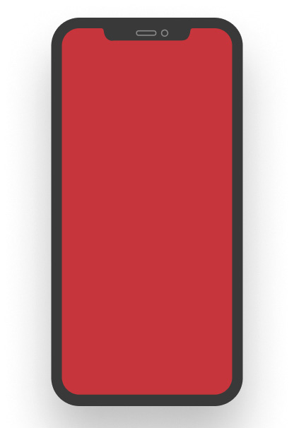
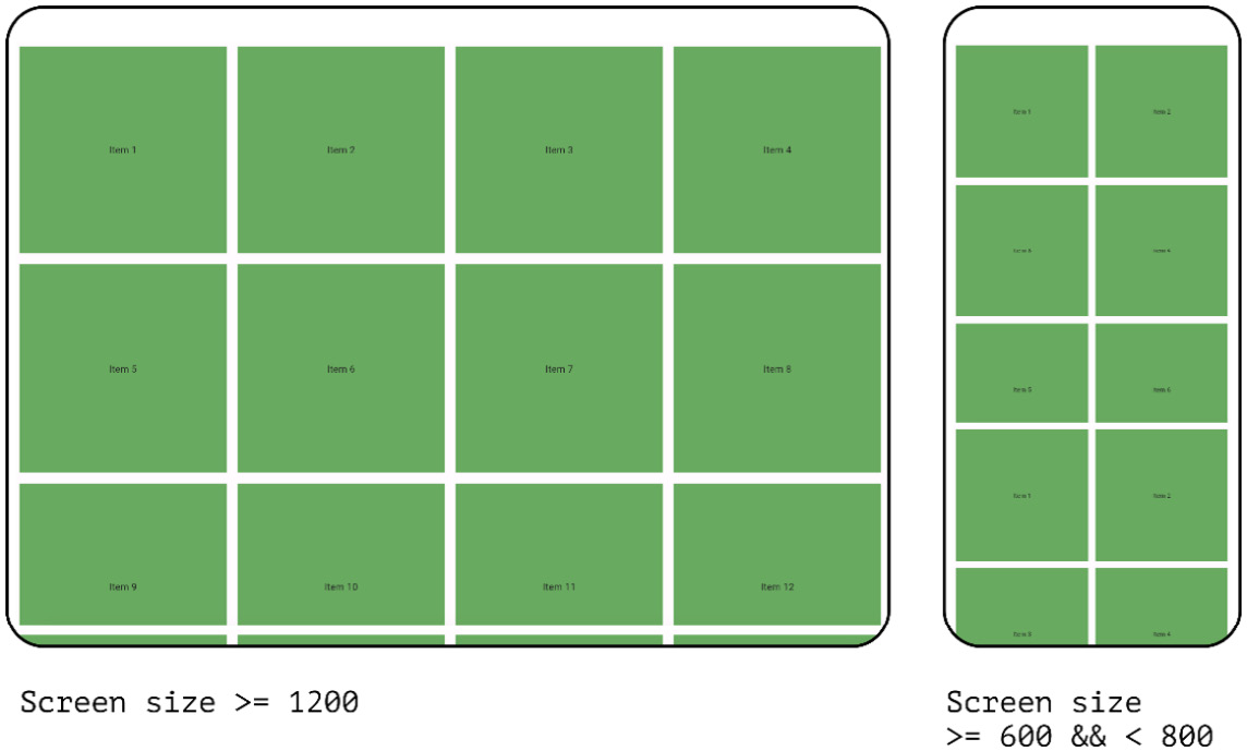
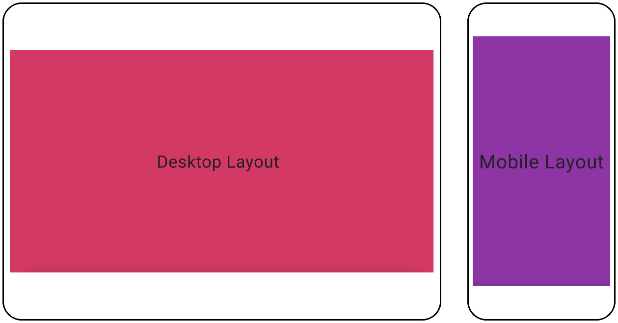


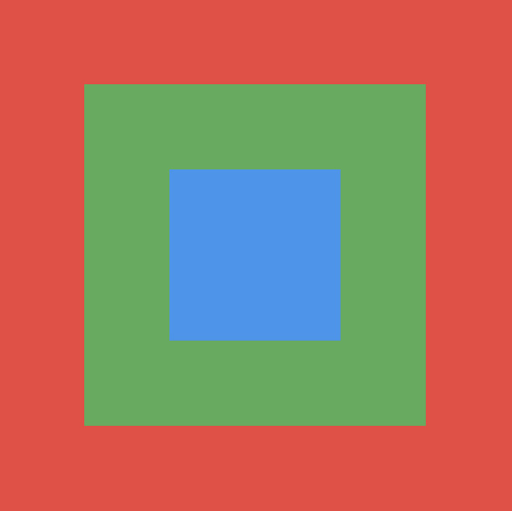


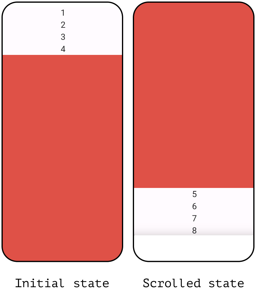
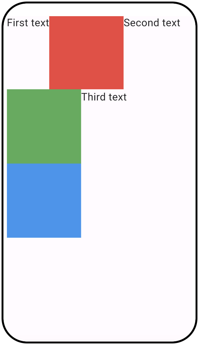
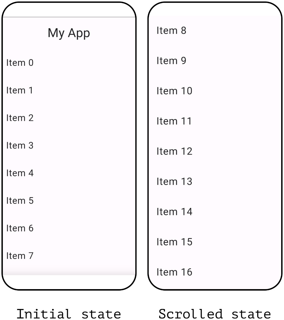
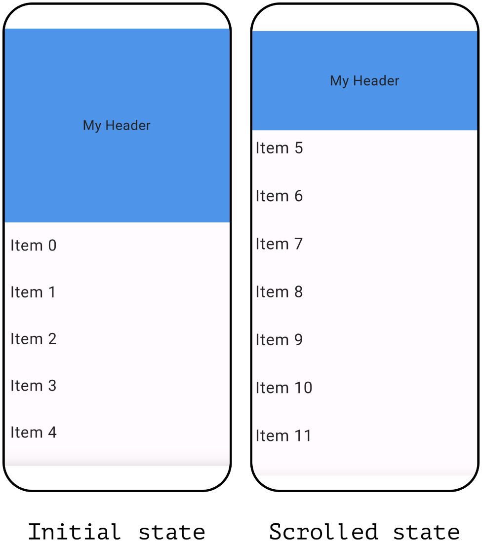
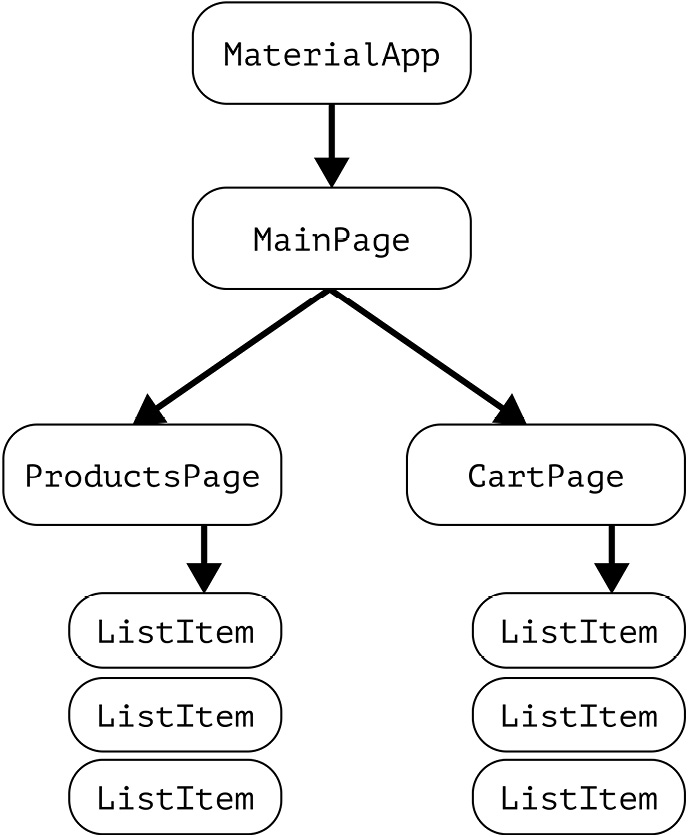
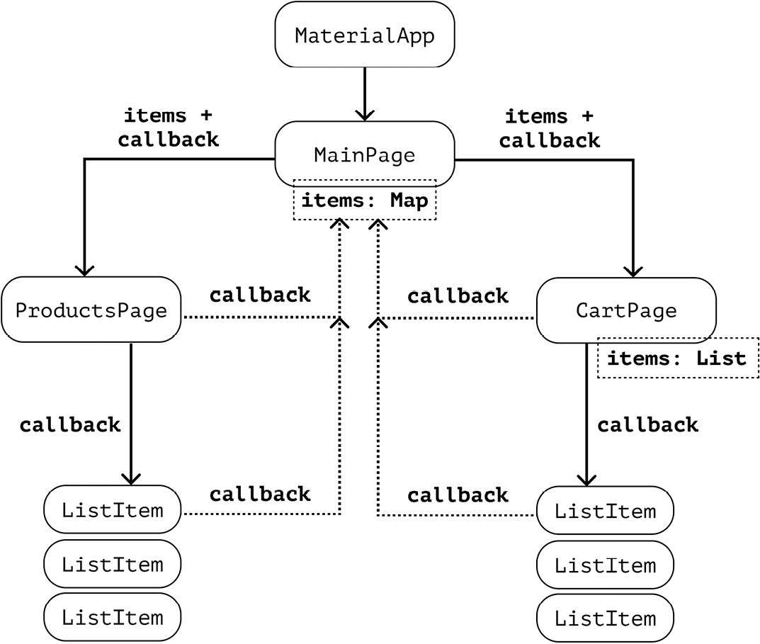
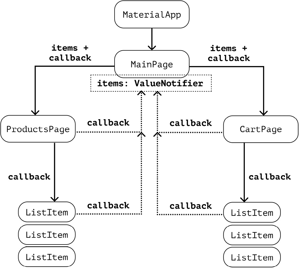
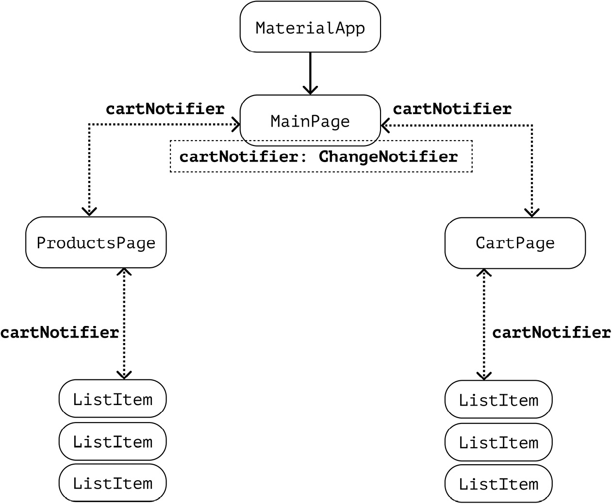
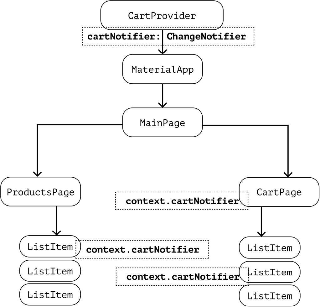
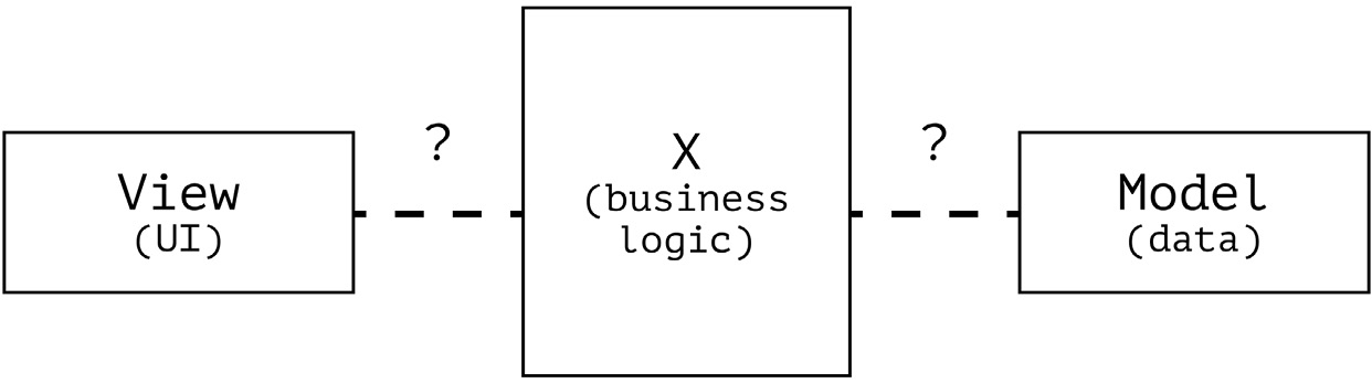
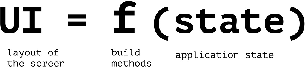
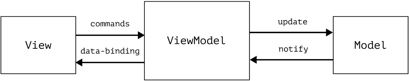
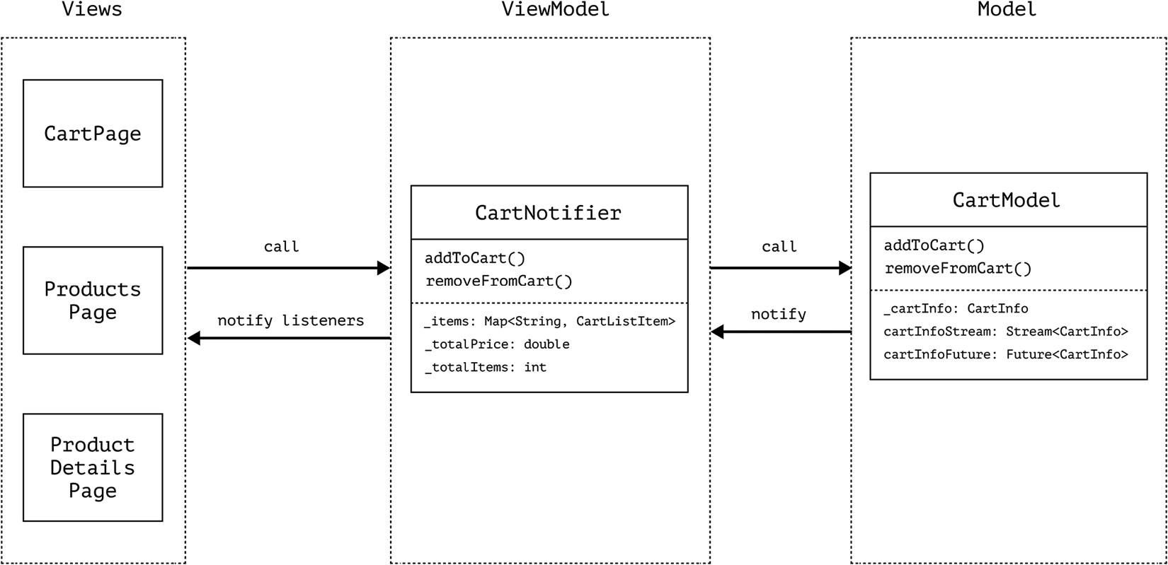
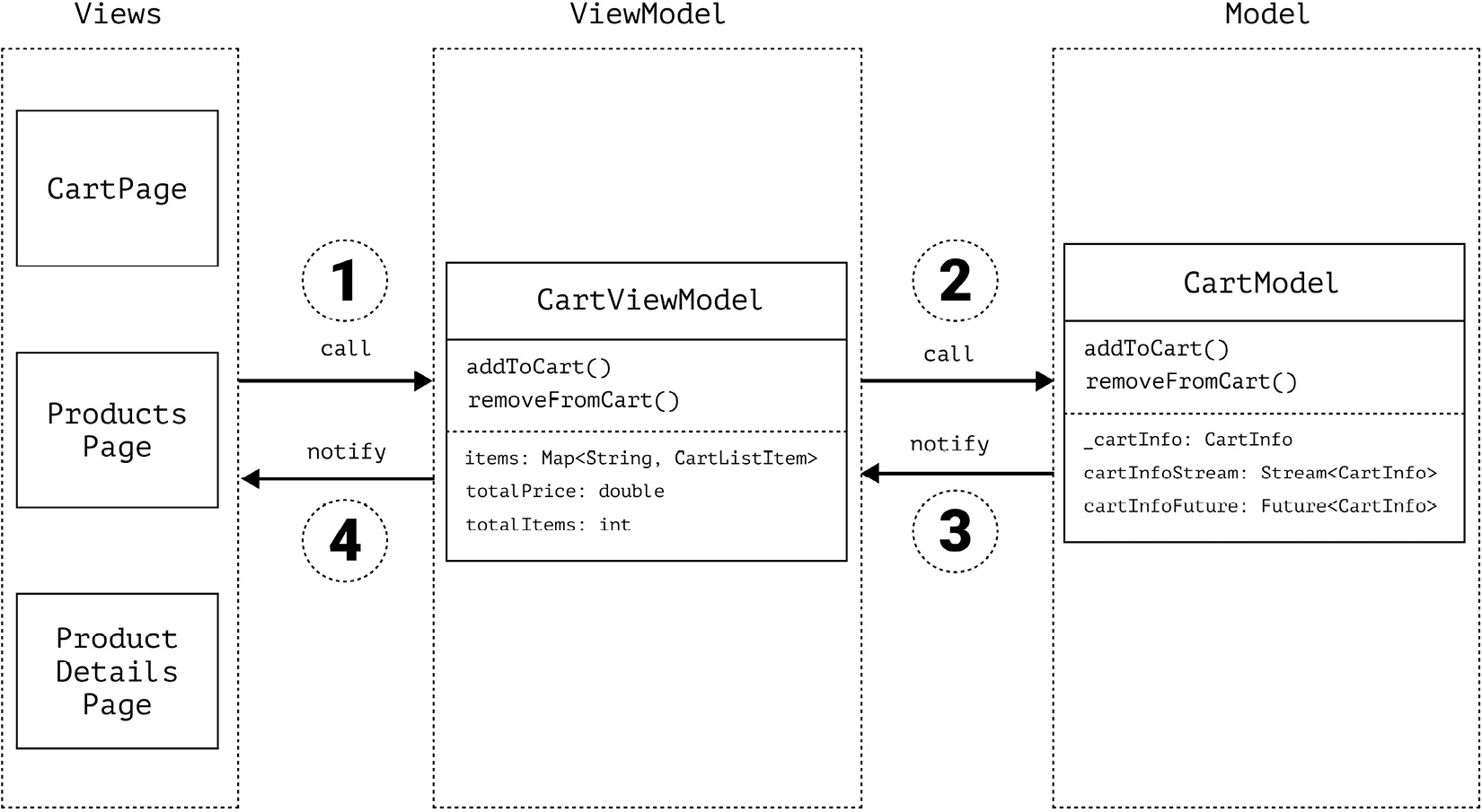
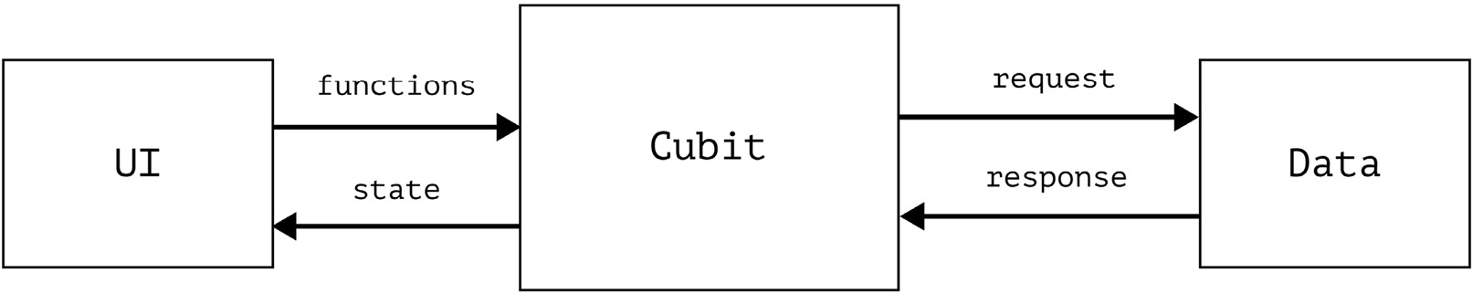
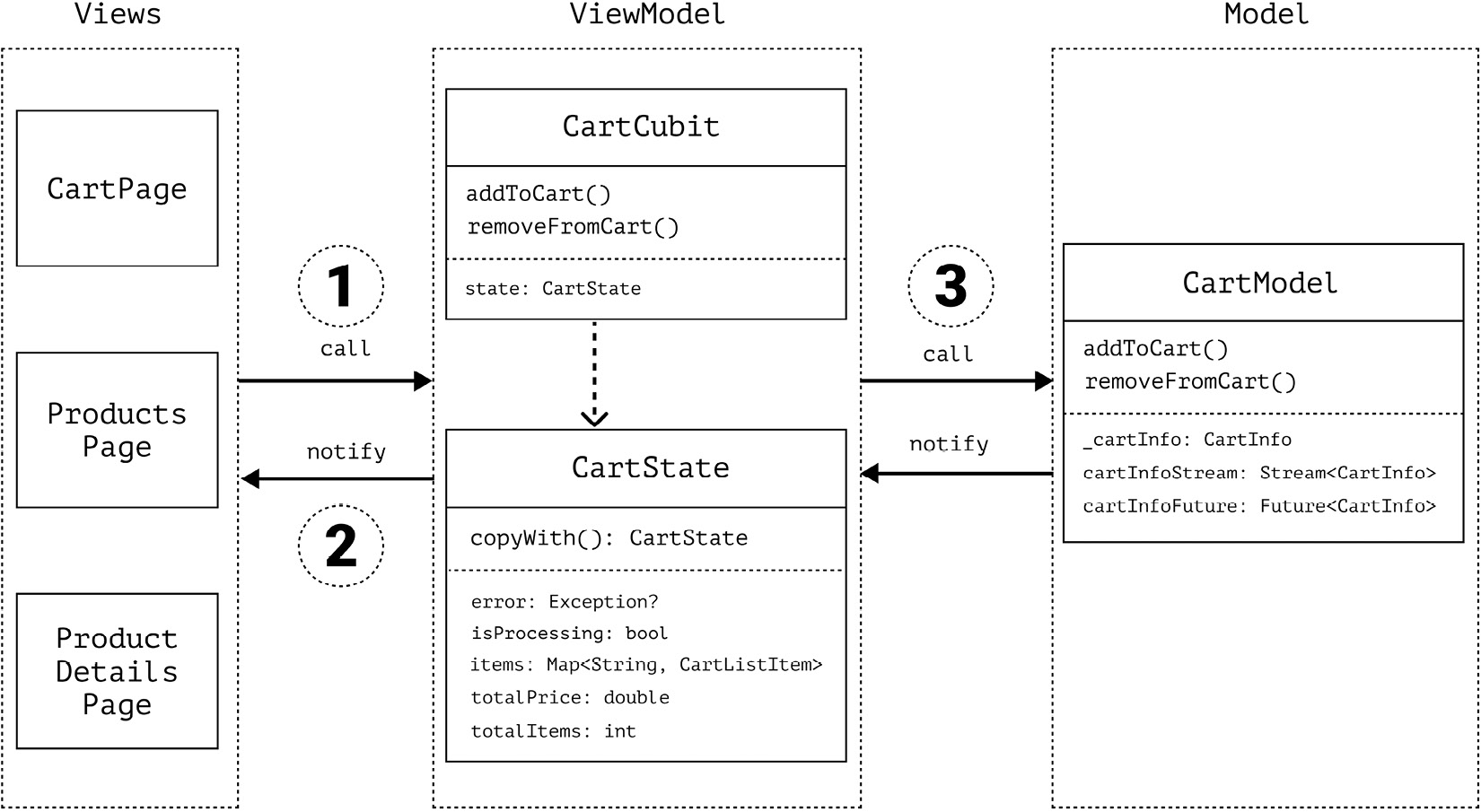
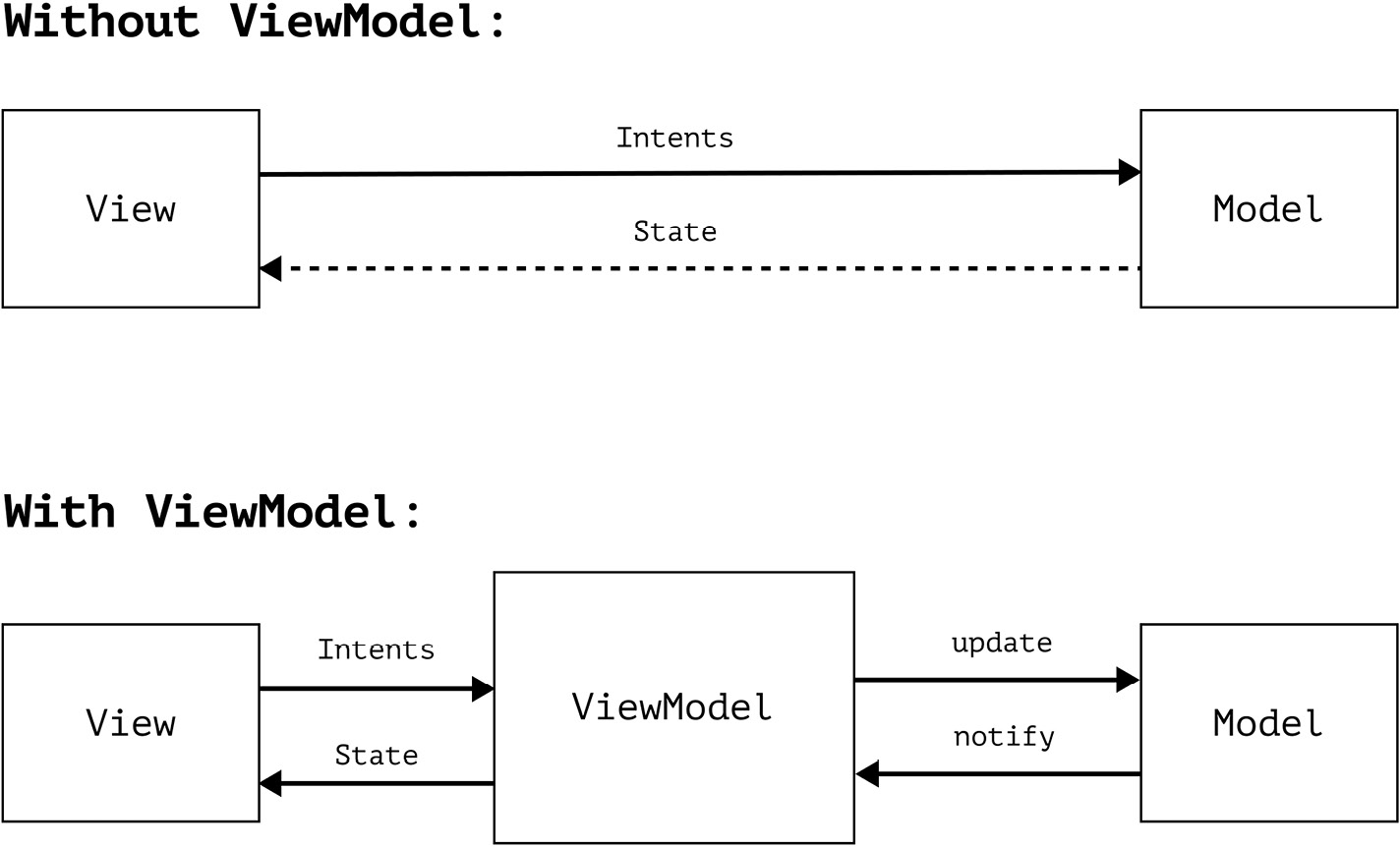
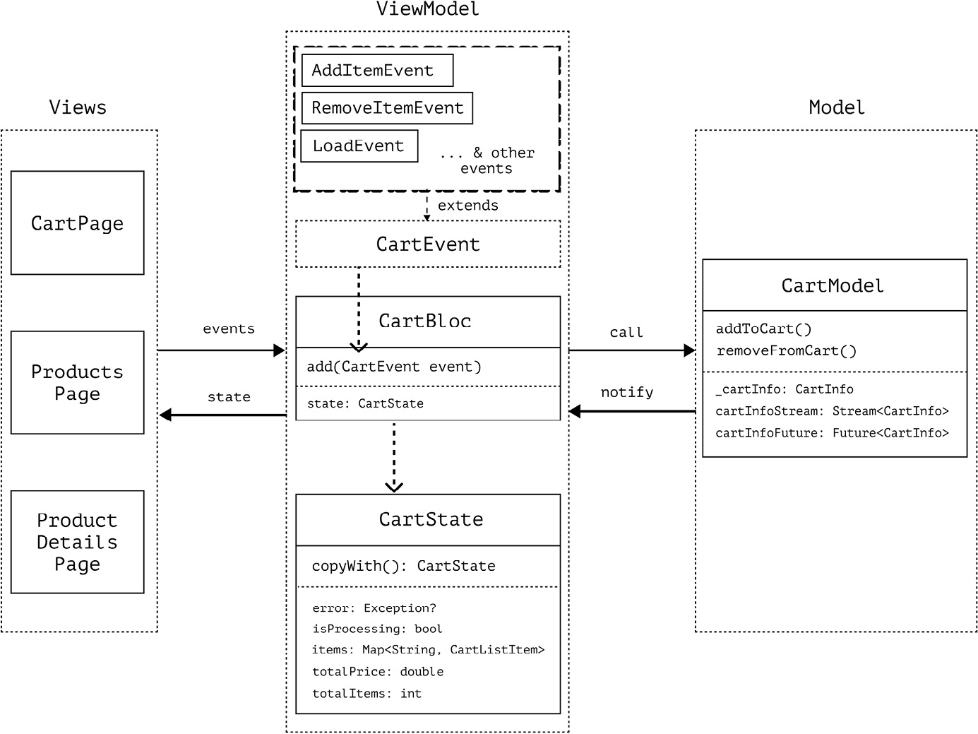
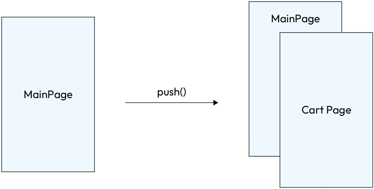
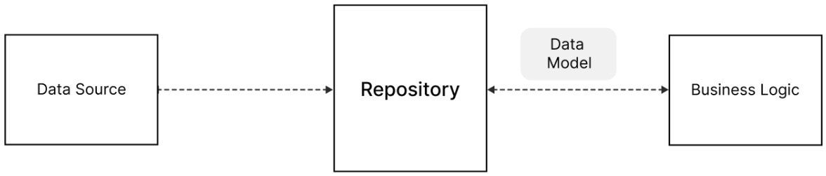
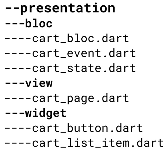
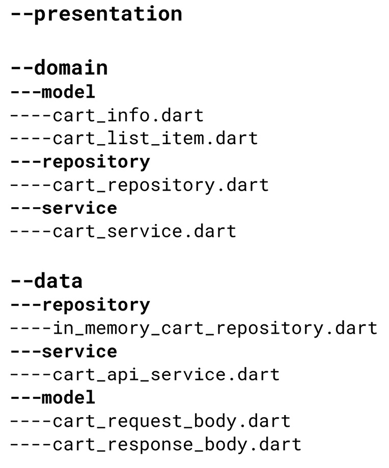
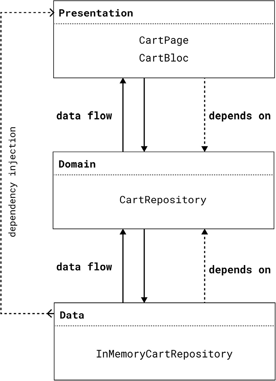
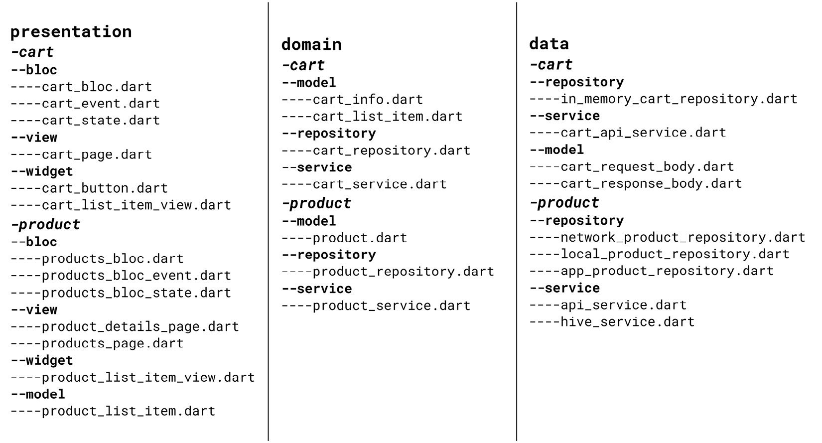
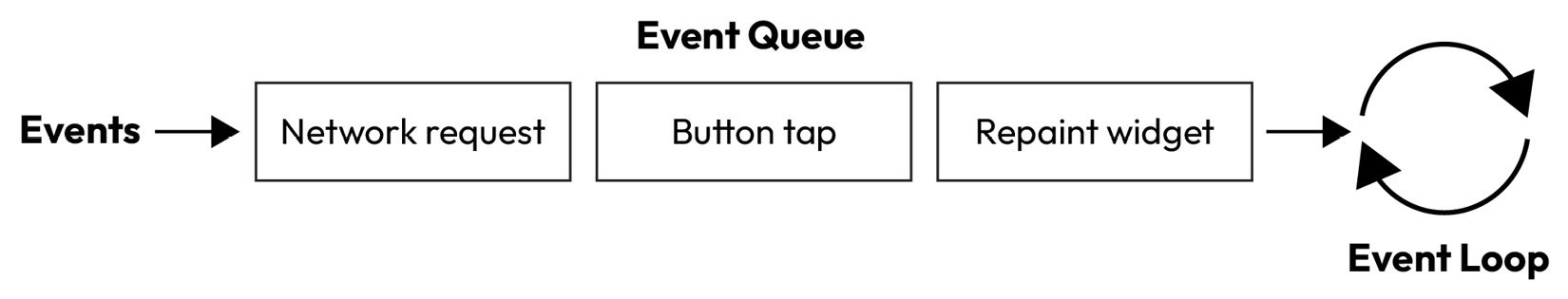
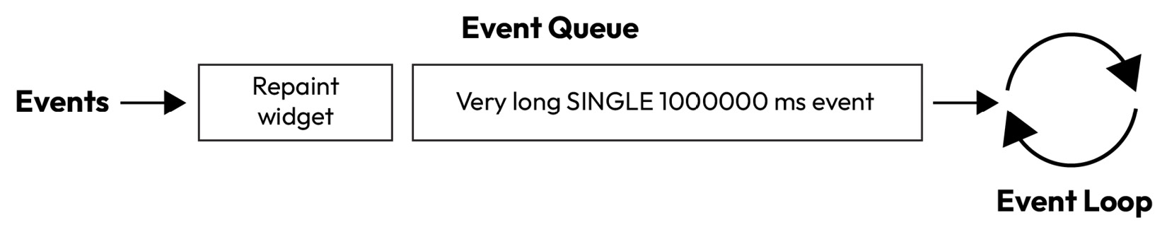
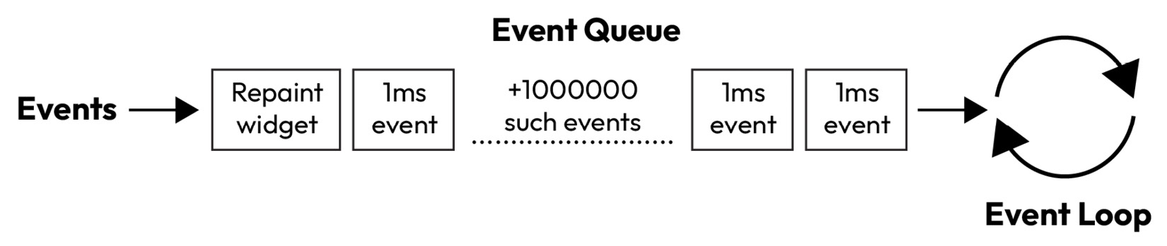
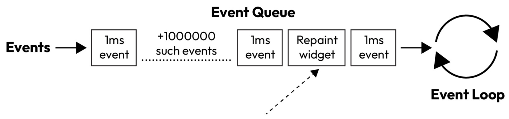
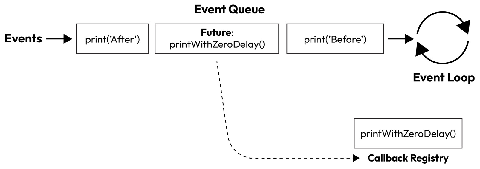
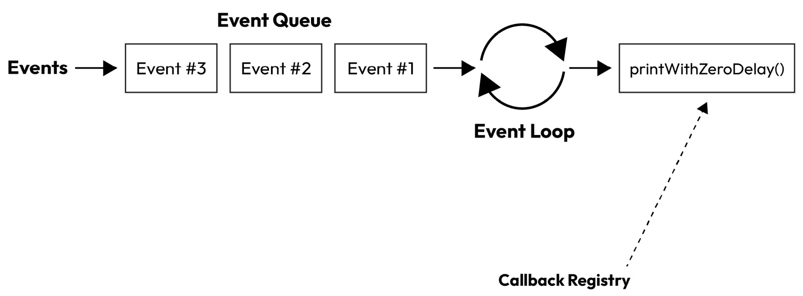
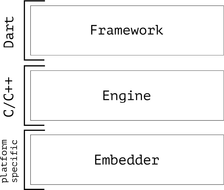
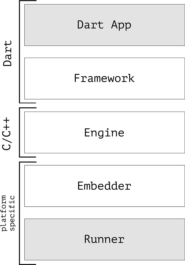
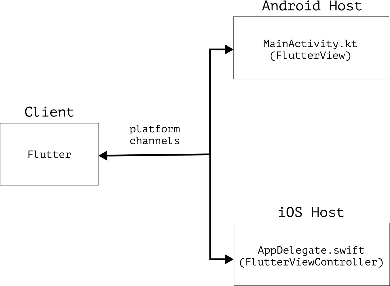
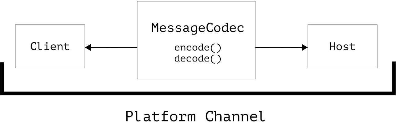
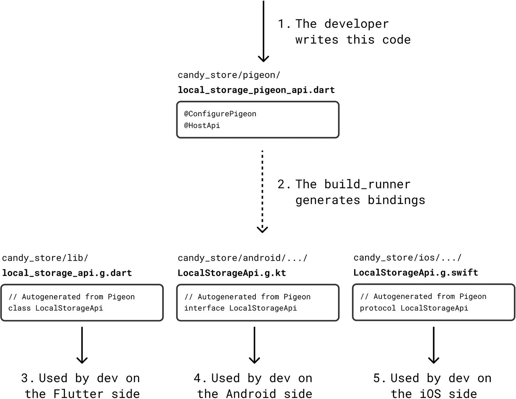


 浙公网安备 33010602011771号