
Android 自定义View 三板斧之三——重写View来实现全新控件
通常情况下,Android实现自定义控件无非三种方式。
Ⅰ、继承现有控件,对其控件的功能进行拓展。
Ⅱ、将现有控件进行组合,实现功能更加强大控件。
Ⅲ、重写View实现全新的控件
本文来讨论最难的一种自定义控件形式,重写View来实现全新的控件。
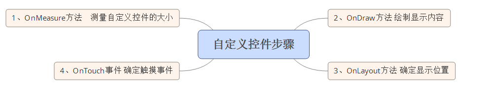
首先,我们要明白在什么样的情况下,需要重写View来实现一种全新的控件,一般当我们遇到了原生控件无法满足我们现有的需求的时候,我们此时就可以考虑创建一个全新的View来实现我们所需要的功能。创建一个全新View实现自定义控件,无非分成这么几步:
Ⅰ、在OnMeasure()方法中,测量自定义控件的大小,使自定义控件能够自适应布局各种各样的需求。
Ⅱ、在OnDraw()方法中,利用哼哈二将(Canvas与Paint)来绘制要显示的内容。
Ⅲ、在OnLayout()方法中来确定控件显示位置。
Ⅳ、在OnTouchEvent()方法处理控件的触摸事件。
相应的思维导图如下:
多说无益,我们通过几个小案例,来讲解到底如何实现自定义控件。
一、一个带有比例进度的环形控件
首先看一下这个控件的示意图:
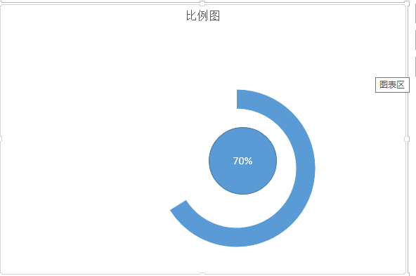
通过这个简单的示意图,我们对于项目所完成的比例,就一目了然了。通过这个简单的示意图,我们可以很快速的把这个图形分成三个部分。Ⅰ、外层的环,Ⅱ、里面的园,三、相应文字。有了这个思路以后,我们只需要在onDraw()方法中一个个进行绘制罢了。我这里为了简单起见,把这个控件的宽度设置为屏幕的宽度。
首先,还是老样子,为自定义控件设置一些自定义属性,便于调用者对其进行扩展,自定义属性的设置代码为:
  <declare-styleable name="circleView">
        <attr name="textSize" format="dimension" />
        <attr name="text" format="string" />
        <attr name="circleColor" format="color" />
        <attr name="arcColor" format="color" />
        <attr name="textColor" format="color" />
        <attr name="startAngle" format="integer" />
        <attr name="sweepAngle" format="integer" />
    </declare-styleable>
Ⅰ、textSize——对应中间文本文字的大小
Ⅱ、text——对应中间文本
Ⅲ、circleColor——对应内圆的颜色
Ⅳ、arcColor——对应外环的颜色
Ⅴ、textColor——对应文本的颜色
Ⅵ、startAngle——对应外环的起始角度
Ⅶ、sweepAngle——对应外环扫描角度
紧接着,就是在自定义控件的初始化方法中来获取这些自定义属性:
TypedArray ta = context.obtainStyledAttributes(attrs,
                R.styleable.circleView);
        if (ta != null) {
            circleColor = ta.getColor(R.styleable.circleView_circleColor, 0);
            arcColor = ta.getColor(R.styleable.circleView_arcColor, 0);
            textColor = ta.getColor(R.styleable.circleView_textColor, 0);
            textSize = ta.getDimension(R.styleable.circleView_textSize, 50);
            text = ta.getString(R.styleable.circleView_text);
            startAngle = ta.getInt(R.styleable.circleView_startAngle, 0);
            sweepAngle = ta.getInt(R.styleable.circleView_sweepAngle, 90);
            ta.recycle();
        }
这里在多说一嘴子,为了释放更多的资源,一定要将TypedArray这个对象进行资源的释放。
接下来,在OnMeasure()方法中,初始化要绘制画笔样式,获取屏幕的宽度,计算中间位置的坐标,以及指定外接矩形的宽高代码如下:
    private void init() {
        int length = Math.min(width, height);
        mCircleXY = length / 2;
        mRadius = length * 0.5f / 2;
        mCirclePaint = new Paint(Paint.ANTI_ALIAS_FLAG);
        mCirclePaint.setColor(circleColor);
        mRectF = new RectF(length * 0.1f, length * 0.1f, length * 0.9f,
                length * 0.9f);

        mArcPaint = new Paint(Paint.ANTI_ALIAS_FLAG);
        mArcPaint.setColor(arcColor);
        mArcPaint.setStyle(Paint.Style.STROKE);
        mArcPaint.setStrokeWidth((width * 0.1f));

        mTextPaint = new Paint(Paint.ANTI_ALIAS_FLAG);
        mTextPaint.setTextSize(textSize);
        mTextPaint.setColor(textColor);
        mTextPaint.setTextAlign(Align.CENTER);

    }
将我们设置的自定义属性,设置给不同笔刷。
做了这么多准备以后,我们所需的就是在OnDraw方法中绘制内圆、外环与文字。代码如下:
@Override
    protected void onDraw(Canvas canvas) {
        super.onDraw(canvas);
        drawSth(canvas);
    }

    private void drawSth(Canvas canvas) {
        canvas.drawCircle(mCircleXY, mCircleXY, mRadius, mCirclePaint);
        canvas.drawArc(mRectF, startAngle, sweepAngle, false, mArcPaint);
        canvas.drawText(text, 0, text.length(), mCircleXY, mCircleXY + textSize
                / 4, mTextPaint);
    }
需要指出的是,画环形需要在一个指定矩形区域画取,并且要指定起始角度,扫描角度,这些变量都是自定义属性。
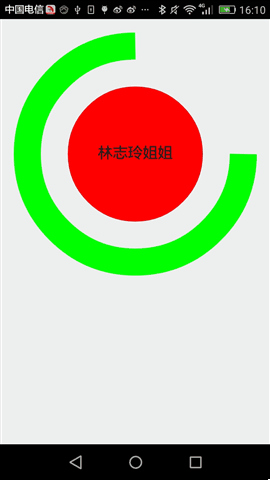
这个自定义控件的最终的运行效果为:
二、动态条形图
条形图,应该在图表展示系统中再普通不过的一种图标了。静态示意图就像这样:

通过这个简单的示意图,我们所需要做的是,绘制一个个的矩形,然后将每一个矩形x坐标平移一定的单位,我们还看到这么一个现象:每个条形图的起始点不一致,而终止点是一样的。起始坐标用个Random(随机函数)刚刚好,实现静态条形图就是这样的思路:
首先,在OnMeasure()方法中计算出每个矩形宽与高,这里为了方便起见,每个矩形默认的高为屏幕的高,每个矩形的宽这里定义为屏幕的宽度乘以80%除以矩形的个数。然后根据宽与高来初始化笔刷(Paint)。为什么要根据宽与高来初始化笔刷了,这里我为了使自定义View更加的逼真,我这里使用LinearGradient(线性渲染器)进行了渲染,这个对象需要使用矩形宽与高。需要指出来的是这个自定义控件是动态的,我只需要onDraw方法不断发生重绘,这里为了防止控件刷新太快,我这里每隔300毫秒刷新视图。这个控件的完整源代码如下:
public class VolumneView extends View {

    private Paint mPaint;
    private int mCount;
    private int mWidth;
    private int mRectHeight;
    private int mRectWidth;
    private LinearGradient mLinearGradient;
    private double mRandom;
    private float mcurrentHeight;

    public static final int OFFSET = 5;

    public VolumneView(Context context, AttributeSet attrs, int defStyleAttr) {
        super(context, attrs, defStyleAttr);
        initView(context, attrs);

    }

    private void initView(Context context, AttributeSet attrs) {
        mPaint = new Paint(Paint.ANTI_ALIAS_FLAG);
        mPaint.setColor(Color.GREEN);
        mPaint.setStyle(Paint.Style.FILL);
        TypedArray ta = context.obtainStyledAttributes(attrs,
                R.styleable.volumneView);
        if (ta != null) {
            mCount = ta.getInt(R.styleable.volumneView_count, 6);
            ta.recycle();
        }
    }

    public VolumneView(Context context, AttributeSet attrs) {
        this(context, attrs, 0);
    }

    public VolumneView(Context context) {
        this(context, null);
    }

    @Override
    protected void onSizeChanged(int w, int h, int oldw, int oldh) {
        super.onSizeChanged(w, h, oldw, oldh);
        mWidth = getMeasuredWidth();
        mRectHeight = getMeasuredHeight();
        mRectWidth = (int) (mWidth * 0.8 / mCount);
        mLinearGradient = new LinearGradient(0, 0, mRectWidth, mRectHeight,
                Color.GREEN, Color.YELLOW, TileMode.CLAMP);
        mPaint.setShader(mLinearGradient);

    }

    @Override
    protected void onDraw(Canvas canvas) {
        super.onDraw(canvas);
        for (int i = 0; i < mCount; i++) {
            mRandom = Math.random();
            mcurrentHeight = (float) (mRectHeight * mRandom);
            float width = (float) (mWidth * 0.4 / 2 + OFFSET);
            canvas.drawRect(width + i * mRectWidth, mcurrentHeight, width
                    + (i + 1) * mRectWidth, mRectHeight, mPaint);
        }
        postInvalidateDelayed(300);
    }
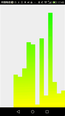
最终,运行效果如下:
后记,通过这两个简单控件,相信大家对于自定义控件基本步骤有说了解,当然,要真正做好自定义控件的话,我们还需要按这个步骤一步步的来。任重而道远。
本人才疏学浅,恳请吐槽。

 浙公网安备 33010602011771号