Vue大屏可视化自适应(等比列缩放)方案✔️✔️✔️✨
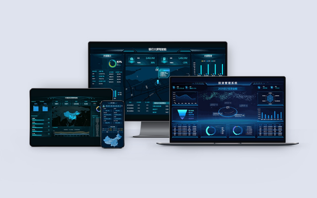
在vue大屏可视化项目中,自适应是确保在不同尺寸屏幕上正常显示的关键需求。下面我将详细介绍我在项目开发中常用的方案:Scale方案的实现✔️✔️
1,常用自适应方案
CSS媒体查询 - 针对不同屏幕尺寸编写不同样式
Flex/Grid布局 - 使用弹性布局适应不同尺寸
Rem/VW单位 - 使用相对单位实现响应式
Scale缩放方案 - 通过CSS transform缩放整个应用
多端适配 - 为不同设备提供不同布局
2,Scale缩放方案详解
Scale方案通过计算缩放比例,使用CSS transform对整个应用容器进行缩放,实现内容在不同屏幕上的等比缩放
2.1 实现步骤
2.2 基础HTML结构
<template>
  <div class="screen-container">
    <div class="screen-wrapper" ref="screenRef">
      <!-- 大屏内容 -->
      <div class="dashboard-content">
        <!-- 各种图表和组件 -->
      </div>
    </div>
  </div>
</template>
2.3 核心CSS样式
.screen-container {
  width: 100vw;
  height: 100vh;
  overflow: hidden;
  background: #0a1a35;
}

.screen-wrapper {
  position: relative;
  width: 1920px;   /* 设计稿宽度 */
  height: 1080px;  /* 设计稿高度 */
  transform-origin: 0 0; /* 缩放基点设为左上角 */
  transition: transform 0.3s; /* 添加过渡效果 */
}

.dashboard-content {
  width: 100%;
  height: 100%;
  /* 其他样式 */
}
2.4 .Vue组件实现
<template>
  <div class="screen-container">
    <div
      class="screen-wrapper"
      ref="screenRef"
      :style="{
        transform: `scale(${scaleRatio}) translate(-50%, -50%)`,
        left: '50%',
        top: '50%'
      }"
    >
      <!-- 大屏内容 -->
      <div class="dashboard-content">
        <div class="header">数据可视化大屏</div>
        <div class="content">
          <div class="chart-section">
            <div class="chart-box">图表1</div>
            <div class="chart-box">图表2</div>
            <div class="chart-box">图表3</div>
          </div>
          <div class="chart-section">
            <div class="chart-box">图表4</div>
            <div class="chart-box">图表5</div>
          </div>
        </div>
      </div>
    </div>
  </div>
</template>

<script>
export default {
  name: 'ScaleDashboard',
  data() {
    return {
      scaleRatio: 1,
      baseWidth: 1920,  // 设计稿宽度
      baseHeight: 1080, // 设计稿高度
    }
  },
  mounted() {
    this.updateScale()
    window.addEventListener('resize', this.updateScale)
  },
  beforeDestroy() {
    window.removeEventListener('resize', this.updateScale)
  },
  methods: {
    updateScale() {
      // 获取当前窗口尺寸
      const { clientWidth, clientHeight } = document.documentElement

      // 计算宽高缩放比例
      const widthRatio = clientWidth / this.baseWidth
      const heightRatio = clientHeight / this.baseHeight

      // 选择较小的比例确保内容完全显示
      this.scaleRatio = Math.min(widthRatio, heightRatio)
    }
  }
}
</script>

<style scoped>
.screen-container {
  width: 100vw;
  height: 100vh;
  overflow: hidden;
  background: linear-gradient(135deg, #0a1a35 0%, #1a3a5f 100%);
  position: relative;
}

.screen-wrapper {
  position: absolute;
  width: 1920px;
  height: 1080px;
  transform-origin: 0 0;
  transition: transform 0.3s;
  display: flex;
  flex-direction: column;
}

.dashboard-content {
  width: 100%;
  height: 100%;
  padding: 20px;
  box-sizing: border-box;
}

.header {
  height: 80px;
  background: rgba(16, 36, 66, 0.8);
  border: 1px solid rgba(32, 86, 166, 0.5);
  border-radius: 8px;
  display: flex;
  align-items: center;
  justify-content: center;
  color: #fff;
  font-size: 36px;
  font-weight: bold;
  margin-bottom: 20px;
  box-shadow: 0 0 20px rgba(32, 86, 166, 0.3);
}

.content {
  flex: 1;
  display: flex;
  flex-direction: column;
  gap: 20px;
}

.chart-section {
  display: flex;
  gap: 20px;
  flex: 1;
}

.chart-box {
  flex: 1;
  background: rgba(16, 36, 66, 0.6);
  border: 1px solid rgba(32, 86, 166, 0.4);
  border-radius: 8px;
  display: flex;
  align-items: center;
  justify-content: center;
  color: #a0c8ff;
  font-size: 24px;
  box-shadow: 0 0 15px rgba(32, 86, 166, 0.2);
  transition: all 0.3s;
}

.chart-box:hover {
  transform: translateY(-5px);
  box-shadow: 0 5px 20px rgba(32, 86, 166, 0.4);
}
</style>
2.5 高级实现 - 添加带防抖和限制的版本
// 在methods中添加
methods: {
updateScale() {
// 防抖处理
if (this.resizeTimer) {
clearTimeout(this.resizeTimer)
}
this.resizeTimer = setTimeout(() => {
const { clientWidth, clientHeight } = document.documentElement
// 限制最小缩放比例
const minScale = 0.5
const maxScale = 2
const widthRatio = clientWidth / this.baseWidth
const heightRatio = clientHeight / this.baseHeight
let scale = Math.min(widthRatio, heightRatio)
scale = Math.max(minScale, Math.min(scale, maxScale))
this.scaleRatio = scale
}, 300)
}
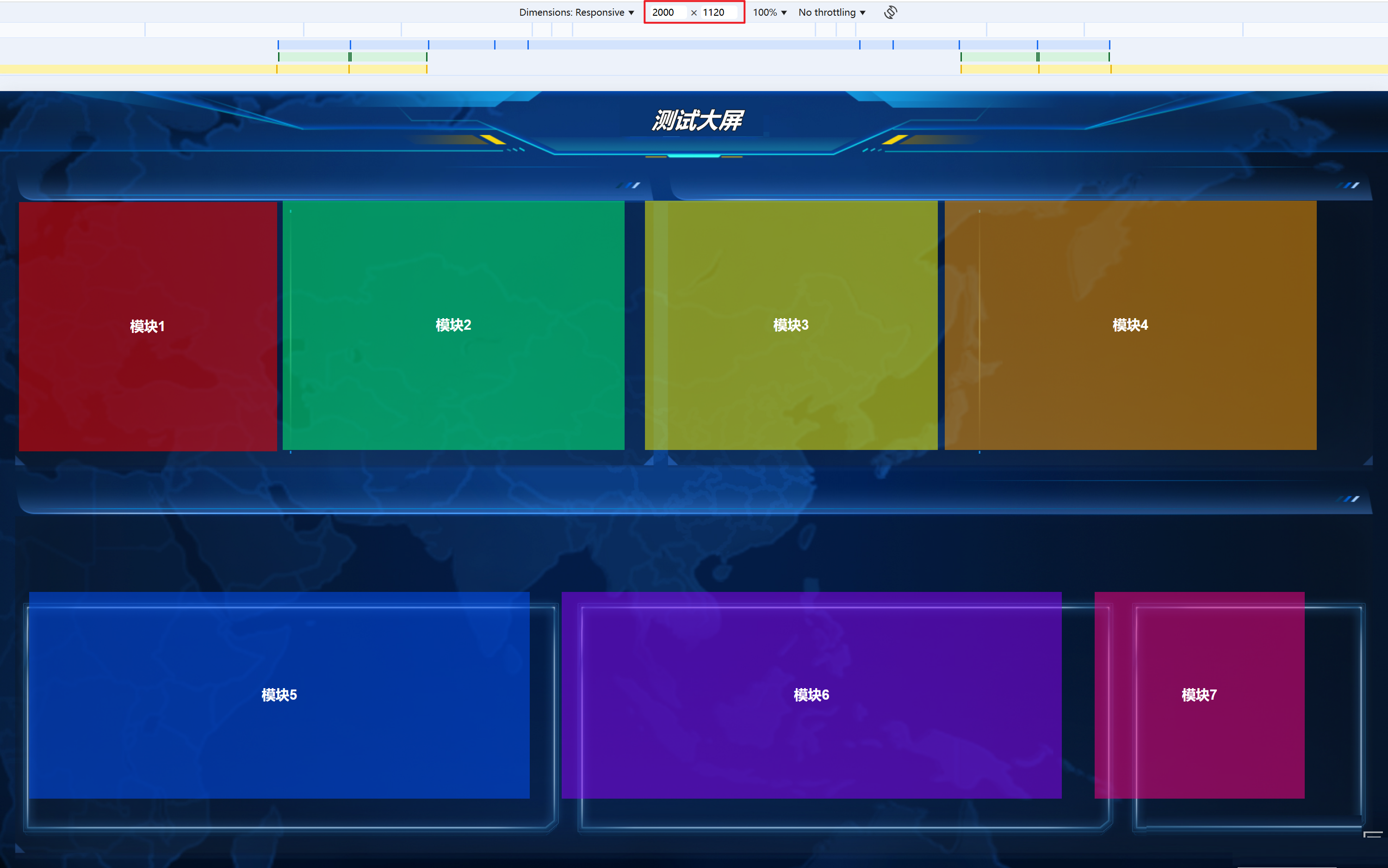
}3. 完整示例 - 带图表的可视化大屏
<template>
  <div class="screen-container">
    <div
      class="screen-wrapper"
      ref="screenRef"
      :style="wrapperStyle"
    >
      <!-- 顶部标题 -->
      <div class="header">
        <div class="title">智慧城市数据可视化平台</div>
        <div class="time">{{ currentTime }}</div>
      </div>

      <!-- 主要内容区域 -->
      <div class="main-content">
        <!-- 左侧图表 -->
        <div class="left-panel">
          <div class="chart-container">
            <div class="chart-title">实时数据监控</div>
            <div class="chart-content">图表1内容</div>
          </div>
          <div class="chart-container">
            <div class="chart-title">区域分布</div>
            <div class="chart-content">图表2内容</div>
          </div>
        </div>

        <!-- 中间地图 -->
        <div class="center-panel">
          <div class="map-container">
            <div class="map-title">城市热力图</div>
            <div class="map-content">地图组件</div>
          </div>
        </div>

        <!-- 右侧图表 -->
        <div class="right-panel">
          <div class="chart-container">
            <div class="chart-title">趋势分析</div>
            <div class="chart-content">图表3内容</div>
          </div>
          <div class="chart-container">
            <div class="chart-title">预警信息</div>
            <div class="chart-content">图表4内容</div>
          </div>
        </div>
      </div>

      <!-- 底部信息栏 -->
      <div class="footer">
        <div class="info-item">数据更新时间: {{ updateTime }}</div>
        <div class="info-item">系统状态: <span class="status">正常</span></div>
      </div>
    </div>
  </div>
</template>

<script>
export default {
  name: 'AdvancedScaleDashboard',
  data() {
    return {
      scaleRatio: 1,
      baseWidth: 1920,
      baseHeight: 1080,
      currentTime: '',
      updateTime: '',
      resizeTimer: null
    }
  },
  computed: {
    wrapperStyle() {
      return {
        transform: `scale(${this.scaleRatio}) translate(-50%, -50%)`,
        left: '50%',
        top: '50%'
      }
    }
  },
  mounted() {
    this.updateScale()
    this.updateTimeDisplay()
    window.addEventListener('resize', this.updateScale)

    // 每秒更新时间
    this.timeInterval = setInterval(this.updateTimeDisplay, 1000)
  },
  beforeDestroy() {
    window.removeEventListener('resize', this.updateScale)
    if (this.timeInterval) clearInterval(this.timeInterval)
    if (this.resizeTimer) clearTimeout(this.resizeTimer)
  },
  methods: {
    updateScale() {
      if (this.resizeTimer) {
        clearTimeout(this.resizeTimer)
      }
      this.resizeTimer = setTimeout(() => {
        const { clientWidth, clientHeight } = document.documentElement

        // 设置缩放限制
        const minScale = 0.4
        const maxScale = 1.5

        const widthRatio = clientWidth / this.baseWidth
        const heightRatio = clientHeight / this.baseHeight

        let scale = Math.min(widthRatio, heightRatio)
        scale = Math.max(minScale, Math.min(scale, maxScale))

        this.scaleRatio = scale
      }, 250)
    },

    updateTimeDisplay() {
      const now = new Date()
      this.currentTime = now.toLocaleString('zh-CN', {
        year: 'numeric',
        month: '2-digit',
        day: '2-digit',
        hour: '2-digit',
        minute: '2-digit',
        second: '2-digit',
        hour12: false
      })

      // 模拟数据更新时间(每分钟更新)
      if (now.getSeconds() === 0) {
        this.updateTime = this.currentTime
      }
    }
  }
}
</script>

<style scoped>
.screen-container {
  width: 100vw;
  height: 100vh;
  overflow: hidden;
  background: radial-gradient(ellipse at center, #0a1a35 0%, #050d1a 100%);
  position: relative;
}

.screen-wrapper {
  position: absolute;
  width: 1920px;
  height: 1080px;
  transform-origin: 0 0;
  transition: transform 0.3s;
  display: flex;
  flex-direction: column;
  padding: 20px;
  box-sizing: border-box;
}

.header {
  height: 100px;
  background: rgba(16, 36, 66, 0.7);
  border: 1px solid rgba(32, 86, 166, 0.5);
  border-radius: 10px;
  display: flex;
  align-items: center;
  justify-content: space-between;
  padding: 0 40px;
  color: #fff;
  margin-bottom: 20px;
  box-shadow: 0 0 30px rgba(32, 86, 166, 0.3);
}

.title {
  font-size: 42px;
  font-weight: bold;
  background: linear-gradient(90deg, #4facfe 0%, #00f2fe 100%);
  -webkit-background-clip: text;
  -webkit-text-fill-color: transparent;
}

.time {
  font-size: 28px;
  color: #a0c8ff;
}

.main-content {
  flex: 1;
  display: flex;
  gap: 20px;
  margin-bottom: 20px;
}

.left-panel, .right-panel {
  width: 400px;
  display: flex;
  flex-direction: column;
  gap: 20px;
}

.center-panel {
  flex: 1;
}

.chart-container, .map-container {
  background: rgba(16, 36, 66, 0.6);
  border: 1px solid rgba(32, 86, 166, 0.4);
  border-radius: 10px;
  box-shadow: 0 0 20px rgba(32, 86, 166, 0.2);
  overflow: hidden;
}

.chart-container {
  flex: 1;
}

.map-container {
  height: 100%;
}

.chart-title, .map-title {
  height: 50px;
  background: rgba(22, 48, 88, 0.8);
  display: flex;
  align-items: center;
  justify-content: center;
  color: #fff;
  font-size: 22px;
  font-weight: bold;
  border-bottom: 1px solid rgba(32, 86, 166, 0.3);
}

.chart-content, .map-content {
  height: calc(100% - 50px);
  display: flex;
  align-items: center;
  justify-content: center;
  color: #a0c8ff;
  font-size: 24px;
}

.footer {
  height: 60px;
  background: rgba(16, 36, 66, 0.7);
  border: 1px solid rgba(32, 86, 166, 0.4);
  border-radius: 8px;
  display: flex;
  align-items: center;
  justify-content: space-between;
  padding: 0 30px;
  color: #a0c8ff;
  font-size: 18px;
}

.status {
  color: #00ff8f;
  font-weight: bold;
}
</style>
3.1最佳实践建议
设置最小/最大缩放限制 - 防止过度缩放影响用户体验
添加防抖处理 - 优化窗口调整时的性能
使用transform-origin - 控制缩放基点
结合媒体查询 - 在极端情况下提供备选布局
上面的方案完全可以直接在Vue大屏项目中使用,并且能够实现完美的等比例缩放✔️✔️✔️

 浙公网安备 33010602011771号