
css背景雪碧图等
1、背景图 雪碧图技术
要设置背景,是要设置在某个盒子上
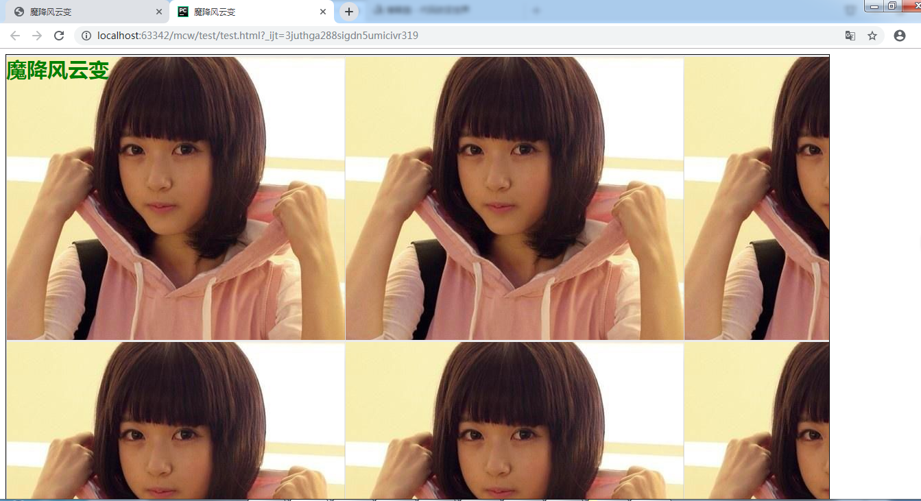
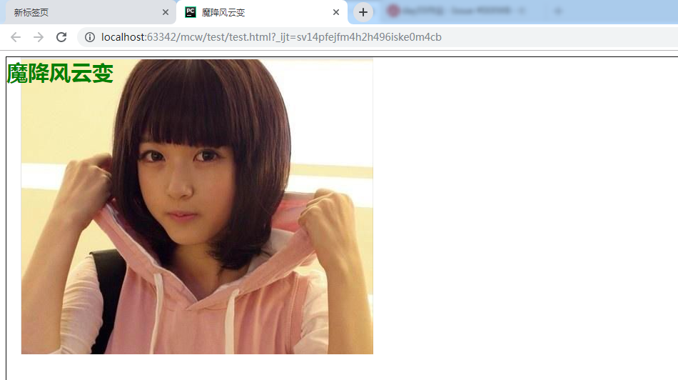
<!doctype html>
<html lang="en">
<head>
    <meta charset="UTF-8">
    <title>魔降风云变</title>
    <style>
        .bg{
            width: 1200px;
            height: 1200px;
            border: 1px solid #0c0c0c;
            background-image: url("3.png");
            color: green;
            font-weight: 700;
            font-size: 30px;
        }
    </style>
</head>
<body>
    <div class="bg">
        魔降风云变
    </div>
</body>
</html>
背景图,图片在文字的下面。“魔降风云变”这个元素作为 <div class="bg">魔降风云变</div>这个div的第一个元素
拿一张图片,平铺到设置了背景图的盒子上就像是天花板和地板砖,如果图片是有对称的,那么 会很好看。背景图比盒子的长和宽都小,实现横向平铺和纵向平铺。横向平铺就是水平平铺,纵向平铺就是垂直平铺
也可以让它不平铺,默认情况下它是background-repeat: repeat;,平铺。
background-repeat: repeat-x; //只显示水平方向的平铺
background-repeat: repeat-y; //只在垂直方向上平铺

background-repeat: no-repeat; //没有平铺 ,没有重复


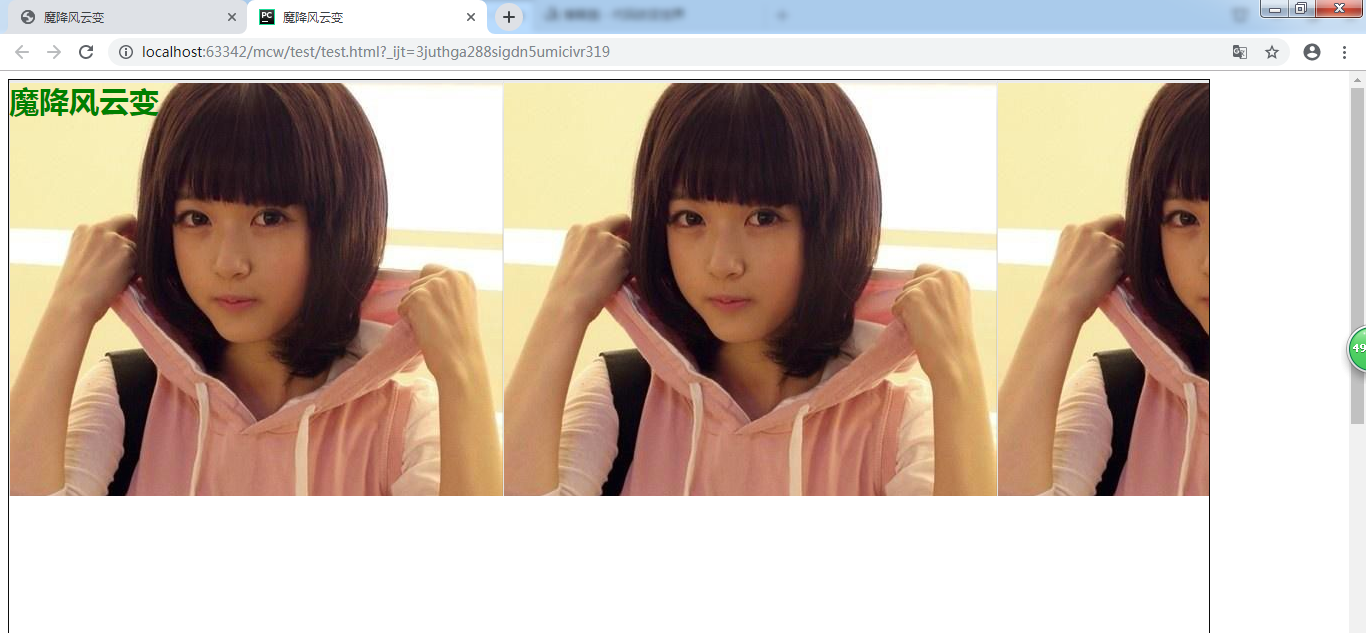
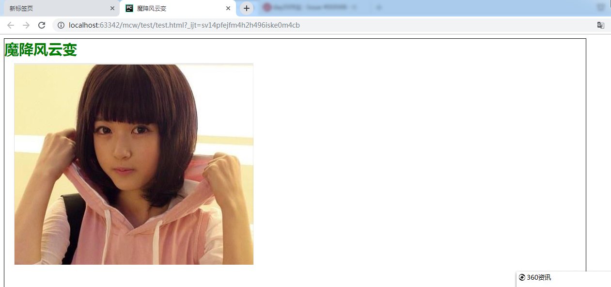
<!doctype html>
<html lang="en">
<head>
    <meta charset="UTF-8">
    <title>魔降风云变</title>
    <style>
        .bg{
            width: 500px;
            height: 420px;
            border: 1px solid #0c0c0c;
            background-image: url("3.png");
            color: green;
            background-repeat: no-repeat;
            font-weight: 700;
            font-size: 30px;
        }
    </style>
</head>
<body>
    <div class="bg">
        魔降风云变
    </div>
</body>
</html>
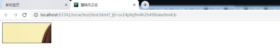
调整盒子宽高和图片一样:就是这个样子,文字在盒子的左上角开始,也是图片的左上角

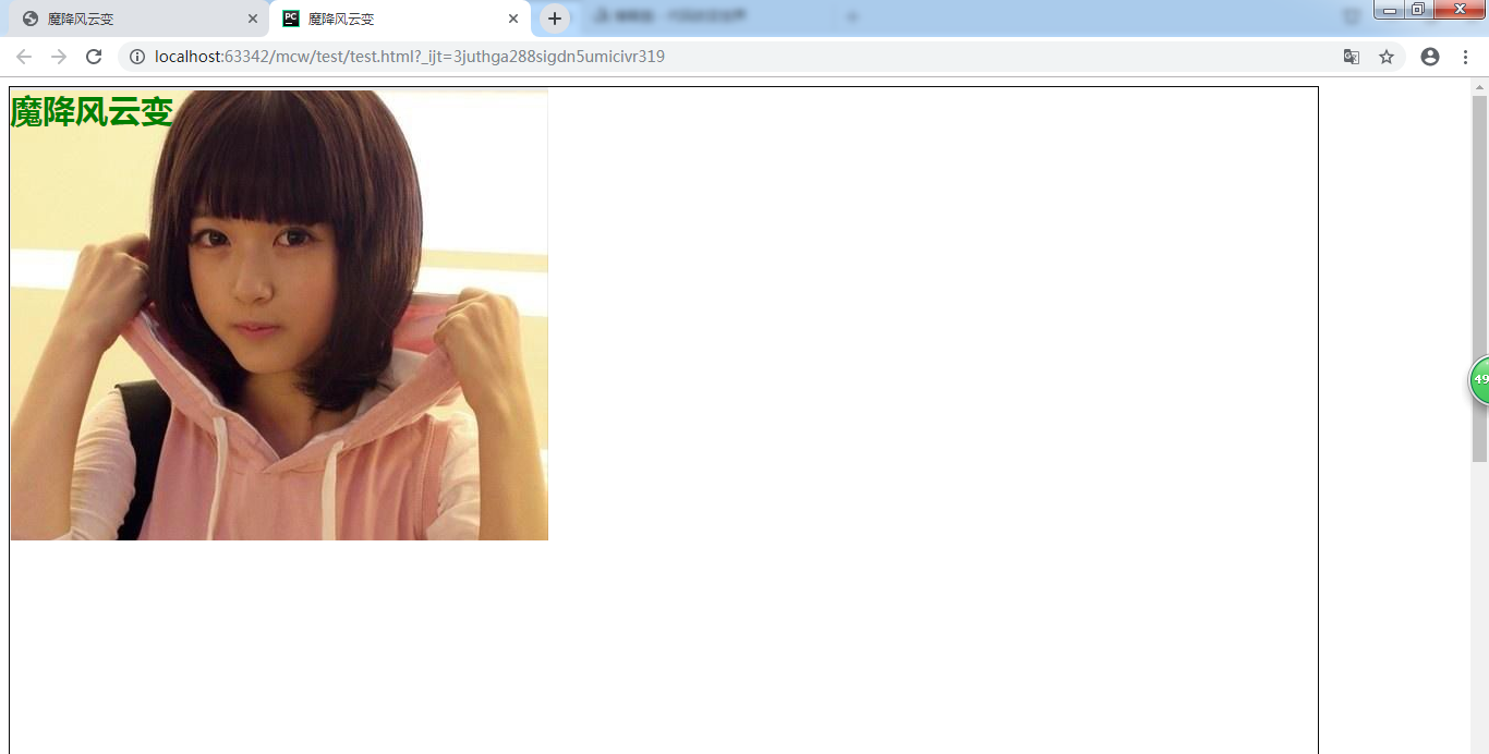
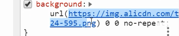
            background-image: url("3.png");
            background-repeat: no-repeat;
            background-position: 0 0;
默认是0 0,第一个是水平方向上的坐标,第二个是垂直方向上的坐标,以盒子左上角作为00点。第一个是左右方向,向左为正,向右为负
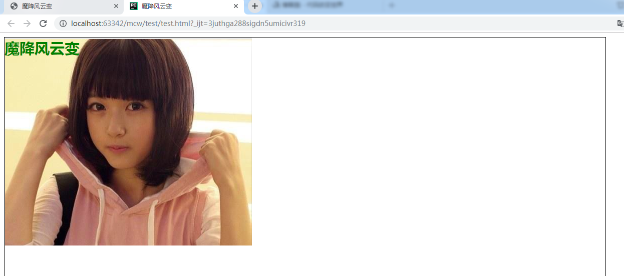
背景图往右走20px,
        background-image: url("3.png");
            background-repeat: no-repeat;
            background-position: 20px 0;
往下走50px
            background-image: url("3.png");
            background-repeat: no-repeat;
            background-position: 20px 50px;
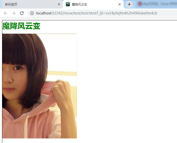
往左走200px,文字不会随着背景图的移动而移动
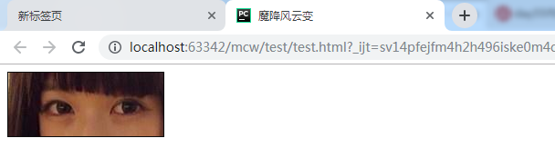
抠图,只需图片中的某一个部分:比如这里只要眼睛的图片:
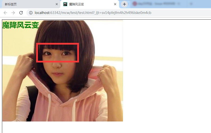
测量一下她的眼睛宽170px,高70px
那么外部的盒子让它就是这个尺寸
然后调整图片的位置:

将调试出来的数字放到css样式中
<!doctype html>
<html lang="en">
<head>
    <meta charset="UTF-8">
    <title>魔降风云变</title>
    <style>
        .bg{
            width: 170px;
            height: 70px;
            border: 1px solid #0c0c0c;
            background-image: url("3.png");
            background-repeat: no-repeat;
            background-position: -130px  -100px;
             color: green;
            font-weight: 700;
            font-size: 30px;
        }
    </style>
</head>
<body>
    <div class="bg">
        <!--魔降风云变-->
    </div>
</body>
</html>
            background-image: url("3.png");
            background-repeat: no-repeat;
            background-position: -130px  -100px;
background-position在css样式中也是一种技术,这种技术叫做精灵图技术,也叫雪碧图技术
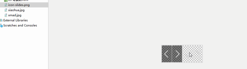
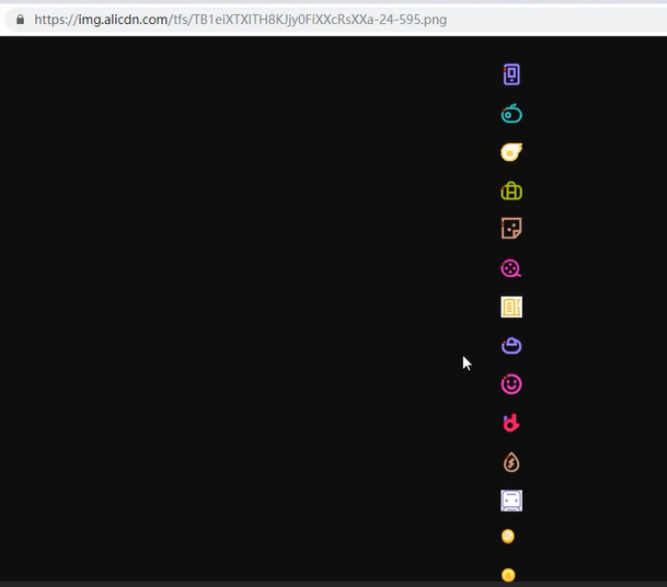
看下图,有个左箭头右箭头,鼠标指针指的地方是透明的左箭头右箭头,四个小图片
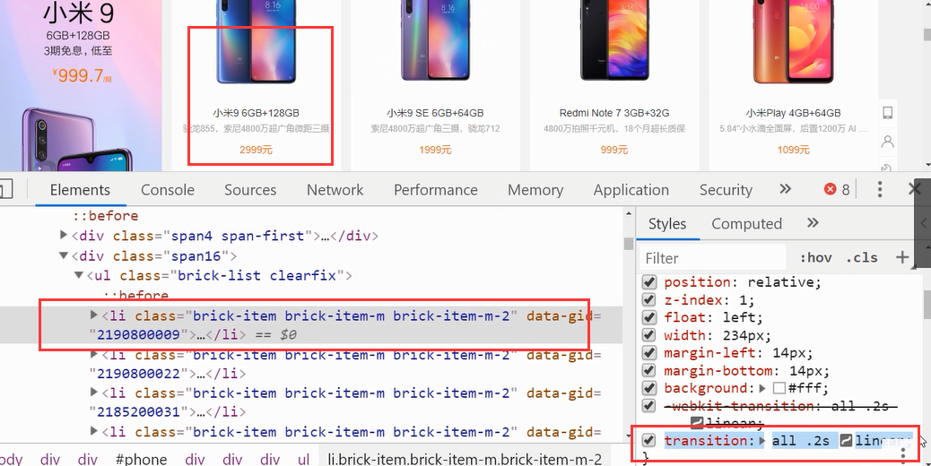
比如淘宝的下面这些地方:
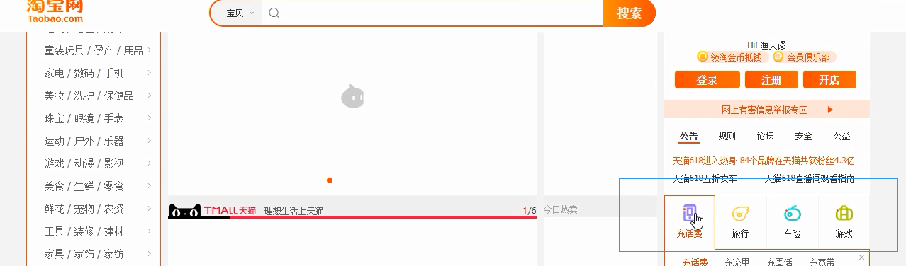
打开这个图片链接:这是一张图片里面很多小图,雪碧图技术就用于这种小图上。一个img标签相当于用户要向服务器发送一次请求,这对于服务器来说是施加压力的。因此可以将很多小图让美工贴到一张大图上,然后用这个background-position这个技术通过位置将每个小图抠出来。这样只需要请求一次这张大图,只请求了一次,减少了http请求的次数;但是也有坏处,比如又有新的小图了,美工又要贴,贴了再改,再去写;但是对比于服务器压力来说,减少服务器压力更重要
比如有些导航等等式渐进式的:颜色由淡变深。我们可以用css样式控制它的颜色。以前用的多的是美工做的,上面时淡淡的颜色,下面是深深的颜色
比如1px宽的图片,渐进式的,设置成背景图横向平铺。现在用的很多的是字体图标

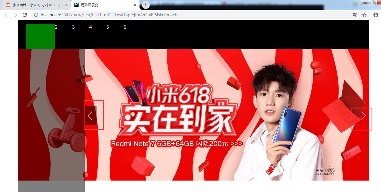
2、雪碧图使用案例,轮播图
那么用这个
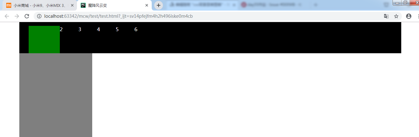
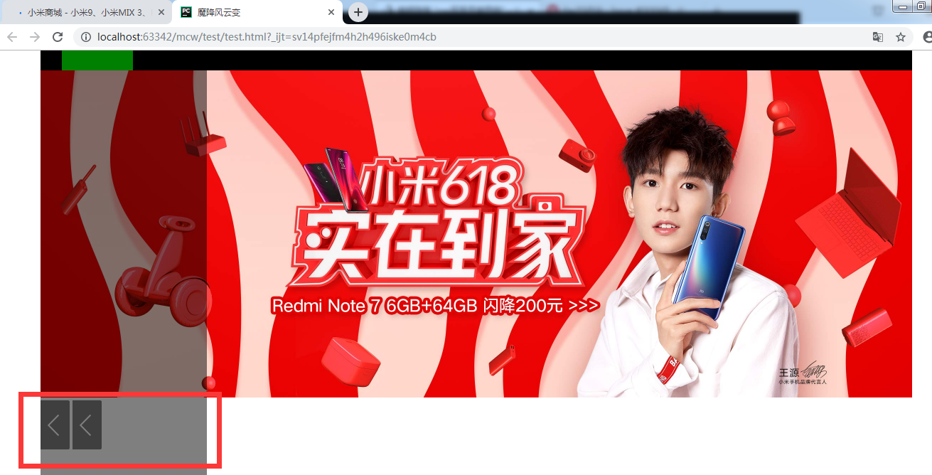
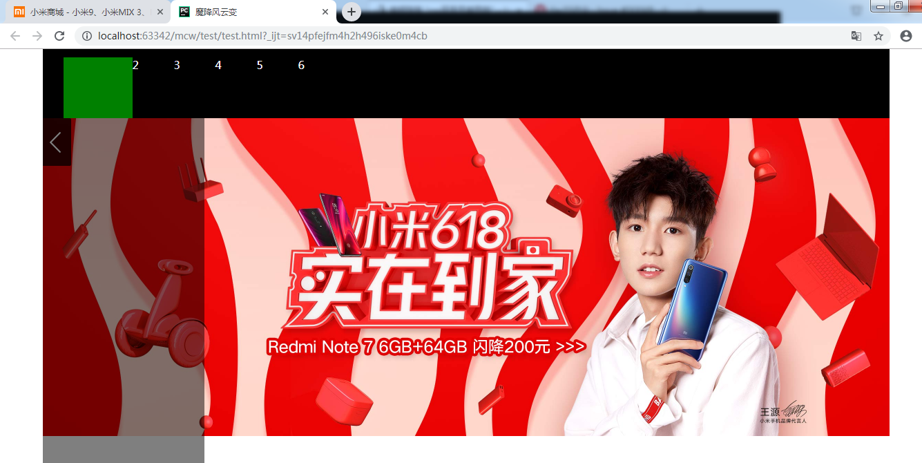
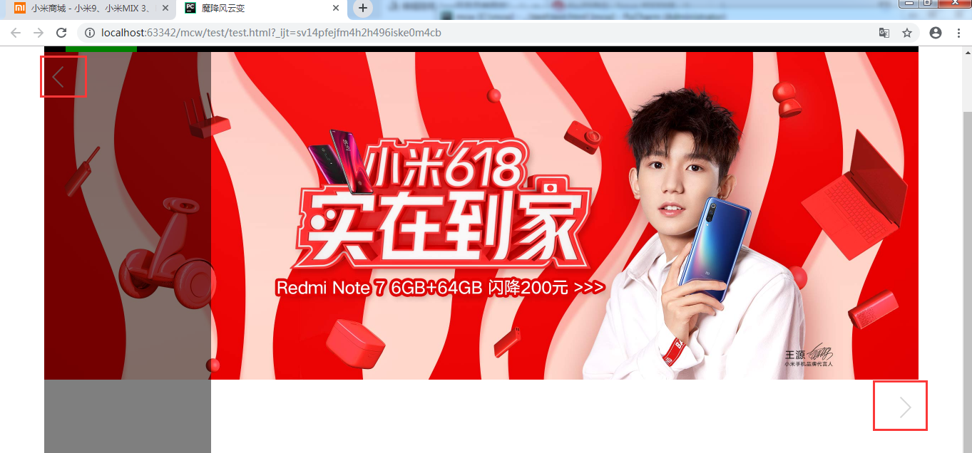
做小米的这个效果:
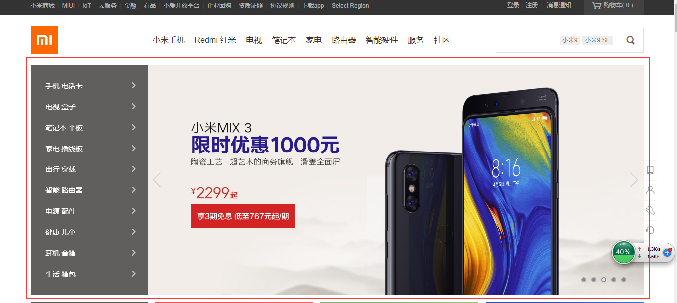
现在是要有张图片在这个地方显示:
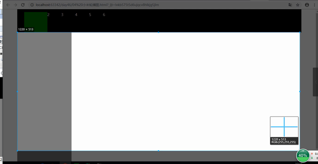
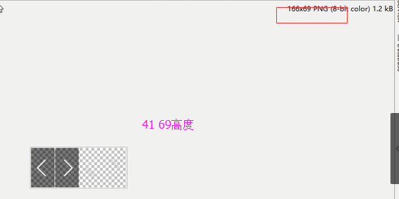
这张图2452*920,正好是在页面的位置将它宽高缩小了一倍

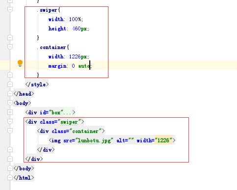
代码如下:
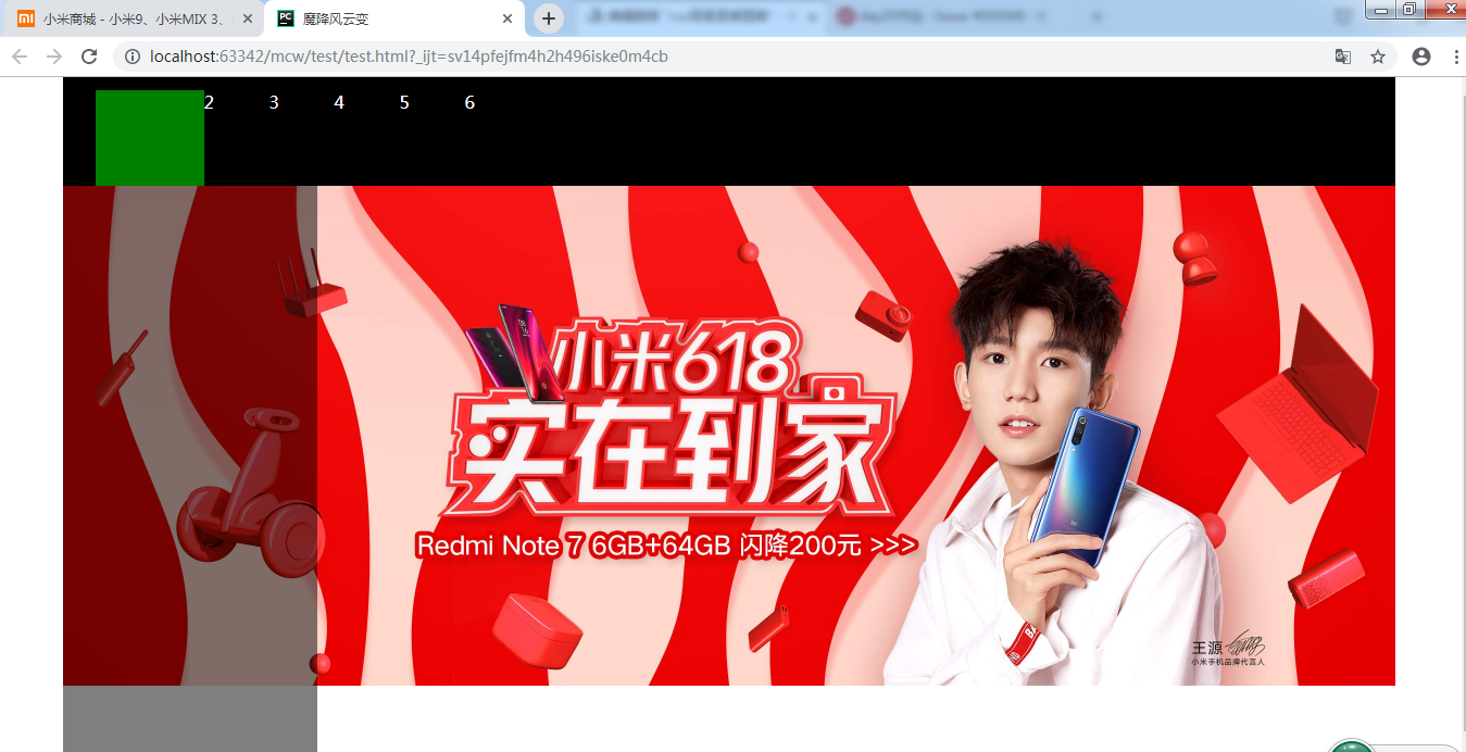
效果如下:
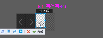
现在要在上图两边弄出下面的这种箭头:鼠标悬浮时会换图
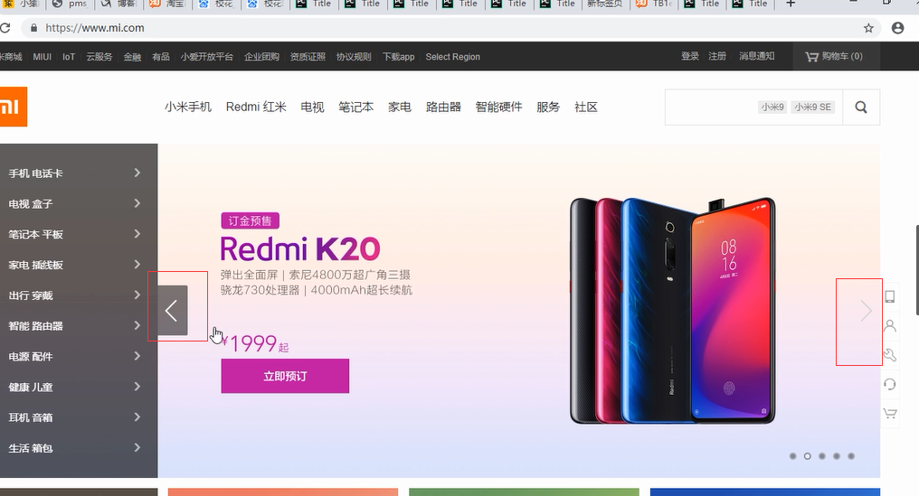
它是模拟的a标签,并且鼠标放在上面变成一个小手;
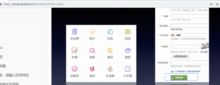
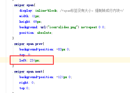
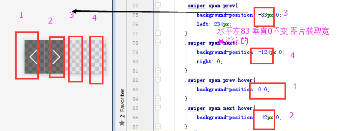
下面的属性可以用一个属性代替实现雪碧图:background
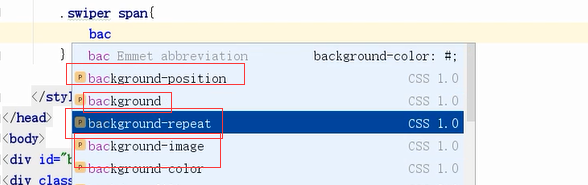
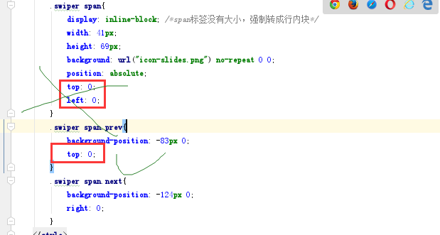
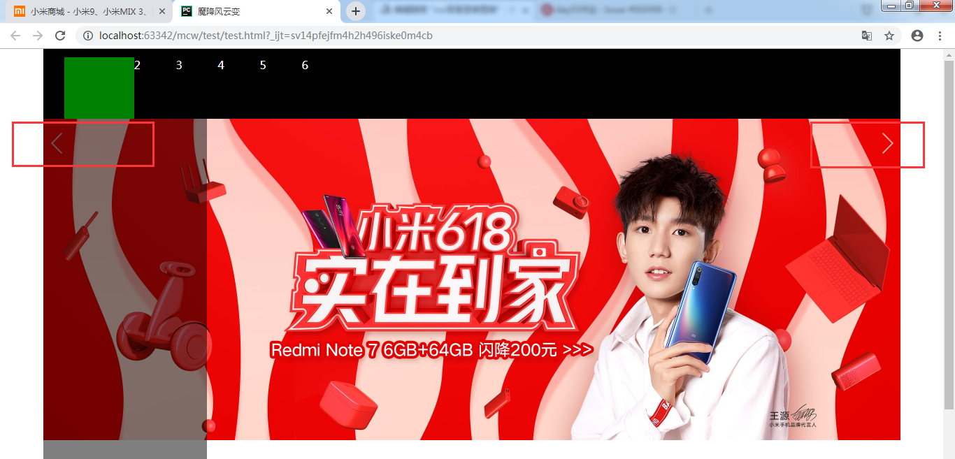
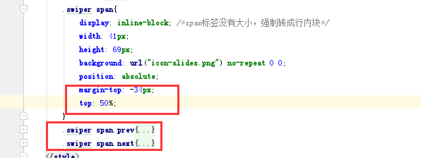
在容器类下添加span标签,设置四个图片的共有属性
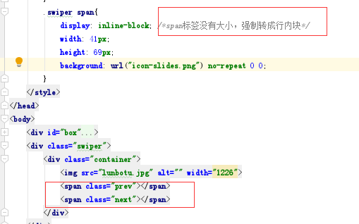
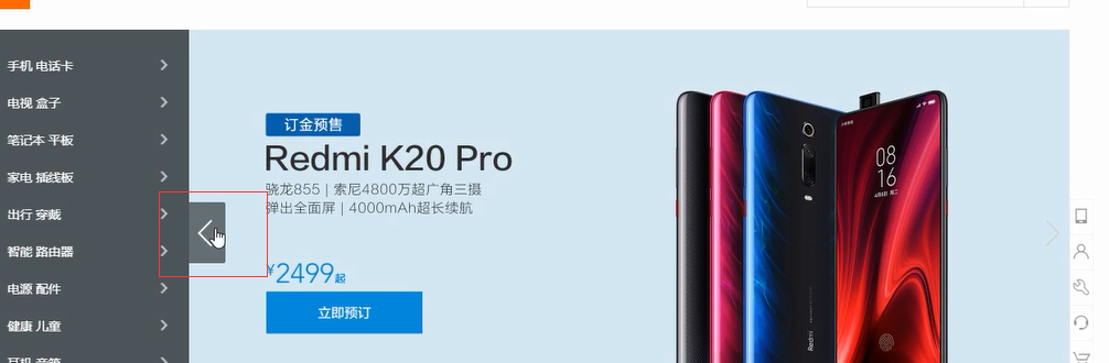
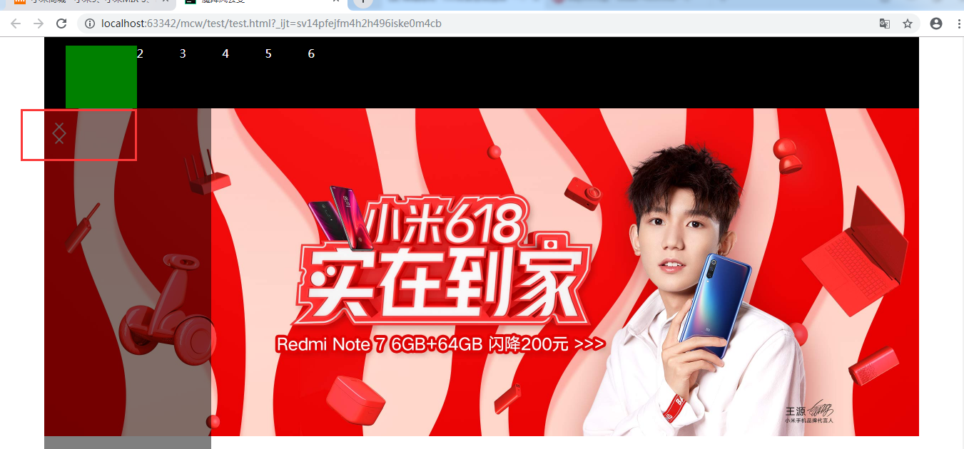
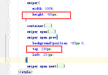
背景图跑到下面的位置了:
现在需要调整这个标签的位置到对应地方,那么我需要做子绝父相,span绝对定位,父相对定位,也可以给父的父swiper相对定位。top,left为0

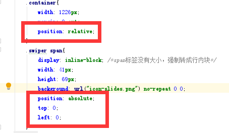
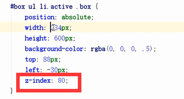
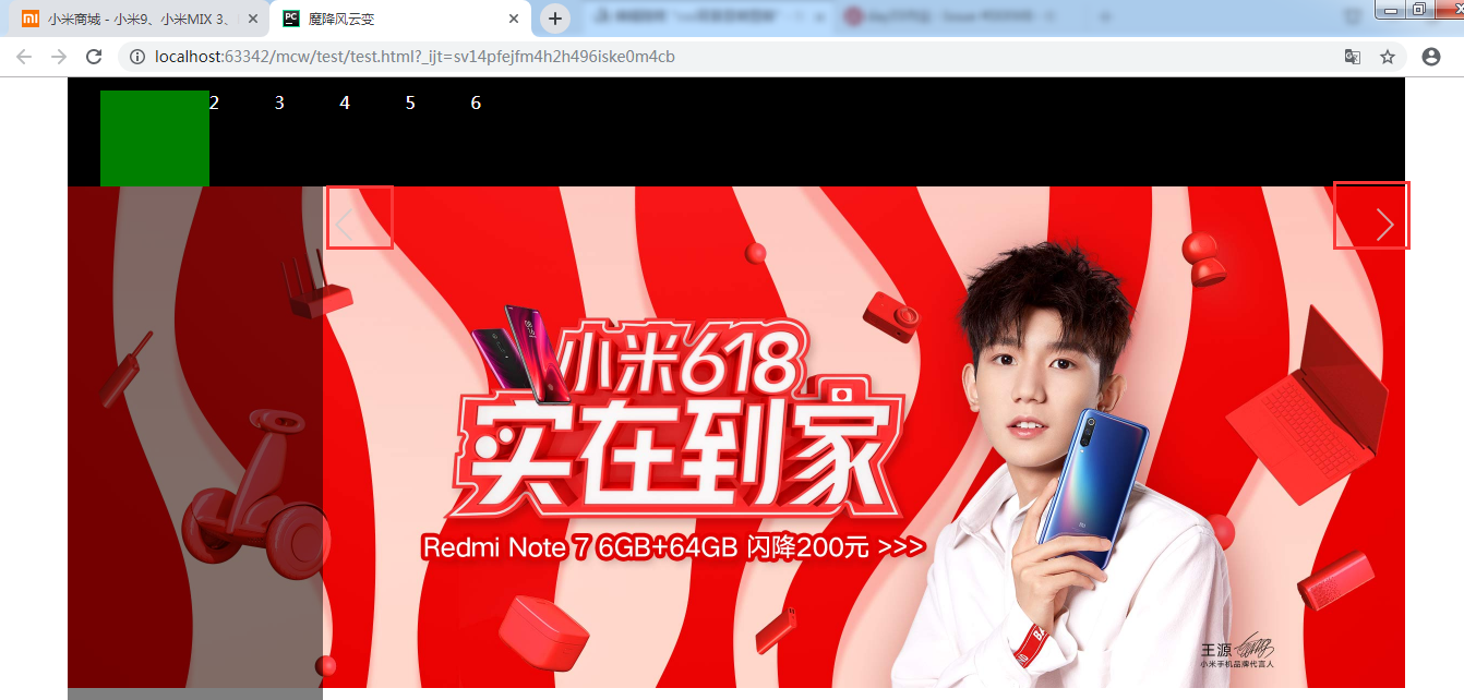
变成这个样子了,图片的层级要高于下面的了,

给下面的盒子一个z-index:80;
正常显示了:
定位,一个在左一个在右:

效果如下:
去掉和添加
效果在下面两个位置
给它一个top:0;

结果如下:
接下来让左边那个到阴影的右边部分:距左阴影宽度个距离
现在让左边的这个距顶图片一半的高度个距离:
不够不是垂直居中的 top:50% ; 也是这个样子
我应该再给它往上调它本身的高度的一半距离:
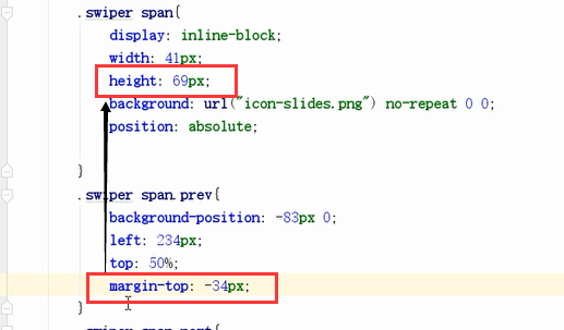
这样就居中了。绝对定位的盒子不占位置,也可以用margin进行微调位置,不影响布局

对于二者一致的样式就放到父里面;
这样就实现了两个标签:

悬浮变成深色的可以使用提供给的图片,雪碧图技术修改背景图位置获取:
这样就实现了轮播图的按钮:
background-position不仅是调整背景图位置,也是一种技术,雪碧图。雪碧图就是一张大图多张小图,用这个属性从大图中将对应的小图切出来
<!DOCTYPE html>
<html lang="en">
<head>
    <meta charset="UTF-8">
    <title>魔降风云变</title>
    <style>
        *{
            padding: 0;
            margin: 0;
        }
        body{
            color: #fff;
        }
        ul{
            list-style: none;
        }
        #box{
            width: 1226px;
            height: 100px;
            margin: 0 auto;
            background-color: #000;
        }
        #box ul{
            /*overflow: hidden;*/
            padding: 12px 0 0 30px;
            /*width: 500px;*/
            height: 88px;
            /*background-color: red;*/
        }
        #box ul li{
            float: left;
            width: 60px;
            height: 58px;
            /*padding-top: 30px;*/
        }
        #box ul li.active{
            width: 100px;
            height: 88px;
            background-color: green;
            position: relative;
        }
        #box ul li.active .box{
            position: absolute;
            width: 234px;
            height: 600px;
            background-color: rgba(0,0,0,.5);
            top: 88px;
            left: -30px;
            z-index: 80;
        }
        .clearfix:after{
            content: '';
            clear: both;
            display: block;
        }
        .swiper{
            width: 100%;
            height: 460px;
        }
        .container{
            width: 1226px;
            margin: 0 auto;
            position: relative;
        }
        .swiper span{
            display: inline-block; /*span标签没有大小,强制转成行内块*/
            width: 41px;
            height: 69px;
            background: url("icon-slides.png") no-repeat 0 0;
            position: absolute;
            margin-top: -34px;
            top: 50%;
        }
        .swiper span.prev{
            background-position: -83px 0;
            left: 234px;
        }
        .swiper span.next{
            background-position: -124px 0;
            right: 0;
        }
        .swiper span.prev:hover{
            background-position: 0 0;
        }
        .swiper span.next:hover{
            background-position: -42px 0;
        }
    </style>
</head>
<body>
    <div id="box">
        <ul class="clearfix">
            <li class="active">
                <div class="box"></div>
            </li>
            <li>2</li>
            <li>3</li>
            <li>4</li>
            <li>5</li>
            <li>6</li>
        </ul>
    </div>
    <div class="swiper">
        <div class="container">
            <img src="lunbotu.jpg" alt="" width="1226">
            <span class="prev"></span>
            <span class="next"></span>
        </div>
    </div>
</body>
</html>
2、阴影图
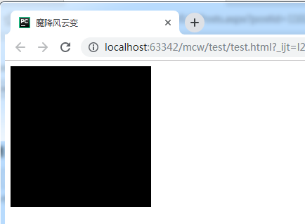
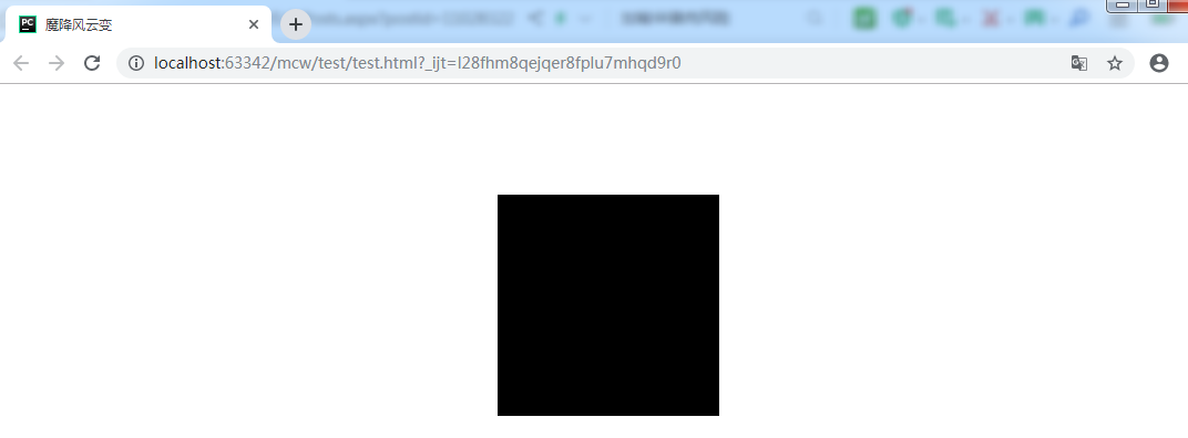
<html lang="en">
<head>
    <meta charset="UTF-8">
    <title>魔降风云变</title>
    <style>
        .box{
            width: 200px;
            height: 200px;
            background-color: #000;
        }
    </style>
</head>
<body>
    <div class="box">

    </div>
</body>
</html>
现在有这么一个黑色的盒子:
       .box{
            width: 200px;
            height: 200px;
            background-color: #000;
            margin: 100px auto;
        }
现在让它居中一下:
        .box{
            width: 200px;
            height: 200px;
            background-color: #000;
            margin: 100px auto;
            box-shadow: 0 0 0 red;
        }
box-shadow :0 0 0 red; 水平方法 垂直方向 模糊距离 阴影颜色。三个都是px,设置初始值为0,第五个值可以不写,可选,默认是inside,现在一点效果也米有。
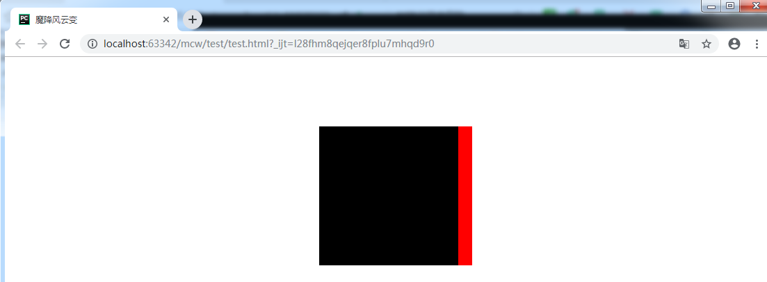
        .box{
            width: 200px;
            height: 200px;
            background-color: #000;
            margin: 100px auto;
            box-shadow: 20px 0 0 red;
        }
现在将水平距离设置20px,当前位置以左上角为基准点,它会在当前位置往右调。阴影设置的是红色的,第三个数越大,才是越模糊
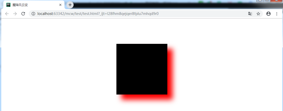
        .box{
            width: 200px;
            height: 200px;
            background-color: #000;
            margin: 100px auto;
            box-shadow: 20px 0 20px red;
        }
现在第三个模糊值给它20px,效果如下:

        .box{
            width: 200px;
            height: 200px;
            background-color: #000;
            margin: 100px auto;
            box-shadow: 20px 20px 20px red;
        }
再给它一个垂直方向的20px,它往下走了。也就是基于盒子的位置,在水平方向向左是正,在垂直方向,向下是正向。那么第一个和第二个值设置正的值时,阴影部分是向右和向下走的。现在阴影的效果就出来了。
应用场景之一:凹凸字,凹凸字也用到了inside和outside。凹进去的叫inside)(内部阴影),凸出的叫outside(外部阴影)。
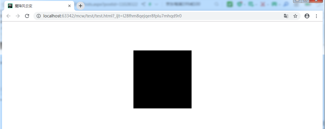
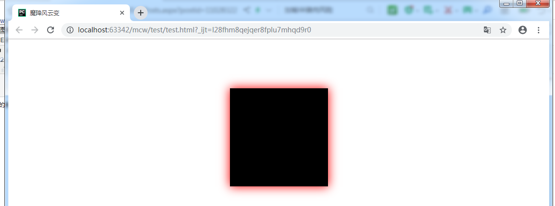
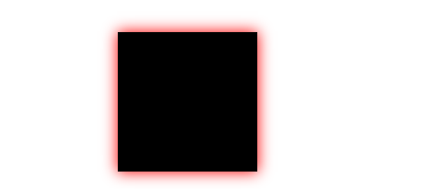
        .box{
            width: 200px;
            height: 200px;
            background-color: #000;
            margin: 100px auto;
            box-shadow: 0 0 20px red;
        }
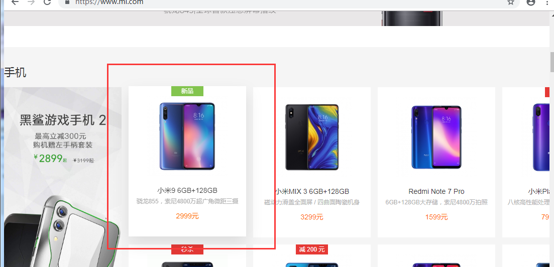
像小米,用的就是0 0 一个模糊距离 一个颜色
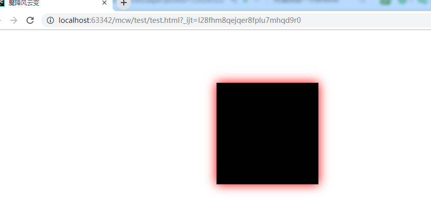
        .box{
            width: 200px;
            height: 200px;
            background-color: #000;
            margin: 100px auto;
        }
        .box:hover{
            box-shadow: 0 0 20px red;
        }
它一开始应该是没有阴影的,鼠标悬浮box的时候,给它添加的阴影属性:这样悬浮的时候才出现这种效果
        .box{
            width: 200px;
            height: 200px;
            background-color: #000;
            margin: 100px auto;
            position: relative;
        }
        .box:hover{
            top: 4px;
            box-shadow: 0 0 20px red;
        }
让它在鼠标悬浮时微微动一下,显示动态的效果,这里是鼠标悬浮时红色阴影,黑盒子向下动了一点
使用场景如下,这里鼠标悬浮就微微向上移动了一点点
并且它是用了transition的动画属性:
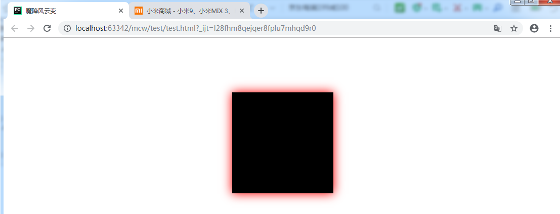
        .box{
            width: 200px;
            height: 200px;
            background-color: #000;
            margin: 100px auto;
            position: relative;
            transition: all 2s linear;
        }
        .box:hover{
            top: 8px;
            box-shadow: 0 0 20px red;
        }
这个动画能让阴影在2秒内渐进的方式由淡到实的显现,鼠标离开时就在指定的2秒内淡出。这是c3的属性
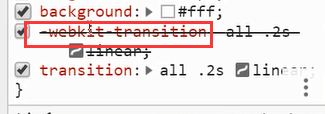
下面的webkit-transition是兼容浏览器用的,比如兼容ie浏览器。现在是划掉了,是走的下面的值,如果是在ie上那么webkit的这个就打开了。我们需要加一个前缀,这个前缀就是webkit,这就是引擎,引擎是做兼容性的根本所在。不同的引擎不同的作用。
web学习网址:

很多要学习的:
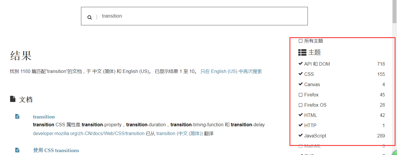
点进去就可以看到里面学习的知识了,教你怎么使用:也可以看效果

https://developer.mozilla.org/zh-CN/search?q=transition&topic=apps&topic=html&topic=css&topic=js&topic=api&topic=canvas&topic=svg&topic=webgl&topic=mobile&topic=webdev&topic=http&topic=webext&topic=standards

 浙公网安备 33010602011771号