
css详解3
推荐学习链接:css盒模型
1、盒模型的常用属性
1.1、pading
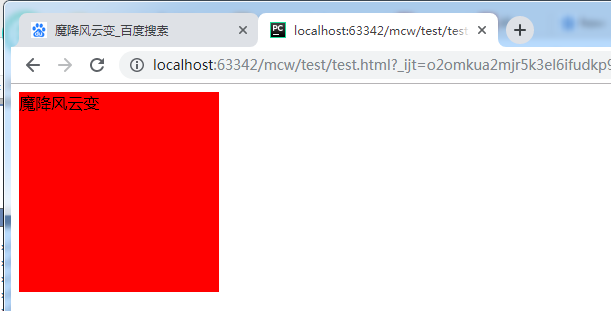
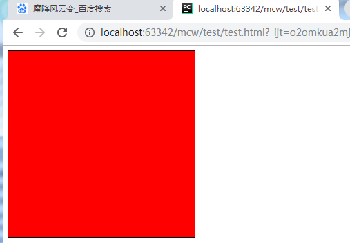
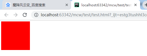
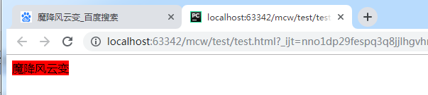
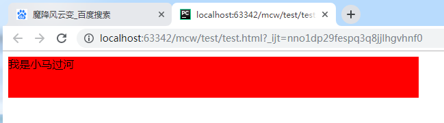
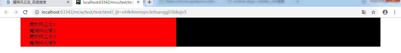
<html lang="en">
<head>
    <meta charset="UTF-8">
    <style>
        #box{
            width: 200px;
            height: 200px;
            background-color: red;
        }
    </style>
</head>
<body>
    <div id="box">魔降风云变</div>
</body>
</html>
内容在左上角显示
如果我想要让字往右走。
       #box{
            width: 200px;
            height: 200px;
            background-color: red;
            padding-left: 20px ;
        }
    </style>
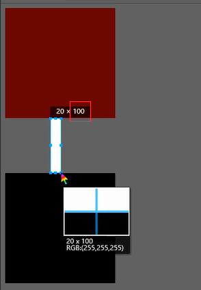
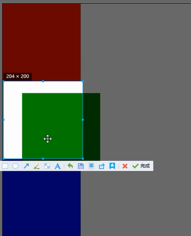
给盒子左边添加个pading,让盒子内容往右走。盒子变大了,从蓝框里面写
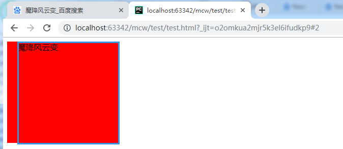
在一行上,因为你的pading增大使得盒子变大了,会导致整个页面布局出现混乱。为了使盒子大小不变,pading增加了多少,盒子就相应减少多少
    <style>
        #box{
            width: 180px;
            height: 200px;
            background-color: red;
            padding-left: 20px ;
        }
    </style>
pading用的好能起到很多效果,下面那里就是pading挤出来的:
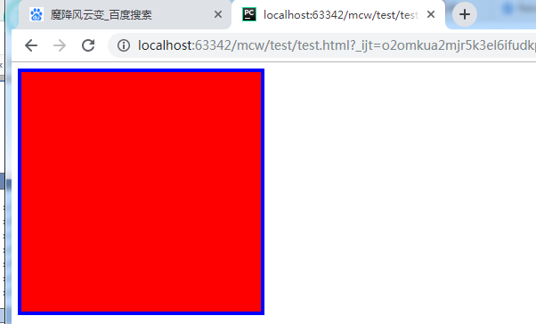
1.2、边框border
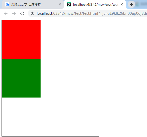
<html lang="en">
<head>
    <meta charset="UTF-8">
    <style>
        #box{
            width: 300px;
            height: 300px;
            background-color: red;
            border: 1px solid #000;
        }
    </style>
</head>
<body>
    <div id="box"></div>
</body>
</html>
添加了一个黑色边框的div块
边框三要素,border: 1px solid #000; 粗细 线型 颜色,还可以单独来设置
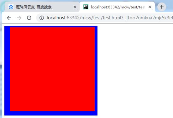
    <style>
        #box{
            width: 300px;
            height: 300px;
            background-color: red;
            border-width: 4px;
            border-style: solid;
            border-color: blue;
        }
    </style>
边框可以表示上下左右,将左右加宽: 两个值表示 上下 左右
    <style>
        #box{
            width: 300px;
            height: 300px;
            background-color: red;
            border-width: 4px 10px;
            border-style: solid;
            border-color: blue;
        }
    </style>

边框还可以加四个值,应该是代表 上 右 下 左
    <style>
        #box{
            width: 300px;
            height: 300px;
            background-color: red;
            border-width: 4px 10px 15px 20px;
            border-style: solid;
            border-color: blue;
        }
    </style>
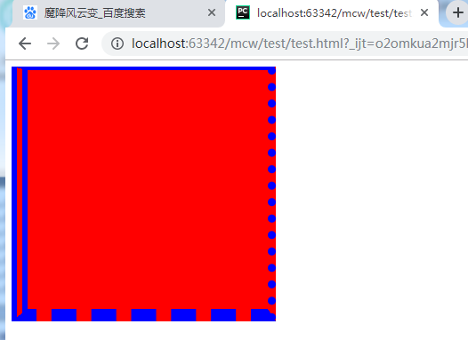
线型也可以修改,也可以四种:
    <style>
        #box{
            width: 300px;
            height: 300px;
            background-color: red;
            border-width: 4px 10px 15px 20px;
            border-style: solid dotted dashed double;
            border-color: blue;
        }
    </style>
olid dotted dashed double; 实线 点 虚线 双线
去掉底色只要边框的样子
    <style>
        #box{
            width: 300px;
            height: 300px;
            border-width: 4px 10px 15px 20px;
            border-style: solid dotted dashed double;
            border-color: blue;
        }
    </style>
background-color: red;去掉背景色
只要一个边: border-top border-right border-bottom border-left
    <style>
        #box{
            width: 300px;
            height: 300px;
            border-top: 1px solid red;
        }
    </style>
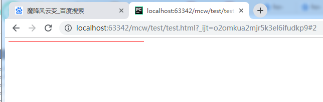
再加个背景色:
    <style>
        #box{
            width: 300px;
            height: 300px;
            border-top: 1px solid red;
            background-color: yellow;
        }
    </style>
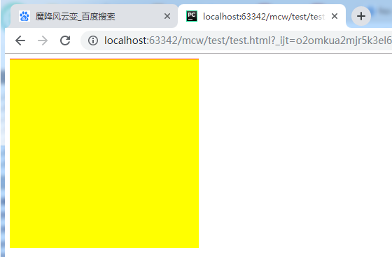
使用场景border-top

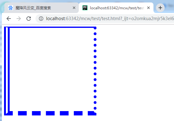
1.3制作三角形
<html lang="en">
<head>
    <meta charset="UTF-8">
    <style>
        #box{
            width: 200px;
            height: 200px;
            background-color: #000;
            border-top: 15px solid yellow;
            border-left: 15px solid red;
            border-right: 15px solid green;
        }
    </style>
</head>
<body>
    <div id="box"></div>
</body>
</html>

加一个底部边框:
    <style>
        #box{
            width: 200px;
            height: 200px;
            background-color: #000;
            border-top: 15px solid yellow;
            border-left: 15px solid red;
            border-right: 15px solid green;
            border-bottom: 15px solid purple;
        }
    </style>
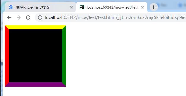
加个图片就是相框了。
盒子宽高变小:
            width: 50px;
            height: 50px;
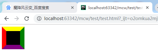
盒子宽高变小:
            width: 10px;
            height: 10px;
再变小:
            width: 0px;
            height: 0px;
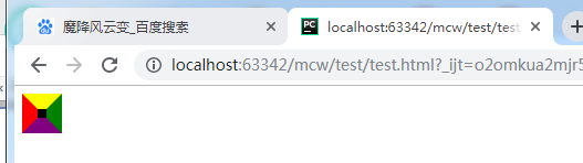
不要下边框:
    <style>
        #box{
            width: 0px;
            height: 0px;
            background-color: #000;
            border-top: 15px solid yellow;
            border-left: 15px solid red;
            border-right: 15px solid green;
            /*border-bottom: 15px solid purple;*/
        }
    </style>
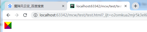
左右设为透明色
        #box{
            width: 0px;
            height: 0px;
            background-color: #000;
            border-top: 15px solid yellow;
            border-left: 15px solid transparent;
            border-right: 15px solid transparent;
            /*border-bottom: 15px solid purple;*/
        }
去掉背景色:
<html lang="en">
<head>
    <meta charset="UTF-8">
    <style>
        #box{
            width: 0px;
            height: 0px;
            border-top: 15px solid yellow;
            border-left: 15px solid transparent;
            border-right: 15px solid transparent;
        }
    </style>
</head>
<body>
    <div id="box"></div>
</body>
</html>
三角形应用场景:

删除线使用:

两个渲染不同的span标签
1.3、magin 详解
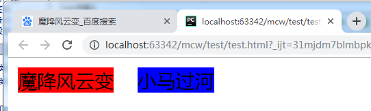
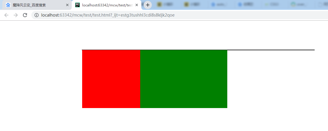
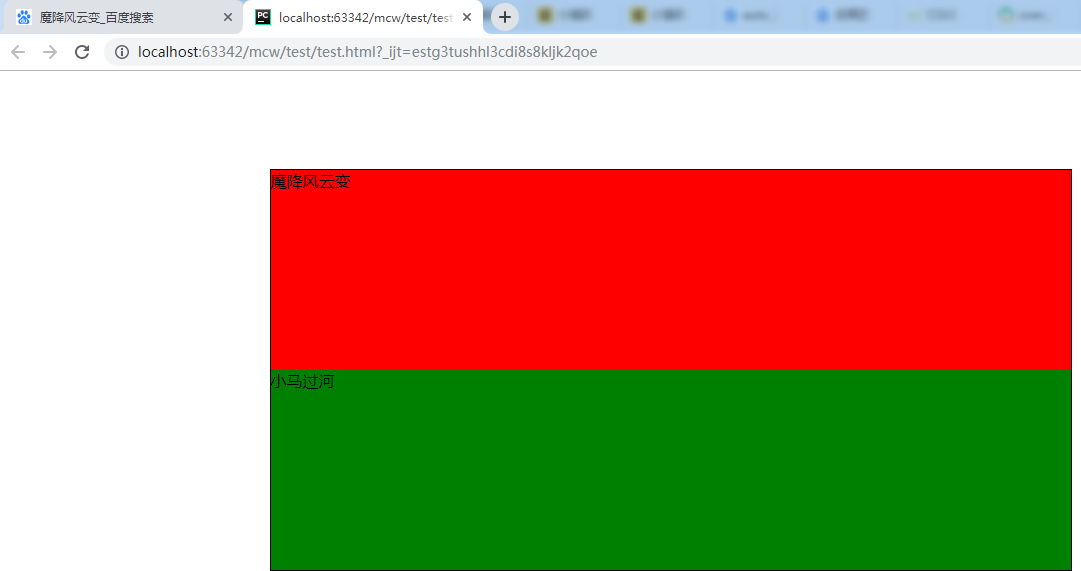
<html lang="en">
<head>
    <meta charset="UTF-8">
    <style>
        span:nth-child(1){
            background-color: red;
        }
    </style>
</head>
<body>
    <span>魔降风云变</span><span>小马过河</span>
</body>
</html>
选中第一个

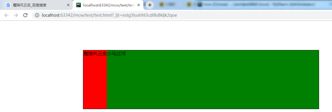
    <style>
        span:nth-child(1){
            background-color: red;
        }
        span:nth-child(2){
            background-color: blue;
        }
    </style>
选中第二个
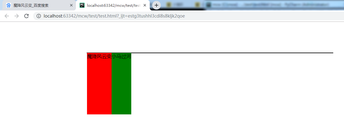
nth-child是css3的选择器
margin是外边距,一个盒模型和另一个盒模型之间的距离。网页上不只是div是盒模型,网页上任意一个标签都是盒模型。只要有pading border margin 的都称为盒模型
设置一个右margin
    <style>
        span:nth-child(1){
            background-color: red;
            margin-right : 20px;
        }
        span:nth-child(2){
            background-color: blue;
        }
    </style>
盒子2往右走了20px
    <style>
        span:nth-child(1){
            background-color: red;
            margin-right : 20px;
        }
        span:nth-child(2){
            background-color: blue;
            margin-left: 100px;
        }
    </style>
设置一个左margin,盒子又往右走了100px,总共120px
margin在水平方向上和我们想象的一样,margin是叠加的。
再来看看垂直方向的margin
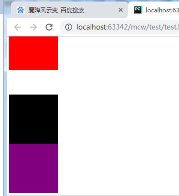
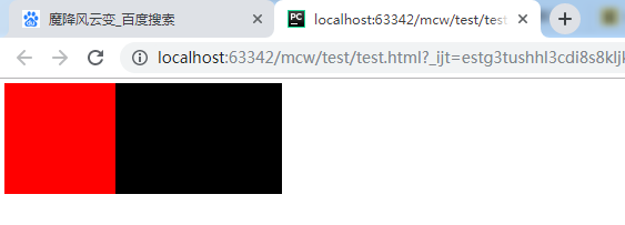
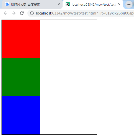
<html lang="en">
<head>
    <meta charset="UTF-8">
    <style>
        div{width: 200px;height: 200px}
        #box1{background-color: red;}
        #box2{background-color: black;}
    </style>
</head>
<body>
    <div id="box1"></div>
    <div id="box2"></div>
</body>
</html>
将两个div共有的部分div{width: 200px;height: 200px}写在一起,独有的写在独有的里面,省代码,更简洁
两个div,独占一行

现在给第一个盒子一个margin-bottom
    <style>
        div{width: 200px;height: 200px}
        #box1{background-color: red;margin-bottom: 30px}
        #box2{background-color: black;}
    </style>
第二个盒子下移了30px,二者相聚30
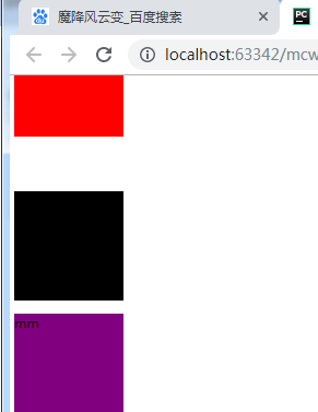
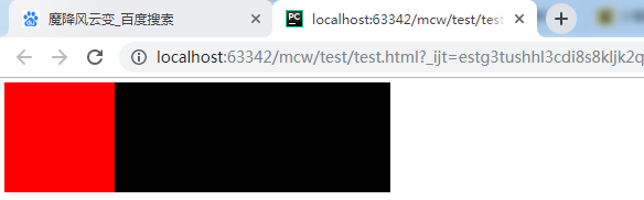
我再给第二个盒子添加一个margin-top
    <style>
        div{width: 200px;height: 200px}
        #box1{background-color: red;margin-bottom: 30px}
        #box2{background-color: black;margin-top: 100px}
    </style>
结果二者间相聚100px,而不是130px。这种现象是外边距合并。可以理解为,一个30的口,一个一百的口,30这个小的口掉到100这个大的口里埋没了。也就是说margin在垂直方向会出现外边距合并的现象。外边距的距离以最大的外边距为基准。以后写网页需要避免这个问题。外边距合并也被称作塌陷。
也就是说下面这样的地方要么设置bottom,要么设置top,只需设置一个margin就可以了。也就避免了外边距塌陷问题。

如下:
<html lang="en">
<head>
    <meta charset="UTF-8">
    <style>
        div{width: 200px;height: 200px}
        #box1{background-color: red;margin-bottom: 30px}
        #box2{background-color: black;margin-top: 100px}
        #box3{background-color: purple}
    </style>
</head>
<body>
    <div id="box1"></div>
    <div id="box2"></div>
    <div id="box3">
    </div>
</body>
</html>
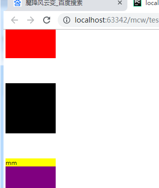
box没有p标签的时候,box2,3垂直方向没有距离
当有p标签的时候,有了距离了这是啥情况?
<body>
    <div id="box1"></div>
    <div id="box2"></div>
    <div id="box3">
        <p>mm</p>
    </div>
</body>
添加一个p的选择器
    <style>
        div{width: 200px;height: 200px}
        #box1{background-color: red;margin-bottom: 30px}
        #box2{background-color: black;margin-top: 100px}
        #box3{background-color: purple}
        #box3 p{background-color: yellow;}
    </style>
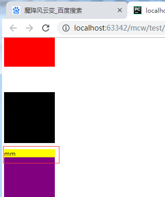
我要将mm往下走,可以给紫盒子用margin-top
    <style>
        div{width: 200px;height: 200px}
        #box1{background-color: red;margin-bottom: 30px}
        #box2{background-color: black;margin-top: 100px}
        #box3{background-color: purple ;margin-top: 100px}
        #box3 p{background-color: yellow;}
    </style>
这也是用塌陷问题。margin这个现象存在很多坑
如果用这种方式的话这里也用margin来调距离,但是不好调,这个地方用浮动布局更方便
2、浮动属性的使用
2.1浮动的初步理解
垂直方向出现的塌陷,给子盒子设置margin,都是在一些文档流下,(文档流式布局,从上往下,从左往右就像流水一样去写。不可能先写下面的再写上面的。流式布局中有一个标准的文档流,就是在浏览器页面中你设置一个盒子比如div,它始终从左上角开始)
比如下面的导航栏, 有一个整个的大的div。中间有个div盒子居中,然后又有三个子div,分别放导航 登录 和购物车的三个部分。这样用浮动布局就比较好。浮动布局最开始是解决文字环绕现象的 ,如果用浮动,很容易就出现文字环绕现象了。由于浮动能实现并排显示,于是就用来做布局了。在浮动布局之前用的是table。把整个表格的宽度设置为整个body的宽度,表格太麻烦,使用浮动布局简单很多。除了浮动布局外,还有很多布局,比如定位布局,flash布局
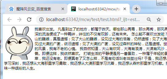
<html lang="en">
<head>
    <meta charset="UTF-8">
    <style>
        img{width: 400px}
    </style>
</head>
<body>

    <img src="timg.gif" alt="">

    <p>
        我喜欢出发。
凡是到达了的地方,都属于昨天。哪怕那山再青,那水再秀,那风再温柔。太深的流连便成了一种羁绊,绊住的不仅有双脚,还有未来。
怎么能不喜欢出发呢?没见过大山的巍峨,真是遗憾;见了大山的巍峨,没见过大海的浩瀚,仍然遗憾;见了大海的浩瀚,没见过大漠的广袤,依旧遗憾;见了大漠的广袤,没见过森林的神秘,还是遗憾。世界上有不绝的风景,我有不老的心情。
我自然知道,大山有坎坷,大海有浪涛,大漠有风沙,森林有猛兽。即便这样,我依然喜欢。
打破生活的平静便是另一番景致,一种属于年轻的景致。真庆幸,我还没有老。即便真老了又怎么样,不是有句话叫老当益壮吗?
于是,我还想从大山那里学习深刻,我还想从大海那里学习勇敢,我还想从大漠那里学习沉着,我还想从森林那里学习机敏。我想学着品味一种缤纷的人生。
    </p>
</body>
</html>
现在看到的效果是图片和文字是上下排着的。
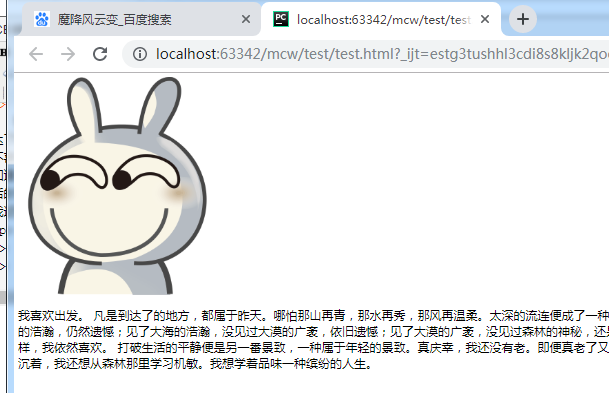
给p标签设置一个浮动属性。float浮动有三个值,一个是none(所有元素在标准流文档下没有浮动,标准文档流就是之前写的所有标签在网页上的排版),
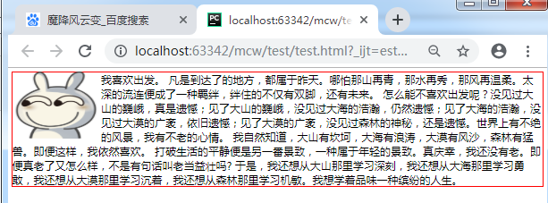
这里有点问题,修改一下代码,把图片放在div里面,给div设置左浮动:
<html lang="en">
<head>
    <meta charset="UTF-8">
    <style>
        img{width: 200px}
        #box{float: left}
    </style>
</head>
<body>
    <div id="box"><img src="timg.gif" alt=""></div>
    <p>
        我喜欢出发。
凡是到达了的地方,都属于昨天。哪怕那山再青,那水再秀,那风再温柔。太深的流连便成了一种羁绊,绊住的不仅有双脚,还有未来。
怎么能不喜欢出发呢?没见过大山的巍峨,真是遗憾;见了大山的巍峨,没见过大海的浩瀚,仍然遗憾;见了大海的浩瀚,没见过大漠的广袤,依旧遗憾;见了大漠的广袤,没见过森林的神秘,还是遗憾。世界上有不绝的风景,我有不老的心情。
我自然知道,大山有坎坷,大海有浪涛,大漠有风沙,森林有猛兽。即便这样,我依然喜欢。
打破生活的平静便是另一番景致,一种属于年轻的景致。真庆幸,我还没有老。即便真老了又怎么样,不是有句话叫老当益壮吗?
于是,我还想从大山那里学习深刻,我还想从大海那里学习勇敢,我还想从大漠那里学习沉着,我还想从森林那里学习机敏。我想学着品味一种缤纷的人生。
    </p>
</body>
</html>
左浮动之后p标签就会往图片左边靠,这就是文字环绕
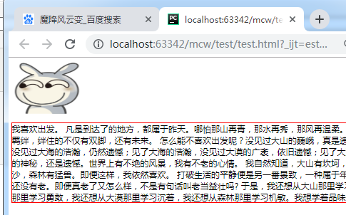
如果给p标签加个边框:
    <style>
        img{width: 200px;height: 150px}
        #box{float: left}
        p{border: 1px solid red}
    </style>
一旦设置了浮动,这些标签就不是标准文档流了。就会产生一种现象,浮动。文档不是贴着页面了,这个p标签是作为文档流下的第一个标签了,往上顶,虽然p的盒子往上挤了,占据了box的位置,但是文字不会挤还是围绕着它,文字不会被盖住。box盒子设置了浮动了,盒子飘起来了,p就去贴父元素的边,如果这两个盒子一样大小,那么p标签就被覆盖看不见了。
如果给盒子再设置一个左浮动,它会去找浮动盒子的边,贴边就没有空白折叠了。
额,这里给p标签设置一个浮动,另起一行了。不了解原因:
    <style>
        img{width: 200px;height: 150px}
        #box{float: left}
        p{border: 1px solid red;float: left}
    </style>
看下面的例子:
<html lang="en">
<head>
    <meta charset="UTF-8">
    <style>
        div{width: 200px;height: 200px}
        .box1{background-color: red;}
        .box2{background-color: black;}
    </style>
</head>
<body>
    <div class="box1"></div>
    <div class="box2"></div>
</body>
</html>
设置两个标准文档流下的盒子,块级标签,div标签,独占一行,上下排版
现在想让盒子在一行内显示,让红色盒子浮动
    <style>
        div{width: 200px;height: 200px}
        .box1{background-color: red;float: left}
        .box2{background-color: black;}
    </style>
红色盒子浮动了,黑色盒子上去了。红色盒子浮动了,就不是标准文档流下的盒子了。黑色盒子浏览器认为是标准文档流下的第一个盒子。
黑色盒子实际上是被盖住了,
将黑色盒子的宽度改一改:
    <style>
        div{width: 200px;height: 200px}
        .box1{background-color: red;float: left}
        .box2{width:500px;background-color: black;}
    </style>
给黑色盒子加个左浮动:
    <style>
        div{width: 200px;height: 200px}
        .box1{background-color: red;float: left}
        .box2{width:500px;background-color: black;float: left}
    </style>
黑色盒子浮动起来后出来了,贴的是红色浮动盒子的边,
浮动它有一种现象,一是:浮动脱离了标准文档流,脱标了,不在文档上占有位置了。下面标准文档流下的盒子就往上挤。
给红色盒子设置了浮动,它有种现象就是贴边,就是它会去找浮动盒子的边,它找不到浮动盒子的边就去找父元素的边,它的父元素是body。给黑色盒子设置浮动,它就去找浮动元素的边,即红色盒子的边
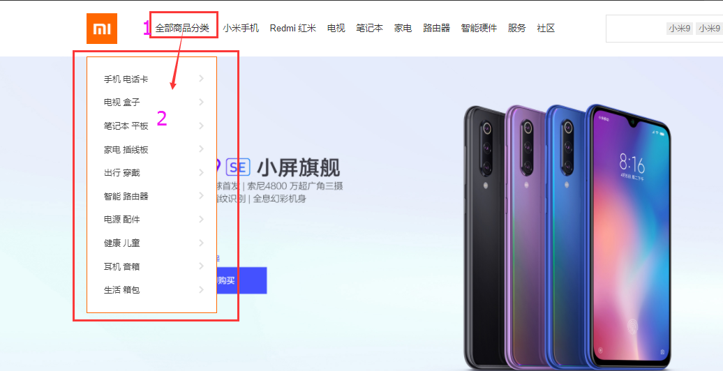
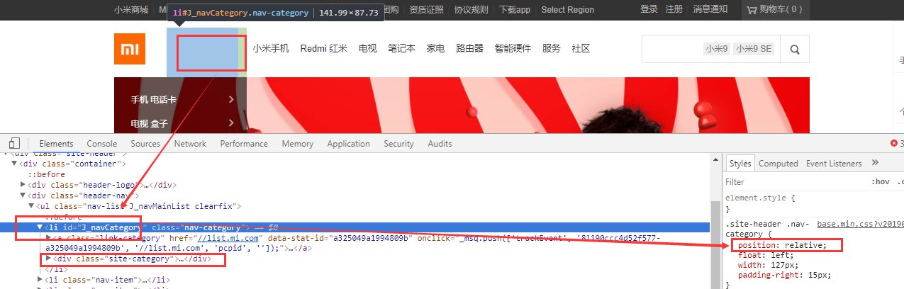
2.2浮动在顶部栏的使用案例
这些地方都有container
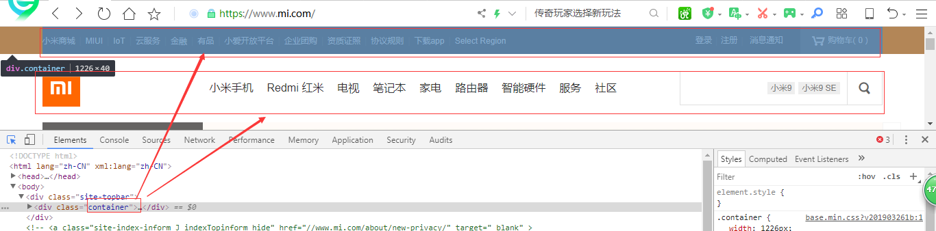

如果写的没有渲染上,首先看看选择器是不是忘记写#.这些东西了。
先写一下top。
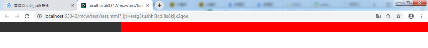
<html lang="en">
<head>
    <meta charset="UTF-8">
    <style>
        *{padding: 0;margin: 0}
        #top{
            width: 100%;
            height: 40px;
            background-color: #333;
        }
        .container{
            width:1226px;
            height: 40px;
            margin-right: auto;
            background-color: red;
        }
    </style>
</head>
<body>
    <div id="top">
        <div class="container">
            <div class="top_l"></div>
            <div class="shop"></div>
            <div class="login"></div>
        </div>
    </div>
</body>
</html>
去掉所有自带的pading和margin。设置一个黑色的盒子。黑盒子里面设置一个红色的盒子。红色盒子设置margin-right: auto; 红色盒子默认从左边排列

将红色盒子设置成margin-left: auto;
    <style>
        *{padding: 0;margin: 0}
        #top{
            width: 100%;
            height: 40px;
            background-color: #333;
        }
        .container{
            width:1226px;
            height: 40px;
            margin-left: auto;
            background-color: red;
        }
    </style>
红色盒子就往右边去靠了。
如果margin-left: auto;margin-ringt: auto;都使用,那么红色盒子就跑到中间去了。实现了子盒子在父盒子中的居中。给子盒子左右margin都设置成自动
        .container{
            width:1226px;
            height: 40px;
            margin-right: auto;
            margin-left: auto;
            background-color: red;
        }

实现子盒子在父盒子中的水平居中,还可以简写:
        .container{
            width:1226px;
            height: 40px;
            margin: 0 auto;
            background-color: red;
        }
给子盒子的margin 上下设置成0,左右设置成auto。(黑色变少了,我调整浏览器100%正常显示了)

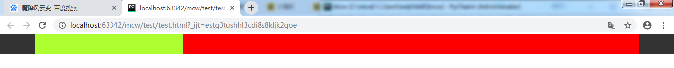
在上面基础上添加top_l类盒子的选择器,后面的几个盒子都是红色盒子的子盒子,排列从红色盒子开头开始:
    <style>
        *{padding: 0;margin: 0}
        #top{
            width: 100%;
            height: 40px;
            background-color: #333;
        }
        .container{
            width:1226px;
            height: 40px;
            margin: 0 auto;
            background-color: red;
        }
        #top .top_l{
            width: 300px;
            height: 40px;
            background-color: greenyellow;
        }
    </style>
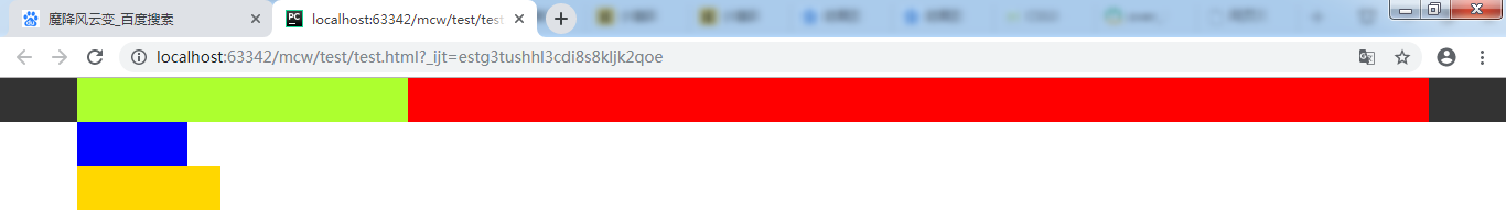
现在添加另外两个红色盒子中的子盒子:
    <style>
        *{padding: 0;margin: 0}
        #top{
            width: 100%;
            height: 40px;
            background-color: #333;
        }
        .container{
            width:1226px;
            height: 40px;
            margin: 0 auto;
            background-color: red;
        }
        #top .top_l{
            width: 300px;
            height: 40px;
            background-color: greenyellow;
        }
        #top .shop{
            width: 100px;
            height: 40px;
            background-color: blue;
        }
        #top .top_l{
            width: 130px;
            height: 40px;
            background-color: gold;
        }
    </style>
查看异常,不是想象中的,竟然把我得第一个黄绿色盒子变没了。原因是我第三个盒子的命名写错了,复制过来忘记修改名字 #top .top_l

改掉选择器名字
   <style>
        *{padding: 0;margin: 0}
        #top{
            width: 100%;
            height: 40px;
            background-color: #333;
        }
        .container{
            width:1226px;
            height: 40px;
            margin: 0 auto;
            background-color: red;
        }
        #top .top_l{
            width: 300px;
            height: 40px;
            background-color: greenyellow;
        }
        #top .shop{
            width: 100px;
            height: 40px;
            background-color: blue;
        }
        #top .login{
            width: 130px;
            height: 40px;
            background-color: gold;
        }
    </style>

选择正确的这三个div将块变成行内块:
#top .container div{display: inline-block}
结果存在空白折叠。如果想把后两个盒子放在右边,还需要测量尺寸。

现在去掉行内块的设置,回到之前的操作:
现在给绿色盒子设置成左浮动:
        #top .top_l{
            width: 300px;
            height: 40px;
            background-color: greenyellow;
            float: left;
        }
蓝色盒子成为了红色盒子中的第一个标准流的盒子。被浮动飘起来的绿色盒子压盖了。
再给蓝色盒子设置左浮动,蓝色盒子贴着绿色左浮动的盒子,黄色盒子成了红色盒子中标准文档流的第一个盒子,并且被覆盖住了。
        .container{
            width:1226px;
            height: 40px;
            margin: 0 auto;
            background-color: red;
        }
        #top .top_l{
            width: 300px;
            height: 40px;
            background-color: greenyellow;
            float: left;
        }
        #top .shop{
            width: 100px;
            height: 40px;
            background-color: blue;
            float: left;
        }

现在给红色盒子内的三个盒子选择器都设置float: left; 实现了多个子元素盒子排在同一行,而不是按照块元素独占一行来显示了。

现在将蓝色盒子和黄色盒子设置成右浮动。
        #top .shop{
            width: 100px;
            height: 40px;
            background-color: blue;
            float: right;
        }
        #top .login{
            width: 130px;
            height: 40px;
            background-color: gold;
            float: right;
这样就实现了这两个盒子在右边
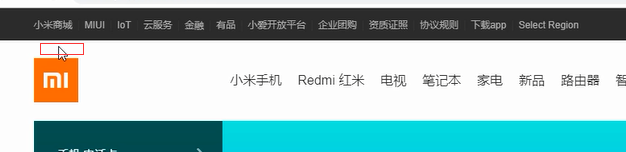
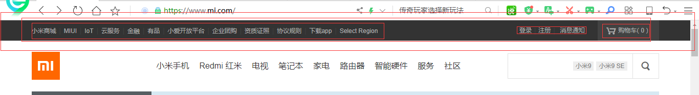
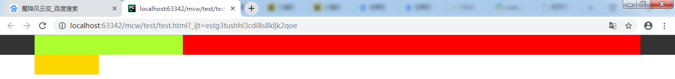
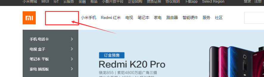
下面来看顶部元素的大致的布局:
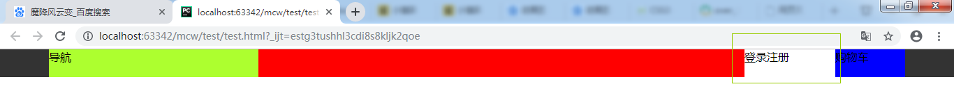
<html lang="en">
<head>
    <meta charset="UTF-8">
    <style>
        *{padding: 0;margin: 0}
        #top{
            width: 100%;
            height: 40px;
            background-color: #333;
        }
        .container{
            width:1226px;
            height: 40px;
            margin: 0 auto;
            background-color: red;
        }
        #top .top_l{
            width: 300px;
            height: 40px;
            background-color: greenyellow;
            float: left;
        }
        #top .shop{
            width: 100px;
            height: 40px;
            background-color: blue;
            float: right;
        }
        #top .login{
            width: 130px;
            height: 40px;
            background-color: gold;
            float: right;
        }
    </style>
</head>
<body>
    <div id="top">
        <div class="container">
            <div class="top_l">导航</div>
            <div class="shop">登录注册</div>
            <div class="login">购物车</div>
        </div>
    </div>
</body>
</html>
这样就实现了顶部的布局:

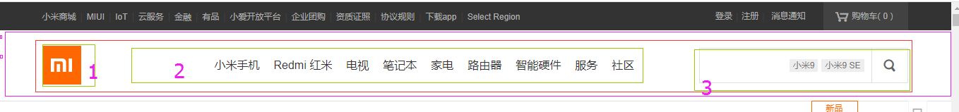
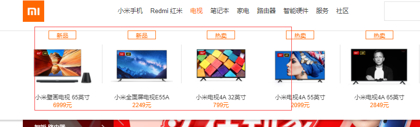
原网页的顶部栏样子:
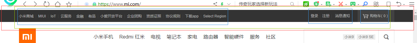
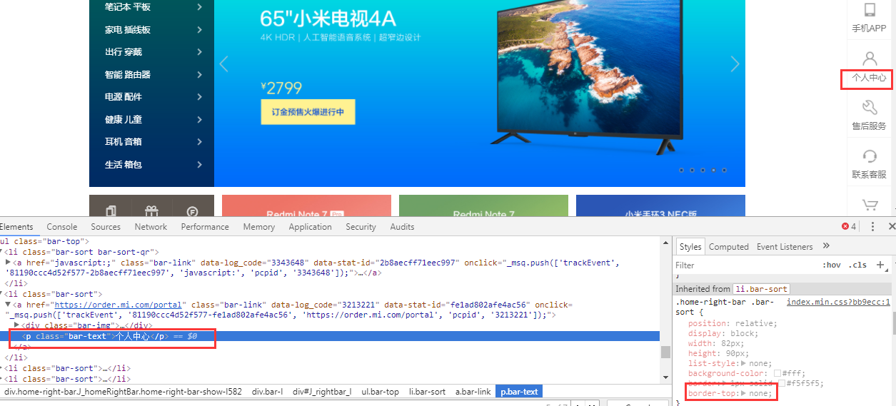
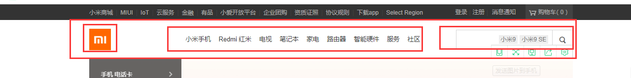
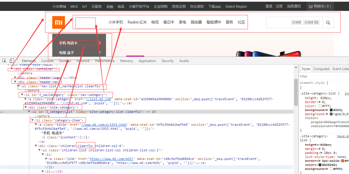
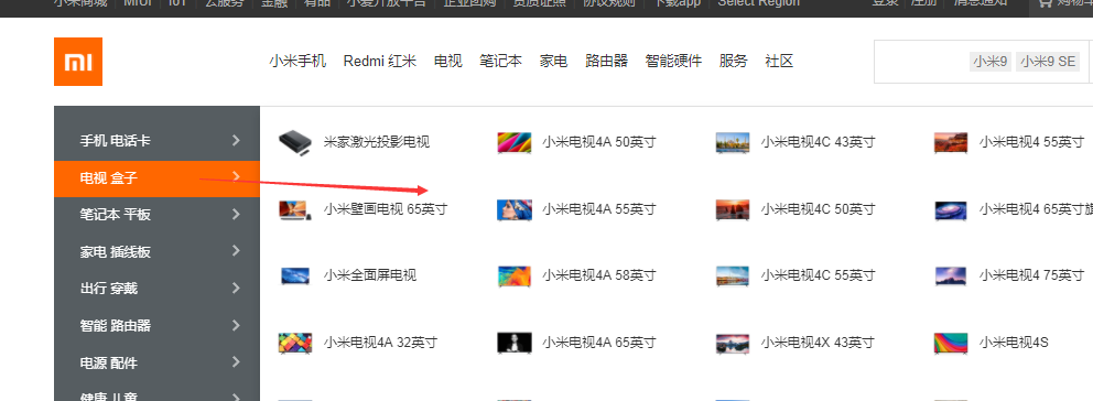
2.3分析网页的元素组成
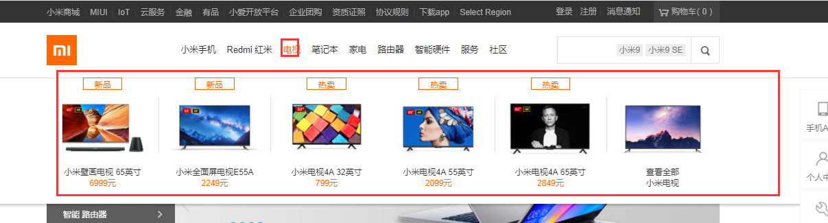
分析下面的这行:
这一栏跟上面类似,有个一样的container。1处包着一个div,div里面包着一个图片。2里面有ul,ul里面有li,li里面有a。3里面有个form表单,form里面有两个input
背景色rgba background-color: rgba(255,255,255,1);
将登录注册的改为rgba,RGBA是代表Red(红色) Green(绿色) Blue(蓝色)和 Alpha的色彩空间,也就是透明度/不透明度。
        #top .login{
            width: 130px;
            height: 40px;
            background-color: rgba(255,255,255,1);
            float: right;
        }
盒子也是有先后的,两个盒子一起右浮,先定义的盒子先浮动,在右边,后定义的盒子在从右数随后。
将登录设置成.2增加了透明色,父标签的底色都显现了。background-color: rgba(0,0,0,.2); 最后一个数可以调整透明度的吧?

三个div都浮动了。第三个div里面form的两个input再浮动就与外面浮动没有任何关系,因为一个也是一个逻辑区,不一定非得是div,只要是把它包裹的东西就行了。比如ul里面所有的li也是逻辑区,鼠标悬浮在电视这个li里面的时候,下面出现的东西也是包裹着li里面的。li标签里的也需要浮动。搜索图标和搜索框间没有空白折叠,这里可以用浮动,也可以用写在一行实现呀。

这里面有个div,div里面有个ul,ul是红框大小,上左下都有pading。首先看它的内容是在哪里显示的,应该是从左上角开始的。一行就是一个li标签,箭头那里就是一个span标签

先想一个大的结构,再想单块,四块div,再想想怎么在一行内显示。大的结构写好了再写里面细的内容。这里应该也有大的div,里面有个容器div,然后才是四个小div的吧?再思考一下,左边那个和右边三个似乎没有关系。左边那个是独立的,右边三个是独立的整体。那么可不可以认为左边是个div,右边是个ul,这个是不是叫图片列表。那么用div可以么,可以。但是列表列表,指的是相同的内容列表。这里右边三个都是一样的。然后左边黑色的左浮,右边的右浮。左边的黑色左浮,右边的左浮也可以,然后里面的三个小元素也左浮。

思考这里应该是一张图,上下有margin
2处是左浮,3处是个图片列表,一个ul里面8个li。第5个li放不下了就换行显示。即浮动元素放不下了,就换行贴着父元素的边。然后再做每个li里面的内容。如果光写大的盒子用颜色来表示的话,那么网页的结构,架构啊就写出来了。如果你能把结构画出来,那么就用标签给它表现出来。
https://www.apeland.cn/web/3/63 的34,35有两个对网页的整体架构分析。推荐看看。
3、浮动的知识
3.1、浮动带来的问题
浮动带来的问题:浮动脱标不占位置,那么所有的盒子都设置固定高度么?如果我不知道这个盒子内容有多少,需要多少高度,那么如何让它去适应适合的高度。一个父盒子,怎么知道自己需要多少高度呢?靠内容。内容5000就5000的高度,内容一万就一万的高度,让父元素适应高度。如果一个父盒子,往里面添加了内容,需要的高度变了,那么应该让它自己适应这个高度,不能一直手动计算并修改这个高度。子盒子设置高度,希望它撑起父元素的高度。但是父盒子下有多个子盒子都是浮动的脱离标准文档流的。怎么能撑起父盒子的高度呢?浮动带来的问题:撑不起父盒子的高度
浮动能实现块元素并排。能实现一行两列三列的布局。上面就是三列布局,可以把它看做table的一行,多列单元格,分列布局。网页其实就是一个表格,行和列的存在。
浮动的作用: 实现元素并排
3.2、浮动的现象
1.脱离标准文档流,不在页面上占位置 “脱标”
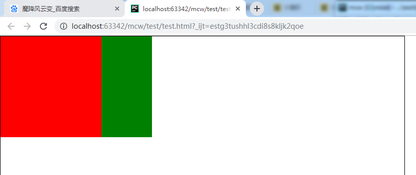
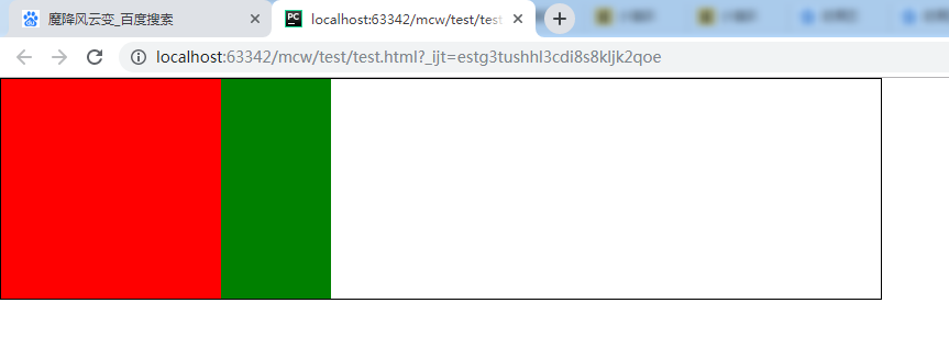
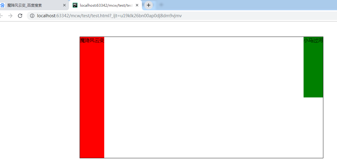
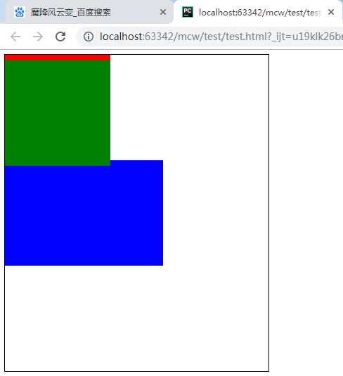
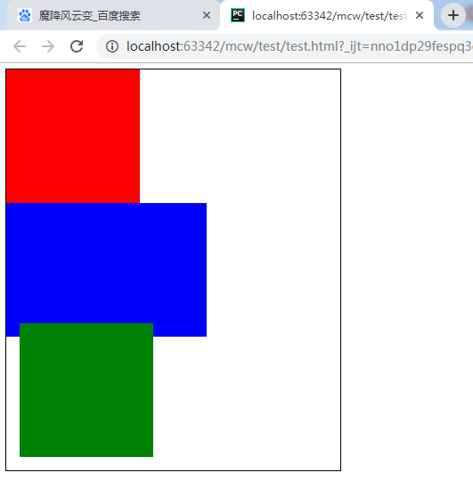
<html lang="en">
<head>
    <meta charset="UTF-8">
    <style>
        *{padding: 0;margin: 0}
        .father{
            width: 800px;
            height: 800px;
            border: 1px solid #000;
        }
        .child1{
            width: 200px;
            height: 200px;
            background-color: red;
        }
        .child2{
            width: 300px;
            height: 200px;
            background-color: green;
        }
    </style>
</head>
<body>
    <div class="father">
        <div class="child1"></div>
        <div class="child2"></div>
    </div>
</body>
</html>
现在父盒子802*802px,宽高800,800,作为body的第一个元素,排列方式是始终在左上角,这是标准流文档排列下的方式。红色盒子是作为父盒子黑框的第一个元素在左上角,绿色黑子作为黑框的第二个子标签。因为独占父元素的一行,上下排列。

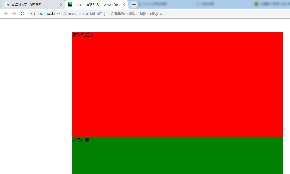
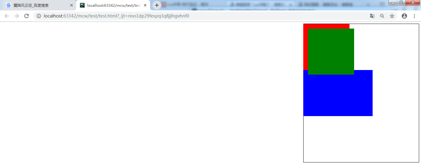
现在给第一个红色盒子设置一个左浮动属性,它就脱离标准文档流了,不充当标准文档流下的黑框的第一个元素了。红色盒子飘起来了 ,绿色盒子还是标准文档流下的盒子,它会认为绿色盒子是标准文档流中的第一个盒子。就会往左上角去挤。此时同时也出现了压盖现象,红色盒子压盖在了绿色盒子上面。
        .child1{
            width: 200px;
            height: 200px;
            background-color: red;
            float: left;
        }
绿色盒子不想被红色压盖就需要做层级优先显示,下面地方就用了层级,压盖了原来的内容,上面的优先级要大:
包括这里也层级,存在优先级显示:
外面的div是标准流下的盒子,1处就是一个浮动的盒子,只要给它设置浮动就会压盖掉父的
1跟2是有关系的,点击1浮现2,。1是li标签里的,包着一个子盒子2,hover
那么这里隐藏了内容了。比如过节优惠活动的时候这里就出现了。这是预留的位置
一般是张动态图

上面就是浮动的第一个现象,脱离标准文档流,不在页面上占位置
现在不给父盒子设置高度,父盒子是200
/*height: 800px;*/
取消红色第一个盒子的左浮动之后,父盒子高度被内容填充到了200+200=400:
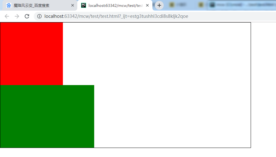
继续给红色盒子设置左浮动属性,那么红色盒子不占位置了,父元素的盒子变成了200.

这就是浮动之后脱离标准文档流,不在页面上占位置
下面给父元素添加一个属性:
        .father{
            width: 800px;
            /*height: 800px;*/
            border: 1px solid #000;
            margin: 100px auto;
        }
上下100px,左右居中,贴着父元素的边

红色盒子贴着父元素的边,绿色盒子设置左浮之后会贴着红色盒子的边,贴边现象。
浮动的现象之一:贴边现象
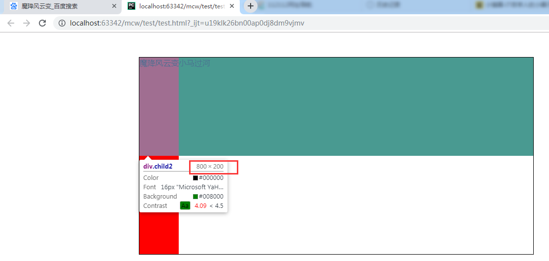
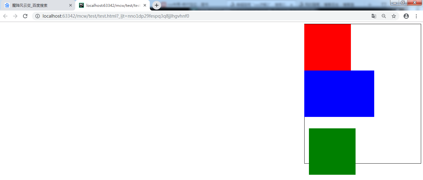
这时,让绿色盒子设置左浮动,出现一个问题:
这两个盒子都不占位置,父元素的盒子没有设置位置,现在父元素的高度就是边框2px。
这时假如我在下面有个导航栏,导航栏应该放在哪里?就会放在2px边框下面,这样就全乱了。

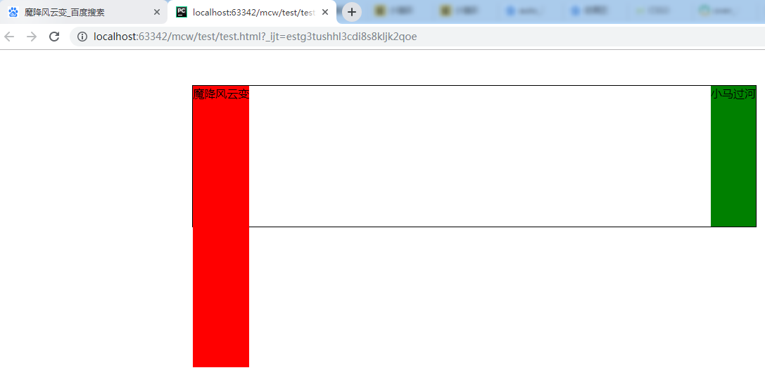
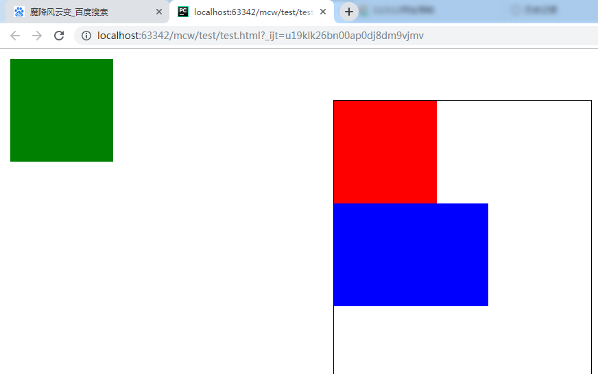
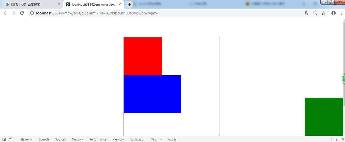
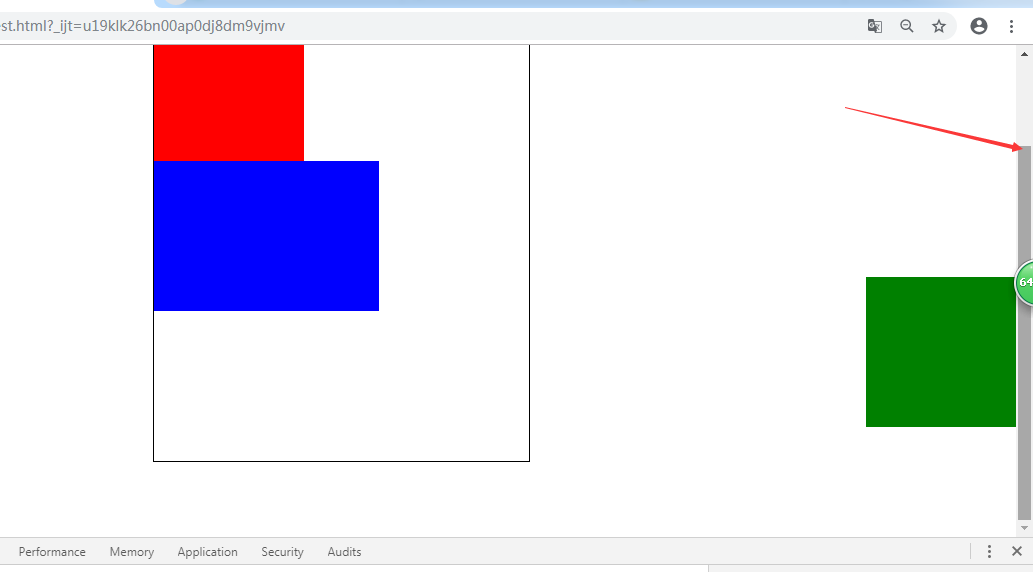
这时我将红色盒子200px的宽度注释掉,绿色盒子的宽度也注释掉,这两个div放入内容。


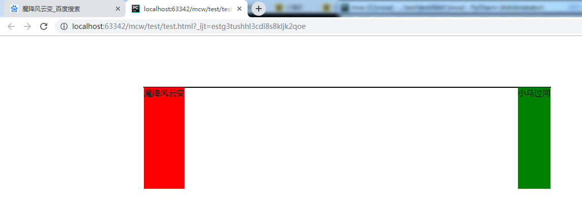
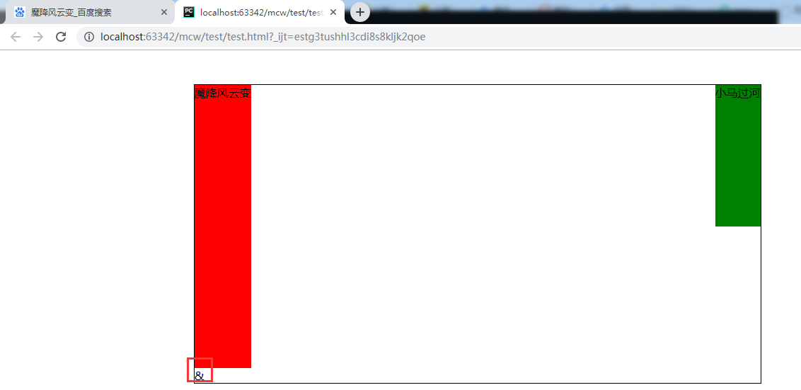
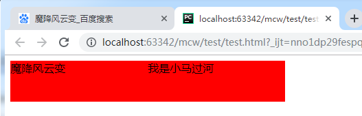
<html lang="en">
<head>
    <meta charset="UTF-8">
    <style>
        *{padding: 0;margin: 0}
        .father{
            width: 800px;
            /*height: 800px;*/
            border: 1px solid #000;
            margin: 100px auto;
        }
        .child1{
            /*width: 200px;*/
            height: 200px;
            background-color: red;
            float: left;
        }
        .child2{
            /*width: 300px;*/
            height: 200px;
            background-color: green;
            float: left;
        }
    </style>
</head>
<body>
    <div class="father">
        <div class="child1">魔降风云变</div>
        <div class="child2">小马过河</div>
    </div>
</body>
</html>
这两个盒子去掉宽度之后,盒子的宽度就是里面内容的宽度,高度还是有的。这是浮动的现象之一:收缩现象

<html lang="en">
<head>
    <meta charset="UTF-8">
    <style>
        *{padding: 0;margin: 0}
        .father{
            width: 800px;
            /*height: 800px;*/
            border: 1px solid #000;
            margin: 100px auto;
        }
        .child1{
            /*width: 200px;*/
            height: 200px;
            background-color: red;
            /*float: left;*/
        }
        .child2{
            /*width: 300px;*/
            height: 200px;
            background-color: green;
            /*float: left;*/
        }
    </style>
</head>
<body>
    <div class="father">
        <div class="child1">魔降风云变</div>
        <div class="child2">小马过河</div>
    </div>
</body>
</html>
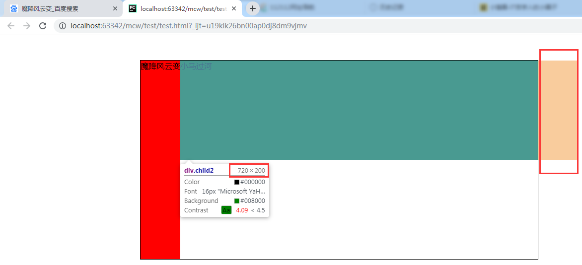
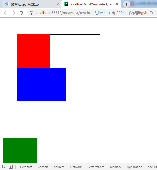
此时,再把红色盒子和绿色盒子的浮动属性去掉,两个div各占一行:
给红色盒子设置浮动之后:
再给绿色盒子设置浮动之后:
给绿色盒子设置右浮:
上面栗子明显看出,浮动元素有收缩效果发生,并且父元素没有高度时是撑不起父盒子的。撑不起父盒子,如果父盒子下面有盒子的话,就会占领红色和绿色盒子所在的区域。这样页面就混乱了。
4、清除浮动
清除浮动作用,我的理解是:在父盒子不设高度,需要用内容来撑起父盒子的高度的情况下,清除浮动带来的不能支撑起父盒子的问题(影响)。
什么时候清除浮动?我的理解满足两个条件是:1、div这类的浮动实现并排 2、父盒子没设置高度。
4.1、给父元素添加固定高度
        .father{
            width: 800px;
            height: 200px;
            border: 1px solid #000;
            margin: 50px auto;
        }
给父元素添加和子盒子一样的高度,父元素撑起了的,但不是子盒子撑起来的:

这时红色盒子突然有添加高度的需求了,又出现问题了。
        .child1{
            /*width: 200px;*/
            height: 400px;
            background-color: red;
            float: left;
        }
,子元素在父元素高度外,父盒子相当于是没有撑起来,页面又会出现混乱
将父盒子高度再次修改成最高的子盒子高度,又不会影响页面了。

一个网页有特别多几百上千的浮动,那么每次都要手动去改父盒子的高度吗?显然不可能的。
所以给父元素添加固定高度,不灵活。后期不易 维护。但是如果是万年不变导航栏是可以使用这种方法的。
比如这里,没有变化的需要,将父盒子高度固定了。
4.2内墙法
给浮动盒子的最后放一堵墙,这堵墙设置一个属性,这个属性解决这个问题。这堵墙一般是clear both。这样就不用自己去计算浮动元素的高度了。
内墙法:给最后一个浮动元素的后面添加一个空的块级标签,并且设置该标签的属性为clear:both;
问题:冗余
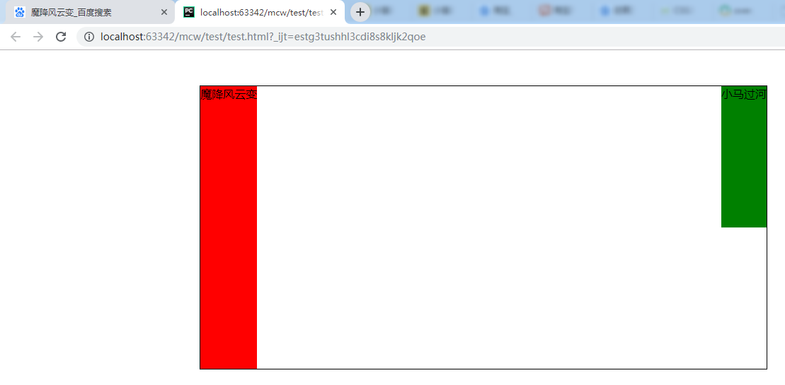
<html lang="en">
<head>
    <meta charset="UTF-8">
    <style>
        *{padding: 0;margin: 0}
        .father{
            width: 800px;
            /*height: 400px;*/
            border: 1px solid #000;
            margin: 50px auto;
        }
        .child1{
            /*width: 200px;*/
            height: 400px;
            background-color: red;
            float: left;
        }
        .child2{
            /*width: 300px;*/
            height: 200px;
            background-color: green;
            float: right;
        }
    </style>
</head>
<body>
    <div class="father">
        <div class="child1">魔降风云变</div>
        <div class="child2">小马过河</div>
    </div>
</body>
</html>
现在去掉父盒子的高度:

添加clear both;
     .clear{clear: both}

<div class="father">
        <div class="child1">魔降风云变</div>
        <div class="child2">小马过河</div>
        <div class="clear"></div>
    </div>
解决了浮动元素撑不起父盒子的问题:

但是内墙法有缺陷,一个网页有很多个浮动,每次都要在所有子盒子后面添加<div class="clear"></div>才能计算并解决子盒子撑不起父盒子的问题,那么需要写很多次这个空的标签。这样代码冗余,代码量增大,也增大网络传输用的带宽。
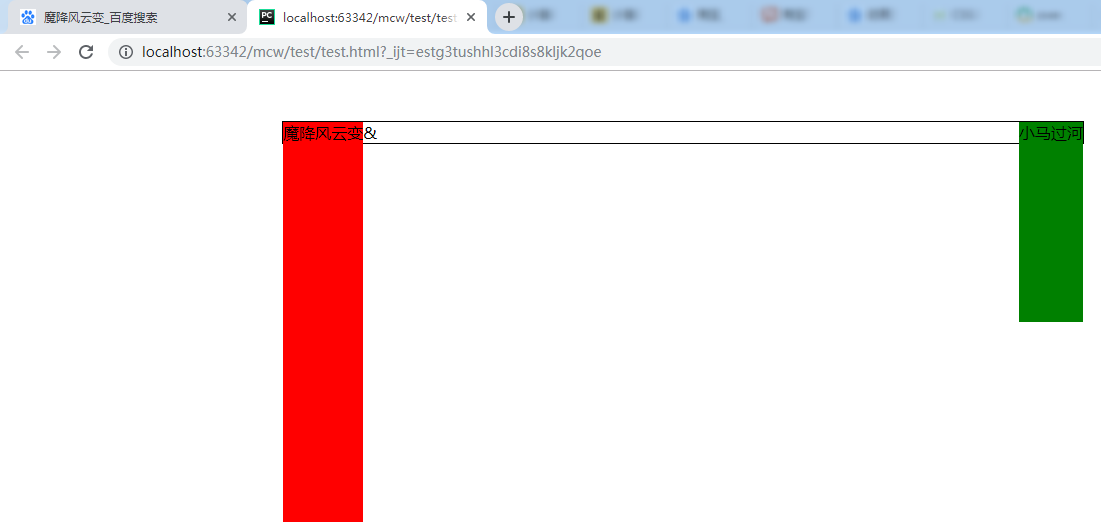
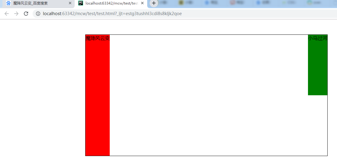
4.3伪元素清除法
        .clearfix::after{
            content: '&';
        }
    </style>
<body>
    <div class="father clearfix">
        <div class="child1">魔降风云变</div>
        <div class="child2">小马过河</div>
    </div>
</body>
添加一个伪元素选择器,在父盒子内容的最后添加一个内容。给需要添加的父盒子添加这个类
下面出现了文字环绕现象
内墙法:给最后一个浮动元素的后面添加一个空的块级标签,并且设置该标签的属性为clear:both;
现在,给给最后一个浮动元素的后面添加一个空的块级标签。转块级标签,并且使用clear: both;
这样就撑起了父盒子,但是现在不想要&符,去掉它
        .clearfix::after{
            content: '';
            display: block;
            clear: both;
        }
如果我想用&,怎样去掉它?display: none;?会把前面的覆盖掉,又没有撑起来了。
但是可以这样:
        .clearfix::after{
            content: '&';
            display: block;
            clear: both;
            visibility: hidden;

        }
这个属性将可以看见的隐藏,但是空行还在,占位置

那么把这个位置去掉:
        .clearfix::after{
            content: '&';
            display: block;
            clear: both;
            visibility: hidden;
            height: 0;
        }
这样清除会多出几行代码。不如直接用空格的:
        .clearfix::after{
            content: '';
            display: block;
            clear: both;
        }
4.4 overflow:hidden;
overflow的功能演示:
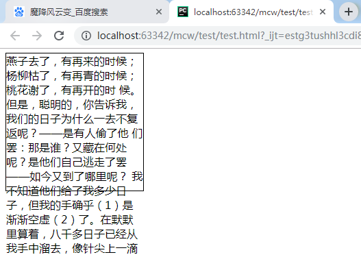
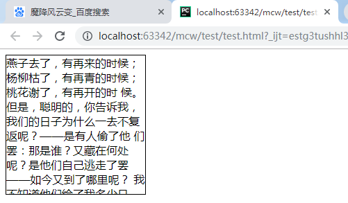
<html lang="en">
<head>
    <meta charset="UTF-8">
    <style>
        .box{width: 200px;height: 200px;border: 1px solid #000}
    </style>
</head>
<body>
    <div class="box">
          燕子去了,有再来的时候;杨柳枯了,有再青的时候;桃花谢了,有再开的时 候。但是,聪明的,你告诉我,我们的日子为什么一去不复返呢?——是有人偷了他 们罢:那是谁?又藏在何处呢?是他们自己逃走了罢——如今又到了哪里呢?
     我不知道他们给了我多少日子,但我的手确乎(1)是渐渐空虚(2)了。在默默里算着,八千多日子已经从我手中溜去,像针尖上一滴水滴在大海里,我的日子滴在时间的流里,没有声音,也没有影子。我不禁头涔涔(3)而泪潸潸(4)了。
       去的尽管去了,来的尽管来着;去来的中间,又怎样地匆匆呢?早上我起来的时候,小屋里射进两三方斜斜的太阳。太阳他有脚啊,轻轻悄悄地挪移了;我也茫茫然跟着旋转。于是——洗手的时候,日子从水盆里过去;吃饭的时候,日子从饭碗里过去;默默时,便从凝然的双眼前过去。我觉察他去的匆匆了,伸出手遮挽时,他又从遮挽着的手边过去,天黑时,我躺在床上,他便伶伶俐俐(5)地从我身上跨过,从我脚边飞去了。等我睁开眼和太阳再见,这算又溜走了一日。我掩着面叹息。但是新来的日子的影儿又开始在叹息里闪过了。
      在逃去如飞的日子里,在千门万户的世界里的我能做些什么呢?只有徘徊(6)罢了(7),只有匆匆罢了;在八千多日的匆匆里,除徘徊外,又剩些什么呢?过去的日子如轻烟,被微风吹散了,如薄雾,被初阳蒸融了;我留着些什么痕迹呢?我何曾留着像游丝(8)样的痕迹呢?我赤裸裸来到这世界,转眼间也将赤裸裸的回去罢?但不能平的,为什么偏要白白走这一遭啊?
       你聪明的,告诉我,我们的日子为什么一去不复返呢?
    </div>
</body>
</html>
文字太多超出了设定的高度,
其实里面使用默认属性
overflow: visible
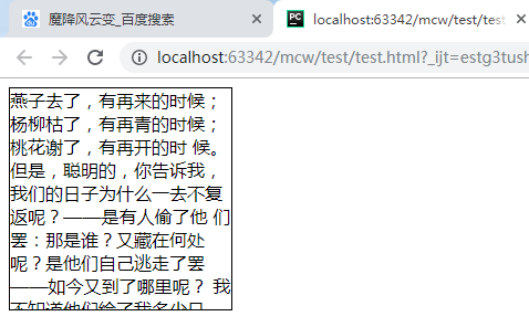
现在设置超出部分隐藏:
.box{width: 200px;height: 200px;border: 1px solid #000;overflow: hidden}
隐藏看不见了,但是超出的我还需要:
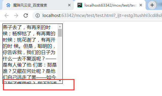
.box{width: 200px;height: 200px;border: 1px solid #000;overflow: scroll}
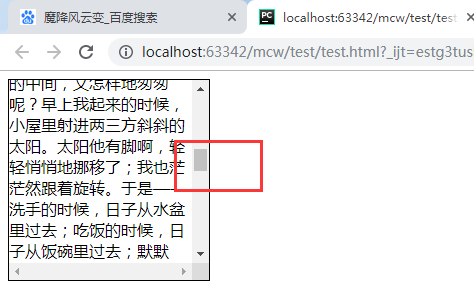
下面没有滚动栏的属性值;
.box{width: 200px;height: 200px;border: 1px solid #000;overflow: auto}
还可以继承父的超出部分的怎么做:
    <style>
        body{overflow: hidden}
        .box{width: 200px;height: 200px;border: 1px solid #000;overflow: inherit}
    </style>
使用这个属性之前:
<html lang="en">
<head>
    <meta charset="UTF-8">
    <style>
        *{padding: 0;margin: 0}
        .father{
            width: 800px;
            margin: 50px auto;
            border: 1px solid #000;
        }
        .child1{
            height: 400px;
            background-color: red;
            float: left;
        }
        .child2{
            height: 200px;
            background-color: green;
            float: right;
        }
    </style>
</head>
<body>
    <div class="father">
        <div class="child1">魔降风云变</div>
        <div class="child2">小马过河</div>
    </div>
</body>
</html>

使用这个属性之后,
        .father{
            width: 800px;
            margin: 50px auto;
            border: 1px solid #000;
            overflow: hidden;
        }
给父盒子使用overflow: hidden;之后,父盒子被撑起来了。
实现的原因:使用overflow: hidden;之后,在CSS2.1版本中会撑起一个BFC 块级格式化上下文
5.BFC详解
https://book.apeland.cn/details/355/
BFC布局规则
1.内部的Box会在垂直方向,一个接一个地放置。2.Box垂直方向的距离由margin决定。属于同一个BFC的两个相邻Box的margin会发生重叠3.每个元素的margin box的左边, 与包含块border box的左边相接触(对于从左往右的格式化,否则相反)。即使存在浮动也是如此。4.BFC的区域不会与float 元素重叠。5.BFC就是页面上的一个隔离的独立容器,容器里面的子元素不会影响到外面的元素。反之也如此。6.计算BFC的高度时,浮动元素也参与计算
那些元素会生成BFC
1.根元素2.float属性不为none3.position为absolute或fixed4.display为inline-block5.overflow不为visible
.overflow不为visible时会产生BFC。BFC会自动让内部浮动元素计算高度。浮动带来的影响就是子元素不会计算高度,父元素不知道用哪个高度,撑不起父元素。BFC以最高的元素为基准撑起父元素。
<html lang="en">
<head>
    <meta charset="UTF-8">
    <style>
        *{padding: 0;margin: 0}
        .father{
            width: 800px;
            margin: 50px auto;
            border: 1px solid #000;
            overflow: hidden;
        }
        .child1{
            height: 400px;
            background-color: red;
            /*float: left;*/
        }
        .child2{
            height: 200px;
            background-color: green;
            /*float: right;*/
        }
    </style>
</head>
<body>
    <div class="father">
        <div class="child1">魔降风云变</div>
        <div class="child2">小马过河</div>
    </div>
</body>
</html>
取消红色和绿色盒子的浮动,给父盒子添加属性overflow: hidden; 这样就形成了BFC(可查看形成的条件在上):
验证了第一句话:1.内部的Box会在垂直方向,一个接一个地放置。
由以前博客(塌陷问题)可知:Box垂直方向的距离由margin决定。属于同一个BFC的两个相邻Box的margin会发生重叠
根元素也是实现了BFC的。
将红色盒子设为左浮动(出现了收缩现象),浮动和不浮动的盒子都是贴着父元素左边。
由此证明:3.每个元素的margin box的左边, 与包含块border box的左边相接触(对于从左往右的格式化,否则相反)。即使存在浮动也是如此。

哪些会形成BFC 2.float属性不为none
红色盒子左浮的时候,float属性不为none形成BFC,绿色盒子宽度800px
将绿色盒子设置成overflow:hidden的时候绿盒子形成BFC:。4.BFC的区域不会与float 元素重叠。
两个都是左浮的的子盒子一般都是形成BFC 。 4.BFC的区域不会与float 元素重叠。 所以两个左浮的盒子一个贴父元素的边。一个被挤出第一个浮动元素的BFC,贴着第一个浮动元素,实现并排。
.BFC就是页面上的一个隔离的独立容器,容器里面的子元素不会影响到外面的元素。反之也如此。6.计算BFC的高度时,浮动元素也参与计算
像下面这些元素:
这些可以显现出来的不能用overflow:hidden;否则超出部分隐藏,那么就显示不出来这些内容了。如果这行没有需要显现出来的这种效果,那么可以用overflow:hidden。上面的那个都是用的固定高度。
清除浮动 给父元素添加固定高度,内墙法,伪元素清除法,overflow:hidden 伪元素清除法不会出现问题,overflow:hidden 需要注意超出部分也会隐藏的问题。
6、绝对定位和相对定位
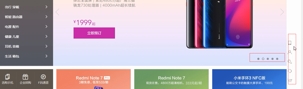
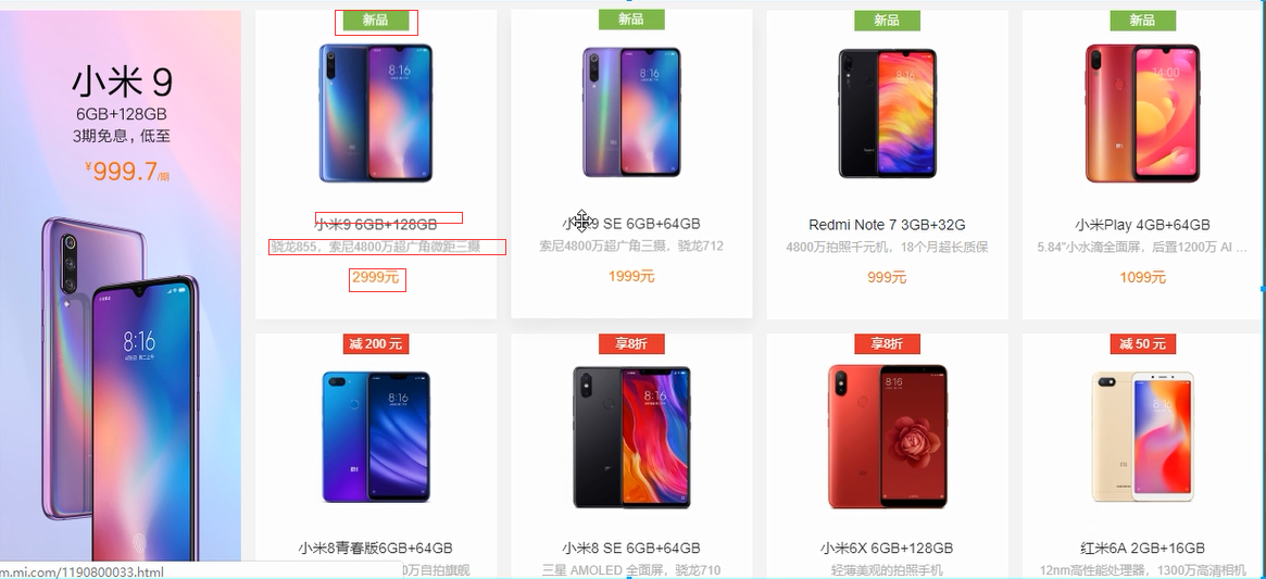
6.1技术使用到的地方举例
鼠标悬浮时,form表单颜色加深

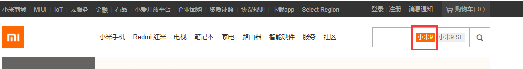
鼠标悬浮小米9,也有改变。 悬浮 伪类选择器 hover
鼠标悬浮搜索图标,改变:
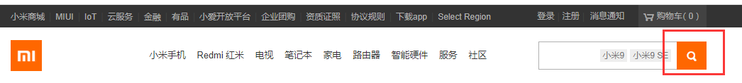
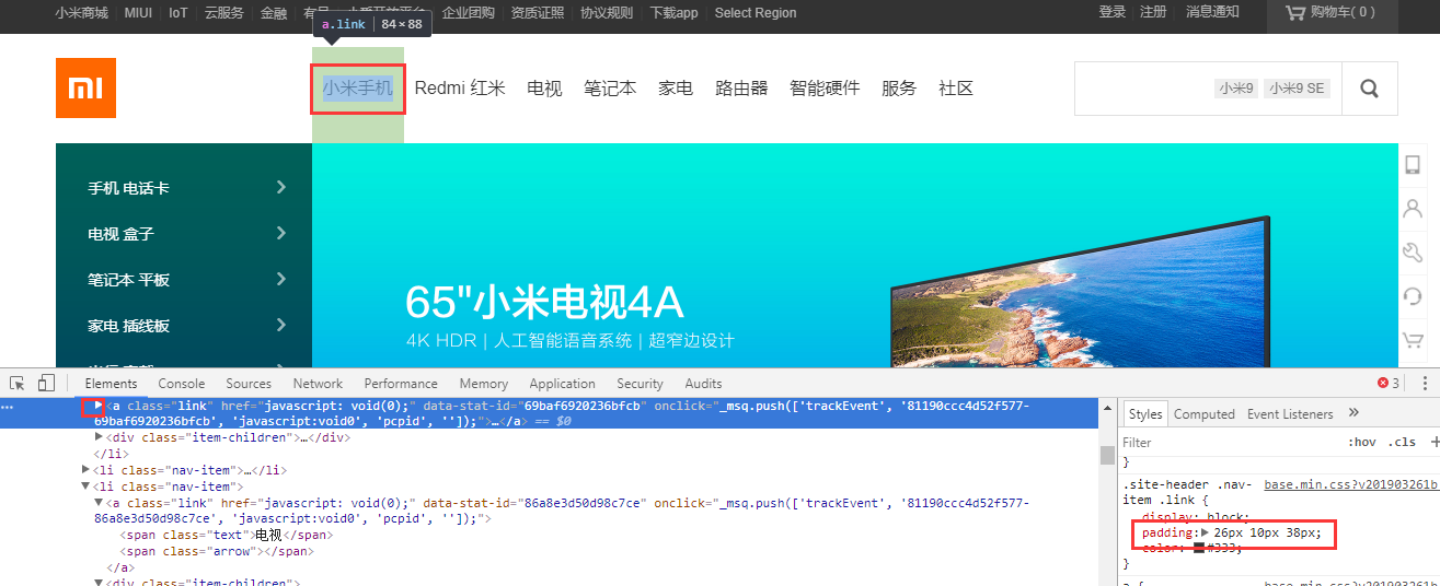
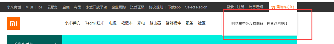
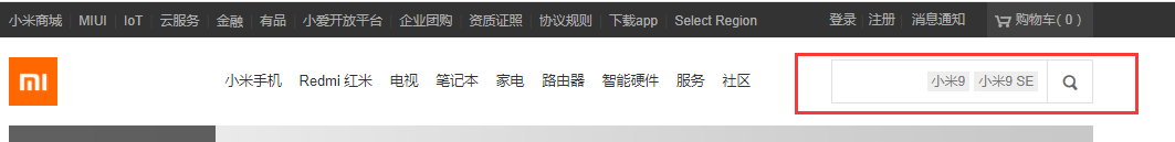
小米9和小米9 SE 怎么实现在搜索框里呢?定位实现的。并且这两个是压盖在了input上面。
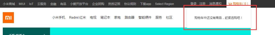
下面购物车这里下拉下来了,下拉下来是js操作,一个动画,卷帘门效果下拉的。下拉下来的这块内容优先级是大于下面那块内容的。
下面红框是定位效果:

看下面:1是2定位过去的

还用了清除浮动,在下边的div里。
6.2相对定位:
(子盒子设置相对定位后)相对于原来的位置,移动方向与属性(上下左右)反,移动属性值个单位
<html lang="en">
<head>
    <meta charset="UTF-8">
    <style>
        .box{width: 500px;height: 600px;border: 1px solid #000}
        .box .a{
            width: 200px;
            height: 200px;
            background-color: red;
        }
        .box .b{
            width: 200px;
            height: 200px;
            background-color: green;
        }
        .box .c{
            width: 200px;
            height: 200px;
            background-color: blue;
        }
    </style>
</head>
<body>
    <div class="box">
        <div class="a"></div>
        <div class="b"></div>
        <div class="c"></div>
    </div>
</body>
</html>
三个标准文档流下的盒子:
给b绿色盒子设置相对定位:
        .box .b{
            width: 200px;
            height: 200px;
            background-color: green;
            position: relative;
        }
给b设置相对定位后刷新没有效果,说明设置相对定位后与我们的标准文档流的盒子没有区别,也米有像浮动一样脱标
设置相对定位后,可以使用上下左右四个属性的英文做设置。那么我用top试试:
        .box .b{
            width: 200px;
            height: 200px;
            background-color: green;
            position: relative;
            top :30px;
        }
结果是在父盒子中,设置了相对定位的绿盒子相对于原来它在标准文档流下当前盒子所在的位置下移30px,top 30px 顶部距离原位置30px,移动方向与属性相反。并且原来的位置不像浮动那样,它还是占有原来的位置。移动后显示的位置如果存在其它元素,会存在压盖现象。这里是绿色压盖了蓝色
如果我再给第二个盒子设置一个left
        .box .b{
            width: 200px;
            height: 200px;
            background-color: green;
            position: relative;
            top :30px;
            left: 50px;
        }
(子盒子设置相对定位后)相对于原来的位置,移动方向与属性(上下左右)反,移动属性值个单位
虽然这样可以实现压盖,但是原来的位置还保留在那里,会影响整个布局的。
那么这种相对定位的使用场景一般是做子绝父相的布局。子元素设置绝对定位,父元素设置相对定位。
-
与标准文档流下的盒子没有任何区别
-
留“坑”,会影响页面布局
作用:
做“子绝父相”布局方案的参考
参考点:
以原来的盒子为参考点
6.3绝对定位
<html lang="en">
<head>
    <meta charset="UTF-8">
    <style>
        .box{width: 500px;height: 600px;border: 1px solid #000}
        .box .a{
            width: 200px;
            height: 200px;
            background-color: red;
        }
        .box .b{
            width: 200px;
            height: 200px;
            background-color: green;

        }
        .box .c{
            width: 200px;
            height: 200px;
            background-color: blue;
        }
    </style>
</head>
<body>
    <div class="box">
        <div class="a"></div>
        <div class="b"></div>
        <div class="c"></div>
    </div>
</body>
</html>
回到之前的状态

给b绿盒子设置绝对定位
        .box .b{
            width: 200px;
            height: 200px;
            background-color: green;
            position: absolute;
        }
c蓝色盒子不见了
给蓝色盒子宽度加100,改成300。发现绿色盒子是脱标了。
给一个标准流文档下的盒子设置了绝对定位,第一种现象是它脱标了,不在页面上占位置

购物车这里也是脱标了,不在页面上占位置。如果它在页面上占位置,那么整个导航就会被拖下去的。所以说这里肯定也是绝对定位的。所以做压盖的时候我们一般使用的是绝对定位

压盖
压盖
绝对定位也有四个属性:上下左右
这里给b绿色盒子设置绝对定位top 20px
        .box .b{
            width: 200px;
            height: 200px;
            background-color: green;
            position: absolute;
            top:20px;
        }
那么b绿色盒子距离顶部20px,是以body为参考呢还是以父盒子为参考呢?给父盒子上下设置margin,左右居中
.box{width: 500px;height: 600px;border: 1px solid #000;margin: 100px auto}

我再给b绿盒子设置一个left值
我将b绿盒子绝对定位的属性上左设置为0px:
        .box .b{
            width: 200px;
            height: 200px;
            background-color: green;
            position: absolute;
            top:0px;
            left: 0px;
        }

当我将b绿盒子设置下左0px的时候,它以浏览器显示的左下角为目标,即使改变左下角的位置它还是跟着移动


设置绝对定位的子盒子右下0px
我把滚动条下移:它动了
我将它放到右上角,移动滚动条,它最终会变没的。

1、不针对于祖先元素的参考点
有top参与的情况:参考点是页面的左上角或者右上角。
有bottom参与的情况:参考点是首屏的左下角或者右下角。
所以绝对定位是:子盒子设置了绝对定位,上下左右的属性值是距离上下左右的距离。它脱离标准文档流不占位置了。一个属性时就还有一边跟父盒子对应。
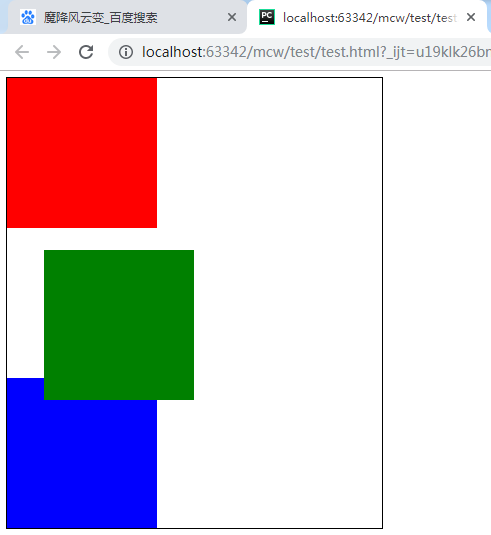
<html lang="en">
<head>
    <meta charset="UTF-8">
    <style>
        .box{width: 500px;height: 600px;border: 1px solid #000;}
        .box .a{
            width: 200px;
            height: 200px;
            background-color: red;

        }
        .box .b{
            width: 200px;
            height: 200px;
            background-color: green;
            position: absolute;
            bottom: 20px;
            left: 20px;
        }
        .box .c{
            width: 300px;
            height: 200px;
            background-color: blue;
        }
    </style>
</head>
<body>
    <div class="box">
        <div class="a"></div>
        <div class="b"></div>
        <div class="c"></div>
    </div>
</body>
</html>
现在让b绿色盒子绝对定位且下20px,左20px。绿色盒子脱离了标准文档流不占位置。

6.4、子绝父相的布局
子绝父相总结:
绝对定位的子盒子以离它最近的相对定位的祖辈盒子的对应角为原点。(跟margin无关,跟相对定位的祖辈盒子的border有关)。如果祖辈没有设置相对定位的,那么以浏览器显示框的四个对应角为原点。子盒子用上下左右属性来定位自己对应边距离对应原点上下左右属性值个位置。属性值可以为负,负为在父盒子或浏览器显示框的外部区域;正为父盒子或浏览器显示框的内部区域。
再让父盒子设置相对定位
.box{width: 500px;height: 600px;border: 1px solid #000;position:relative}
绝对定位的子盒子以相对定位的父盒子的四个边为参考做绝对定位。
给设置了相对定位的父盒子设置右浮,父盒子在body下往右靠,绝对定位的子盒子也跟着走,相对于父盒子的位置不变。

加相对定位的绿盒子下属性改为top属性,
子绝父相。父正常改变位置,子相对父位置不变,子以父的四个顶点为原点,在父内绝对定位且父内空间为正坐标,超出父则为负坐标。
子绝父相。父正常改变位置,子相对父位置不变,子以父的四个顶点为原点,在父内绝对定位且父内空间为正坐标,超出父则为负坐标。
下图父相对对定位且右浮。子(绿色)绝对定位left: 20px;bottom: -50px; 在父内绝对定位且父内空间为正坐标,超出父则为负坐标。左20子左在父内距父左20。下-50子下距父下50且子下在父外,父外为负,父内为正,父边为0。
现在如下:
<style>
    body{margin: 100px}
    .box{width: 500px;height: 600px;border: 1px solid #000}
    .box .a{
        width: 200px;
        height: 200px;
        background-color: red;
    }
    .box .b{
        width: 200px;
        height: 200px;
        background-color: green;
        position: absolute;
        /*top: 20px;*/
        left: 20px;
        bottom: -50px;
    }
    .box .c{
        width: 300px;
        height: 200px;
        background-color: blue;
    }
</style>
子绝对定位,左20,下-50。

body{margin: 100px;border: 4px solid yellow;}
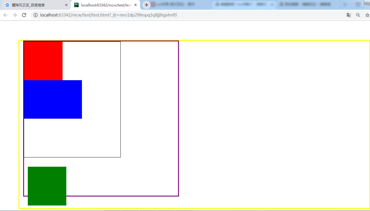
#father-of-box{border: 4px solid purple;width: 800px;height: 800px;}
.box{width: 500px;height: 600px;border: 1px solid #000}
<html lang="en">
<head>
    <meta charset="UTF-8">
    <style>
        body{margin: 100px;border: 4px solid yellow;}
        #father-of-box{border: 4px solid purple;width: 800px;height: 800px;}
        .box{width: 500px;height: 600px;border: 1px solid #000}
        .box .a{
            width: 200px;
            height: 200px;
            background-color: red;
        }
        .box .b{
            width: 200px;
            height: 200px;
            background-color: green;
            position: absolute;
            /*top: 20px;*/
            left: 20px;
            bottom: -50px;
        }
        .box .c{
            width: 300px;
            height: 200px;
            background-color: blue;
        }
    </style>
</head>
<body>
    <div id="father-of-box">
        <div class="box">
            <div class="a"></div>
            <div class="b"></div>
            <div class="c"></div>
        </div>
    </div>
</body>
</html>
box,father,body没有设置相对定位。box内第二个盒子绿盒子绝对定位左20下-50结果以浏览器显示出来的对应角为原点,参考点不是body的边界,在body的margin内的角。
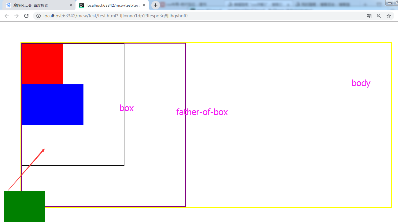
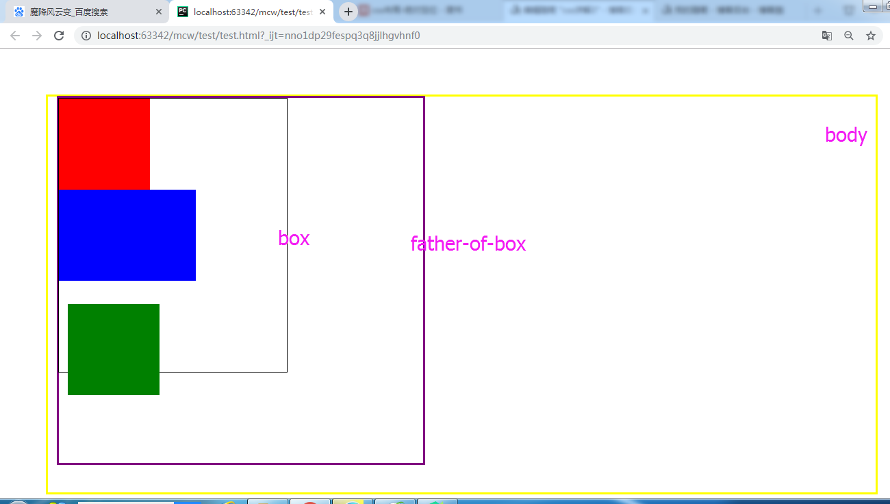
现在给father-of-box设置相对定位。
#father-of-box{border: 4px solid purple;width: 800px;height: 800px;position: relative}
现在绿盒子以father-of-box的左下角为原点。
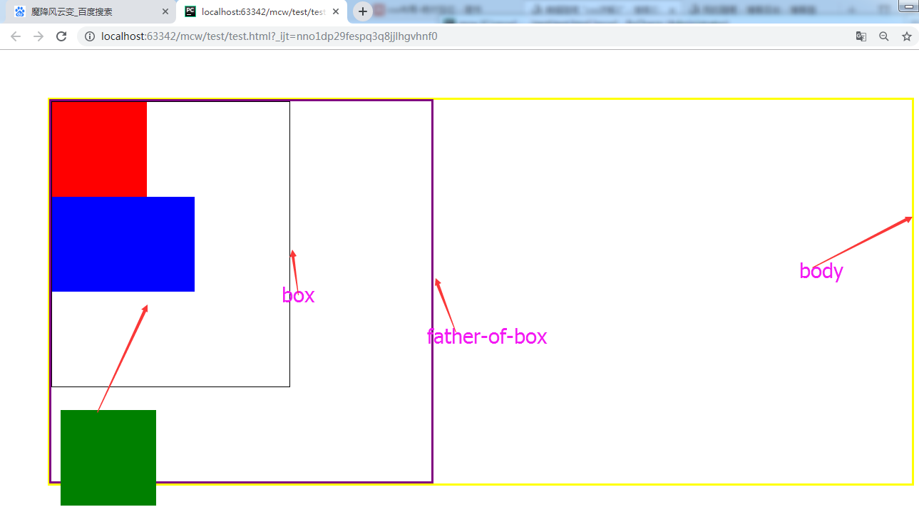
给father-of-box左margin20,下margin60,绝对定位的子盒子以离它最近的相对定位的祖辈盒子的对应角为原点。(跟margin无关,跟相对定位的祖辈盒子的border有关)
将box设置为相对定位:
.box{width: 500px;height: 600px;border: 1px solid #000;position: relative}
将box设置为相对定位后,因为绝对定位的子盒子以离它最近的相对定位的祖辈盒子的对应角为原点。(跟margin无关,跟相对定位的祖辈盒子的border有关),所以以box的左下角为原点
子绝父相总结:
绝对定位的子盒子不占标准文档流的空间,但是会压盖别人的位置。绝对定位的子盒子以离它最近的相对定位的祖辈盒子的对应角为原点。(跟margin无关,跟相对定位的祖辈盒子的border有关)。如果祖辈没有设置相对定位的,那么以浏览器显示框的四个对应角为原点。子盒子用上下左右属性来定位自己对应边距离对应原点上下左右属性值个位置。属性值可以为负,负为在父盒子或浏览器显示框的外部区域;正为父盒子或浏览器显示框的内部区域。
6.5浮动和绝对定位的特征:
<html lang="en">
<head>
    <meta charset="UTF-8">
    <style>
        span{background-color: red;}
    </style>
</head>
<body>
    <span>魔降风云变</span>
</body>
</html>
给它span设置一个左浮动:
span{background-color: red;float: left}

去掉浮动,再添加一个span,
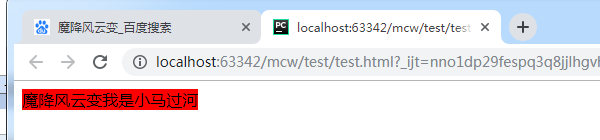
<html lang="en">
<head>
    <meta charset="UTF-8">
    <style>
        span{background-color: red;}
    </style>
</head>
<body>
    <span>魔降风云变</span>
    <span>我是小马过河</span>
</body>
</html>
有空白折叠
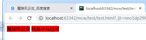
将两个设置左浮动
span{background-color: red;float: left}
去掉了空白折叠
span{background-color: red;float: left;width: 200px;height: 60px}
添加左浮动之后,行内标签span不用转行内块也可以设置宽高了。这时浮动元素带来的特征
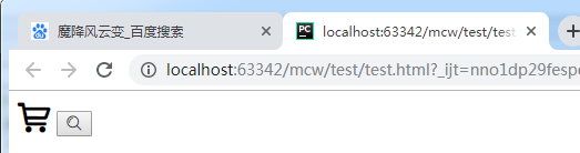
<html lang="en">
<head>
    <meta charset="UTF-8">
    <style>
        span{background-color: red;position: absolute;width: 600px;height: 60px}
    </style>
</head>
<body>
    <span>魔降风云变</span>
    <span>我是小马过河</span>
</body>
</html>
给span行内标签设置绝对定位也可以添加宽高,但是相对定位是不可以的。一旦给一个元素设置了浮动,它的宽高就不受限制了。
比如下面这个logo,设置了margin-top不好使了。会拽着父元素往下走

<html lang="en">
<head>
    <meta charset="UTF-8">
    <style>
        .container{width: 100%;height: 100px;margin: 20px auto;background-color: #000; }
        .logo{width: 55px;height: 55px;background-color: #ff6700;}
    </style>
</head>
<body>
    <div class="container">
        <div class="logo"></div>
    </div>
</body>
</html>
想要将黄色盒子在褐色盒子中垂直居中,
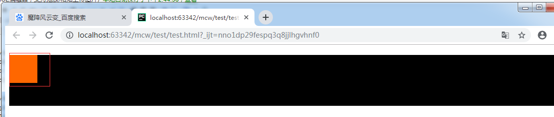
给log添加一个margin-top,父盒子容器被拉下来了,但是log还是没有动
.logo{width: 55px;height: 55px;background-color: #ff6700;margin-top:30px}
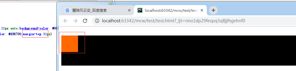
给log再加个浮动:
.logo{width: 55px;height: 55px;background-color: #ff6700;margin-top:30px;float: left}
让子盒子垂直居中,需要让子盒子在父元素中设置浮动,才能使用margin-top的方法将子盒子在父盒子中垂直移动位置

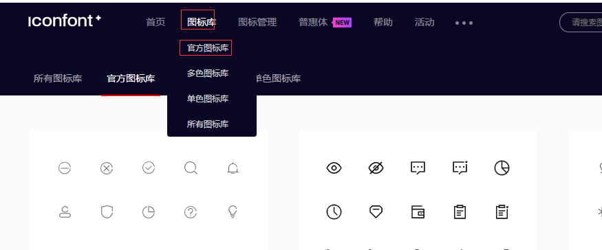
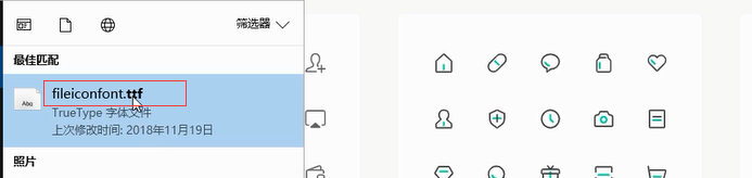
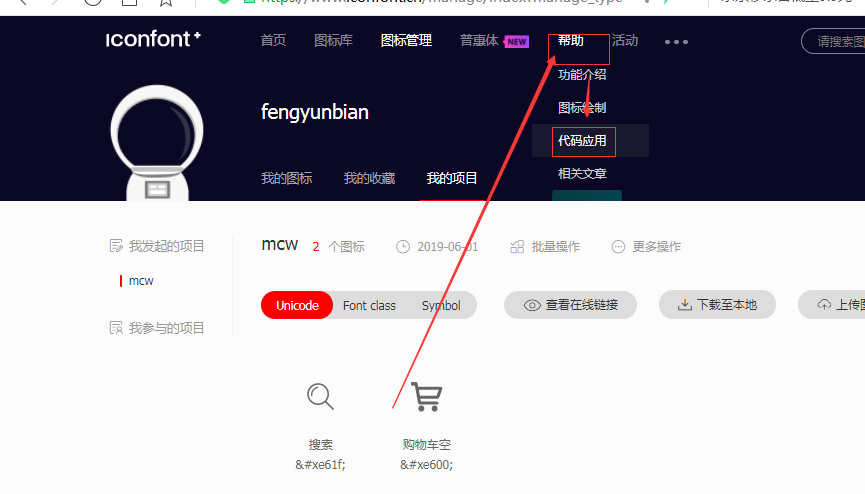
7、iconfont使用方法
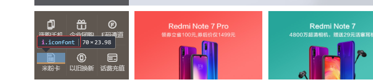
小图标使用的是iconfont

像这种小图标,如果东西多了占用自己的带宽,请求自己的也多了。如果是用的别人服务器里写好的图标,自己服务器压力也能减小一点。
它们其实就是ttf字体文件
可简单搜索,下载调色:
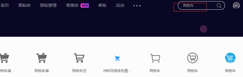


添加入库:
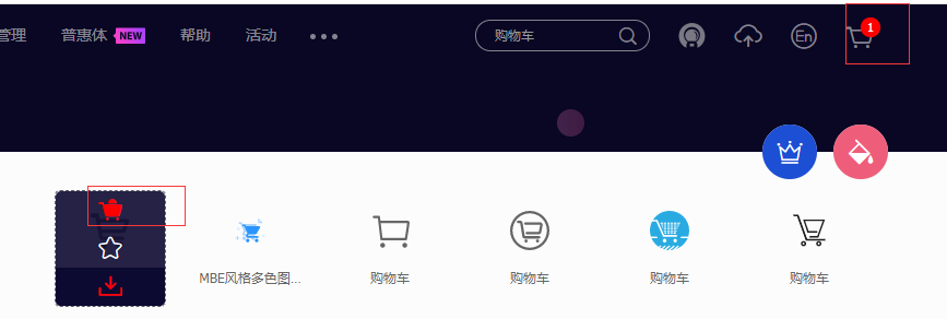
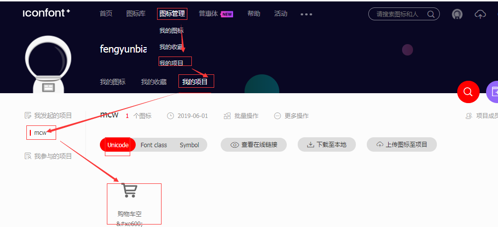
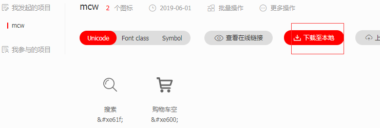
添加至项目->没有项目就新建->添加到项目中可以查看到刚才添加的图标。如果用链接的方式有三种用法 unicode 、font class 、symbol。
不会使用的话查看这里
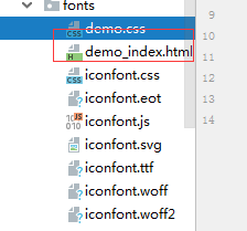
解压之后目录修改为fonts目录,demo里面有使用方法。删了就行,没用。
在css目录下创建myIconfon.css样式,将使用方法里的内容复制到样式文件中。url改为正确的fonts目录这个路径下。
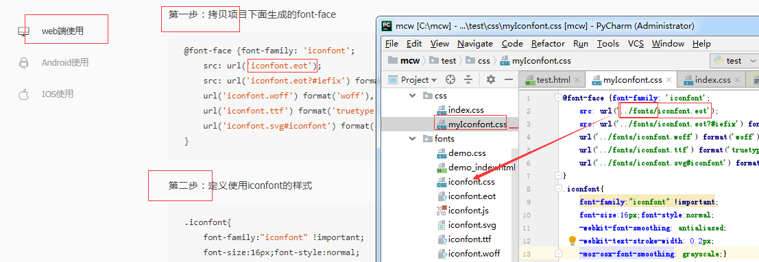
样式和字体配置好后就可以在html中引入这个css样式<link rel="stylesheet" href="css/myIconfont.css">
第三步:挑选相应图标并获取字体编码,应用于页面<i class="iconfont">3</i>

使用案例:
<html lang="en"> <head> <meta charset="UTF-8"> <link rel="stylesheet" href="css/myIconfont.css"> <style> i.active{font-size: 30px} </style> </head> <body> <i class="iconfont active"></i> <input type="submit" value="" class="iconfont"> </body> </html>
通过font-size: 30px控制图标大小。
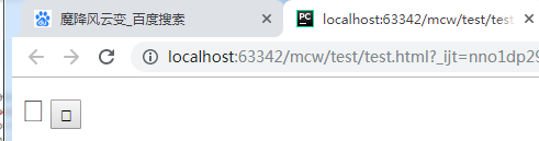
如果我把fontface的字体文件路径注释掉,就成了小方框
css配置的代码:css和fonts同目录下。
@font-face {font-family: 'iconfont';
    src: url('../fonts/iconfont.eot');
    src: url('../fonts/iconfont.eot?#iefix') format('embedded-opentype'),
    url('../fonts/iconfont.woff') format('woff'),
    url('../fonts/iconfont.ttf') format('truetype'),
    url('../fonts/iconfont.svg#iconfont') format('svg');
}
.iconfont{
    font-family:"iconfont" !important;
    font-size:16px;font-style:normal;
    -webkit-font-smoothing: antialiased;
    -webkit-text-stroke-width: 0.2px;
    -moz-osx-font-smoothing: grayscale;}
这样几个小图标也是iconfont
还有另一种方法使用,使用网上的字体样式而不是本地下载下来的。

将本地的字体文件地址改成网络上的地址链接,一样可以使用:

8、子绝父相的应用案例之一
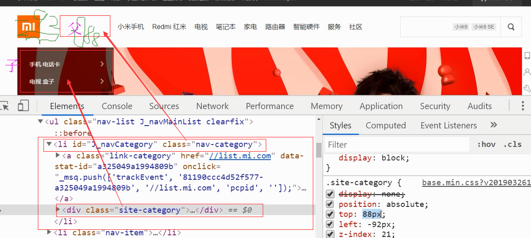
大框是个div,1和2是个div。2里面有个图片。1里面有个3是列表ul,4这里隐藏了一个li,类名从下面的元素审查里看出和其它li标签有区别,这里隐藏了。

这个隐藏的li里面有个子标签div。
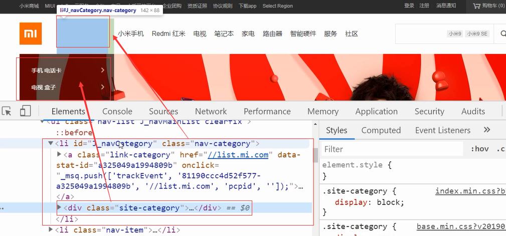
li父元素设置相对定位
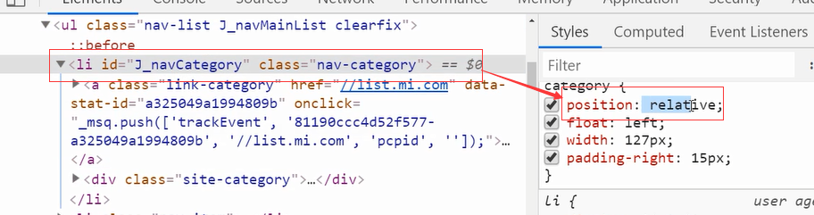
子元素设置绝对定位。子绝父相的结构:

子元素top 88, 向下移了88;left -92 负的 向左移了92,到了现在的位置。子绝父相,绝对定位不占位置。这个div覆盖了下面的图片,但是透明度高,能看到一点压盖的图片。它的优先级z-index是21,比下面图片优先级高,压盖了下面的图片。
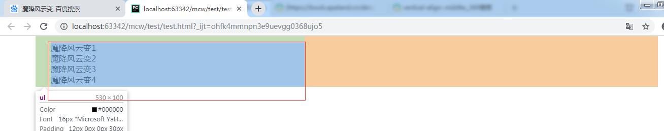
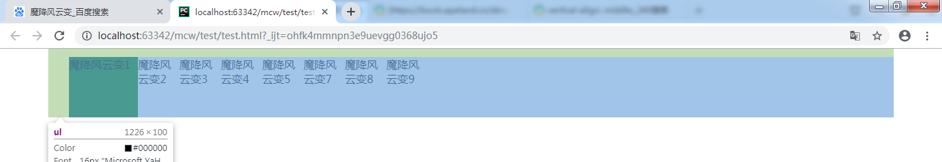
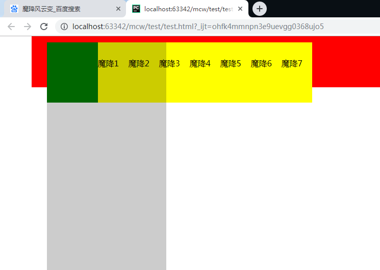
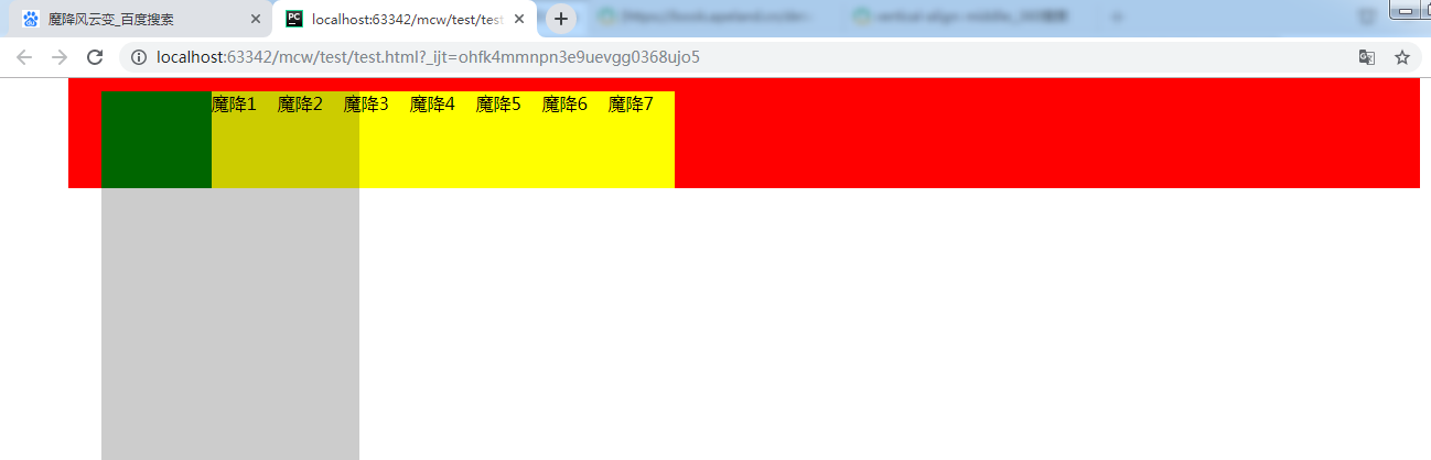
<html lang="en">
<head>
    <meta charset="UTF-8">
    <style>
        #box{
            width: 1226px;
            height: 100px;
            margin: 0 auto;
            background: #000;
        }
    </style>
</head>
<body>
    <div id="box">
        <ul>
            <li class="active">魔降风云变1</li>
            <li class="active">魔降风云变2</li>
            <li class="active">魔降风云变3</li>
            <li class="active">魔降风云变4</li>
            <li class="active">魔降风云变5</li>
            <li class="active">魔降风云变6</li>
            <li class="active">魔降风云变7</li>
            <li class="active">魔降风云变8</li>
            <li class="active">魔降风云变9</li>
        </ul>
    </div>
</body>
</html>
一个居中div,里面有ul,很多个li。
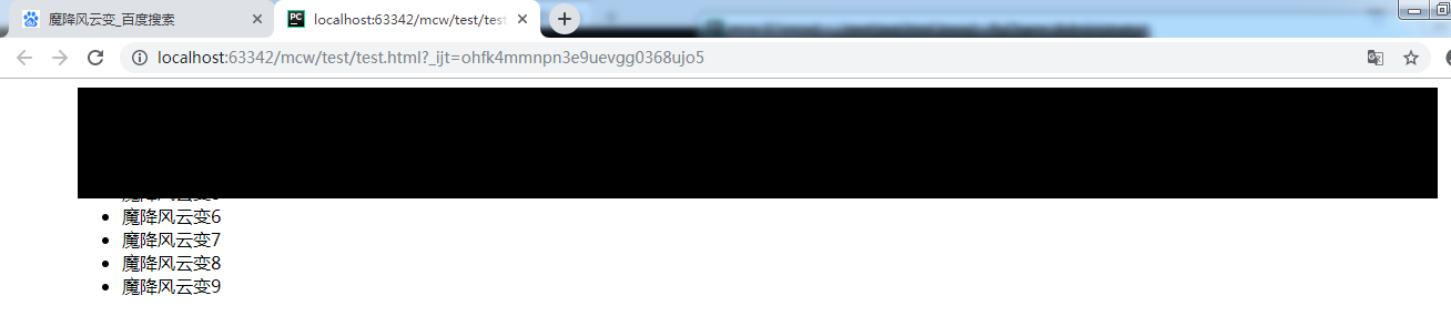
清除浮动
        #box ul{
            overflow: hidden;
        }
9个li要浮动,overflow: hidden;要做清除浮动
    <style>
        #box{
            width: 1226px;
            height: 100px;
            margin: 0 auto;
            background: #000;
        }
        #box ul{
            overflow: hidden;
            padding: 12px 0 0 30px;
            width: 500px;
            height: 88px;
            background-color: red;
        }
    </style>
ul大小,宽高用内容来填充。ul上右设置padding
默认margin和padding没有取消,取消默认:

ul中默认有黑圆圈这些,取消默认
ul{list-style: none}
把两个背景色去掉,内容从这里开始显示:
ul大小这样的:
让url下的每个li浮动,第一个li单独设置一下,设置宽度100px吧。,高度和ul高度一样就可以。将ul宽度取消,给li设置宽度,有几个li就计算出来,然后在加上第一个li设置的100宽度。
    <style>
        *{margin: 0;padding: 0}
        #box{
            width: 1226px;
            height: 100px;
            margin: 0 auto;
            /*background: #000;*/
        }
        ul{list-style: none}
        #box ul{
            overflow: hidden;
            padding: 12px 0 0 30px;
            width: 500px;
            height: 88px;
            /*background-color: red;*/
        }
        #box ul li{
            float: left;
            width: 60px;
            height: 88px;
        }
        #box ul li.active{
            width: 100px;
            height: 88px;
            background-color: green;
        }
    </style>
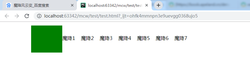
ul宽度不够,li少了一个
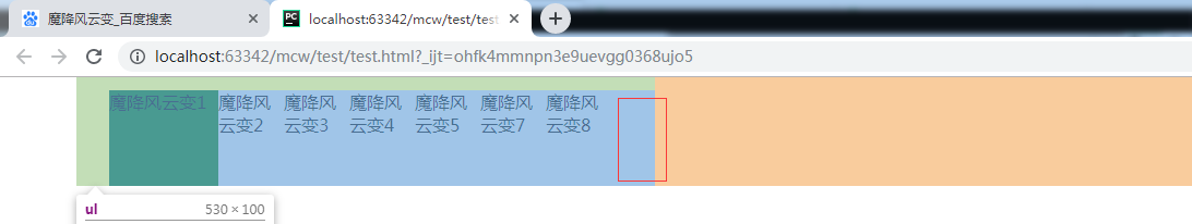
去掉ul的宽度:
让li里的文字居中,可以padding-top去挤,
        #box ul li{
            float: left;
            width: 60px;
            height: 88px;
            padding-top: 30px;
        }
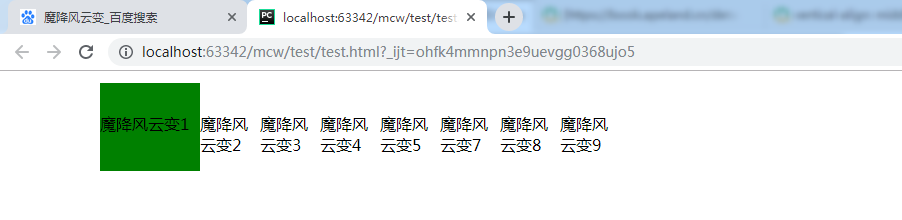
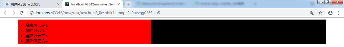
<html lang="en">
<head>
    <meta charset="UTF-8">
    <style>
        *{margin: 0;padding: 0}
        #box{
            width: 1226px;
            height: 100px;
            margin: 0 auto;
            /*background: #000;*/
        }
        ul{list-style: none}
        #box ul{
            overflow: hidden;
            padding: 12px 0 0 30px;
            /*width: 500px;*/
            height: 88px;
            /*background-color: red;*/
        }
        #box ul li{
            float: left;
            width: 60px;
            height: 88px;
            padding-top: 30px;
        }
        #box ul li.active{
            width: 100px;
            height: 88px;
            background-color: green;
        }
    </style>
</head>
<body>
    <div id="box">
        <ul>
            <li class="active"></li>
            <li>魔降1</li>
            <li>魔降2</li>
            <li>魔降3</li>
            <li>魔降4</li>
            <li>魔降5</li>
            <li>魔降6</li>
            <li>魔降7</li>
        </ul>
    </div>
</body>
</html>
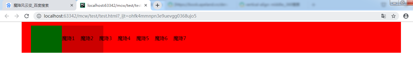
加上背景色,有个盒子想调整到这个位置上:

#box ul{
    overflow: hidden;
    padding: 12px 0 0 30px;
    /*width: 500px;*/
    height: 88px;
    background-color: red;
}
 #box ul li{
            float: left;
            width: 60px;
            height: 88px;
            padding-top: 30px;
        }
        #box ul li.active{
            width: 100px;
            height: 88px;
            background-color: green;
            position: relative;
        }
         #box ul li.active .box{
             position: absolute;
             width: 234px;
             height: 600px;
             background-color: rgba(0,0,0,.2);
             top: 0;
             left: 0;
         }
加个绿色盒子的子盒子(透明色的盒子),子盒子绝对定位,绿盒子相对定位。子盒子上左为o。因为设了超出部分隐藏属性,所以没显示。
我希望透明盒子下移再右移,那么就不能用overflow: hidden;。去掉overflow:hidden ,使用伪元素清除法。
        .clearfix{
            content: '';
            clear: both;
            display: block;
        }


 <ul class="clearfix">
去掉overflow:hidden ,之前使用它的目的是ul
取消掉ul属性padding-top
        ul{list-style: none}
        #box ul{
            /*overflow: hidden;*/
            padding: 12px 0 0 30px;
            /*width: 500px;*/
            height: 88px;
            background-color: red;
        }
        #box ul li{
            float: left;
            width: 60px;
            height: 88px;
            background-color: yellow;
        }
        #box ul li.active{
            width: 100px;
            height: 88px;
            background-color: green;
            position: relative;
        }
         #box ul li.active .box{
             position: absolute;
             width: 234px;
             height: 600px;
             background-color: rgba(0,0,0,.2);
             top: 88px;
             left: -30px;
         }
top是下移绿盒子高度值个单位,left是子盒子左远离父盒子左的单位数,是负值。因为子盒子要和红盒子左竖直方向对齐,所以左移ul在红盒子的左padding值。

这个也是定位:
图片src,文本都是数据:图片放在某个目录下,数据库存这些图片的信息及图片的地址。看这些联想表的结构是什么样的。
看图片想象数据库表的结构:一条数据,可以是表的一行。字段有 id ,推荐,文章标题,内容,发布时间,阅读等等。如果自己建立表的话,存储字段是怎样的。

 浙公网安备 33010602011771号