
echarts地图展示
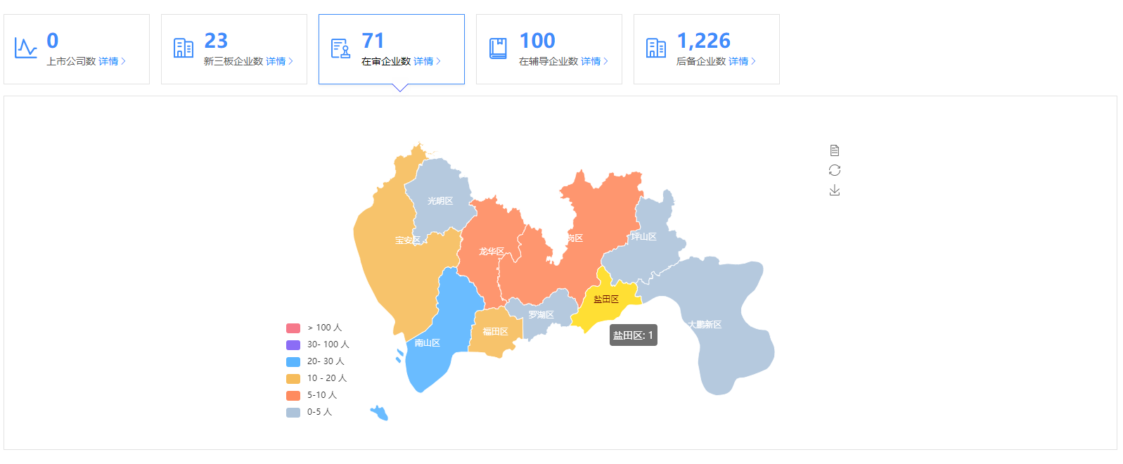
之前看到网上很多那种可视化的后台管理页面,觉得很炫,刚好前阵子公司也有个地图可视化需求,又刚好分配给我了,今天来说说我的理解,先看效果,我这是第一次写博客园,后面会持续更新项目中觉得有意思的需求
import echarts from 'echarts'
首先引入echarts
我这边的需求是展现深圳市每个区的数据,其实都一样的道理,然后需要深圳市每个区的详细经纬度数据,这个可以在 http://datav.aliyun.com/tools/atlas/#&lat=30.332329214580188&lng=106.72278672066881&zoom=3.5 这里找到你需要的数据,我是使用的json,
在需要用的组件中引入json
const jsonData = require('@/assets/js/shen_zhen.json')
鼠标移到哪个区显示哪个区的数据,并且颜色改变,移到左侧的数据返回对应的区也会改变颜色,这些都是属性可以配置的,网上可以找到很多,这里也插入给大家看看吧
      options: {
        tooltip: {
          trigger: 'item',
          showDelay: 0,
          transitionDuration: 0.2,
          formatter: function(params) {
            var value = (params.value + '').split('.')
            value = value[0].replace(/(\d{1,3})(?=(?:\d{3})+(?!\d))/g, '$1,')
            return params.name + ': ' + value
          }
        },
        geo: {
          roam: false, // 是否开启缩放和平移
          zoom: 1, // 当前视角缩放比例
          selectedMode: 'single', // 选中模式
          aspectScale: 1, // 长宽比
          label: {
            normal: {
              show: true,
              textStyle: {
                color: '#ffffff'
              }
            },
            emphasis: {
              show: true
            }
          },
          // 设置为一张完整经纬度的世界地图
          // map: 'world',
          map: '广东',
          left: 100,
          top: 0,
          right: 100,
          bottom: 0,
          itemStyle: {
            // 地图区域的多边形 图形样式
            hoverAnimation: true,
            normal: {
              opacity: 0.9,
              borderWidth: 1,
              areaColor: '#27A5F9', // 默认的地图板块颜色
              borderColor: '#fff' // 地图边框颜色
            },
            emphasis: {
              // 点击时候的颜色
              areaColor: '#FFDF34', // 默认的地图板块颜色
              borderColor: '#fff', // 地图边框颜色
              opacity: 1,
              color: '#fff'
            }
          }
        },
        // 旁边的数据范围 gte大于等于 lte小于等于  gt大于  lt小于
        visualMap: {
          min: 0,
          max: 5000,
          left: 0,
          bottom: 0,
          showLabel: !0,
          show: true,
          pieces: [
            {
              gte: 0,
              lt: 5,
              color: '#ADC3DA',
              label: '0-5 人'
            },
            {
              gte: 5,
              lt: 10,
              color: '#FE8B5F',
              label: '5-10 人'
            },
            {
              gte: 10,
              lt: 20,
              label: '10 - 20 人',
              color: '#F6BC5B'
            },
            {
              gte: 20,
              lt: 30,
              label: '20- 30 人',
              color: '#5AB5FF'
            },
            {
              gte: 30,
              lt: 100,
              label: '30- 100 人',
              color: '#8B6DF6'
            },
            {
              gt: 100,
              label: '> 100 人',
              color: '#F6798A'
            }
          ]
        }
}
最主要就是数据的显示了,this.allNumList就是后端返回的数据,这里还有一个坑给大家补充一下,数组返回的数据里面,item里面一定要有name跟value字段,否则数据显示不出来的,我这里就踩坑了,
 series: [
          {
            type: 'map',
            map: '广东',
            geoIndex: 0,
            aspectScale: 1, // 长宽比
            showLegendSymbol: true, // 存在legend时显示
            data: this.allNumList, // 返回的数组
            label: {
              normal: {
                show: true
              },
              emphasis: {
                show: true,
                textStyle: {
                  color: '#fff'
                }
              }
            },
            roam: true,
            itemStyle: {
              normal: {
                label: {
                  show: true
                }
              },
              emphasis: {
                areaColor: '#FFDF34'
              }
            },
            animation: true
          },
          {
            type: 'lines',
            z: 3,
            coordinateSystem: 'geo'
            // data: []
          }
        ],

 浙公网安备 33010602011771号