
用css3+js写了一个钟表
有一天看到css3旋转这个属性,突发奇想的写了一个钟表(没做浏览器兼容),来一起看看是怎么写的吧!
先给个成品图,最终结果是个样子的(动态的).
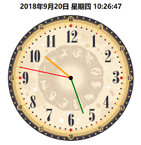
首先,思考了一下页面的布局,大致需要4层div,最底层是一个表盘的背景图,然后其余3层分别是时针,分针,秒针的图层.
html代码如下 ↓
<div class="dial">
</div>
<div class="bigdiv bigdiv1" id="secondHand">
    <div class="secondHand"></div>
</div>
<div class="bigdiv bigdiv2" id="minuteHand">
    <div class="minuteHand"></div>
</div>
<div class="bigdiv bigdiv3" id="hourHand">
    <div class="center"></div>
    <div class="hourHand"></div>
</div>
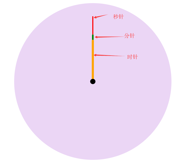
变量名是随便起的,不要介意; class=center的这个div是表中心那个小黑点.
时针是12*60*60s转一圈, 分针是60*60s转一圈, 秒针是60s转一圈, 所以css代码如下 ↓
.dial{
    width:600px;
    height:600px;
    margin:0 auto;
    position: absolute;
    border-radius: 50%;
    overflow: hidden;
    background-color: rgba(153,50,204,0.2);
    background-image: url(img/表盘.jpg);
    background-size: 100% 100%;
}
.bigdiv{
    width:600px;
    height:600px;
    margin:0 auto;
    position: absolute;
    border-radius: 50%;
    overflow: hidden;
}
.bigdiv>div{
    position: absolute;
    left:298px;
    border-radius: 100px;
}
.bigdiv1{
    animation: moves 60s steps(60) infinite;
}
.bigdiv1 .secondHand{
    width:4px;
    height:250px;
    background-color: red;
    top:50px;
    left:298px;
}
.bigdiv2{
    animation: moves 3600s steps(3600) infinite;
}
.bigdiv2 .minuteHand{
    width:6px;
    height:180px;
    background-color: green;
    top:120px;
    left:297px;
}
.bigdiv3{
    animation: moves 43200s steps(216000) infinite;
}
.bigdiv3 .hourHand{
    width:8px;
    height:160px;
    background-color: orange;
    top:140px;
    left:296px;
    border-radius: 100px;
}
.bigdiv .center{
    top:290px;
    left:290px;
    width:20px;
    height:20px;
    background-color: black;
    z-index: 2;
}
@keyframes moves{
    from{ transform: rotateZ(0deg); }
    to{ transform: rotateZ(360deg); }
}
这一步做完后效果图是这个样子的:
然后用js计算当前时间,
var date = new Date();
var hours = date.getHours();
var minutes = date.getMinutes();
var seconds = date.getSeconds();
然后计算当前每个针的旋转角度
var secondAngle = seconds;
var minuteAngle = minutes * 60 + seconds;
var hourAngle = 43200 * ((hours%12)/12) + minuteAngle;
现在的思路就是:每个针会按照自己定的时间转一圈,初始角度也能知道,怎么组成一个显示当前时间的动态钟表呢?
刚开始的想法是让这3层div旋转对应的角度,然后再开始,后来一想不行,因为它还是固定的时间旋转一周,指针指向会有偏差,
现在需要的是页面进来的第一圈旋转固定角度,其余的按照原来固定的时间旋转一周就行了,
css3里面有一个animation-delay属性,它表示的意思是动画延迟,负数就表示提前开始(比如-5s就表示动画从第5s的时间开始),
刚好可以用到,让这几个指针提前开始对应的角度.
js代码如下↓
hourHand.style.cssText = "animation-delay: -"+ hourAngle +"s";
minuteHand.style.cssText = "animation-delay: -"+ minuteAngle +"s";
secondHand.style.cssText = "animation-delay: -"+ secondAngle +"s";
最后自己再加了个动态时间在钟表的上面展示

 浙公网安备 33010602011771号