从零开始学 Web 之 CSS3(五)transform
大家好,这里是「 从零开始学 Web 系列教程 」,并在下列地址同步更新......
- github:https://github.com/Daotin/Web
- 微信公众号:Web前端之巅
- 博客园:http://www.cnblogs.com/lvonve/
- CSDN:https://blog.csdn.net/lvonve/
在这里我会从 Web 前端零基础开始,一步步学习 Web 相关的知识点,期间也会分享一些好玩的项目。现在就让我们一起进入 Web 前端学习的探索之旅吧!

transform
transform 字面上就是变形,改变的意思。在CSS3中transform主要包括以下几种:移动 translate,缩放scale,旋转rotate,翻转skew,改变旋转轴心等。
1、元素的移动:translate
作用:使用transform实现元素的移动
语法:
/*使用transform实现元素的移动
1.如果只有一个参数就代表x方向
2.如果有两个参数就代表x/y方向*/
transform: translate(100px);
transform: translate(400px,500px);
transform: translate(0px,500px);

/*添加水平或者垂直方向的移动*/
transform:translateX(300px);
transform:translateY(300px);
注意:
1、移动是参照元素的左上角 ;
2、执行完毕之后会恢复到原始状态。
2、缩放:scale
作用:实现缩放(参照元素的几何中心):1指不缩放,>1.01放大, <0.99缩小。
语法:
/*实现缩放(参照元素的几何中心):1指不缩放,>1.01放大  <0.99缩小。
1.如果只有一个参数,就代表x和y方向都进行相等比例的缩放
2.如果有两个参数,就代表x/y方向*/
transform: scale(2);
transform: scale(2,1);
/* 缩放指定的方向 */
transform:scaleX(0.5);
transform:scaleY(0.5);
3、旋转:rotate
作用:实现元素的旋转。
语法:
/*参数:正数就是顺时针方向,负数就是逆时针方向。*/
transform:rotate(90deg);
4、翻转:skew
作用:实现元素的翻转
语法:
/*如果角度为正,则往当前轴的负方向斜切,如果角度为负,则往当前轴的正方向斜切*/
transform:skew(-30deg);
/*两个值,一个往x方向,一个y方向*/
transform:skew(30deg,-30deg);
/*设置某个方向的斜切值*/
/*transform:skewX(30deg);*/
/*transform:skewY(30deg);*/
5、改变旋转轴心
语法:
/*设置旋转轴心
1.参数:x y
2.关键字:left top right bottom center*/
transform-origin: left top;
transform-origin: 10px 10px;
6、同时添加多个transform属性值
/*单独写两个是无效的,后面的会覆盖前面的*/
transform: translateX(700px);
transform: rotate(-90deg);

/*需要合并起来写*/
transform: translateX(700px) rotate(-90deg);
注意:
1、transform 多个属性分开写的话,后面的属性会覆盖前面的,一定要合并起来写。
2、
transform: rotate(-90deg) translateX(700px);会出问题,因为旋转会将坐标系旋转,所以先移动再旋转。
案例:旋转轴心案例
效果:鼠标放在图形上,图形旋转,鼠标移开,图形回归原状。
<!DOCTYPE html>
<html lang="en">
<head>
    <meta charset="UTF-8">
    <title>Document</title>
    <style>
        * {
            padding: 0;
            margin: 0;
        }
        .box {
            width: 100px;
            height: 100px;
            margin: 300px auto;
            position: relative;
        }
        .box > img {
            width: 100px;
            height: 100px;
            position: absolute;
            transition: transform 1s;
            transform-origin: 110px -10px;
        }
        .box:hover > img:nth-of-type(1) {
            transform: rotate(60deg);
        }
        .box:hover > img:nth-of-type(2) {
            transform: rotate(120deg);
        }
        .box:hover > img:nth-of-type(3) {
            transform: rotate(180deg);
        }
        .box:hover > img:nth-of-type(4) {
            transform: rotate(240deg);
        }
        .box:hover > img:nth-of-type(5) {
            transform: rotate(300deg);
        }
        .box:hover > img:nth-of-type(6) {
            transform: rotate(360deg);
        }

    </style>
</head>
<body>
    <div class="box">
        <img src="./images/gzh.png">
        <img src="./images/gzh.png">
        <img src="./images/gzh.png">
        <img src="./images/gzh.png">
        <img src="./images/gzh.png">
        <img src="./images/gzh.png">
    </div>
</body>
</html>

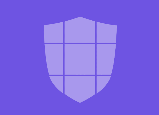
案例:图形打散
效果:鼠标放到图形上,图形打散,鼠标移开,图形归位。
<!DOCTYPE html>
<html lang="en">
<head>
    <meta charset="UTF-8">
    <title>Document</title>
    <style>
        *{
            margin: 0;
            padding: 0;
        }
        body {
            background-color: rgb(110, 84, 226);
        }
        .box {
            width: 500px;
            height: 100%;
            margin: 100px auto;
        }
        .box > img {
            transition: transform 1s;
        }
        .box:hover > img:nth-of-type(1){
            transform: translate(-100px, 200px) rotate(30deg);
        }
        .box:hover > img:nth-of-type(2){
            transform: translate(-500px, -50px) rotate(60deg);
        }
        .box:hover > img:nth-of-type(3){
            transform: translate(300px, 10px) rotate(-50deg);
        }
        .box:hover > img:nth-of-type(4){
            transform: translate(600px, 20px) rotate(-90deg);
        }
        .box:hover > img:nth-of-type(5){
            transform: translate(30px, 200px) rotate(90deg);
        }
        .box:hover > img:nth-of-type(6){
            transform: translate(-100px, -200px) rotate(-30deg);
        }
        .box:hover > img:nth-of-type(7){
            transform: translate(-300px, 100px) rotate(-30deg);
        }
        .box:hover > img:nth-of-type(8){
            transform: translate(200px, 250px) rotate(30deg);
        }
        .box:hover > img:nth-of-type(9){
            transform: translate(0, -150px) rotate(-30deg);
        }
    </style>
</head>
<body>
    <div class="box">
        <img src="./images/shield_1_01.png">
        <img src="./images/shield_1_02.png">
        <img src="./images/shield_1_03.png">
        <img src="./images/shield_1_04.png">
        <img src="./images/shield_1_05.png">
        <img src="./images/shield_1_06.png">
        <img src="./images/shield_1_07.png">
        <img src="./images/shield_1_08.png">
        <img src="./images/shield_1_09.png">
    </div>
</body>
</html>
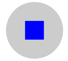
案例:脱标流盒子居中
我们之前也学过脱标流盒子的居中问题,当时做的是先移动父盒子的 50%(比如:left:50%),再往相反方向移动子盒子的 50%(比如:margin-left:100px;)。大家可以看到,子盒子的移动只能写具体的像素值,而不能写 -50%。如果子盒子的大小改变了,就需要重新计算。
这里可以使用:left: 50%; 和 transform:translate(-50%, -50%); 就可以解决。
示例:
<!DOCTYPE html>
<html lang="en">
<head>
    <meta charset="UTF-8">
    <title>Document</title>
    <style>
        .cir {
            width: 300px;
            height: 300px;
            background-color: #ccc;
            border-radius: 50%;
            margin: 100px auto;
            position: relative;
        }
        .rec {
            width: 100px;
            height: 100px;
            background-color: blue;
            position: absolute;
            left: 50%;
            top: 50%;
            /* margin-left: -50px;
            margin-top: -50px; */
            transform: translate(-50%, -50%);
        }
    </style>
</head>
<body>
    <div class="cir">
        <div class="rec"></div>
    </div>
</body>
</html>
7、3d三维变换
语法:
/*添加三维移动--3D移动*/
/*translate3d(X方向的偏移,Y方向的偏移,Z方向的偏移)*/
/*transform: translate3d(400px,0,0);*/
/*transform: translate3d(400px,400px,0);*/
transform: translate3d(0px,0px,400px);

/*添加3d缩放*/
/*scale3d(x方向上的缩放,y方向的缩放,z方向的缩放)
>1.01 放大   <0.99 缩小*/
transform:scale3d(1,1,10);

/*添加三维旋转*/
/*rotate3d(x,y,z,angle):
x:代表x轴方向上的一个向量值
y:代表y轴方向上的一个向量值
z:代表z轴方向上的一个向量值
330deg:旋转的度数*/
transform: rotate3d(1,1,1,330deg);
/*注意:当只有一个方向的向量值的时候,数字大小无所谓,但是当有两个或三个向量值的时候,旋转轴心为三个向量值合成的一个向量值,这个时候,各个向量值的大小会对合成的向量值的方向有影响。*/
案例:立方体
<!DOCTYPE html>
<html lang="en">
<head>
    <meta charset="UTF-8">
    <title>Document</title>
    <style>
        * {
            margin: 0;
            padding: 0;
        }
        .cube {
            width: 100px;
            height: 100px;
            position: relative;
            margin: 100px auto;
            /* 旋转一定的角度便于查看 */
            transform: rotate3d(1,1,0,30deg);
            /* 保存变换之后的效果 (加在父元素身上)*/
            transform-style: preserve-3d;

        }
        .cube > div {
            width: 100px;
            height: 100px;
            position: absolute;
            opacity: 0.5;
        }
        .front {
            background-color: red;
            transform: translateZ(50px);
        }
        .back {
            background-color: orange;
            transform: translateZ(-50px) rotateY(180deg);
        }
        .left{
            background-color: yellow;
            transform: translateX(-50px) rotateY(-90deg);
        }
        .right {
            background-color: green;
            transform: translateX(50px) rotateY(90deg);
        }
        .top{
            background-color: blue;
            transform: translateY(-50px) rotateX(90deg);
        }
        .bottom{
            background-color: purple;
            transform: translateY(50px) rotateX(-90deg);
        }
    </style>
</head>
<body>
    <div class="cube">
        <div class="front">front</div>
        <div class="back">back</div>
        <div class="left">left</div>
        <div class="right">right</div>
        <div class="top">top</div>
        <div class="bottom">bottom</div>
    </div>
</body>
</html>

8、景深/透视效果
当perspective:none/0;时,相当于没有设置,没有设置的时候,视角位于3D的几何中心位置,相当于在
盒子内部往外看;
当perspective的值大于中心到各个平面的距离时,相当于出了盒子看。
语法:
/*默认无透视效果*/
perspective: 0px;

/*perspective-origin属性规定了镜头在平面上的位置。默认是放在元素的中心*/
perspective-origin: 0px 0px;

/*transform-style:使被转换的子元素保留其 3D 转换(需要设置在父元素中)
flat: 不保留3d转换结果
preserve-3d:保留3d转换结果*/
transform-style: preserve-3d;

 浙公网安备 33010602011771号