

手机端--swiper一屏展示下个轮播的一半的效果
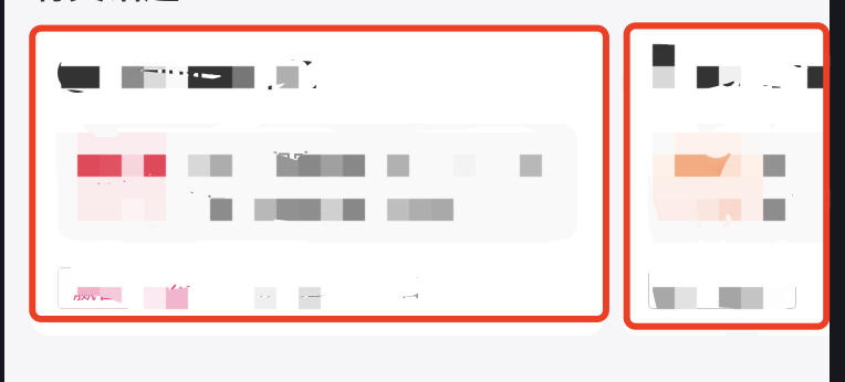
手机屏展示这样的效果,用swiper去实现,
<template>
  <view class="container">
    <view
      class="mas-promo-swiper-scroll-wrapper"
      :style="{ transform:'translateX(' +swiperMarginLeft+'rpx)'}"   //最主要的就是设置 previous-margin next-margin的值!并且设置父元素的平移距离,,并且在滑动到第一个或者最后一个时更改相对应的值!
    >
      <swiper
        class="swiper-wrapper"
        previousMargin="30rpx"
        nextMargin="30rpx"
        @change="changeSwiperItem"
      >
        <swiper-item
          v-for="(item, index) in list"
          :key="index"
          class="swiper-item"
        >
          <view class="mas-promo-swiper-item-image-wrapper">
            <image :src="item.elememtIcon" />
          </view>
        </swiper-item>
      </swiper>
    </view>
  </view>
</template>

<script lang="ts">
import { Vue, Component, Prop } from 'vue-property-decorator';
import * as util from '@/util/util.ts';

@Component
export default class mySwiper extends Vue {
  private swiperMarginLeft: Number = -48;

  private interval: any = 5000;

  private allowClick: any = true;

  private currentIndex: Number = 0;
  private list: any = [];
  changeSwiperItem(e) {
    // TODO 滑动的同时动态修改margin-left会有抖动
    var itemId = e.detail.current;
    var bannerList = this.list;
    this.currentIndex = itemId;

    if (itemId === 0) {
      this.swiperMarginLeft = -48;
    } else if (itemId === bannerList.length - 1) {
      this.swiperMarginLeft = 48;
    } else {
      this.swiperMarginLeft = 0;
    }
  }
}
</script>

<style lang="less" scoped>
.container {
  overflow: hidden;
}

.mas-promo-swiper-scroll-wrapper {
  transition: all 0.3s ease-out;//记得为父元素加个动画!这样在改变父元素的平移距离的时候就不会有跳动感觉了
}
.swiper-wrapper {
  overflow: visible;
}
.swiper-item {
  display: flex;
  justify-content: center;
  align-items: center;
}

.mas-promo-swiper-item-image-wrapper image {
  display: block;
  width: 620rpx;
  height: 164rpx;
  border-radius: 16rpx;
}
</style>

 浙公网安备 33010602011771号