
自适应相关
css 像素(现实不存在,逻辑上存在 )
物理像素(现实存在,像素点和CSSpx 虽然写的一样 但不是一个东西)

相关概念
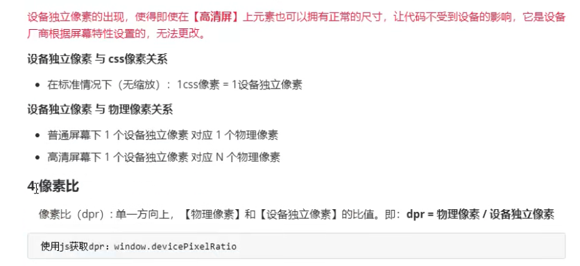
JS获取像素比dpr :
window.devicePixelRatio


图片的高清显示
位图和矢量图

移动端高清图片显示(更具DPR自动匹配到相应的图片)


<!DOCTYPE html>
<html lang="en">

<head>
    <meta charset="UTF-8">
    <meta http-equiv="X-UA-Compatible" content="IE=edge">
    <meta name="viewport" content="width=device-width, initial-scale=1.0">
    <title>图片的高清显示</title>
    <style>
        .box {
            width: 200px;
            height: 200px;
        }

        /* 切记 按从小到大的匹配  匹配到后 就不会匹配到后面 */
        @media screen and (-webkit-min-device-pixel-ratio:2) {
            .box {
                border: 2px solid blue;
                content: url('./imgs/2x.png')
            }
        }

        @media screen and (-webkit-min-device-pixel-ratio:3) {
            .box {
                border: 2px solid skyblue;
                content: url('./imgs/3x.png')
            }
        }
    </style>
</head>

<body>
    <img src="./imgs/1x.png" class="box" alt="">
</body>

</html>
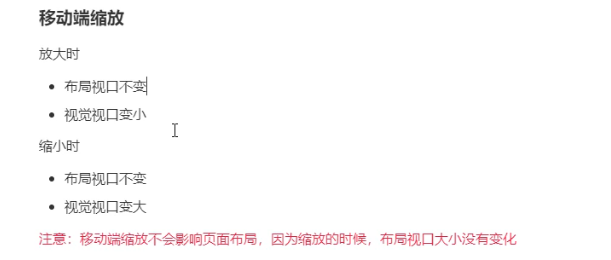
PC端视口相关
<!DOCTYPE html>
<html lang="en">
<head>
    <meta charset="UTF-8">
    <meta http-equiv="X-UA-Compatible" content="IE=edge">
    <meta name="viewport" content="width=device-width, initial-scale=1.0">
    <title>PC端视口</title>
    <style>
        body{
            height: 9000px;
        }
    </style>
</head>
<body>
    <script type="text/javascript">
        console.log("最干净的显示区域: ",document.documentElement.clientWidth);
        console.log("最干净的显示区域+滚动条: ",window.innerWidth);
        console.log("最干净的显示区域+滚动条+浏览器边框: ",window.outerWidth);
        console.log("与浏览器无关,当前设备显示分辨率横向的值: ",screen.width);
    </script>
</body>
</html>
移动端

移动端
布局视口 大多数厂商 都定的980px
视觉视口
<!DOCTYPE html>
<html lang="en">
  <head>
    <meta charset="UTF-8" />
    <title>Document</title>
    <style>
      * {
        margin: 0;
        padding: 0;
      }
      #box {
        width: 350px;
        height: 100px;
        background: skyblue;
        font-size: 15px;
      }
    </style>
  </head>
  <body>
    <div id="box"></div>
    <script>
      let box = document.getElementById("box");
      box.innerHTML =
        "布局视口" + document.documentElement.clientWidth + "<br/>";
      /*
         移动端获取视觉视口的方式:window.innerWidth;
         不过在Android2,Opera mini,US8中无法中却获取(一般不通过代码看视觉视口)
         视觉视口 默认跟布局视口一样宽 默认980px
         视觉视口 是布局视口缩放下的状态
        */
      box.innerHTML += "视觉视口" + window.innerWidth;

      /*
    描述你的屏幕
    现在以你的Iphone5 为例(横向上)
    物理像素:750px
    设备独立像素:375px
    css像素:980px;
    */
    </script>
  </body>
</html>
理想视口
<!DOCTYPE html>
<html lang="en">
  <head>
    <meta charset="UTF-8" />
    <meta http-equiv="X-UA-Compatible" content="IE=edge" />
    <meta name="viewport" content="width=device-width, initial-scale=1.0" />
    <title>Document</title>
    <style>
      * {
        margin: 0;
        padding: 0;
      }
      #box {
        width: 350px;
        height: 100px;
        background: skyblue;
        font-size: 15px;
      }
    </style>
  </head>
  <body>
    <div id="box"></div>
    <script>
        // 开启理想视口后   布局视口和屏幕等宽,
         let box = document.getElementById("box");
            box.innerHTML =
        "布局视口" + document.documentElement.clientWidth + "<br/>";

    /*
    描述你的屏幕
    现在以你的Iphone5 为例(横向上)
    物理像素:750px
    设备独立像素:375px
    css像素:980px;

    与屏幕等宽的布局视口,称之为理想视口,所以也可以说理想视口是一种标准: 让布局视口宽度与屏幕等宽(设备独立像素),靠meta标签上实现


    理想视口的特点
    布局视口和屏幕等宽,以Iphone6为例,符合理想视口标准之后:
    设备独立橡树:375px
    布局视口宽度:375px
    用户不需要缩放,滚动就能看见网站的全部内容
    要为移动端设备单独设计一个移动端网站.

    实现理想视口的具体方法:
     <meta name="viewport" content="width=device-width, initial-scale=1.0" />
    */
    </script>
  </body>
</html>


PC端缩放
<!DOCTYPE html>
<html lang="en">
<head>
    <meta charset="UTF-8">
    <title>Document</title>
    <style>
        .box{
            width: 200px;
            height: 200px;
            background: blue;
            margin:20px 20px;
            display: inline-block;
        }
    </style>
</head>
<body>
    <div class="box"></div>
    <div class="box"></div>
    <div class="box"></div>
    <div class="box"></div>
    <div class="box"></div>
    <script>
        //监控浏览器窗口的变化
        window.onresize=()=>{
            /*
            PC 端的缩放
            浏览器的缩放的实现是:如果放大 则将浏览器初始快缩小 在讲视口拉升到真个浏览器页面,则所看到的元素变大,css值不变
            */
            console.log('浏览器初始化块: '+document.documentElement.clientWidth)
        }
    </script>
</body>
</html>
移动端适配加上这句
<meta name="viewport" content="width=device-width, initial-scale=1.0, maximum-scale=1.0, user-scalable=0, shrink-to-fit=no, viewport-fit=cover">


viewport 适配很简单 这个标签写死 之后设计稿咋写就咋写
<meta name="viewport" content=" width=375" >
<!DOCTYPE html>
<html lang="en">
<head>
    <meta charset="UTF-8">
    <meta http-equiv="X-UA-Compatible" content="IE=edge">
    <!-- viewpor 适配方式 假如设计稿 宽度375px -->
    <meta name="viewport"  content=" width=375">
    <title>Document</title>
    <style>
        *{
            margin: 0;
            padding: 0;
        }
        html,body{
            width: 100%;
            height: 100%;
        }
        #demo{
            width: 345px;
            height: 150px;
            background: #8faadc;
            margin: 0 auto;
            margin-top: 15px;
            border: 1px solid black;
        }
    </style>
</head>
<body>
    <div id="demo"></div>
</body>
</html>
em 与rem
- em 相对于父元素的字体大小
- rem 相对于根元素的字体大小
<!DOCTYPE html>
<html lang="en">
  <head>
    <meta charset="UTF-8" />
    <meta http-equiv="X-UA-Compatible" content="IE=edge" />
    <meta name="viewport" content="width=device-width, initial-scale=1.0" />
    <title>em与rem适配</title>
    <style>
      html,
      body {
        font-size: 40px;
      }
      #demo1 {
        width: 400px;
        height: 400px;
        background: skyblue;
        font-size: 40px;
      }
      /* #demo2{
          //rm 相对于父元素字体而言
            width: 5em;
            height: 5em;
            background:blue;
        }
        */
      /* rem */
      #demo2 {
        /* rem相当于根元素字体而言 */
        width: 5rem;
        height: 5rem;
        background: blue;
      }
    </style>
  </head>
  <body>
    <div id="demo1">
      <div id="demo2"></div>
    </div>
  </body>
</html>

适配方案一(淘宝百度适配方案) 推荐
<!DOCTYPE html>
<html lang="en">
  <head>
    <meta charset="UTF-8" />
    <meta http-equiv="X-UA-Compatible" content="IE=edge" />
    <!-- 第一步开启理想视口-->
    <meta
      name="viewport"
      content="width=device-width, initial-scale=1.0, maximum-scale=1.0, user-scalable=0, shrink-to-fit=no, viewport-fit=cover"
    />
    <title>rem适配方案一</title>
    <style>
        *{
            margin: 0;
            padding: 0;
        }
        #demo{
            width: 3.45rem;
            height: 1.5rem;
            margin: 0 auto;
            background-color: blue;
            margin-top: 0.15rem;
            /* 边框不参与适配 */
            /* border: 1px solid black; */
            border:0.01rem solid black;
        }
    </style>
  </head>
  <body>
      <div id="demo"></div>

    <script>
        //时实适配
        window.onresize=adapter;

    /* 第二部计算根字体的设备独立像素 */
       function adapter(){
      /*
         获取手机横向的设备独立像素
         开启理想视口后  视觉视口=设备独立像素
        */
       //获取手机很想的设备独立像素
       const dip=document.documentElement.clientWidth;
       //计算跟字体大小(100是我们直接指定的.375是设计稿的宽度)
       const rootFontSize=(dip*100)/375;
       //设置根字体
       document.documentElement.style.fontSize=rootFontSize+'px';
       }
    </script>
  </body>
</html>
适配方案二(搜狐 唯品会)

前锋写法
<!DOCTYPE html>
<html>
<head>
<meta charset="utf-8">
<meta http-equiv="X-UA-Compatible" content="IE=edge,chrome=1">
<meta name="viewport" content="width=device-width,initial-scale=1.0,user-scalable=no">
<title>Examples</title>
<meta name="description" content="">
<meta name="keywords" content="">
<link href="" rel="stylesheet">

<script type="text/javascript">
    var ratio = window.devicePixelRatio;
    var meta = document.querySelector("[name=viewport]");
    meta.setAttribute("content",
    `width=device-width,initial-scale=${1/ratio},user-scalable=no`);

    document.documentElement.style.fontSize=window.innerWidth/750*100+"px";

</script>

<style>


    *{
        margin: 0;
        padding: 0;
    }
    html{
        font-size: 100px;
    }
    .box{
        width: 7.5rem;
        height: 1rem;
        background: red;
    }
</style>
</head>
<body>
    <div class="box">

    </div>

</body>
</html>
<!DOCTYPE html>
<html lang="en">
  <head>
    <meta charset="UTF-8" />
    <meta http-equiv="X-UA-Compatible" content="IE=edge" />
    <!-- 第一步开启理想视口-->
    <meta
      name="viewport"
      content="width=device-width, initial-scale=1.0, maximum-scale=1.0, user-scalable=0, shrink-to-fit=no, viewport-fit=cover"
    />
    <title>rem适配方案一(配合less 使用   推荐插件easy less插件)</title>
    <style>
        *{
            margin: 0;
            padding: 0;
        }
        #demo{
            /* 计算  width=375/fontSize */
            width: 9.2rem;
            height: 4rem;
            background-color: blue;
            margin: 0 auto;
            margin-top: 0.4rem;
            /* 边框不参与适配 */
            /* border: 1px solid black; */
            border:0.02rem solid black;
        }
    </style>
  </head>
  <body>
      <div id="demo"></div>
    <script>
        //时实适配
        window.onresize=adapter;

    /* 第二部计算根字体的设备独立像素 */
       function adapter(){
      /*
         获取手机横向的设备独立像素
         开启理想视口后  视觉视口=设备独立像素
        */
       //获取手机很想的设备独立像素
       const dip=document.documentElement.clientWidth;
       //计算跟字体大小(100是我们直接指定的.375是设计稿的宽度)
       const rootFontSize=(dip/10);
       //设置根字体
       document.documentElement.style.fontSize=rootFontSize+'px';
       }
    </script>
  </body>
</html>
vw 适配(兼容没rem兼容好)
<!DOCTYPE html>
<html lang="en">
<head>
    <meta charset="UTF-8">
    <meta http-equiv="X-UA-Compatible" content="IE=edge">
    <meta name="viewport" content="width=device-width, initial-scale=1.0, maximum-scale=1.0, user-scalable=0, shrink-to-fit=no, viewport-fit=cover">
    <title>vw适配</title>
<!--
100vw=100%宽度
1vw 占具宽度的百分1
设计稿宽度375px
demo盒子宽度345px
    高150px
则 width=345/375 vw;
高 height=150/375 vw
 -->
    <style>
        *{
            margin: 0;
            padding: 0;
        }
        #demo{
            width: 92vw;
            height: 40vw;
            background: blue;
            margin: 0 auto;
            margin-top:4vw;
        }
    </style>
</head>
<body>
    <div id="demo"></div>
</body>
</html>
边框是否参与适配
一物理像素物理边框()

解决一物理像素的边框
<!DOCTYPE html>
<html lang="en">

<head>
    <meta charset="UTF-8">
    <meta http-equiv="X-UA-Compatible" content="IE=edge">
    <meta name="viewport"
        content="width=device-width, initial-scale=1.0, maximum-scale=1.0, user-scalable=0, shrink-to-fit=no, viewport-fit=cover">
    <title>Document</title>
    <style>
        * {
            margin: 0;
            padding: 0;
        }
        #demo{
            width: 3.45rem;
            height: 1.45rem;
            margin: 0 auto;
            margin-top:0.15rem;
            background: blue;
            border:1px solid black
        }
        @media screen and (-webkit-min-device-pixel-ratio:2){
           #demo{
               border:0.5px solid green;
           }
        }
        @media screen and (-webkit-min-device-pixel-ratio:3){
            #demo{
                border:0.33px solid red;
            }
        }
    </style>
</head>

<body>
    <div id="demo"></div>
    <script>

        window.onresize=adapter;
        function adapter(){
            let dip=document.documentElement.clientWidth;
            let rootFontSize=(dip*100)/375;
            document.documentElement.style.fontSize=rootFontSize+"px";
        }
    </script>
</body>

</html>

 浙公网安备 33010602011771号