
createElement函数的语法及其简单使用
createElement函数语法如下:
 1 // @returns {VNode}
 2 createElement(
 3     // {String | Object | Function}
 4     // 一个 HTML 标签名、组件选项对象,或者
 5     // resolve 了上述任何一种的一个 async 函数。必填项。
 6     'div',
 7     // {Object}
 8     // 一个与模板中属性对应的数据对象。可选。
 9     {
10         // 与 `v-bind:class` 的 API 相同,
11         // 接受一个字符串、对象或字符串和对象组成的数组
12         'class': {
13           foo: true,
14           bar: false
15         },
16         // 与 `v-bind:style` 的 API 相同,
17         // 接受一个字符串、对象,或对象组成的数组
18         style: {
19           color: 'red',
20           fontSize: '14px'
21         },
22         // 普通的 HTML 特性
23         attrs: {
24           id: 'foo'
25         },
26         // 组件 prop
27         props: {
28           myProp: 'bar'
29         },
30         // DOM 属性
31         domProps: {
32           innerHTML: 'baz'
33         },
34         // 事件监听器在 `on` 属性内,
35         // 但不再支持如 `v-on:keyup.enter` 这样的修饰器。
36         // 需要在处理函数中手动检查 keyCode。
37         on: {
38           click: this.clickHandler
39         },
40         // 仅用于组件,用于监听原生事件,而不是组件内部使用
41         // `vm.$emit` 触发的事件。
42         nativeOn: {
43           click: this.nativeClickHandler
44         },
45         // 自定义指令。注意,你无法对 `binding` 中的 `oldValue`
46         // 赋值,因为 Vue 已经自动为你进行了同步。
47         directives: [
48           {
49             name: 'my-custom-directive',
50             value: '2',
51             expression: '1 + 1',
52             arg: 'foo',
53             modifiers: {
54               bar: true
55             }
56           }
57         ],
58         // 作用域插槽的格式为
59         // { name: props => VNode | Array<VNode> }
60         scopedSlots: {
61           default: props => createElement('span', props.text)
62         },
63         // 如果组件是其它组件的子组件,需为插槽指定名称
64         slot: 'name-of-slot',
65         // 其它特殊顶层属性
66         key: 'myKey',
67         ref: 'myRef',
68         // 如果你在渲染函数中给多个元素都应用了相同的 ref 名,
69         // 那么 `$refs.myRef` 会变成一个数组。
70         refInFor: true
71       },
72     // {String | Array}
73     // 子级虚拟节点 (VNodes),由 `createElement()` 构建而成,
74     // 也可以使用字符串来生成“文本虚拟节点”。可选。
75     [
76       '先写一些文字',
77       createElement('h1', '一则头条'),
78       createElement(MyComponent, {
79         props: {
80           someProp: 'foobar'
81         }
82       })
83     ]
84   )
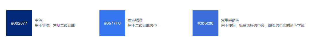
以下样式卡片,是使用render渲染函数实现的功能。
功能比较简单,主要是用于记录渲染函数的使用方法
<template>
    <div class="systemColor">
        <div style="display:flex;">
            <color-card background="#002877" color="#fff">
            #002877
            <div slot="text">主色</div>
            <div slot="subText">用于导航、左侧二级菜单</div>
        </color-card>
            <color-card background="#3677F0" color="#fff">
                #3677F0
                <div slot="text">重点强调</div>
                <div slot="subText">用于二级菜单选中</div>
            </color-card>
            <color-card background="#3b6cd8" color="#fff">
                #3b6cd8
                <div slot="text">常用辅助色</div>
                <div slot="subText">用于按钮、标签切换选中项、翻页选中项的蓝色字体</div>
            </color-card>
        </div>
    </div>
</template>
<script>
let colorCard = {
    render: function (createElement) {
        return createElement('div',{
            class:{renderCls: true},
            on: {
                click: () => alert(this.background)
            },
        },[
            createElement('span',{
                class: {
                    renderColor: true
                },
                style: {
                    background: this.background,
                    color: this.color
                },
            },
            [
                createElement('div',{
                    class:{renderColor: true}
                }, [
                    createElement('span',{
                        style:{fontSize: '16px',color: '#FFFFFF'}
                    },this.$slots.default)
                ]),
            ]),
            createElement('div',{
                class:{
                    renderSubTxt: true
                },
            },[
                this.$slots.text,
                this.$slots.subText
            ]),
        ])
    },
    props: {
        background:{
            type: String,
            default:'#fff',
        },
        color:{
            type: String,
            default:'#111',
        }
    }
}

export default {
    name:'systemColor',
    components: {
        'color-card': colorCard
    },
    data(){
        return{}
    },
    methods: {
        clickFun(){
            alert(1)
        }
    }
}
</script>
<style lang="less" scoped>
    /deep/.renderCls{
        display: flex;
        margin: 20px 10px;
        min-width: 340px;
        .renderColor {
            height: 100px;
            width: 100px;
            display: flex;
            justify-content: center;
            align-items: center;
            flex-direction:column
        }
        .renderSubTxt {
            height: 100px;
            display: flex;
            justify-content: center;
            align-items: left;
            flex-direction:column;
            padding: 10px;
        }
    }
    .systemColor {
        .title {
            font-size: 22px;
            color: #393A3C;
            letter-spacing: 1.22px;
            margin-right: 20px;
        }
        .label {
            font-size: 16px;
            color: #898A8E;
            letter-spacing: 0.89px;
        }
        .color {
            width: 160px;
            height: 90px;
            background: #fff;
            display: inline-block;
            color: #fff;

        }
    }
</style>

 浙公网安备 33010602011771号