
css实现聊天气泡效果
---------------------------------------
css功能强大,能实现很多炫
酷的效果,今天给大家分享
用css3绘制聊天气泡的方法:
---------------------------------------
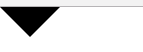
在绘制气泡之前,先实现箭
头的绘制,代码如下:

 1 <!DOCTYPE html>
 2 <html lang="en">
 3 <head>
 4     <meta charset="UTF-8">
 5     <title>arrow</title>
 6     <style type="text/css">
 7         *{
 8             margin:0;
 9             padding:0;
10         }
11         #box{
12             width:0;
13             height:0;
14             border-top:30px solid black;
15             border-left:30px solid green;
16             border-right:30px solid red;
17             border-bottom:30px solid blue;
18         }
19     </style>
20 </head>
21 <body>
22     <div id="box"></div>
23 </body>
24 </html>

效果如上图所示;
-----------------------------------------
从上面的图可以发现,在未设
置宽高的情况下,上下左右的
边框都是一个三角形,如果只
留下某一个方向上的border,
就可以实现三角箭头的效果;
实现css代码和效果如下:
----------------------------------------
1 #box{
2         width:0;
3         height:0;
4         border-top:30px solid black;
5         border-left:30px solid transparent;
6         border-right:30px solid transparent;
7         border-bottom:30px solid transparent;
8     }
-----------------------------------------
通过上面的箭头,我们就可以
绘制出一个聊天气泡了,代码
如下:
------------------------------------------
 1 <!DOCTYPE html>
 2 <html lang="en">
 3 <head>
 4     <meta charset="UTF-8">
 5     <title>arrow</title>
 6     <style type="text/css">
 7         *{
 8             margin:0;
 9             padding:0;
10         }
11         #box{
12             position: relative;
13             top:100px;
14             left:100px;
15             width: 140px;
16             height: 100px;
17             background: #088cb7;
18             -moz-border-radius: 12px;
19             -webkit-border-radius: 12px;
20             border-radius: 12px;
21         }
22         #box:before{
23             position: absolute;
24             content: "";
25             width: 0;
26             height: 0;
27             right: 100%;
28             top: 38px;
29             border-top: 13px solid transparent;
30             border-right: 26px solid #088cb7;
31             border-bottom: 13px solid transparent;
32         }
33     </style>
34 </head>
35 <body>
36     <div id="box"></div>
37 </body>
38 </html>
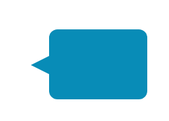
效果如上图所示:
------------------------------------
感谢大家的阅读;

 浙公网安备 33010602011771号