


bizcharts其他问题解决整理
1.对于legend项目比较多的情况下,由于legend超出导致换行(因为对于使用canvas的模式下,右侧legend的高度实际上等于canvas画图的高度),但是页面布局不允许换行,解决方式:
useHtml={true} 将legend的渲染方式改为html的,这样可以自定义样式,脱离canvas的控制
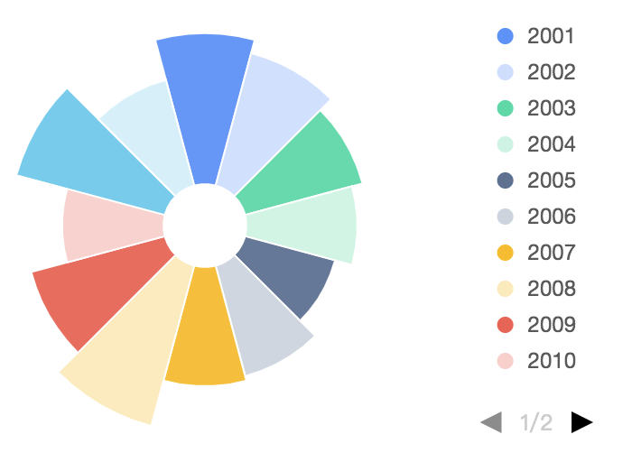
<Legend position=‘right’
  useHtml={true}
  g2-legend = {{
    marginLeft: '100px',
    marginTop: '-107px'
  }}
  g2-legend-list={{
    border: 'none'
  }}
/>
2.双柱状图
adjust 声明几何标记对象的数据调整方式,可用于绘制层叠图、扰动图、分组图等。支持单一的数据调整方式也支持各种数据调整方式的组合。 支持的调整类型包括: 'stack', 'dodge', 'jitter', 'symmetric'
需要注意的是区分双轴的数据的参数需要使用字符串区分,比如说不能用 left:true 和 left:false,但是可以转成 left:’true’ 和 left:’false’
<Geom
            type="interval"
            position="月份*月均降雨量"
            color={"name"}
            adjust={[
              {
                type: "dodge",
                marginRatio: 1 / 32
              }
            ]}
          />
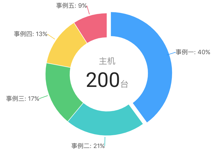
3.带坐标轴的饼图
render() {
         const data = [
            { termField: "field1", termCountPercent: 20 },
            { termField: "field2", termCountPercent: 20 },
            { termField: "field3", termCountPercent: 20 },
            { termField: "field4", termCountPercent: 20 },
        ]
        const cols={
            termCountPercent:{tickCount:5}
        }
        return (
            <Chart padding={[20, 20, 20, 20]} forFit scale={cols} data={data}>
                <Coord type="polar" radius={1} scale={[1.1, 1.1]}></Coord>
                <Legend position="right" textStyle={{ fill: '#fff', fontSize: '12' }} offsetX={-10} useHtml={true} />
                <Tooltip crosshairs={{ type: 'cross', style: { stroke: "rgba(255,255,255,0)" } }} />
                <Axis name="termField"
                    label={{ offset: 15, autoRotate: true, formatter: val => `${val}` }}
                    grid={{ type: 'line', lineStyle: { lineWidth: 1, stroke: "#ccc" } }}
                    line={{ stroke: "#FFF" }}
                    tickLine={{ lineWidth: 1, length: 15, stroke: "#ccc" }} />
                <Axis name="termCountPercent"
                    label={null}
                    grid={{ type: 'circle', lineStyle: { lineWidth: 1, stroke: "#ccc" } }}
                    tickLine={null} />
                <Geom
                    type="intervalStack"
                    position="termField*termCountPercent"
                    color={['termField']}
                    opacity={1}
                    style={{ lineWidth: 1 }} />
            </Chart>
        )
    }
4.Geom中 interval 与intervalStack 的区别,
在x轴对应的数据只有一份的时候这俩没有什么区别,在x轴对应的数据有两份时,intervalStack是层叠柱状图,interval只是柱状图一根柱子
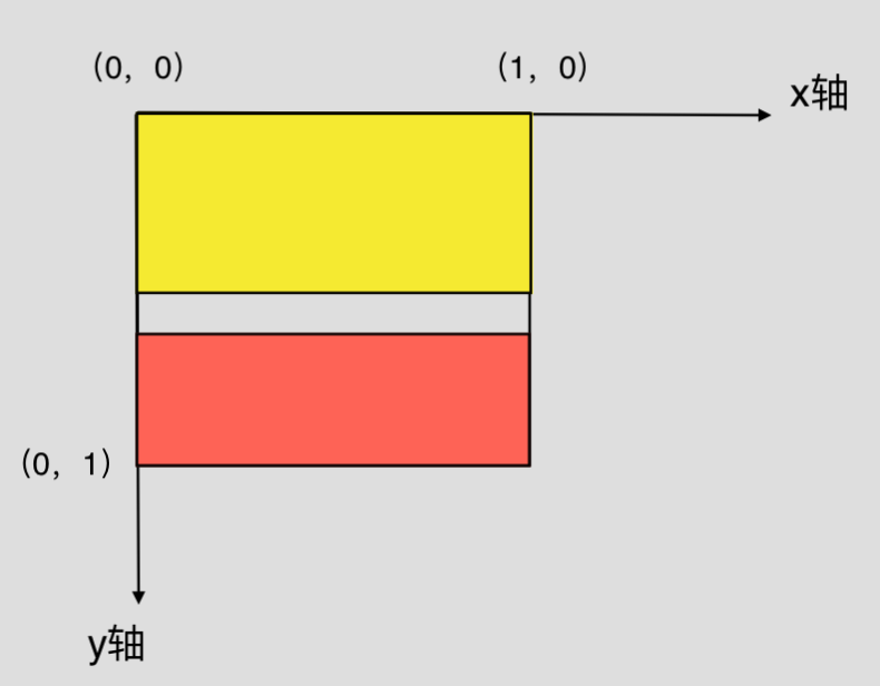
5.View:由 Chart 生成和管理,拥有自己独立的数据源、坐标系和图层,用于异构数据的可视化以及图表组合,一个 Chart 由一个或者多个视图 View 组成
注意:start 和 end 都是从左上角开始计算的
<View start={{x:0, y:0}} end={{x:1, y:0.5}}/> // 黄色区域
<View start={{x:0, y:0.65}} end={{x:1, y:1 }}/> // 红色区域
6.饼图点击每一项的动画效果控制 :Geom 的select属性
开启、关闭以及设置 shape 对于鼠标 click 事件的响应效果。BizCharts 默认仅为饼图开启了选中效果。

7.默认使用 Canvas 渲染,可以改用 SVG 版本、
如何选择:如果单就图表库的视角来看,选择 Canvas 和 SVG 各有千秋。小画布、大数据量的场景适合用 Canvas,譬如热力图、大数据量的散点图等。如果画布非常大,有缩放、平移等高频的交互,或者移动端对内存占用量非常敏感等场景,可以使用 SVG 的方案。
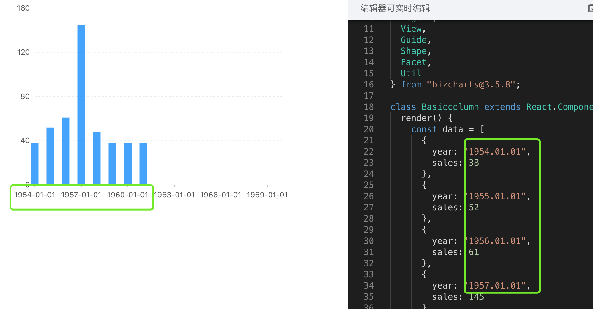
8.Aixs 默认日期格式化
bizCharts 和 g2 默认会将符合”YYYY.MM.DD”的日期格式化成”YYYY-MM-DD”(默认先转成时间戳格式,然后格式化成”-”的,目前看来是只对”YYYY.MM.DD”会格式化,像是”YYYY.MM”不影响),而这个并不是我们系统中想要的话,本来的YYYY.MM.DD”才是我们想要的格式类型,这时候就要自己动手格式化,避免默认操作
Chart有scale={cols} 的属性,设置scale
 const cols = {
        year:{ formatter: (val) => `${ moment(val).format(“YYYY.MM.DD” )}` },
    };
9.饼图的 tooltip 轮播,轮播到当前高亮或者是select
针对theta类型的饼图:

注意:坐标轴不展示,但是还是要写的;
找tooltip轮播的三个点

import React, { Component } from 'react';
import { Chart, Geom, Axis, Tooltip, Coord, Label, Legend, View, Guide, Shape } from 'bizcharts';
import DataSet from '@antv/data-set';
const { DataView } = DataSet;

export default class Basic extends Component {
    constructor() {
        super();
        this.state = {
            tooltipStuff: true, // tooltip是否轮播
            mockData: []  // 页面数据
        }
    }

    componentDidMount() {
        this.setState({
            mockData: [
                { type: 'type1', value: 250, percent: 25 },
                { type: 'type2', value: 500, percent: 50 },
                { type: 'type3', value: 250, percent: 25 },
            ]
        })
    }

    onGetG2InstanceTooltips = (chart, data) => {
        let basePercent = 0;
        let pointList = [];
        const outerRadius = 0.5, innerRadius = 0.45;
        // 坐标系的内外半径和data都可以从chart的属性中找到,为了省事我的代码里是写死的
        const coord = chart.get('coord')
        data.map((item, index) => {
            pointList.push({ index: index, point: this.getThetaPiePoint(basePercent, item['newPercent'], coord, outerRadius, innerRadius), data: item })
            basePercent += item['newPercent']
        })
        this.setState({ tooltipStuff: true }, () => {
            this.onActivedPointInterval(pointList, chart)
        })
    }

    getThetaPiePoint = (basePercent, percent, coord, outerRadius, innerRadius) => {
        const { radius, circleCentre } = coord  // circleCentre 圆环圆心所在坐标
        const middleRadius = (outerRadius, innerRadius) / 2  // 找圆环中间的半径
        const middleLength = middleRadius * radius / outerRadius  // 获取圆环上新的点的半径
        const angle = Math.PI * 2 * (basePercent + percent / 2) - Math.PI / 2   // 角度 Math.PI * 2(占比 / 2) - Math.PI / 2  圆环的角度开始的位置在手表的12点中位置
        const x1 = circleCentre.x + middleLength * Math.cos(angle)  // x1 = x0 + r*cos(a)
        const y1 = circleCentre.y + middleLength * Math.sin(angle)  // y1 = y0 + r*sin(a)
        // 取的点是geom每一块的中心的点,如图
        return { x: x1, y: y1 }
    }
    // tooltip 轮播与Geom的交互有两种:select效果,active效果
    // 方案一:select效果
    onSelectedPointInterval = (pointList, chart) => {
        let i = 0
        this.selectedInterval = setInterval(() => {
            if (!!this.state.tooltipStuff) {
                ++i;
                if (i > pointList.length - 1) {
                    i = -1
                } else {
                    const geoms = chart.get('geoms')[0]
                    const items = geoms.get('data')
                    geoms.setSelected(items[pointList[i].index])
                    chart.showTooltip(pointList[i].point)
                }
            }
        }, 1000 * 3);
    }
    // 方案二:active效果,项目中由于每一块chart占用的空间比较小,所以采用了这种方式
    onActivedPointInterval = (pointList, chart) => {
        let i = 0
        this.activeInterval = setInterval(() => {
            if (!!this.state.tooltipStuff) {
                ++i;
                if (i > pointList.length - 1) {
                    i = -1
                } else {
                    const geoms = chart.get('geoms')[0]
                    const shapes = geoms.getShapes();
                    // _id 是bizcharts用来区分执行动画的,所以不能再<Chart/> 中加入 {animate:false},在这里用来表示geom的每一项,跟Geom的color属性传递的字段一致,如 _id:"chart-geom0-1-#64d5ec"
                    const shapeItemIndex = shapes.findIndex(item => item._id.includes(pointList[i].data.color))
                    geoms.setShapesActived([shapes[shapeItemIndex]])  // 需要传入数组
                    chart.showTooltip(pointList[i].point)
                }
            }
        }, 1000 * 3);
    }
    // 鼠标移入
    onPlotMoveTooltips = (ev) => {
        this.setState({ tooltipStuff: false })
    }
    // 鼠标移出
    onPlotLeaveTooltips = (ev) => {
        this.setState({ tooltipStuff: true })
    }


    render() {
        const dv = new DataView()
        // 后台返回的percent页面展示需要用,所以我定义了一个计算圆环百分比的newPercent,根据value计算出来的,避免了小数位数等问题
        dv.source(this.state.mockData).transform({
            type: 'percent',
            field: 'value',
            dimension: 'type',
            as: 'newPercent'
        })
        const cols = {
            percent: { formatter: (val) => `${(val * 100).toFixed(2)}%` }
        }
        const itemColor = [
            { field: 'type1', color: '#e9b05c' },
            { field: 'type2', color: '#5b6bfe' },
            { field: 'type3', color: '#64d5ec' },
        ]
        itemColorMap = (type) => {
            return itemColor.find(item => item.field === type)["color"]
        }
        return (
            <div>
                {
                    !!this.state.mockData && this.state.mockData.length > 0 ?
                        <Chart height={400} data={dv} scale={cols} forceFit
                            onGetG2Instance={(chart, data) => this.onGetG2InstanceTooltips(chart, dv['rows'])}
                            onPlotMove={(ev) => this.onPlotMoveTooltips(ev)}
                            onPlotLeave={(ev) => this.onPlotLeaveTooltips(ev)}>
                            <Coord type="theta" radius={0.5} innerRadius={0.45} />
                            <Axis name="type" />
                            <Axis name="newPercent" />
                            <Tooltip
                                crosshairs={{ type: "cross", style: { stroke: 'rgba(0,0,0,0)' } }}
                                showTitle={false} />
                            <Geom type="line" position="year*value" size={2} />
                            <Geom
                                type="intervalStack"
                                position="newPercent"
                                color={["type", (type => { itemColorMap(type) })]}
                                opacity={1}
                                select={false}
                                active={[true, { highlight: true }]}
                                tooltip={["type*value*percent", (type, value, percent) => { return { name: type, value: `${value}(${percent.toFixed(2)}%)` } }]} />
                        </Chart> : null
                }
            </div>
        )
    }
}
10. 未完待续

 浙公网安备 33010602011771号