


bizChart 饼图(theta)的tooltip轮播
继折线图柱状图的tooltip自动轮播之后,需求又加了饼图的tooltip自动轮播,
涉及的原因有页面上布局的位置有限,饼图加内容比较多的label展示的话会很费位置,导致饼子太小,其次,bizcharts的label比较长的情况下,formatter只是格式化数据,导致内容过长,使用HTMLTemplate虽然可以多行展示,但是如果饼图数据不美好的情况下,会导致label叠加在一起,bizcharts只计算了又一行数据的情况下label的位置不叠加,唉

而tooltip自动轮播完美的解决了这些问题
针对theta类型的饼图:(后续补充polar类型)
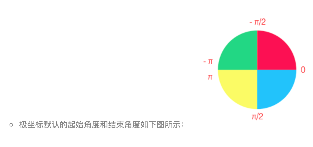
1.关于坐标系官网是这样说的
注意:坐标轴不展示,但是还是要写的;

坐标系讲解可见官网
https://bizcharts.net/product/bizcharts/category/7/page/25
需要注意坐标系起始位置
2.找tooltip轮播的三个点
3.有两种方式,一种是selected选中tooltip展示,第二种是actived后tooltip展示,下面代码中两种方式都有,项目中选择了后者
方式不同,Geom的参数也需要对应着改
  select={false}
  active={[true, { highlight: true }]}
4.代码和部分注释如下
import React, { Component } from 'react';
import { Chart, Geom, Axis, Tooltip, Coord, Label, Legend, View, Guide, Shape } from 'bizcharts';
import DataSet from '@antv/data-set';
const { DataView } = DataSet;
export default class Basic extends Component {
constructor() {
super();
this.state = {
tooltipStuff: true, // tooltip是否轮播
mockData: [] // 页面数据
}
}
componentDidMount() {
this.setState({
mockData: [
{ type: 'type1', value: 250, percent: 25 },
{ type: 'type2', value: 500, percent: 50 },
{ type: 'type3', value: 250, percent: 25 },
]
})
}
onGetG2InstanceTooltips = (chart, data) => {
let basePercent = 0;
let pointList = [];
const outerRadius = 0.5, innerRadius = 0.45;
// 坐标系的内外半径和data都可以从chart的属性中找到,为了省事我的代码里是写死的
const coord = chart.get('coord')
data.map((item, index) => {
pointList.push({ index: index, point: this.getThetaPiePoint(basePercent, item['newPercent'], coord, outerRadius, innerRadius), data: item })
basePercent += item['newPercent']
})
this.setState({ tooltipStuff: true }, () => {
this.onActivedPointInterval(pointList, chart)
})
}
getThetaPiePoint = (basePercent, percent, coord, outerRadius, innerRadius) => {
const { radius, circleCentre } = coord // circleCentre 圆环圆心所在坐标
const middleRadius = (outerRadius, innerRadius) / 2 // 找圆环中间的半径
const middleLength = middleRadius * radius / outerRadius // 获取圆环上新的点的半径
const angle = Math.PI * 2 * (basePercent + percent / 2) - Math.PI / 2 // 角度 Math.PI * 2(占比 / 2) - Math.PI / 2 圆环的角度开始的位置在手表的12点中位置
const x1 = circleCentre.x + middleLength * Math.cos(angle) // x1 = x0 + r*cos(a)
const y1 = circleCentre.y + middleLength * Math.sin(angle) // y1 = y0 + r*sin(a)
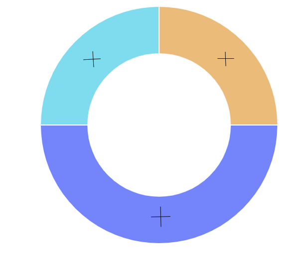
// 取的点是geom每一块的中心的点,如图
return { x: x1, y: y1 }
}
// tooltip 轮播与Geom的交互有两种:select效果,active效果
// 方案一:select效果
onSelectedPointInterval = (pointList, chart) => {
let i = 0
this.selectedInterval = setInterval(() => {
if (!!this.state.tooltipStuff) {
++i;
if (i > pointList.length - 1) {
i = -1
} else {
const geoms = chart.get('geoms')[0]
const items = geoms.get('data')
geoms.setSelected(items[pointList[i].index])
chart.showTooltip(pointList[i].point)
}
}
}, 1000 * 3);
}
// 方案二:active效果,项目中由于每一块chart占用的空间比较小,所以采用了这种方式
onActivedPointInterval = (pointList, chart) => {
let i = 0
this.activeInterval = setInterval(() => {
if (!!this.state.tooltipStuff) {
++i;
if (i > pointList.length - 1) {
i = -1
} else {
const geoms = chart.get('geoms')[0]
const shapes = geoms.getShapes();
// _id 是bizcharts用来区分执行动画的,所以不能再<Chart/> 中加入 {animate:false},在这里用来表示geom的每一项,跟Geom的color属性传递的字段一致,如 _id:"chart-geom0-1-#64d5ec"
const shapeItemIndex = shapes.findIndex(item => item._id.includes(pointList[i].data.color))
geoms.setShapesActived([shapes[shapeItemIndex]]) // 需要传入数组
chart.showTooltip(pointList[i].point)
}
}
}, 1000 * 3);
}
// 鼠标移入
onPlotMoveTooltips = (ev) => {
this.setState({ tooltipStuff: false })
}
// 鼠标移出
onPlotLeaveTooltips = (ev) => {
this.setState({ tooltipStuff: true })
}
render() {
const dv = new DataView()
// 后台返回的percent页面展示需要用,所以我定义了一个计算圆环百分比的newPercent,根据value计算出来的,避免了小数位数等问题
dv.source(this.state.mockData).transform({
type: 'percent',
field: 'value',
dimension: 'type',
as: 'newPercent'
})
const cols = {
percent: { formatter: (val) => `${(val * 100).toFixed(2)}%` }
}
const itemColor = [
{ field: 'type1', color: '#e9b05c' },
{ field: 'type2', color: '#5b6bfe' },
{ field: 'type3', color: '#64d5ec' },
]
itemColorMap = (type) => {
return itemColor.find(item => item.field === type)["color"]
}
return (
<div>
{
!!data && data.length > 0 ?
<Chart height={400} data={dv} scale={cols} forceFit
onGetG2Instance={(chart, data) => this.onGetG2InstanceTooltips(chart, dv['rows'])}
onPlotMove={(ev) => this.onPlotMoveTooltips(ev)}
onPlotLeave={(ev) => this.onPlotLeaveTooltips(ev)}>
<Coord type="theta" radius={0.5} innerRadius={0.45} />
<Axis name="type" />
<Axis name="newPercent" />
<Tooltip
crosshairs={{ type: "cross", style: { stroke: 'rgba(0,0,0,0)' } }}
showTitle={false} />
<Geom type="line" position="year*value" size={2} />
<Geom
type="intervalStack"
position="newPercent"
color={["type", (type => { itemColorMap(type) })]}
opacity={1}
select={false}
active={[true, { highlight: true }]}
tooltip={["type*value*percent", (type, value, percent) => { return { name: type, value: `${value}(${percent.toFixed(2)}%)` } }]} />
</Chart> : null
}
</div>
)
}
}

 浙公网安备 33010602011771号