

CSS3背景 制作导航菜单综合练习题
CSS3背景 制作导航菜单综合练习题
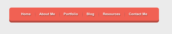
小伙伴们,根据所学知识,使用CSS3实现下图的导航菜单效果
任务
1、制作导航圆角
提示:使用border-radius实现圆角
2、制作导航立体风格
提示:使用box-shadow实现立体风格
3、制作导航分隔线
提示:使用渐变与伪元素制作
4、删除第一个和最后一个导航分隔线
提示:使用伪元素删除第一个和最后一个分隔线
<!doctype html>
<html lang="en">
<head>
    <meta charset="UTF-8">
    <title>CSS制作立体导航</title>
    <link rel="stylesheet" href="http://www.w3cplus.com/demo/css3/base.css">
    <style>
        body{
          background: #ebebeb;
        }
        .nav{
          width:560px;
          height: 50px;
          font:bold 0/50px Arial;
          text-align:center;
          margin:40px auto 0;
          background: #f65f57;
          /*制作圆*/
          border-radius:10px;

          /*制作导航立体风格*/
          box-shadow:0px 5px #B23F34;
        }
        .nav a{
          display: inline-block;
          -webkit-transition: all 0.2s ease-in;
          -moz-transition: all 0.2s ease-in;
          -o-transition: all 0.2s ease-in;
          -ms-transition: all 0.2s ease-in;
          transition: all 0.2s ease-in;
        }
        .nav a:hover{
          -webkit-transform:rotate(10deg);
          -moz-transform:rotate(10deg);
          -o-transform:rotate(10deg);
          -ms-transform:rotate(10deg);
          transform:rotate(10deg);
        }

        .nav li{
          position:relative;
          display:inline-block;
          padding:0 16px;
          font-size: 13px;
          text-shadow:1px 2px 4px rgba(0,0,0,.5);
          list-style: none outside none;
        }
        /*使用伪元素制作导航列表项分隔线*/
      .nav li:before{
          content:"";
          position:absolute;
          left:0;
          top:18px;
          height:16px;
          width:1px;
          background:-webkit-linear-gradient(right,#E16459,#D05448 );
          background:-moz-linear-gradient( left,#E16459,#D05448 );
          background:-o-linear-gradient( left,#E16459,#D05448 );
          background:linear-gradient(to left,#E16459,#D05448 );
      }
        /*删除第一项和最后一项导航分隔线*/
        .nav>li:first-child:before{
            background:none;
        }

        .nav a,
        .nav a:hover{
          color:#fff;
          text-decoration: none;
        }

    </style>
</head>
<body>
    <ul class="nav">
        <li><a href="">Home</a></li>
        <li><a href="">About Me</a></li>
        <li><a href="">Portfolio</a></li>
        <li><a href="">Blog</a></li>
        <li><a href="">Resources</a></li>
        <li><a href="">Contact Me</a></li>
    </ul>
</body>
</html>

 浙公网安备 33010602011771号