

css加载动画(纯css和html)
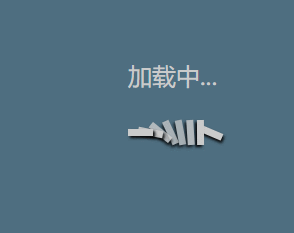
从jq官网上摘抄下来的一个简单加载动画,个人比较喜欢使用~存在这里,作为记录
话不多说~上代码
<!DOCTYPE html>
<html lang="en">
<head>
<meta charset="UTF-8">
<meta name="viewport" content="width=device-width, initial-scale=1.0">
<title>Document</title>
<style>
/* 登陆动画 */
.loader {
width: 90px;
height: 42px;
position: absolute;
top: 50%;
left: 50%;
transform: translate(-50%);
}
#logining {
/* display: none; */
width: 447px;
height: 438px;
/* background-color: rgba(255, 255, 255, 0.3); */
position: relative;
top: 0;
left: 0;
text-align: center;
font-size: 24px;
color: #cccccc;
background: rgba(4, 49, 75, 0.7);
overflow: hidden;
}
#logining p {
margin-top: 150px;
}
.css-square {
position: absolute;
top: 0;
left: 0;
width: 25px;
height: 7px;
background: #cccccc;
box-shadow: 2px 2px 3px 0px black;
}
.square1 {
left: 70px;
-webkit-animation: dominos 1s 0.125s ease infinite;
animation: dominos 1s 0.125s ease infinite;
}
.square2 {
left: 60px;
-webkit-animation: dominos 1s 0.3s ease infinite;
animation: dominos 1s 0.3s ease infinite;
}
.square3 {
left: 50px;
-webkit-animation: dominos 1s 0.425s ease infinite;
animation: dominos 1s 0.425s ease infinite;
}
.square4 {
left: 40px;
-webkit-animation: dominos 1s 0.540s ease infinite;
animation: dominos 1s 0.540s ease infinite;
}
.square5 {
left: 30px;
-webkit-animation: dominos 1s 0.665s ease infinite;
animation: dominos 1s 0.665s ease infinite;
}
.square6 {
left: 20px;
-webkit-animation: dominos 1s 0.79s ease infinite;
animation: dominos 1s 0.79s ease infinite;
}
.square7 {
left: 10px;
-webkit-animation: dominos 1s 0.9s ease infinite;
animation: dominos 1s 0.9s ease infinite;
}
.square8 {
left: 0px;
-webkit-animation: dominos 1s 1s ease infinite;
animation: dominos 1s 1s ease infinite;
}
@-webkit-keyframes loader-1-outter {
0% {
-webkit-transform: rotate(0deg);
transform: rotate(0deg);
}
100% {
-webkit-transform: rotate(360deg);
transform: rotate(360deg);
}
}
@keyframes loader-1-outter {
0% {
-webkit-transform: rotate(0deg);
transform: rotate(0deg);
}
100% {
-webkit-transform: rotate(360deg);
transform: rotate(360deg);
}
}
@-webkit-keyframes dominos {
50% {
opacity: 0.7;
}
75% {
-webkit-transform: rotate(90deg);
transform: rotate(90deg);
}
80% {
opacity: 1;
}
}
@keyframes dominos {
50% {
opacity: 0.7;
}
75% {
-webkit-transform: rotate(90deg);
transform: rotate(90deg);
}
80% {
opacity: 1;
}
}
</style>
</head>
<body>
<div id="logining">
<p>加载中...</p>
<section>
<div class="loader ">
<div class="css-square square1"></div>
<div class="css-square square2"></div>
<div class="css-square square3"></div>
<div class="css-square square4"></div>
<div class="css-square square5"></div>
<div class="css-square square6"></div>
<div class="css-square square7"></div>
<div class="css-square square8"></div>
</div>
</section>
</div>
</body>
</html>

 浙公网安备 33010602011771号