CSS样式示例
1、CSS语法和注释规则:
<!DOCTYPE html>
<html lang="en">
<head>
<meta charset="UTF-8">
<title>CSS样式</title>
<style type="text/css">
<!-- css样式:选择符和声明构成。声明(span):属性名(color)和属性值(orange)。-->
span{
color: orange;
font-size: 20px;
}
<!-- span属性应用于网页中所有<span>标签。-->
</style>
</head>
<body>
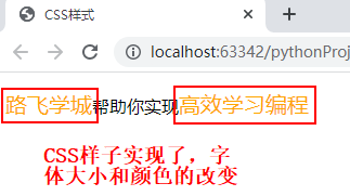
<p>
<span>路飞学城</span>帮助你实现<span>高效学习编程</span>
</p>
</body>
</html>
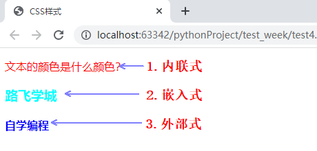
2、CSS的三种引入方式:优先级:内联式>嵌入式>外部式。
优先级不是唯一,也要看在网页中的先后顺序。嵌入式在外部式的前面,则嵌入式>外部式。
<!--
    1.内联式(行内式)
    2.嵌入式
    3.外部式
-->
<!DOCTYPE html>
<html lang="en">
<head>
    <meta charset="UTF-8">
    <title>CSS样式</title>
    <style>
        h3{
            color: aqua;
        }
    </style>
<!--3.外部式,link链接外css文件夹中的index.css文件。href为文件路径。-->
    <link rel="stylesheet" type="text/css" href="css/index.css">
</head>
<body>
<!--1.内联式-->
    <p style="color: red">
        文本的颜色是什么颜色?
    </p>
<!--2.嵌入式,属性为head里面的style里面的h3-->
    <h3>
        路飞学城
    </h3>
<!--3.外部式-->
    <h4>
        自学编程
    </h4>
</body>
</html>
/*index.css里面的内容*/
h4{
    color: blue;
}
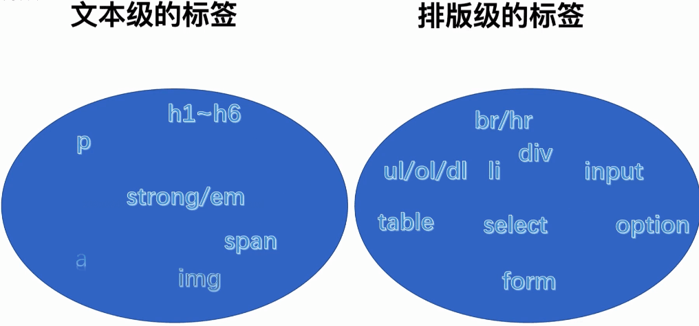
3、CSS常用的几种选择器
/*选择器{
    样式;
}
div{
    color:red;
    font-size:30px;
}*/
<!--
css选择器:
    一、基础选择器
        1、标签(元素)选择器
        2、类(class)选择器
        3、id(身份证号)选择器
    二、高级选择器
        1、后代选择器
        2、子代选择器
        3、组合选择器
        4、交集选择器
        5、伪类选择器
-->
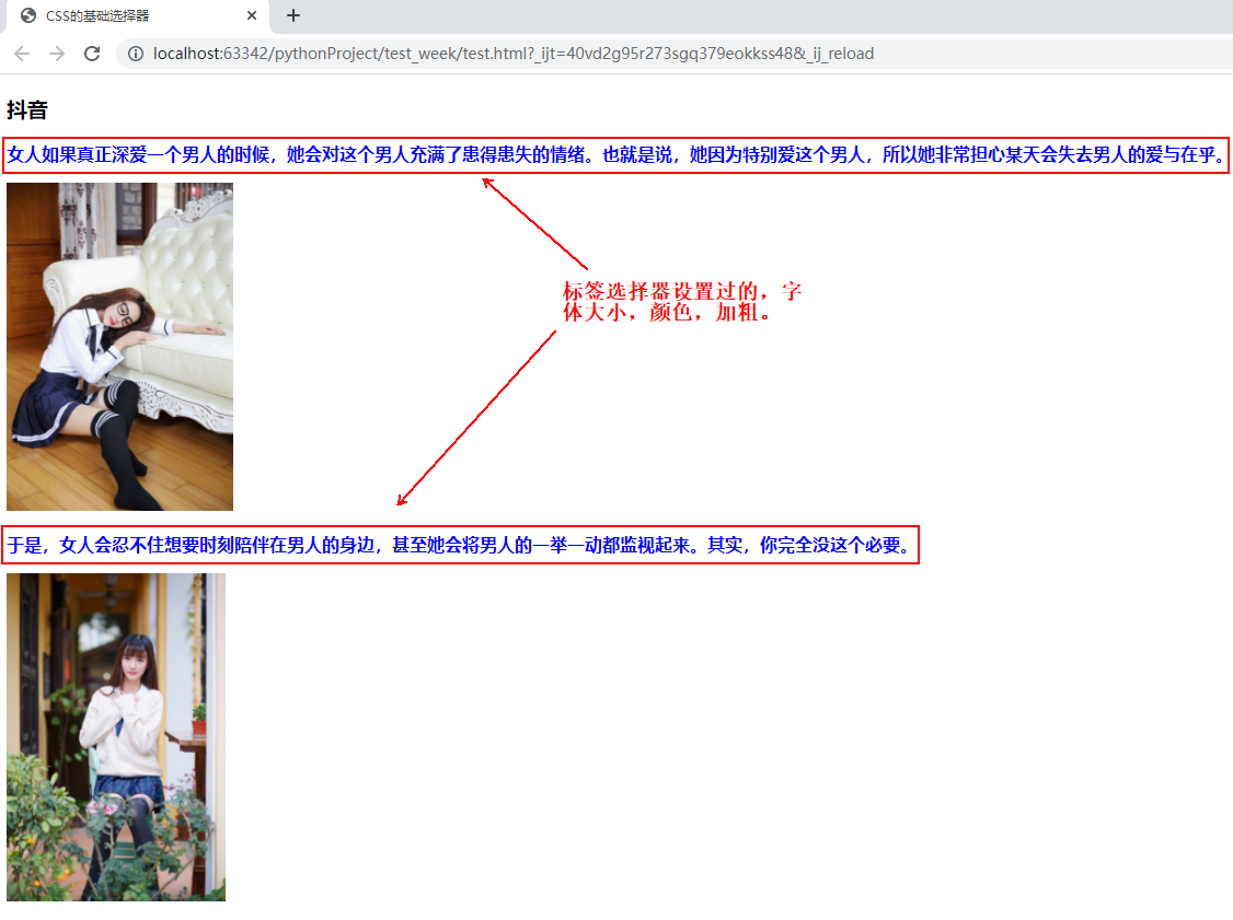
4、CSS选择器之标签选择器
<!--test.html里面的内容-->
<!DOCTYPE html>
<html lang="en">
<head>
<meta charset="UTF-8">
<title>CSS的基础选择器</title>
<link rel="stylesheet" type="text/css" href="css/index.css">
</head>
<body>
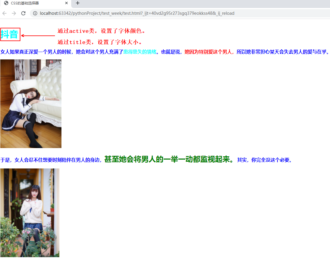
<h3>抖音</h3>
<p>
女人如果真正深爱一个男人的时候,她会对这个男人充满了患得患失的情绪。也就是说,她因为特别爱这个男人,所以她非常担心某天会失去男人的爱与在乎。 </p>
<img src="images/30-1.jpg" height="300">
<p>
于是,女人会忍不住想要时刻陪伴在男人的身边,甚至她会将男人的一举一动都监视起来。其实,你完全没这个必要。
</p>
<img src="images/30-2.jpg" height="300">
</body>
</html>
/*index.css里面的内容*/
p{
    color: blue;
    font-size: 16px;
    font-weight: bold;
}
/*对test.html里面所有<p>标签的内容进行了字体颜色设置,字体大小设置,字体加粗设置。*/
5、CSS选择器之ID选择器
<!--test.html里面的内容-->
<!DOCTYPE html>
<html lang="en">
<head>
    <meta charset="UTF-8">
    <title>CSS的基础选择器</title>
    <link rel="stylesheet" type="text/css" href="css/index.css">
</head>
<body>
    <h3>抖音</h3>
    <p>
        女人如果真正深爱一个男人的时候,她会对这个男人充满了患得患失的情绪。也就是说,<span id="thisman">她因为特别爱这个男人,</span>所以她非常担心某天会失去男人的爱与在乎。    </p>
    <img src="images/30-1.jpg" height="300">
    <p>
        于是,女人会忍不住想要时刻陪伴在男人的身边,<span id="shenzhi">甚至她会将男人的一举一动都监视起来。</span>其实,你完全没这个必要。
    </p>
    <img src="images/30-2.jpg" height="300">
</body>
</html>
/*index.css里面的内容*/
p{
    color: blue;
    font-size: 16px;
    font-weight: bold;
}
/*对test.html里面所有的<p>标签的内容进行了字体颜色设置,字体大小设置,字体加粗设置。*/
#thisman{
    color: red;
    font-size: 16px;
    font-weight: bold;
}
/*仅仅对ID为thisman这个进行了单独的设置。*/
#shenzhi{
    color: green;
    font-size: 25px;
    font-weight: bold;
}
/*仅仅对ID为shenzhi这个进行了单独的设置。*/

6、CSS类选择器
<!--test.html里面的内容-->
<!DOCTYPE html>
<html lang="en">
<head>
    <meta charset="UTF-8">
    <title>CSS的基础选择器</title>
    <link rel="stylesheet" type="text/css" href="css/index.css">
</head>
<body>
<!--类标签:class-->
    <h3 class="active title">抖音</h3>
<!--这里class类设置了,两个属性,active和title。两个可以分别设置。-->

    <p>
        女人如果真正深爱一个男人的时候,她会对这个男人充满了<span class="active">患得患失的情绪</span>。也就是说,<span id="thisman">她因为特别爱这个男人,</span>所以她非常担心某天会失去男人的爱与在乎。    </p>
    <img src="images/30-1.jpg" height="300">
    <p>
        于是,女人会忍不住想要时刻陪伴在男人的身边,<span id="shenzhi">甚至她会将男人的一举一动都监视起来。</span>其实,你完全没这个必要。
    </p>
    <img src="images/30-2.jpg" height="300">
</body>
</html>
/*index.css里面的内容*/
p{
    color: blue;
    font-size: 16px;
    font-weight: bold;
}
/*对test.html里面所有的<p>标签的内容进行了字体颜色设置,字体大小设置,字体加粗设置。*/

#thisman{
    color: red;
    font-size: 16px;
    font-weight: bold;
}
/*仅仅对ID为thisman这个进行了单独的设置。*/
#shenzhi{
    color: green;
    font-size: 25px;
    font-weight: bold;
}
/*仅仅对ID为shenzhi这个进行了单独的设置。*/

/*下面是类:class选择器。*/
.active{
    color: aqua;
}
/*.active设置了“抖音”两个字的颜色。*/
.title{
    font-size: 30px;
}
/*.title设置了“抖音”两个字的大小。*/
7、如何正确地使用类class选择器
<!--test.html里面的内容-->
<!DOCTYPE html>
<html lang="en">
<head>
<meta charset="UTF-8">
<title>CSS类选择器</title>
<link rel="stylesheet" type="text/css" href="css/index.css">
</head>
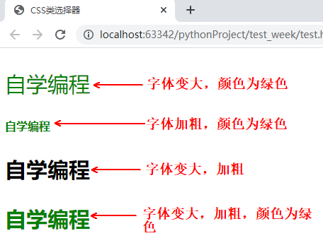
<body>
<p class="color size">自学编程</p>
<!--改变字体颜色和大小-->
<p class="color bole">自学编程</p>
<!--改变字体颜色和加粗-->
<p class="size bole">自学编程</p>
<!--改变字体大小和加粗-->
<p class="color size bole">自学编程</p>
<!--改变字体颜色、大小和加粗-->
</body>
</html>
/*index.css里面的内容*/
.color{
    color: green;
}
/*改变字体颜色*/

.size{
    font-size: 30px;
}
/*改变字体大小*/

.bold{
    font-weight: bold;
}
/*字体加粗*/
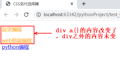
8、CSS后代选择器
<!--test.html里面的内容-->
<!DOCTYPE html>
<html lang="en">
<head>
    <meta charset="UTF-8">
    <title>CSS后代选择器</title>
    <link rel="stylesheet" type="text/css" href="css/index.css">
</head>
<body>
<!--后代选择器div a{},只改变了,div 里面a的内容,没有改变div之外a的内容-->
    <div>
        <p>
            <a href="#">自学编程</a>
        </p>
            <a href="#">web前端编程</a>

    </div>
    <a href="#">python编程</a>
</body>
</html>
/*index.css里面的内容*/
div a{
    color: orange;
}
/*后代选择器div a{},只改变了,div 里面a的内容,没有改变div之外a的内容*/
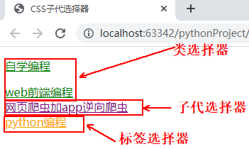
9、CSS子代选择器
<!--test.html里面的内容-->
<!DOCTYPE html>
<html lang="en">
<head>
    <meta charset="UTF-8">
    <title>CSS子代选择器</title>
    <link rel="stylesheet" type="text/css" href="css/index.css">
</head>
<body>
<!--后代选择器div a{},只改变了,div 里面a的内容,没有改变div之外a的内容-->
    <div class="wrap">
        <p>
            <a href="#">自学编程</a>
        </p>
            <a href="#">web前端编程</a>
    </div>
<!--这里的第一个div/p/a是后代,中间隔了个p标签。-->

    <div>
        <a href="#">网页爬虫加app逆向爬虫</a>
    </div>
<!--这里第二个div/a是子代。-->
    <a href="#">python编程</a>
</body>
</html>
/*index.css里面的内容*/
a{
    color: orange;
}
/*后代选择器div a{},只改变了,div 里面a的内容,没有改变div之外a的内容*/
/*这里的div可以换成id,类class,或者标签(div就是标签)。*/

.wrap a{
    color: green;
}
/*有空格的是后代选择器,这里是类wrap的后代选择器*/

div>a{
    color: purple;
}
/*有>的是子代选择器*/
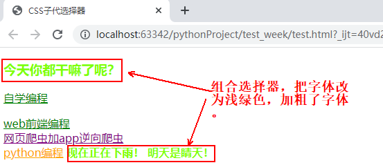
10、CSS组合选择器
<!--test.html里面的内容-->
<!DOCTYPE html>
<html lang="en">
<head>
    <meta charset="UTF-8">
    <title>CSS子代选择器</title>
    <link rel="stylesheet" type="text/css" href="css/index.css">
</head>
<body>
    <h3>今天你都干嘛了呢?</h3>
    <div class="wrap">
        <p>
            <a href="#">自学编程</a>
        </p>
        <a href="#">web前端编程</a>
    </div>

    <div>
        <a href="#">网页爬虫加app逆向爬虫</a>
    </div>
    <a href="#">python编程</a>
    <span>现在正在下雨!</span>
    <span>明天是睛天!</span>
</body>
</html>
/*index.css里面的内容*/
a{
    color: orange;
}
/*后代选择器div a{},只改变了,div 里面a的内容,没有改变div之外a的内容*/
/*这里的div可以换成id,类class,或者标签(div就是标签)。*/

.wrap a{
    color: green;
}
/*有空格的是后代选择器,这里是类wrap的后代选择器*/

div>a{
    color: purple;
}
/*有>的是子代选择器*/

h3,span{
    color: chartreuse;
    font-weight: bold;
}
/*h3,span这是组合选择器,这里可以有很多个标签*/
11、CSS交集选择器,不常用。
<!--test.html里面的内容-->
<!DOCTYPE html>
<html lang="en">
<head>
    <meta charset="UTF-8">
    <title>CSS交集选择器</title>
    <link rel="stylesheet" type="text/css" href="css/index.css">
</head>
<body>
    <h3>今天你都干嘛了呢?</h3>
    <span class="active">现在正在下雨!</span>
    <p>
        <span>明天是睛天!</span>
    </p>
</body>
</html>
/*index.css里面的内容*/
h3{
    font-size: 30px;
    /*color: green;*/
}
.active{
    font-size: 20px;
    /*color: green;*/
}
/*上面为重复的颜色*/

h3.active{
    color: green;
}
/*上面为交集选择器,把重复的颜色单独列出来。*/
/*交集选择器,可以是标签,ID,类class。*/
测试之后没有效果,待求证。
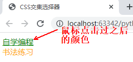
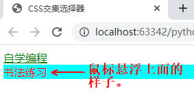
12、CSS伪类选择器
<!--test.html里面的内容-->
<!DOCTYPE html>
<html lang="en">
<head>
    <meta charset="UTF-8">
    <title>CSS交集选择器</title>
    <link rel="stylesheet" type="text/css" href="css/index.css">
</head>
<body>
    <a href="#">自学编程</a>
    <div>
        <span>书法练习</span>
    </div>
</body>
</html>
/*index.css里面的内容*/
/*CSS伪类选择器*/
/*爱恨准则,先爱再恨。LoVe HAte*/
/*没有被访问过a的状态*/
a:link{
    color: orange;
}

/*访问过后a的状态*/
a:visited{
    color: green;
}

/*鼠标悬浮时a的状态*/
a:hover{
    color: purple;
}

/*鼠标摁住时a的状态*/
a:active{
    color: blue;
}
/*上面这些标签,除了hover能用于网页所有标签,其它的只能用于a标签。*/

span{
    color: orange;
}
div:hover{
    background-color: aqua;
}
/*上面div标签,当鼠标放在div内的内容上时,相应的一行背景颜色显示为aqua。*/

div:hover span{
    color: red;
}
/*上面div标签,当鼠标放在div内的内容上时,相应的一行背景颜色显示为aqua。并且字体颜色显示为红色。*/
13、CSS选择器总结:
css 选择器总结:
    语法:
        选择符{
            属性:值;
        }
    作用:选中页面上的元素(标签),设置对应的样式
    -基础选择器
        +标签选择器
            *对页面中相同的元素,设置共同的属性
        + id 选择器
            *任何的元素都可以设置 id
            * id 是唯一,并且不能重复,表示选中的是有特性的元素
        + class 选择器
            *任何的元素都可以设置类
            *一个元素中可以设置多个类
            *一定要有“归类的概念,公共类的想法”。选中的页面元素,设置相同的属性
    -高级选择器
        +后代(爸爸的儿子,孙子....)
            * div p {}
        +子代(亲儿子)
            * diV > p
    +组合
        *选择器1,选择器2,选择器3{}
    +交集选择器(了解)
        *选择器1选择器2{}
    +伪类选择器
        * a 标签
            -爱恨准则 LoVe HAte
                 +a:link{}
                 +a:visited{}
                 +a:hover{}
                 +a:active{}
    注意:hover可以应用于任何的元素。
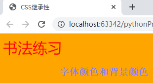
14、CSS的断承性
<!--test.html里面的内容-->
<!DOCTYPE html>
<html lang="en">
<head>
    <meta charset="UTF-8">
    <title>CSS继承性</title>
    <link rel="stylesheet" type="text/css" href="css/index.css">
</head>
<body>
    <div>
        <span>书法练习</span>
    </div>
</body>
</html>
/*index.css里面的内容*/
/*CSS继承性*/
body{
    color: red;
    font-size: 30px;
    background-color:orange ;
}
/*body内所有的标签都有body的属性。其中也有不能断承的属性。*/
15、选择器权重
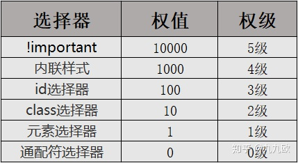
!important > 内联样式 > ID选择器 > class选择器 > 元素选择器 > 通配符选择器
选择器权重计算永不进位。
<!--test.html里面的内容-->
<!DOCTYPE html>
<html lang="en">
<head>
    <meta charset="UTF-8">
    <title>CSS选择器权重</title>
    <style type="text/css">
        /*003*/
        div div p{
            color: yellow;
        }
        /*001*/
        p{
            color: gray;
        }
        /*010*/
        .active{
            color: purple;
        }
        /*011*/
        div.active{
            color: black;
        }
        /*012*/
        div div .active{
            color: blue;
        }
        /*120*/
        .wrap1#box2 .active{
            color: green;
        }
        /*201*/
        #box1 #box2 p{
            color: red;
        }
        /*继承来的属性,它的权重非常低0*/
        #box1 #box2 #box3{
            color: orange;
        }
        /*这里没有选中标签p,是继承关系,上面几个都有选中标签p,不是继承关系。*/
    </style>
</head>
<body>
    <div class="wrap1" id="box1">
        <div class="wrap2" id="box2">
            <div class="wrap3" id="box3">
                <p class="active">自学编程</p>
            </div>
        </div>
    </div>
</body>
</html>
16、!important的讲解
<!--test.html里面的内容-->
<!DOCTYPE html>
<html lang="en">
<head>
    <meta charset="UTF-8">
    <title>!important</title>
    <style type="text/css">
        #box1{
            color: green !important;
        }
        div{
            color: orange !important;
        }
    </style>
<!--如果两个都有!important,则根据选择器的权重作用其属性。这里显示为绿色。-->
</head>
<body>
    <div class="wrap1" id="box1">
        web前端开发
    </div>
</body>
</html>
17、字体属性
<!--test.html里面的内容-->
<!DOCTYPE html>
<html lang="en">
<head>
    <meta charset="UTF-8">
    <title>字体属性</title>
    <style type="text/css">
        body{
            font-family: 'impact 常规', 'Consolas', 'Deja Vu Sans Mono', 'Bitstream Vera Sans Mono','monospace';
            /*font-family这是字体样式,第一个为首先字体,后面的都是备用字体。如果这些都没有,就默认用户电脑上的默认字体。*/

            font-style: italic;
            /*italic是倾斜的意思,这里就是设置斜体字的。另外标签<em>自带斜体效果。*/

            font-weight: 900;
            /*字体加粗,加细,可以用bold,或者100-900之间的数字表示。另外标签<strong>自带加粗效果。*/

            text-decoration: line-through;
            /*underline下划线,overline上划线,line-through中划线。值为NONE可以清除a标签的属性*/
        }
    </style>
</head>
<body>
    <em>你好</em>
    <strong>web前端开发</strong>
</body>
</html>
字体大小的属性:像素单位:px em rem。
18、字体属性之color颜色
<!--test.html里面的内容-->
<!DOCTYPE html>
<html lang="en">
<head>
    <meta charset="UTF-8">
    <title>字体属性</title>
    <style type="text/css">
        body{
            font-family: 'Consolas', 'Monaco', 'Bitstream Vera Sans Mono', monospace ;
            /*color: rgb(255,0,0);*/
            /*color: rgba(0,255,0,0.3);*/
            /*这里的a:alpha透明度的意思,取值范围:0-1*/
            color: #FF6700;
            /*这里是十六进制表示方法,相当于十进制的:255,103,0*/

            /*
            十进制:0 1 2 3 4 5 6 7 8 9 10 11 12 13 14 15 16
            十六进制:0 1 2 3 4 5 6 7 8 9 A B C D E F
            FF 67 00
            15 * 16 + 15 = 255
            6 * 16 + 7 = 103
            0 * 16 + 0 = 0
             */
        }
    </style>
</head>
<body>
    web前端开发
</body>
</html>
19、文本属性和字体属性示例
<!--test.html里面的内容-->
<!DOCTYPE html>
<html lang="en">
<head>
<meta charset="UTF-8">
<title>文本属性和字体属性示例</title>
<style type="text/css">
a{
text-decoration: none;
/*这里的none为了清除a标签里面的下划线。*/
color: #333;
font-size: 15px;
}
a:hover{
color: #FD8308;
text-decoration: underline;
/*鼠标悬浮变颜色,并且加下划线。*/
}
.box p span{
text-decoration: line-through;
/*399.00中间划一道线。*/
}
</style>
</head>
<body>
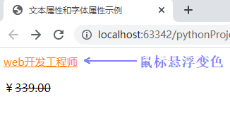
<div class="box">
<a href="http:www.baidu.com">
web开发工程师
</a>
<p>¥<span>339.00</span></p>
</div>
</body>
</html>
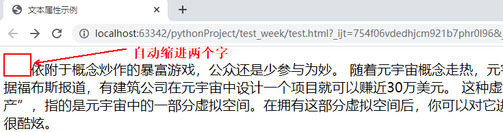
20、文本属性示例。自动缩进两个字。
<!--test.html里面的内容-->
<!DOCTYPE html>
<html lang="en">
<head>
    <meta charset="UTF-8">
    <title>文本属性示例</title>
    <style type="text/css">
        p{
            text-indent: 2em;
            font-size: 20px;
            /*indent是缩进的意思。2em的作用是,不管下面字体大小怎么变化,都自动缩进两个字。*/
            line-height: 40px;
            /*行高:行与行之间的距离。行高一定要大于字体大小。*/
            letter-spacing: 5px;
            /*文字与文字之间的距离。这个只对中文起作用,英文不起作用。*/
            word-spacing: 10px;
            /*英文单词之间的距离。*/
        }
    </style>
</head>
<body>
    <p>
        依附于概念炒作的暴富游戏,公众还是少参与为妙。hello word。
        随着元宇宙概念走热,元宇宙“房产”交易变得火爆起来。在11月22日到28日的一周内,四个最主要的元宇宙房地产交易平台的总交易额就接近1.06亿美元。据福布斯报道,有建筑公司在元宇宙中设计一个项目就可以赚近30万美元。
        这种虚拟世界里的“房产”交易在近期频频刷新价格新高,甚至超出现实世界里很多大城市的住房价格,让人大受震撼。所谓元宇宙“房产”,指的是元宇宙中的一部分虚拟空间。在拥有这部分虚拟空间后,你可以对它进行建设、装修,可以开设商场,可以用作博物馆展示虚拟藏品,也可以直接出租……拿一张元宇宙“房产证”,听上去似乎很潮流也很酷炫。
    </p>
</body>
</html>
21、总合字体
<!--test.html里面的内容-->
<!DOCTYPE html>
<html lang="en">
<head>
<meta charset="UTF-8">
<title>文本属性示例</title>
<style type="text/css">
p{
text-indent: 2em;
/*font-size: 20px;*/
/*indent是缩进的意思。2em的作用是,不管下面字体大小怎么变化,都自动缩进两个字。*/
/*line-height: 40px;*/
/*行高:行与行之间的距离。行高一定要大于字体大小。*/
letter-spacing: 5px;
/*文字与文字之间的距离。这个只对中文起作用,英文不起作用。*/
word-spacing: 10px;
/*英文单词之间的距离。*/
/*字体的样式,大小,行高,这三个可以写在一起,称为总合属性。下面为总合字体的格式。*/
font:20px/3 "微软雅黑",'宋体','Arial';
}
</style>
</head>
<body>
<p>
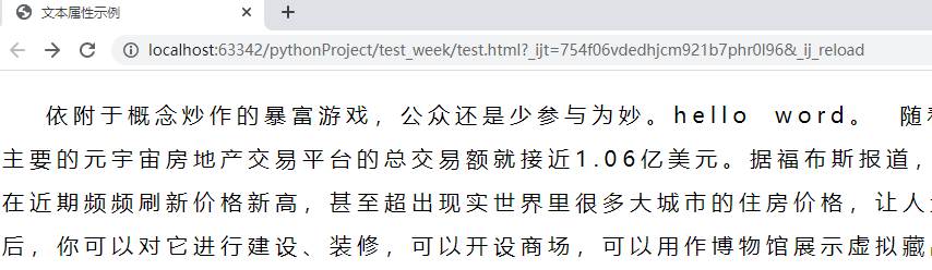
依附于概念炒作的暴富游戏,公众还是少参与为妙。hello word。
随着元宇宙概念走热,元宇宙“房产”交易变得火爆起来。在11月22日到28日的一周内,四个最主要的元宇宙房地产交易平台的总交易额就接近1.06亿美元。据福布斯报道,有建筑公司在元宇宙中设计一个项目就可以赚近30万美元。
这种虚拟世界里的“房产”交易在近期频频刷新价格新高,甚至超出现实世界里很多大城市的住房价格,让人大受震撼。所谓元宇宙“房产”,指的是元宇宙中的一部分虚拟空间。在拥有这部分虚拟空间后,你可以对它进行建设、装修,可以开设商场,可以用作博物馆展示虚拟藏品,也可以直接出租……拿一张元宇宙“房产证”,听上去似乎很潮流也很酷炫。
</p>
</body>
</html>
22、字体属性和文本属性总结:
字体属性和文本属性总结:
字体属性
    1.字体
        font-family: "微软雅黑","宋体",...;
    2.字体大小
        font-size: 20px;
        像素单位: px,em,rem
        px: 绝对单位。 一旦设置了值,不管网页如何变化始终如一
        em:相对单位。当前某块区域的字体大小,比如给p标签设置了字体大小20px,那么1em= 20px;
        rem:相对单位 主要应用于移动端
    3.字体颜色
        color: red
        颜色表示法:
            - 单词表示法  red green yellow purple.
            - rgb()表示法
                + rgba()  a:alpha 表示透明度
            - 十六进制表示法
                + #ff6700
    4.字体样式
            font-style
                normal : 默认的字体
                italic:斜体
    5.字体粗细
            font-weight:
                bold:粗的字体
                100~900
                400表示默认
文本属性:
    1.文本修饰
            text-decoration
                underline 下划线
                none 无线
                overline 上划线
                line-through 删除线
    2.文本缩进
            text-indent
                单位建议使用em
    3.行高
            行与行之间的距离
                line-height
                    px,em,rem
    4.中文字间距/单词间距
            letter-spacing
            word-spacing
    5.文本对齐方式
            text-align
                left
                right
                center  使用最多
23、文本对齐方式:
            text-align: center;
            /*居中对齐*/
            text-align: left;
            /*左对齐,默认对齐方式。*/
            text-align: right;
            /*右对齐。*/
24、元素分类
<!--test.html里面的内容-->
<!DOCTYPE html>
<html lang="en">
<head>
    <meta charset="UTF-8">
    <title>文本属性示例</title>
    <style type="text/css">
		div{
			background-color: red;
			width: 200px;
			height: 200px;
		}
		p{
			background-color: green;
		}
		a,span{
			font-size: 30px;
			background-color: purple;
			width: 300px;
			height: 300px;
		}
		input{
			width: 300px;
			height: 50px;
		}
		img{
			width: 100px;
		}
	</style>
</head>
<body>
	<!-- 1 块级元素
			(1)独自占一行
			(2)可以设置宽度和高度,如果不设置宽,默认是父标签的100%宽
		2 行内元素
			(1)行内元素在一行内显示
			(2)不能设置宽度和高度
			3 行内块元素
				(1)在一行内显示
				(2)可以设置宽度和高度
	 -->
	 <div>MJJ</div>
	 <p>我是一个段落</p>
	 <h1>mjj</h1>
	 <ul>
	 	<li>小米商城</li>
	 </ul>
	 <ul>
	 	<li>小米商城</li>
	 </ul>
	 <a href="#">百度一下</a>
	 <span>小猿圈</span>
	 <strong></strong>
	 <em></em>
	 <input type="text" name="">
	 <input type="password" name="">
	 <img src="images/index02.jpeg">
	 <img src="images/index02.jpeg">
</body>
</html>

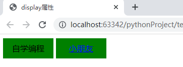
25、display属性讲解,通常用于行内标签转为行内块。(比较常用)
<!--test.html里面的内容-->
<!DOCTYPE html>
<html lang="en">
<head>
    <meta charset="UTF-8">
	<title>display属性</title>
	<style type="text/css">
		div{
			background-color:red;
			width: 200px;
			height: 200px;
			/*元素隐藏*/
			display: none;
		}
		a,span{
			background-color: green;
			width: 100px;
			height: 40px;
			display: inline-block;
			/* text-align: center; 水平居中
			line-height= height 控制文本垂直居中
			*/
			text-align: center;
			line-height: 40px;
		}
	</style>
</head>
<body>
	<div>我是一个块</div>
	<span>自学编程</span>
	<a href="#">小朋友</a>
</body>
</html>
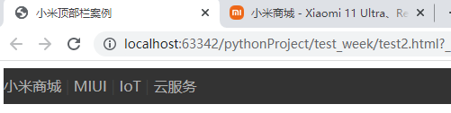
26、小米商城顶部栏案例
<!--test.html里面的内容-->
<!DOCTYPE html>
<html>
<head>
	<meta charset="utf-8">
	<title>小米顶部栏案例</title>
	<style type="text/css">
		a{
			text-decoration: none;
		}
		.top_bar{
			width: 100%;
			height: 40px;
			background-color: #333;
		}
		.top_bar a{
			color: #b0b0b0;
			display: inline-block;
            /*这里的display的作用是,当鼠标放在“小米商城”字体下面的黑色部分的时候,也有超链接。*/
			line-height: 40px;
		}
		.top_bar span{
			color: #424242;
		}
		.top_bar a:hover{
			color: #fff;
		}
	</style>
</head>
<body>
	<div class="top_bar">
		<a href="#">小米商城</a>
		<span>|</span>
		<a href="#">MIUI</a>
		<span>|</span>
		<a href="#">IoT</a>
		<span>|</span>
		<a href="#">云服务</a>
	</div>
</body>
</html>
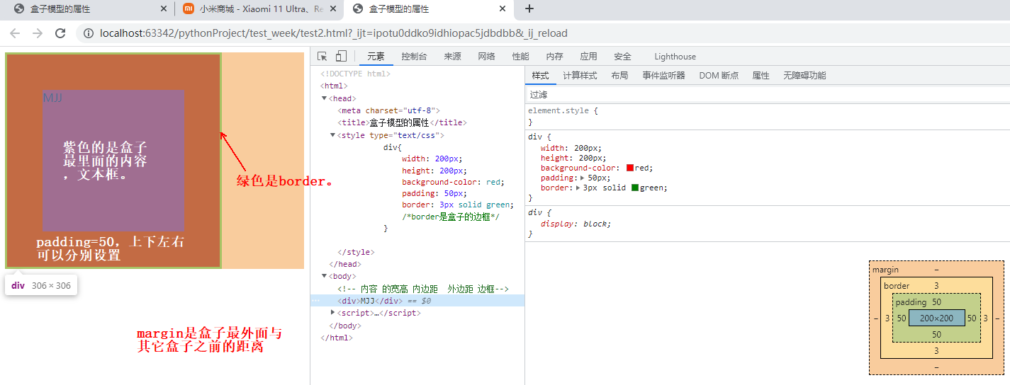
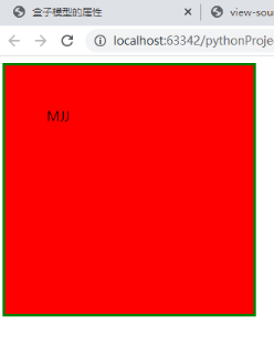
27、盒子模型的属性介绍
<!--test.html里面的内容-->
<!DOCTYPE html>
<html>
<head>
	<meta charset="utf-8">
	<title>盒子模型的属性</title>
	<style type="text/css">
		div{
			width: 200px;
			height: 200px;
			background-color: red;
			padding: 50px;
			border: 3px solid green;
			/*border是盒子的边框*/
		}
	</style>
</head>
<body>
	<!-- 内容 的宽高 内边距  外边距 边框-->
	<div>MJJ</div>
</body>
</html>
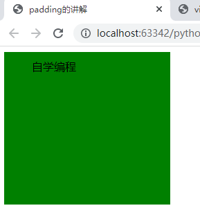
28、padding的讲解
<!--test.html里面的内容-->
<!DOCTYPE html>
<html>
<head>
	<meta charset="utf-8">
	<title>padding的讲解</title>
	<style type="text/css">
		div{
			width: 180px;
			height: 180px;
			background-color: green;
			/*padding-top: 20px;
			padding-left: 20px;
			padding-bottom: 20px;
			padding-right: 50px;*/
			/* 上 下 左 右 四个方向*/
			/*padding: 20px;*/
			/* 上 左*/
			/*padding: 20px 40px;*/
			/* 上 左 下*/
			/*padding: 20px 30px 40px;*/
			/* 上  右  下 左*/
			padding: 10px 20px 30px 40px;
		}
	</style>
</head>
<body>
	<!-- 内边距: 盒子边框到内容的距离 -->
	<div>自学编程</div>
</body>
</html>
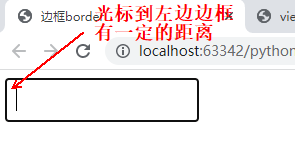
29、border边框属性
<!--test.html里面的内容-->

<!DOCTYPE html>
<html>
<head>
	<meta charset="utf-8">
	<title>边框border</title>
	<style type="text/css">
		.border{
			width: 200px;
			height: 200px;
			/*border: 1px solid red;*/
			/*按照三要素来编写border*/
			border-width: 4px 10px;
			border-style: solid dotted double dashed;
			border-color: green red purple yellow;

			/*按照方向来编写border*/
			/*
			border-top-width: 4px;
			border-top-color: red;
			border-top-style: solid;

			border-bottom-width: 4px;
			border-bottom-color: red;
			border-bottom-style: solid;
			*/
		}
		input{
			/*清除默认样式*/
			/*border: none;*/
			/*或者*/
			/*border: 0;*/
			/*清除外线*/
			/*outline: none;*/
		}
		.username{
			/*width: 180px;*/
			/*height: 40px;*/
			/*font-size: 20px;*/
			/*padding-left: 10px;*/
			/*border: 1px solid #666;*/
		}
		/*.username:hover{*/
		/*	border: 1px solid orange;*/
		}
	</style>
</head>
<body>
	<!-- 三要素: 粗细(width)  样式 (style) 颜色 (color)-->
	<div class="border"></div>
<!--	<input type="text" name="" class="username">-->

</body>
</html>

下面是输入框样式设置:
<!--test.html里面的内容-->
<!DOCTYPE html>
<html>
<head>
	<meta charset="utf-8">
	<title>边框border</title>
	<style type="text/css">
		.border{
			/*width: 200px;*/
			/*height: 200px;*/
			/*border: 1px solid red;*/
			/*按照三要素来编写border,重要*/
			/*
			border-width: 4px 10px;
			border-style: solid dotted double dashed;
			border-color: green red purple yellow;
			*/

			/*按照方向来编写border*/
			/*
			border-top-width: 4px;
			border-top-color: red;
			border-top-style: solid;

			border-bottom-width: 4px;
			border-bottom-color: blue;
			border-bottom-style: solid;
			*/
		}
		input{
			/*清除默认样式,重要*/
			/*border: none;*/
			/*或者*/
			/*border: 0;*/
			/*清除外线*/
			/*outline: none;*/
		}
		.username{
			width: 180px;
			height: 40px;
			font-size: 20px;
			padding-left: 10px;
			border: 1px solid #666;
		}
		.username:hover{
			border: 1px solid orange;
		}
	</style>
</head>
<body>
	<!-- 三要素: 粗细(width)  样式 (style) 颜色 (color)-->
	<div class="border"></div>
	<input type="text" name="" class="username">

</body>
</html>
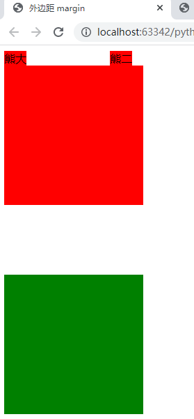
margin属性讲解。
<!DOCTYPE html>
<html>
<head>
	<meta charset="utf-8">
	<title>外边距 margin</title>
	<style type="text/css">
		span{
			background-color: red;
		}
		.xiongda{
			margin-right: 20px;
		}
		.xionger{
			margin-left: 100px;
		}
		div{
			width: 200px;
			height: 200px;
		}
		/*margin 垂直方向上 会出现外边距合并   外边距塌陷*/
		.box1{
			background-color: red;
			margin-bottom: 30px;
		}
		.box2{
			background-color: green;
			margin-top: 100px;
		}
		/*box1和box2,100+30=100,合并数字小的。*/
	</style>
</head>
<body>
	<!-- 外边距: 一个盒子到另一个盒子的距离 -->
	<span class="xiongda">熊大</span><span class="xionger">熊二</span>
	<div class="box1"></div>
	<div class="box2"></div>
</body>
</html>
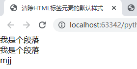
30、清除HTML标签元素的默认样式
<!--test.html里面的内容-->
<!DOCTYPE html>
<html>
<head>
	<meta charset="utf-8">
	<title>清除HTML标签元素的默认样式</title>
	<link rel="stylesheet" href="css/reset.css">
	<link rel="stylesheet" type="text/css" href="main.css">
</head>
<body>
	<p>我是个段落</p>
	<p>我是个段落</p>
	<ul>
		<li>mjj</li>
	</ul>
	<input type="text" name="">
</body>
</html>
/*reset.css里面的内容。*/
body,p,ul,ol,dl,dt{
	margin: 0;
	padding: 0;
}
ul,ol{
	list-style: none;
}
input{
	border: none;
	outline: none;
}
a{
	text-decoration: none;
}
31、HTML盒子居中显示
<!--test.html里面的内容-->
<!DOCTYPE html>
<html>
<head>
	<meta charset="utf-8">
	<title>盒子居中</title>
	<link rel="stylesheet" type="text/css" href="css/reset.css">
	<style type="text/css">
		.top_bar{
			width: 100%;
			height: 40px;
			background-color: #333;
		}
		.container{
			width: 1200px;
			height: 100%;
			background-color: red;
			/*margin-left:  auto;*/
			/*margin-right: auto;*/
			margin: 0 auto;
		}
	</style>
</head>
<body>
	<div class="top_bar">
		<div class="container">
			小米商城
		</div>
	</div>
</body>
</html>
/*reset.css里面的内容。*/
body,p,ul,ol,dl,dt{
	margin: 0;
	padding: 0;
}
ul,ol{
	list-style: none;
}
input{
	border: none;
	outline: none;
}
a{
	text-decoration: none;
}

32、浮动元素现象float
<!DOCTYPE html>
<html>
<head>
	<meta charset="utf-8">
	<title>浮动的现象</title>
	<style type="text/css">
		div{
			width: 200px;
			height: 200px;
			color: #fff;
            	}
            	div.left{
            		background-color: red;
            		float: left;
            	}
            	div.right{
            		width: 300px;
            		background-color: green;
            		float: left;
            	}
            	div.center{
            		background-color: orange;
            		float: left;
            	}
	</style>
</head>
<body>
	<!-- 浮动的现象:
		        0.文字环绕
			1.脱离了标准文档流
			2.浮动元素互相贴靠
			3.浮动元素有收缩现象
	 -->
	<div class="left">左边的盒子</div>
	<div class="right">右边的盒子</div>
	<div class="center">右边的盒子</div>
</body>
</html>

33、浮动元素的破坏性
<!DOCTYPE html>
<html>
<head>
	<meta charset="utf-8">
	<title>浮动元素的破坏性</title>
	<style type="text/css">
		.top_bar{
			border: 1px solid red;
		}
		.child1{
			width: 200px;
			height: 200px;
			background-color: green;
			float: left;
		}
		.child2{
			width: 200px;
			height: 200px;
			background-color: orange;
			float: right;
		}
		.header{
			width: 100%;
			height: 100px;
			background-color: purple;
		}
	</style>
</head>
<body>
	<div class="top_bar">
		<div class="child1">儿子</div>
		<div class="child2">二儿子</div>
	</div>
	<div class="header">
	</div>
</body>
</html>

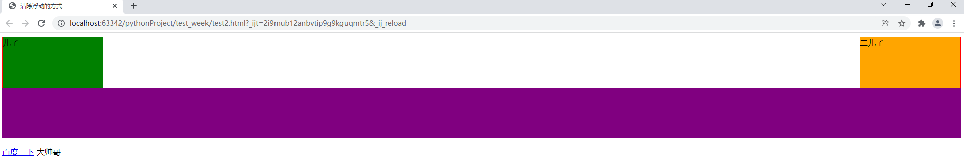
34、清除浮动的方式
<!DOCTYPE html>
<html>
<head>
	<meta charset="utf-8">
	<title>清除浮动的方式</title>
	<style type="text/css">
		.top_bar{
			border: 1px solid red;
		}
		.child1{
			width: 200px;
			height: 100px;
			background-color: green;
			float: left;
		}
		.child2{
			width: 200px;
			height: 100px;
			background-color: orange;
			float: right;
		}
		.header{
			width: 100%;
			height: 100px;
			background-color: purple;
		}
		/*.clear{*/
		/*	clear: both;*/
		/*}*/
		p::after{
			/*行内元素*/
			content:'大帅哥';
		}
		.clearfix::after{
			content:'';
			display: block;
			clear: both;
		}
/*这里的.clearfix是伪元素清除法。*/
	</style>
</head>
<body>
	<!-- 1.给父元素设置固定高度
			缺点: 使用不灵活 后期不易维护
			应用:网页中盒子固定高度区域,比如固定的导航栏
		2.内墙法(了解)
			规则: 在最后一个浮动元素的后面加一个空的块级元素,并且设置该属性clear: both;
			缺点: 结构冗余
		重要:
		3.伪元素(选择器)清除法(网页中应用非常多的方法)
		4.overflow:hidden;
	 -->
	<div class="top_bar clearfix">
		<div class="child1">儿子</div>
		<div class="child2">二儿子</div>
		<!-- <div class="clear"></div> -->
	</div>
	<div class="header">
	</div>
	<p>
		<a href="#">百度一下</a>
	</p>
</body>
</html>
35、清除浮动的方式之overflow法
<!DOCTYPE html>
<html>
<head>
	<meta charset="utf-8">
	<title>清除浮动的方式</title>
	<style type="text/css">
		.top_bar{
			/*BFC区域 一条规则:计算BFC(块级盒子)的高度时,浮动元素也参与计算*/
			/*形成BFC的条件: 除了overflow:visitable 的属性值*/
			/*Block Formtting Context*/
			overflow: hidden;
			border: 1px solid red;
		}
		.child1{
			width: 200px;
			height: 100px;
			background-color: green;
			float: left;
		}
		.child2{
			width: 200px;
			height: 100px;
			background-color: orange;
			float: right;
		}
		.header{
			width: 100%;
			height: 100px;
			background-color: purple;
		}
	</style>
</head>
<body>
	<div class="top_bar clearfix">
		<div class="child1">儿子</div>
		<div class="child2">二儿子</div>
	</div>
	<div class="header">
	</div>
</body>
</html>
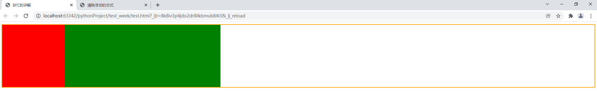
36、BFC的讲解
<!DOCTYPE html>
<html>
<head>
	<meta charset="UTF-8">
	<title>BFC的讲解</title>
	<style type="text/css">
		div.xiongda{
			border: 2px solid orange;
			overflow: hidden;
		}
		div.box1{
			width: 200px;
			height: 200px;
			background-color: red;
			/*margin-bottom: 30px;*/
			float: left;
		}
		div.box2{
			width: 500px;
			height: 200px;
			background-color: green;
			/*overflow: hidden;*/
			float: left;
			/*margin-top: 100px;*/
		}
	</style>
</head>
<body>
	<div class="xiongda">
		<div class="box1"></div>
		<div class="box2"></div>
	</div>
</body>
</html>
<!-- 一:BFC是什么东东
了解BFC前先一了解一下Box和Formatting Context
(1)B: BOX即盒子,页面的基本构成元素。分为 inline 、 block 和 inline-block三种类型的BOX
(2)FC: Formatting Context是W3C的规范中的一种概念。它是页面中的一块渲染区域,并且有一套渲染规则,它决定了其子元素将如何定位,以及和其他元素的关系和相互作用。
常见的 Formatting Context 有 Block fomatting context (简称BFC)和 Inline formatting context (简称IFC)
BFC 定义
	BFC(Block formatting context)直译为"块级格式化上下文"。它是一个独立的渲染区域,只有Block-level box参与, 它规定了内部的Block-level Box如何布局,并且与这个区域外部毫不相干。
BFC布局规则:
	1.内部的Box会在垂直方向,一个接一个地放置。
	2.Box垂直方向的距离由margin决定。属于同一个BFC的两个相邻Box的margin会发生重叠
	3.每个元素的margin box的左边, 与包含块border box的左边相接触(对于从左往右的格式化,否则相反)。即使存在浮动也是如此。
	4.BFC的区域不会与float 元素重叠。
	5.BFC就是页面上的一个隔离的独立容器,容器里面的子元素不会影响到外面的元素。反之也如此。
	6.计算BFC的高度时,浮动元素也参与计算
二:那些元素会生成BFC
	1.根元素
	2.float属性不为none
	3.position为absolute或fixed
	4.display为inline-block
	5.overflow不为visible -->
37、小米商城导航栏制作
<!--mi_header.html里面的内容-->
<!DOCTYPE html>
<html lang="en">
<head>
    <meta charset="UTF-8">
    <title>小米导航</title>
    <link rel="stylesheet" type="text/css" href="css/reset.css">
    <style type="text/css">
        .site-header{
            width: 100%;
            height: 100px;
            /*background-color: red;*/
        }
        .container{
            width: 1226px;
            /*height: 100px;*/
            margin: 0 auto;
            /*background-color: green;*/
        }
        .site-header .nav-logo{
            float:left;
            margin-top: 25px;
        }
        .nav-logo a{
            display: block;
            width: 56px;
            height: 56px;
        }
        .site-header .nav-list{
            float: left;
            width: 820px;
            height: 88px;
            padding: 12px 0 0 30px;
        }
        .nav-list li{
            float: left;
            font-size: 16px;
        }
        .nav-list li a{
            display: block;
            color: #333;
            padding: 28px 10px 38px;
        }
        .clearfix::after{
            content: '';
            clear: both;
            display: block;
        }
        .site-search{
            float: left;
            width: 296px;
            margin-top: 25px;
        }
        .site-search form{
            height: 50px;
            width: 296px;
        }
        .site-search form input.content{
            width: 223px;
            height: 48px;
            border: 1px solid #e0e0e0;
            padding: 0 10px;
            float: left;
        }
        .site-search form input.search{
            width: 49px;
            height: 50px;
            border: 1px solid #e0e0e0;
            float: left;
            margin-left: -1px;
        }
    </style>
</head>
<body>
    <div class="site-header">
        <div class="container clearfix">
            <div class="nav-logo">
                <a href="#">
                    <img width="56" src="images/logo-mi2.png">
                </a>
            </div>
            <ul class="nav-list">
                <li>
                    <a href="#">全部商品分类</a>
                </li>
                <li>
                    <a href="#">小米手机</a>
                </li>
                <li>
                    <a href="#">红米</a>
                </li>
                <li>
                    <a href="#">电视机</a>
                </li>
                <li>
                    <a href="#">笔记本</a>
                </li>
                <li>
                    <a href="#">家电</a>
                </li>
                <li>
                    <a href="#">新品</a>
                </li>
                <li>
                    <a href="#">路由器</a>
                </li>
                <li>
                    <a href="#">智能硬件</a>
                </li>
                <li>
                    <a href="#">服务</a>
                </li>
                <li>
                    <a href="#">社区</a>
                </li>
            </ul>
            <div class="site-search">
                <form>
                    <input type="text" name="" class="content">
                    <input type="submit" name="" value="搜索" class="search">
                </form>
            </div>
        </div>
    </div>
</body>
</html>
/*reset.css里面的内容。*/
body,p,ul,ol,dl,dt{
	margin: 0;
	padding: 0;
}
ul,ol{
	list-style: none;
}
input{
	border: none;
	outline: none;
}
a{
	text-decoration: none;
}

小米商城搜索实战应用
<!--mi_header.html里面的内容-->
<!DOCTYPE html>
<html lang="en">
<head>
    <meta charset="UTF-8">
    <title>小米导航</title>
    <link rel="stylesheet" type="text/css" href="css/reset.css">
    <style type="text/css">
        .site-header{
            width: 100%;
            height: 100px;
            /*background-color: red;*/
        }
        .container{
            width: 1226px;
            /*height: 100px;*/
            margin: 0 auto;
            /*background-color: green;*/
        }
        .site-header .nav-logo{
            float:left;
            margin-top: 25px;
        }
        .nav-logo a{
            display: block;
            width: 56px;
            height: 56px;
        }
        .site-header .nav-list{
            float: left;
            width: 820px;
            height: 88px;
            padding: 12px 0 0 30px;
        }
        .nav-list li{
            float: left;
            font-size: 16px;
        }
        .nav-list li a{
            display: block;
            color: #333;
            padding: 28px 10px 38px;
        }
        .clearfix::after{
            content: '';
            clear: both;
            display: block;
        }
        .site-search{
            float: left;
            width: 296px;
            margin-top: 25px;
        }
        .site-search form{
            position: relative;
            /*这里设置相对定位,需要配合top,bottom,left,right这向个一起使用。如果不设置这四个值,不起作用。*/
            height: 50px;
            width: 296px;
        }
        .site-search form input.content{
            width: 223px;
            height: 48px;
            border: 1px solid #e0e0e0;
            padding: 0 10px;
            float: left;
        }
        .site-search form input.search{
            width: 49px;
            height: 50px;
            border: 1px solid #e0e0e0;
            float: left;
            margin-left: -1px;
        }
        .search-hot-word{
            position: absolute;
            top: 14px;
            right: 70px;
            font-size: 14px;
        }
        .search-hot-word span{
            background-color: #eee;
            padding: 0 5px;
            color: #757575;
        }
        .search-hot-word span:hover{
            cursor:pointer;
            /*cursor是指针的意思,pointer是手指的意思。*/
            background-color: #ff6700;
            color: #fff;
        }
    </style>
</head>
<body>
    <div class="site-header">
        <div class="container clearfix">
            <div class="nav-logo">
                <a href="#">
                    <img width="56" src="images/logo-mi2.png">
                </a>
            </div>
            <ul class="nav-list">
                <li>
                    <a href="#">全部商品分类</a>
                </li>
                <li>
                    <a href="#">小米手机</a>
                </li>
                <li>
                    <a href="#">红米</a>
                </li>
                <li>
                    <a href="#">电视机</a>
                </li>
                <li>
                    <a href="#">笔记本</a>
                </li>
                <li>
                    <a href="#">家电</a>
                </li>
                <li>
                    <a href="#">新品</a>
                </li>
                <li>
                    <a href="#">路由器</a>
                </li>
                <li>
                    <a href="#">智能硬件</a>
                </li>
                <li>
                    <a href="#">服务</a>
                </li>
                <li>
                    <a href="#">社区</a>
                </li>
            </ul>
            <div class="site-search">
                <form>
                    <input type="text" name="" class="content">
                    <input type="submit" name="" value="搜索" class="search">
                    <div class="search-hot-word">
                        <span>小米9</span>
                        <span>小米11</span>
                    </div>
                </form>
            </div>
        </div>
    </div>
</body>
</html>
/*reset.css里面的内容。*/
body,p,ul,ol,dl,dt{
	margin: 0;
	padding: 0;
}
ul,ol{
	list-style: none;
}
input{
	border: none;
	outline: none;
}
a{
	text-decoration: none;
}

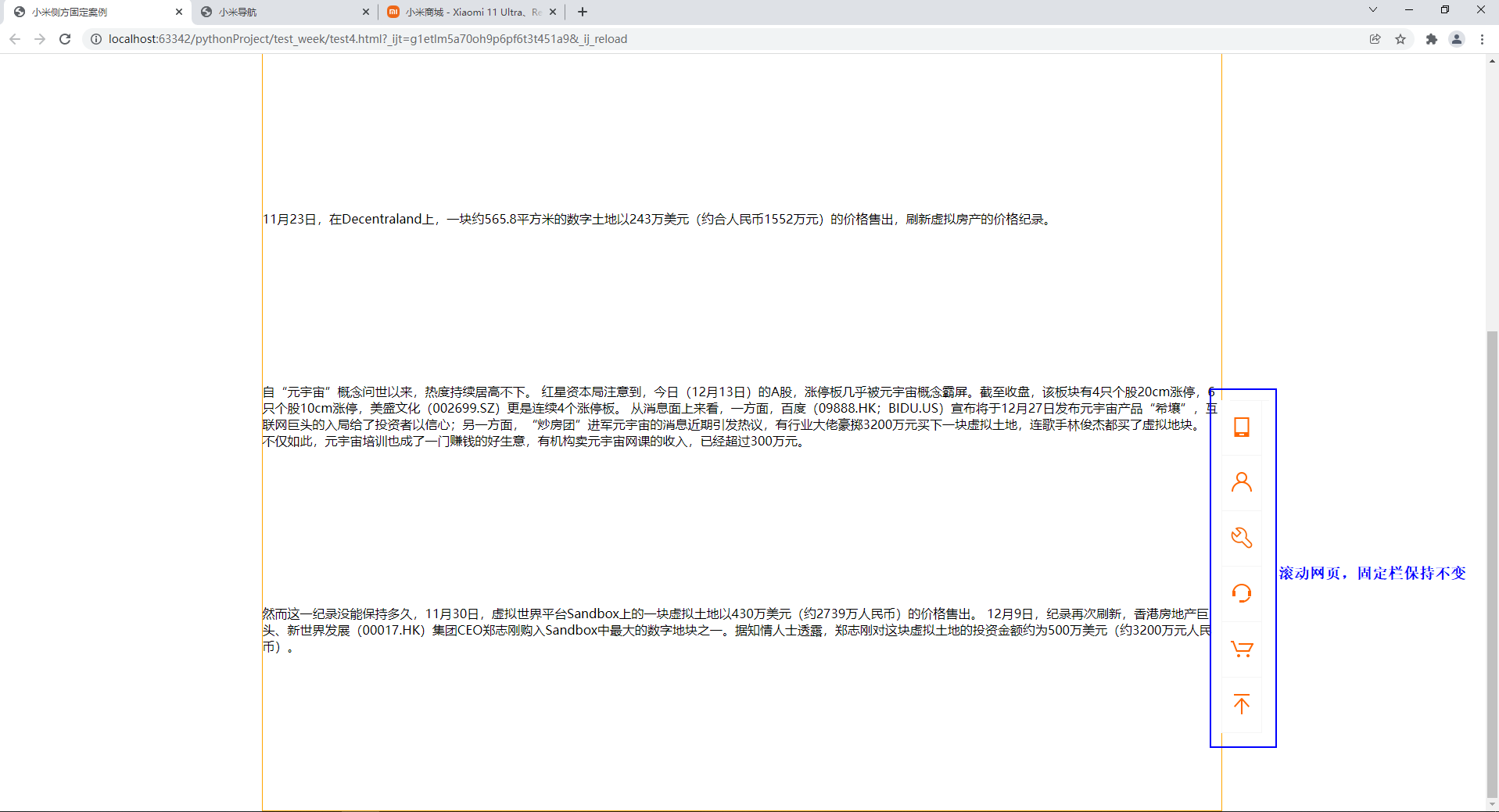
38、定位介绍及分类,子绝(对定位)父相(对定位)
<!DOCTYPE html>
<html>
<head>
	<meta charset="utf-8">
	<title>定位</title>
</head>
<body>
 	<!-- position:static 静态
			1.相对定位  position: relative;
				特点:不脱离标准文档流,可以调整元素。
				参考点:以原来的位置为参考点。
			2.绝对定位 position: absolute
				特点:
					1.脱离标准文档流,不在页面占位置。
					2.层级提高,压盖现象。
				参考点:
					相对于最近的非static(静止的)祖先元素定位,如果没有非static祖先元素,
					那么以页面根元素左上角进行定位。
				网站中实战应用:”子绝(对定位)父相(对定位)“
			3.固定定位 position:fixed
				特点:
					1.脱离标准文档流。
					2.一旦设置固定定位,在页面中滚动网页,固定不变。
				参考点:
					以浏览器的左上角。
				应用:
					小广告,回到顶部,固定导航栏。
 	-->
 	<div></div>
</body>
</html>
39、小米侧方固定案例
<!DOCTYPE html>
<html lang="en">
<head>
    <meta charset="UTF-8">
    <title>小米侧方固定案例</title>
    <link rel="stylesheet" type="text/css" href="css/reset.css">
    <style type="text/css">
        .container{
            width: 1226px;
            height: 100%;
            border: 1px solid orange;
            margin: 0 auto;
        }
        .container p{
            margin-bottom: 200px;
        }
        .site-bar{
            position: fixed;
            width: 27px;
            bottom: 100px;
            right: 50%;
            margin-right: -640px;
        }
        .site-bar ul li .one{
            border-top: 1px solid #f5f5f5;
        }
        .site-bar ul li{
            width: 50px;
            height: 70px;
            border: 1px solid #f5f5f5;
            background-color: #fff;
            border-top: none;
        }
        .site-bar ul li{

        }
        .site-bar ul li a{
            display: block;
            width: 50px;
            height: 50px;
            margin-left: 10px;
            padding-top: 19px;
        }
        .site-bar ul li a img{
            width: 30px;
            height: 30px;
        }
    </style>
</head>
<body>
    <div class="container">
        <p>
            自“元宇宙”概念问世以来,热度持续居高不下。
红星资本局注意到,今日(12月13日)的A股,涨停板几乎被元宇宙概念霸屏。截至收盘,该板块有4只个股20cm涨停,6只个股10cm涨停,美盛文化(002699.SZ)更是连续4个涨停板。
从消息面上来看,一方面,百度(09888.HK;BIDU.US)宣布将于12月27日发布元宇宙产品“希壤”,互联网巨头的入局给了投资者以信心;另一方面,“炒房团”进军元宇宙的消息近期引发热议,有行业大佬豪掷3200万元买下一块虚拟土地,连歌手林俊杰都买了虚拟地块。
不仅如此,元宇宙培训也成了一门赚钱的好生意,有机构卖元宇宙网课的收入,已经超过300万元。
        </p>
        <p>
            2021年,被称为“元宇宙元年”,3月“元宇宙第一股”Roblox登陆纳斯达克,上市暴涨;10月Facebook改名为元宇宙(Metaverse)的前四个字母Meta。天眼查数据显示,截至12月9日,我国“元宇宙”商标申请注册有7882次。
        </p>
        <p>
            元宇宙不仅成了互联网大佬的“必争之地”,一股炒房热也已席卷元宇宙,虚拟世界平台Decentraland和Sandbox上的土地被天价售出。
        </p>
        <p>
            11月23日,在Decentraland上,一块约565.8平方米的数字土地以243万美元(约合人民币1552万元)的价格售出,刷新虚拟房产的价格纪录。
        </p>
        <p>
            自“元宇宙”概念问世以来,热度持续居高不下。
红星资本局注意到,今日(12月13日)的A股,涨停板几乎被元宇宙概念霸屏。截至收盘,该板块有4只个股20cm涨停,6只个股10cm涨停,美盛文化(002699.SZ)更是连续4个涨停板。
从消息面上来看,一方面,百度(09888.HK;BIDU.US)宣布将于12月27日发布元宇宙产品“希壤”,互联网巨头的入局给了投资者以信心;另一方面,“炒房团”进军元宇宙的消息近期引发热议,有行业大佬豪掷3200万元买下一块虚拟土地,连歌手林俊杰都买了虚拟地块。
不仅如此,元宇宙培训也成了一门赚钱的好生意,有机构卖元宇宙网课的收入,已经超过300万元。
        </p>
        <p>
            然而这一纪录没能保持多久,11月30日,虚拟世界平台Sandbox上的一块虚拟土地以430万美元(约2739万人民币)的价格售出。
12月9日,纪录再次刷新,香港房地产巨头、新世界发展(00017.HK)集团CEO郑志刚购入Sandbox中最大的数字地块之一。据知情人士透露,郑志刚对这块虚拟土地的投资金额约为500万美元(约3200万元人民币)。
        </p>
    </div>
    <div class="site-bar">
        <ul>
            <li>
                <a class="one">
                    <img src="images/1.png">
                </a>
            </li>
            <li>
                <a>
                    <img src="images/2.png">
                </a>
            </li>
            <li>
                <a>
                    <img src="images/3.png">
                </a>
            </li>
            <li>
                <a>
                    <img src="images/4.png">
                </a>
            </li>
            <li>
                <a>
                    <img src="images/5.png">
                </a>
            </li>
            <li>
                <a>
                    <img src="images/totop_hover.png">
                </a>
            </li>
        </ul>
    </div>
</body>
</html>
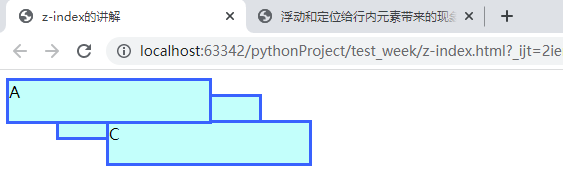
40、z-index讲解,盒子的层叠等级。
<!DOCTYPE html>
<html lang="en">
<head>
	<meta charset="UTF-8">
	<title>z-index的讲解</title>
	<style type="text/css">
		.a{
			position: relative;
			width: 200px;
			height: 40px;
			background-color: #C3FFFB;
			border: 3px solid #3962FE;
			z-index: 1;
		}
		.b{
			position: relative;
			width: 200px;
			height: 40px;
			background-color: #C3FFFB;
			border: 3px solid #3962FE;
			top: -30px;
			left: 50px;
			z-index: 10000;
		}
		.c{
			position: relative;
			width: 200px;
			height: 40px;
			background-color: #C3FFFB;
			border: 3px solid #3962FE;
			top: -50px;
			left: 100px;
			/*z-index: auto;*/
            /*z-index只对定位起作用,不写时默认值是auto。数值是正整数,数值越大,等级越高。*/
            /*另外,父级等级越大,子级也越大,比较顺序,先父后子。*/
			z-index:10;
		}
	</style>
</head>
<body>
	<div style="position: relative;z-index: 15;">
		<div class="a">A</div>
	</div>

	<div style="position: relative;z-index: 10;">
		<div class="b">B</div>
	</div>
	<div class="c">C</div>
</body>
</html>
41、背景定位属性值解讲,图片背景。
<!DOCTYPE html>
<html>
<head>
	<meta charset="utf-8">
	<title>背景属性</title>
	<style type="text/css">
		.bg{
			width: 1200px;
			height: 1300px;
			border: 3px solid green;
			background-color: red;
			background-image: url('images/30-1.jpg');/*图片背景属性*/
			/*平铺方式*/
			background-repeat:no-repeat;/*这个是应用最多的*/
			/*背景定位*/
			/*background-position:  50px 100px;默认position的值是0,0。*/
			/*background-position-x: 100px;*/
			/*background-position-y: 200px;*/
			/*关键字:top right bottom left center*/
			/*background-position: bottom right;*/
			background-position: top center;/*顶部中间显示*/
			/*这里position的值还可以用百分比: 0% 50% 100%*/
			/*水平百分比的值 =  容器宽度的百分比- 背景图片宽度百分比*/
			/*background-position: 30% 60%;*/
			/*background-position: 270px 600px;*/
		}
	</style>
</head>
<body>
	<div class="bg">
		<p style="color:#fff;">谁的女盆友</p>
	</div>
</body>
</html>

小米背景定位案例
<!DOCTYPE html>
<html>
<head>
	<meta charset="utf-8">
	<title>小米背景定位案例</title>
	<link rel="stylesheet" type="text/css" href="css/reset.css">
	<style type="text/css">
		.bgi{
			width: 100%;
			height: 657px;
			background: url('images/MIUI.png') no-repeat  center top ;
			/*这里是综合属性,下面是分开属性。*/
			/*
			background-image: url('images/MIUI.png');
			background-repeat: no-repeat;
			background-position: center top;
			*/
		}
	</style>
</head>
<body>
	<div class="bgi">

	</div>
</body>
</html>
43、CSS Sprite雪碧图技术
使用雪碧图的场景:
- 静态图片,不随用户信息变化而变化
- 小图片,图片比较小(2~3kb)
- 加载量比较大。
- 大图不建议使用寻碧图。
作用:
- 有效的减少了HTTP请求数量,加速内容显示。
- 每请求一次,就会和服务器链接一次,建立链接式需要额外的时间开销的。
原理:通过css的背景属性的background-position来控制雪碧图的显示。
<!DOCTYPE html>
<html>
<head>
	<meta charset="utf-8">
	<title>CSS Sprite雪碧图技术</title>
	<style type="text/css">
		div{
			width: 24px;
			height: 24px;
			display: inline-block;
			/*48 * 1194*/
			background: url('images/taobao_list.png') no-repeat 0 0;/*后面的0,0定位位置,表示在左上角*/
			/*控制背景图大小  */
			background-size: 24px 597px;
		}
		div.sprite{
			background-position: 0 0;
		}
		div.sprite2{
			background-position: 0 -44px;
		}
		div.sprite3{
			background-position: 0 -88px;
		}
		div.sprite4{
			background-position: 0 -132px;
		}
	</style>
</head>
<body>
	<div class="sprite"></div>
	<div class="sprite2"></div>
	<div class="sprite3"></div>
	<div class="sprite4"></div>
</body>
</html>
44、淘宝列表导航案例
<!DOCTYPE html>
<html>
<head>
	<meta charset="utf-8">
	<title>淘宝列表导航案例</title>
	<link rel="stylesheet" href="css/reset.css">
	<style type="text/css">
		.taobao_list{
			float: left;
            /*左边悬浮。*/
			border-top: 1px solid #f4f4f4;
		}
		.taobao_list ul{
			width: 292px;
            /*此处设置宽度为了让各小格列队,如果不设置,则显示在一排。*/
			overflow: hidden;
		}
		.taobao_list ul li{
			float: left;
            /*左边悬浮,如果不设置,则显示在一列。*/
			width: 71px;
			height: 75px;
			/*这里的宽和高设置的是小方格的大小。*/
			border: 1px solid #f4f4f4;
			border-top-color: transparent;
			border-left-color: transparent;
            /*transparent作用是让重合的边框变透明。*/
		}
		.taobao_list ul li a{
			text-align: center;
            /*文字居中显示。*/
			display: block;
			/*block设置块显示。*/
			font-size: 12px;
			color: #888;
		}
		.taobao_list ul li a span{
			margin-top: 12px;
			display: inline-block;
            /*转换为行内块标签。让图片显示出来*/
			width: 24px;
			height: 24px;
			background: url('images/taobao_list.png') no-repeat 0 0;
			/*no-repeat的作用,图片只显示一次。*/
			background-size: 24px 597px;
			/*这里设置背景图片的尺寸。*/
		}
		.taobao_list ul li a span.span1{
			background-position: 0 0;
		}
		.taobao_list ul li a span.span2{
			background-position: 0 -88px;
		}
		.taobao_list ul li a span.span3{
			background-position: 0  -44px;
		}
        .taobao_list ul li a span.span4{
			background-position: 0 -132px;
		}
		.taobao_list ul li a span.span5{
			background-position: 0 -176px;
		}
		.taobao_list ul li a span.span6{
			background-position: 0  -220px;
		}
        .taobao_list ul li a span.span7{
			background-position: 0 -264px;
		}
		.taobao_list ul li a span.span8{
			background-position: 0 -308px;
		}
		.taobao_list ul li a span.span9{
			background-position: 0 -352px;
		}
        .taobao_list ul li a span.span10{
			background-position: 0 -396px;
		}
		.taobao_list ul li a span.span11{
			background-position: 0 -440px;
		}
		.taobao_list ul li a span.span12{
			background-position: 0  -484px;
		}
	</style>
</head>
<body>
	<div class="taobao_list">
		<ul>
			<li>
				<a href="#">
					<!-- 背景图 -->
					<span class="span1"></span>
					<p>充话费</p>
				</a>
			</li>
			<li>
				<a href="#">
					<!-- 背景图 -->
					<span class="span2"></span>
					<p>旅行</p>
				</a>
			</li>
			<li>
				<a href="#">
					<!-- 背景图 -->
					<span class="span3"></span>
					<p>车险</p>
				</a>
			</li>
			<li>
				<a href="#">
					<!-- 背景图 -->
					<span class="span4"></span>
					<p>游戏</p>
				</a>
			</li>
			<li>
				<a href="#">
					<!-- 背景图 -->
					<span class="span5"></span>
					<p>彩票</p>
				</a>
			</li>
			<li>
				<a href="#">
					<!-- 背景图 -->
					<span class="span6"></span>
					<p>电影</p>
				</a>
			</li>
			<li>
				<a href="#">
					<!-- 背景图 -->
					<span class="span7"></span>
					<p>酒店</p>
				</a>
			</li>
			<li>
				<a href="#">
					<!-- 背景图 -->
					<span class="span8"></span>
					<p>理财</p>
				</a>
			</li>
			<li>
				<a href="#">
					<!-- 背景图 -->
					<span class="span9"></span>
					<p>找服务</p>
				</a>
			</li>
			<li>
				<a href="#">
					<!-- 背景图 -->
					<span class="span10"></span>
					<p>演出</p>
				</a>
			</li>
			<li>
				<a href="#">
					<!-- 背景图 -->
					<span class="span11"></span>
					<p>水电煤</p>
				</a>
			</li>
			<li>
				<a href="#">
					<!-- 背景图 -->
					<span class="span12"></span>
					<p>火车票</p>
				</a>
			</li>
		</ul>
	</div>
</body>
</html>
45、边框属性,制作圆角,圆或者半圆。
<!DOCTYPE html>
<html>
<head>
	<meta charset="utf-8">
	<title>边框属性</title>
	<style type="text/css">
		.box{
			width: 200px;
			height: 100px;
			background-color:red;
			/*border-radius: 3px  10px 30px;*/
			/*border-top-left-radius: 15px 30px;*/
			/*通常不用上面的方法,因为圆角不对称。*/
			/*border-radius: 50px;*/
			/*border-radius: 50%;*/
			/*切出一个圆。*/
			border-top-left-radius: 100px;
			border-top-right-radius: 100px;
			border: 5px solid purple;
			/*切出个半圆*/
		}
	</style>
</head>
<body>
	<!-- border-radius
		box-shadow
	-->
	<div class="box"></div>
</body>
</html>
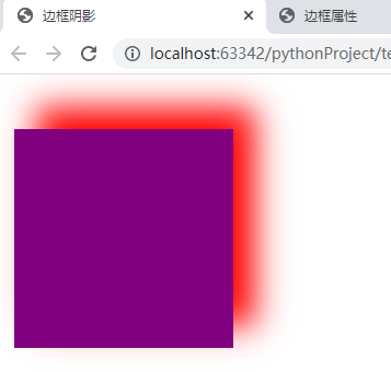
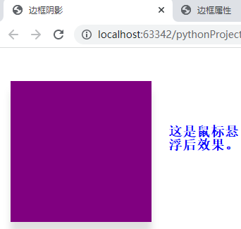
46、边框阴影,及鼠标悬浮动画。
<!DOCTYPE html>
<html>
<head>
	<meta charset="UTF-8">
	<title>边框阴影</title>
	<style type="text/css">
		.shadow{
			position: relative;
			/*此处设置相对位置,为下面的鼠标悬浮准备。*/
			width: 200px;
			height: 200px;
			margin: 50px 10px auto;
			/*margin的值,调整紫色方块的位置。*/
			background-color: purple;
			box-shadow: 20px -20px 30px red;/*后面还可以加个inset,内部的意思。内部阴影。*/
			/*shadow的值,四个数字分别代表:水平,垂直,模糊度,颜色。*/
		}
		.shadow:hover{
			top: -3px;
			box-shadow: 0 15px 10px #e0e0e0;
			/*鼠标悬浮实现动画效果。*/
		}
	</style>
</head>
<body>
	<div class="shadow"></div>
</body>
</html>
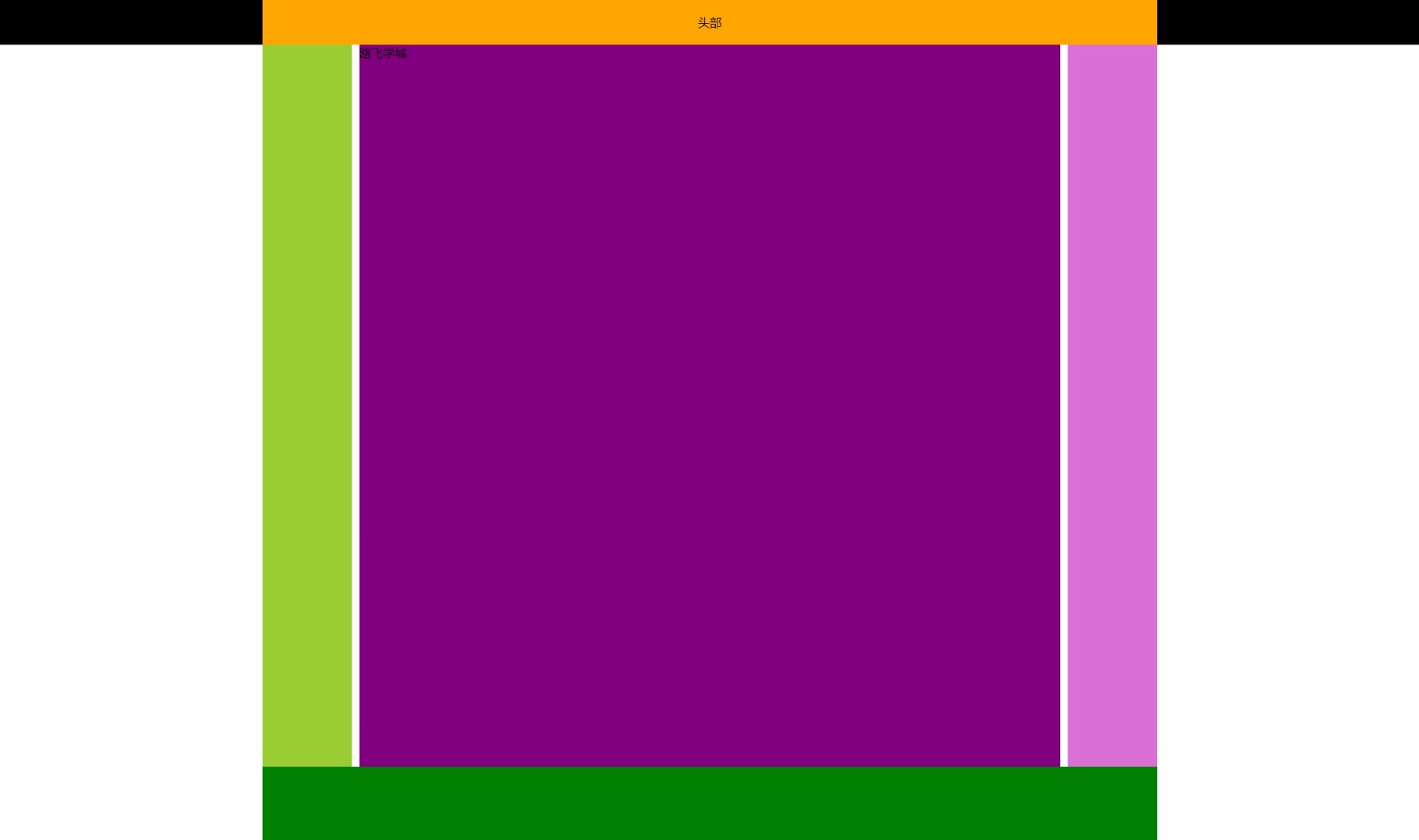
47、网页常见布局方案-多列布局
<!DOCTYPE html>
<html lang="en">
<head>
	<meta charset="UTF-8">
	<title>网页常见布局方案-多列布局</title>
	<style type="text/css">
		html,body{
			margin: 0;
			height: 100%;
		}
		.header{
			width: 100%;
			height: 60px;
			line-height: 60px;
			text-align: center;
			background-color: #000;
		}
		.container{
			width: 1200px;
			margin: 0 auto;
		}
		.header .container{
			height: 60px;
			background-color: orange;
		}
		.wrap{
			width: 100%;
			height: 100%;
		}
		.wrap .container{
			height: 100%;
		}
		.wrap .left{
			width: 10%;/*这里可以设置具体的数据,也可以设置百分比。*/
			height: 100%;
			float: left;
			background-color: yellowgreen;
		}
		.wrap  .right{
			width: 10%;
			height: 100%;
			float: right;
			background-color: orchid;
		}
		.wrap .center{
			height: 100%;
			background-color: purple;
			margin: 0 130px;/*设置左右边框值。上下边框值为零。*/
		}
		.footer{
			width: 100%;
			height: 100px;
		}
		.footer .container{
			height: 100px;
			background-color: green;
		}
	</style>
</head>
<body>
	<!--头部 -->
	<div class="header">
		<div class="container">头部</div>
	</div>
	<!-- 主体内容 -->
	<div class="wrap">
		<div class="container">
			<div class="left"></div>
			<div class="right"></div>
			<div class="center">
				路飞学城
			</div>
		</div>
	</div>
	<!-- 脚部 -->
	<div class="footer">
		<div class="container"></div>
	</div>
</body>
</html>
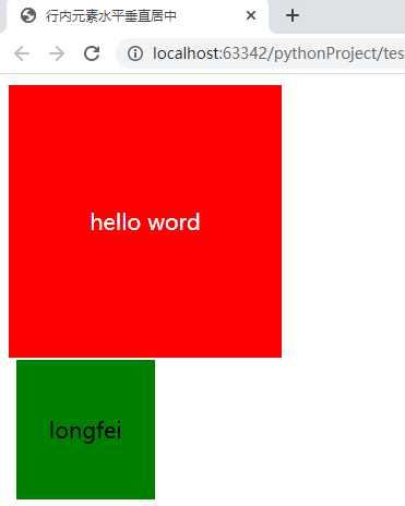
48、行内元素水平垂直居中
<!DOCTYPE html>
<html lang="en">
<head>
    <meta charset="UTF-8">
    <title>行内元素水平垂直居中</title>
    <style type="text/css">
        .box{
            width: 200px;
            height: 200px;
            background-color: red;
            color: white;
            text-align: center;
            /*line-height: 200px;*/
            display: table-cell; /*转化为表格属性,才能使用下面的vertiacal-align*/
            vertical-align: middle;
        }
        td{/*td默认垂直方向居中*/
            width: 100px;
            height: 100px;
            background-color: green;
            text-align: center;
            vertical-align: center;
            /*vertical-align有三个值:top,center,bottom;*/
        }
    </style>
</head>
<body>
    <div class="box">
        <span>hello word</span>
    </div>
    <table>
        <th>
            <td>longfei</td>
        </th>
    </table>
</body>
</html>
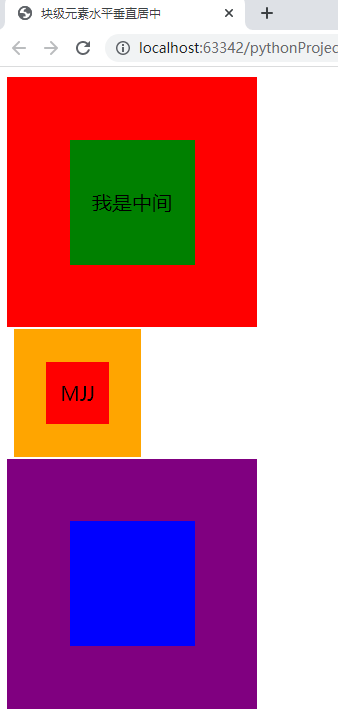
49、块级元素水平垂直居中
<!DOCTYPE html>
<html>
<head>
	<meta charset="utf-8">
	<title>块级元素水平垂直居中</title>
	<style type="text/css">
		.box{
			width: 200px;
			height: 200px;
			background-color: red;
			/*position: relative;*/
			display: table-cell;
			vertical-align: middle;
			text-align: center;
		}
		/*方法一:
		.child{
			width: 100px;
			height: 100px;
			background-color: green;
			position: absolute;
			margin: auto;
			top: 0;
			bottom: 0;
			left: 0;
			right: 0;
		}*/
		.child{
			width: 100px;
			height: 100px;
			background-color: green;
			display: inline-block;
			line-height: 100px;
		}
		td{
			width: 100px;
			height: 100px;
			background: orange;
			vertical-align: middle;
			text-align: center;
		}
		/*方法二:*/
		span{
			display: inline-block;
			width: 50px;
			height: 50px;
			background-color: red;
			line-height: 50px;
		}
		.wrap{
			width: 200px;
			height: 200px;
			background-color: purple;
			position: relative;
		}
		/*方法三:*/
		.xiongda{
			width: 100px;
			height: 100px;
			background-color: blue;
			position: absolute;
			top: 50%;
			left: 50%;
			margin-left: -50px;
			margin-top: -50px;
		}
	</style>
</head>
<body>
	<!-- positon+margin -->
	<div class="box">
		<div class="child">我是中间</div>
	</div>
	<!-- display:table-cell; 单元格。-->
	<table>
		<th>
			<td>
				<span>MJJ</span>
			</td>
		</th>
	</table>
	<!-- 纯定位 -->
	<div class="wrap">
		<div class="xiongda"></div>
	</div>
</body>
</html>
50、html中的:下划线标签、中划线标签、斜体标记、粗体标记
    <!-- 下划线标记 -->
    <b>下划线标签:</b>
    <u>u标签是下划线标签</u>
    <br>

    <!-- 中划线标签 -->
    <b>中划线标题:</b>
    <s>s是中划线标签</s>
    <del>del也是中划线标签</del>
    <br>

    <!-- 斜体标记 -->
    <b>斜体标签:</b>
    <i>i是斜体标签</i>
    <em>em也是斜体标签</em>
    <br>

    <!-- 粗体标签 -->
    <b>粗体标签</b>
    <b>b是粗体标签</b>
    <strong>strong也是粗体标签</strong>
作者:龙飞
-------------------------------------------
个性签名:独学而无友,则孤陋而寡闻。做一个灵魂有趣的人!
如果觉得这篇文章对你有小小的帮助的话,记得在右下角点个“推荐”哦,博主在此感谢!

 浙公网安备 33010602011771号