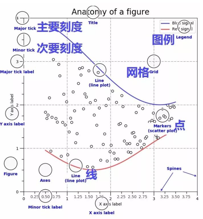
matplotlib 绘图概述
matplotlib是python绘图的最重要的工具,使用matplotlib绘图时,必须理解画布(figure),图表(axe或subplot)和坐标轴(axis)的区别。figure是画布,matplotlib的图像都位于Figure对象中,而区域axe是画布上的一个子图(subplot),axis是子图上的坐标系。
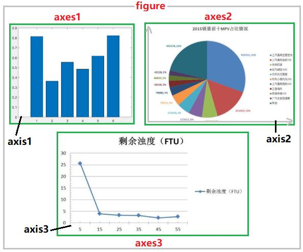
下图显示了figure(画布)、axes(坐标系)、axis(坐标轴)三者之间的关系。
构成一个子图subplot(或axe)的元素有:
- tick(刻度):Major tick、Minor tick和tick label
- axis:分为x轴和y轴,每个轴都有label
- legend:图列
- grid:背景表格
- marker:点的形状
- linestyle:线的形状
- color:线或点的颜色
一,导入相关库
导入常用的库,并设置画布的参数:
import numpy as np
import pandas as pd
import matplotlib as mpl
import matplotlib.pyplot as plt
# matplotlib画图常见参数设置
mpl.rcParams["font.family"] = "SimHei" # 设置字体
mpl.rcParams["axes.unicode_minus"]=False # 用来正常显示负号
plt.rcParams['font.sans-serif']=['SimHei'] # 用来正常显示中文标签

# 嵌入式显示图形
%matplotlib inline
二,创建画布
创建画布的方式有显式和隐式两种,本文显式创建画布
1,通过figure函数创建画布
matplotlib.figure.Figure(figsize=None, dpi=None, facecolor=None, edgecolor=None, linewidth=0.0, frameon=None, subplotpars=None, tight_layout=None, constrained_layout=None, *, layout=None, **kwargs)
参数注释:
- figsize:是一个元组(width, height),表示画布的大小
- dpi:Dots per inch,分辨率
- facecolor:画布的背景色
- edgecolor:画布边框的颜色
- linewith:画布边框的线宽
- frameon:是否显示画布的边框
添加子图,并设置子图在画布中的位置:
# 手动创建一个figure对象
figure = plt.figure()
# 获取每个位置的axes对象
axes1 = figure.add_subplot(2,1,1)
axes2 = figure.add_subplot(2,1,2)
函数add_subplot()的功能:切分画布,指定当前子图的区域,并返回该区域的引用。

在绘图完成之后,可以通过plt.show() 或者figure.show()把图形显示出来。
举例说明,在一块画布中绘制两个折线图,并设置linestyle和线的颜色:
import matplotlib.pyplot as plt

figure = plt.figure(figsize=(8,4),facecolor='white', edgecolor='red', linewidth=4, frameon=True)
axes1 = figure.add_subplot(2,1,1)
axes2 = figure.add_subplot(2,1,2)

axes1.plot([1,3,5,7],[4,9,6,8],linestyle='dashed',color='r')
axes2.plot([1,2,4,5],[8,4,6,2],linestyle='solid',color='g')
plt.show()
绘制的两个axe如下所示:

2,通过subplots函数创建画布
matplotlib.pyplot.subplots(nrows=1, ncols=1, *, sharex=False, sharey=False, squeeze=True, subplot_kw=None, gridspec_kw=None, **fig_kw)
参数注释:
- nrows, ncols:行和列的数量
- sharex, sharey:共享x和y轴,即所有subplot共享相同的x轴或y轴的刻度,调节xlim将会影响所有的subplot
- subplot_kw:用于创建各个subplot的关键字字典
- **fig_kw:创建figure的其他关键字
返回值是:figure,由axe的数组。
举个例子,使用plt.subplots(2,3) 生成一个画布,并返回一个由六个axe构成的2行3列的数组。

3,调整各个subplot之间的间距
subplot可以通过pyplot来调整所有subplot的间距,
pyplot.subplots_adjust(left=None, bottom=None, right=None, top=None, wspace=None, hspace=None)
wsapce:不同subplot之间的水平间隔
hsapce:不同subplot之间的垂直间隔
三,绘制subplot
常用的图表类型:
- 线型图:axe.plot
- 散点图:axe.scatter
- 条形图:axe.bar
1,绘制线图Axes.plot
在一个线图中,可以绘制多条线,每条线都有自己的格式,通过参数[fmt]来设置,子图的属性,可以通过关键字参数 **kwargs来设置:
Axes.plot(*args, scalex=True, scaley=True, data=None, **kwargs)

Axes.plot([x], y, [fmt], *, data=None, **kwargs)
Axes.plot([x], y, [fmt], [x2], y2, [fmt2], ..., **kwargs)
参数[fmt]的格式:
fmt = '[marker][line][color]'
常用的关键字参数 **kwargs :
- color:子图的背景色
- label:legent的标签
- linestyle:
- linewidth:
2,设置subplot的属性
axe.set_title()           #设置标题

axe.set_xlim()            #设置轴的范围
axe.set_ylim()

axe.set_xlabel()          #设置轴标签
axe.set_ylabel()

axe.set_xticks()          #设置刻度 (横坐标等于哪些值的时候显示刻度)
axe.set_yticks()

axe.set_xticklabels()     #设置刻度标签 (刻度之下显示什么,默认是其代表的值)
axe.set_yticklabels()
3,设置注解
通过annotate设置注解,可以在注解中设置文本,箭头,详细的属性设置,请参考官方文档:matplotlib.axes.Axes.annotate
Axes.annotate(text, xy, *args, **kwargs)
参数注释:
- text:注释的文本
- xy:注释目标点的坐标
- xytext:注释字符串的坐标
- xycoords:参数xy所在的坐标系统,默认值是data
- textcoords 注释字符串(xytext)所在的坐标系统,默认与xycoords相同,也可以设置为'offset points'或'offset pixels'这种偏移量的形式
- arrowprops 字典结构,用于指定箭头属性
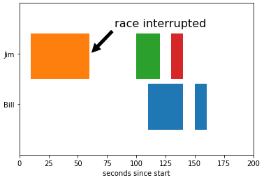
举个例子,绘制图形,并设置注解:
fig, ax = plt.subplots()
ax.broken_barh([(110, 30), (150, 10)], (10, 9), facecolors='tab:blue')
ax.broken_barh([(10, 50), (100, 20), (130, 10)], (20, 9),
               facecolors=('tab:orange', 'tab:green', 'tab:red'))
ax.set_ylim(5, 35)
ax.set_xlim(0, 200)
ax.set_xlabel('seconds since start')
ax.set_yticks([15, 25])
ax.set_yticklabels(['Bill', 'Jim'])
ax.grid(False)
ax.annotate('race interrupted', (61, 25),
            xytext=(0.8, 0.9), textcoords='axes fraction',
            arrowprops=dict(facecolor='black', shrink=0.05),
            fontsize=16,
            horizontalalignment='right', verticalalignment='top')

plt.show()
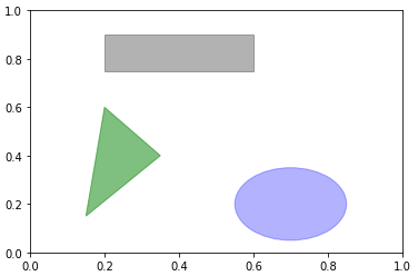
4,patch
patch需要添加到subplot中,完整的pacth集合位于matplotlib.patches
fig=plt.figure()
ax=fig.add_subplot(1,1,1)

rect=plt.Rectangle((0.2, 0.75),0.4, 0.15, color='k',alpha=0.3)
circ=plt.Circle((0.7,0.2),0.15,color='b',alpha=0.3)
pgon=plt.Polygon([[0.15,0.15],[0.35,0.4],[0.2,0.6]],color='g',alpha=0.5)

ax.add_patch(rect)
ax.add_patch(circ)
ax.add_patch(pgon)

plt.show()
四,举个例子
# The following code to create a dataframe and remove duplicated rows is always executed and acts as a preamble for your script:

# dataset = pandas.DataFrame(Measure Mapping_DP_Advertiser_StoreConsumer_Month, ShortYearMonthName, MonthKey)
# dataset = dataset.drop_duplicates()

# Paste or type your script code here:

import pandas as pd
import matplotlib.pyplot as plt

#exclude the current month
current_month = dataset['MonthKey'].max()

title = current_month
dataset=dataset.loc[dataset['MonthKey']<current_month, ['StoreConsumer_Month', 'ShortYearMonthName','MonthKey']]
target = 4.7
current_month = dataset['MonthKey'].max()
current_year_month=dataset.loc[dataset['MonthKey'] == current_month,'ShortYearMonthName'].max()


fig = plt.figure(figsize=(10,6), facecolor='white', frameon=False)
plt.subplots_adjust(wspace=1, hspace=1)
ax=fig.add_subplot(1,1,1)
ax.spines['right'].set_visible(False)
ax.spines['top'].set_visible(False)
ax.spines['left'].set_visible(False)
ax.get_yaxis().set_visible(False)
ax.set_xticklabels(labels=dataset['ShortYearMonthName'],fontdict={'fontsize':15,'fontweight':1} )
ax.plot('ShortYearMonthName','StoreConsumer_Month',data=dataset, lw=2, linestyle='dashed', color='blue', marker='o')

for i in dataset['ShortYearMonthName']:
    for j in dataset.loc[dataset['ShortYearMonthName']==i,'StoreConsumer_Month']:
        plt.text(x=i,y=j+j*0.005,s=j,ha='center',va='top',fontsize=20)

plt.axhline(target,color='red', lw=2, linestyle='dashed',alpha=0.7)
plt.annotate('Target {0}'.format(target),xy=(0, target), xytext=(current_year_month,target), fontsize=20)

plt.show()

参考文档:

 浙公网安备 33010602011771号