

《来自 1920×1080 的你》:一段 Vue 大屏自适应组件的自述
Vue使用scale方法实现响应式自适应大屏缩放通用组件详解(附完整代码)
前言
在开发数据大屏项目时,我们经常会遇到一个“甜蜜的烦恼”:如何让页面内容随着浏览器窗口大小灵活缩放,适配各种分辨率的设备。以前我总是靠 rem 单位配合动态设置 html 的 font-size 来实现响应式布局,妥妥的“老司机操作”。但在刷博客、写总结的过程中,频频看到有人激情安利 scale 布局,仿佛它是什么“前端黑科技”。于是我就想,与其在一棵树上吊死,不如换个姿势试试看。这次干脆大胆使用 scale 实现一次响应式大屏,既是为了项目需求,更是为了给自己的知识库“充个电”,拓宽一下技术视野。
前端开发中的大屏布局方案:使用 rem 单位与动态设置 html 的 font-size
需求背景
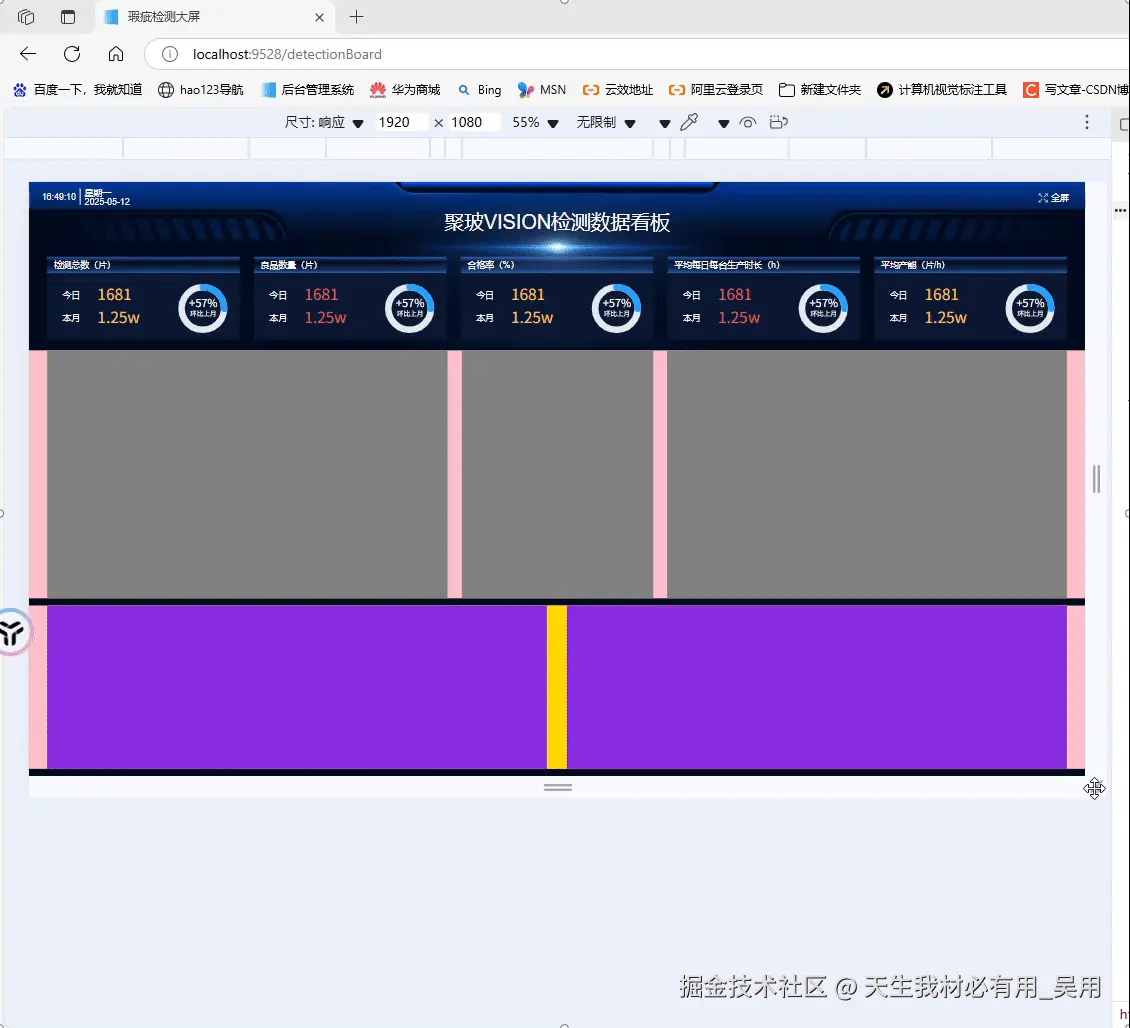
大屏系统设计时通常采用固定分辨率设计稿(例如 1920x1080),但最终运行的设备分辨率却各不相同。为了不失真、不留白、完整展示内容,我们就需要一个“等比缩放容器”来处理视口的自适应问题。
多说无用先上效果
先看随意变换屏幕分辨率的效果
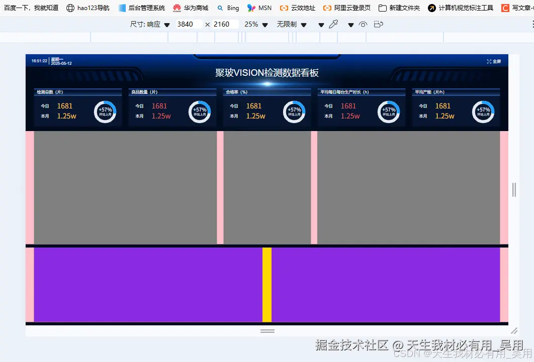
再看超大屏的显示效果
3840*2160的4k屏幕下的效果
在投身 scale 布局的大屏适配之前,我浏览了一堆案例,发现大多数都是直接在 .html 文件里硬塞一段段 JavaScript 代码。这感觉就像是给自行车装上了火箭推进器——有点猛。现在既然咱用的是 Vue 框架,我就寻思着:为啥不自己整一个超级 scale 容器呢?我的目标很简单:只要你把大屏内容往这个容器里一放,就像把信件投进了一个魔法信箱,里面的内容就能自动适应各种尺寸变化。
目前我的 UI 设计是基于经典(或者说“万恶”)的 1920*1080 分辨率。接下来,我将根据这个分辨率的UI图,开始封装一个能让你的项目瞬间变身响应式明星的 scale 容器组件。让我们一起见证从固定到灵活的华丽转身吧!
容器布局:固定大小+缩放比例
外层容器.container占满整个视口100vw100vh,并设置背景,隐藏滚动条。内容容器.scale-content固定为设计稿的尺寸19201080,通过transform :scale(...)进行缩放实现。
点击查看代码
<template>
  <div class="container">
    <div ref="scaleContainer" class="scale-content">
      <!-- 这里是你的大屏内容 -->
      <slot />
    </div>
  </div>
</template>
计算缩放比例逻辑
定义baseRate原设计稿宽高比,大多数大屏宽高比都是16:9,获取当前浏览器的宽高比,然后判断当前窗口比例是否“更宽”还是“更窄”,如果当前比例更宽,说明高度有限按高度缩放,如果当前比例更窄,按宽度缩放,通过宽度和基准比例推算出当前等比高度,并于设计稿对比,然后设置transform缩放。
点击查看代码
 calculateRatio() {
      const baseWidth = 1920;
      const baseHeight = 1080;
      const baseRate = parseFloat(baseWidth / baseHeight).toFixed(5);
      const currentRate = parseFloat(
        window.innerWidth / window.innerHeight
      ).toFixed(5);

      const el = this.$refs.scaleContainer;
      let widthRatio = 1;
      let heightRatio = 1;

      if (currentRate > baseRate) {
        widthRatio = parseFloat(
          ((window.innerHeight * baseRate) / baseWidth).toFixed(5)
        );
        heightRatio = parseFloat((window.innerHeight / baseHeight).toFixed(5));
      } else {
        heightRatio = parseFloat(
          (window.innerWidth / baseRate / baseHeight).toFixed(5)
        );
        widthRatio = parseFloat((window.innerWidth / baseWidth).toFixed(5));
      }

      el.style.transform = `scale(${widthRatio}, ${heightRatio}) translate(-50%, 0)`;
    },
点击查看代码
 mounted() {
    this.calculateRatio();
    window.addEventListener("resize", this.calculateRatio);
  },
  beforeDestroy() {
    window.removeEventListener("resize", this.calculateRatio);
  },
点击查看代码
import ScreenScale from "../../components/scaleContainer.vue";
export default {
 components: { ScreenScale },
}
点击查看代码
<template>
  <ScreenScale>
  		... 大屏内容
  < /ScreenScale>
</template>
点击查看代码
<template>
  <div class="container">
    <div ref="scaleContainer" class="scale-content">
      <!-- 这里是你的大屏内容 -->
      <slot />
    </div>
  </div>
</template>

<script>
export default {
  name: "ScreenScale",
  mounted() {
    this.calculateRatio();
    window.addEventListener("resize", this.calculateRatio);
  },
  beforeDestroy() {
    window.removeEventListener("resize", this.calculateRatio);
  },
  methods: {
    calculateRatio() {
      const baseWidth = 1920;
      const baseHeight = 1080;
      const baseRate = parseFloat(baseWidth / baseHeight).toFixed(5);
      const currentRate = parseFloat(
        window.innerWidth / window.innerHeight
      ).toFixed(5);

      const el = this.$refs.scaleContainer;
      let widthRatio = 1;
      let heightRatio = 1;

      if (currentRate > baseRate) {
        widthRatio = parseFloat(
          ((window.innerHeight * baseRate) / baseWidth).toFixed(5)
        );
        heightRatio = parseFloat((window.innerHeight / baseHeight).toFixed(5));
      } else {
        heightRatio = parseFloat(
          (window.innerWidth / baseRate / baseHeight).toFixed(5)
        );
        widthRatio = parseFloat((window.innerWidth / baseWidth).toFixed(5));
      }

      el.style.transform = `scale(${widthRatio}, ${heightRatio}) translate(-50%, 0)`;
    },
  },
};
</script>

<style scoped>
.container {
  width: 100vw;
  height: 100vh;
  background: #010a1c;
  overflow: hidden;
  position: relative;
}

.scale-content {
  width: 1920px;
  height: 1080px;
  transform-origin: top left;
  margin-left: 50%;
  background-color: #010a1c; /* 可根据需求更换 */
}
</style>

作者:天生我材必有用_吴用
链接:https://juejin.cn/post/7503370040763793442
来源:稀土掘金
著作权归作者所有。商业转载请联系作者获得授权,非商业转载请注明出处。

 浙公网安备 33010602011771号