

网页布局-----导航栏
1、导航栏
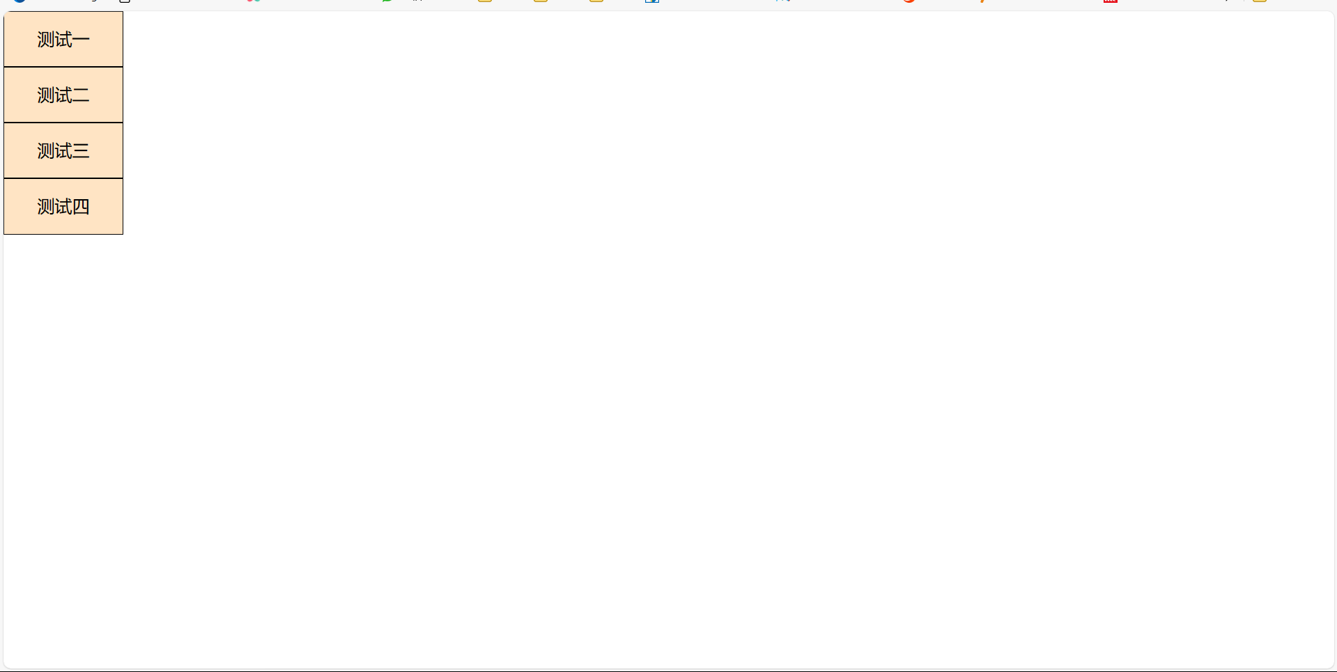
(1)垂直导航栏
<!-- 垂直导航栏 -->
<!DOCTYPE html>
<html lang="en">
<head>
    <meta charset="UTF-8">
    <meta name="viewport" content="width=device-width, initial-scale=1.0">
    <title>Document</title>
</head>
<style>
    *{
        padding: 0;
        margin: 0;
    }
    ul{
        list-style: none;
        background-color: bisque;
        width: 110px;
        line-height: 50px;
        text-align: center;

    }
    li{
        border: 1px solid black;
    }
    li:hover{
        background-color: cornsilk;
    }
</style>
<body>
    <ul>
        <li>测试一</li>
        <li>测试二</li>
        <li>测试三</li>
        <li>测试四</li>
    </ul>
</body>
</html>
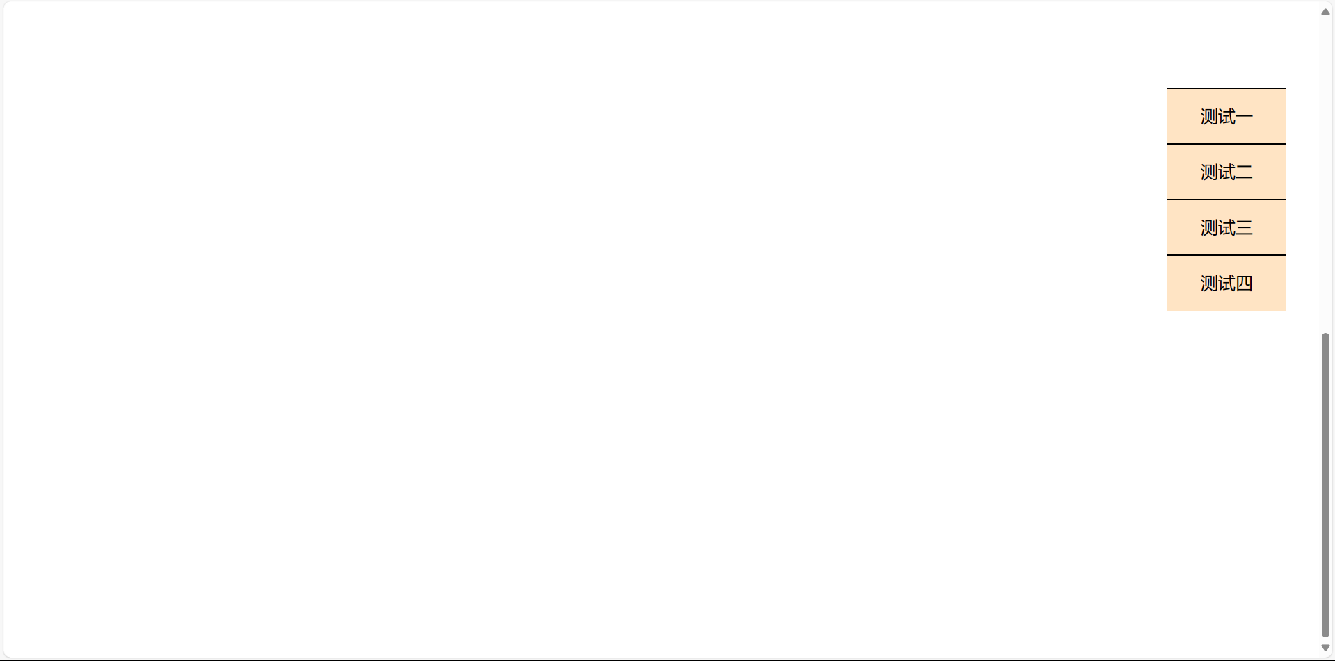
(2)固定的垂直导航栏
实现效果:不会随着页面下滑而变动
使用固定定位fixed,通过right、left、top、bottom设置导航栏在页面中的位置,设置z-index在发生重叠时让导航栏在上面
<!DOCTYPE html>
<html lang="en">
<head>
    <meta charset="UTF-8">
    <meta name="viewport" content="width=device-width, initial-scale=1.0">
    <title>Document</title>
</head>
<style>
    *{
        padding: 0;
        margin: 0;
    }
    .text{
        height: 1200px;
    }
    ul{
        list-style: none;
        background-color: bisque;
        width: 110px;
        line-height: 50px;
        text-align: center;
        position: fixed;
        right: 30px;
        top: 80px;
        z-index: 1;


    }
    li{
        border: 1px solid black;

    }
    li:hover{
        background-color: cornsilk;
    }
</style>
<body>
    <div class="text">
    <ul>
        <li>测试一</li>
        <li>测试二</li>
        <li>测试三</li>
        <li>测试四</li>
    </ul>
    </div>
</body>
</html>
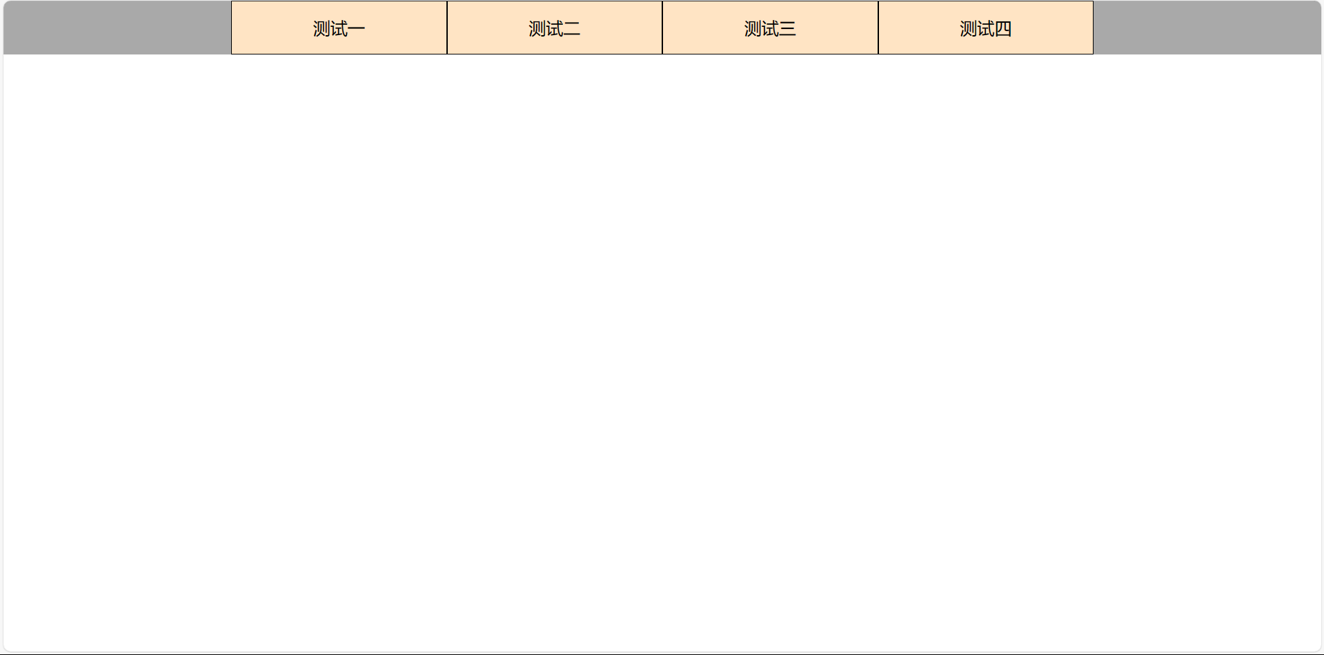
(3)水平导航栏
可以通过flex和float将导航栏水平设置
<!DOCTYPE html>
<html lang="en">
<head>
    <meta charset="UTF-8">
    <meta name="viewport" content="width=device-width, initial-scale=1.0">
    <title>Document</title>
</head>
<style>
    *{
        padding: 0;
        margin: 0;
    }
    .text{

        height: 50px;
        background-color: aqua;
        width: 100%;
    }
    ul{
        list-style: none;
        background-color: bisque;
        width: 800px;
        height: 50px;
        line-height: 50px;
        text-align: center;
        display: flex;
        margin: 0 auto;

    }
    li{
        border: 1px solid black;
        /* float: left; */
        flex: 1;
    }
    li:hover{
        background-color: cornsilk;
    }
</style>
<body>
    <div class="text">
    <ul>
        <li>测试一</li>
        <li>测试二</li>
        <li>测试三</li>
        <li>测试四</li>
    </ul>
    </div>
</body>
</html>
(4)水平导航栏悬浮特效
实现效果:当鼠标指针悬浮在导航栏上会出现内阴影效果
页面结构
  <ul>
        <li>首页</li>
        <li>知识星球</li>
        <li>趣味问答</li>
        <li>奖品</li>
    </ul>
页面样式
*{
            margin: 0;
            padding: 0;
            list-style: none;
        }
        ul{
            width: 700px;
            height: 66px;
            margin: 30px auto;
            background-color: rgb(166, 234, 155);
        }
        li{
            width: 65px;
            height: 27px;
            padding: 15px 45px;
            float: left;
            margin-left: 10px;
            text-align: center;
            font: 16px/27px "微软雅黑";
            color: #fff;
            box-shadow: 0px 0px 1px 0px #470b12 inset;
        }
        li:hover{
            box-shadow: 0px 0px 20px 0px #470b12 inset;
            transition: box-shadow 1s linear ;
        }
设置导航栏,在css中为li添加阴影效果和经过导航栏时的显示效果,当鼠标经过导航栏时将阴影半径放大,通过过度动画的方式实现

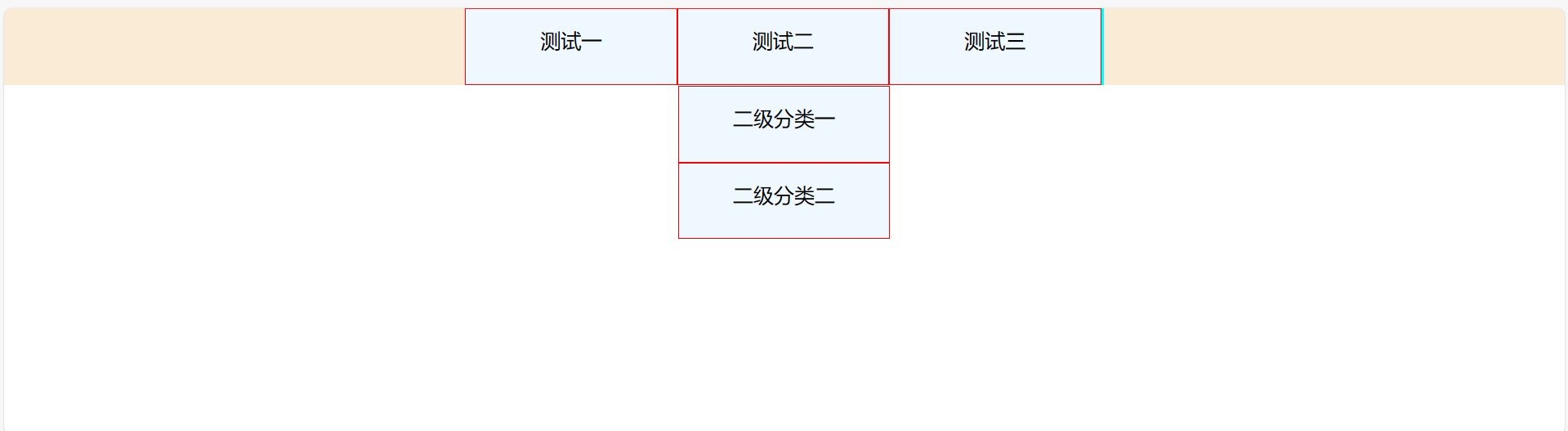
(5)水平导航栏二级分类
<!DOCTYPE html>
<html lang="en">
<head>
    <meta charset="UTF-8">
    <meta name="viewport" content="width=device-width, initial-scale=1.0">
    <title>Document</title>
</head>
<style>
    *{
        padding: 0;
        margin: 0;
    }
    .content{
        width: 100%;
        height: 60px;
        background-color: antiquewhite;
    }
    .nav1{
        list-style: none;
        /* display: flex; */
        width: 500px;
        height: 60px;
        background-color: aqua;
        margin: 0 auto;
        text-align: center;
        line-height: 50px;
    }
    li{
        float: left;
        /* flex: 1; */
        list-style: none;
        width: 166px;
        height: 60px;
        background-color: aliceblue;
        border: 1px solid red;
        box-sizing: border-box;
    }
    a{
        text-decoration: none;
    }
    .nav2{
        display: none;
        margin-top: 10px;

    }
    li:hover .nav2{
        display: block;
        width: 166px;
    }
</style>
<body>
    <div class="content ">
        <ul class="nav1">
            <li>测试一</li>
            <li>测试二
                <ul class="nav2">
                    <li><a>二级分类一</a></li>
                    <li><a>二级分类二</a></li>
                </ul>
            </li>
            <li>测试三</li>
        </ul>
    </div>
</body>
</html>

 浙公网安备 33010602011771号