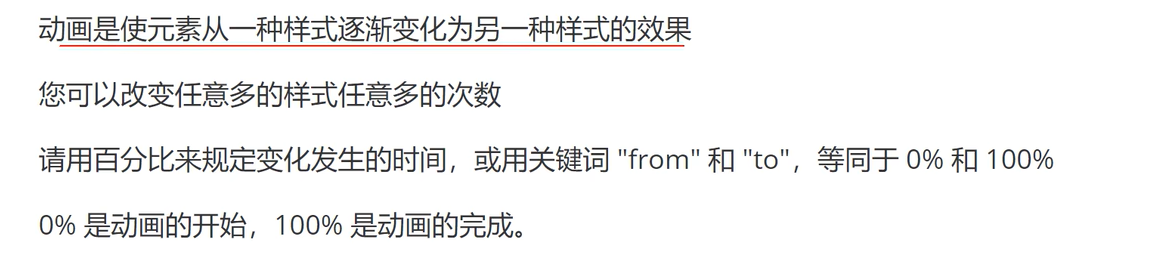
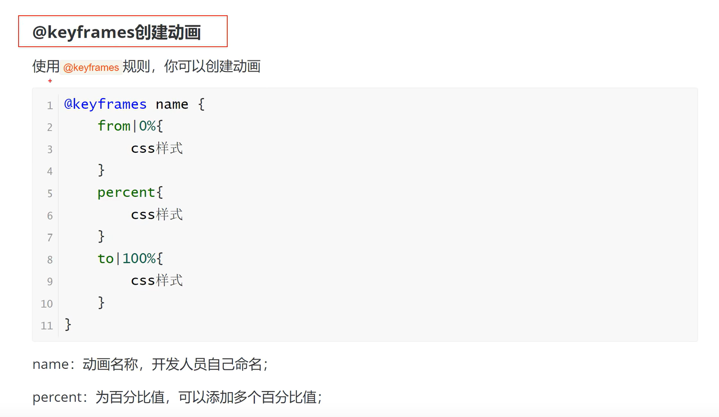
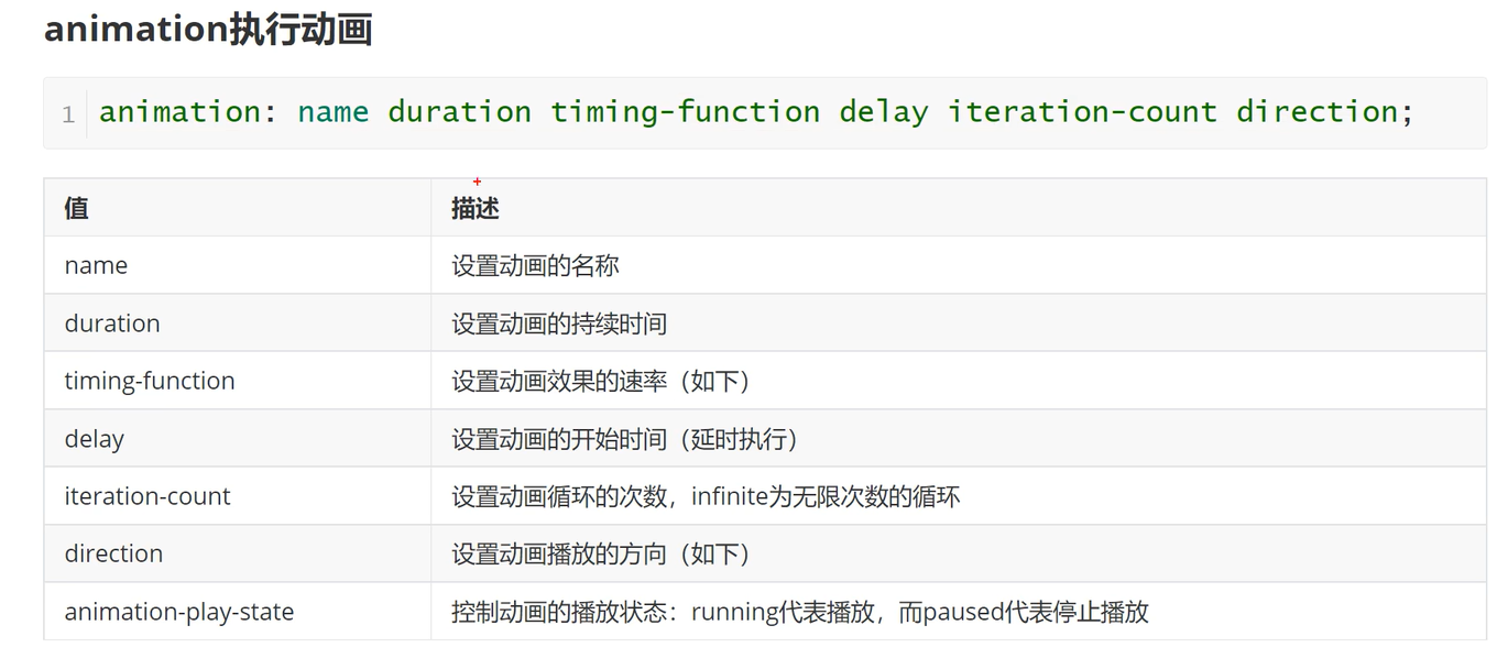
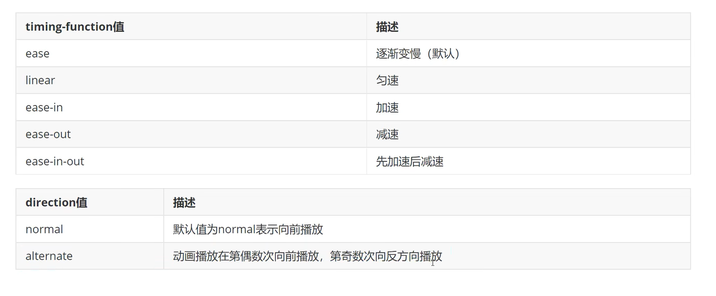
动画
![]()
![]()
![]()
![]()
示例
<!DOCTYPE html>
<html lang="en">
<head>
    <meta charset="UTF-8">
    <title>Title</title>
</head>
<style>
    .box{
        /*动画*/
        width: 100px;
        height: 100px;
        background-color: red;
        /*animation 第一个值是要写定义的动画名字
        第二个值是动画每次循环持续的时间
        第三个值是动画改变的速度
        第四个值是页面开始到执行的时间
        第五个值是循环次数,不写默认为1
        第六个值不写就是默认一直正向播放*/
        animation: col 3s linear 2s infinite;
    }
    /*:hover可以指定在鼠标停留时的颜色,这里用作动画启动*/
    .box:hover{
        /*background-color: blue;*/
        animation-play-state: paused;
    }
    @keyframes col {
        0%{
            width: 100px;
            background-color: red;
        }
        50%{
            width: 200px;
            background-color: yellow;
        }
        100%{
            width: 100px;
            background-color: green;
        }

    }
    /*呼吸效果
    这是一个示例,主要就是用到了animation第六个属性,让它能够有回复效果,不是直接变回初始颜色*/
    .box1{
        width: 100px;
        height: 100px;
        background-color: #2b92d4;
        border-radius:5px;
        box-shadow:0 1px 2px rgba(0,0,0,.3);
        animation:b 2.7s ease-in-out infinite alternate;
    }
    @keyframes b{
        0%{
            /*opacity代表透明度*/
            opacity:0.2;
            box-shadow:0 1px 2px rgba(255,255,255,0.1)
        }
        50%{
            opacity: 0.5;
            box-shadow:0 1px 2px rgba(18,190,84,0.76)
        }
        100%{
            opacity: 1;
            box-shadow:0 1px 30px rgba(59,255,255,1)
        }
    }
</style>
<body>
<div class="box"></div>

<div class="box1"></div>
</body>
</html>
这是直接粘贴在随笔上的示例,之前搞得一个盒子模型学习会影响到博客页面,直接不能看了,希望这个不会影响到
Title


 浙公网安备 33010602011771号