
2025-2-4-css3新知-圆角跟阴影
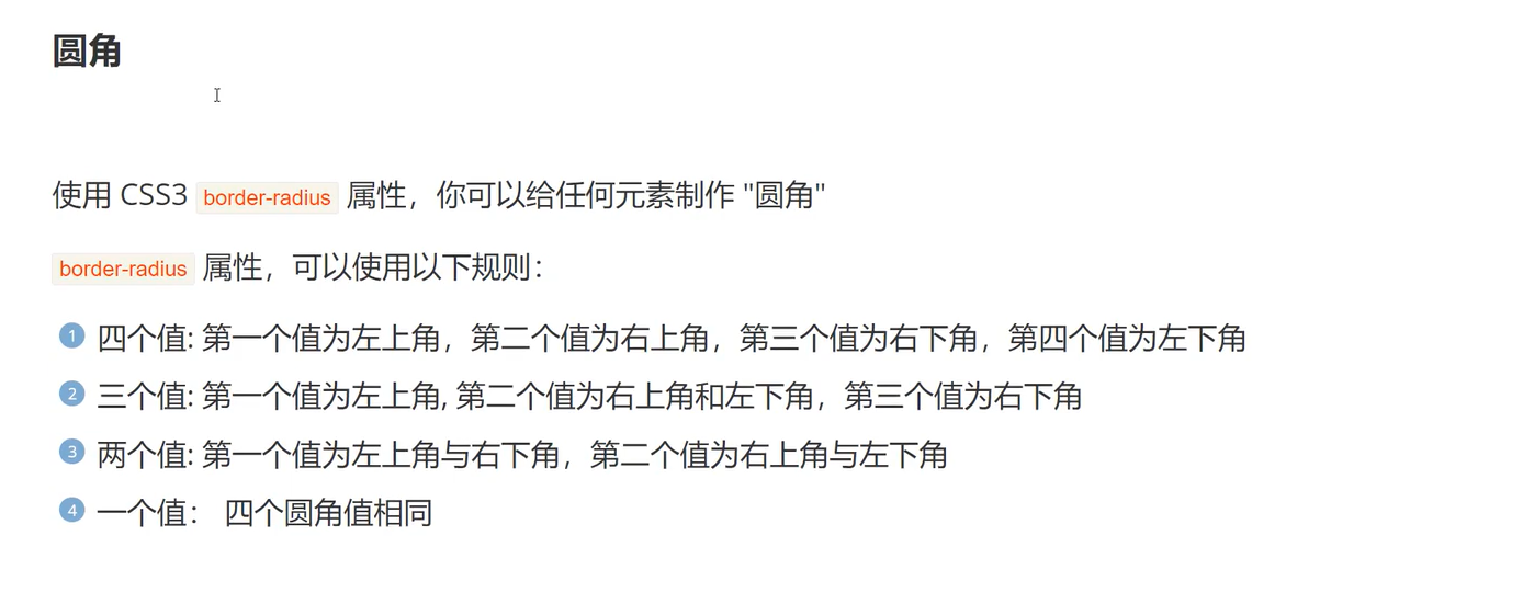
圆角
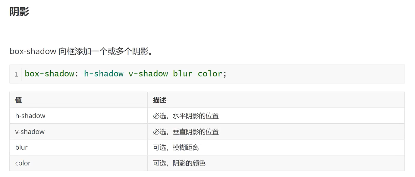
阴影
示例
<!DOCTYPE html>
<html lang="en">
<head>
<meta charset="UTF-8">
<title>Title</title>
</head>
<style>
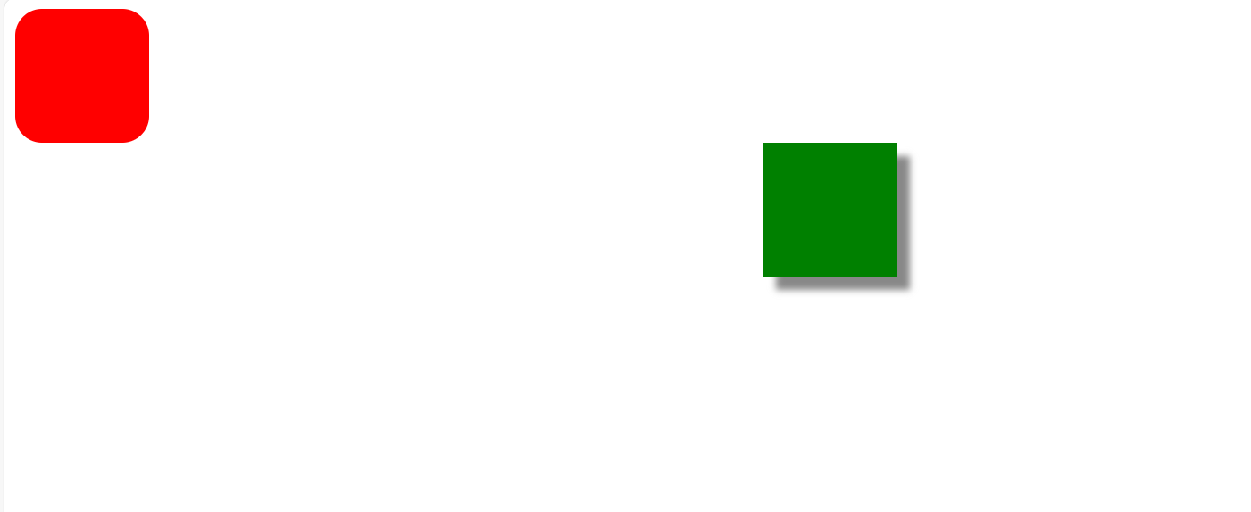
.box1{
width: 100px;
height: 100px;
background-color: red;
/*圆角,写不同的值来进行圆角的改变
值为100%是圆,经测试,正方形填边长的一半也会变成圆
可以有一个值:四个角
两个值:第一个值为左上右下,第二个值为右上左下
三个值:第一个为左上,第二个为右上跟左下,第三个为右下
四个值:第一个为左上,第二个为右上,第三个为右下,第四个为左下*/
border-radius: 20px;
}
.box2{
width: 100px;
height: 100px;
background-color: green;
margin:0 auto;
/*阴影,第一个值为左右位置,第二个值为上下位置,第三个是阴影大小,第四个是颜色
左右跟上下阴影的位置是以0为分界线,正为右跟下,负为上跟左*/
box-shadow: 10px 10px 5px #888888;
}
</style>
<body>
<div class="box1"></div>
<div class="box2"></div>
</body>
</html>

 浙公网安备 33010602011771号