
不用图片做的三角语言框效果,纯样式编写,css三角样式写法
上边效果与理想的有误差,代码布不上去,下边是源代码,另行保存后查看真正效果,下图是真正效果,区别在三角处,里面颜色
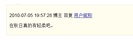
<!DOCTYPE html>
<html lang="en-US">
  <head>
    <meta http-equiv="Content-Type" content="text/html; charset=utf-8" />
    <title></title>
    <style>
      .depth_2 {
        margin-left: 29px;
        margin-top: 18px;
        border: 1px solid #e3e3e3;
        background: #fffeee;
        padding: 10px 6px 8px 10px;
        position: relative;
        zoom: 1;
      }
      .depth_2 .triangle {
        border-color: transparent;
        border-style: dashed dashed solid dashed;
        border-width: 0 6px 6px 6px;
        border-bottom-color: #e3e3e3;
        display: block;
        width: 0;
        height: 0;
        line-height: 0;
        position: absolute;
        top: -6px;
        left: 35px;
      }
      .depth_2 .trianglee {
        width: 0;
        height: 0;
        line-height: 0;
        position: absolute;
        top: 2px;
        left: -5px;
        border-color: transparent;
        border-style: dashed dashed solid dashed;
        border-width: 0 5px 5px 5px;
        border-bottom-color: #fffeee;
        display: block;
      }
    </style>
  </head>
  <body>
    <div class="depth_2">
      <div class="triangle"><span class="trianglee"></span></div>
      <p class="comment_info">
        <time datetime="2013-09-18T10:07:07+00:00" class="entry_date">2010-07-05 19:57:28</time>
        博主 回复 <a class="comment_author" title="用户昵称" href="#">用户昵称</a>
      </p>
      <p class="comment_cont">在秋日真的有轻柔吧。</p>
    </div>
  </body>
</html>
向下箭头的

<!DOCTYPE html>
<html lang="en-US">
  <head>
    <meta http-equiv="Content-Type" content="text/html; charset=utf-8" />
    <title></title>
    <style>
      .depth_2 {
        margin-left: 29px;
        margin-top: 18px;
        border: 1px solid #e3e3e3;
        background: #fffeee;
        padding: 10px 6px 8px 10px;
        position: relative;
        zoom: 1;
      }
      .depth_2 .triangle {
        border-color: transparent;
        border-style: solid dashed dashed dashed;
        border-width: 10px 10px 0 10px;
        border-top-color: red;
        display: block;
        width: 0;
        height: 0;
        line-height: 0;
        position: absolute;
        bottom: -10px;
        left: 35px;
      }
    </style>
  </head>
  <body>
    <div class="depth_2">
      <div class="triangle"></div>
      <p class="comment_info">
        <time datetime="2013-09-18T10:07:07+00:00" class="entry_date">2010-07-05 19:57:28</time>
        博主 回复 <a class="comment_author" title="用户昵称" href="#">用户昵称</a>
      </p>
    </div>
  </body>
</html>

 浙公网安备 33010602011771号