

Web移动端常见问题-摘抄
一、按钮点击时出现黑色背景
解决方法:
|
1
2
|
.class { -webkit-tap-highlight-color:rgba(0,0,0,0);}.class { -webkit-appearance: none; -webkit-tap-highlight-color: transparent;} |
二、iOS中伪类:active失效
解决方法:
|
1
2
3
|
$(function(){ document.body.addEventListener('touchstart', function () { });}) |
三、移动端常用<meta>标签
|
1
2
3
4
|
<meta content="width=device-width,height=device-height,inital-scale=1.0,maximum-scale=1.0,user-scalable=no;" name="viewport"><meta content="yes" name="apple-mobile-web-app-capable"><meta content="black" name="apple-mobile-web-app-status-bar-style"><meta content="telephone=no" name="format-detection"> |
四、响应式语法
|
1
2
3
4
5
6
|
@media screen and (max-width: 320px){ .class { } }@media screen and (min-width: 321px) and (max-width: 375px){ .class { }} |
五、屏蔽浏览器滑动翻页
解决方法
|
1
2
3
4
5
|
var doc = document.getElementById('id');doc.addEventListener('touchmove', function(event) { if(event.target.type == 'range') return; event.preventDefault();}) |
六、input标签placeholder颜色
|
1
2
|
input::-webkit-input-placeholder{ color: orange;}input:focus::-webkit-input-placeholder{ color: #09f;} |
七、Andriod微信浏览器中a标签如果不使用类名而用标签命名,会让同级标签继承其padding属性。
|
1
2
3
4
5
6
7
8
9
10
11
12
13
14
15
16
17
18
19
20
21
22
23
24
25
26
27
28
29
30
31
32
33
34
35
36
|
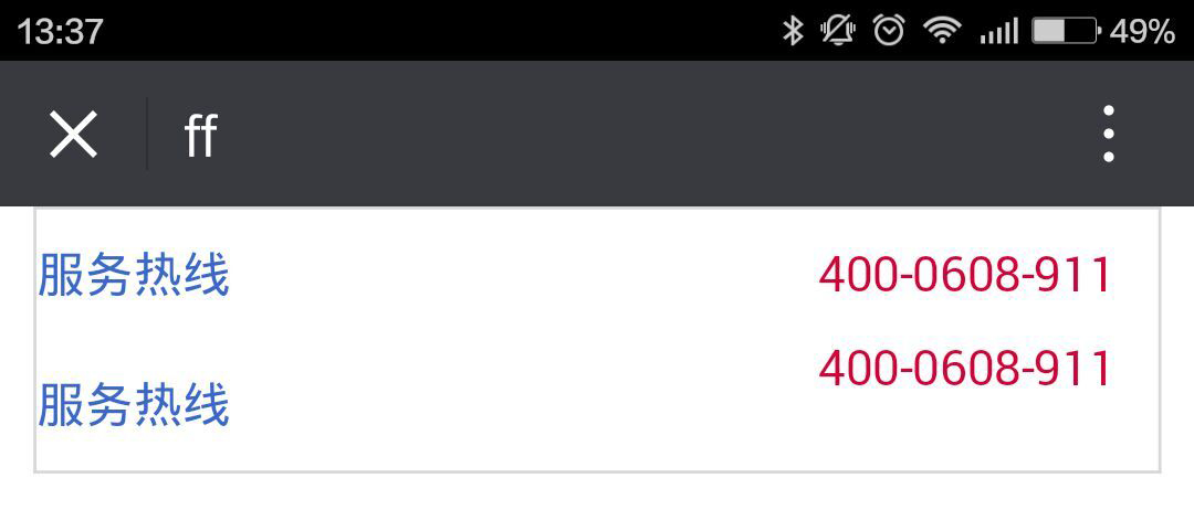
<style> .link { width: 94%; margin: 0 auto; border: 1px solid #d8d8d8; overflow: hidden; } .link dt { overflow: hidden; } .link .tel a { display: block; float: left; padding: 0.8rem 0; } .link .tel span { float: right; color: #d60037; margin-right: 4%; } .link .title .a { display: block; float: left; padding: 0.8rem 0; } .link .title span { float: right; color: #d60037; margin-right: 4%; }</style><dl class="link"> <dt class="tel"><a href="#">服务热线</a><span>400-0608-911</span></dt> <dt class="title"><a class="a" href="#">服务热线</a><span>400-0608-911</span></dt></dl> |
iOS微信浏览器下:

Andriod微信浏览器下:
八、解除移动端最小12字号的限制
|
1
|
.class { -webkit-text-size-adjust: none;} |
九、去除手机自带样式(select,button)
|
1
|
.class { -webkit-appearance: none; appearance: none; -webkit-box-sizing: border-box; box-sizing: border-box;} |
十、移动端弹窗出现时,禁止底部内容
|
1
2
3
4
5
|
$("弹层").on("touchmove",function(event){ if($("弹层").is(":visible")==true){ event.preventDefault(); }}) |
请爱好前端技术的朋友,联系我,有问题大家一起讨论

 浙公网安备 33010602011771号