CSS网页布局
_____egon新书来袭请看:https://egonlin.com/book.html
一 网页布局方式
#1、什么是网页布局方式
布局可以理解为排版,我们所熟知的文本编辑类工具都有自己的排版方式,比如word,nodpad++等等

而网页的布局方式指的就是浏览器这款工具是如何对网页中的元素进行排版的

#2、网页布局/排版的三种方式
2.1、标准流
2.2、浮动流
2.3、定位流
二 标准流
标准流的排版方式,又称为:文档流/普通流,所谓的文档流,指的是元素排版布局过程中,元素会自动从左往右,从上往下的流式排列。
#   1 浏览器默认的排版方式就是标准流排版方式

#   2 在CSS中将元素分为三类:分别是
        块级
        行内
        行内块级

#  3 在标准流中有两种排版方式,一种是垂直排版,一种是水平排版

        垂直排版,如果元素是块级元素,那么就会垂直排版
        水平排版,如果元素是行内元素或行内块级元素,那么就会水平排版


<!DOCTYPE html>
<html lang="en">
<head>
    <meta charset="UTF-8">
    <title></title>

    <style type="text/css">
        div,h1,p {
            border: 1px solid red;
        }

        span,strong,b {
            border: 1px solid #000;
        }
    </style>
</head>
<body>
<div>我是div</div>
<h1>我是标题</h1>
<p>我是段落</p>

<span>span</span>
<strong>我是强调</strong>
<b>我是加粗</b>
</body>
</html>
三 浮动流
1、浮动流是一种半脱离标准流的排版方式那什么是脱离文档流?什么又是半脱离文档流?
1.1 什么是脱离文档流?
1、浮动元素脱离文档流意味着
#1、不再区分行内、块级、行内块级,无论是什么级的元素都可以水平排版
#2、无论是什么级的元素都可以设置宽高
综上所述,浮动流中的元素和标准流总的行内块级元素很像
<!DOCTYPE html>
<html>
<head>
    <title></title>
    <meta charset="utf-8">
    <style>
        * {
            margin: 0;
            padding: 0;
        }
        /*
        不再区分行内、块级、行内块级,无论是什么级的元素都可以水平排版:span和p都显示到一行
        无论是什么级的元素都可以设置宽高:span这种行内元素也可以设置宽高
        */
        .box1 {
            width: 100px;
            height: 100px;
            background-color: red;

            float: left;
        }
        .box2 {
            width: 100px;
            height: 100px;
            background-color: blue;

            float: left;
        }


    </style>
</head>

<body>

<span class="box1">我是span</span>
<p class="box2">我是段落</p>


</body>
</html>
2、浮动元素脱标文档流意味着
#1、当某一个元素浮动走之后,那么这个元素看上去就像被从标准流中删除了一样,这个就是浮动元素的脱标

#2、如果前面一个元素浮动走了,而后面一个元素没有浮动,那么垂直方向的元素会自动填充,浮动元素重新归位后就会覆盖该元素
<!DOCTYPE html>
<html lang="en">
<head>
    <meta charset="UTF-8">
    <title>浮动元素脱标</title>

    <style>
        .box1 {
            float: left;

            width: 100px;
            height: 100px;
            background-color: red;
        }

        .box2 {
            width: 150px;
            height: 150px;
            background-color: blue;
        }
    </style>
</head>
<body>
<div class="box1"></div>
<div class="box2"></div>


</body>
</html>
注意点:
1、浮动流只有一种排版方式,就是水平排版,它只能设置某个元素左对齐或者右对齐,没有居中对齐,也就是没有center这个取值
2、一旦使用了浮动流,则margin:0 auto;失效
<!DOCTYPE html>
<html>
<head>
    <title></title>
    <meta charset="utf-8">
    <style>
        * {
            margin: 0;
            padding: 0;
        }

        .header {
            width: 930px;
            height: 100px;
            border: 1px solid #000;

            margin: 0 auto;
        }

        .logo {
            width: 100px;
            height: 50px;
            background-color: yellow;
            float: left;
        }
        .nav {
            width: 300px;
            height: 50px;
            background-color: green;
            float: left;

            /*失效*/
            margin: 0 auto;
        }

    </style>
</head>

<body>

<div class="header">
    <div class="logo"></div>
    <div class="nav"></div>
</div>
<!DOCTYPE html>
<html>
<head>
    <title>方式一:修改显示方式为inline-block</title>
    <meta charset="utf-8">
    <style>
        .box1 {
            display: inline-block;
            width: 100px;
            height: 100px;
            background-color: red;
        }
        .box2 {
            display: inline-block;
            width: 100px;
            height: 100px;
            background-color: blue;

            /*
            当设置box2的margin-left足够大时,第二个盒子就靠右面显示了
            但是当浏览器界面缩小时,box2由于左边的margin-left不够930,则必须换一个新行显示,就无法让两个盒子处于一行
            */
            margin-left: 930px;
        }

    </style>
</head>

<body>


<div class="box1"></div>
<div class="box2"></div>


</body>
</html>


<!DOCTYPE html>
<html>
<head>
    <title>方式二:用浮动的方式</title>
    <meta charset="utf-8">
    <style>
        .box1 {
            display: inline-block;
            width: 100px;
            height: 100px;
            background-color: red;

            float: left;
        }
        .box2 {
            display: inline-block;
            width: 100px;
            height: 100px;
            background-color: blue;

            float: right;
        }

    </style>
</head>

<body>


<div class="box1"></div>
<div class="box2"></div>


</body>
</html>
1.2 那什么又是半脱离文档流?
脱离分为:半脱离与完全脱离,

其中完全脱离指的是元素原先在正常文档流中所占的空间会关闭,就好像该元素原来不存在一样

而之所以称为半脱离:是因为浮动元素浮动之后的位置取决于它在浮动之前的标准流中的位置,跟标准流还是有一定的关系,比如说浮动的元素在浮动之前处于标准流的第二行,那么他浮动之后也是处于浮动流的第二行,不会去找其他行的浮动元素去贴靠,打一个比方就是:浮动流就是在标准流上面覆盖的一层透明薄膜,元素浮动之后就会被从标准流中扔到浮动流这个薄膜上,他在这个薄膜上的位置还是以前在标准流的位置上找同方向的浮动元素进行贴靠,贴靠的准则就是:

(1)同一个方向上谁先浮动,谁在前面

(2)不同方向上左浮动找左浮动,右浮动找右浮动
<!DOCTYPE html>
<html lang="en">
<head>
    <meta charset="UTF-8">
    <title>浮动元素排序规则</title>

    <style>
        .box1 {
            float: left;

            width: 100px;
            height: 100px;
            background-color: red;
        }

        .box2 {
            width: 150px;
            height: 150px;
            background-color: blue;
        }

        .box3 {
            float: left;

            width: 250px;
            height: 250px;
            background-color: yellow;
        }


        .box4 {
            width: 300px;
            height: 300px;
            background-color: rebeccapurple;
        }
    </style>
</head>
<body>

<div class="box1">1</div>
<div class="box2">2</div>
<div class="box3">3</div>
<div class="box4">4</div>


</body>
</html>
<!DOCTYPE html>
<html lang="en">
<head>
    <meta charset="UTF-8">
    <title>浮动元素排序规则</title>

    <style>
        .box1 {
            float: left;

            width: 100px;
            height: 100px;
            background-color: red;
        }

        .box2 {
            float: left;

            width: 150px;
            height: 150px;
            background-color: blue;
        }

        .box3 {
            float: left;

            width: 250px;
            height: 250px;
            background-color: yellow;
        }


        .box4 {
            float: left;

            width: 300px;
            height: 300px;
            background-color: rebeccapurple;
        }
    </style>
</head>
<body>

<div class="box1">1</div>
<div class="box2">2</div>
<div class="box3">3</div>
<div class="box4">4</div>


</body>
</html>
<!DOCTYPE html>
<html lang="en">
<head>
    <meta charset="UTF-8">
    <title>浮动元素排序规则</title>

    <style>
        .box1 {
            float: left;

            width: 100px;
            height: 100px;
            background-color: red;
        }

        .box2 {
            float: left;

            width: 150px;
            height: 150px;
            background-color: blue;
        }

        .box3 {
            float: right;

            width: 250px;
            height: 250px;
            background-color: yellow;
        }


        .box4 {
            float: right;

            width: 300px;
            height: 300px;
            background-color: rebeccapurple;
        }
    </style>
</head>
<body>

<div class="box1">1</div>
<div class="box2">2</div>
<div class="box3">3</div>
<div class="box4">4</div>


</body>
</html>
1.3 浮动元素贴靠问题
当父元素的宽度足够显示所有元素时,浮动的元素就会并列显示
当父元素的宽度不足够显示所有元素时,浮动的元素就贴前一个元素,如果还不够,就会再贴前一个元素
直到贴到父元素左边,此时无论是否宽度足够都会在这一行显示了
<!DOCTYPE html>
<html lang="en">
<head>
    <meta charset="UTF-8">
    <title>浮动元素贴靠问题</title>

    <style>
        .father {
            width: 400px;
            height: 400px;
            border: 1px solid #000;

        }

        .box1 {
            float: left;
            width: 50px;
            height: 300px;
            background-color: rebeccapurple;

        }
        .box2 {
            float: left;
            width: 50px;
            height: 100px;
            background-color: green;

        }
        .box3 {
            float: left;
            width: 250px;
            /*width: 300px;*/
            /*width: 310px;*/
            /*width: 400px;*/

            height: 100px;
            background-color: red;

        }


    </style>
</head>
<body>

<div class="father">
    <div class="box1">1</div>
    <div class="box2">2</div>
    <div class="box3">3</div>
</div>


</body>
</html>
1.4 浮动元素字围现象
没有浮动文字、图片、超链接等元素会给浮动的元素让位置,并围绕在浮动元素的周围
<!DOCTYPE html>
<html lang="en">
<head>
    <meta charset="UTF-8">
    <title>浮动元素字围现象</title>

    <style>
        img {
            float: left;
            width:300px;
        }

        p {
            background-color: #b9950c;
        }


    </style>
</head>
<body>
<img src="https://timgsa.baidu.com/timg?image&quality=80&size=b9999_10000&sec=1526318630409&di=8186a1ab56ed36696ade3e23a228acfc&imgtype=0&src=http%3A%2F%2Fpic1.win4000.com%2Fwallpaper%2Ff%2F58be1c554d5f0.jpg" alt="">
<p>
迪丽热巴(Dilraba),1992年6月3日出生于新疆乌鲁木齐市,中国内地影视女演员。2013年,迪丽热巴因主演个人首部电视剧《阿娜尔罕》而出道。2014年,她主演了奇幻剧《逆光之恋》。2015年,迪丽热巴凭借爱情剧《克拉恋人》赢得高人气,并获得国剧盛典最受欢迎新人女演员奖。2016年,其主演的现代剧《麻辣变形计》播出;同年,她还凭借喜剧片《傲娇与偏见》获得中英电影节最佳新人奖。2017年,迪丽热巴因在玄幻剧《三生三世十里桃花》中饰演青丘白凤九而获得白玉兰奖最佳女配角提名。2018年 ...
    迪丽热巴(Dilraba),1992年6月3日出生于新疆乌鲁木齐市,中国内地影视女演员 [1]  。
2013年,迪丽热巴因主演个人首部电视剧《阿娜尔罕》而出道 [2]  。2014年,她主演了奇幻剧《逆光之恋》 [3]  。2015年,迪丽热巴凭借爱情剧《克拉恋人》赢得高人气,并获得国剧盛典最受欢迎新人女演员奖 [4]  。2016年,其主演的现代剧《麻辣变形计》播出 [5]  ;同年,她还凭借喜剧片《傲娇与偏见》获得中英电影节最佳新人奖 [6]  。2017年,迪丽热巴因在玄幻剧《三生三世十里桃花》中饰演青丘白凤九而获得白玉兰奖最佳女配角提名 [7]  。2018年4月20日,主演的爱情喜剧电影《21克拉》上映 [8]  。
    迪丽热巴出生于新疆乌鲁木齐市,父亲是新疆歌舞团的独唱演员。因受父亲影响,迪丽热巴从小便对各种艺术类的东西颇感兴趣,并主动要求学习钢琴、舞蹈、小提琴、吉他等 [9]  。
2001年,9岁的迪丽热巴被父亲带去一所艺术学院参加考试,当时她以为是上兴趣班,结果被录取后才发现是一个专业的舞蹈院校,而迪丽热巴也开始了为期六年的民族舞、芭蕾舞专业学习。2007年,从艺术学院毕业的迪丽热巴成为了新疆歌舞团的舞蹈演员 [10]  。2009年,迪丽热巴还在东北师范大学民族学院读了一年预科,在此期间她还参加了吉林省的首届少数民族新歌大赛,并最终获得了省级三等奖的成绩 [11]  。
之后,迪丽热巴却慢慢发现这并不是自己想要的生活。于是决定继续求学,去看看外面的世界,因为有不错钢琴基础,所以本来想报考的是中央音乐学院,可报名时却看到了中戏和上戏在招生,便突然决定改学表演。而迪丽热巴会有这样的决定则是受到了她钢琴老师的指点。2010年,迪丽热巴顺利考入了上海戏剧学院表演系戏剧影视专业;同年,她参加了陆川执导的古装片《王的盛宴》女主角“虞姬”的上海站海选 [12]  ,并因此获得了颇多关注 [13]  。
</p>


</body>
</html>
<!DOCTYPE html>
<html>
<head>
    <title>只要是行内块级元素,都会有字围效果</title>
    <meta charset="utf-8">
    <style>
        * {
            margin: 0;
            padding: 0;
        }
        .box1 {
            width: 200px;
            height: 200px;
            background-color: blue;
            float: left;
        }
        .box2 {
            display: inline-block;
            width: 200px;
            height: 50px;
            background-color: green;
        }
        .box3 {
            width: 200px;
            height: 200px;
            background-color: red;
        }

    </style>
</head>
<body>
<div class="box1"></div>
<div class="box2"></div>
<div class="box2"></div>
<div class="box2"></div>
<div class="box2"></div>
<div class="box2"></div>
<div class="box2"></div>
<div class="box2"></div>
<div class="box2"></div>
<div class="box2"></div>
<div class="box2"></div>
<div class="box2"></div>
<div class="box2"></div>
<div class="box2"></div>
<div class="box2"></div>
<div class="box2"></div>
<div class="box2"></div>
<div class="box2"></div>
<div class="box2"></div>
<div class="box2"></div>
<div class="box2"></div>
<div class="box2"></div>
<div class="box2"></div>
<div class="box2"></div>
<div class="box2"></div>
<div class="box2"></div>
<div class="box3"></div>
</body>
</html>
1.5 浮动流排版练习
#注意:在企业开发中,如何对网页进行布局
#1、垂直方向的布局用标准流布局,水平方向用浮动流布局
#2、从上至下布局
#3、从外向内布局
#4、水平方向可以先划分为一左一右再对左边后者右边进一步布局
<!DOCTYPE html>
<html lang="en">
<head>
    <meta charset="UTF-8">
    <title>div与span标签</title>

    <style>
        /*
        水平方向的块级元素的宽默认是父元素的100%
        而垂直方向如果想让子元素的高是父元素的100%
        则必须先设置父元素的高为100%
        */
        * {
            margin: 0;
            padding: 0;
        }
        html {
            height: 100%;
        }
        body {
            height: 100%;
            background-color: #cccccc;
        }
        .header {
            width: 80%;
            height: 10%;
            background: red;
            margin: auto;
            margin-bottom: 10px;

            padding: 20px;
            box-sizing: border-box;
        }

        .content {
            width: 80%;
            height: 70%;
            background: green;
            margin: auto;
            margin-bottom: 10px;
            padding: 20px;
            box-sizing: border-box;

        }

        .footer {
            width: 80%;
            height: 10%;
            background: blue;
            margin: auto;

        }

        .logo {
            width: 20%;
            height: 100%;
            background: pink;
            float: left;
        }

        .nav {
            width: 75%;
            height: 100%;
            background: yellow;
            float: right;
            margin-left: 5%;

        }

        .aside {
            width: 20%;
            height: 100%;
            background: purple;
            float: left;
        }

        .article {
            width: 75%;
            height: 100%;
            background: skyblue;
            float: right;
            margin-left: 5%;
        }


    </style>
</head>
<body>
<div class="header">
    <div class="logo"></div>
    <div class="nav"></div>
</div>


<div class="content">
    <div class="aside"></div>
    <div class="article"></div>
</div>


<div class="footer"></div>
</body>
</html>
<!DOCTYPE html>
<html lang="en">
<head>
    <meta charset="UTF-8">
    <title>浮动流排版练习2</title>

    <style>
        * {
            margin: 0px;
            padding: 0px;
        }
        .header {
            height: 100px;
            width: 980px;
            background-color: #fefefe;
            margin: 0 auto;
        }

        .header .logo {
            width: 250px;
            height: 100px;
            background-color: #f6c2d2;
            float: left;

        }

        .header .language {
            width: 150px;
            height: 50px;
            background-color: #a0d7e9;
            float: right;
        }

        .header .nav {
            width: 630px;
            height: 50px;
            background-color: #7e1487;
            float: right;

        }

        .content {
            height: 400px;
            width: 980px;
            background-color: #fcfd00;
            margin: 0 auto;

            margin-top: 10px;
        }
        .footer {
            height: 40px;
            width: 980px;
            background-color: #ec6357;
            margin: 0 auto;

            margin-top: 10px;
        }


    </style>
</head>
<body>

<div class="header">
    <div class="logo">logo</div>
    <div class="language">language</div>
    <div class="nav">导航</div>

</div>
<div class="content"></div>
<div class="footer"></div>


</body>
</html>
<!DOCTYPE html>
<html lang="en">
<head>
    <meta charset="UTF-8">
    <title>浮动流排版练习3</title>

    <style>
        * {
            margin: 0px;
            padding: 0px;
        }
        .header {
            height: 100px;
            width: 980px;
            background-color: #f6c2d2;
            margin: 0 auto;
        }


        .content {
            height: 400px;
            width: 980px;
            background-color: #fefefe;
            margin: 0 auto;

            margin-top: 10px;
        }
        .content .aside {
            width: 320px;
            height: 400px;
            background-color: #fcfd00;
            float: left;
        }

        .content .article {
            width: 650px;
            height: 400px;
            background-color: #fefefe;
            float: right;
        }

        .content .articleTop {
            width: 650px;
            height: 350px;
            background-color: #fefefe;
        }
        .content .articleTopLeft {
            width: 400px;
            height: 350px;
            background-color: #fefefe;
            float: left;
        }
        .content .articleTopLeft .new1 {
            width: 400px;
            height: 200px;
            background-color: #e9289c;
        }
        .content .articleTopLeft .new2 {
            width: 400px;
            height: 140px;
            background-color: #3dd1fd;

            margin-top: 10px;
        }


        .content .articleTopRight {
            width: 240px;
            height: 350px;
            background-color: #acde3d;
            float: right;
        }


        .content .articleBottom {
            width: 650px;
            height: 40px;
            background-color: #b9950c;
            margin-top: 10px;
        }

        .footer {
            height: 40px;
            width: 980px;
            background-color: #ec6357;
            margin: 0 auto;

            margin-top: 10px;
        }


    </style>
</head>
<body>


<div class="header"></div>
<div class="content">
    <div class="aside"></div>
    <div class="article">
        <div class="articleTop">
            <div class="articleTopLeft">
                <div class="new1"></div>
                <div class="new2"></div>
            </div>
            <div class="articleTopRight"></div>

        </div>
        <div class="articleBottom"></div>

    </div>
</div>
<div class="footer"></div>


</body>
</html>
1.6 浮动元素高度问题(又称父级塌陷)
#1、在标准流中,内容的高度可以撑起父元素的高度
#2、在浮动流中,浮动的元素是不可以撑起父元素的高度的,当子元素都浮动起来后,父亲的内容高度即height变为0,父元素就好像塌陷了一样,因而又称为父级塌陷
<!DOCTYPE html>
<html lang="en">
<head>
    <meta charset="UTF-8">
    <title>浮动元素高度问题</title>
    <style>
        * {
            margin: 0;
            padding: 0;
        }

        div {
            border: 10px solid #741a7b;
        }

        p {
            width: 100px;
            height: 100px;
            background-color: red;

            float: left;
        }


    </style>

</head>
<body>
<div>
    <p>我是p标签</p>
</div>
</body>
</html>
<!DOCTYPE html>
<html lang="en">
<head>
    <meta charset="UTF-8">
    <title>Title</title>
    <style type="text/css">
        * {
            margin: 0;
            padding: 0;
        }

        .header {
            border: 5px solid #000;
        }

        .logo {
            width: 200px;
            height: 200px;
            background-color: red;

            float: left;
        }
        .nav {
            width: 200px;
            height: 200px;
            background-color: green;

            float: left;
        }

        .content {
            width: 960px;
            height: 200px;
            background-color: yellow;
        }
    </style>
</head>
<body>

<div class="header">
    <div class="logo">logo</div>
    <div class="nav">nav</div>
</div>

<div class="content">content</div>


</body>
</body>
</html>
1.7 清除浮动
清除浮动方式一:
    为浮动的那些子元素的父亲设置一个高度

#1、注意点:
    在企业开发中,这样限定固定高度会使页面操作不灵活,不推荐!
<!DOCTYPE html>
<html lang="en">
<head>
    <meta charset="UTF-8">
    <title>Title</title>
    <style type="text/css">
        * {
            margin: 0;
            padding: 0;
        }

        .header {
            border: 5px solid #000;

            height: 200px;
        }

        .logo {
            width: 200px;
            height: 200px;
            background-color: red;

            float: left;
        }
        .nav {
            width: 200px;
            height: 200px;
            background-color: green;

            float: left;
        }

        .content {
            width: 960px;
            height: 200px;
            background-color: yellow;
        }
    </style>
</head>
<body>

<div class="header">
    <div class="logo">logo</div>
    <div class="nav">nav</div>
</div>

<div class="content">content</div>


</body>
</body>
</html>
清除浮动方式二:
    clear : none | left | right | both
    注意:clear这个属性必须设置在块级、并且不浮动的元素中

#1、取值:
    none : 默认值。允许两边都可以有浮动对象
    left : 不允许左边有浮动对象
    right : 不允许右边有浮动对象
    both : 不允许左右有浮动对象

#2、把握住两点:
    1、元素是从上到下、从左到右依次加载的。
    2、clear: left;对自身起作用,而不会影响其他元素。一旦左边有浮动元素,即切换到下一行来保证左边元素不是浮动的,依据这一点解决父级塌陷问题。
<!DOCTYPE html>
<html lang="en">
<head>
    <meta charset="UTF-8">
    <title>Title</title>
    <style type="text/css">
        * {
            margin: 0;
            padding: 0;
        }

        .header {
            border: 5px solid #000;
        }

        .logo {
            width: 200px;
            height: 200px;
            background-color: red;

            float: left;
        }
        .nav {
            width: 200px;
            height: 200px;
            background-color: green;

            float: left;
        }

        .content {
            width: 960px;
            height: 200px;
            background-color: yellow;

            /*该元素的左右两边都允许有浮动元素*/
            clear: both;
        }
    </style>
</head>
<body>

<div class="header">
    <div class="logo">logo</div>
    <div class="nav">nav</div>
</div>

<div class="content">content</div>


</body>
</body>
</html>
#注意1:
元素是从上到下、从左到右依次加载的。在右侧元素还没有加载到时,clear:right是无用的
<!DOCTYPE html>
<html lang="en">
<head>
    <meta charset="UTF-8">
    <title>Title</title>
    <style>
        *{
            margin: 0;
        }

        .r1{
            width: 300px;
            height: 100px;
            background-color: #7A77C8;
            float: left;
        }
        .r2{
            width: 200px;
            height: 200px;
            background-color: wheat;
            float: left;

            /*
            元素是从上到下、从左到右依次加载的。
            而此时r2右侧并没有浮动的元素,
            所以此处即便是设置了也没有用
            */
            clear: right;

        }
        .r3{
            width: 100px;
            height: 200px;
            background-color: darkgreen;
            float: left;
        }
    </style>
</head>
<body>

<div class="r1"></div>
<div class="r2"></div>
<div class="r3"></div>

</body>
</html>
#注意2:
这种方式的弊端是:当我们给某个元素添加clear属性之后,那么这个属性的margin-top属性可能会失效,因而也不推荐直接用clear
<!DOCTYPE html>
<html lang="en">
<head>
    <meta charset="UTF-8">
    <title>Title</title>
    <style type="text/css">
        * {
            margin: 0;
            padding: 0;
        }

        body {
            /*border: 1px solid #000;*/
        }
        .header {
            /*border: 5px solid #000;*/
        }

        .logo {
            width: 200px;
            height: 200px;
            background-color: red;

            float: left;
        }
        .nav {
            width: 200px;
            height: 200px;
            background-color: green;

            float: left;
        }

         /*
        浮动header内的两个元素,然后div内没有标准流元素能撑起他的高度,于是它的高度为0
        此时content应该先填充到header原来的位置,由于此时header既没有高度也没有边框,
        于是content的margin-top就是相对于body来说的了
        对于margin-top,如果父元素body没有边框,则父元素会被一起顶下来,而body这个元素
        又不应该被顶下来,于是我们可以为body设置边框,但在企业开发中没人会为body设置边框
        所以此处只是单纯的演示效果而为body加边框
        */
        .content {
            width: 960px;
            height: 200px;
            background-color: yellow;

            clear: both;
            margin-top: 500px;

        }
    </style>
</head>
<body>

<div class="header">
    <div class="logo">logo</div>
    <div class="nav">nav</div>
</div>

<div class="content">content</div>


</body>
</body>
</html>
清除浮动的方式三
隔墙法


#1、外墙法
    2.1 在两个盒子中间添加一个额外的块级元素
    2.2 给这个额外添加的块级元素设置clear:both;属性
        注意:
            外墙法它可以让第二个盒子使用margin-top属性
            外墙法不可以让第一个盒子使用margin-bottom属性,所以我们通常用墙的高度作margin的替代品

            在企业开发中可以为墙添加一个类h20,然后设置h20的高度为20实现外间距,搜狐网站大量使用了外墙法

#2、内墙法
    3.1 在第一个盒子中所有子元素最后添加一个额外的块级元素
    3.2 给这个额外添加的块级元素设置clear:both;属性
        注意:
            内墙法它可以让第二个盒子使用margin-top属性
            内墙法可以让第一个盒子使用margin-bottom属性

            内墙法也可以为墙添加一个类h20,然后设置h20的高度为20实现外间距,搜狐网站大量使用了外墙法


#3、内墙法与外墙法的区别?
    1、外墙法不可以撑起第一个盒子的高度,而内墙可以

    2、在企业开发中清除浮动,内墙法与外墙法都不常用,因为添加一个无用的墙
        在前端开发中推崇结构与样式分离,而隔墙法需要添加大量的没有意义的空标签div
<!DOCTYPE html>
<html lang="en">
<head>
    <meta charset="UTF-8">
    <title>Title</title>
    <style type="text/css">
        * {
            margin: 0;
            padding: 0;
        }

        body {
        }

        .header {
        }

        .logo {
            width: 200px;
            height: 200px;
            background-color: red;

            float: left;
        }
        .nav {
            width: 200px;
            height: 200px;
            background-color: green;

            float: left;
        }

        .content {
            width: 960px;
            height: 200px;
            background-color: yellow;
        }

        .wall {
            clear: both;
            height: 20px;
        }
    </style>
</head>
<body>

<div class="header">
    <div class="logo">logo</div>
    <div class="nav">nav</div>
</div>

<!--外墙-->
<div class="wall h20"></div>

<div class="content">content</div>


</body>
</body>
</html>
<!DOCTYPE html>
<html lang="en">
<head>
    <meta charset="UTF-8">
    <title>Title</title>
    <style type="text/css">
        * {
            margin: 0;
            padding: 0;
        }

        body {
        }

        .header {
            /*margin-bottom: 30px;*/
        }

        .logo {
            width: 200px;
            height: 200px;
            background-color: red;

            float: left;
        }
        .nav {
            width: 200px;
            height: 200px;
            background-color: green;

            float: left;
        }

        .content {
            width: 960px;
            height: 200px;
            background-color: yellow;
            /*margin-top: 30px;*/
        }

        .wall {
            clear: both;
            height: 30px;
        }
    </style>
</head>
<body>

<div class="header">
    <div class="logo">logo</div>
    <div class="nav">nav</div>
    <!--内墙-->
    <div class="wall h20"></div>
</div>


<div class="content">content</div>


</body>
</body>
</html>
清除浮动的方式四
    本质原理与内墙法一样,但我们用的css的伪元素选择器实现的,就应该用css来控制样式,符合前端开发思想
            #I、详细用法
            .header:after {             <----在类名为“clearfix”的元素内最后面加入内容;
            content: ".";                 <----内容为“.”就是一个英文的句号而已。也可以不写。
            display: block;               <----加入的这个元素转换为块级元素。
            clear: both;                  <----清除左右两边浮动。
            visibility: hidden;           <----可见度设为隐藏。注意它和display:none;是有区别的。
                                               visibility:hidden;仍然占据空间,只是看不到而已;
            line-height: 0;               <----行高为0;
            height: 0;                    <----高度为0;
            font-size:0;                  <----字体大小为0;
            }

            .header { *zoom:1;}         <----兼容ie6,否则伪类选择器只能在谷歌浏览器中生效,其余没用


            整段代码就相当于在浮动元素后面跟了个宽高为0的空div,然后设定它clear:both来达到清除浮动的效果。
            之所以用它,是因为,你不必在html文件中写入大量无意义的空标签,又能清除浮动。
            <div class="header"></div>


            #II、必须要写的是下面这三句话
            content: '.';
            display: block;
            clear: both;


            #III、新浪首页清除浮动的方法,也是采用伪元素
            content: ".";
            display: block;
            height: 0;
            clear: both;
            visibility: hidden;

#1、复习伪元素选择器(CSS3中新增的为元素选择器)
    伪元素选择器的作用就是给指定标签的内容前面添加一个子元素
    或者给指定标签的内容后面添加一个子元素


#2、格式:给指定标签的前面和后面添加子元素
    标签名称::before{
        属性名称:值;
    }

    标签名称::after{
        属性名称:值;
    }
<!DOCTYPE html>
<html lang="en">
<head>
    <meta charset="UTF-8">
    <title>Title</title>
    <style type="text/css">
        * {
            margin: 0;
            padding: 0;
        }

        body {
        }

        .header:after {
            /*必须要写这三句话*/
            content: '.';
            height: 0;
            display: block;
            clear: both;
            visibility: hidden;
        }
        .header {
            /*兼容ie6,否则伪类选择器只能在谷歌浏览器中生效,其余没用*/
            *zoom: 1;
        }

        .logo {
            width: 200px;
            height: 200px;
            background-color: red;

            float: left;
        }
        .nav {
            width: 200px;
            height: 200px;
            background-color: green;

            float: left;
        }

        .content {
            width: 960px;
            height: 200px;
            background-color: yellow;
        }
    </style>
</head>
<body>

<div class="header">
    <div class="logo">logo</div>
    <div class="nav">nav</div>
</div>


<div class="content">content</div>


</body>
</body>
</html>
#通用写法
.clearfix {
    *zoom:1
}

.clearfix:before,.clearfix:after {
    content: " ";
    display: table
}

.clearfix:after {
    clear: both
}
<!DOCTYPE html>
<html>
<head>
    <meta charset="utf-8">

    <style>

        * {
            margin: 0;
            padding: 0;
        }
        .clearfix {
            *zoom:1
        }

        /*
            before的作用是子元素设置margin-top父元素不会一起被顶下来
            after的作用是清除浮动
        */
        .clearfix:before,.clearfix:after {
            content: " ";
            display: table
        }

        .clearfix:after {
            clear: both
        }


        .father {
            background-color: purple;
        }

        .box1 {
            width: 200px;
            height: 300px;
            background-color: red;
            margin-top: 100px;
        }
        .box2 {
            width: 200px;
            height: 200px;
            background-color: green;

        }


    </style>
</head>
<body>

<div class="father clearfix">
    <div class="box1"></div>
    <div class="box2"></div>
</div>

</body>
</html>
清除浮动的方式五:
    overflow:hidden,但其实它除了清除浮动还有其他方面的用途

    #1、可以将超出标签范围的内容裁剪掉
    #2、清除浮动
    #3、可以通过overflow:hidden,让里面的盒子设置margin-top属性后,外面的盒子不被顶下来,这样就不用为外边的盒子添加边框了
<!DOCTYPE html>
<html lang="en">
<head>
    <meta charset="UTF-8">
    <title>Title</title>
    <style type="text/css">
        * {
            margin: 0;
            padding: 0;
        }

        div {
            width: 200px;
            height: 50px;
            background-color: red;

            /*将超出标签范围的内容剪裁掉*/
            overflow: hidden;
        }
    </style>
</head>
<body>

<div>
    阿斯蒂芬俺的沙发士大夫撒分萨芬按时发到付阿道夫按时大是大非啊
    阿道夫阿士大夫撒地方
</div>

</body>
</body>
</html>
<!DOCTYPE html>
<html lang="en">
<head>
    <meta charset="UTF-8">
    <title>Title</title>
    <style type="text/css">
        * {
            margin: 0;
            padding: 0;
        }

        body {
        }

        .header {
            overflow: hidden;
        }
        .logo {
            width: 200px;
            height: 200px;
            background-color: red;

            float: left;
        }
        .nav {
            width: 200px;
            height: 200px;
            background-color: green;

            float: left;
        }

        .content {
            width: 960px;
            height: 200px;
            background-color: yellow;
        }
    </style>
</head>
<body>

<div class="header">
    <div class="logo">logo</div>
    <div class="nav">nav</div>
</div>


<div class="content">content</div>


</body>
</body>
</html>
<!DOCTYPE html>
<html lang="en">
<head>
    <meta charset="UTF-8">
    <title>清除浮动方式六</title>

    <style>
        * {
            margin: 0px;
            padding: 0px;
        }

        .box1 {
            width: 200px;
            height: 200px;
            background-color: red;

            /*border: 1px solid #000;*/
            overflow: hidden;
        }
        .box2 {
            width: 100px;
            height: 100px;
            background-color: blue;

            margin-top: 100px;
        }


    </style>

</head>
<body>


<div class="box1">
    <div class="box2"></div>
</div>
</body>
</html>
四 定位流
1、相对定位就是相对于自己以前在标准流中的位置来移动
格式:
  position:relative

需要配合以下四个属性一起使用
        top:20px;
        left:30px;
        right:40px;
        bottom:50px;
<!DOCTYPE html>
<html lang="en">
<head>
    <meta charset="UTF-8">
    <title></title>

    <style>
        * {
            margin:0;
            padding:0;
        }

        div {
            width: 100px;
            height: 100px;
        }

        .box1 {
            background-color: red;
        }

        .box2 {
            background-color: green;
            position: relative;
            top: 20px;
            left: 20px;

        }

        .box3 {
            background-color: blue;
        }

    </style>
</head>
<body>

<div class="box1"></div>
<div class="box2"></div>
<div class="box3"></div>


</body>
</html>
1.1 相对定位的注意点
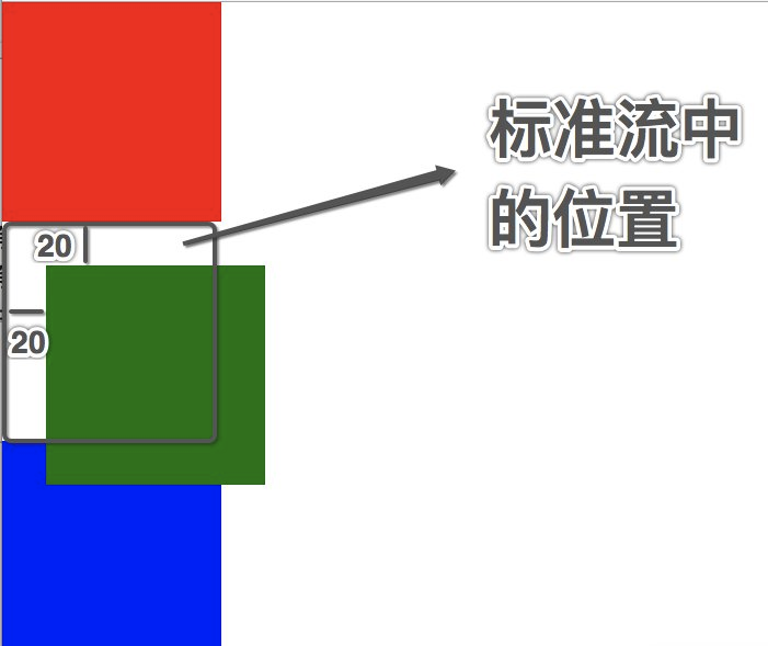
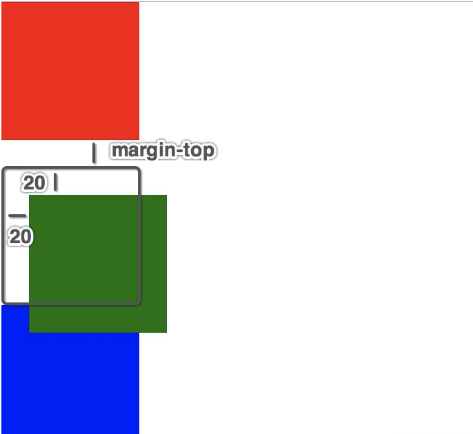
#1 在相对定位中同一个方向上的定位属性只能使用一个
  top/bottom 只能用一个
  left/right 只能用一个
#2 相对定位是不脱离标准流的,会继续在标准流中占用一份空间
#3 由于相对定位是不脱离标准流的,所以在相对定位中是区分块级、行内、行内块级元素的
#4 由于相对定位是不脱离标准流的,并且相对定位的元素会占用标准流中的位置,所以当给相对定位的元素设置margin/padding
等属性时会影响到标准流的布局,即,给相对定位的标签设置marin或padding,是以该标签原来的位置为基础来进行偏移的
<!DOCTYPE html>
<html lang="en">
<head>
    <meta charset="UTF-8">
    <title></title>

    <style>
        * {
            margin:0;
            padding:0;
        }

        div {
            width: 100px;
            height: 100px;
        }

        .box1 {
            background-color: red;
        }

        .box2 {
            background-color: green;
            position: relative;
            top: 20px;
            left: 20px;

            /*相对于该标签原来的位置进行偏移*/
            margin-top: 50px;

        }

        .box3 {
            background-color: blue;
        }

    </style>
</head>
<body>

<div class="box1"></div>
<div class="box2"></div>
<div class="box3"></div>


</body>
</html>
1.2 相对对位的应用场景
#1、用于对元素进行微调
#2、配合后面学习的绝对定位来使用
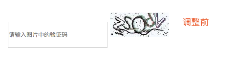
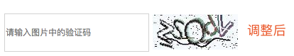
<!DOCTYPE html>
<html lang="en">
<head>
    <meta charset="UTF-8">
    <title></title>

    <style>
        * {
            margin:0;
            padding:0;
        }

        input {
            width: 200px;
            height: 50px;
        }

        input:focus {
          outline: none;
          background-color: #eee;
        }

        img {
            height: 50px;
            position: relative;
            top: 20px;
        }
    </style>
</head>
<body>

<input type="text" name="call" placeholder="请输入图片中的验证码">
<img src="call.jpeg" alt="">


</body>
</html>
2、绝对定位就是相对于body或者某个定位流中的祖先元素来定位
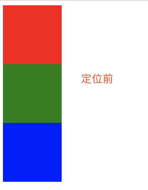
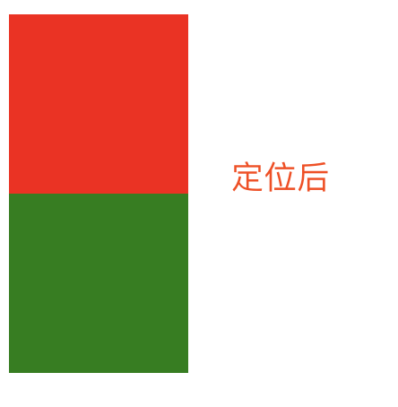
<!DOCTYPE html>
<html lang="en">
<head>
    <meta charset="UTF-8">
    <title></title>
    <style>
        div {
            width: 100px;
            height: 100px;
        }

        .box1 {
            background-color: red;
        }
        .box2 {
            position: absolute;
            /*left: 0;*/
            /*top: 10px;*/
            background-color: green;

        }
        .box3 {
            background-color: blue;
        }
    </style>
</head>
<body>
<div class="box1"></div>
<div class="box2"></div>
<div class="box3"></div>

</body>
</html>
2.1 绝对定位的参考点
#1、默认情况下所有的绝对定位的元素,无论有无祖先元素,都会以body作为参考点

#2、如果一个绝对定位的元素有祖先元素,并且祖先元素也是定位流,那么这个绝对定位的元素就会以定位流的那个祖先元素作为参考点
2.1 只要是这个绝对定位元素的祖先元素都可以

2.2 祖先必须是定位流,此处的定位流指的是绝对定位、相对定位、固定定位(定位流中只有静态定位不行)

2.3、如果一个绝对定位的元素有祖先元素,而且祖先元素中有多个元素都是定位流,那么这个绝对定位的元素会以离它最近的那个定位流的祖先元素为参考点
<!DOCTYPE html>
<html lang="en">
<head>
    <meta charset="UTF-8">
    <title></title>
    <style>

        * {
            margin: 0;
            padding: 0;
        }

        .box1 {
            width: 100px;
            height: 100px;
            background-color: red;

            position: absolute;
            right: 0;
            bottom: 0;

        }

        .box2 {
            width: 2000px;
            height: 100px;
            background-color: green;
        }

        .box3 {
            width: 100px;
            height: 2000px;
            background-color: blue;
        }


    </style>
</head>
<body>

<div class="box1"></div>
<div class="box2"></div>
<div class="box3"></div>


</body>
</html>
<!DOCTYPE html>
<html lang="en">
<head>
    <meta charset="UTF-8">
    <title></title>
    <style>
        * {
            margin: 0;
            padding: 0;
        }

        .box1 {
            width: 300px;
            height: 300px;
            background-color: red;
            position: absolute;
            /*position: relative;*/
            /*position: fixed;*/
            /*position: static;*/
        }
        .box2 {
            width: 200px;
            height: 200px;
            background-color: green;
            /*position: absolute;*/
            /*position: relative;*/
            /*position: fixed;*/
            /*position: static;*/

            /*left: 200px;*/
            /*bottom: 200px;*/

        }

        .box3 {
            width: 100px;
            height: 100px;
            background-color: blue;
            position: absolute;
            right: 0;
            bottom: 0;

        }

    </style>
</head>
<body>

<div class="box1">
    <div class="box2">
        <div class="box3"></div>
    </div>
</div>


</body>
</html>
2.1 绝对定位的注意点
#1、绝对定位的元素是脱离标准流的,所以绝对定位的元素不区分块级元素/行内元素/行内块级元素
#2、如果一个绝对定位的元素是以body作为参考点, 那么其实是以网页首屏的宽度和高度作为参考点, 而不是以整个网页的宽度和高度作为参考点,会相对于body定位会随着页面的滚动而滚动
#3、一个绝对定位的元素会忽略祖先元素的padding
<!DOCTYPE html>
<html lang="en">
<head>
    <meta charset="UTF-8">
    <title></title>
    <style>

        * {
            margin: 0;
            padding: 0;
        }

        .box1 {
            width: 100px;
            height: 100px;
            background-color: red;

            position: absolute;


        }


    </style>
</head>
<body>

<span class="box1"></span>


</body>
</html>
<!DOCTYPE html>
<html lang="en">
<head>
    <meta charset="UTF-8">
    <title></title>
    <style>

        * {
            margin: 0;
            padding: 0;
        }

        .box1 {
            width: 100px;
            height: 100px;
            background-color: red;

            position: absolute;
            right: 0;
            bottom: 0;

        }

        .box2 {
            width: 2000px;
            height: 100px;
            background-color: green;
        }

        .box3 {
            width: 100px;
            height: 2000px;
            background-color: blue;
        }


    </style>
</head>
<body>

<div class="box1"></div>
<div class="box2"></div>
<div class="box3"></div>


</body>
</html>
<!DOCTYPE html>
<html lang="en">
<head>
    <meta charset="UTF-8">
    <title></title>
    <style>

        * {
            margin: 0;
            padding: 0;
        }

        .box1 {
            width: 100px;
            height: 100px;
            background-color: red;

            padding: 20px;

        }
        .box2 {
            width: 50px;
            height: 50px;
            background-color: yellow;
            position: absolute;
            left: 0;
            top: 0;
        }


    </style>
</head>
<body>

<div class="box1">
    <div class="box2"></div>
</div>

</body>
</html>
2.3 绝对定位水平居中
#1.注意当一个盒子绝对定位之后不能使用margin: 0 auto;让盒子自身居中
#2.如果想让过一个绝对定位的盒子自身居中, 可以使用left: 50%; margin-left:-元素宽度一半px;
<!DOCTYPE html>
<html lang="en">
<head>
    <meta charset="UTF-8">
    <title></title>
    <style>

        * {
            margin: 0;
            padding: 0;
        }

        .box1 {
            width: 200px;
            height: 50px;
            background-color: red;

            position: absolute;
            left: 50%;
            margin-left: -100px;

        }


    </style>
</head>
<body>
<div class="box1"></div>
</body>
</html>
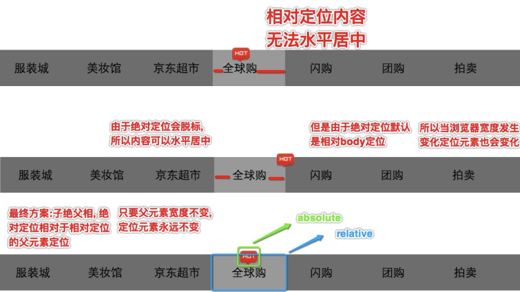
2.4 绝对定位的应用场景
#1、用于对元素进行微调
#2、配合相对定位来使用
企业开发中一般相对定位和绝对定位都是一起出现, 很少单独使用===>子绝父相
那为何要用子绝父相呢,请看下图
练习1:
<!DOCTYPE html>
<html lang="en">
<head>
    <meta charset="UTF-8">
    <title></title>
    <style>

        * {
            margin: 0;
            padding: 0;
        }

        ul {
            width: 800px;
            height: 50px;
            list-style: none;
            margin: 0 auto;
        }

        ul li {
            float: left;
            width: 100px;
            /*height: 50px;*/
            line-height: 50px;
            text-align: center;
        }

        a {
            display: inline-block;
            text-decoration: none;
            width: 100px;
            height: 50px;
            background-color: #5c5c62;

        }

        a:link {
            color: white;
        }

        a:visited {
            color: #b9950c;
        }

        a:hover{
            background-color: yellow;

        }

        a:hover {
            color: #55BBBB;
        }

        a:active {
            background-color: #003399;
        }

        ul li:nth-of-type(4) {
            position: relative;
        }

        img {
            width: 35px;

            /*
            相对定位弊端
            相对定位不会脱离标准流
            会继续在标准流中占用一份空间
            所以不利于布局界面
            */
            /*position: relative;*/
            /*top: -60px;*/
            /*left: 30px;*/


            /*
            绝对定位弊端
            绝对定位会脱离标准流,
            不会继续在标准流中占用一份空间

            但问题是默认情况下绝对定位的元素会以body为参考点

            所以会随着浏览器的宽度高度的变化而变化
            */
            /*
            position: absolute;
            top: 0px;
            left: 608px;
            */


            /*
            子绝父相
            子元素用绝对定位,父元素用相对定位
            */
            position: absolute;
            right: 0;
            top: 0;
        }


    </style>
</head>
<body>
    <ul>
        <li>
            <a href="#">服装城</a>
        </li>
        <li>
            <a href="#">美妆馆</a>
        </li>
        <li>
            <a href="#">京东超市</a>
        </li>
        <li>
            <a href="#">全球购</a>
            <img src="https://images2018.cnblogs.com/blog/1036857/201805/1036857-20180515210447998-344384162.png" alt="">
        </li>
        <li>
            <a href="#">闪购</a>
        </li>
        <li>
            <a href="#">团购</a>
        </li>
        <li>
            <a href="#">拍卖</a>
        </li>
        <li>
            <a href="#">金融</a>
        </li>
    </ul>
</body>
</html>
练习2:轮播图

<!--<!DOCTYPE html>--> <!--<html lang="en">--> <!--<head>--> <!--<meta charset="UTF-8">--> <!--<title></title>--> <!--<style>--> <!--* {--> <!--margin: 0;--> <!--padding: 0;--> <!--}--> <!--.box1 {--> <!--width: 300px;--> <!--height: 300px;--> <!--background-color: red;--> <!--position: absolute;--> <!--/*position: relative;*/--> <!--/*position: fixed;*/--> <!--/*position: static;*/--> <!--}--> <!--.box2 {--> <!--width: 200px;--> <!--height: 200px;--> <!--background-color: green;--> <!--/*position: absolute;*/--> <!--/*position: relative;*/--> <!--/*position: fixed;*/--> <!--/*position: static;*/--> <!--/*left: 200px;*/--> <!--/*bottom: 200px;*/--> <!--}--> <!--.box3 {--> <!--width: 100px;--> <!--height: 100px;--> <!--background-color: blue;--> <!--position: absolute;--> <!--right: 0;--> <!--bottom: 0;--> <!--}--> <!--</style>--> <!--</head>--> <!--<body>--> <!--<div class="box1">--> <!--<div class="box2">--> <!--<div class="box3"></div>--> <!--</div>--> <!--</div>--> <!--</body>--> <!--</html>--> <!DOCTYPE html> <html lang="en"> <head> <meta charset="UTF-8"> <title></title> <style> * { margin: 0; padding: 0; } div { width: 590px; height: 470px; border: 2px solid gold; margin: 0 auto; margin-top: 100px; position: relative; background-color: green; } span { display: block; width: 40px; /*height: 80px;*/ background-color: rgba(0,0,0,0.3); margin-top: 10px; font-size: 50px; color: white; text-align: center; line-height: 80px; } .leftArrow { position: absolute; left: 0px; top:200px; } .rightArrow { position: absolute; right: 0px; top:200px; } ol { list-style: none; width: 200px; height: 40px; background-color: rgba(255,255,255,0.7); position: absolute; right: 10px; bottom:7px; } ol li { width: 40px; /*height: 40px;*/ float: left; border: 1px solid gold; box-sizing: border-box; text-align: center; line-height: 40px; } </style> </head> <body> <div> <img src="https://images2018.cnblogs.com/blog/1036857/201805/1036857-20180515224016405-1306758469.jpg" alt=""> <span class="leftArrow"><</span> <span class="rightArrow">></span> <ol> <li>1</li> <li>2</li> <li>3</li> <li>4</li> <li>5</li> </ol> </div> </body> </html>
练习3:团购界面


<!DOCTYPE html>
<html lang="en">
<head>
    <meta charset="UTF-8">
    <title></title>
    <style>
        * {
            margin: 0;
            padding: 0;
        }

        div {
            width: 300px;
            height: 300px;
            border: 2px solid #ccc;
            margin: 0 auto;
            margin-top: 100px;

            position: relative;
        }

        div img {
            width: 300px;
            height: 200px;
        }

        div .rx {
            width: 60px;
            height: 60px;

            position: absolute;
            left: 0px;
            top: 0px;

        }

        div .star {
            width: 70px;
            height: 15px;

            position: absolute;
            left: 0px;
            top: 205px;
        }

        div p {
            padding-top: 25px;
        }
    </style>
</head>
<body>

<div>
    <img src="https://images2018.cnblogs.com/blog/1036857/201805/1036857-20180515224158063-1650448180.jpg" alt="">
    <img src="https://images2018.cnblogs.com/blog/1036857/201805/1036857-20180515224206323-1896837444.png" alt="" class="rx">
    <img src="https://images2018.cnblogs.com/blog/1036857/201805/1036857-20180515224212575-1236813022.png" alt="" class="star">
    <p>
        多店通用】必胜客欢乐餐厅
        150元代金券!免费WiFi!
    </p>

</div>

</body>
</html>
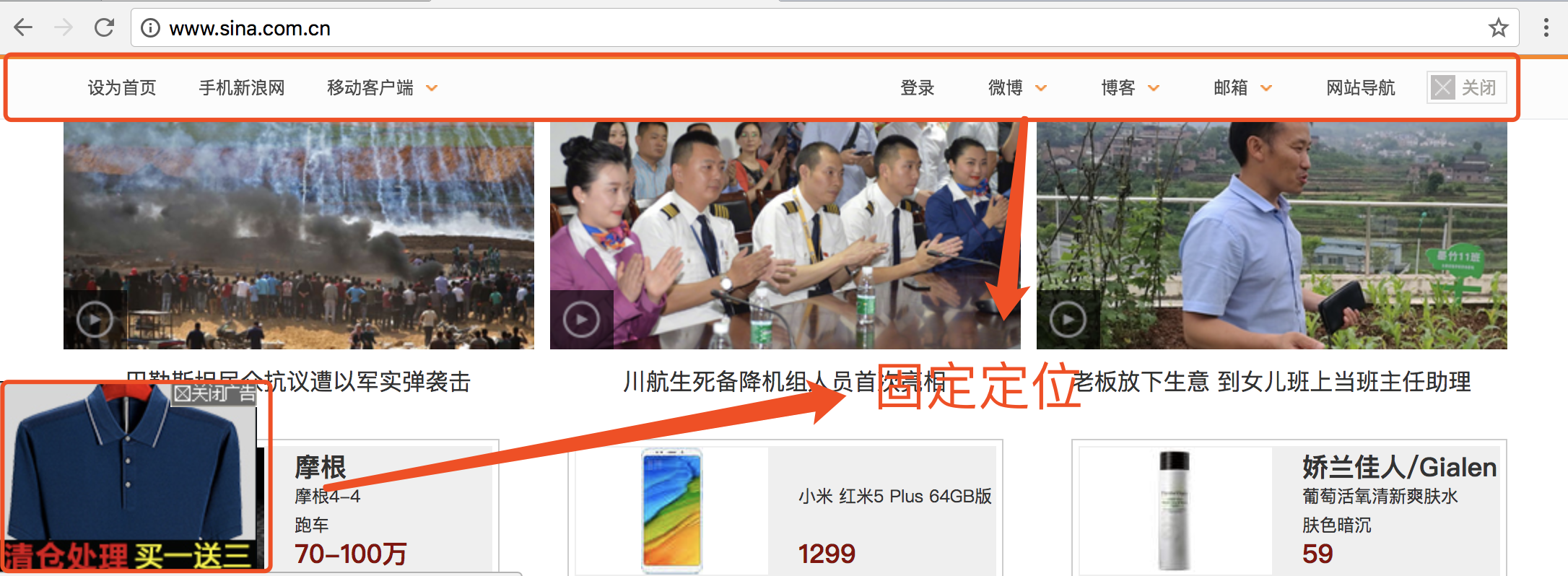
3、固定定位
#1、固定定位(和绝对定位高度相似,和背景的关联方式也高度相似)
背景的关联方式background-attachment: fixed;可以让图片不随着滚动条的滚动而滚动
而固定定位可以让某一个元素不随着滚动条的滚动而滚动

#2、注意点
    1、固定定位,就是相对浏览器窗口定位。页面如何滚动,这个盒子显示的位置不变。
    2、固定定位的元素是脱离标准流的,不会占用标准流中的空间
    3、固定定位和绝对定位一样不区分行内、块级、行内块级
    4、E6不支持固定定位
<!DOCTYPE html>
<html lang="en">
<head>
    <meta charset="UTF-8">
    <title></title>

    <style>
        * {
            margin: 0;
            padding: 0;
        }


        .bg {
            width: 600px;
            height: 1000px;
            border: 1px solid #000;
            background-image: url("https://images2018.cnblogs.com/blog/1036857/201805/1036857-20180515224016405-1306758469.jpg");
            background-repeat: no-repeat;
            background-attachment: fixed;
        }


        div {
            width: 100px;
            height: 100px;
        }

        .box1 {
            background-color: red;
        }

        .box2 {
            border: 1px solid #000;
            border-radius: 50%;
            text-align: center;
            line-height: 100px;

            background-color: green;
            position: fixed;
            right: 0;
            bottom: 0;
        }

        .box3 {
            background-color: blue;
        }

        .box4 {
            background-color: yellow;
            height: 2000px;
        }


    </style>


</head>
<body>

<div class="bg"></div>

<div class="box1"></div>
<div class="box2">回到顶部</div>
<div class="box3"></div>
<div class="box4"></div>
</body>
</html>
固定定位应用场景
- 网页对联广告
- 网页头部通栏(穿透效果)
4、静态定位
#1、什么是静态定位?
默认情况下标准流中的元素position属性就等于static, 所以静态定位其实就是默认的标准流
5、z-index
#1、z-index属性:用于指定定位的元素的覆盖关系
    1.1、z-index值表示谁压着谁。数值大的压盖住数值小的。

    1.2、只有定位了的元素,才能有z-index值。也就是说,不管相对定位、绝
            对定位、固定定位,都可以使用z-index值。而浮动的东西不能用。

    1.3、z-index值没有单位,就是一个正整数。默认的z-index值是0。

    1.4、如果大家都没有z-index值(默认所有元素z-index值为0),或者z-
           index值一样,那么谁写在HTML后面,谁在上面能压住别人。定位了
           的元素,永远能够压住没有定位的元素。

#2、注意点:从父现象(父亲怂了,儿子再牛逼也没用)
    父元素没有z-index值, 那么子元素谁的z-index大谁盖住谁
    父元素z-index值不一样, 那么父元素谁的z-index大谁盖住谁
<!DOCTYPE html>
<html lang="en">
<head>
    <meta charset="UTF-8">
    <title></title>

    <style>
        * {
            margin: 0;
            padding: 0;
        }

        /*div  {*/
            /*width: 100px;*/
            /*height: 100px;*/
        /*}*/

        /*.box1 {*/
            /*background-color: red;*/
            /*position: relative;*/
            /*top: 0px;*/
            /*left: 0px;*/

            /*!*z-index: 3;*!*/
        /*}*/

        /*.box2 {*/
            /*background-color: green;*/
            /*position: absolute;*/
            /*top: 50px;*/
            /*left: 50px;*/

            /*!*z-index: 2;*!*/
        /*}*/

        /*.box3 {*/
            /*background-color: blue;*/
            /*position: fixed;*/
            /*left: 100px;*/
            /*top: 100px;*/

            /*!*z-index: 1;*!*/
        /*}*/


        .father1 {
            width: 200px;
            height: 200px;
            background-color: red;


            position: relative;
            z-index: 5;
        }

        .father2 {
            width: 200px;
            height: 200px;
            background-color: green;

            position: relative;
            z-index: 4;
        }

        .son1 {
            width: 100px;
            height: 100px;
            background-color: blue;
            position: absolute;
            left: 200px;
            top: 200px;

            z-index: 1;


        }
        .son2 {
            width: 100px;
            height: 100px;
            background-color: yellow;
            position: absolute;
            left: 250px;
            /*top: 250px;*/

            z-index: 2;
            top: 50px;

        }

    </style>
</head>
<body>


<!--<div class="box1"></div>-->
<!--<div class="box2"></div>-->
<!--<div class="box3"></div>-->


<div class="father1">
    <div class="son1"></div>
</div>


<div class="father2">
    <div class="son2"></div>
</div>
</body>
</html>
五 练习
<!doctype html>
<html lang="zh">
<head>
    <meta charset="UTF-8">
    <title>Document</title>
    <style>
        * {
            margin: 0;
            padding: 0;
        }

        .clearfix {
            *zoom:1
        }

        .clearfix:before,.clearfix:after {
            content: " ";
            display: table
        }

        .clearfix:after {
            clear: both
        }

        .left {
            /*display: none;*/
            width: 20%;
            height: 100%;
            background-color: rgb(77,77,77);
            position: fixed;
            top: 0;
            left: 0;
            color: darkgrey;
        }
        .left .header-img {
            width: 120px;
            height: 120px;
            border: 5px solid white;
            border-radius: 50%;

            overflow: hidden;
            margin: 20px auto;
        }
        .left .header-img img {
            max-width: 120px;
        }

        .left .blog-title {
            text-align: center;
        }
        .left .blog-info {
            font-size: 12px;
            text-align: center;
            margin-top: 10px;
        }

        ul li {
            list-style: none;
        }

        a {
            text-decoration: none;
        }

        .blog-link,.blog-tag {
            margin-top: 20px;
            text-align: center;

            /*width: 100px;*/
            /*border: 5px solid #000;*/
            /*margin: 0 auto;*/
        }

        .blog-link a,.blog-tag a{
            color: darkgrey;
        }

        .blog-link a:hover,.blog-tag a:hover{
            color: white;
            font-size: 14px;
        }

        .right {
            width: 80%;
            height: 1000px;
            background-color: #eee;
            float: right;


        }
        .article-list {
            padding-left: 50px;
            width: 80%;
        }
        .article-list .article {
            background-color: white;
            margin-top: 20px;

            box-shadow: 3px 3px 3px rgba(0,0,0,0.2);
        }
        .article-list .article *{
            padding: 10px;
        }

        .article-list .article .article-header p {
            float: left;
            font-size: 24px;
            font-weight: bold;

            border-left: 5px solid red;
        }
        .article-list .article .article-header span {
            float: right;
            margin: 10px 0;
        }

        .article-list .article .article-info {
            border-bottom: 1px solid darkgrey;
        }

    </style>
</head>
<body>

<div class="left">
    <div class="header-img">
        <img src="o_tx.jpg" alt="">
    </div>
    <div class="blog-title">
        <p>我的博客</p>
    </div>
    <div class="blog-info">
        <p>这个人很懒,什么都没留下</p>
    </div>
    <div class="blog-link">
        <ul>
            <li><a href="#">关于我</a></li>
            <li><a href="#">微博</a></li>
            <li><a href="#">公众号</a></li>
        </ul>
    </div>

    <div class="blog-tag">
        <ul>
            <li><a href="#">JavaScript</a></li>
            <li><a href="#">Python</a></li>
            <li><a href="#">Golang</a></li>
        </ul>
    </div>

</div>
<div class="right">
    <div class="article-list">
        <div class="article">
            <div class="article-header clearfix">
                <p>海燕</p>
                <span>2018-07-03</span>
            </div>
            <div class="article-info">
                <p>在苍茫的大海上,狂风卷积着乌云。在乌云和大海之间,海燕像黑色的闪电,在高傲的飞翔</p>

            </div>
            <div class="article-tag">
                <span># HTML</span>
                <span># CSS</span>
            </div>
        </div>
    </div>
</div>
</body>
</html>

 浙公网安备 33010602011771号