CSS技巧收集——毛玻璃效果
毛玻璃的模糊效果技术使用 css 的filter中的 blur 属性。
即:
filter: blur(20px)
线上demo:https://my.weblf.cn/alone_page/pages/filter_blur.html
代码:
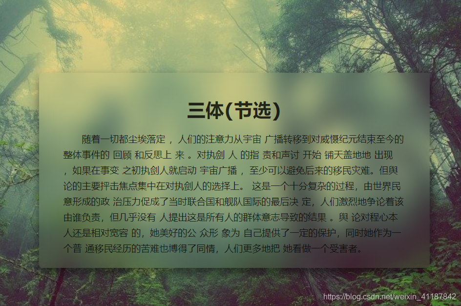
<html>
<head>
    <meta http-equiv="pragma" content="no-cache">
    <meta http-equiv="Cache-Control " content="no-cache,must-revalidate">
    <meta name="description" content="">
    <meta http-equiv="content-type" content="text/html; charset=UTF-8" />
    <meta name="viewport" content="width=device-width, user-scalable=no, initial-scale=1, maximum-scale=1">
    <title>css毛玻璃效果</title>
</head>
<body>
    <div class="container">
        <div class="content">
            <h1>三体(节选)</h1>
            <p>随着一切都尘埃落定 ,人们的注意力从宇宙 广播转移到对威慑纪元结束至今的整体事件的 回顾 和反思上 来 。对执剑 人 的指 责和声讨 开始 铺天盖地地 出现 ,如果在事变 之初执剑人就启动 宇宙广播 ,至少可以避免后来的移民灾难。但舆 论的主要抨击焦点集中在对执剑人的选择上。 这是一个十分复杂的过程,由世界民意形成的政 治压力促成了当时联合国和舰队国际的最后决 定,人们激烈地争论着该由谁负责,但几乎没有 人提出这是所有人的群体意志导致的结果 。舆 论对程心本人还是相对宽容 的,她美好的公 众形 象为 自己提供了一定的保护,同时她作为一个普 通移民经历的苦难也博得了同情,人们更多地把 她看做一个受害者。</p>
        </div>
    </div>
</body>
<style>
  html, body, div, h1, h2, h3, h4, h5, h6, p, span, img, input {
    margin: 0;
    padding: 0;
}

html, body {
    font-size: 19px;
    font-family: 'Verdana','Arial';
    color: rgba(0,0,0,0.8);
}

.container {
    width: 100%;
    height: 100%;
    position: relative;
    background-image: url('../statics/images/tree.jpg');
    background-position: center top;
    background-size: cover;
}

.content {
    width: 800px;
    height: 400px;
    position: absolute;
    top: 50%;
    left: 50%;
    margin-top: -200px;
    margin-left: -400px;
    border-radius: 8px;
    box-shadow: 0 10px 20px rgba(0,0,0,0.5);
    overflow: hidden;
    z-index: 2;
    padding: 50px;
    box-sizing: border-box;
}
/* 通过给背景添加模糊效果使其不会模糊容器内荣,即文字 */
.content::before {
    content: '';
    position: absolute;
    top: 0;
    left: 0;
    right: 0;
    bottom: 0;
    -webkit-filter: blur(20px);
    -moz-filter: blur(20px);
    -ms-filter: blur(20px);
    -o-filter: blur(20px);
    filter: blur(20px);
  z-index: -3;
  /* 将距离限制于容器内部,防止边缘虚化 */
    margin: -30px;
    background-image: url('../statics/images/tree.jpg');
  background-position: center top;
  /* 把背景图像扩展至足够大,以使背景图像完全覆盖背景区域。 */
  background-size: cover;
  /* 固定的背景图像 */
    background-attachment: fixed;
}

.content h1 {
    text-align: center;
    margin-bottom: 20px;
}

.content p {
    text-indent: 2em;
    line-height: 1.7;
}
</style>
</html>
效果:

 浙公网安备 33010602011771号