Day6
一、Tables——表格
1、 table-layout——表格布局
| auto | 这是默认值。它定义了要由其“单元格”的内容来确定的表的布局 |
| fixed | 此值设置由提供给表的宽度属性确定的表布局。如果单元格的内容超过此宽度,则该单元格将不会调整大小,而是让内容溢出。 |
|
collapse
|
此值将表的边界合并在一起,而不是不同的。(如果不使用,就默认分离表格) |
|
<length>
|
这是默认行为,尽管确切的值可能因浏览器而不同。 |
|
<length> <length>
|
此语法允许分别指定单独的水平值和垂直值 |
|
top
|
这是默认值。它将标题放在表格的上方。 |
|
bottom
|
此值会将标题放在表的下面。 |
二、Transitions——过渡变迁
1、Transition shorthand——过渡速记
代码:
<head>
    <meta charset="utf-8">
    <style>
        div {
            width: 150px;
            height: 150px;
            background-color: red;
            transition: background-color 1s;
        }

        div:hover {
            background-color: green;
        }
    </style>
</head>

<body>
    <div>
    </div>
</body>
实现:
2、Transition (longhand)——过渡段(长距)
代码:
<head>
    <meta charset="utf-8">
    <style>
        div {
            height: 100px;
            width: 100px;
            border: 1px solid;
            transition-property: height, width;
            transition-duration: 1s, 500ms;
            transition-timing-function: linear;
            transition-delay: 0s, 1s;
        }

        div:hover {
            height: 200px;
            width: 200px;
        }
    </style>
</head>

<body>
    <div>
    </div>
</body>
实现:
三、Animations
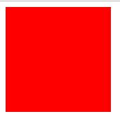
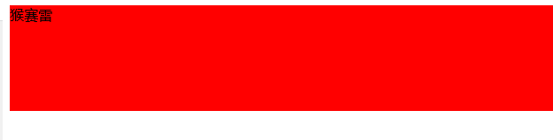
1、Animations with the transition property——具有过渡性的动画
本来以为自己编译错了,因为没有出现红色的过渡性动画。因为过渡性动画是那种闪过的动画,没有想到居然是这种点击才有的动画。
代码:
<head>
    <meta charset="utf-8">
    <style>
        .Example {
            height: 100px;
            background: #fff;
        }

        .Example:hover {
            height: 120px;
            background: #ff0000;
        }
    </style>
</head>

<body>
    <div class="Example">
    </div>
</body>
实现:
四、二维转换
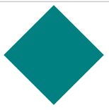
1、Rotate——旋转
代码:
<head>
    <meta charset="utf-8">
    <style>
        .rotate {
            margin: 25px 20px;
            width: 100px;
            height: 100px;
            background: teal;
            transform: rotate(45deg);
        }
    </style>
</head>

<body>
    <div class="rotate">
    </div>
</body>
实现:
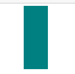
2、Scale
代码:
<style>
        .rotate {
            margin: 20px;
            width: 100px;
            height: 100px;
            background: teal;
            transform: scale(0.5, 1.3);
        }
    </style>
实现:
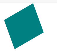
3、Skew
代码:
<style>
        .rotate {
            margin: 30px;
            width: 100px;
            height: 100px;
            background: teal;
            transform: skew(20deg, -30deg);
        }
</style>
实现:
五、3D转换
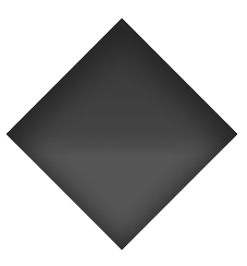
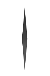
1、Compass pointer or needle shape using 3D transforms ——指南针指针或针头使用三维变换的形状
代码:
<style>
        .transform {
            margin: 100px;
            height: 150px;
            width: 150px;
            transform:rotateY(85deg) rotateZ(45deg);//此行删除,呈现正方形,去掉rotateY呈现菱形,最后呈现最后一个图
            background-image: linear-gradient(to top left, #555 0%, #555 40%, #444 50%, #333 97%);//颜色梯度
            box-shadow: inset 6px 6px 22px 8px #272727;
        }
</style>
实现:

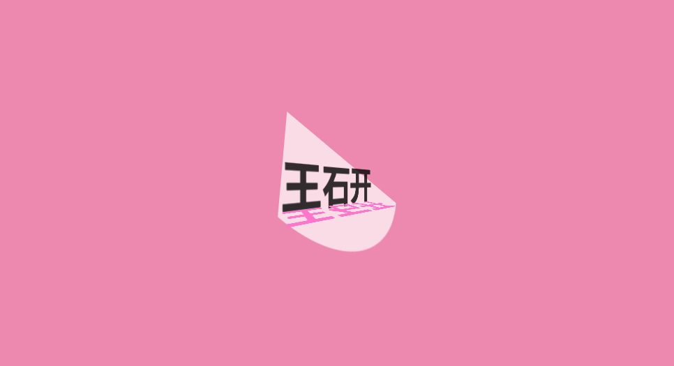
2、3D text effect with shadow——3D文本等与阴影
代码:
<head>
    <meta charset="utf-8">
    <style>
        * {
            margin: 0;
            padding: 0;
        }

        html,
        body {
            height: 100%;
            width: 100%;
            overflow: hidden;
            background: #ed89af;//背景
        }

        #title {
            position: absolute;
            top: 50%;
            left: 50%;
            transform: translate(-50%, -50%);
            perspective-origin: 50% 50%;
            perspective: 300px;
        }

        h1 {
            text-align: center;
            font-size: 12vmin;
            font-family: 'Open Sans', sans-serif;
            color: rgba(0, 0, 0, 0.8);
            line-height: 1em;
            transform: rotateY(50deg);
            perspective: 150px;
            perspective-origin: 0% 50%;
        }

        h1:after {
            content: attr(data-content);
            position: absolute;
            left: 0;
            top: 0;
            transform-origin: 50% 100%;
            transform: rotateX(-90deg);
            color: #fd76cc;
        }

        #title:before {
            content: '';
            position: absolute;
            top: -150%;
            left: -25%;
            width: 180%;
            height: 328%;
            background: rgba(255, 255, 255, 0.7);
            transform-origin: 0 100%;
            transform: translatez(-200px) rotate(40deg) skewX(35deg);
            border-radius: 0 0 100% 0;
        }
    </style>
</head>

<body>
    <div id="title">
        <h1 data-content="王石开">王石开</h1>
    </div>
</body>
实现:
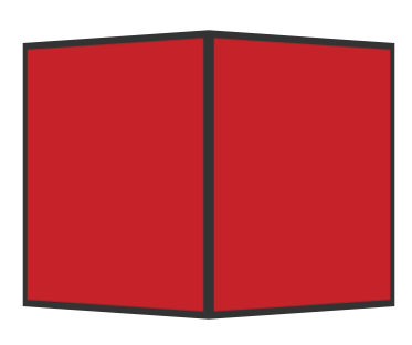
3、背景不可见性
代码:
<head>
    <meta charset="utf-8">
    <style>
        body {
            perspective-origin: 50% 100%;
            perspective: 1500px;
            overflow: hidden;
        }

        .cube {
            position: relative;
            padding-bottom: 20%;
            transform-style: preserve-3d;
            transform-origin: 50% 100%;
            transform: rotateY(45deg) rotateX(0);
        }

        .cubeFace {
            position: absolute;
            top: 0;
            left: 40%;
            width: 20%;
            height: 100%;
            margin: 0 auto;
            transform-style: inherit;
            background: #C52329;
            box-shadow: inset 0 0 0 5px #333;
            transform-origin: 50% 50%;
            transform: rotateX(90deg);
            backface-visibility: hidden;
        }

        .face2 {
            transform-origin: 50% 50%;
            transform: rotatez(90deg) translateX(100%) rotateY(90deg);
        }

        .cubeFace:before,
        .cubeFace:after {
            content: '';
            position: absolute;
            width: 100%;
            height: 100%;
            transform-origin: 0 0;
            background: inherit;
            box-shadow: inherit;
            backface-visibility: inherit;
        }

        .cubeFace:before {
            top: 100%;
            left: 0;
            transform: rotateX(-90deg);
        }

        .cubeFace:after {
            top: 0;
            left: 100%;
            transform: rotateY(90deg);
        }
    </style>
</head>

<body>
    <div class="cube">
        <div class="cubeFace"></div>
        <div class="cubeFace face2"></div>
       </div>
</body>
实现:

 浙公网安备 33010602011771号