


CSS3学习笔记(4)—上下滑动展开的按钮
最近写了一个动画,下面来看看我以前写的一个上下滑动展开的按钮效果:
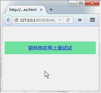
这类的效果经常会在一些网站页面下载按钮处看到,当你鼠标悬浮在下载按钮时,会提醒你是否已注册,或者点击登录什么的小提示~~~~~
一、页面的主体布局
<!DOCTYPE html>
<html>
    <head>
        <meta charset="utf-8" />
        <title></title>
        <link type="text/css" rel="stylesheet" href="css/both_slid_menu.css" />
    </head>
    <body>
        <div class="both_sild_menu">
            <div class="sild_top">我是上面</div>
            <a href="#" target="_blank">鼠标放在我上面试试</a>
            <div class="sild_bottom">我是下面</div>
        </div>
    </body>
</html>
布局就不多说了,很简单.
二、CSS样式(主要是CSS3)
先说一下动画的原理:
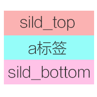
(1)先来布局,我是将三个DIV并列排出来,如下图:
(2)把sild_top和sild_bottom的两个子级按钮置于a标签按钮的下方,用定位里面的z-index属性
(3)然后sild_top和sild_bottom的两个子级按钮进行位移到a标签按钮正下方
(4)为sild_top和sild_bottom的两个子级按钮设置动画
.both_sild_menu{
    text-align: center;
    width: 300px;
}
.both_sild_menu .sild_top{
    text-decoration: none;
    padding: 10px;
    background-color: #6c987e;
    border-radius: 10px 10px 0 0;

    /*让它的位置在名为both_sild_menu a的底部,且隐藏起来*/
    transform: translate(0,40px);
    opacity: 0;                   /*置于底部后再让它透明度为0,不显示*/
    position: relative;
    z-index: 1;
}
.both_sild_menu a{
    display: block;
    text-decoration: none;
    padding: 10px;
    background-color: #7eedaa;
    position: relative;
    z-index: 2;    /*让它的位置在顶部*/
}
.both_sild_menu .sild_bottom{
    text-decoration: none;
    padding: 10px;
    background-color: #6c987e;
    border-radius: 0 0 10px 10px;

    /*让它的位置在名为both_sild_menu a的底部,且隐藏起来*/
    opacity: 0;
    transform: translate(0,-40px);
    position: relative;
    z-index: 1;

}
.both_sild_menu .sild_top,.both_sild_menu .sild_bottom{      /*给两个DIV设置动画的属性*/
    transition: all 0.2s ease-in-out 0s;
    -moz-transition: all 0.2s ease-in-out 0s;
    -ms-transition: all 0.2s ease-in-out 0s;
    -o-transition: all 0.2s ease-in-out 0s;
    -webkit-transition: all 0.2s ease-in-out 0s;
}

/*名为sild_top的div动画效果设置开始*/
.both_sild_menu:hover .sild_top{               /*当鼠标悬浮在框架上时,将名为sild_top的div透明度变为1*/
    opacity: 1;
}
.both_sild_menu:hover .sild_top{                /*当鼠标悬浮在框架上时,将名为sild_top的div从初始的Y轴40px移动到Y轴0px位置*/
    transform: translate(0,0);
    -moz-transform: translate(0,0);
    -o-transform: translate(0,0);
    -ms-transform: translate(0,0);
    -webkit-transform: translate(0,0);
}
/*名为sild_top的div动画效果设置结束*/

/*名为sild_bottom的div动效果设置画开始*/
.both_sild_menu:hover .sild_bottom{
    opacity: 1;
}
.both_sild_menu:hover .sild_bottom{
    transform: translate(0,0);
    -moz-transform: translate(0,0);
    -o-transform: translate(0,0);
    -ms-transform: translate(0,0);
    -webkit-transform: translate(0,0);
}
/*名为sild_bottom的div动画效果设置结束*/
原理我已经说的很清楚了,配合上面的程序应该很容易看出来吧.
个性签名:别低头,王冠会掉,别后退,梦想会碎~~~~~

 浙公网安备 33010602011771号