四、图片
一、图片制作多边形
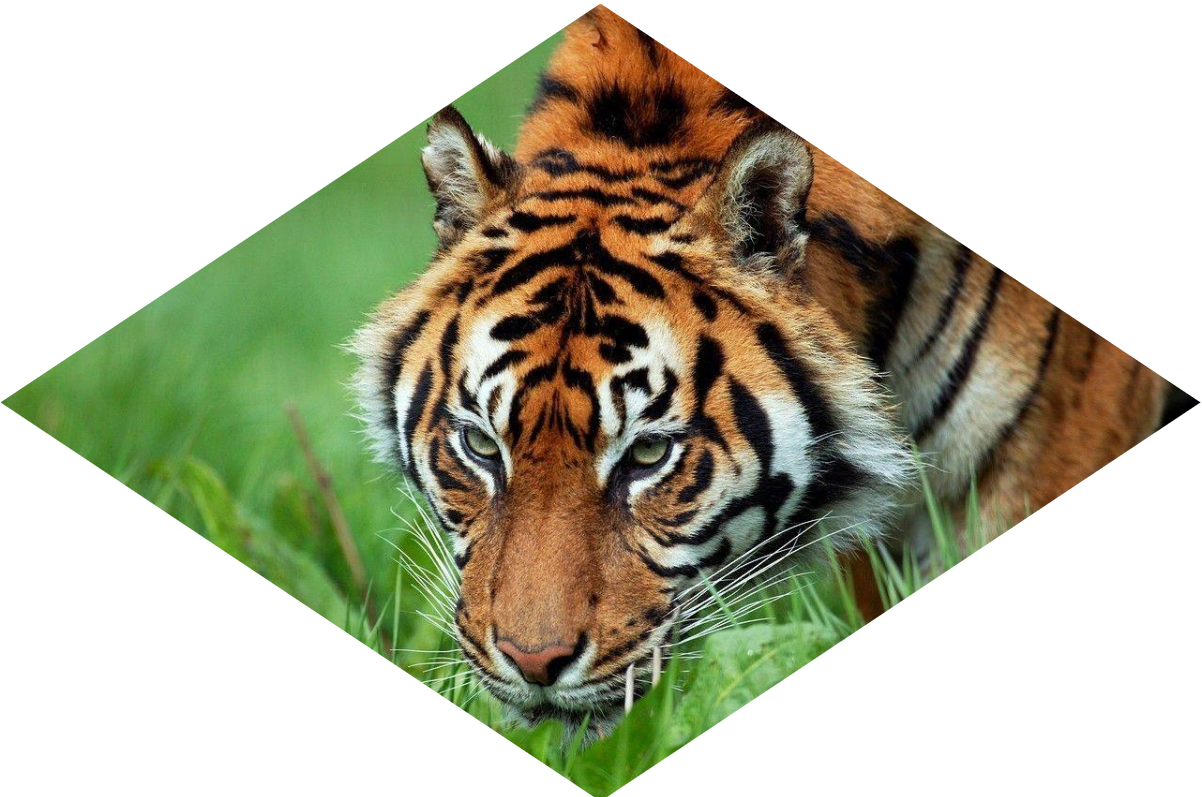
img {clip-path: polygon(50% 0, 100% 50%,50% 100%, 0 50%);}
二、添加动画效果
img {
50% 100%, 0 50%);transition: 1s clip-path;}
clip-path: polygon(50% 0, 100% 50%,
img:hover {clip-path: polygon(0 0, 100% 0,100% 100%, 0 100%);}
三、添加滤镜
1、混合滤镜
img {
transition: .5s filter;
filter: sepia(1) saturate(4) hue-rotate(295deg);
}
img:hover,img:focus{
filter: none;
}
2、混合模式一
HTML:
<a href="#a">
<img src="11.jpeg" alt="" width="200">
</a>
CSS:
a {
display: inline-block;
background: hsl(335, 100%, 50%);
}
img {
mix-blend-mode: luminosity;
}
a:hover {
background: none;
}
3、混合模式二
HTML:
<div></div>
CSS:
div {
width: 200px; height: 200px;
background-image: url(11.jpeg);
background-size: cover;
background-color: hsl(335, 100%, 50%);
background-blend-mode: luminosity;
transition: .5s background-color;
}
div:hover {
background-color: transparent;
}

 浙公网安备 33010602011771号