

三、伪类伪元素
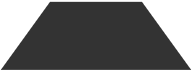
一、用伪元素做平行四边形

.button { position: relative; width: 100px; height: 100px; background-color: rgba(0,0,0,.0); margin: 100px; }
.button::before {content: '';position: absolute;top: 0;right: 0;bottom: 0;left: 0;z-index: -1;background: #58a;transform: skew(45deg);}
二、用伪元素做梯形
div {
width: 100px;
height: 50px;
position: relative;
display: inline-block;
padding: .5em 1em .35em;
color: wheat;
}
div::before {
content: '';
position: absolute;
top: 0; right: 0; bottom: 0; left: 0;
z-index: -1;
background: #333;
transform: perspective(.5em) rotateX(5deg);
}
三、带圆角的梯形
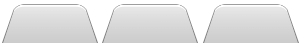
nav > a {
position: relative;
display: inline-block;
padding: .3em 1em 0;
}
nav > a::before {
content: '';
position: absolute;
top: 0;left: 0;right: 0;bottom: 0;
z-index: -1;
background: #cccccc;
background-image: linear-gradient(
hsla(0,0%,100%,.6),
hsla(0,0%,100%,0));
border: 1px solid rgba(0,0,0,.4);
border-bottom: none;
border-radius: .5em .5em 0 0;
box-shadow: 0 .15em white inset;
transform: perspective(.5em) rotateX(5deg);
transform-origin: bottom;
}
四、扇形
1、用伪元素制作扇形
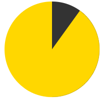
@keyframes spin {
to {
transform: rotate(.5turn);
}
}
@keyframes bg {
50% {
background: #333;
}
}
.pie {
position: relative;
width: 200px;
height: 200px;
border-radius: 50%;
background-color: gold;
background-image: linear-gradient(to right, transparent 50%, #333 0)
}
.pie::before {
content: '';
position: absolute;
top: 0;left: 50%;
display: block;
width: 50%;
height: 100%;
border-radius: 0 100% 100% 0 / 50%;
background-color: inherit;
transform-origin: left;
animation: spin 50s linear infinite,
bg 100s step-end infinite;
animation-play-state: paused;
/* animation-delay: inherit; */
animation-delay: -10s
}
五、进行文字换行
HTML:
<dl>
<dt>Name:</dt>
<dd>qingtian</dd>
<dt>Email:</dt>
<dd>111@qq.com</dd>
<dd>222@qq.com</dd>
</dl>
CSS:
dt,dd{
display: inline;
margin: 0;
}
dd + dt::before {
content: '';
display: block;
}
dd + dd::before {
content: ','
}

 浙公网安备 33010602011771号