第五模块 WEB开发基础之CSS
1 CSS介绍
CSS: cascading style sheet
用来控制网页样式, 并允许将样式代码与网页内容分离的一种标记性语言.
CSS的引入就是为了使得HTML的语言更好地适应页面的美工设计
为什么要使用CSS?
网页结构和样式混用让网页代码变得混乱不堪, 代码冗余增加了带宽负担, 代码维护也变得苦不堪言.
目前, CSS2.1对浏览器的兼容性最好.
CSS的优点:
节省时间
页面加载速度更快
易于维护
多设备兼容
2 快速认识CSS
采用以上方式代码冗余, 维护起来比较困难.
<!DOCTYPE html>
<html>
<head>
    <title>div标签</title>
</head>
<body>
    <p style="font-size: 30px;color: red;font-weight: bold;">哈哈哈哈</p>
</body>
</html>
所以出现了以下方式:
<!DOCTYPE html>
<html>
<head>
    <title></title>
    <style type="text/css">
        p{
            font-size: 30px;
            color: green;
            font-weight: bold;
        }
        /*对网页中的所有p标签的格式进行设置*/
    </style>
</head>
<body>
    <p>哈哈哈哈</p>
</body>
</html>
3 使用CSS的优势
<!DOCTYPE html>
<html>
<head>
    <title></title>
    <style type="text/css">
        span{
            color: green;
        }
    </style>
</head>
<body>
    <p>
        <span>小圆圈</span>帮助1000w人<span>高效学编程</span>
    </p>
    <!-- 样式尽量不要写在标签内部, 尽量把它分离出去 -->
</body>
</html>
4 CSS语法和注释规则
<!DOCTYPE html>
<html>
<head>
    <title></title>
    <style type="text/css">
        span{
            color: green;
        }
/*CSS的样式: 由选择符和声明构成
声明: 属性和值*/
/*注意不要进行注释嵌套*/
    </style>
</head>
<body>
    <p>
        <span>小圆圈</span>帮助1000w人<span>高效学编程</span>
    </p>
</body>
</html>
5 CSS的三种引入方式
<!--
1. 内联式(行内式)
2. 嵌入式
3. 外部式
开发中, 嵌入式使用非常少, 大部分使用内联式和外部式.
 -->
 <!DOCTYPE html>
 <html>
 <head>
     <title></title>
     <!-- 嵌入式 -->
     <style type="text/css">
         h3{
             color: green;
         }
     </style>
     <!-- 外部式 -->
     <link rel="stylesheet" type="text/css" href="CSS\index.css">
 </head>
 <body>
     <!-- 内联式 -->
     <p style="color: red;">文本颜色</p>
     <h3>苹果</h3>
     <h4>香蕉</h4>
 </body>
 </html>
6 三种引入方式的优缺点
内联式:
缺点: 容易产生重复代码; 不易于维护; 不符合标签结构与样式分离的规范;
优点: 不会额外产生请求.
尽量少用.
嵌入式:
缺点: 初步实现标签结构与样式分离, 但是代码复用不方便; 适用于单页面应用;
优点: 不会产生额外的请求.
不推荐使用.
外部式:
缺点: 会产生额外的请求.
优点: 便于后期维护; 可以重复使用; 完美实现标签结构与样式的分离.
推荐使用.
7 三种引入方式的优先级
如果对于同一标签同时设置了三种方式, 那么优先级是怎样的?
内联式 > 嵌入式 > 外部式 (前提: link写在style的后面)
由于网页的代码是从上到下解析的, 对于嵌入式和外部式, 后解析到谁, 就呈现谁的样式.
8 CSS的常用选择器介绍
选择符/选择器{
    样式1;
    样式2;
}

css选择器:
    1. 基础选择器
        -标签(元素)选择器
        -类(class)选择器
        -id(身份证号)选择器
    2. 高级选择器
        -后代选择器
        -子代选择器
        -组合选择器
        -交集选择器
        -伪类选择器
9 CSS选择器之标签选择器
对body中某类标签全部有效.
10 CSS选择器之ID选择器
#id选择器名称{
    样式;
}

示例:
#peiqi{
    color: green;
}
11 CSS选择器之类选择器
所有的标签都可以添加类选择器.
标签选择器可以选中全部的某个标签, 对其添加样式; 类选择器可以选中不同的标签, 对其添加样式.
一个标签中可以有多个类.
<h3 class="active title">苹果</h3>
     <!-- 注意: 两个类名之间要用空格隔开 -->
.类选择器名称{
    样式;
}

示例:
.active{
    color: green;
}
12 如何正确地玩好类选择器
不同标签中有共同的样式时, 建议使用类选择器.
<!DOCTYPE html>
<html>
<head>
    <title></title>
    <link rel="stylesheet" type="text/css" href="CSS\index.css">
</head>
<body>
    <p class="red">苹果</p>
    <p class="red round">西瓜</p>
    <p class="green round">猕猴桃</p>
</body>
</html>
.red{
    color: red;
}
.green{
    color: green;
}
.round{
    font-size: 30px;
}
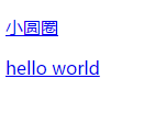
13 CSS 选择器之后代选择器
后代包括儿子, 孙子, 重孙子...
<!DOCTYPE html>
<html>
<head>
    <title></title>
    <link rel="stylesheet" type="text/css" href="CSS\index.css">
</head>
<body>
    <div>
        <p>
            <a href="#">小圆圈</a>
        </p>
        <a href="#">hello world</a>
    </div>
</body>
</html>
/*后代选择器的语法: 中间使用空格分隔*/
div a{
    color: green;
}
/*注意: a之前的选择器可以是任意的基础选择器, 即标签选择器, 类选择器, ID选择器*/
<!DOCTYPE html>
<html>
<head>
    <title></title>
    <link rel="stylesheet" type="text/css" href="CSS\index.css">
</head>
<body>
    <div class="wrap">
        <p>
            <a href="#">小圆圈</a>
        </p>
        <a href="#">hello world</a>
    </div>
    <div>
        <a href="#">hello A</a>
    </div>
</body>
</html>
/*后代选择器的语法: 中间使用空格分隔*/
.wrap a{
    color: green;
}
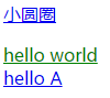
14 CSS 选择器之子代选择器
子代: 父亲的亲儿子
<!DOCTYPE html>
<html>
<head>
    <title></title>
    <link rel="stylesheet" type="text/css" href="CSS\index.css">
</head>
<body>
    <div class="wrap">
        <p>
            <a href="#">小圆圈</a>
        </p>
        <a href="#">hello world</a>
    </div>
    <div>
        <a href="#">hello A</a>
    </div>
</body>
</html>
/*子代选择器的语法: 中间使用 > 分隔*/
.wrap > a{
    color: green;
}
15 CSS 选择器之组合选择器
<!DOCTYPE html>
<html>
<head>
<title></title>
<link rel="stylesheet" type="text/css" href="CSS\index.css">
</head>
<body>
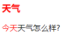
<h3>天气</h3>
<p>
<span>今天</span>天气怎么样?
</p>
</body>
</html>
/*组合选择器语法: 中间使用逗号分隔*/
h3,span{
    color: red;
}
16 CSS 选择器之交集选择器(了解)
本选择器应用不多, 了解即可.
/*交集选择器语法:
选择器1选择器2{
    样式;
    }
    */
.active{
    font-weight: lighter;
}
h2{
    color: red;
}
h2.active{
    font-size: 14px;
}
17 CSS 选择器之伪类选择器
<!DOCTYPE html>
<html>
<head>
<title></title>
<link rel="stylesheet" type="text/css" href="CSS\index.css">
</head>
<body>
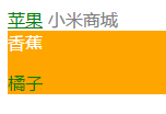
<a href="#">苹果</a>
<span>小米商城</span>
<div>
<span>香蕉</span>
<p>
<span>橘子</span>
</p>
</div>
</body>
</html>
/*爱恨准则: 先爱后恨  LoVe HAte*/
/*hover适用于所有的标签, 其他三个只适用于a标签.*/
/*没有被访问过的a的状态*/
a:link{
    color: orange;
}
/*访问过后的a的状态*/
a:visited{
    color: green;
}
/*鼠标悬浮时a的状态*/
a:hover{
    color: black;
}
/*鼠标摁住时a的状态*/
a:active{
    color: red;
}
span{
    color: gray;
}
span:hover{
    color: red;
}
div:hover{
    background-color: orange;
}
div:hover span{
    color: green;
}
div:hover>span{
    color: white;
}
18 CSS 选择器总结
CSS选择器
    语法:
        选择符{
            属性:值;
        }
    作用:选中页面上的元素(标签), 设置对应的样式
    - 基础选择器
        +标签选择器
         对页面中相同的元素, 设置共同的属性
        +id选择器
         任何的元素都可以设置id
         id是唯一, 并且不能重复, 表示选中的是有特性的元素
        +class选择器
         任何的元素都可以设置类
         一个元素中可以设置多个类
         一定要有"归类的概念, 公共类的想法". 选中的页面元素, 设置相同的属性
    - 高级选择器
        +后代(爸爸的儿子,孙子...)
            div p{}
        +子代(亲儿子)
            div>p
        +组合
            选择器1,选择器2,选择器3{}
        +交集选择器(了解)
            选择器1选择器2{}
        +伪类选择器
            a标签
                 -爱恨准则 LoVe HAte
                     +a:link{}
                     +a:visited{}
                     +a:hover{}
                     +a:active{}
                 注意: hover可以应用于任何元素
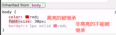
19 CSS的继承性
自己元素会继承父级元素的属性. 不过有些属性是无法被继承的.
20 CSS选择器权重
内联样式的权重为1000
id选择器的权重为100
类选择器的权重为10
元素选择器的权重为1
权重计算永不进位
注意: 跟先后顺序无关
<!DOCTYPE html>
<html>
<head>
    <title></title>
    <link rel="stylesheet" type="text/css" href="CSS\index.css">
    <style type="text/css">
        <!-- 数选择器的数量: id选择器  类选择器  标签选择器 -->
        /*010*/
        .b{
            color: purple;
        }
        /*003*/
        html body div{
            color: red;
        }
        /*100*/
        #b{
            color: orange;
        }
    </style>
</head>
<body>
    <a href="#">苹果</a>
    <span>小米商城</span>
    <div>
        <span>香蕉</span>
        <p>
            <span>橘子</span>
        </p>
    </div>
</body>
</html>
21 CSS选择器权重深入
继承来的属性, 它的权重非常非常低, 几乎接近于0.
在选中某个标签的情况下才能比较权重, 继承来的不适用.
22 !important的讲解
内联样式的权重是最高的, 如果想覆盖掉内联样式的样式, 则需要使用!important.
<!DOCTYPE html>
<html>
<head>
    <title></title>
    <style type="text/css">
        div{
            color: green !important;
        }
    </style>
</head>
<body>
    <div style="color: red;">a</div>
</body>
</html>
<!-- 通常不会使用!important, 因为它会破坏原有的权重规则.
使用场景:
1. 网站上有个全局的CSS文件, 通过link标签链接该文件, 通过!important去覆盖原有的CSS;
2. 通过!important修改内联式的样式
3. 如果都加了!important, 权重大的样式将被采用.
 -->
23 字体属性之font-family
<!DOCTYPE html>
<html>
<head>
    <title>字体属性</title>
    <style type="text/css">
        body{
            font-family: "Helvetica Neue","Microsoft Yahei","heiti SC"
        }
    </style>
</head>
<body>
    <div>xxx</div>
</body>
</html>
<!-- 多个字体作为备选字体. -->
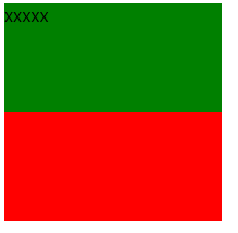
24 字体属性之font-size
<!DOCTYPE html>
<html>
<head>
    <title>字体大小</title>
    <style type="text/css">
        body{
            font-size: 20px;
        }
    </style>
</head>
<body>
    <div>xxx</div>
</body>
</html>
<!-- px是像素单位, 是绝对单位. 还有em rem -->
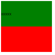
25 字体属性之color
<!DOCTYPE html>
<html>
<head>
    <title>字体颜色</title>
    <style type="text/css">
        body{
            color: rgb(255,0,255);
        }
    </style>
</head>
<body>
    <div>xxx</div>
</body>
</html>
<!-- rgb: red green blue
rgb的取值范围: 0-255
-->
<!DOCTYPE html>
<html>
<head>
    <title>字体颜色</title>
    <style type="text/css">
        body{
            color: rgba(255,0,255,0.5);
        }
    </style>
</head>
<body>
    <div>xxx</div>
</body>
</html>
<!-- rgba: red green blue alpha(透明度)
rgb的取值范围: 0-255
a的取值范围: 0-1, 通常0.5会写成.5
-->
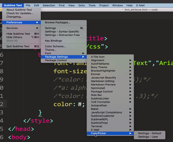
十六进制表示法:
插件: colorpicker
快捷键: ctrl+shift+c
26 字体属性之font-style
<!DOCTYPE html>
<html>
<head>
    <title>字体颜色</title>
    <style type="text/css">
        body{
            font-style: italic;
        }
    </style>
</head>
<body>
    <div>xxx</div>
</body>
</html>
<!-- font-style: 默认normal, 可以设置成italic-->
27 字体属性之font-weight
<!DOCTYPE html>
<html>
<head>
    <title>字体粗细</title>
    <style type="text/css">
        body{
            font-weight: 600;
        }
    </style>
</head>
<body>
    <div>xxx</div>
    <strong>yyy</strong>
    <em>zzz</em>
</body>
</html>
<!-- font-weight: 默认normal, 可以设置成border-->
<!-- 通常使用数值表示法, 范围:100-900, 默认是400 -->

28 文本属性之text-decoration
删除线或下划线修饰
<!DOCTYPE html>
<html>
<head>
    <title>字体粗细</title>
    <style type="text/css">
        body{
            text-decoration: underline;
        }
    </style>
</head>
<body>
    <div>xxx</div>
</body>
</html>
<!-- text-decoration: 默认none,
    none: 没有线
    underline: 下划线
    overline: 上划线
    line-through: 删除线
-->
<!-- 可以使用text-decoration清除a标签中的下划线 -->
29 制作淘宝满减女装示例效果
<!DOCTYPE html>
<html>
<head>
    <title></title>
    <style type="text/css">
        a{
            text-decoration: none;
        }
        a:hover{
            text-decoration: underline;
            color: red;
        }
        #lab{
            text-decoration: line-through;
        }
    </style>
</head>
<body>
    <div>
        <a href="https://item.taobao.com/item.htm?id=616577637604&ns=1&abbucket=8">白衬衫女大码胖mm森女韩版学院风加肥加大长袖休闲纯棉衬衣200斤</a>
    </div>
    <div>
        <span>¥ </span><span id="lab">100.00</span>
    </div>
    <!-- ¥的输入方法: 拼音renminbi,然后按5 -->
</body>
</html>

30 文本属性之text-indent
<!DOCTYPE html>
<html>
<head>
    <title>文本属性</title>
    <style type="text/css">
        p{
            text-indent: 2em;
            font-size: 20px;
        }
    </style>
</head>
<body>
    <p>
        在人类漫长的历史长河中, 推动社会向前的从不会是那些甘于平凡的多数人, 相反, 他们往往都是一群特立独行桀骜不驯的疯子!
    </p>
</body>
</html>
<!-- 默认字体大小的情况下, 32px表示空两格, 但是如果设置了字体大小, 则会导致缩进混乱 -->
<!-- em是相对单位, 相对当前标签的字体大小, 推荐使用这种 -->
31 文本属性之行高
<!DOCTYPE html>
<html>
<head>
<title>文本属性</title>
<style type="text/css">
p{
text-indent: 2em;
font-size: 20px;
/*行高: 表示行与行之间的距离, 注意行高一定要大于字体的大小*/
line-height: 40px;
/*字间距: 调整文字之间的距离, 只对中文起作用*/
letter-spacing: 5px;
/*调整英文单词之间的距离*/
word-spacing: 10px;
}
div{
line-height: 40px;
background-color: red;
font-size: 40px;
}
</style>
</head>
<body>
<p>
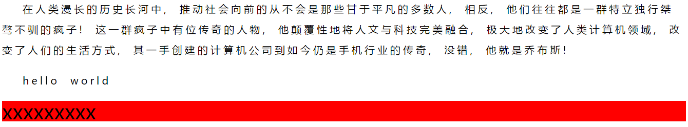
在人类漫长的历史长河中, 推动社会向前的从不会是那些甘于平凡的多数人, 相反, 他们往往都是一群特立独行桀骜不驯的疯子! 这一群疯子中有位传奇的人物, 他颠覆性地将人文与科技完美融合, 极大地改变了人类计算机领域, 改变了人们的生活方式, 其一手创建的计算机公司到如今仍是手机行业的传奇, 没错, 他就是乔布斯!
</p>
<p>hello world</p>
<div>xxxxxxxxx</div>
</body>
</html>
<!-- 默认字体大小的情况下, 32px表示空两格, 但是如果设置了字体大小, 则会导致缩进混乱 -->
<!-- em是相对单位, 相对当前标签的字体大小, 推荐使用这种 -->
32 文本属性之text_align
/*设置文本水平居中/左对齐/右对齐显示, 默认是左对齐*/
            text-align: center;
            text-align: left;
            text-align: right;
33 字体属性和文本属性总结
字体属性和文本属性总结:
    1. 字体
        font-family: 'microsoft yahei', '宋体';应该设置多个备选字体, 如果电脑上没有某种字体可以找备选字体.

    2. 字体大小
        font-size: 20px;
        像素单位: px, em, rem
        px: 绝对单位. 一旦设置了值, 不管网页如何变化始终如一
        em: 相对单位. 当前某块区域的字体大小.
        rem: 相对单位, 主要应用于移动端.

    3. 字体颜色
        color
        颜色表示法:
            单词表示法
            rgba表示法
            十六进制表示法(常用)

    4. 字体样式
        font-style
        normal(normal)
        italic

    5. 字体粗细
        font-weight
            bold
            100-900
            400(默认)

文本属性:
    1. 文本修饰
        text-decoration
        underline 下划线
        none 无线
        overline 上划线
        line-through 删除线

    2. 文本缩进
        text-indent
        单位建议使用em

    3. 行高
        line-height
            px, em, rem
    4. 中文字间距/单词间距
        letter-spacing
        world-spacing

    5. 文本对齐方式
        text-align
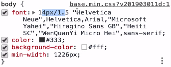
字体样式的综合写法:
其中, 14px/1.5表示字体大小为14px, 行间距为14px*1.5, 后面是字体
34 元素分类和dispaly属性介绍
元素分类:
文本级的标签:
p, h1-h6, strong/em, span, a, img
排版级的标签:
br/hr, div, ul/ol/dl, li, input, table, select, option, form

CSS中元素分类:
块状元素
div, ul, ol, p, h, table, form
特点:
    独占一行
    可以设置宽高, 如果不设置宽度, 默认是父级标签的100%宽度

行内元素
a, span, em, strong, label
特点:
    在一行内显示
    不能设置宽高, 默认的宽高为文本内容占据的宽高

行内块元素
input, img
特点:
    在一行内显示
    可以设置宽高

display属性:
    块级元素   display: block
    行内元素   display: inline
    行内块元素 display: inline-block
35 块级元素特点
36 行内元素和行内块元素特点
<!DOCTYPE html>
<html>
<head>
    <title></title>
    <style type="text/css">
        div{
            height: 200px;
            width: 200px;
            background-color: red;
        }
        span{
            background-color: green;
            height: 100px;
            width: 200px
        }
    </style>
</head>
<body>
    <div>
        <span>xxxxx</span>
    </div>

</body>
</html>
<!-- 单纯对span标签设置宽高不管用 -->
<!DOCTYPE html>
<html>
<head>
    <title></title>
    <style type="text/css">
        div{
            height: 200px;
            width: 200px;
            background-color: red;
        }
        span{
            background-color: green;
            line-height: 100px;
            width: 200px
        }
    </style>
</head>
<body>
    <div>
        <span>xxxxx</span>
    </div>

</body>
</html>
<!DOCTYPE html>
<html>
<head>
    <title></title>
    <style type="text/css">
        div{
            height: 200px;
            width: 200px;
            background-color: red;
        }
        span{
            background-color: green;
            height: 100px;
            width: 200px;
            display: inline-block;
        }
    </style>
</head>
<body>
    <div>
        <span>xxxxx</span>
    </div>
</body>
</html>
<!DOCTYPE html>
<html>
<head>
    <title></title>
    <style type="text/css">
        div{
            height: 200px;
            width: 200px;
            background-color: red;
        }
        span{
            background-color: green;
            line-height: 100px;
            width: 200px;
            display: inline-block;
        }
    </style>
</head>
<body>
    <div>
        <span>xxxxx</span>
    </div>
</body>
</html>
37 display属性讲解
<!DOCTYPE html>
<html>
<head>
    <title></title>
    <style type="text/css">
        div{
            display: none;
        }
        a,span{
            background-color: red;
            width: 100px;
            height: 40px;
            display: inline-block;
            text-align: center;
            line-height: 40px;
        }
    </style>
</head>
<body>
    <div>被隐藏的内容</div>
    <a href="#">百度一下</a>
    <span>最新新闻</span>
</body>
</html>
<!-- width和line-height的值相同, 可以使文本垂直居中 -->
<!-- text-align: 水平居中 -->
<!-- 想让a和span的内容在一行显示, 并且能设置宽高, 则可以将其display的方式改为inline-block. -->
<!-- display可以设置成block, inline, inline-block, block转inline非常少见; inline转inline-block非常常见 -->
<!-- inline转inline-block以及隐藏使用非常频繁 -->
示例: 如下a标签在一行显示, 并且可以设置高和宽

38 小米顶部栏案例
<!DOCTYPE html>
<html>
<head>
    <!-- 设置字符编码格式, 防止显示乱码 -->
    <meta charset="utf-8">
    <title>小米顶部栏案例</title>
    <style type="text/css">
        .top_bar{
            width: 100%
            height: 40px;
            background-color: #333;
        }
        .top_bar a:link{
            text-decoration: none;
        }
        .top_bar a:hover{
            color: #fff;
        }
        .top_bar a{
            color: #b0b0b0;
        }
        a,span{
            display: inline-block;
            line-height: 40px;
        }
        .top_bar span{
            color: #424242;
        }
    </style>
</head>
<body>
    <div class="top_bar">
        <a href="#">小米商城</a>
        <span>|</span>
        <a href="#">MIUI</a>
        <span>|</span>
        <a href="#">IOT</a>
        <span>|</span>
        <a href="#">云服务</a>
    </div>
</body>
</html>
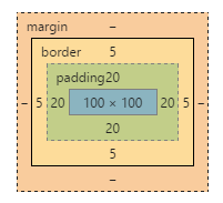
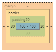
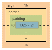
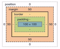
39 盒子模型介绍
什么是盒模型?
css model这一术语是用来设计和布局时使用的.
所有的HTML元素都可以看作盒子.
它包括: 外边距, 边框, 内填充和实际内容.
div, ul, ol, p, h, table, form都具有盒子模型的特征.
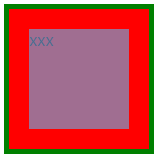
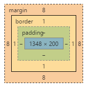
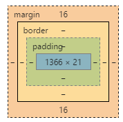
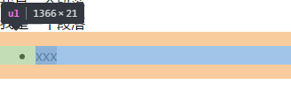
40 盒子模型的属性介绍
<!DOCTYPE html>
<html>
<head>
    <title>盒模型</title>
    <style type="text/css">
        div{
            width: 100px;
            height: 100px;
            background-color: red;
            padding: 20px;
            border: 5px solid green;
        }
    </style>
</head>
<body>
    <div>xxx</div>
</body>
</html><!DOCTYPE html>
<html>
<head>
    <title>盒模型</title>
    <style type="text/css">
        div{
            width: 100px;
            height: 100px;
            background-color: red;
            padding: 20px;
            border: 5px solid green;
        }
    </style>
</head>
<body>
    <div>xxx</div>
</body>
</html>
注意: width和height设置的是内容的宽和高.
41 padding属性讲解
<!DOCTYPE html>
<html>
<head>
    <title>盒模型</title>
    <style type="text/css">
        div{
            width: 100px;
            height: 100px;
            background-color: red;
            padding-top: 20px;
            padding-bottom: 30px;
            padding-left: 30px;
            padding-right: 20px;
        }
    </style>
</head>
<body>
    <div>xxx</div>
</body>
</html>
<!-- 可以通过调整padding的数值, 调整文本的位置. -->
<!DOCTYPE html>
<html>
<head>
    <title>盒模型</title>
    <style type="text/css">
        div{
            width: 100px;
            height: 100px;
            background-color: red;
            /*上下左右*/
            padding: 20px;

            /*上下  左右*/
            padding: 20px 40px;

            /*上  左右  下*/
            padding: 20px 30px 40px;

            /*上  右  下  左*/
            padding: 10px 20px 3px 40px;
        }
    </style>
</head>
<body>
    <div>xxx</div>
</body>
</html>
<!-- 可以通过调整padding的数值, 调整文本的位置. -->
42 border属性讲解
<!DOCTYPE html>
<html>
<head>
    <title>盒模型</title>
    <style type="text/css">
        div{
            width: 200px;
            height: 200px;
            /*border: 1px solid red;*/
            border-width: 4px 10px;
            border-style: solid dotted double dashed;
            border-color: green red purple yellow;
        }
    </style>
</head>
<body>
    <div>xxx</div>
</body>
</html>
<!-- 三要素: 粗细(width), 样式(style), 颜色(color) -->
<!DOCTYPE html>
<html>
<head>
    <title>盒模型</title>
    <style type="text/css">
        div{
            width: 200px;
            height: 200px;
            /*按照方向来编写border*/
            border-top-width: 4px;
            border-top-color: red;
            border-top-style: solid;
        }
    </style>
</head>
<body>
    <div>xxx</div>
</body>
</html>
<!-- 三要素: 粗细(width), 样式(style), 颜色(color) -->
<!DOCTYPE html>
<html>
<head>
    <title>盒模型</title>
    <style type="text/css">
        input{
            /*清除默认的样式*/
            /*删除边框, 但是鼠标检索到相应位置时还会出现外线*/
            /*border: none;*/
            /*border:0;*/
            /*删除外线*/
            /*outline: none;*/
            /*outline: 0;*/
        }
        .username{
            width: 200px;
            height: 40px;
            padding-left: 10px;
            font-size: 20px;
            border: 1px solid red;
            }
        .username:hover{
            border: 1px solid orange;
        }
    </style>
</head>
<body>
    <input type="text" name="" class="username">
</body>
</html>
43 margin属性讲解
<!DOCTYPE html>
<html>
<head>
    <title></title>
    <style type="text/css">
        span{
            background-color: red;
        }
        .xiongda{

            margin-right: 20px;
        }
        .xionger{
            margin-left: 100px;
        }
        div{
            width: 200px;
            height: 200px;
        }
        .box1{
            background-color: green;
            margin-bottom: 20px;
        }
        .box2{
            background-color: red;
            margin-top: 10px;
        }
        /*box1和box2之间的距离只有20px.
        margin垂直方向上会出现外边距合并, 也称为外边距塌陷.
        为了避免这种问题, 在设置垂直方向上的外边距时尽量只设置一个盒子垂直方向上的距离. 当然, 后面会有方法解决这种问题.*/
    </style>
</head>
<body>
    <span class="xiongda">熊大</span><span class="xionger">熊二</span>
    <div class="box1"></div>
    <div class="box2"></div>
</body>
</html>
<!-- 一个盒子到另一个盒子的距离, 通常这两个盒子属于同级盒子.
 -->
44 清除某些HTML元素的默认样式
1. body有个默认的外边距, 需要清除掉
<!DOCTYPE html>
<html>
<head>
    <title>清除HTML标签元素的默认样式</title>
    <style type="text/css">
        body{
            height: 200px;
            border: 1px solid red;
        }
    </style>
</head>
<body>

</body>
</html>
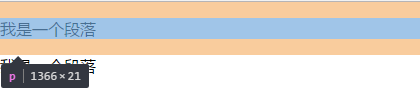
2. p标签有默认的margin
3. ul标签默认有margin和padding
<!DOCTYPE html>
<html>
<head>
    <title>清除HTML标签元素的默认样式</title>
    <style type="text/css">
        body, p, ul, ol, dl, dt{
            margin: 0;
            padding: 0;
        }
        /*对ul清除padding后, 实际上默认的点还是存在的, 要清除它可以采用以下方式*/
        ul,ol{
            list-style: none;
        }
        input{
            border: none;
            outline: none;
        }
    </style>
</head>
<body>
    <p>我是一个段落</p>
    <p>我是一个段落</p>
    <ul>
        <li>xxx</li>
    </ul>
</body>
</html>
<!-- 可以另建一个css文件, 专门重置样式
也可以引用别人设置好的格式:
https://meyerweb.com/eric/tools/css/reset/
 -->
body, p, ul, ol, dl, dt{
    margin:0;
    padding:0;
}
ul,ol{
    list-style:non;
}
input{
    border:none;
    outline:none;
}
45 HTML盒子居中显示
默认是靠左侧显示, 如果想让其居中显示, 可以将margin-left和margin-right设置成atuo.
<!DOCTYPE html>
<html>
<head>
    <title>盒子居中</title>
    <link rel="stylesheet" type="text/css" href="CSS\reset.css">
    <style type="text/css">
        .top_bar{
            width: 100%;
            height: 40px;
            background-color: #333;
        }
        .container{
            width: 1200px;
            height: 100%;
            /*注意:这个地方不要将height设置成40px.*/
            background-color: red;
            margin-left: auto;
            margin-right: auto;
            /*采用这种方式使盒子居中, 也课可以采用以下方式:*/
            margin: 0 auto;
        }
    </style>
</head>
<body>
    <div class="top_bar">
        <div class="container">
            小米商城
        </div>
    </div>
</body>
</html>
46 浮动的介绍
float技术最初为了实现文字环绕现象:
现在常用于网页中盒子的多列排版布局, 例如一栏布局, 两栏布局...
正常情况下, 多个块级元素在网页中呈上下显示. 如果想让其呈左右显示, 则要用到浮动技术. 网页中如果想实现多列排版布局, 就一定会用到浮动.
浮动的属性:
none: 表示不浮动, 默认情况
left: 左浮动
right: 右浮动
inherit: 继承父元素的浮动属性
47 了解网页中的文字环绕现象
<!DOCTYPE html>
<html>
<head>
<title></title>
<link rel="stylesheet" type="text/css" href="CSS\reset.css">
<style type="text/css">
.box img{
height: 100px;
float: left;
}
.box p{
width: 500px;
}
</style>
</head>
<body>
<div class="box">
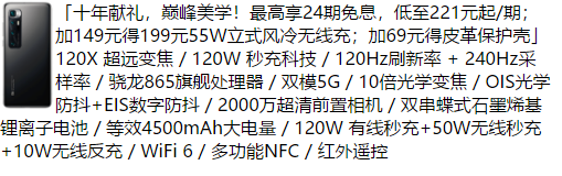
<img src="F:\imgs\2.png">
<p>
「十年献礼,巅峰美学!最高享24期免息,低至221元起/期;加149元得199元55W立式风冷无线充;加69元得皮革保护壳」120X 超远变焦 / 120W 秒充科技 / 120Hz刷新率 + 240Hz采样率 / 骁龙865旗舰处理器 / 双模5G / 10倍光学变焦 / OIS光学防抖+EIS数字防抖 / 2000万超清前置相机 / 双串蝶式石墨烯基锂离子电池 / 等效4500mAh大电量 / 120W 有线秒充+50W无线秒充+10W无线反充 / WiFi 6 / 多功能NFC / 红外遥控
</p>
</div>
</body>
</html>
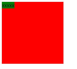
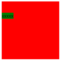
48 浮动元素的现象
浮动的现象:
1. 文字环绕
2. 脱离了标准文档流
3. 浮动元素相互贴靠
4. 浮动元素有收缩现象
<!DOCTYPE html>
<html>
<head>
    <title></title>
    <link rel="stylesheet" type="text/css" href="CSS\reset.css">
    <style type="text/css">
        .box1{
            width: 100px;
            height: 100px;
            background-color: red;
            float: left;
        }
        .box2{
            width: 200px;
            height: 200px;
            background-color: green;
            /*float: right;*/
        }
    </style>
</head>
<body>
    <div class="box1">
        左边的盒子
    </div>
    <div class="box2">
        右边的盒子
    </div>
</body>
</html>
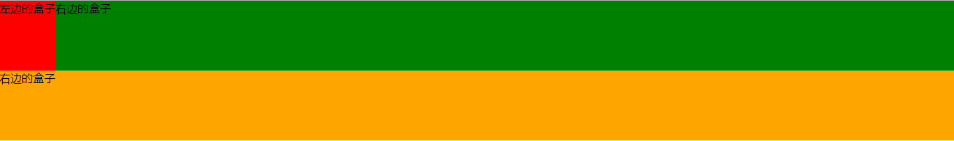
浮动后, 块级元素悬浮于页面之上.
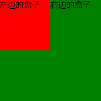
红色盒子浮动起来, 绿色盒子上移, 红色盒子覆盖在绿色盒子之上. 但是文字不会被遮盖住, 会环绕在浮动起来的盒子的旁边.
所有HTML元素都采用从左往右, 从上往下的方式排布. 这种文档流称为标准文档流. 元素浮动后就会脱离标准文档流, 简称脱标.
<!DOCTYPE html>
<html>
<head>
    <title></title>
    <link rel="stylesheet" type="text/css" href="CSS\reset.css">
    <style type="text/css">
        .box1{
            width: 100px;
            height: 100px;
            background-color: red;
            float: left;
        }
        .box2{
            width: 100px;
            height: 100px;
            background-color: green;
            float: left;
        }
    </style>
</head>
<body>
    <div class="box1">
        左边的盒子
    </div>
    <div class="box2">
        右边的盒子
    </div>
</body>
</html>
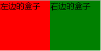
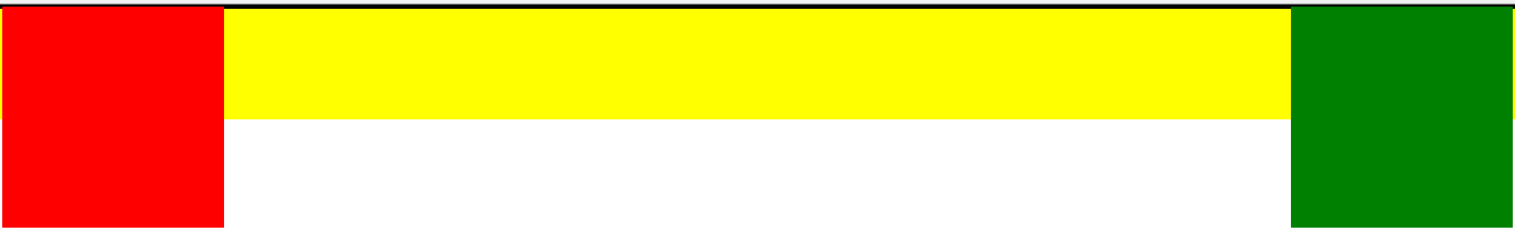
第一个盒子float后会贴body的边, 第二个盒子float后会贴第一个盒子的边.
<!DOCTYPE html>
<html>
<head>
<title></title>
<link rel="stylesheet" type="text/css" href="CSS\reset.css">
<style type="text/css">
.box1{
width: 100px;
height: 100px;
background-color: red;
float: left;
}
.box2{
width: 100px;
height: 100px;
background-color: green;
float: left;
}
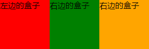
.box3{
width: 100px;
height: 100px;
background-color: orange;
float: left;
}
</style>
</head>
<body>
<divclass="box1">
左边的盒子
</div>
<div class="box2">
右边的盒子
</div>
<div class="box3">
右边的盒子
</div>
</body>
</html>
<!DOCTYPE html>
<html>
<head>
    <title></title>
    <link rel="stylesheet" type="text/css" href="CSS\reset.css">
    <style type="text/css">
        .box1{
            /*width: 100px;*/
            height: 100px;
            background-color: red;
            float: left;
        }
        .box2{
            /*width: 100px;*/
            height: 100px;
            background-color: green;
            /*float: left;*/
        }
        .box3{
            /*width: 100px;*/
            height: 100px;
            background-color: orange;
            /*float: left;*/
        }
    </style>
</head>
<body>
    <div class="box1">
        左边的盒子
    </div>
    <div class="box2">
        右边的盒子
    </div>
    <div class="box3">
        右边的盒子
    </div>
</body>
</html>
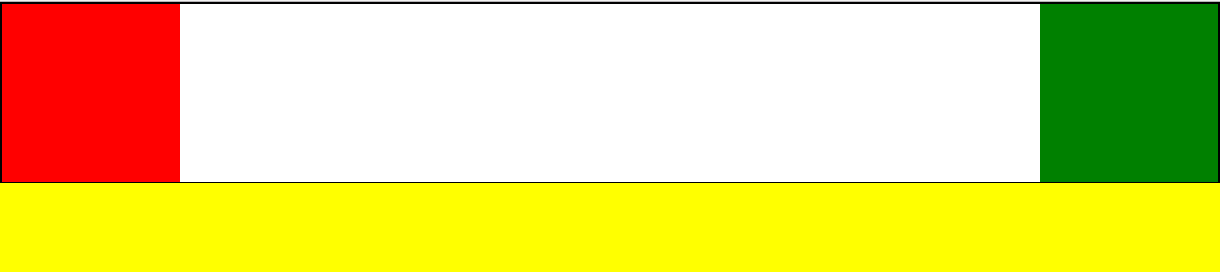
通常, 不要单独针对一个盒子浮动, 要浮动就一起浮动, 要不浮动就都不浮动.
49 浮动元素的破坏性
浮动会引发父级元素的高度塌陷问题
<!DOCTYPE html>
<html>
<head>
    <title></title>
    <link rel="stylesheet" type="text/css" href="CSS\reset.css">
    <style type="text/css">
        .box1{
            width: 200px;
            height: 200px;
            background-color: red;
            float: left;
        }
        .box2{
            width: 200px;
            height: 200px;
            background-color: green;
            float: right;
        }
        .top_bar{
            border: 2px solid black;
        }
        .box3{
            height: 100px;
            background-color: yellow;
        }
    </style>
</head>
<body>
    <div class="top_bar">
        <div class="box1"></div>
        <div class="box2"></div>
    </div>
    <div class="box3"></div>
</body>
</html>
50 清除浮动方式(固定高度和内墙法)
<!DOCTYPE html>
<html>
<head>
    <title></title>
    <link rel="stylesheet" type="text/css" href="CSS\reset.css">
    <style type="text/css">
        .box1{
            width: 200px;
            height: 200px;
            background-color: red;
            float: left;
        }
        .box2{
            width: 200px;
            height: 200px;
            background-color: green;
            float: right;
        }
        .top_bar{
            border: 2px solid black;
        }
        .box3{
            height: 100px;
            background-color: yellow;
        }
        /*内墙法: 清除左右浮动导致的父级标签高度塌陷问题*/
        .clear{
            clear: both;
        }
    </style>
</head>
<body>
    <div class="top_bar">
        <div class="box1"></div>
        <div class="box2"></div>
        <div class="clear"></div>
    </div>
    <div class="box3"></div>
</body>
</html>
<!--
1. 给父元素设置固定高度
    缺点: 使用不灵活, 后期不易维护
    应用: 网页中盒子固定高度区域, 比如固定的导航栏
2. 内墙法(了解)
    规则: 在最后一个浮动元素的后面加一个空的块级元素, 并且设置属性: clear:both
    缺点: 加空的块级元素, 导致结构冗余
3. 伪元素(选择器)清除法(重要)
4. overflow: hidden(重要)
 -->
51 清除浮动的方式之伪元素清除法
<!DOCTYPE html>
<html>
<head>
    <title></title>
    <link rel="stylesheet" type="text/css" href="CSS\reset.css">
    <style type="text/css">
        .box1{
            width: 200px;
            height: 200px;
            background-color: red;
            float: left;
        }
        .box2{
            width: 200px;
            height: 200px;
            background-color: green;
            float: right;
        }
        .top_bar{
            border: 2px solid black;
        }
        .box3{
            height: 100px;
            background-color: yellow;
        }
        /*伪元素清除法:
        添加了一个没有内容的块级标签, 用于清除左右浮动产生的塌陷问题*/
        .clearfix::after{
            content:'';
            display: block;
            clear: both;
        }
    </style>
</head>
<body>
    <div class="top_bar clearfix">
        <div class="box1"></div>
        <div class="box2"></div>
    </div>
    <div class="box3"></div>
</body>
</html>
<!--
1. 给父元素设置固定高度
    缺点: 使用不灵活, 后期不易维护
    应用: 网页中盒子固定高度区域, 比如固定的导航栏
2. 内墙法(了解)
    规则: 在最后一个浮动元素的后面加一个空的块级元素, 并且设置属性: clear:both
    缺点: 加空的块级元素, 导致结构冗余
3. 伪元素(选择器)清除法(重要)
4. overflow: hidden(重要)
 -->
52 清除浮动方式之overflow
overflow: visible(默认)
overflow: hidden(常用)
overflow: scroll(常用)
overflow: auto
overflow: inherit(继承父级)
<!DOCTYPE html>
<html>
<head>
    <title></title>
    <link rel="stylesheet" type="text/css" href="CSS\reset.css">
    <style type="text/css">
        .box1{
            width: 200px;
            height: 200px;
            background-color: red;
            float: left;
        }
        .box2{
            width: 200px;
            height: 200px;
            background-color: green;
            float: right;
        }
        .top_bar{
            border: 2px solid black;
            /*给父级元素加上overflow:hidden*/
            /*形成BFC区域: block formtting context
            这是一个独立的渲染的区域, 如果给父级设置了BFC, 那么下面的子元素都在BFC区域中.
            BFC区域的一条规则: 计算BFC的高度时, 浮动元素也参与计算.
            形成BFC的条件: 除了overflow:visitable的属性值*/
            overflow: hidden;
        }
        .box3{
            height: 100px;
            background-color: yellow;
        }

    </style>
</head>
<body>
    <div class="top_bar">
        <div class="box1"></div>
        <div class="box2"></div>
        <div class="clear"></div>
    </div>
    <div class="box3"></div>
</body>
</html>
<!--
1. 给父元素设置固定高度
    缺点: 使用不灵活, 后期不易维护
    应用: 网页中盒子固定高度区域, 比如固定的导航栏
2. 内墙法(了解)
    规则: 在最后一个浮动元素的后面加一个空的块级元素, 并且设置属性: clear:both
    缺点: 加空的块级元素, 导致结构冗余
3. 伪元素(选择器)清除法(重要)
4. overflow: hidden(重要)
 -->
53 深入挖掘BFC到底是什么
54 小米导航栏制作
<!DOCTYPE html>
<html>
<head>
    <title></title>
    <link rel="stylesheet" type="text/css" href="CSS\reset.css">
    <style type="text/css">
        .site-header{
            width: 100%;
            height: 100px;
            font: 14px/1.5 Helvetica Neue,Helvetica,Arial,Microsoft Yahei,Hiragino Sans GB,Heiti SC,WenQuanYi Micro Hei,sans-serif;
        }
        .container{
            width: 1226px;
            margin-left: auto;
            margin-right: auto;
        }
        .clearfix::after{
            content: "";
            clear: both;
            display: block;
        }
        .site-header .nav-log{
            margin-top: 22px;
            float: left;
        }
        .nav-log a{
            display: block;
            width: 55px;
            height: 55px;
        }
        .site-header .nav-list{
            width: 830px;
            height: 88px;
            float: left;
            padding: 12px 0 0 30px;
        }
        .nav-list li{
            float: left;
            font-size: 16px;
        }
        .nav-list a{
            display: block;
            padding: 26px 10px 38px;
            color: #333;
        }
        .site-header .nav-search{
            width: 296px;
            float: right;
            margin-top: 25px;
        }
        .nav-search form{
            width: 296px;
            height: 50px;
        }
        .header-input{
            border: 1px solid #e0e0e0;
            width: 223px;
            height: 48px;
            padding: 0 10px;
            line-height: 48px;
        }
        .header-submit{
            border: 1px solid #e0e0e0;
            width: 49px;
            height: 50px;
            background-color: #fff;
            margin-left: -1px;
        }
    </style>
</head>
<body>
    <div class="site-header">
        <div class="container clearfix">
            <div class="nav-log">
                <a href="#">
                    <img src="F:\imgs\mi.png">
                </a>
            </div>
            <ul class="nav-list">
                <li>
                    <a href="#">全部商品</a>
                </li>
                <li>
                    <a href="#">小米手机</a>
                </li>
                <li>
                    <a href="#">Redmi红米</a>
                </li>
                <li>
                    <a href="#">电视</a>
                </li>
                <li>
                    <a href="#">笔记本</a>
                </li>
                <li>
                    <a href="#">家电</a>
                </li>
                <li>
                    <a href="#">路由器</a>
                </li>
                <li>
                    <a href="#">智能硬件</a>
                </li>
                <li>
                    <a href="#">服务</a>
                </li>
                <li>
                    <a href="#">社区</a>
                </li>
            </ul>
            <div class="nav-search">
                <form>
                    <input class="header-input" type="text" placeholder="液晶小黑板20寸"><input class="header-submit" type="submit" value="搜索">
                </form>
            </div>
        </div>
    </div>
</body>
</html>
body, p, ul, ol, dl, dt{
    margin:0;
    padding:0;
}
ul,ol{
    list-style:none;
}
input{
    border:none;
    outline:none;
}
a{
    text-decoration: none;
}
注意: 有些div的高度不用设置, 可以通过里边的内容撑起相应的高度. a标签属于行内元素, 即便里边包含了img等标签, 也撑不起其高度, 需要将其转化为block, 然后设置其高度.
55 定位的介绍
1. 静态定位 position: static(默认)
2. 相对定位 position: relative
3. 绝对定位 position: absolute
4. 固定定位 position: fixed
56 相对定位讲解
<!DOCTYPE html>
<html>
<head>
<title>定位</title>
<link rel="stylesheet" type="text/css" href="CSS/reset.css">
<style type="text/css">
body{
border: 1px solid orange;
}
div{
width: 200px;
height: 200px;
color: #fff;
}
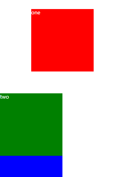
div.one{
background-color: red;
position: relative;
top: 30px;
left: 100px;
}
div.two{
background-color: green;
position:relative;
top:100px;
}
div.three{
background-color: blue;
}
</style>
</head>
<body>
<div class="one">one</div>
<div class="two">two</div>
<div class="three">three</div>
</body>
</html>
<!--
静态定位(position:static):
在文档流下不受任何影响, 所以在静态定位下, 不能设置left, right, top, bottom这四个属性.
-->
<!--
相对定位(position:relative):
不脱离标准文档流, 可以调整元素位置
参考点: 以原来的位置为参考点进行定位
如果数值是负值, 表示反方向移动.
给标准文档流下的盒子设置了相对定位, 该盒子与标准文档中的其他盒子没有任何区别.
但是设置了相对定位后就可以使用left right top bottom这四个属性值.
-->
57 绝对定位讲解
<!--
绝对定位(position: absolute):
特点:
    1. 脱离标准文档流, 不在页面占位置
    2. 层级提高, 压盖现象
参考点:
    1. 单独给一个盒子设置绝对定位, 以根元素页面左上角为参考点
    2. 相对于最近的非static祖先元素定位, 如果没有非static祖先元素, 那么以页面根元素的左上角为参考点进行定位
网站中实战应用: 子绝父相
 -->
58 小米搜索实战应用
<!DOCTYPE html>
<html>
<head>
    <title></title>
    <link rel="stylesheet" type="text/css" href="CSS\reset.css">
    <style type="text/css">
        .site-header{
            width: 100%;
            height: 100px;
            font: 14px/1.5 Helvetica Neue,Helvetica,Arial,Microsoft Yahei,Hiragino Sans GB,Heiti SC,WenQuanYi Micro Hei,sans-serif;
        }
        .container{
            width: 1226px;
            margin-left: auto;
            margin-right: auto;
        }
        .clearfix::after{
            content: "";
            clear: both;
            display: block;
        }
        .site-header .nav-log{
            margin-top: 22px;
            float: left;
        }
        .nav-log a{
            display: block;
            width: 55px;
            height: 55px;
        }
        .site-header .nav-list{
            width: 830px;
            height: 88px;
            float: left;
            padding: 12px 0 0 30px;
        }
        .nav-list li{
            float: left;
            font-size: 16px;
        }
        .nav-list a{
            display: block;
            padding: 26px 10px 38px;
            color: #333;
        }
        .site-header .nav-search{
            width: 296px;
            float: right;
            margin-top: 25px;
        }
        .nav-search form{
            width: 296px;
            height: 50px;
            position: relative;
        }
        .header-input{
            border: 1px solid #e0e0e0;
            width: 223px;
            height: 48px;
            padding: 0 10px;
            line-height: 48px;
        }
        .header-submit{
            border: 1px solid #e0e0e0;
            width: 49px;
            height: 50px;
            background-color: #fff;
            margin-left: -1px;
        }
        .search_hot_word{
            position: absolute;
            right: 70px;
            top: 14px;
            font-size: 14px;
        }
        .search_hot_word span{
            background-color: #eee;
            padding: 0 3px;
            color: #757575;
        }
        .search_hot_word span:hover{
            background-color: #ff6700;
            color: #fff;
            cursor: pointer;
        }
    </style>
</head>
<body>
    <div class="site-header">
        <div class="container clearfix">
            <div class="nav-log">
                <a href="#">
                    <img src="F:\imgs\mi.png">
                </a>
            </div>
            <ul class="nav-list">
                <li>
                    <a href="#">全部商品</a>
                </li>
                <li>
                    <a href="#">小米手机</a>
                </li>
                <li>
                    <a href="#">Redmi红米</a>
                </li>
                <li>
                    <a href="#">电视</a>
                </li>
                <li>
                    <a href="#">笔记本</a>
                </li>
                <li>
                    <a href="#">家电</a>
                </li>
                <li>
                    <a href="#">路由器</a>
                </li>
                <li>
                    <a href="#">智能硬件</a>
                </li>
                <li>
                    <a href="#">服务</a>
                </li>
                <li>
                    <a href="#">社区</a>
                </li>
            </ul>
            <div class="nav-search">
                <form>
                    <input class="header-input" type="text" placeholder="液晶小黑板20寸"><input class="header-submit" type="submit" value="搜索">
                    <div class="search_hot_word">
                        <span>小米9</span>
                        <span>小米9 SE</span>
                    </div>
                </form>
            </div>
        </div>
    </div>
</body>
</html>
59 固定定位讲解
<!--
特点:
1. 脱离标注文档流, 且有压盖现象
2. 一旦设置固定定位, 在页面中滚动网页, 固定不变
参考点:
    以浏览器的左上角为参考点.
应用:
    小广告, 回到顶部, 固定导航栏...
 -->
60 小米固定侧方栏案例讲解
<!DOCTYPE html>
<html>
<head>
    <title>小米右侧方栏示例</title>
    <link rel="stylesheet" type="text/css" href="CSS/reset.css">
    <style type="text/css">
        .container{
            width: 1000px;
            height: 100%;
            border: 1px solid red;
            margin:0 auto;
        }
        .container p{
            margin-bottom: 200px;
        }
        .site-bar{
            position: fixed;
            width: 27px;
            bottom: 100px;
            right: 50%;
            margin-right: -540px;
        }
        .site-bar li{
            width: 25px;
            height: 39px;
            border:1px solid #f5f5f5;
            background-color: #fff;
            border-top: none;
        }
        .site-bar img{
            width: 20px;
            height: 20px;
        }
        .site-bar a{
            display: block;
            width: 20px;
            height: 20px;
            margin-left: 2px;
            padding-top: 9px;
        }
        .site-bar .one{
            border-top: 1px solid #f5f5f5;
        }
    </style>
</head>
<body>
    <div class="container">
        <p>
            《华尔街日报》9月2日报道称,花旗集团已成为第一家在中国获得基金托管人资格的美国银行。这张牌照将有助于花旗利用中国资本市场的巨大机遇。美国消费者新闻与商业频道(CNBC)9月2日报道称,尽管两国之间的政治紧张局势正在加剧,从监管批准到商业决策,美国主要金融巨头正在深入中国市场。花旗集团也是全球五大托管机构中首家获得牌照的银行。报道称,在过去两年里,中国政府加快了允许外资进入其此前较为封闭的金融市场的步伐,放宽所有权限制和向美国金融机构颁发营业执照也是中美第一阶段经贸协议的一部分。上周,贝莱德(BlackRock)获得中国证监会批准在上海设立全资所有的公募基金管理公司,这就为这家全球最大资产管理公司跻身首批为中国个人理财的外资公司铺平了道路。
        </p>
    </div>
    <div class="site-bar">
        <ul>
            <li class="one">
                <a href="#">
                    <img src="https://i8.mifile.cn/b2c-mimall-media/98a23aae70f25798192693f21c4d4039.png">
                </a>
            </li>
            <li>
                <a href="#">
                    <img src="https://i8.mifile.cn/b2c-mimall-media/55cad219421bee03a801775e7309b920.png">
                </a>
            </li>
            <li>
                <a href="#">
                    <img src="https://cdn.cnbj1.fds.api.mi-img.com/mi-mall/12eb0965ab33dc8e05870911b90f3f13.png">
                </a>
            </li>
            <li>
                <a href="#">
                    <img src="https://i8.mifile.cn/b2c-mimall-media/4f036ae4d45002b2a6fb6756cedebf02.png">
                </a>
            </li>
            <li>
                <a href="#">
                    <img src="https://i8.mifile.cn/b2c-mimall-media/d7db56d1d850113f016c95e289e36efa.png">
                </a>
            </li>
        </ul>
    </div>
</html>
61 浮动和定位对行内元素的影响
1. float给行内元素带来的影响:
对行内元素设置浮动后, 行内元素便可以设置宽高. 设置浮动后有收缩的效果.
这种效果与disply:block的区别:
display:block依然是标准文档流下的盒子, 但是设置成float后就脱离了标准文档流.
2. 定位给行内元素带来的影响:
position: relative, 无法设置宽高
position: absolute, 可以设置宽高
position: fixed, 可以设置宽高
综上, 以下情况下盒子脱离了标准文档流, 就不符合标准文档流的特性, 可以任意设置宽高:
display: float;
position: absolute;
position: fixed;
62 z-index的讲解
绝对定位和固定定位都有压盖现象, 那么到底是谁压盖谁呢?
一旦设置了定位后, 就存在z-index属性, 默认是auto.
z-index只能应用在定位的元素上.
一个定位的元素的z-index一定大于非定位元素.
z-index取值是整数, 数值越大, 就压在上面.
63 z-index属性深入挖掘
如果父级元素也设置了定位, 则z-index存在从父现象, 即父级元素的z-index越大, 子元素就显示在上方.
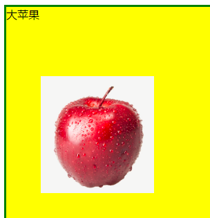
64 css的背景属性讲解
<!DOCTYPE html>
<html>
<head>
    <title>背景属性</title>
    <style type="text/css">
        .bg{
            width: 1200px;
            height: 1300px;
            border: 3px solid green;
            background-color: yellow;
            /*注意:路径中使用\不管用*/
            background-image: url('F:/imgs/0.png');
            /*平铺方式*/
            /*默认repeat*/
            /*background-repeat: repeat;*/
            background-repeat: no-repeat;
            /*background-repeat: repeat-x;*/
            /*background-repeat: repeat-y;*/
            /*背景定位*/
            /*第一个值: x方向,
            第二个值: y方向*/
            /*background-position: 50px 100px;*/
            /*以下两个默认都是0*/
            background-position-x:50px;
            background-position-y:100px;

        }
    </style>
</head>
<body>
    <div class="bg">
        大苹果
    </div>
</body>
</html>
65 背景定位属性详解
<!DOCTYPE html>
<html>
<head>
    <title>背景属性</title>
    <style type="text/css">
        .bg{
            width: 1200px;
            height: 1300px;
            border: 3px solid green;
            background-color: yellow;
            background-image: url('F:/imgs/0.png');
            background-repeat: no-repeat;
            /*关键字的方式*/
            /*background-position: top left;*/
            /*background-position: top center;*/
            /*background-position: top right;*/
            /*background-position: center left;*/
            /*background-position: center center;*/
            /*background-position: center right;*/
            /*background-position: bottom left;*/
            /*background-position: bottom center;*/
            /*background-position: bottom right;*/
            /*百分比的方式: 0% 50% 100%*/
            /*以下0 和 50%分别对应着x轴方向和y轴方向
            x轴方向为0, 说明在x轴方向上没有移动,
            50%表示在y轴方向移动了50%.
            */
            /*background-position: 0 50%;*/
            /*水平百分比的值 = 容器宽度的百分比 - 背景图片宽度百分比
       如果百分比不为0 50% 100%, 则需要进行计算.
      */
        }
    </style>
</head>
<body>
    <div class="bg">
        大苹果
    </div>
</body>
</html>
66 MIUI背景图实战应用案例
<!DOCTYPE html>
<html>
<head>
    <title>
        MIUI背景图实战应用案例
    </title>
    <style type="text/css">
        .bgi{
            width: 100%;
            height: 657px;
            /*background-image: url('F:/imgs/miui.png');
            background-repeat: no-repeat;
            background-position: center top;*/
            background: url("F:/imgs/miui.png") no-repeat center top;
        }
    </style>
</head>
<body>
    <div class="bgi">

    </div>
</body>
</html>
67 CSS Sprite雪碧图技术
CSS Sprite雪碧图技术:
它是一种图像拼合技术.
将多个小图标和背景图像合并到一张图片上,
利用CSS的背景定位来显示需要显示的图片部分.
使用雪碧图的场景:
静态图片, 不随用户信息变化而变化
小图片, 图片比较小(2-3kb)
加载量比较大, 一些大图不建议使用雪碧图
优点:
有效减少了HTTP请求数量
加速内容显示
因为: 每请求一次, 就会和服务器链接一次,
建立链接时需要额外的时间开销.
原理: 通过CSS的背景属性的background-position来控制雪碧图的显示.
68 CSS Sprite雪碧图技术实现
<!DOCTYPE html>
<html>
<head>
    <title>CSS Sprite雪碧图技术实现原理</title>
    <style type="text/css">
        div{
            width: 48px;
            height: 45px;
            background: url('F:/imgs/img.png') no-repeat 0 0;

        }
        div.sprite1{
            background-position: 0 0;
            float: left;
        }
        div.sprite2{
            background-position: 0px -45px;
            float: left;
        }
        div.sprite3{
            background-position: 0 -88px;
            float: left;
        }

    </style>
</head>
<body>
    <div class="sprite1"></div>
    <div class="sprite2"></div>
    <div class="sprite3"></div>
</body>
</html>
69 如何快速地让背景图缩放比例
<!DOCTYPE html>
<html>
<head>
    <title></title>
    <style type="text/css">
        div{
            /*1. 首先缩放div的宽高*/
            width: 12px;
            height: 12px;
            display: inline-block;
            background: url('F:/imgs/img.png') no-repeat 0 0;
            /*2. 等比例缩放背景图片的宽高*/
            background-size: 12px 300px;
            margin-right: 5px;
        }
        /*3. 等比例缩放x或y轴上移动的距离*/
        div.sprite1{
            background-position: 0 0;
        }
        div.sprite2{
            background-position: 0px -22px;
        }
        div.sprite3{
            background-position: 0 -44px;
        }

    </style>
</head>
<body>
    <div class="sprite1"></div>
    <div class="sprite2"></div>
    <div class="sprite3"></div>
</body>
</html>
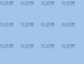
70 淘宝列表导航案例制作
<!DOCTYPE html>
<html>
<head>
    <title>淘宝列表导航案例</title>
    <link rel="stylesheet" type="text/css" href="CSS/reset.css">
    <style type="text/css">
        .taobao_list{
            border-top: 1px solid #f4f4f4;
            /*设置浮动, 让div收缩, 即让div的大小和内容大小一致*/
            float: left;
        }
        .taobao_list ul{
            width: 292px;
            overflow: hidden;
        }
        .taobao_list ul li{
            float:left;
            width: 71px;
            height: 75px;
            border:1px solid #f4f4f4;
            border-top-color: transparent;
            border-left-color: transparent;
        }
        .taobao_list ul li a{
            text-align: center;
            display: block;
            font-size: 12px;
            color: #888;
        }
        .taobao_list ul li a span{
            display: inline-block;
            width: 24px;
            height: 24px;
            background: url("F:/imgs/img.png") no-repeat 0 0;
            margin-top: 12px;
        }
        .taobao_list ul li a span.span1{
            background-position: 0 0;
        }
        .taobao_list ul li a span.span2{
            background-position: 0 -88px;
        }
        .taobao_list ul li a span.span3{
            background-position: 0 -44px;
        }
        .taobao_list ul li a span.span4{
            background-position: 0 -132px;
        }
        .taobao_list ul li a span.span5{
            background-position: 0 -176px;
        }
        .taobao_list ul li a span.span6{
            background-position: 0 -220px;
        }
        .taobao_list ul li a span.span7{
            background-position: 0 -264px;
        }
        .taobao_list ul li a span.span8{
            background-position: 0 -308px;
        }
        .taobao_list ul li a span.span9{
            background-position: 0 -352px;
        }
        .taobao_list ul li a span.span10{
            background-position: 0 -396px;
        }
        .taobao_list ul li a span.span11{
            background-position: 0 -440px;
        }
        .taobao_list ul li a span.span12{
            background-position: 0 -484px;
        }
    </style>
</head>
<body>
    <div class="taobao_list">
        <ul>
            <li>
                <a href="#">
                    <span class="span1"></span>
                    <p>充话费</p>
                </a>
            </li>
            <li>
                <a href="#">
                    <span class="span2"></span>
                    <p>旅行</p>
                </a>
            </li>
            <li>
                <a href="#">
                    <span class="span3"></span>
                    <p>车险</p>
                </a>
            </li>
            <li>
                <a href="#">
                    <span class="span4"></span>
                    <p>游戏</p>
                </a>
            </li>
            <li>
                <a href="#">
                    <span class="span5"></span>
                    <p>彩票</p>
                </a>
            </li>
            <li>
                <a href="#">
                    <span class="span6"></span>
                    <p>电影</p>
                </a>
            </li>
            <li>
                <a href="#">
                    <span class="span7"></span>
                    <p>酒店</p>
                </a>
            </li>
            <li>
                <a href="#">
                    <span class="span8"></span>
                    <p>理财</p>
                </a>
            </li>
            <li>
                <a href="#">
                    <span class="span9"></span>
                    <p>找服务</p>
                </a>
            </li>
            <li>
                <a href="#">
                    <span class="span10"></span>
                    <p>演出</p>
                </a>
            </li>
            <li>
                <a href="#">
                    <span class="span11"></span>
                    <p>水电煤</p>
                </a>
            </li>
            <li>
                <a href="#">
                    <span class="span12"></span>
                    <p>火车票</p>
                </a>
            </li>
        </ul>
    </div>
</body>
</html>
div浮动之后的收缩效果:
收缩之前:
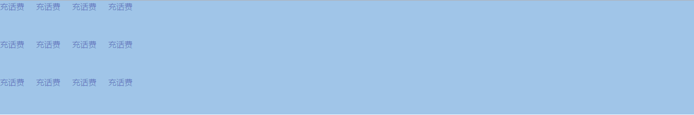
收缩之后:
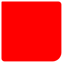
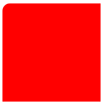
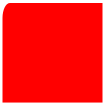
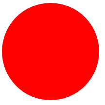
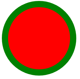
71 如何制作圆, 圆环以及半圆
<!DOCTYPE html>
<html>
<head>
    <title>边框属性</title>
    <style type="text/css">
        .box{
            width: 200px;
            height: 200px;
            background-color: red;
            border-radius: 3px 10px 30px;
        }
    </style>
</head>
<body>
    <div class="box"></div>
</body>
</html>
<!DOCTYPE html>
<html>
<head>
    <title>边框属性</title>
    <style type="text/css">
        .box{
            width: 200px;
            height: 200px;
            background-color: red;
            /*border-radius: 3px 10px 30px;*/
            border-top-left-radius: 15px;
        }
    </style>
</head>
<body>
    <div class="box"></div>
</body>
</html>
<!DOCTYPE html>
<html>
<head>
    <title>边框属性</title>
    <style type="text/css">
        .box{
            width: 200px;
            height: 200px;
            background-color: red;
            /*border-radius: 3px 10px 30px;*/
            border-top-left-radius: 15px 30px;
        }
    </style>
</head>
<body>
    <div class="box"></div>
</body>
</html>
<!DOCTYPE html>
<html>
<head>
    <title>圆</title>
    <style type="text/css">
        .box{
            width: 200px;
            height: 200px;
            background-color: red;
            /*切出圆: 半径设置成宽高的一半或50%(推荐使用50%)*/
            border-radius: 50%;
        }
    </style>
</head>
<body>
    <div class="box"></div>
</body>
</html>
<!DOCTYPE html>
<html>
<head>
    <title>圆环</title>
    <style type="text/css">
        .box{
            width: 200px;
            height: 200px;
            background-color: red;
            /*制作圆环*/
            border-radius: 50%;
            border:20px solid green;
        }
    </style>
</head>
<body>
    <div class="box"></div>
</body>
</html>
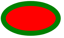
<!DOCTYPE html>
<html>
<head>
    <title>椭圆</title>
    <style type="text/css">
        .box{
            width: 200px;
            height: 100px;
            background-color: red;
            /*制作圆环*/
            border-radius: 50%;
            border:20px solid green;
        }
    </style>
</head>
<body>
    <div class="box"></div>
</body>
</html>
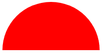
<!DOCTYPE html>
<html>
<head>
    <title>半圆</title>
    <style type="text/css">
        .box{
            width: 200px;
            height: 100px;
            background-color: red;
            border-top-left-radius: 100px;
            border-top-right-radius: 100px;
        }
    </style>
</head>
<body>
    <div class="box"></div>
</body>
</html>
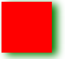
72 使网页中的元素产生阴影的效果
边框没有阴影, 当前盒子模型有阴影.
CSS中可以设置两种阴影, 一种是外部阴影, 另一种是内部阴影.
阴影的颜色, 阴影颜色的透明度, 阴影的大小, 阴影的模糊程度, 阴影的位置(角度), 阴影的距离.
在CSS中, 可以将角度和距离看成阴影在水平和垂直方向上的偏移位置.
<!DOCTYPE html>
<html>
<head>
    <title>边框阴影</title>
    <!-- 第一个值: 阴影的水平偏移值, 可以为正值和负值;
            第二个值: 阴影的垂直偏移值, 可以为正值和负值;
            第三个值: 阴影的模糊程度;
            第四个值: 阴影的颜色;
            第五个值: 内置(默认)或外置(inset)阴影 -->
    <style type="text/css">
        .sd{
            width: 200px;
            height: 200px;
            background-color: red;
            box-shadow: 20px 10px 50px green;
        }
    </style>
</head>
<body>
    <div class="sd"></div>
</body>
</html>
<!DOCTYPE html>
<html>
<head>
    <title>鼠标悬浮产生阴影效果</title>
    <style type="text/css">
        .sd{
            position: relative;
            width: 200px;
            height: 200px;
            background-color: red;
        }
        .sd:hover{
            top:-3px;
            box-shadow: 0 10px 10px green;
        }
    </style>
</head>
<body>
    <div class="sd"></div>
</body>
</html>
73 网页常见布局方案 - 单列布局
<!DOCTYPE html>
<html>
<head>
    <title>单列布局</title>
    <style type="text/css">
        html,body{
            margin:0;
            height: 100%;
        }
        .header{
            width: 100%;
            height: 60px;
            line-height: 60px;
            text-align: center;
            background-color: #000;
        }
        .container{
            width: 1200px;
            margin:0 auto;
        }
        .header .container{
            height: 60px;
            background-color: orange;
        }
        .wrap{
            width: 100%;
            height: 100%;
        }
        .wrap .container{
            height: 100%;
            background-color: red;
            }
        .footer{
            width: 100%;
            height: 100px;
        }
        .footer .container{
            height: 100px;
            background-color: green;
        }
    </style>
</head>
<body>
    <!-- 头部 -->
    <div class="header">
        <div class="container">头部</div>
    </div>
    <!-- 主体内容 -->
    <div class="wrap">
        <div class="container"></div>
    </div>
    <!-- 脚部 -->
    <div class="footer">
        <div class="container"></div>
    </div>
</body>
</html>
74 网页常见布局方案 - 多列布局
<!DOCTYPE html>
<html>
<head>
    <title>两列布局</title>
    <style type="text/css">
        html,body{
            margin:0;
            height: 100%;
        }
        .header{
            width: 100%;
            height: 60px;
            line-height: 60px;
            text-align: center;
            background-color: #000;
        }
        .container{
            width: 1200px;
            margin:0 auto;
        }
        .header .container{
            height: 60px;
            background-color: orange;
        }
        .wrap{
            width: 100%;
            height: 100%;
        }
        .wrap .container{
            height: 100%;
            background-color: red;
            }
        .wrap .left{
            width: 10%;
            height: 100%;
            float: left;
            background-color: yellowgreen;
        }
        .wrap .right{
            width: 90%;
            height: 100%;
            float: right;
            background-color: orchid;
        }
        .footer{
            width: 100%;
            height: 100px;
        }
        .footer .container{
            height: 100px;
            background-color: green;
        }
    </style>
</head>
<body>
    <!-- 头部 -->
    <div class="header">
        <div class="container">头部</div>
    </div>
    <!-- 主体内容 -->
    <div class="wrap">
        <div class="container">
            <div class="left"></div>
            <div class="right"></div>
        </div>
    </div>
    <!-- 脚部 -->
    <div class="footer">
        <div class="container"></div>
    </div>
</body>
</html>
<!DOCTYPE html>
<html>
<head>
    <title>三列布局</title>
    <style type="text/css">
        html,body{
            margin:0;
            height: 100%;
        }
        .header{
            width: 100%;
            height: 60px;
            line-height: 60px;
            text-align: center;
            background-color: #000;
        }
        .container{
            width: 1200px;
            margin:0 auto;
        }
        .header .container{
            height: 60px;
            background-color: orange;
        }
        .wrap{
            width: 100%;
            height: 100%;
        }
        .wrap .container{
            height: 100%;
            }
        .wrap .left{
            width: 10%;
            height: 100%;
            float: left;
            background-color: yellowgreen;
        }
        .wrap .right{
            width: 10%;
            height: 100%;
            float: right;
            background-color: orchid;
        }
        .wrap .center{
            height: 100%;
            background-color: purple;
            margin:0 130px;
        }
        .footer{
            width: 100%;
            height: 100px;
        }
        .footer .container{
            height: 100px;
            background-color: green;
        }
    </style>
</head>
<body>
    <!-- 头部 -->
    <div class="header">
        <div class="container">头部</div>
    </div>
    <!-- 主体内容 -->
    <div class="wrap">
        <div class="container">
            <div class="left"></div>
            <div class="right"></div>
            <div class="center">mjj</div>
        </div>
    </div>
    <!-- 脚部 -->
    <div class="footer">
        <div class="container"></div>
    </div>
</body>
</html>
75 网页中常见问题介绍
1. CSS的命名规范
www.divcss5.com/jiqiao/j4.shtml#no2
2. 项目目录规范
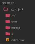
css: link的css文件
fonts: 字体,图标, 通常使用第三方的
images:图片
js
3. 确定错误发生的位置
将某些标签注释掉或删除掉.
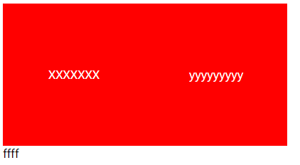
76 行内元素水平垂直居中
<!DOCTYPE html>
<html>
<head>
    <title>行内元素水平垂直居中</title>
    <style type="text/css">
        .box{
            width: 200px;
            height: 200px;
            background-color: red;
            color: #fff;
            /*方式1*/
            /*水平居中*/
            text-align: center;
            /*垂直居中*/
            /*line-height: 200px;*/

            /*方式2*/
            display: table-cell;
            /*垂直居中*/
            vertical-align: middle;
        }
    </style>
</head>
<body>
    <div class="box">
        XXXXXXX
    </div>
    <div class="box">
        <span>yyyyyyyyy</span>
    </div>
    <div class="box1">
        ffff
    </div>
</body>
</html>
77 块级元素水平垂直居中方法一
<!DOCTYPE html>
<html>
<head>
    <title>块级元素水平垂直居中 - 方式1</title>
    <style type="text/css">
        .box{
            width: 200px;
            height: 200px;
            background-color: red;
            position: relative;

        }
        .child{
            width: 100px;
            height: 100px;
            background-color: green;
            margin:0 auto;
            position: absolute;
            top: 50px;
            left: 50px;
        }
    </style>
</head>
<body>
    <div class="box">
        <div class="child"></div>
    </div>

</body>
</html>
<!DOCTYPE html>
<html>
<head>
    <title>块级元素水平垂直居中 - 方式2</title>
    <style type="text/css">
        .box{
            width: 200px;
            height: 200px;
            background-color: red;
            position: relative;

        }
        .child{
            width: 100px;
            height: 100px;
            background-color: green;
            margin:0 auto;
            position: absolute;
            margin: auto;
            top: 0;
            bottom: 0;
            left: 0;
            right: 0;
        }
    </style>
</head>
<body>
    <div class="box">
        <div class="child"></div>
    </div>

</body>
</html>
78 块级元素水平垂直居中方法二
<!DOCTYPE html>
<html>
<head>
    <title>块级元素水平垂直居中 - 方式3</title>
    <style type="text/css">
        .box{
            width: 200px;
            height: 200px;
            background-color: red;
            display: table-cell;
            vertical-align: middle;
            /*
            text-align不能控制块级元素, 所以要将块级元素转为行内块;
            注意: 父级的text-align适用于父级及其子级中的所有行内元素.
            */
            text-align: center;
        }
        .child{
            width: 100px;
            height: 100px;
            background-color: green;
            display: inline-block;
        }
    </style>
</head>
<body>
    <div class="box">
        <div class="child">XXXX</div>
    </div>
</body>
</html
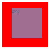
79 块级元素水平垂直居中方法三
<!DOCTYPE html>
<html>
<head>
    <title>块级元素水平垂直居中 - 方式4</title>
    <style type="text/css">
        .box{
            width: 200px;
            height: 200px;
            background-color: red;
            position: relative;
        }
        .child{
            width: 100px;
            height: 100px;
            background-color: green;
            position: absolute;
            /*top和left分别为50%, 这里以父级元素的宽高为基准.*/
            top: 50%;
            left: 50%;
            margin-left: -50px;
            margin-top: -50px;
        }
    </style>
</head>
<body>
    <div class="box">
        <div class="child">XXXX</div>
    </div>
</body>
</html>

 浙公网安备 33010602011771号