左右固定宽度中间自适应布局方式
话不多说先上要实现的效果:(很简单水平居中)
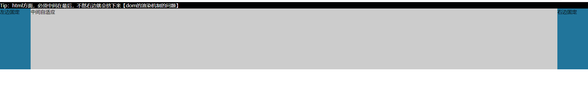
<!DOCTYPE html>
<html>
    <head>
        <meta charset="utf-8">
        <title>左右固定中间自适应</title>
    </head>
    <style type="text/css">
        * {
            margin: 0;
            padding: 0;
            list-style: none;
        }
        /* 方式一:浮动 */
        .box{
            height: 200px;
            background: #000000;
        }
        .left{
            width: 100px;
            height: 100%;
            background: #21759B;
            float: left;
        }
        .main{
            margin: 0 100px;
            height: 100%;
            background: #ccc;
        }
        .right{
            width: 100px;
            height: 100%;
            background: #21759B;
            float: right;
        }
    </style>
    <body>
        <div class="box">
            <p style="color:#fff">Tip:html方面,必须中间在最后,不然右边就会挤下来【dom的渲染机制的问题】</p>
            <div class="right">右边固定</div>
            <div class="left">左边固定</div>
            <div class="main">中间自适应</div>
        </div>
    </body>
</html>
<!DOCTYPE html>
<html>
    <head>
        <meta charset="utf-8">
        <title>左右固定中间自适应</title>
    </head>
    <style type="text/css">
        * {
            margin: 0;
            padding: 0;
            list-style: none;
        }
        /* 方式二:定位 */
        .box{
            background: #000000;
            position: relative;
        }
        .left{
            width: 100px;
            height: 100%;
            background: #21759B;
            position: absolute;
            top: 0;
            left: 0;
        }
        .main{
            margin: 0 100px;
            height: 200px;
            background: #ccc;
        }
        .right{
            width: 100px;
            height: 100%;
            background: #21759B;
            position: absolute;
            top: 0;
            right: 0;
        }
    </style>
    <body>
        <div class="box">
            <div class="left">左边固定</div>
            <div class="main">中间自适应</div>
            <div class="right">右边固定</div>
        </div>
    </body>
</html>
<!DOCTYPE html>
<html>
    <head>
        <meta charset="utf-8">
        <title>左右固定中间自适应</title>
    </head>
    <style type="text/css">
        * {
            margin: 0;
            padding: 0;
            list-style: none;
        }
        /* 方式三:flex */
        .box{
            display: flex;
            height: 200px;
            background: #000000;
        }
        .left{
            width: 100px;
            height: 100%;
            background: #21759B;
        }
        .main{
            flex: 1;
            height: 100%;
            background: #ccc;
        }
        .right{
            width: 100px;
            height: 100%;
            background: #21759B;
        }
    </style>
    <body>
        <div class="box">
            <div class="left">左边固定</div>
            <div class="main">中间自适应</div>
            <div class="right">右边固定</div>
        </div>
    </body>
</html>
本文来自博客园,作者:鱼樱前端,转载请注明原文链接:https://www.cnblogs.com/lhl66/p/14057156.html

 浙公网安备 33010602011771号