
Python疫情可视化
Python分析疫情
一、对疫情谣言进行分析
首先,向奋战在前线的医护人员、科研人员致敬,因为他们的不懈努力,目前疫情已经有所好转。但是自从疫情开始,各种谣言、假新闻等等蔓延开来,出现各种微信公众号、微信群里。很多我们年轻人一眼看过去就知道是引人注目的宣传手段、但是这些文章在老人们眼中就成了心灵鸡汤,各种转发,呼吁。而自己在家也收到了家庭群中的各式各样的谣言。我理解他们渴望关注疫情并且及时推荐给家人了解,但有些媒体和标题党正式借用了他们这种为家人、为朋友的出发点不停地蹭热度、散播谣言。


1、数据来源
腾讯较真平台(https://vp.fact.qq.com/home)上实时更新有关疫情的信息,并且给出了相关信息的真伪。

2、观察页面元素
通过谷歌浏览区查看页面信息,找到相应的数据

从页面信息可以了解到所需要的信息的真假以文本的形式出现。
3、爬取数据
import requests
import pandas as pd
class SpiderRumor(object):
    def __init__(self):
        self.url = "https://vp.fact.qq.com/loadmore?artnum=0&page=%s"
        self.header = {
            "User-Agent": "Mozilla/5.0 (iPhone; CPU iPhone OS 11_0 like Mac OS X) AppleWebKit/604.1.38 (KHTML, like Gecko) Version/11.0 Mobile/15A372 Safari/604.1",
 }
    def spider_run(self):
        df_all = list()
        for url in [self.url % i for i in range(61)]:
            data_list = requests.get(url, headers=self.header).json()["content"]
            temp_data = [[df["title"], df["date"], df["result"], df["explain"], df["tag"]] for df in data_list]
            df_all.extend(temp_data)
            print(temp_data[0])
        pd.DataFrame(df_all, columns=["title", "date", "result", "explain", "tag"]).to_csv("冠状病毒谣言数据.csv", encoding="utf_8_sig")
if __name__ == '__main__':
    spider = SpiderRumor()
    spider.spider_run()
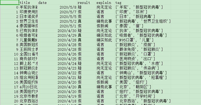
效果图所示:
本地生成的csv文件:
生成的信息数据从1月18号到5月8号。
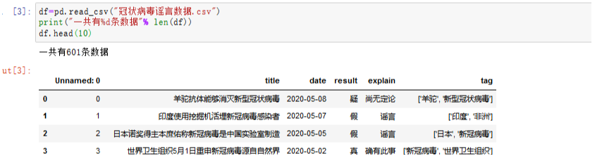
4、对数据进行相关操作
数据从1月18号到5月8号一共有601条。
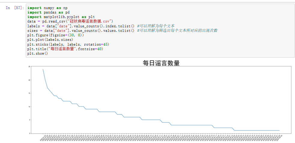
5、折线图
用来分析每日的谣言数量,从结果可以看出在1月25 、26号两天的谣言数量最多。
可能这两天是春节,大家都坐在家里,时刻关注疫情的发展。茶余饭后的闲聊可能就成了各大微信群、公众号、微博等散布出去的谣言。从而一传十,十传百越传越多。在2月10日左右每天的谣言数目已经出现看明显的下降,可能是因为部分企业开始网上办公、网上教学等措施,使得本来在家闲到发慌的人们开始忙碌起来,也就不那么关注谣言了。
6、绘制饼图和环图
如此多的信息,让我们分不清真假,那到底有多少是真、多少是假的。我们用饼图和环图来做对比分析。
import numpy as np
import pandas as pd
import matplotlib.pyplot as plt
data = pd.read_csv("冠状病毒谣言数据.csv")
labels = data["explain"].value_counts().index.tolist() #可以理解为每个文本
sizes = data["explain"].value_counts().values.tolist() #可以理解为筛选出每个文本所对应的出现次数
colors = ['lightgreen', 'gold', 'lightskyblue', 'lightcoral']
plt.figure(figsize=(18,10))
plt.pie(sizes, labels=labels,
        colors=None, autopct='%1.1f%%', shadow=True,explode=(0.1,0.1,0,0,0,0,0,0,0,0),textprops={'fontsize':15,'color':'black'})  # shadow=True 表示阴影
plt.axis('equal')  # 设置为正的圆形
plt.legend(loc = 'upper right',ncol = 2)
plt.show()
输出结果为:
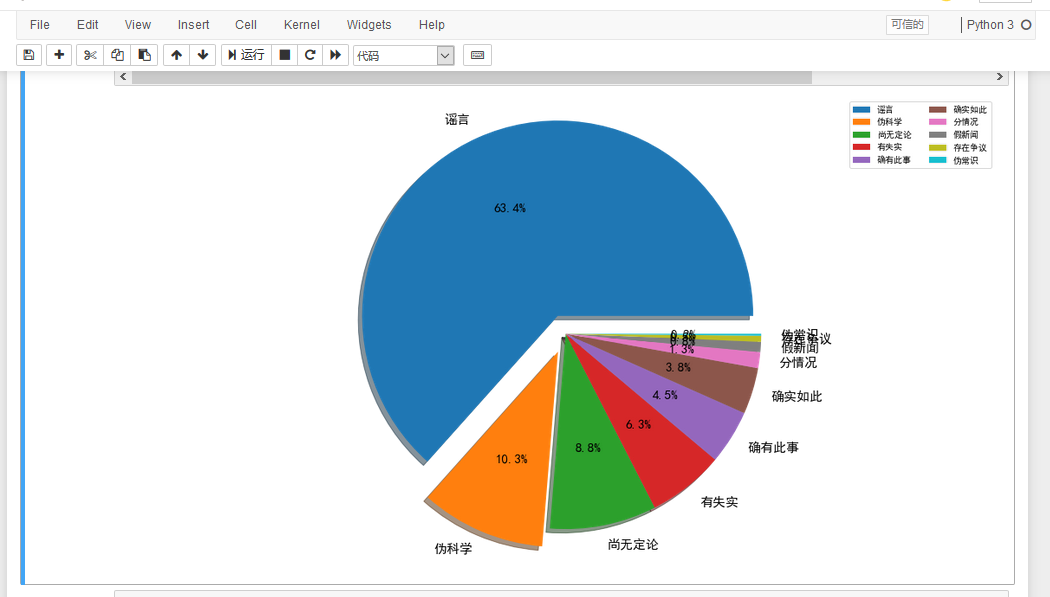
我们可以在饼中清楚地看到,有63.4%的属于真正的谣言,并且歪曲事实,给无辜的长辈们带来了很大的恐慌,而还有10.3%的不知名公众号散播出来的伪科学。“多洗热水澡可以预防新型冠状病毒肺炎”,“用棉布、保鲜膜、纱布自制口罩,可预防新冠病毒感染”、'复方甲酚皂能杀死新冠肺炎病毒'等谣言,贴近生活,与百姓生活息息相关,才会让长辈们迷失了自己的判断力,在各种贴吧、微信群转发这些“博眼球”的谣言。
另外,我们也可以通过分析信息中的关键词。
import numpy as np
import pandas as pd
import matplotlib.pyplot as plt
# Windows系统设置中文字体
plt.rcParams['font.sans-serif']=['SimHei']
plt.rcParams['axes.unicode_minus'] = False

data = pd.read_csv("冠状病毒谣言数据.csv")
df = pd.Series([j for i in [eval(i) for i in data["tag"].tolist()] for j in i]).value_counts()[:20]
X = df.index.tolist()
y = df.values.tolist()
plt.figure(figsize=(15, 8)) # 设置画布
plt.bar(X, y, color="blue")
plt.tight_layout()
# plt.grid(axis="y")
plt.grid(ls='-.')
plt.show()
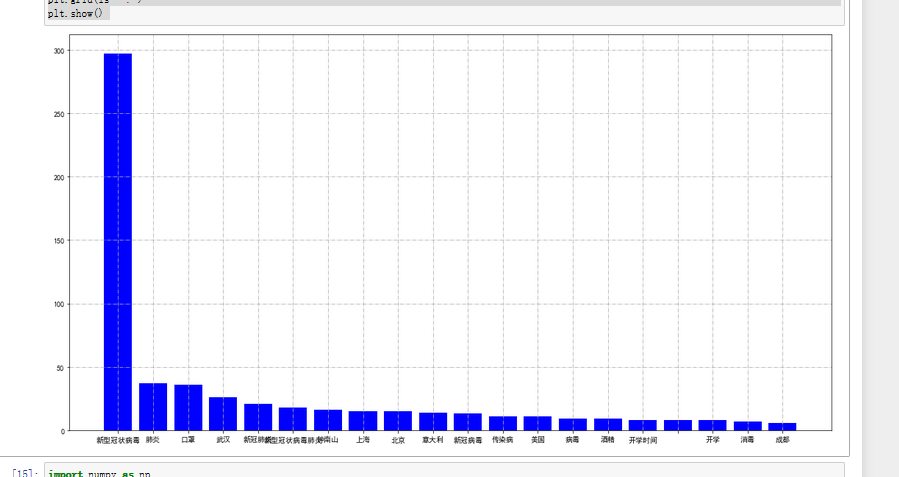
结果输出为:
也可用环图来表示:
from pyecharts import Pie
pie = Pie("谣言关键字环图", title_pos='center')
pie.add(
    "",
    X,
    Y,
    radius=[40, 75],
    label_text_color=None,
    is_label_show=True,
    is_more_utils=True,
    legend_orient="vertical",
    legend_pos="left",
)
pie.render(path="谣言环图.html")
结果:
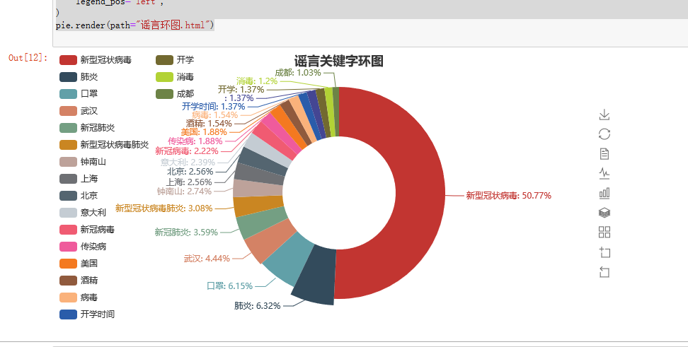
从以上分析结果可以看出新型冠状病毒还是人们关注的重点,也是谣言中关键词出现最多的。
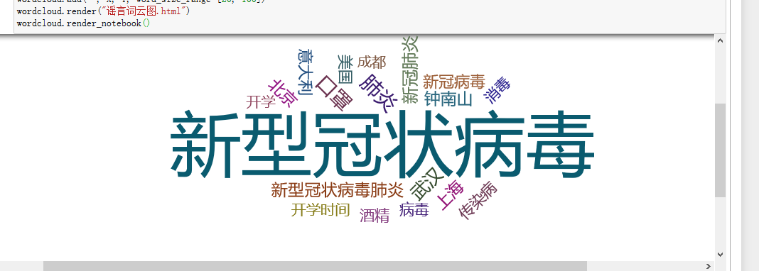
我们也可以用Pyecharts中的WordCloud制作关键词词云图表示。
import numpy as np
import pandas as pd
from pyecharts import WordCloud
import matplotlib.pyplot as plt

# Windows系统设置中文字体

plt.rcParams['font.sans-serif']=['SimHei']
plt.rcParams['axes.unicode_minus'] = False

data = pd.read_csv("冠状病毒谣言数据.csv")
df = pd.Series([j for i in [eval(i) for i in data["tag"].tolist()] for j in i]).value_counts()[:20]
X = df.index.tolist()
Y= df.values.tolist()
wordcloud = WordCloud(width=1300, height=620)
wordcloud.add("", X, Y, word_size_range=[20, 100])
wordcloud.render("谣言词云图.html")
wordcloud.render_notebook()
结果:
三、对疫情数据可视化
1、数据来源
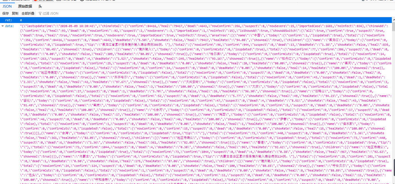
腾讯的实时疫情网页 https://view.inews.qq.com/g2/getOnsInfo?name=disease_h5 爬取地区疫情数据。
通过浏览器“审查元素”查看源代码及“网络”反馈的消息,如下图所示:
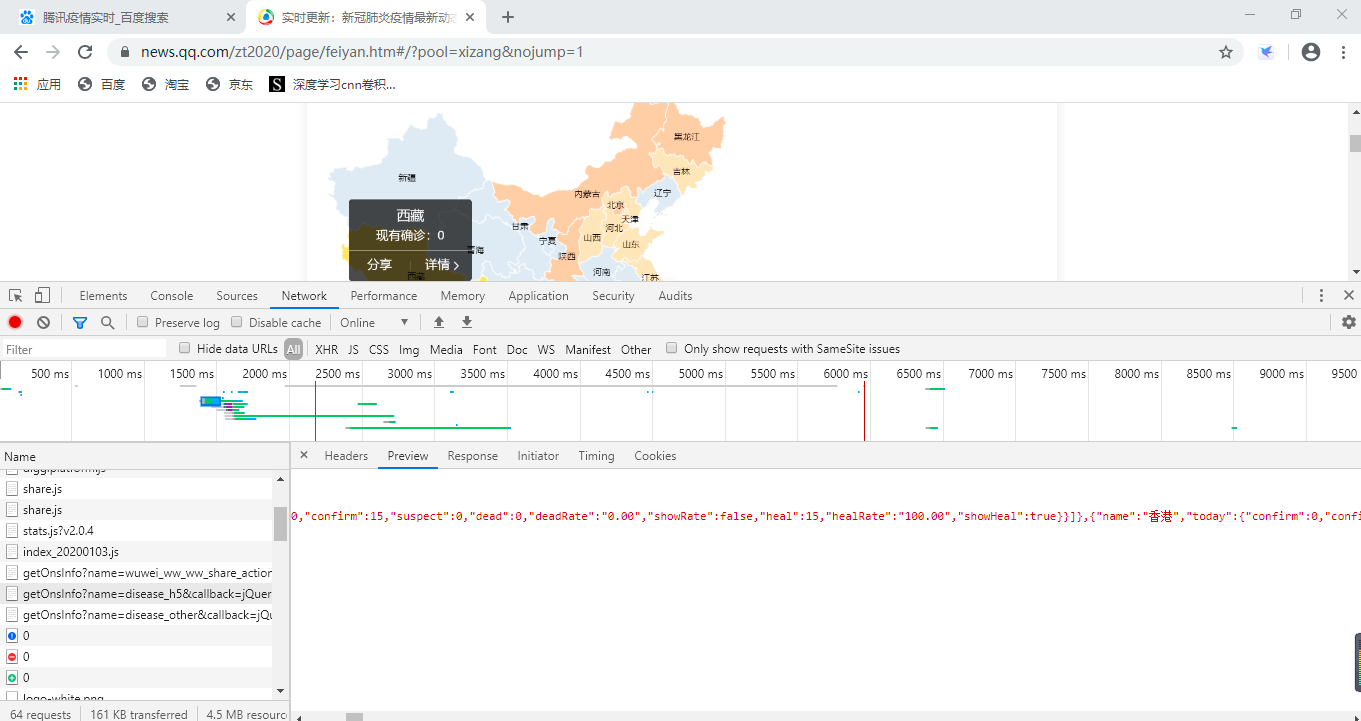
对应的响应信息如下所示:
2、爬取和处理数据
代码在Jupyter Notebook里运行
import time
import json
import requests
from datetime import datetime
import pandas as pd
import numpy as np
def catch_data():
url = 'https://view.inews.qq.com/g2/getOnsInfo?name=disease_h5'
reponse = requests.get(url=url).json()
#返回数据字典
data = json.loads(reponse['data'])
return data
data = catch_data()
data.keys()
lastUpdateTime = data['lastUpdateTime']
# 数据明细,数据结构比较复杂,一步一步打印出来看,先明白数据结构
areaTree = data['areaTree']
# 国内数据
china_data = areaTree[0]['children']
china_list = []
for a in range(len(china_data)):
province = china_data[a]['name']
province_list = china_data[a]['children']
for b in range(len(province_list)):
city = province_list[b]['name']
total = province_list[b]['total']
today = province_list[b]['today']
china_dict = {}
china_dict['province'] = province
china_dict['city'] = city
china_dict['total'] = total
china_dict['today'] = today
china_list.append(china_dict)
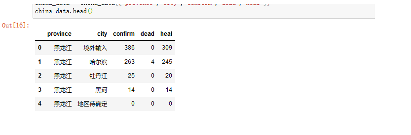
china_data = pd.DataFrame(china_list)
china_data.head()
爬取结果如图所示:

对数据进行清洗处理并筛选需要的数据:
# 定义数据处理函数
def confirm(x):
    confirm = eval(str(x))['confirm']
    return confirm
def dead(x):
    dead = eval(str(x))['dead']
    return dead
def heal(x):
    heal =  eval(str(x))['heal']
    return heal
# 函数映射
china_data['confirm'] = china_data['total'].map(confirm)
china_data['dead'] = china_data['total'].map(dead)
china_data['heal'] = china_data['total'].map(heal)
china_data = china_data[["province","city","confirm","dead","heal"]]
china_data.head()
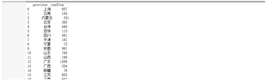
把每个省总的数据求出来,并存到csv表格中。
area_data = china_data.groupby("province")["confirm"].sum().reset_index()
area_data.column=["province","confirm"]
print(area_data)
3、对疫情数据进行可视化操作
import pandas as pd
from pyecharts import WordCloud
import matplotlib.pyplot as plt
from pyecharts import Line
plt.rcParams['font.sans-serif']=['SimHei']
plt.rcParams['axes.unicode_minus'] = False

data = pd.read_csv("confirm.csv")
data
x=data["province"]
y=data["confirm"]
wordcloud = WordCloud(width=900, height=420)
wordcloud.add("", x, y, word_size_range=[20, 100])
对处理出来的csv表格进行读取,并对每个省市的确诊人数进行词云图可视化操作。

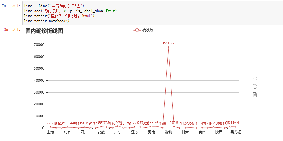
用折线图来表示每个省市确诊人数的对比分析
图中显示可得,湖北确诊人数最高。
另外也可以用环图或者饼图更加直观的表示各省市的确诊人数数据
from pyecharts import Pie
from pyecharts import Bar
pie = Pie("确诊环图", title_pos='right')
pie.add(
    "",
    x,
    y,
    radius=[40, 75],
    label_text_color=None,
    is_label_show=True,
    is_more_utils=True,
    legend_orient="vertical",
    legend_pos="left",
)
pie.render(path="确诊环图.html")
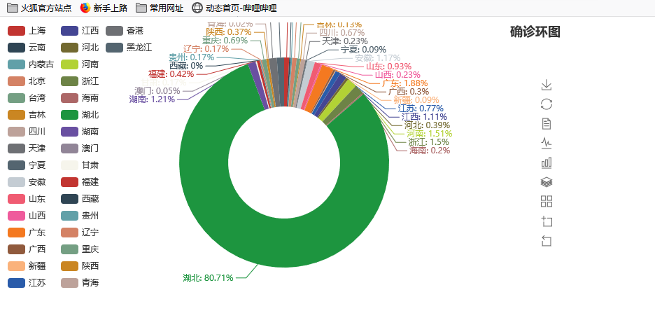
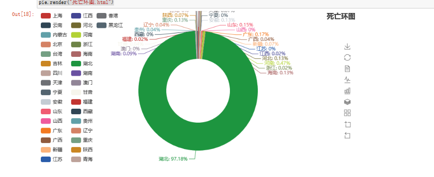
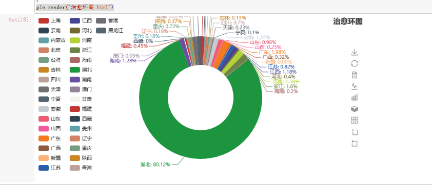
同上分别可以得到死亡人数的环图和治愈人数的环图。
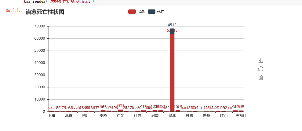
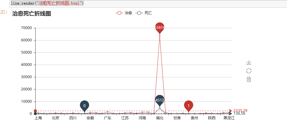
最后把治愈人数和死亡人数通过折线图和柱状图可视化
# coding=utf-8

from pyecharts import Bar, Line
import random
import pandas as pd
data = pd.read_csv("dead.csv")
x=data["province"]
y=data["dead"]
data1 = pd.read_csv("heal.csv")
z=data1["heal"]
bar = Bar("治愈死亡柱状图")
bar.add("治愈", x, z, is_stack=True,is_label_show=True)
bar.add("死亡",x, y, is_stack=True,is_label_show=True)
bar.render("治愈死亡折线图.html")
line = Line("治愈死亡折线图")
line.add("治愈",x,z,mark_point=["max", "min"],mark_line=["average"])
line.add("死亡",x,y,mark_point=["max", "min"],mark_line=["average"])
line.render("治愈死亡折线图.html")
确诊病例数据在中国地图上的可视化的实现:
from pyecharts import Geo
data = {'河南': 1276, '北京': 593, '河北': 328, '辽宁': 146, '江西': 937, '上海': 657, '安徽': 991, '江苏': 653, '湖南': 1019,
                         '浙江': 1268, '海南': 168, '广东': 1589, '湖北': 68128, '黑龙江': 944, '澳门': 45, '陕西': 308, '四川': 561, '内蒙古': 201, '重庆': 579,
                         '云南': 185, '贵州':147 , '吉林': 113, '山西': 198, '山东': 788, '福建': 356, '青海': 18,  '天津': 191,'新疆':76,'西藏':1,'甘肃':139,'宁夏':75,
                         '广西':254,'台湾':440,'香港':1044,'其他': 1}
map = Map(
    "全国主要城市空气质量",
    "data from pm2.5",
    title_color="#fff",
    title_pos="center",
    width=1200,
    height=600,
    background_color="#404a59",
)
attr, value = map.cast(data)
map.add(
    "",
    attr,
    value,
    visual_range=[0, 7000],
    visual_text_color="#fff",
    symbol_size=15,
    is_visualmap=True,
)
map.render(r"全国空气质量图.html")
结果如下:

在Jupyter notebook的项目如图所示:
三、模拟疫情病毒传播
2019年12月以来,湖北省武汉市持续开展流感及相关疾病监测,发现多起病毒性肺炎病例,均诊断为病毒性肺炎/肺部感染 ,截至5月9日24时,据31个省(自治区、直辖市)和新疆生产建设兵团报告,现有确诊病例148例(其中重症病例13例),累计治愈出院病例78120例,累计死亡病例4633例,累计报告确诊病例82901例。这些都是多门可怕的数字啊,为什么病毒会传染的如此之快。我们今天用Python来模拟一下新冠状病毒的传播过程(在不做任何防护措施的情况下)
1、编写模型
编写一些City()、Human()、Simulation
import random
import numpy as np
class City():
    def __init__(self,fileName):
        super().__init__()
        with open(fileName,"r") as f:
            self.w=int(f.readline())
            self.h=int(f.readline())
            self.cell=int(f.readline())
            self.map=[ ['0' for col in range(0,self.w)] for row in range(0,self.h)]
            for row in range(0,self.h):
                line=f.readline()
                for col in range(0,self.w):
                    self.map[row][col]=line[col]
    def canMove(self,x,y):
        if x>=0 and x<self.w and y>=0 and y<self.h:
            return self.map[y][x]=='0';
        else:
            return False;
class Human():
    def __init__(self,x,y,city,infected=False):
        super().__init__()
        self.x=x
        self.y=y
        self.city=city
        self.infected=infected
    def move(self):
        r=random.randint(0,3)
        if r==0:
            if self.city.canMove(self.x+1,self.y):
                self.x+=1
        elif r==1:
            if self.city.canMove(self.x-1,self.y):
                self.x-=1
        elif r==2:
            if self.city.canMove(self.x,self.y+1):
                self.y+=1
        else:
            if self.city.canMove(self.x,self.y-1):
                self.y-=1
class Simulation:
    def __init__(self,humanSize,iRatio,p):
        super().__init__()
        self.city=City("resources/map.txt")
        self.p=p
        self.humans=[]
        for i in range(0,humanSize):
            while True:
                x=random.randint(0,self.city.w-1)
                y=random.randint(0,self.city.h-1)
                if self.city.map[y][x]=='0':
                    break
            self.humans.append(Human(x,y,self.city))
        for i in range(0,int(humanSize*iRatio)):
            self.humans[i].infected=True
        self.infected=int(humanSize*iRatio)
        self.uninfected=humanSize-self.infected
        self.iteration=0
    def run(self):
        self.iteration+=1
        for human in self.humans:
            human.move()
        for human in self.humans:
            for other in self.humans:
                if human!=other and human.x==other.x and human.y==other.y:
                    if human.infected and (not other.infected):
                        if random.random()<self.p:
                            other.infected=True
        self.infected=0
        for human in self.humans:
            if human.infected:
                self.infected+=1
        self.uninfected=len(self.humans)-self.infected
    def getHumanPosition(self):
        infectedPos=[]
        unInfectedPos=[]
        for i in range(len(self.humans)):
            if self.humans[i].infected:
                infectedPos.append((self.humans[i].x*self.city.cell+self.city.cell//2,self.humans[i].y*self.city.cell+self.city.cell//2))
            else:
                unInfectedPos.append((self.humans[i].x*self.city.cell+self.city.cell//2,self.humans[i].y*self.city.cell+self.city.cell//2))
        return {"infected":np.array(infectedPos),"uninfected":np.array(unInfectedPos)}

# sim=Simulation(500,0.1,0.1)

# for i in range(100):

#     sim.run()

#     print("迭代次数:%d,感染人数:%d,健康人数:%d"%(sim.iteration,sim.infected,sim.uninfected))
2、可视化:
from model import City
from model import Human
from model import Simulation
import matplotlib.pyplot as plt
import matplotlib.animation as ma
sim=Simulation(2000,0.1,0.2)
map=plt.imread("resources/map.jpg")
plt.imshow(map)
scInfected=plt.scatter([],[],10, color='r')
scUnInfected=plt.scatter([],[],10,color='g')
def update(number):
    sim.run()
    print("迭代次数:%d,感染人数:%d,健康人数:%d"%(sim.iteration,sim.infected,sim.uninfected))
    pos=sim.getHumanPosition()
    scInfected.set_offsets(pos["infected"])
    scUnInfected.set_offsets(pos["uninfected"])

anim = ma.FuncAnimation(plt.gcf(), update, interval=1)
plt.show()
结果如下所示:
红点表示感染人群,绿点表示健康人群。随着时间的推移和人口的流动,红点越来越多,绿点越来越少。

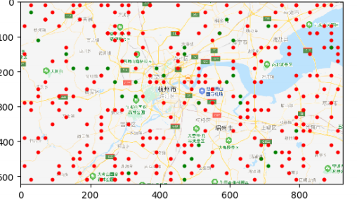
由上图可知,随着防护措施的薄弱和人口的流动,最终会全部感染。由此可见,在平常生活中戴口罩、消毒等相关防护措施是相当的重要,如果没有这些防护,我们最后都会变成图中的红点
本次Python疫情分析就到这里结束了,同时,向钟院士致敬,向一线工作者致敬。侠之大者,为国为民。咱们中国人一生的最高追求,为天地立心,为生民立命,为往圣继绝学,为万世开太平。以一人之力系万民康乐,以一身犯险保大业安全。他们真是做到了,武汉加油,中国加油!

 浙公网安备 33010602011771号