

CSS3过渡、变形、动画(一)
先给大家上一个效果感受一哈:
http://demo.marcofolio.net/3d_animation_css3/
效果图(3D炫酷翻转):

一、CSS3过渡以及如何使用
通过一个例子来说明这一点:
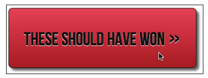
这是一个按钮的样式:
 1 #content a {
 2   text-decoration: none;
 3   font: 2.25em /* 36px ÷ 16 */ 'BebasNeueRegular';
 4   background-color: #b01c20;
 5   border-radius: 8px;
 6   color: #ffffff;
 7   padding: 3%;
 8   float: left;
 9   background: linear-gradient(90deg, #b01c20 0%, #f15c60 100%);
10   margin-top: 30px;
11   box-shadow: 5px 5px 5px hsla(0, 0%, 26.6667%, 0.8);
12   text-shadow: 0px 1px black;
13   border: 1px solid #bfbfbf;
14 }
再来给按钮添加一个悬停样式:
1 #content a:hover {
2   border: 1px solid #000000;
3   color: #000000;
4   text-shadow: 0px 1px white;
5 }
效果:
默认时:

鼠标悬停时:
使用这段 CSS 代码,当鼠标悬停在按钮上面时,按钮会直接从第一种状态(白色文字)突变到第二种状态(黑色文字)
下面我们给第一段CSS添加一点代码:
1 #content a {
2 /*……原来的样式……*/
3 transition: all 1s ease 0s;
4 }
现在再把鼠标悬停在按钮上,文字、文字阴影和边框阴影的颜色都会从第一种状态平滑过渡到第二种状态。
二、过渡相关的属性
CSS3过渡效果涉及四个属性,也可以使用包含这四个属性的缩写。
(1)transition-property :要过渡的 CSS 属性名称(比如 background-color 、
text-shadow 或者 all ,使用 all 则过渡会被应用到每一个可能的 CSS属性上);
(2)transition-duration :定义过渡效果持续的时间(时间单位为秒,比如 .3s 、 2s
或 1.5s );
(3)transition-timing-function :定义过渡期间速度如何变化(比如 ease 、 linear 、
ease-in 、 ease-out 、 ease-in-out 或 cubic-bezier );
(4)transition-delay :可选,用于定义过渡开始前的延迟时间。相反,将该值设置为
一个负数,可以让过渡效果立即开始,但过渡旅程则会从半路开始。
1 #content a {
2   ……其他样式……
3   transition-property: all;
4   transition-duration: 1s;
5   transition-timing-function: ease;
6   transition-delay: 0s;
7 }
可以分开写这些属性,当然也可以简写:
1 #content a {
2 /*……原来的样式……*/
3 transition: all 1s ease 0s;
4 }
还有浏览器私有前缀:
1 #content a{
2   /*其他样式*/
3 -o-transition: all 1s ease 0s;
4 -ms-transition: all 1s ease 0s;
5 -moz-transition: all 1s ease 0s;
6 -webkit-transition: all 1s ease 0s;
7 transition: all 1s ease 0s;
8 }
你还可以在不同时间段内过渡不同的属性:
1 #content a {
2 /*……其他样式……*/
3 transition-property: border, color, text-shadow;
4 transition-duration: 2s, 3s, 8s;
5 }
小tips(给所有元素添加一个过渡效果,是不是又好玩又好看):
1 * { transition: all 1s; }
联系作者:
VX:Mm_Lewis

 浙公网安备 33010602011771号