

悬浮窗样式设置+跟随鼠标移动的悬浮框demo
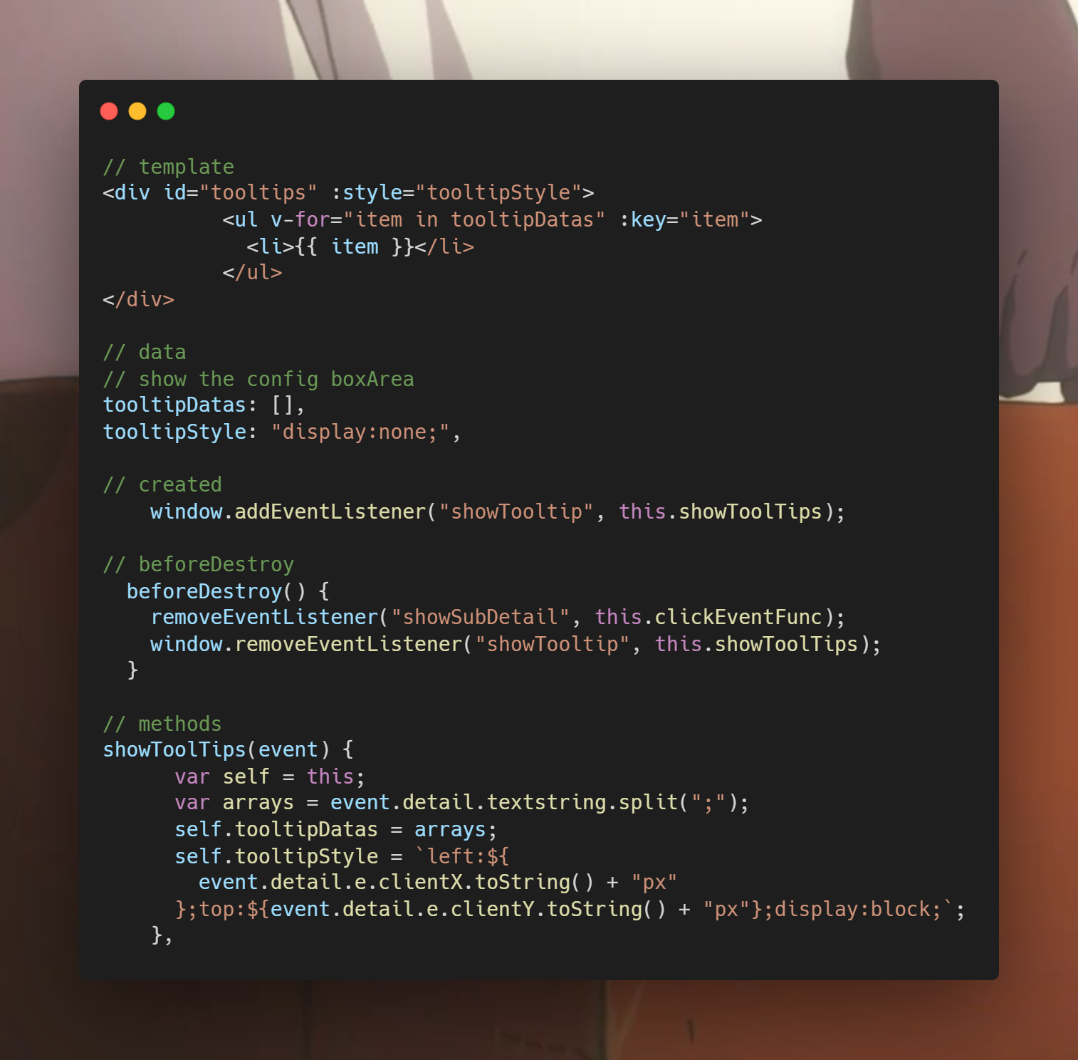


// template
<div id="tooltips" :style="tooltipStyle">
          <ul v-for="item in tooltipDatas" :key="item">
            <li>{{ item }}</li>
          </ul>
</div>

// data
// show the config boxArea
tooltipDatas: [],
tooltipStyle: "display:none;",

// created
    window.addEventListener("showTooltip", this.showToolTips);

// beforeDestroy
  beforeDestroy() {
    removeEventListener("showSubDetail", this.clickEventFunc);
    window.removeEventListener("showTooltip", this.showToolTips);
  }

// methods
showToolTips(event) {
      var self = this;
      var arrays = event.detail.textstring.split(";");
      self.tooltipDatas = arrays;
      self.tooltipStyle = `left:${
        event.detail.e.clientX.toString() + "px"
      };top:${event.detail.e.clientY.toString() + "px"};display:block;`;
    },
悬浮移出后的隐藏
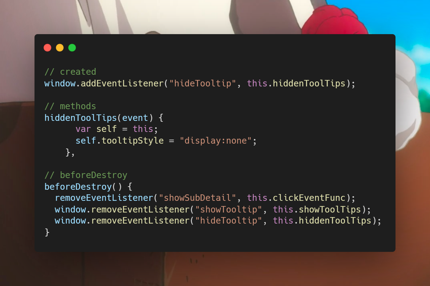
上文为自定义事件的高级版本
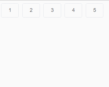
下面是原生事件mouseenter与mouseleave版本,更亲切
<template>
  <div>
    <el-button
      class="cursor"
      v-for="(item, index) in 5"
      :key="index"
      @mouseenter.native="handleClick"
      @mouseleave.native="hiddenTool"
      >{{ item }}<br
    /></el-button>
    <span v-show="showTool" class="tooltip" :style="tooltipStyle">tooltip</span>
  </div>
</template>

<script>
export default {
  data() {
    return {
      showTool: false,
      tooltipStyle: "",
    };
  },
  methods: {
    handleClick(e) {
      this.showTool = true;
      this.tooltipStyle = `left:${(e.clientX+20).toString() + "px"};top:${
        (e.clientY+20).toString() + "px"
      };display:block;`;
    },
    hiddenTool() {
      this.showTool = false;
    },
  },
};
</script>

<style lang="scss" scoped>
.tooltip {
  position: fixed;
  z-index: 100;
  background-color: rgb(103, 166, 238);
}
</style>
注意悬浮框的样式,fixed且z-index要设置高一点。
效果如图
人生到处知何似,应似飞鸿踏雪泥。

 浙公网安备 33010602011771号