按钮的简单封装
根据公司业务的需要,发现一些静态的功能总是发生历史上的相同,于是进行简单的封装,因为不涉及接口数据渲染,采用对象静态渲染的方式
先看看公司的业务大概是什么样子
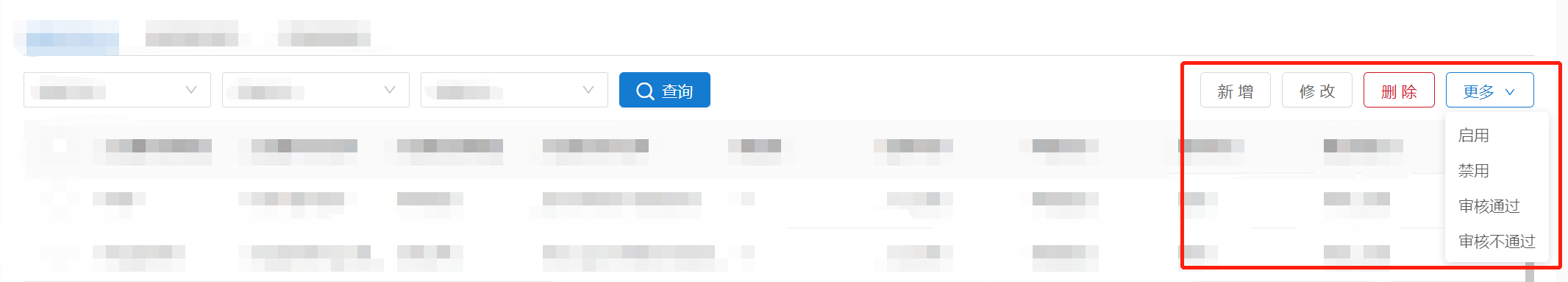
这里使用的是ant design vue的组件库,然后看看原本的组件编写方式,存在着普通的按钮点击事件还存在下拉选择组件
<div class="as-f-rt">
	<a-button type="add" @click="addClick">新增</a-button>
	<a-button type="edit" @click="editClick">修改</a-button>
	<a-button type="del" @click="btnClick">删除</a-button>
	<a-dropdown>
		<a-button class="ant-dropdown-link" @click="e => e.preventDefault()">
			更多
			<a-icon type="down" />
		</a-button>
		<a-menu slot="overlay">
			<a-menu-item @click="fnStatus(1)">启用</a-menu-item>
			<a-menu-item @click="fnStatus(2)">禁用</a-menu-item>
			<a-menu-item @click="fnAudit(2)">审核通过</a-menu-item>
			<a-menu-item @click="fnAudit(3)">审核不通过</a-menu-item>
		</a-menu>
	</a-dropdown>
</div>
于是乎就出现了优化(懒人手段)个人觉得至少方便了许多,先上源码,因为未接触jsx语法这里就暂时使用vue的方式进行封装
<template>
  <div style="display: inline">
    <span v-for="item in data" :key="item.name">
      <a-button
        v-if="item.buttonType == 'button' || item.buttonType == undefined"
        :disabled="item.disabled || false"
        :ghost="item.ghost || false"
        :htmlType="item.htmlType || 'button'"
        :icon="item.icon || undefined"
        :loading="item.loading || false"
        :shape="item.shape || undefined"
        :size="item.size || 'default'"
        :type="item.type || 'default'"
        :block="item.block || false"
        @click="() => {item.click()}"
      >
      <!-- @click="Object.prototype.toString.call(item.click)=='[object Function]'?() => {item.click()}:delItem(item.click)" -->
        {{ item.name || '未定义名称'}}
      </a-button>
      <a-dropdown v-else >
        <a-button style="margin-left: 8px" @click="e=>e.preventDefault()">
          {{item.name || '批量操作'}} <a-icon type="down" />
        </a-button>
        <a-menu slot="overlay">
          <a-menu-item v-for="(ele,index) in item.dropdownList" :key="index" @click="ele.click" :disabled='ele.disabled || false'>{{ele.name}}</a-menu-item>
        </a-menu>
      </a-dropdown>
    </span>
  </div>
</template>

<script>
export default {
  name: "as-button-list",
  props: {
    btnData: {
      type: Array,
      default: () => {
        return [{
          buttonType: 'button',           // 类型  可选项 button和dropdown
          dropdownList:[{                 // dropdown的下拉数据--type类型是dropdown才写
            name:'下拉选择一',             // 下拉选择项
            disabled:false,               // 菜单是否禁用
            click:function (event) { console.log(event); }
          }],
          name: "新增",                   // 按钮名称*
          disabled: false,                // 按钮失效状态,
          ghost: false,                   // 幽灵属性,使按钮背景透明
          htmlType: "button",             // 设置 button 原生的 type 值
          icon: undefined,                // 设置按钮的图标类型
          loading: false,                 // 设置按钮载入状态--可以是boolean值或者是一个延时对象{ delay: number }
          shape: undefined,               // 设置按钮形状,可选值为 circle、 round 或者不设
          size: "default",                // 设置按钮大小,可选值为 small large 或者不设
          type: "default",                // 设置按钮类型,可选值为 primary dashed danger link 或者不设
          block: false,                   // 将按钮宽度调整为其父宽度的选项
          click: function (event) { console.log(event); }  // 默认事件
        }]
      }
    }
  }
}
</script>
<style lang="less" scoped>
</style>
然后根据eleui源码的注册组件方式进行组件注册,这里可以去GitHub下载eleui的源码看看,eleui的源码是使用vue来编写的,易学易懂
import asButtonList from './asButtonList.vue';
    asButtonList.install = (Vue) => {
        Vue.component(asButtonList.name, asButtonList);
    };
export default asButtonList;
注册后要使用的时候记得导入组件,公司一半也会存在一个自己的公共组件,这里是在全局进行添加的,普通引用方法就不在这里写入了
// 记得导入组件然后使用
// 按钮批量渲染
// import asButtonList from '../components/asButtonList';
// Vue.use(asButtonList)
看看组件效果
<template>
<div>
<as-button-list :data="buttonData"></as-button-list>
</div>
</template>
<script>
export default {
data() {
return {
buttonData: [
{ name: '新增', type: 'add', click: this.addClick },
{ name: '修改', type: 'edit', click: this.editClick },
{ name: '删除', type: 'del', click: this.delClick },
{
buttonType: 'dropdown',
name: '更多',
dropdownList: [
{ name: '启用', click: () => { console.log('启用'); } },
{ name: '禁用', click: () => { console.log('禁用'); } },
{ name: '审核通过', click: () => { console.log('审核通过'); } },
{ name: '审核不通过', click: () => { console.log('审核不通过'); } }
]
}],
}
},
method: {
addClick() {
console.log('新增')
},
editClick() {
console.log('修改')
},
delClick() {
console.log('删除')
}
}
}
</script>
<style>
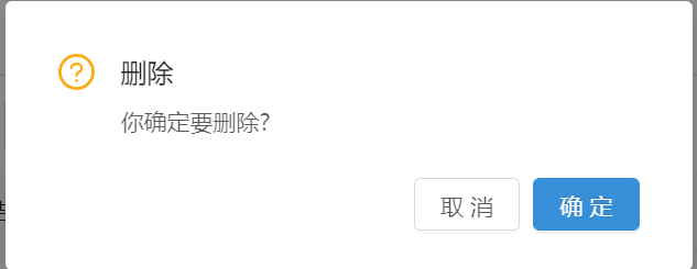
</style>当然组件因人而异,业务还存在的一个功能---点击删除的时候需要弹出确认框二次确认的操作,暂时没时间完善
在点击事件那里还有个想法,如果click事件不是传的函数传的是对象或者是数组然后进行数据处理再发送出去,也是想法暂未实现
有想法或者建议可以留言完善

 浙公网安备 33010602011771号